Artist.
#25
Rank
219
Upvotes
85
Feedback Given
99%
Helpful
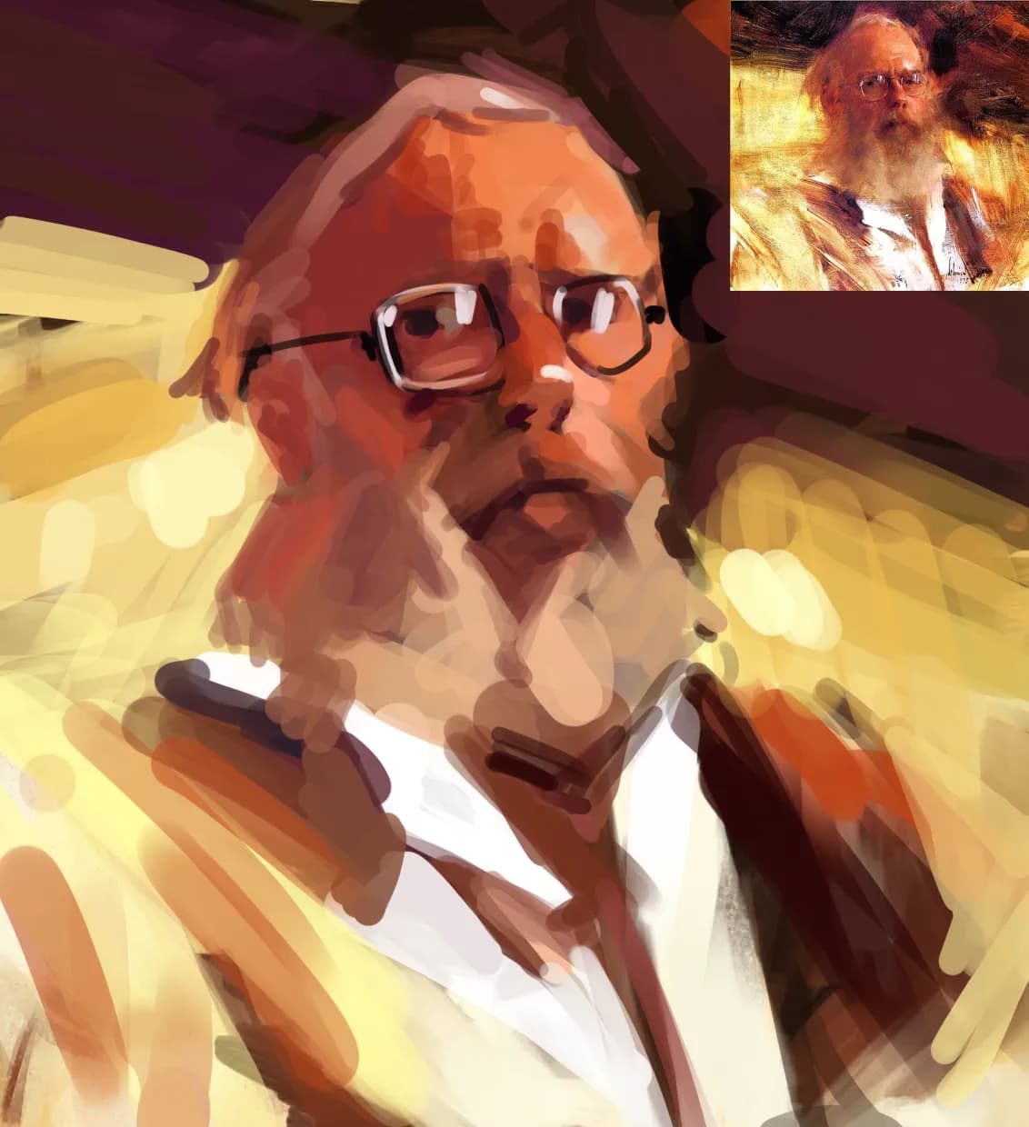
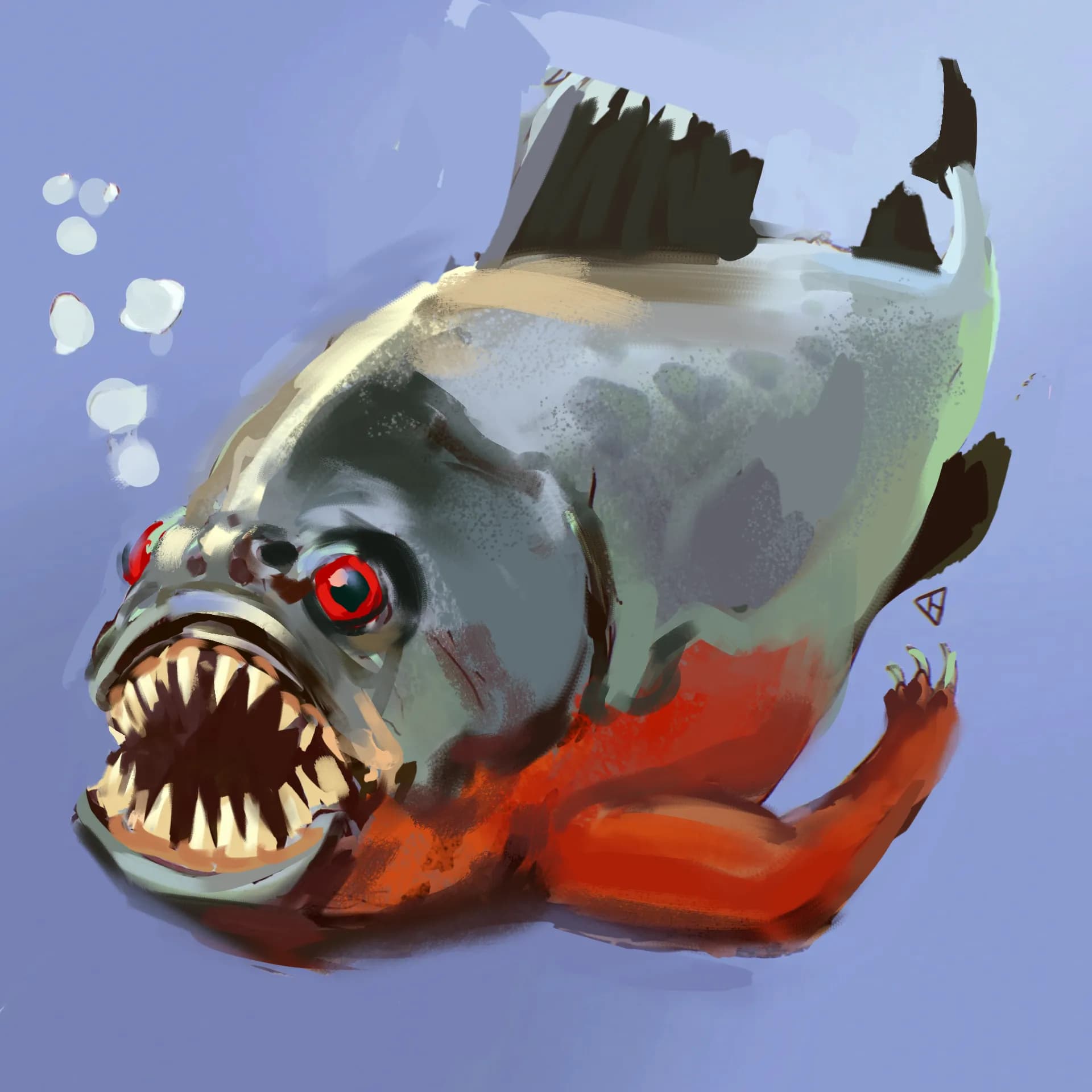
“Hi, here is my roundbrush attempt for this study, it is a fun challange, for color there is mostely red, oranges, yellow and violets used, with diffrent level of gray. To confidentely paint a portr”
“Hi, this is a nice drawing, don't be so harsh on yourself. In my opinionm proportions are fine, shat is missing is a contaposto for a pose, if you lower hips, shoulders should follow. Aslo pay ”
“The drawing is looking very nice, clean delicate linework, looking forward to see the colored version!”
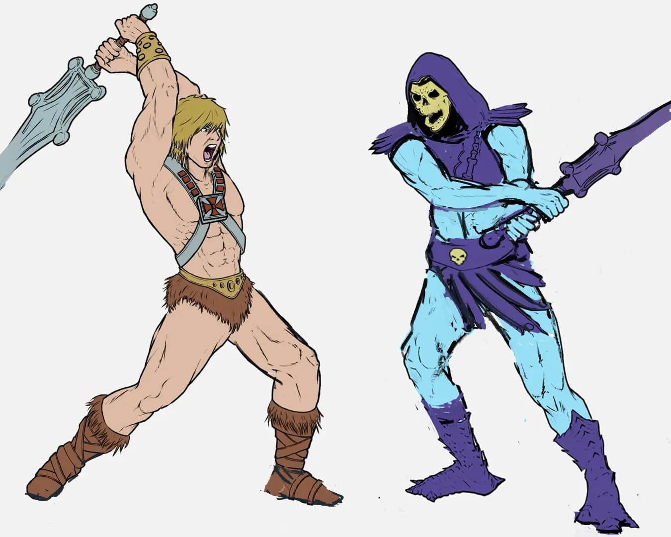
“Hi, nice drawing I like your style. Here is my idea for the pose and notes to the image: Right now SKeletor has few proportional anatomical issues that should be resolves: Size of hhands, he lo”
“Hello, I like this drawing a lot, at this stage I don't have much to critique, execution is clear, story is redable, I see only two minor dlements I would correct: The hopscotch decal on the floor sho”
“Hello, nice drawing, I like your style. Here is my overpaint and notes. I would push his pose more , broader shoulders, longers more proportional arms, leg forms rendered to indicate its true po”
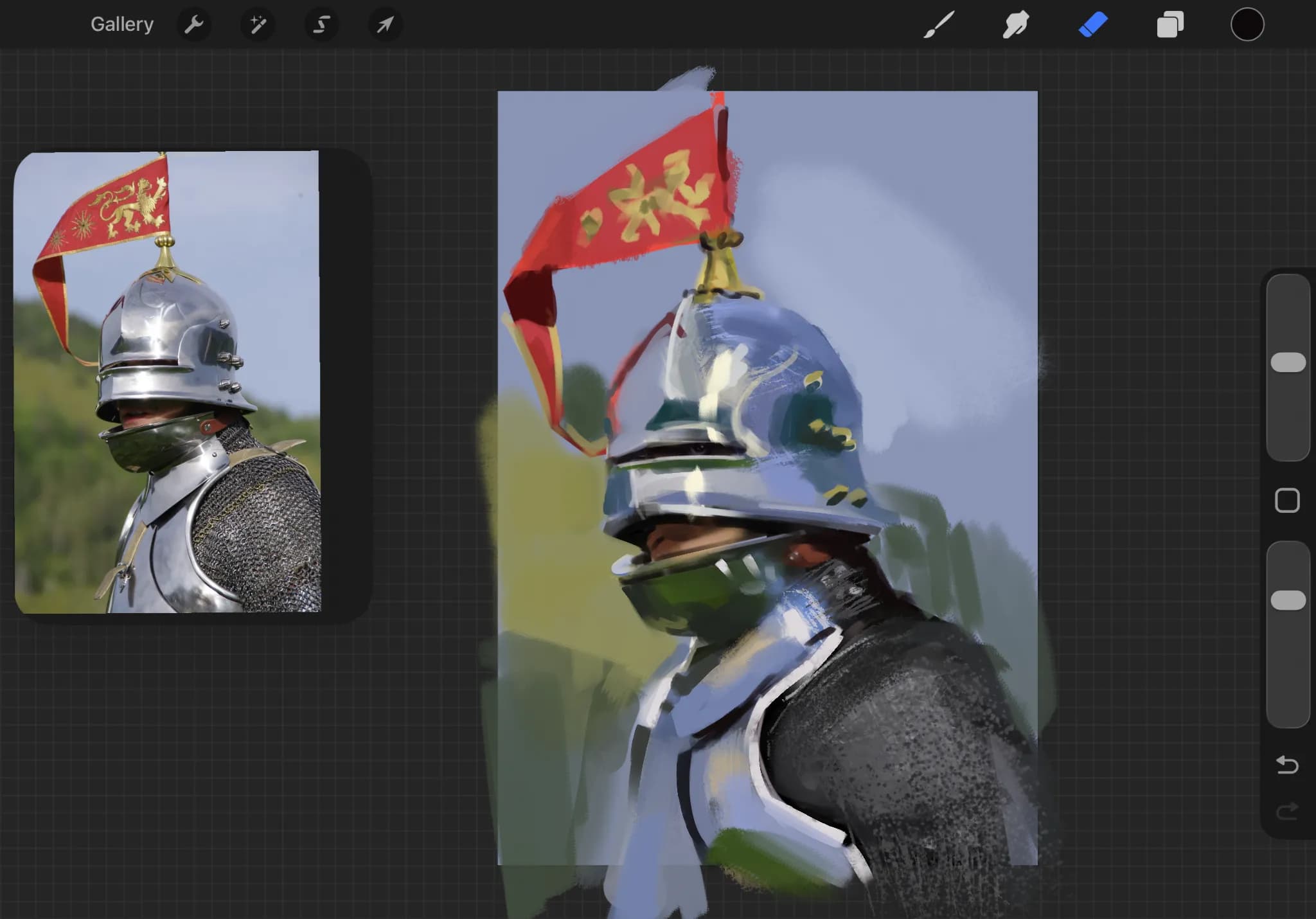
“Hi, welcome, you did great, don't worry abour color blidness, painting is mostely about values. Take a look at LiXin Yin artworks, he is also colorblind. Now to the Knight study, I did the ove”
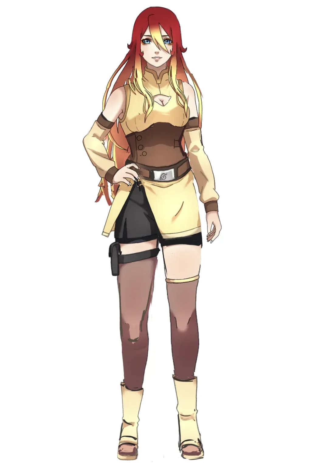
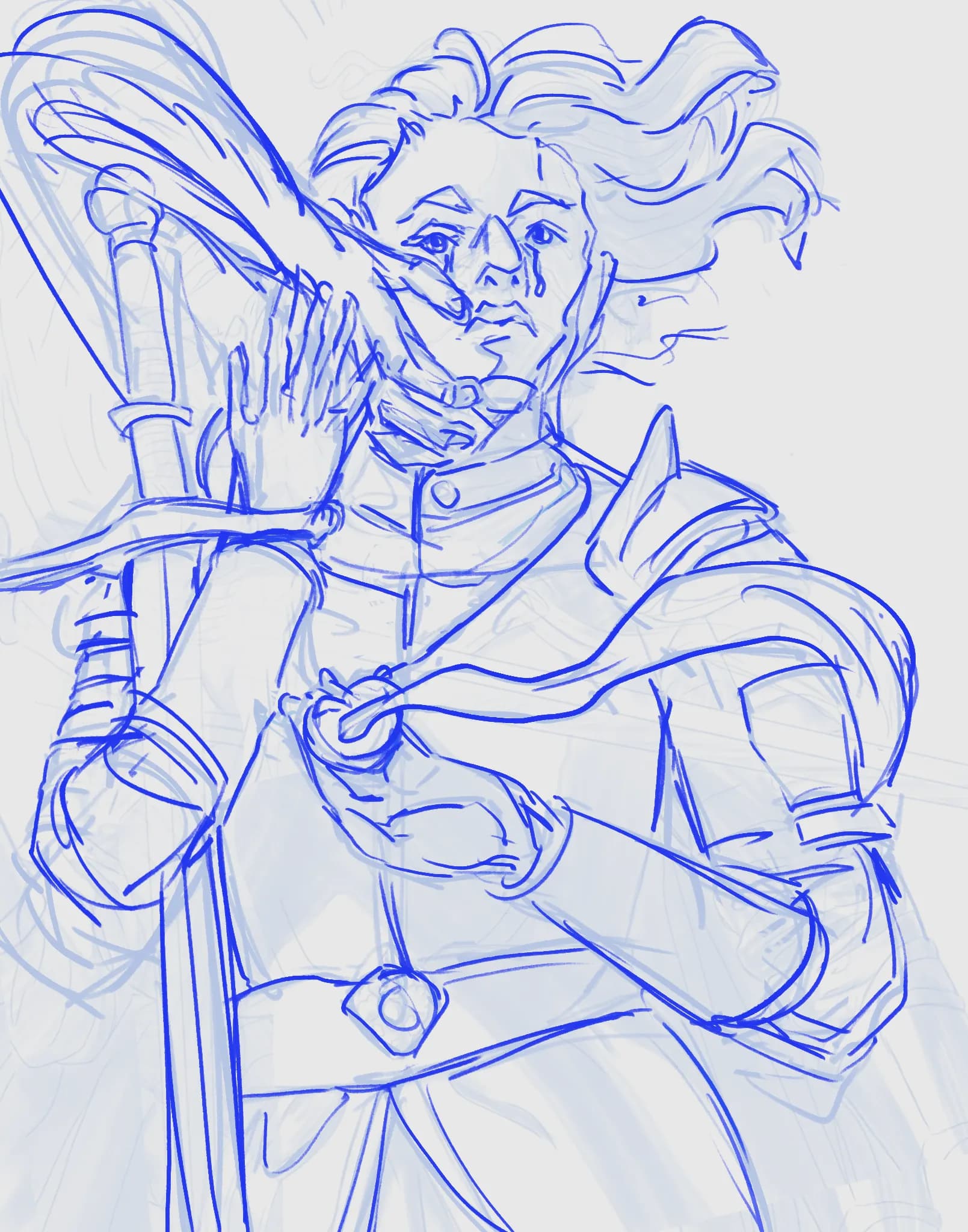
“Hi, great drawing! Here is my overpaint and notes: I would make her stand in a heroic pose, hair blown with the wind, rather than lying down (if I read the sketch correctly) Her pendant in her p”
“Hi, it is sucessful value sketch, I think that you capoture the gesture and graphic read nicely. Painting is not about getting the values "right" because there is no right way of painting, since act ”
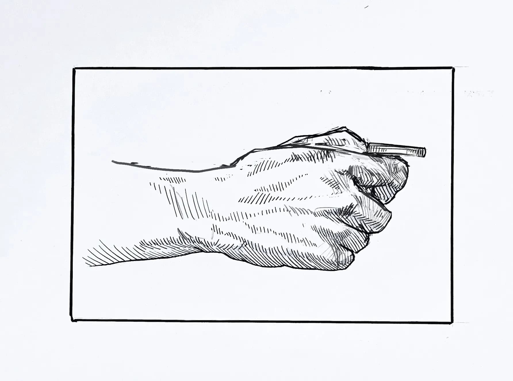
“Hi, first I will say that your hatching is nice, and I like the way you stylize your shapes, a bit Bridgmanesque. My feedback is about underlying anatomical problem this hand is having. Fingers hav”
“Hi, here is my overpaint drawing of your reference. Now as I could go into details why I made those decisions, I will give you genral advice which I think will be more beneficial at this stage. ”
“Not really a feedback, your construction process is on point, and I see tahis page as a sucesfull exercise. If you are aiming for more stylisation and breaking from realism, instead of working with ch”
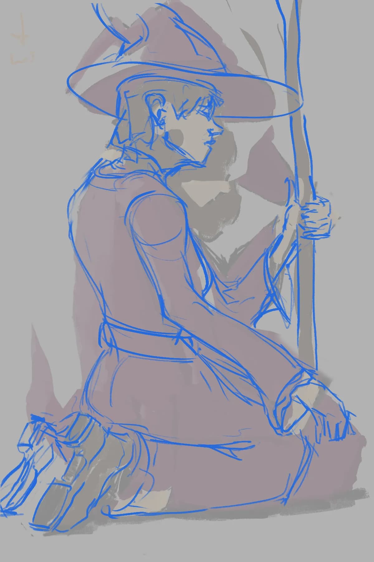
“Hi, here is my feedback and notes to it: I think his pose is a bit unrealistic, also placment and proportions of th body parts could be adjusted. Hand gripping the staff should respect the stick v”
“Hi, cool demon design, I like his pose and gesture. Here is my overpaint. In my opinion main issue with the background is that it is not following tha same perspective as the character. I have p”
“Naah, I think the anatomy is fine for the sketch, on top energy and gesture is great with this one!”
“Hi, nice painting! Here is my overpaint. I want to bring your attention towards shadow shapes, and shapes in general. In m over paint I've painted patches of light and shadow with sharp bolder”
“That is perfectly striking depiction, so that I can feel it... Stay strong and take care of yourself.”
“Hi, here is my sketch, how you could tackle the issues you are facing: Indicate her eyes as closed Make her posture straight and empowering, with the arm move forward, suggesting as if she just fi”
“Hi, this is a great illustration, you did a good job rendering. In terms of achieving more three-dimensionality here is a overpaint and some explanations of thought process behinf it. Key to mov”
“Hi, I woudn't add more black, what you need in my opinion is light and shadow separation by color. I did it digitally, to simulate how it could look as if you add some color wash. Using black wi”
“Hi, I like your line art, quality, here is a drawing of what could be a solution to your request. Right now nose is not in the same line as the mouth, so I have moved it. Also made the eye small”
“Good attempt, don't get discouraged, you are making progress :) There are indeed some things to solve, here is a drawing how I would approach them. Generaly if you feel that you are missing asom”
“Hello, here is suggestion as a overpaint. THe diesign is interesting. For improvment I would sugest you to focus on simple forms, how they turn, elements can be simplified to better represent the r”
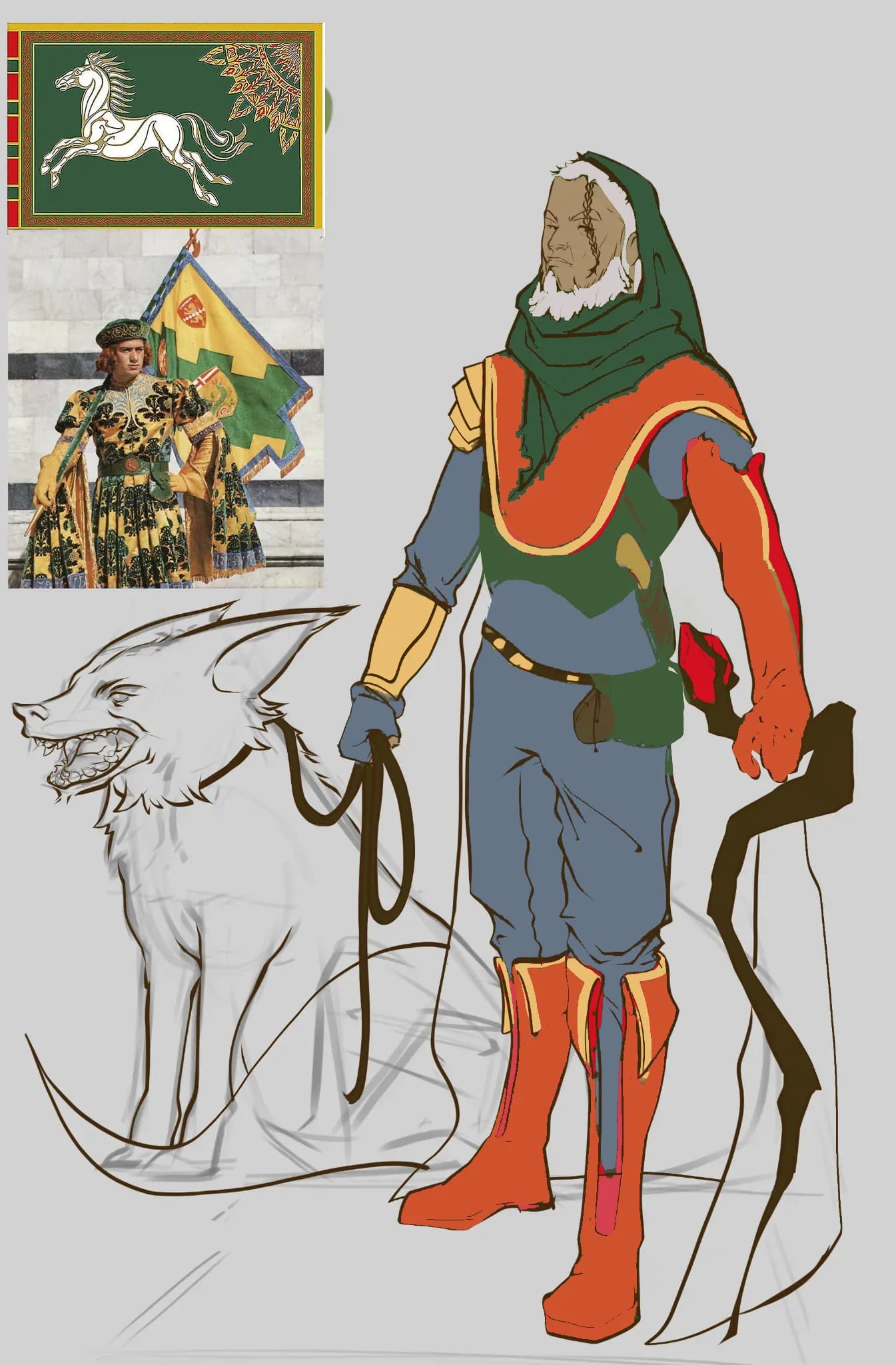
“Hi, nice drawing. When it comes to color, especially for character, I would suggest to look for some reference, in that case some medieval outfits and flags. That will provide you with some colo”