I'm Stibnite. @stibniteart on YouTube.
#3
Rank
63
Upvotes
25
Feedback Given
100%
Helpful
“I really struggled to find something wrong with this! You applied correct line weight, the stylization is nice. It's best to give yourself hyperspecific feedback, and also, to overhype yourself rather”
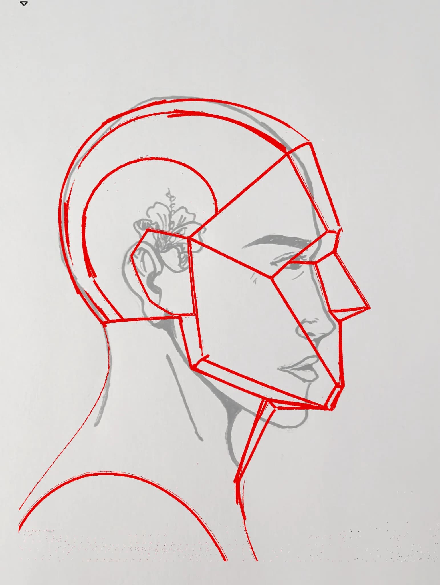
“I really like the flower behind their ear and the concept! The face looks androgynous, the design is mysterious. In terms of avoiding this next time, I'm sure you already thought of it: be more care”
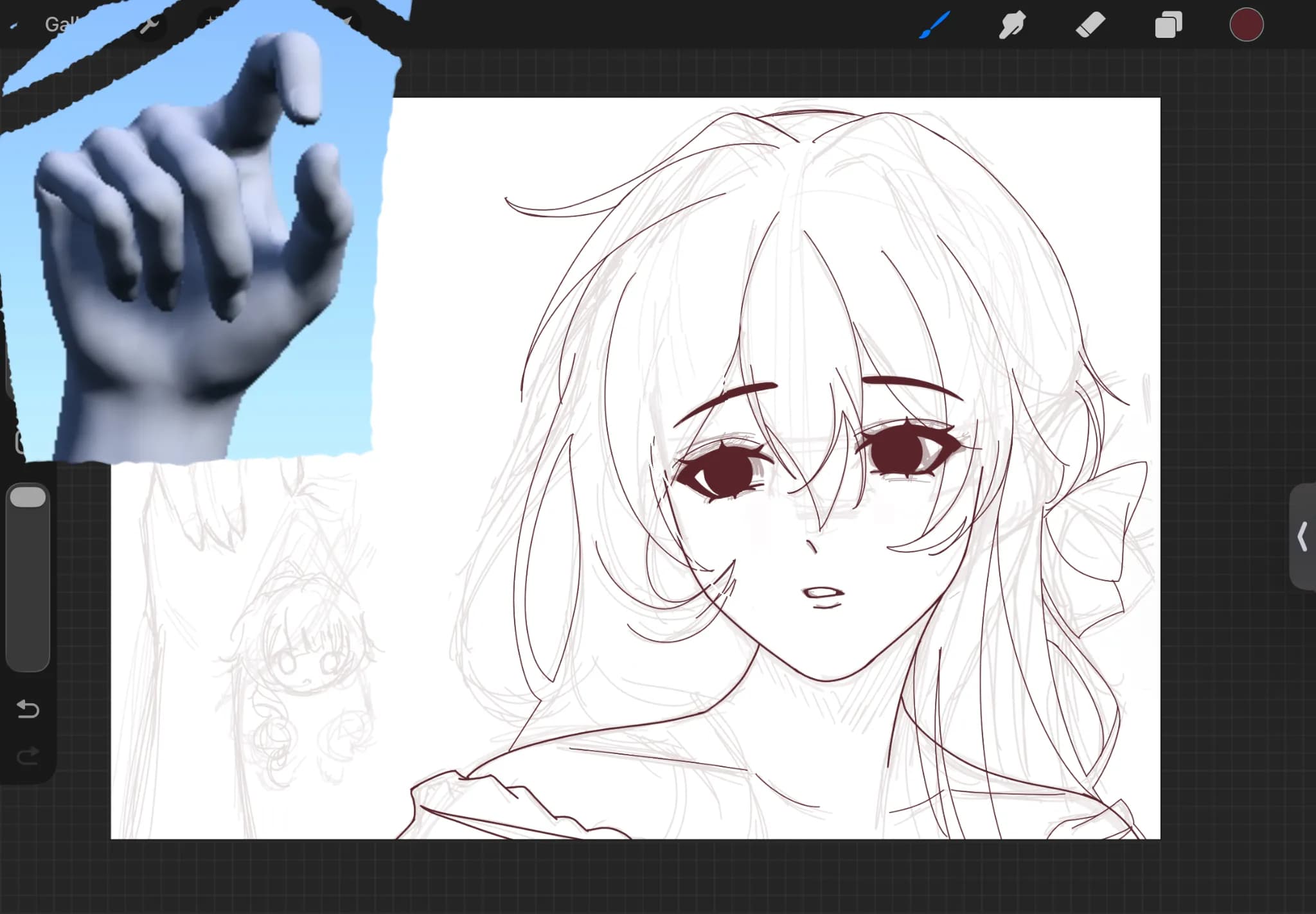
“And generally, for drawing hands, the tutorila by Chommang Drawing on YouTube, "How to draw Hands / Useful Tips!! / Tutorials (easy way) / Part 1" was groundbreaking for me. I suggest you watch his vi”
“I love your stylization, your lines are clean and the character's face is super appealing! The scene also intrigues me, because she looks like a super sweet girl, but is at the same time holding the C”
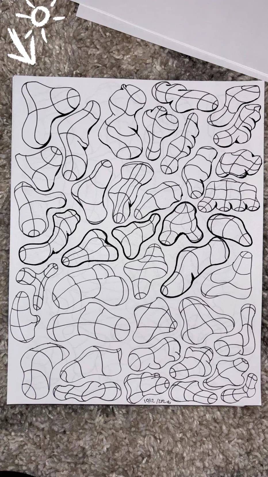
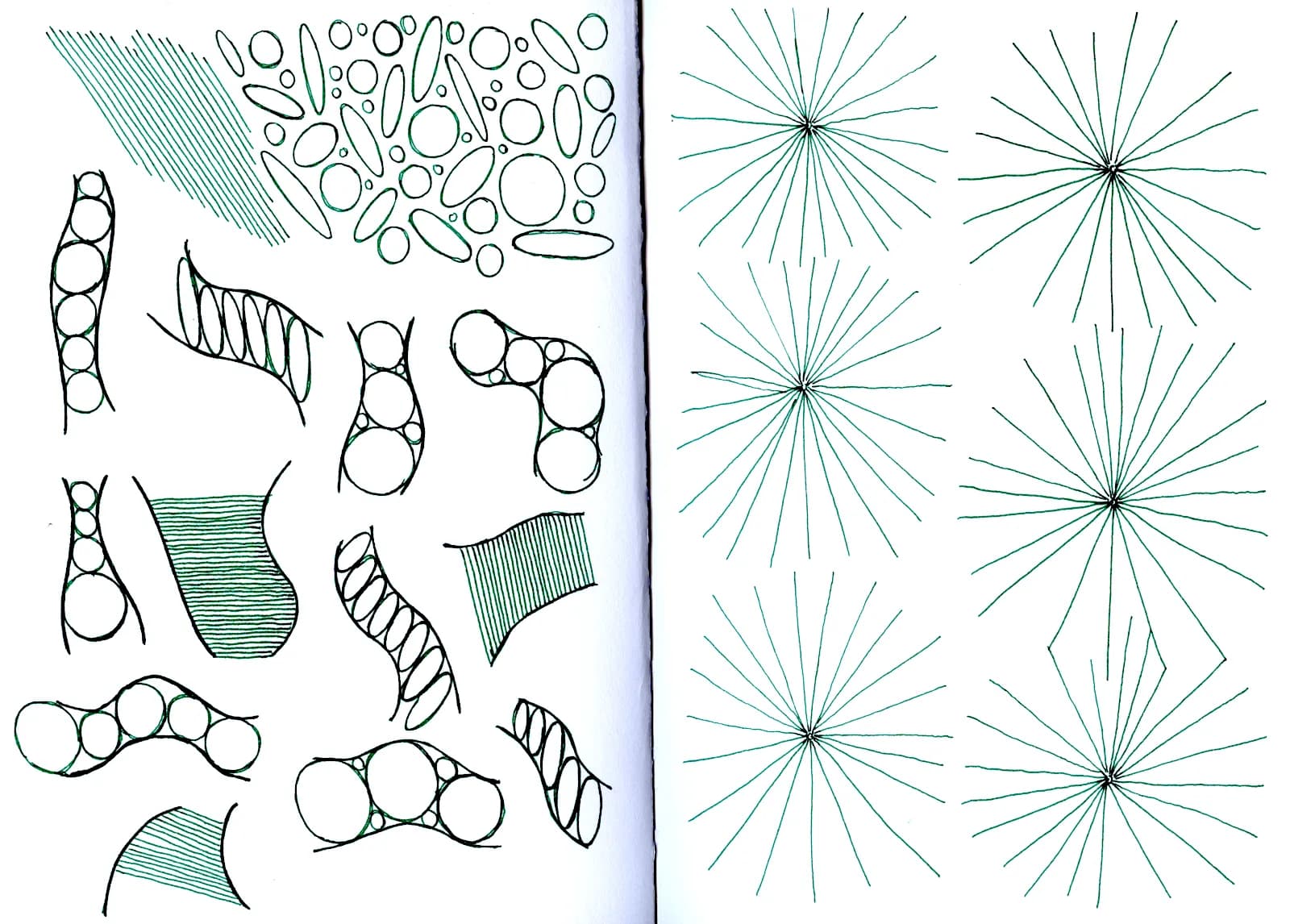
“First of all, this type of exercise definitely isn't fun and the fact tat it looks like you filled pages upon pages speaks a lot to your dedication. I think you will achieve great results by just stic”
“And at this stage, it's fine if your drawings look flat! You can invest more points into shapes :)”
“I know it's hard not to dislike your art when you're in the beginning stages, and it's really painful to put in a lot of work for a result you're not happy with. Look at the good parts: 1. The fact t”
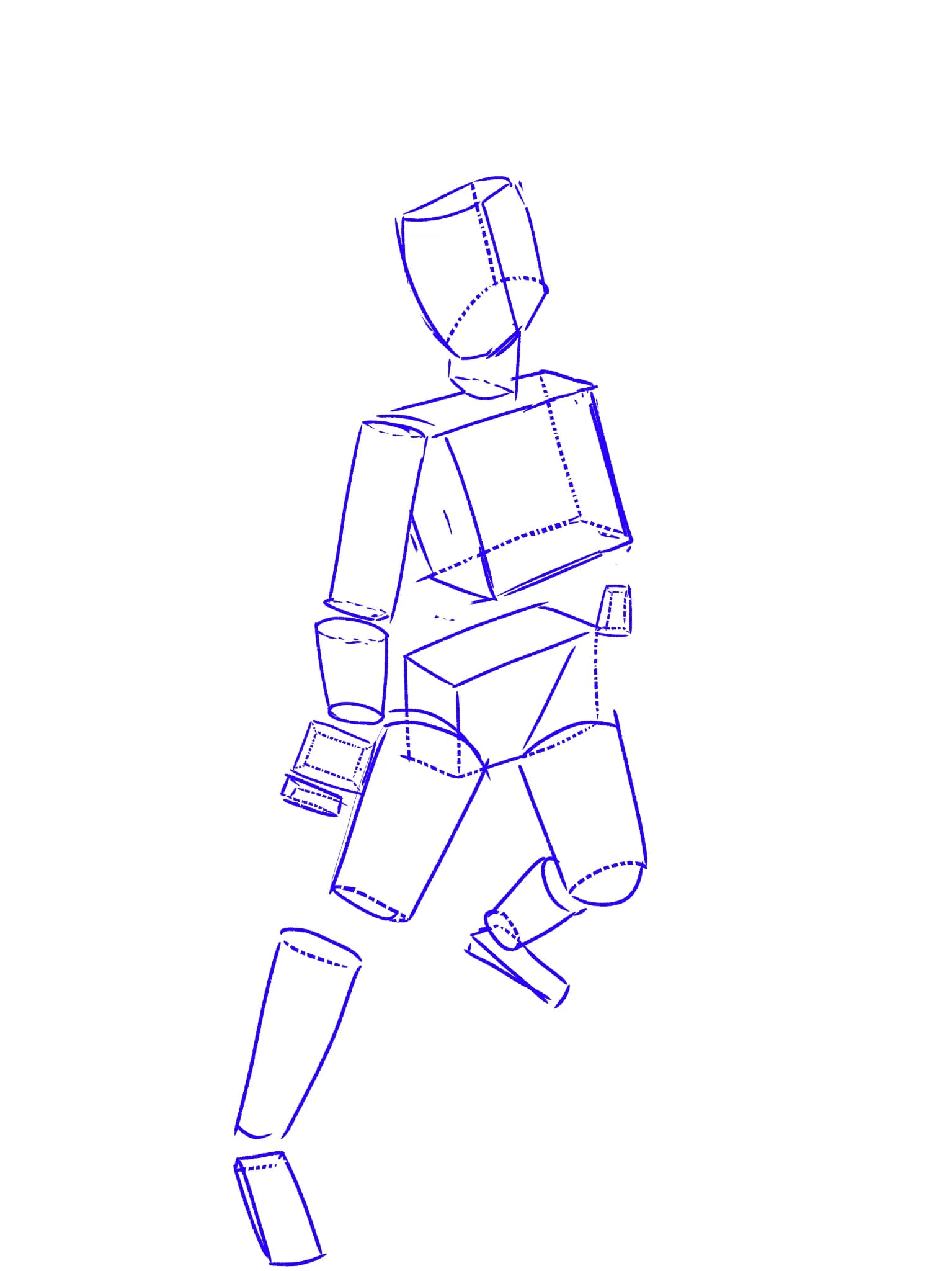
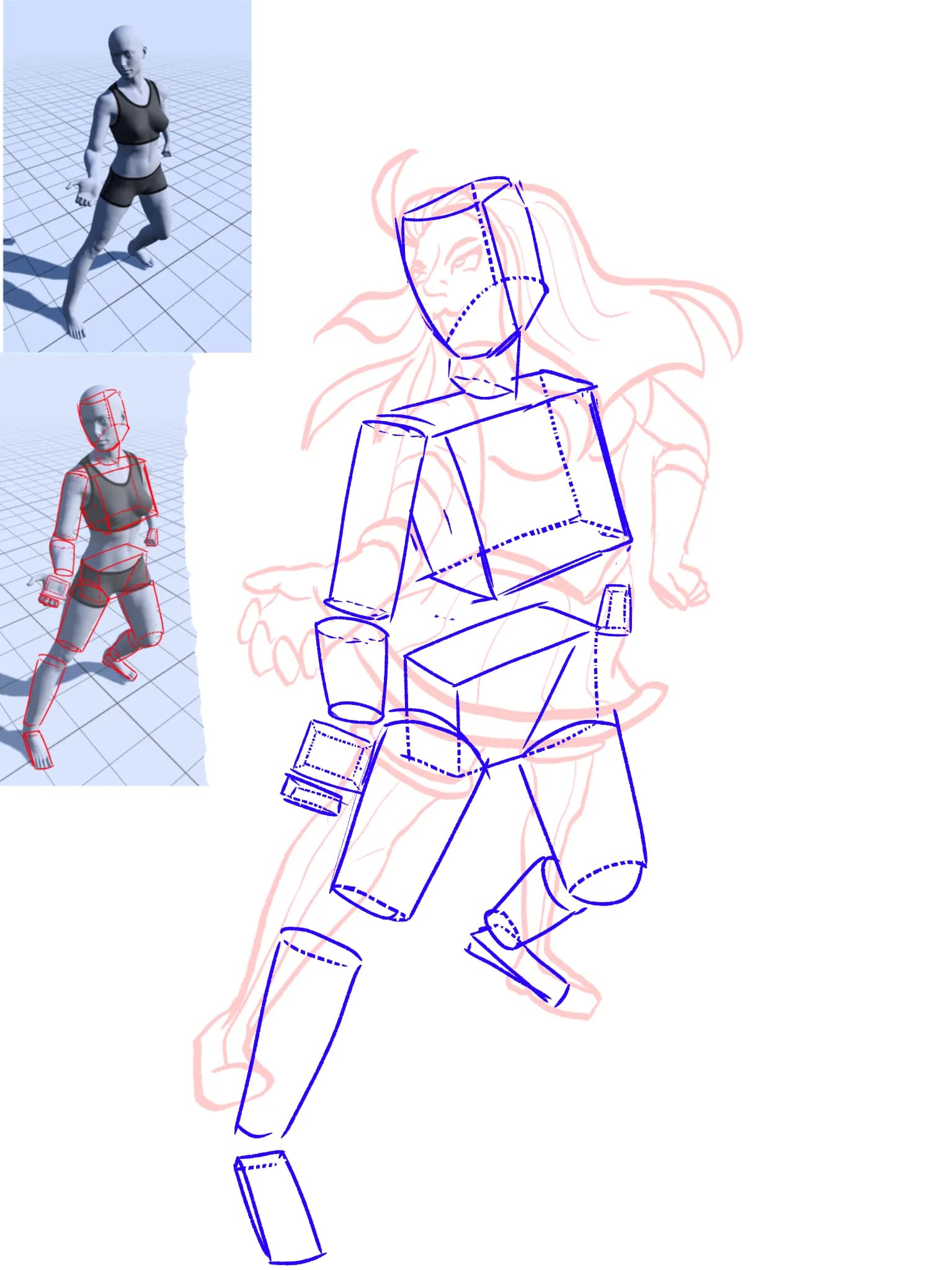
“The MOST important and accessible exercise is gesture drawing. It's great to do with a ballpoint pen. I would suggest starting with the shortest time frame available. Quickposes and Line of Action are”
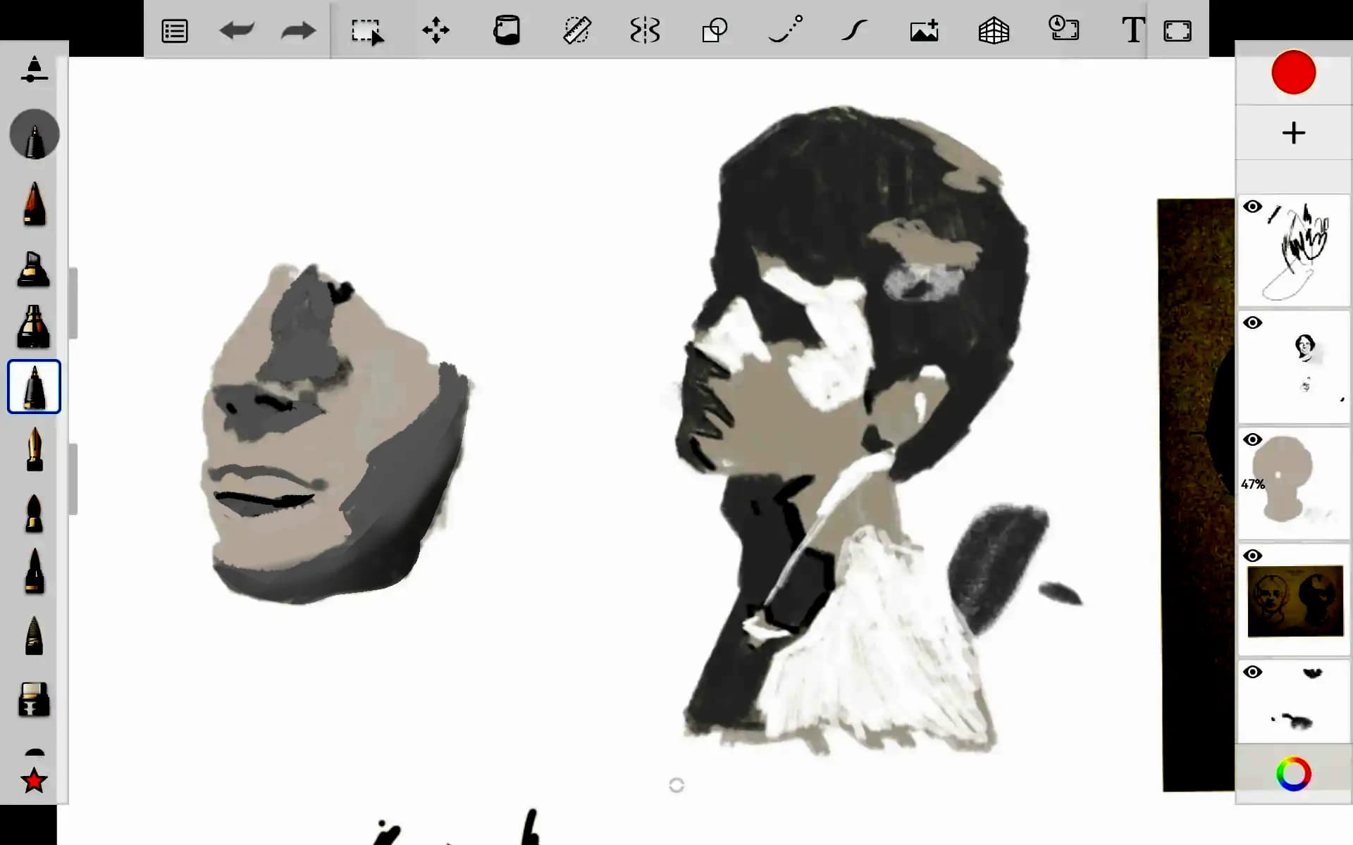
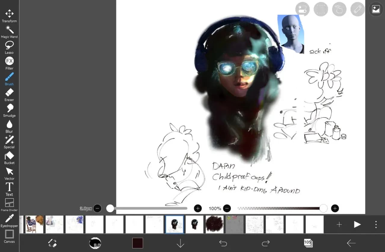
“I'm still not sure if you were following the values in the reference and it really was that light! I also cheated, since I work in Ibis Paint and I have an easy contrast and brightness slider (in this”
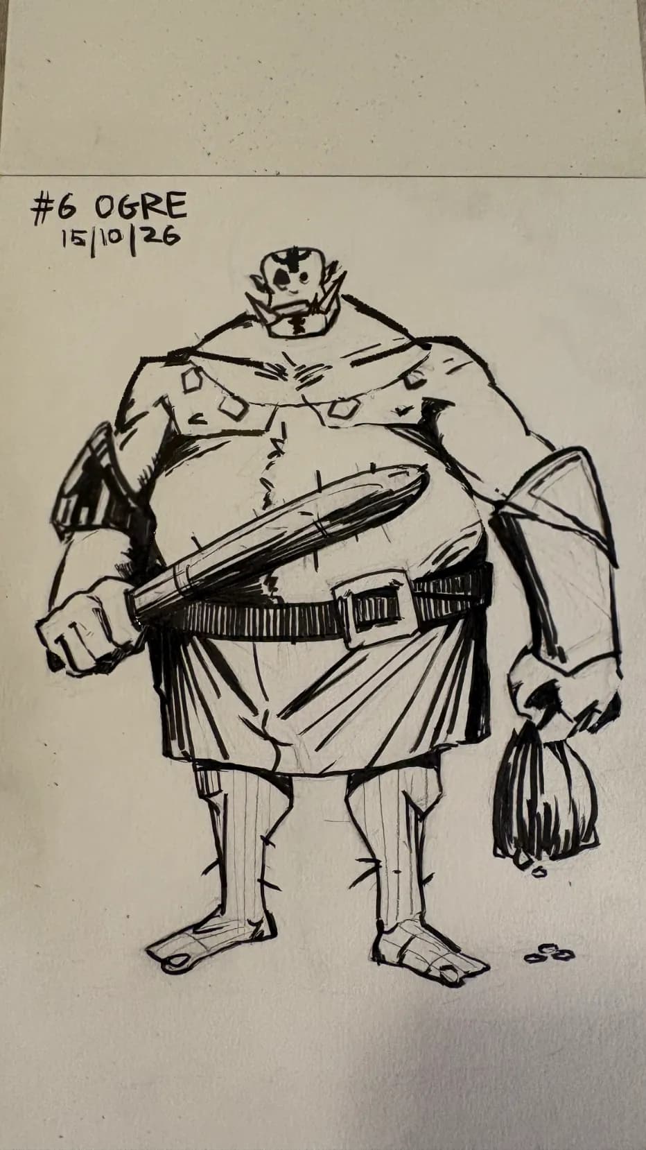
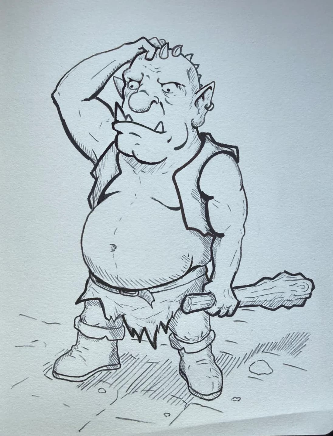
“I'll be straight with you, I adored this ogre. You made him look so inept and lumbering and charming. I wanted to suggest some genuinely small design choices that could make him an even dumber lumber ”
“Shape-wise, everything seems fine, I just want to ask if this layer is full opacity or if the reference you were working off was this light? As in, it's a very light and low-contrast drawing, darkenin”
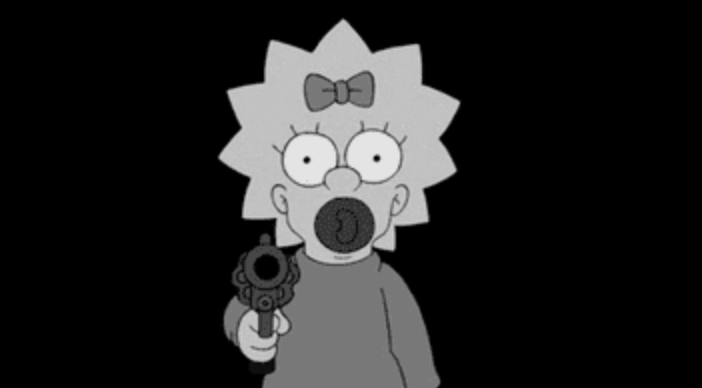
“Ditto to the previous critic, it looks awesome and moody with the black background, but mostly I just want to say how much I love this one. The hatching is very even-handed, it follows the forms so we”
“DUDE!!!!!! To be honest this is total glazing, not even feedback, but I'll just say, you put in so much practice into fundamentals (even more than I initially saw) and it's DEFINITELY paying off! The ”
“AWESOME!!! This is an exercise that can get boring real fast so I commend you for sticking it out. Two questions: 1) Are you working with a tablet and a stylus? 2) Do you want to be a primarily digita”
“The shapes I'm providing are lacking, but IMO it's best for you to take it gradually, I saw on your other post you're just getting back to drawing. Drawing is very labor-intensive, it takes a lot of c”
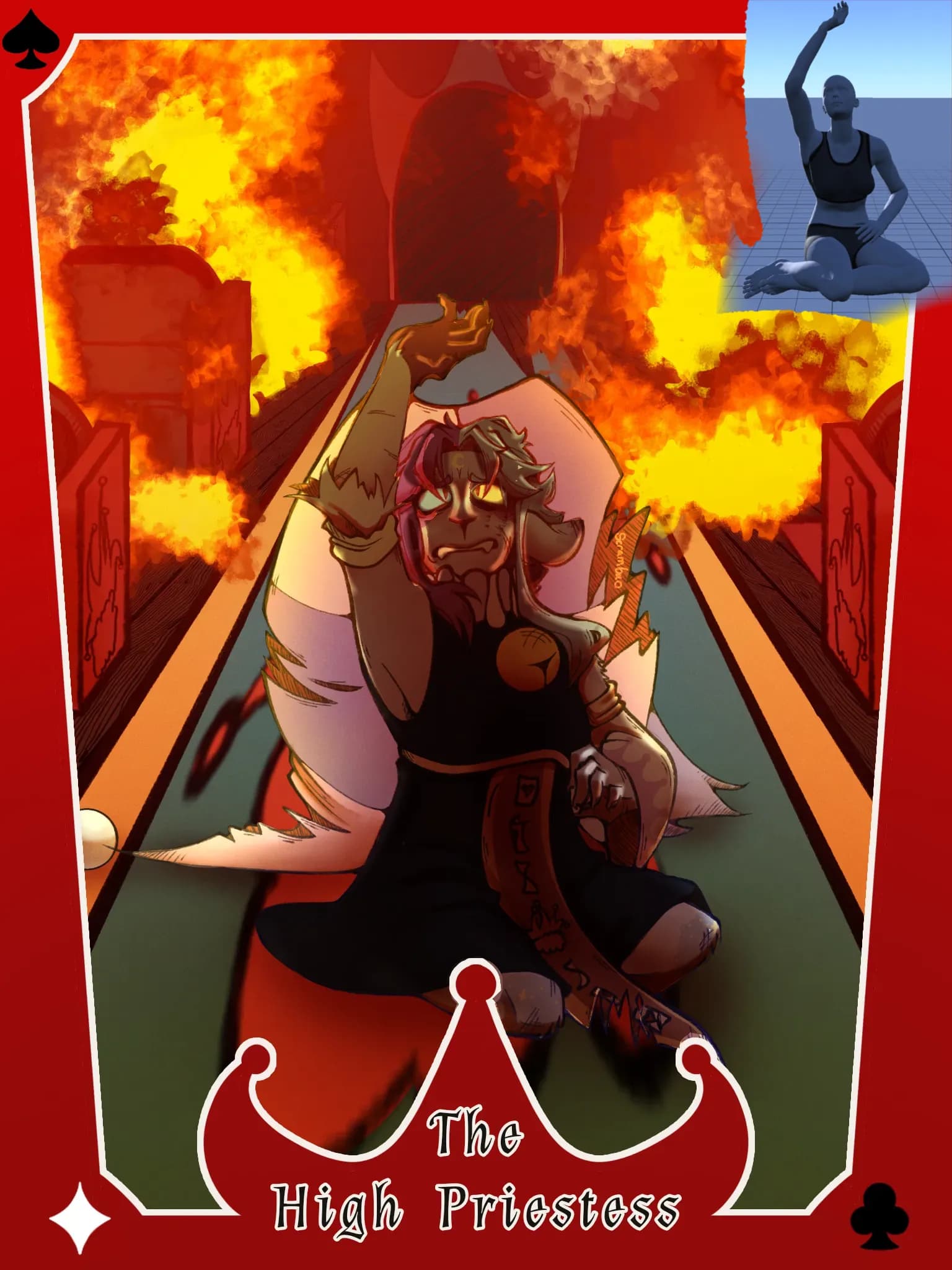
“First of all, I want to compliment your stylization, shape language and the personality! I could immediately tell by the expression that this girlie is mischievous, confident and fun. Your lines are a”
“It looks super fun, I love the storytelling of the prices being crossed out, implying very clearly that the ram just does this for the love of the game) I also love this combined with his no-thoughts-”
“I sized it correctly for more clarity! But I'd still consider zooming in on your work more, it deserves to be front and center + it will make more of an impact that way”
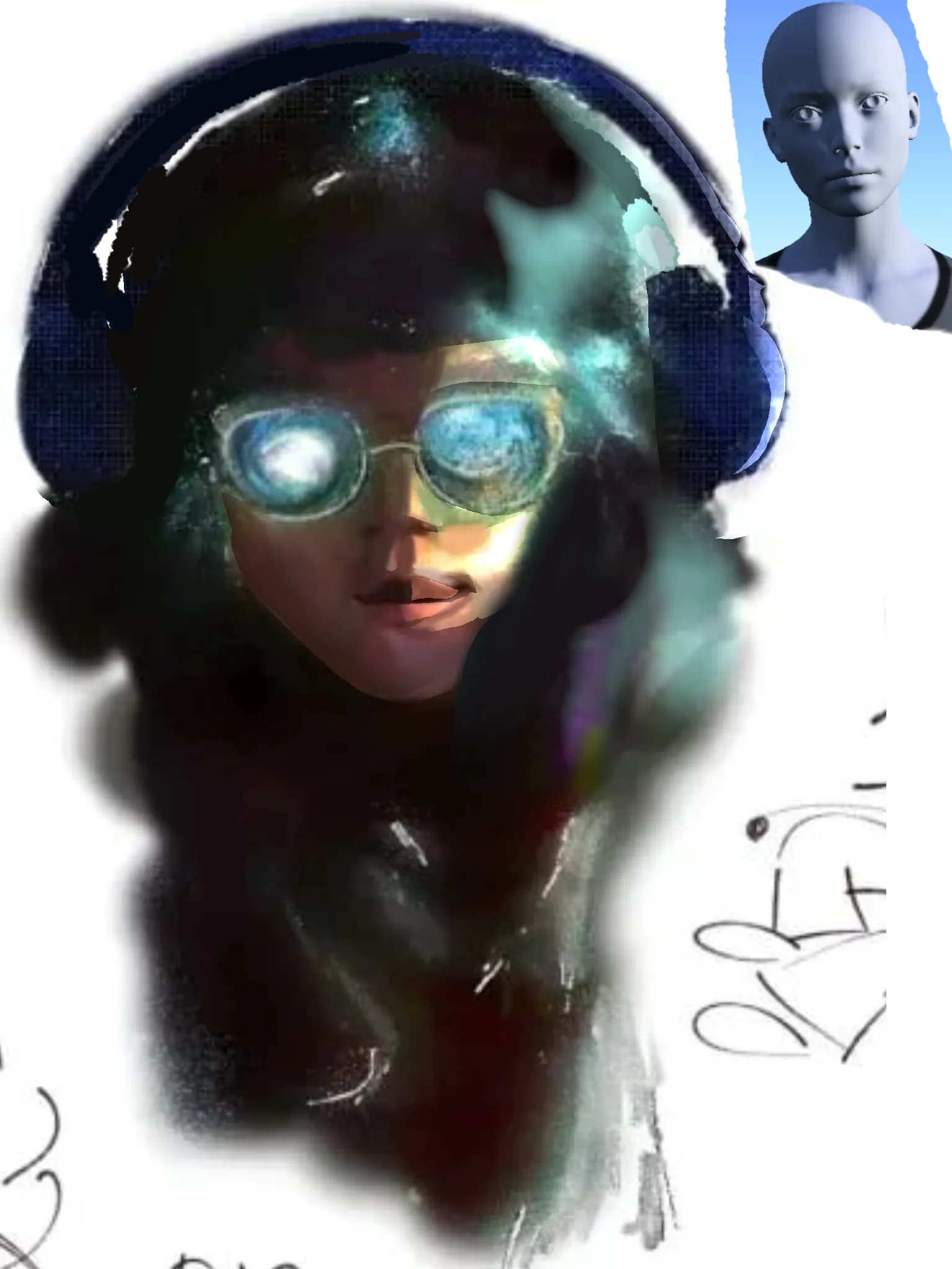
“Your strengths: awesome, bold color choices!!! The idea is super creative too, it looks like she has galaxies in her glasses, or the Milky Way, or like she's covered in pixie dust. The facial features”
“Graphically, everything works! Based on your style, it doesn't look like realism is the main thing you are focusing on, so it not being completely realistic is fine, and also your linework and line we”