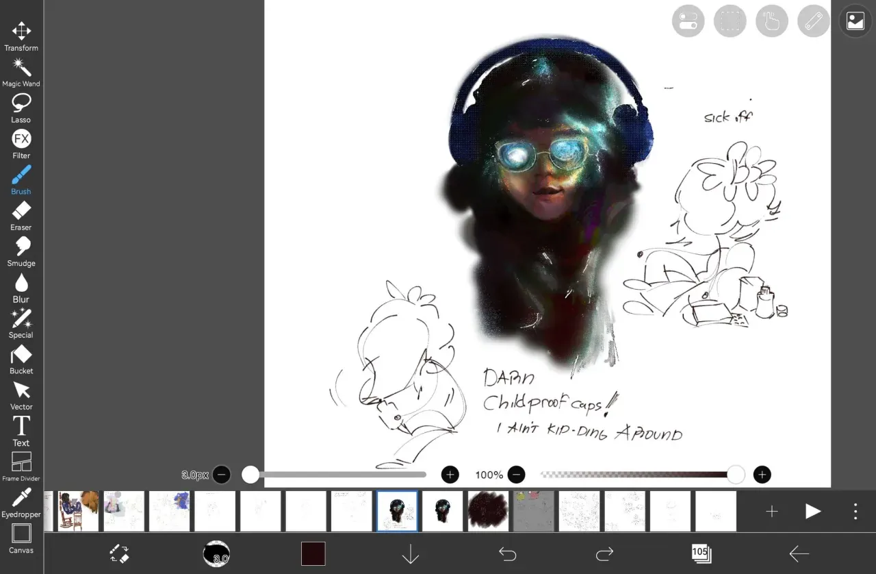
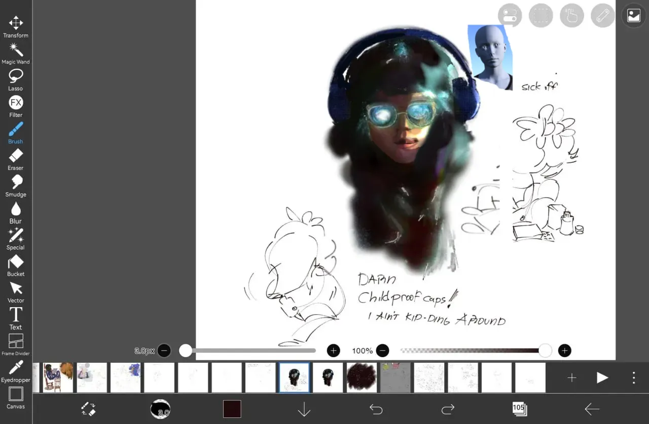
I sized it correctly for more clarity! But I'd still consider zooming in on your work more, it deserves to be front and center + it will make more of an impact that way
Paintovers (2)
Looking for art advice or friends to doodle around w 🐼
Artist's notes:
Fixed bits of the lights and shadows, been biting me, and speaking of biting, i got rabies, but what do you think ? like how would you paint me as one of ur french girls or sumn ik my setup ranks stinky overall, its got no law in art against using wacky tools like this (unupdated n all), jus doodlin on it
Comments 2
Your strengths: awesome, bold color choices!!! The idea is super creative too, it looks like she has galaxies in her glasses, or the Milky Way, or like she's covered in pixie dust. The facial features are nice, soft and approachable, the textures are awesome, on the sparkling bits and the canvas-y stuff on the headphones. In general the painting really caught my eye and even though later I will suggest using more hard shapes and edges, I personally loved how misty it was, and how she's floating on the canvas and melting into her hair. Really nice and mysterious. This girlie looks like she has intense side lighting! I went into Magic Poser to recreate the lighting scenario. It didn't completely solve my problems because the model doesn't have hair, glasses or headphones, but it gave me a guideline. During the paintover I considered the hair and headphones, and whether they would be blocking the skin, and how much. My steps for the paintover: 1. I flipped the canvas and ... Didn't find a lot wrong, tbh! The face of the subject looked like it was really leaning to one side, so I used the select / lasso tool to make a quick curl of hair and color-picked from your colors to make the tilt look more deliberate. I also selected the headphones and pulled them a little to the side (for precise adjustments I used the pixel tool in Ibis Paint where you can literally count the pixels you move the object by, it's worth it). I moved them to make them look more attached to the head and to support the tilt to one side. 2. Once again, color-picking, I used a hard brush and really roughly covered up the mess I left by selecting an object and moving it. I ruined some of your textures, which were really lovely :(((((( 3. To follow your lead on the style, I used the add layer to keep the bold, awesome color choices. The 'add' layer makes anything really saturated and flowing. I used it to make the lighting more in line with the reference. I noted how the lighting on the piece was different from the reference. 4. I used the lasso tool to select the shapes of my lights on the 'add' layer, filled them in with the airbrush of the color I color-picked from your work, and then, on a 'normal' layer above, also color-picking, or using the airbrush eraser, I 'sculpted' the highlights. Note how in the reference, there is some light on the chin that I didn't include because of the hair covering it + there's a light at the model's nose, on the shadowed side of the face, that I also didn't include, to keep the composition strong. 5. I erased the light on the other cheek since, due to the form of the skull, that cheek would be in shadow. 6. I deepened the shadows on that side of the face according to the reference + made the form of the face more clear. To keep my shapes sharp and to only fix what I'm trying to fix, I again use the lasso tool. Aaand I techically did this at the very beginning, but I zoomed in and made the artwork the focus by making sure it's the left-most object on the screen. There's still space to include your other doodles, but the focus is now more clear. So, the steps I would add to your workflow are: find a reference for what you want in terms of lighting or make a precise one if you want (in Magic Poser, adjusting lighting is free, and there are 3 lighting modes which should be free as well. for this strong lighting I used the spotlight type lighting). Consider the reference, but break away from it if needed (like how I didn't touch the chin because the hair would get light on itself. Make harder shapes, you can use a hard brush or the lasso tool for this. Ibis Paint users unite!