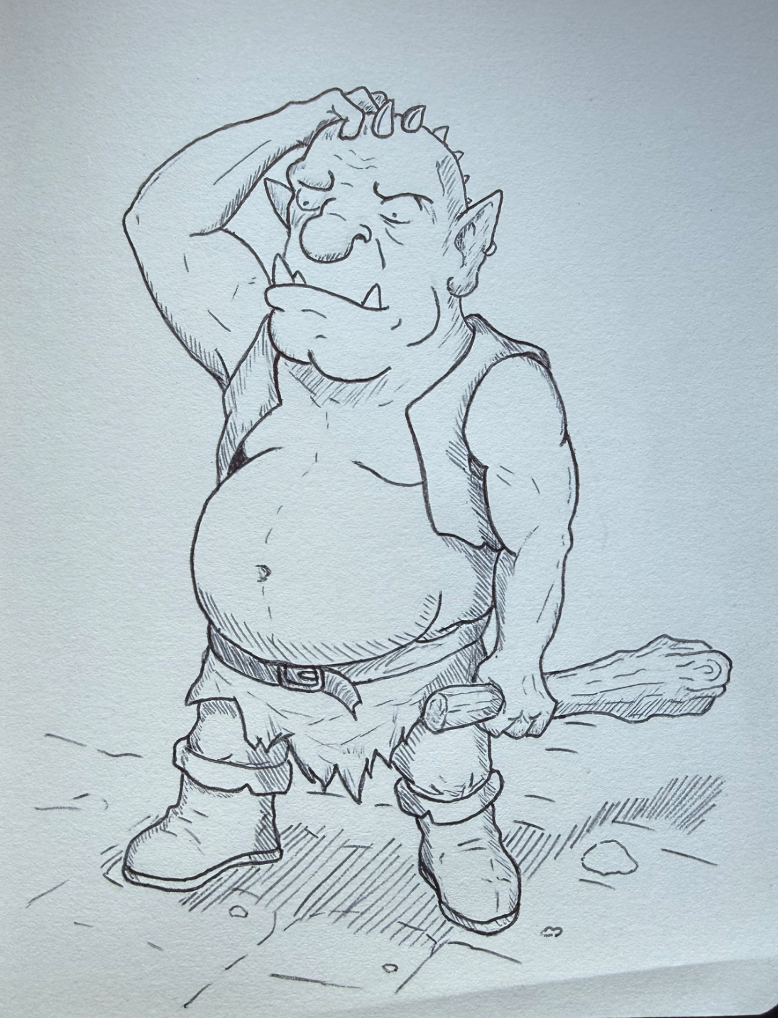
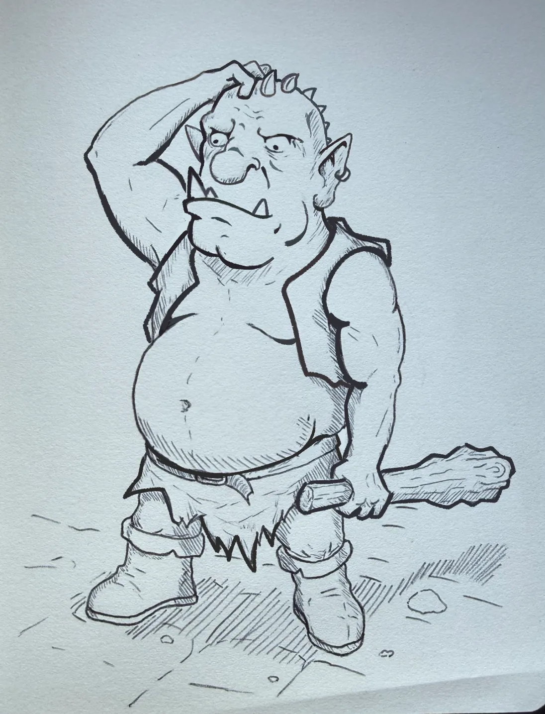
I'll be straight with you, I adored this ogre. You made him look so inept and lumbering and charming. I wanted to suggest some genuinely small design choices that could make him an even dumber lumber of an ogre. (I'm serious, I love him) In your design process, I would suggest you: 1. Make the small elements of your character stand out. One of the tings I did was make the ring in his ear bigger. It's a really small part of the process, but it goes a long way. Most viewers give your artwork a passing glance (not out of disregard, we just do it to images) so, especially since it looks like you're going for a more cartoony style, emphasizing small parts does a lot to make it actually register in the viewer's mind. When sketching, I would suggest you exaggerate these elements so far as to almost "break" them, stretch the concept to its full capacity, make it look almost ridiculous: that's how you will find the limits of your stylization. Jackie Droujko on YouTube does a lot of this in her paintovers (fixing your art videos + "I taught my students design for 10 weeks videos). 2. I did the same "bulking up" to his teeth, pot belly and jacket. 3. By contrast, I made his eyes smaller and pushed your choice to sort of have his pupils facing different directions. The idea was to make him look much dumber and more memorable. 4. Depth doesn't only come in shadow! By simply thickening the outside of his silhouette, as well as filling the crevices in more, like at his chest, under his eyelids, in his wrinkles, ear, nose, under the chin and lip, so, using line weight, you can make him look like he has more, well, weight. Good places to thicken your lines are: where you want the audience to look first; the heaviest point of every form (under the lip, where it's heavy, the underside of the ear, etc). If you thicken up the outside, it makes the character stand out more from the background paper. Take my advice with a grain of salt since it was a digital paintover, but I think some steps like exaggerating design elements and deciding the line weight ahead of time. The likelihood of you being satisfied with your finished piece increases the more you plan beforehand. Line weight tips: thin where the light hits, thicker where there is shadow, thicker where the object is heavy, thicker at the focal point, in crevices, thicker where objects overlap (see: his jacket and the hand around the club.) But I'd like to underscore: the main reason I wanted to do a paintover of this is because I was in love with this ogre! ╰(*°▽°*)╯
I really appreciate all the advice and tips you shared! I’ll definitely make sure to keep them in mind for my next drawings. I have to say, with your tweaks the character truly pops off the page—that enlarged earring caught my eye even before i started reading. I actually thought i had already exaggerated the proportions, but now i get that i need to push it even further! 😁 And you made me realize just how crucial line weight is. Thanks a lot for spending your time on this, it means a lot!