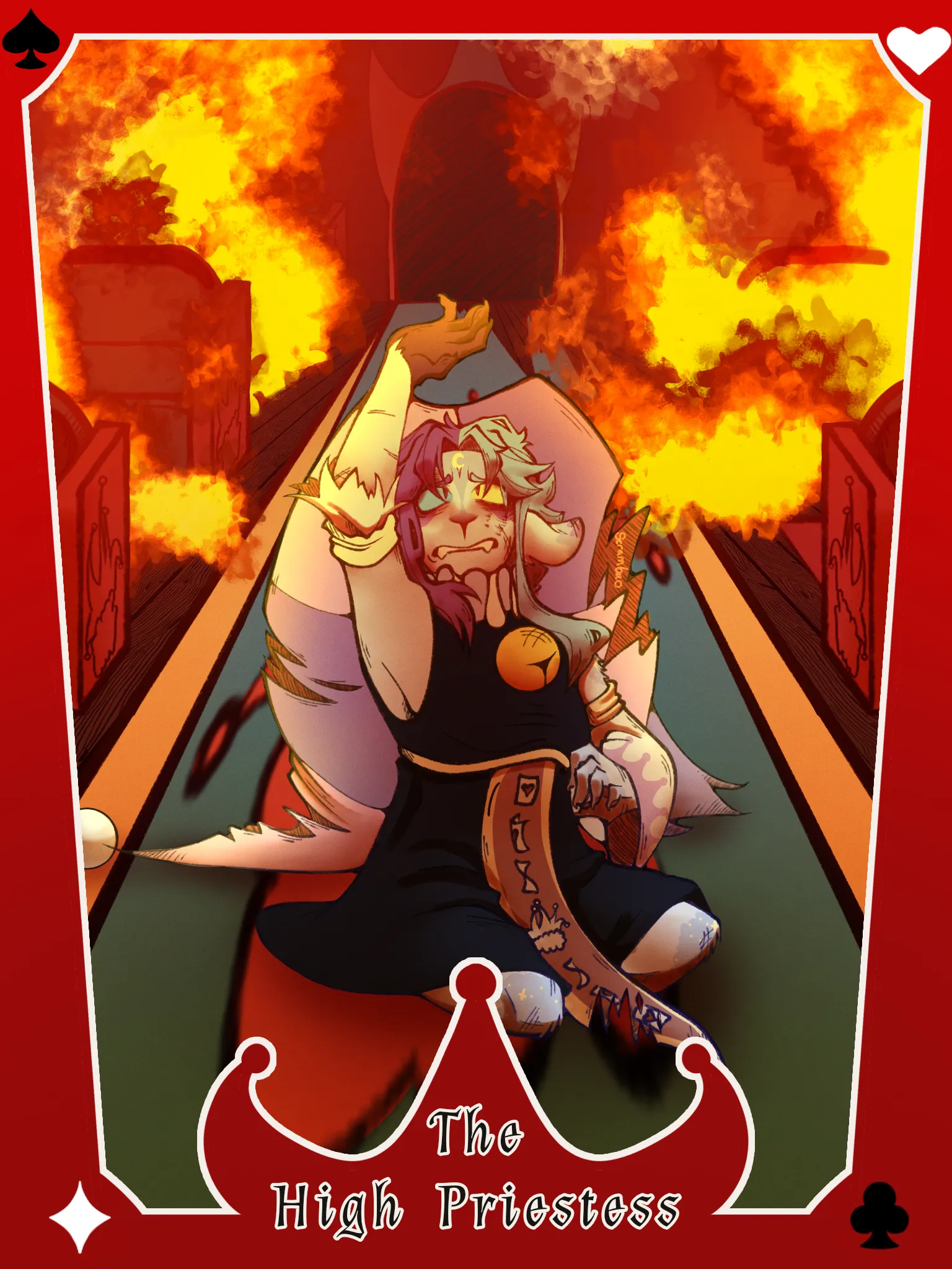
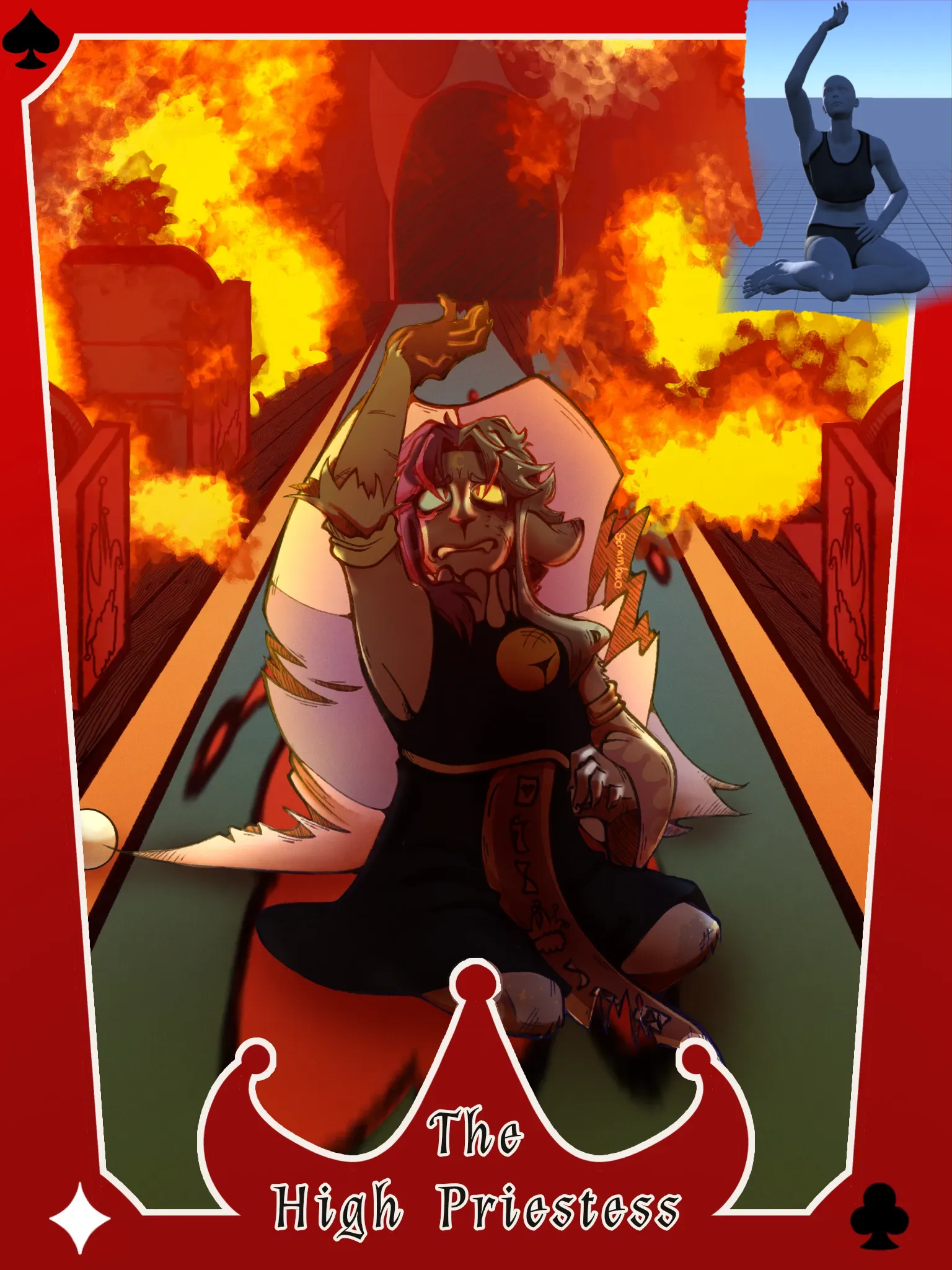

Graphically, everything works! Based on your style, it doesn't look like realism is the main thing you are focusing on, so it not being completely realistic is fine, and also your linework and line weight is really solid. The reason why it might feel off to you is probably clarity. When I looked at the piece for the first time, I really struggled to find the character and I struggled to figure out what the object behind them is as well. I also really struggled to understand the character's intent. It's actually really useful to ask yourself: what are they looking at, what are they reaching for, what are they thinking. My interpretation is, she's upset about the destruction of her city or circus. I would suggest the YT channel Jackie Droujko and videos where she talks about her mentorship projects and shows snippets of her live critiques of character designs and posing, if you listen to it a lot and really absorb it, it will really help you narrow down the purposeful mindset that leads to memorable pieces. I will focus mainly on lighting in my feedback in the paintover, and an easy shortcut I personally use for figuring out lighting scenarios is Magic Poser. Last I checked, you can manipulate the lighting for free, so I used that to roughly recreate the pose and lighting. As far as I understood, the character has darkness ahead and stark lighting behind them, so they would be heavily backlit. Putting them in shadow like this would already solve a lot of clarity and storytelling problems (they're losing everyting = they're in shadow, in darkness). Also the detailed lighting would make them the focal point. I'd also like to compliment your material game. Your hatching is good at representing materials and again, your line weight and stylization is cool. The expression is also very clear and makes you feel things. As a part of your further workflow, I would suggest finding more specific references for your preferred lighting scenario or making your own. My steps for the paintover: 1. I selected the entire character silhouette, used a multiply layer and airbrushed the silhouette with a color from the background (from the floor). I adjusted the opacity of the multiply layer to make sure it wasn't so dark that I can't see the details of the character. 2. I looked at the reference I created in Magic Poser and noted the shapes of the brightest lights and erased the multiply layer, following your forms. Your base colors were actually all I needed! I followed the model reference but this is where it can let you down, because it's not a 1 to 1 equivalent to your character's styling. Mostly all I did is follow along the forms you set. 3. I erased the multiply layer over the eyes completely, to make them stand out. I added deeper shadows (also following the Magic Poser reference) also only on the face, for it to stay the focal point, with a darker and more saturated color. I also airbrushed the middle of the character's torso. This was really bare bones, but my main goal was to give you repeatable steps you'd be able to integrate. So, next time you feel the piece is "off": try to make the main focus of the piece and the objects in it clearer; track down a reference for your lighting scenario, objects you want to feature, materials. Don't be afraid to use multiple references for one piece. You can see that I didn't do a lot, but it still emphasized the character more. I'm also really sorry that I didn't do anything with that shape behind her, I just genuinely don't know what it could be :(( And remember your strengths: linework, form, stylization! If your forms weren't so clear, I wouldn't be able to apply the rim light that I did. I also took a look at your linework and it's super detailed, the hatching is a lot of fun.
Holy!!! Thank you so much for the detailed description!!! AAAA this was super helpful!! And don't worry about not being about to make out the background, backgrounds are not my specialty ehehe Again, thank you so much :]