Concept artist @ Wonderspark / Northhack
#524
Rank
23
Upvotes
21
Feedback Given
100%
Helpful
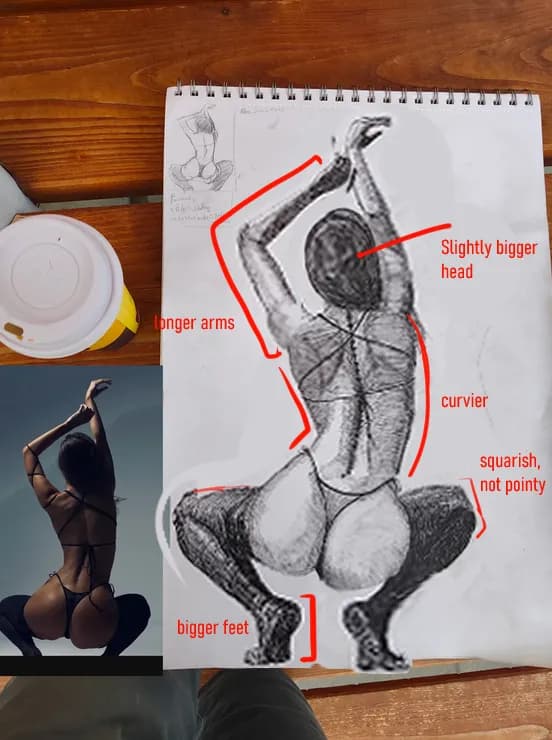
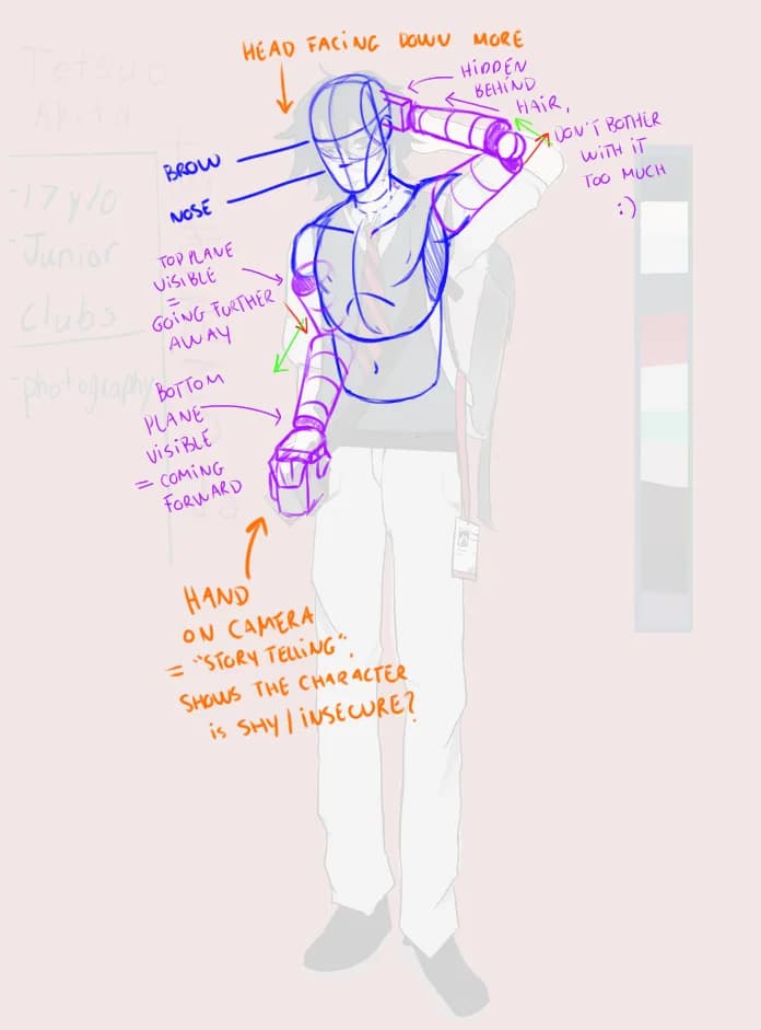
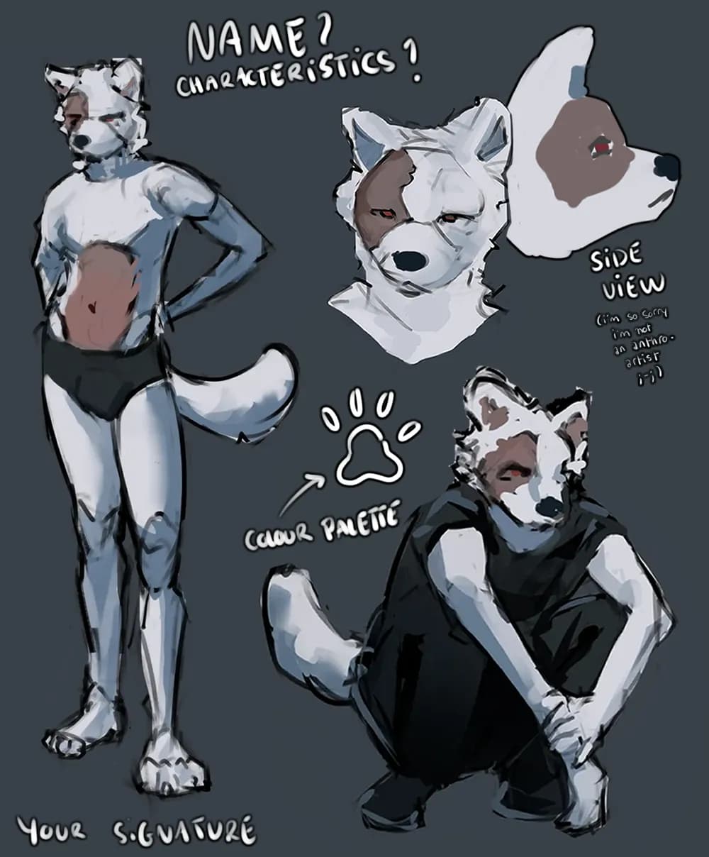
“Hiya ! Here's what I corrected and what you should look for next time : - Torso was too long - Feet two smalls, arms too short - The figure is off balance, the top body is too straight compared to ”
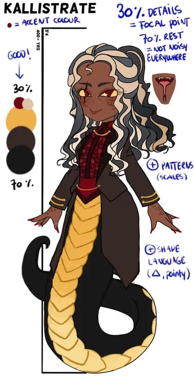
“Hiya ! Here's my take, now here comes the explanations behind my modifications : - I added more patterns to support the 30/70 rule (30% details where your focal point is, which is often the top body/”
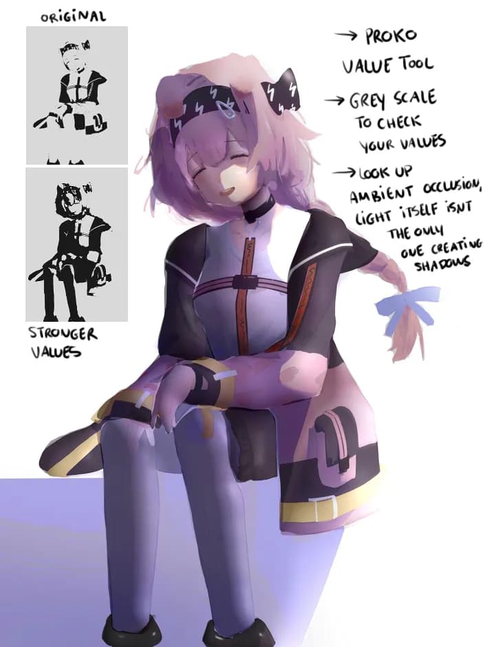
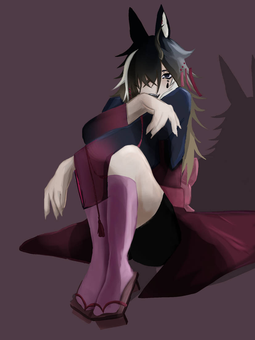
“I think the main issue is the lack of strong values : Your original painting stays in a very similar range of greys, however if you add stronger greys, perhaps even going in the blacks, it will help y”
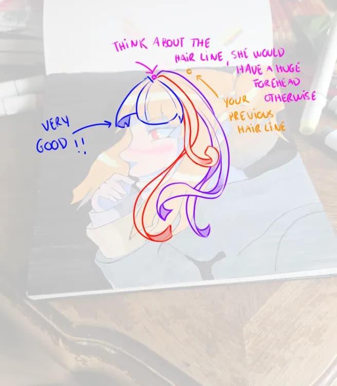
“The hair is composed of multiple strands of hair, even anime style, but not individual strands of hair like IRL, in stylized drawings they're often grouped up ; now, think about those strands of hair ”
“Hiya ! I think what's mostly missing is some volume, more around the top of the body, you did a pretty nice job showing it with the feet not being on the same level for example. The very straight lef”
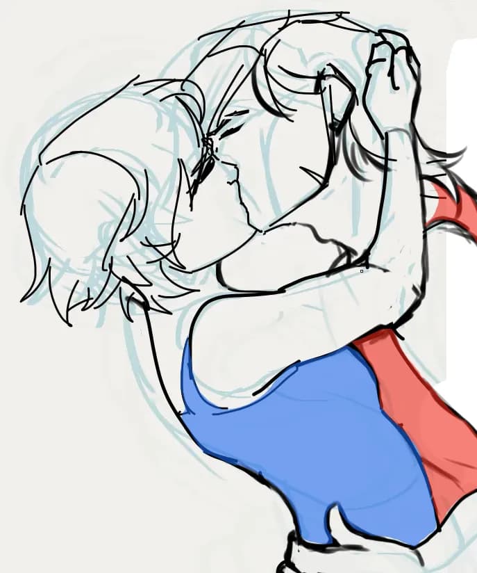
“I'd make it clear that their body are being pressed against each other, since the kiss seems very passionate (I colored the shirts for that reason, for clarity) ; don't mind the badly drawn hand of th”
“Hiya ! Here's my take :) -> changed the canvas shape to be more squarish, more height less width -> removed one of the front facing portraits, there's very few differences between the two -> added ”
“I don't think it's your rendering per say, what type of markers are you using ? If you want to work in layers, and being able to blend, alcohol based markers work best, you can find very affordable on”
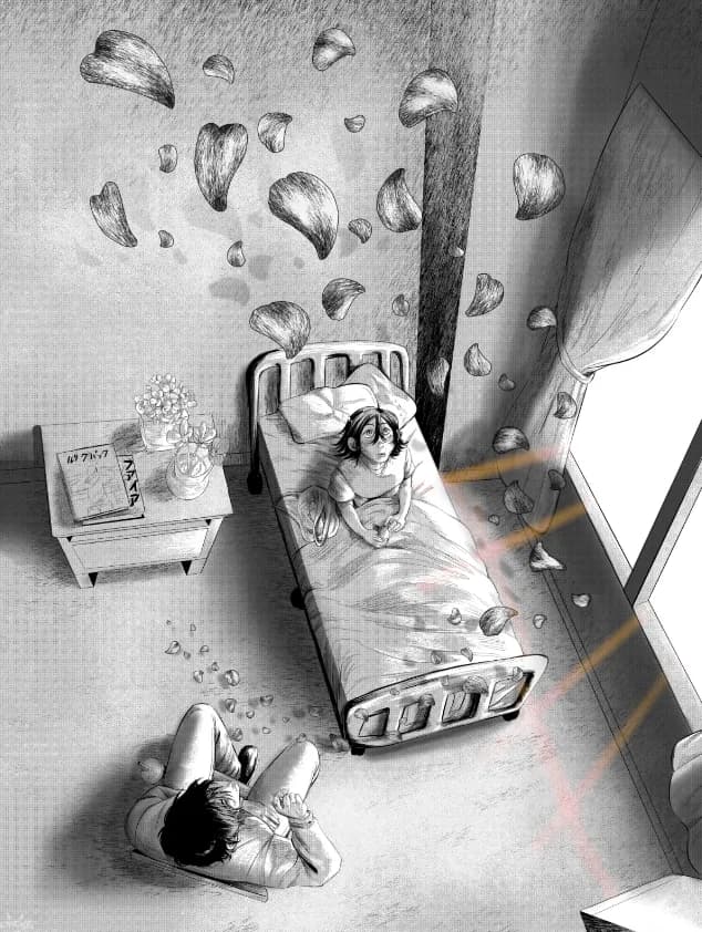
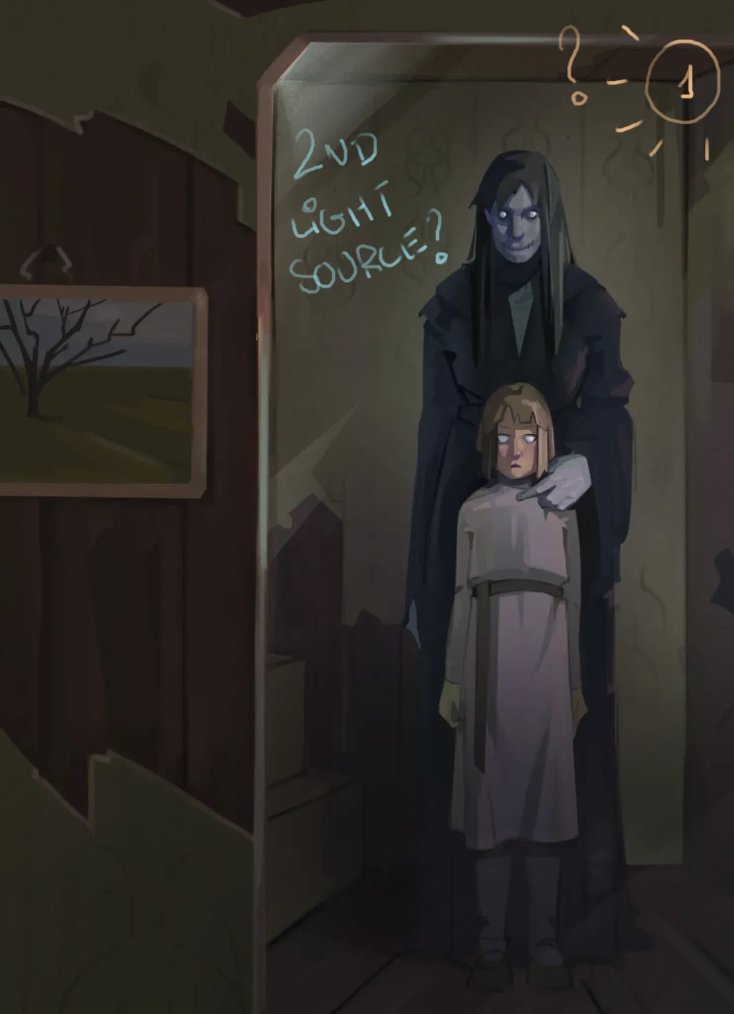
“It looks amazing, congrats ! I added more contrast, bolder shadows, not in the manga style unfortunately but I hope it helps ! Assuming the only light source comes from the window.”
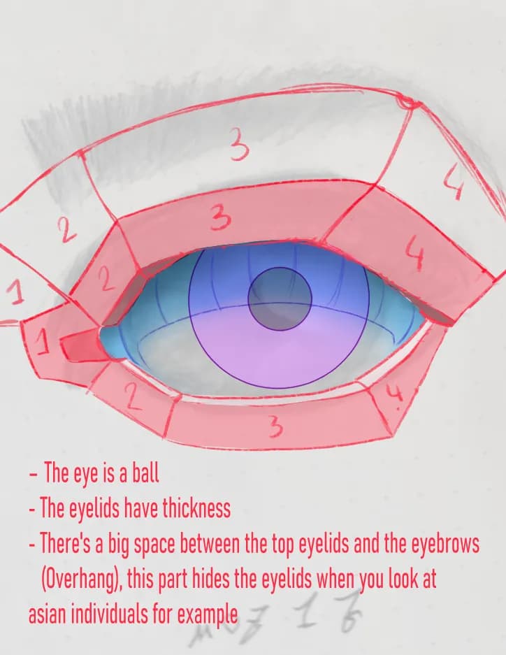
“For the eyelashes, you were on the right path also ! They appear shorter in the middle because there's no "perspective", and since the eyes are "roundish", they appear longer on the sides (especially ”
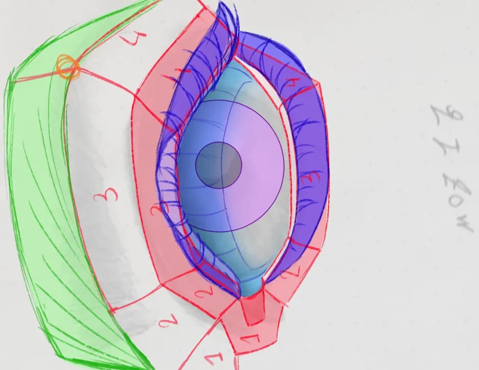
“I will reply in two parts because there's a lot of informations coming up. First, yes the pupils are too big, good point, it's important to notice the errors yourself, you're on the right path. Seco”
“Hiya ! I added stronger shadows by adding more visible planes to the head (you can used the asaro head to know where the planes are, there's also a light simulator on artstation by William Nguyen to h”
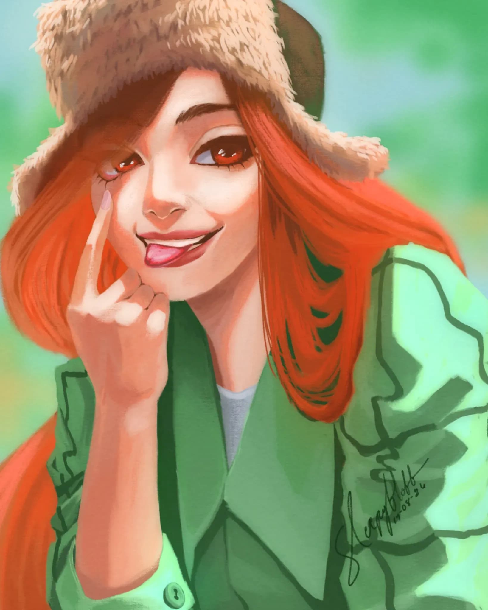
“This looks amazing ! I added some reflects in her eyes, because eyes are very very wet (well, if they're healthy) so they get lots of reflections from the light ! I also added some bounce light on the”
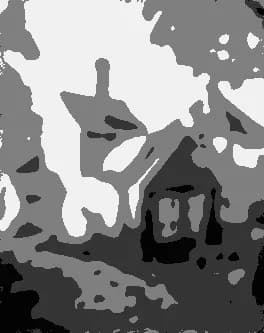
“Hiya ! this looks really really good but to help you with your issue, there's a really nice tool made by Proko called "Proko - Value Study Tool", you can upload your image and choose the number of val”
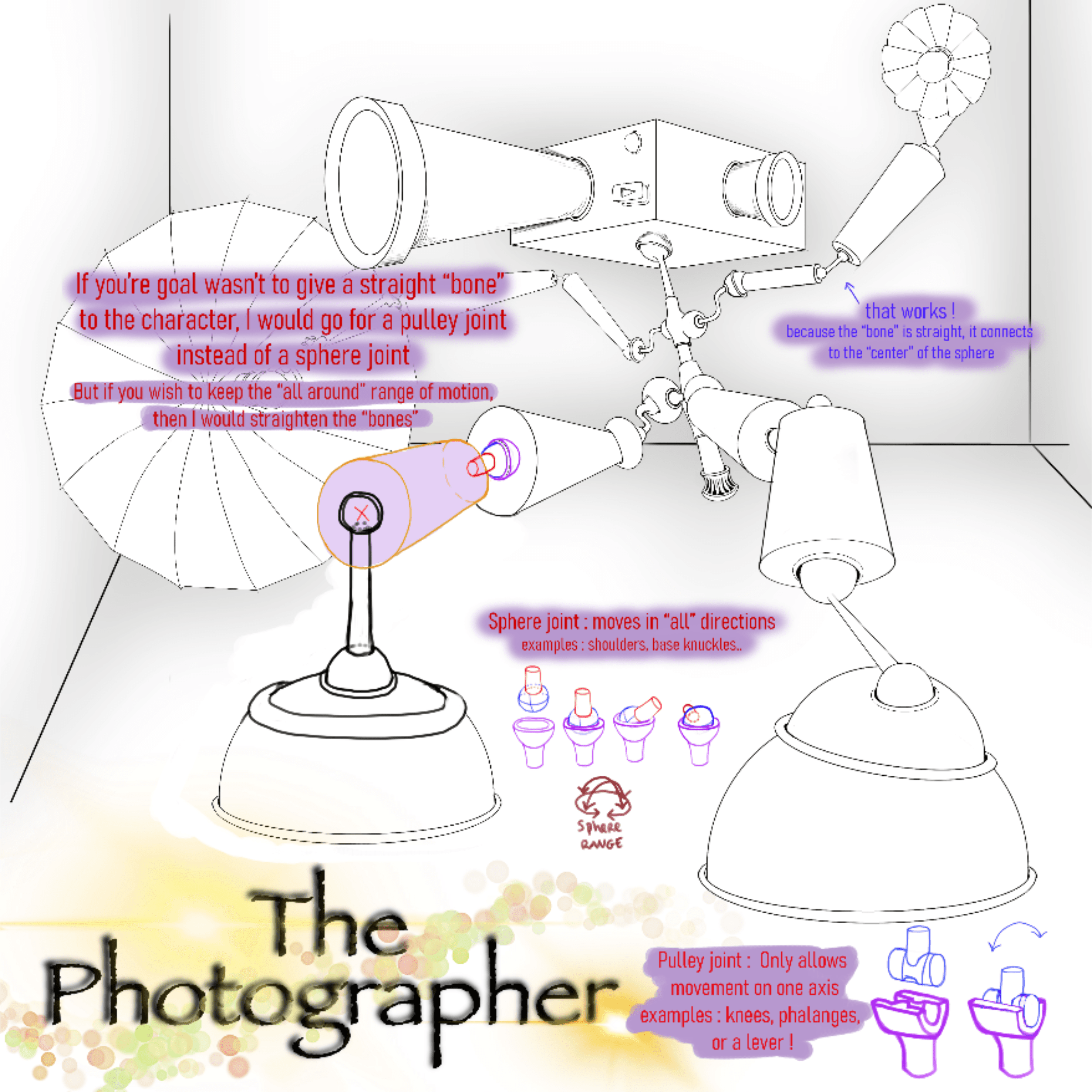
“Hello ! I went a bit deep into this, I hope my explanations are clear enough ;-; I hope that helps for the "believability" part, hopefully that was what you were looking for. You can apply these rules”