How to Draw One Piece Characters: Lessons From Real Fan Art Submissions
How to Draw One Piece Characters: Lessons From Real Fan Art Submissions
One Piece has been running since 1997. That's almost thirty years of Eiichiro Oda drawing, plotting, designing, and shipping chapters every single week. The man reportedly survives on three hours of sleep, sends his blood pressure readings to his doctor daily, and has been hospitalised multiple times from overwork. He has diabetes, gout, and takes breaks so rarely that when he does, the internet panics.
He is also one of the most successful creative people alive, with over 480 million copies of his manga sold worldwide. The Netflix live-action adaptation reached over 50 million households in its first month. One Piece is officially a cultural phenomenon.
But here's the thing worth saying plainly: the overwork didn't make One Piece great. The ideas did. The world-building did. The character design did. The relentless schedule may be why it kept going - but it's also actively damaging the person who made it, and there's nothing romantic about that. You don't need to destroy your health to make something meaningful. Oda's success is despite his schedule, not because of it.
What you can actually learn from Oda is how to look at his work - at the specific visual decisions that make One Piece look like nothing else. That's what this post is about.
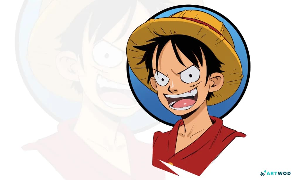
Monkey D Luffy digital 2d portrait art by Antonio Stappaerts.
What makes One Piece's visual style so hard to draw
One Piece doesn't look like other manga. The proportions are wild. Limbs stretch. Faces are built from pure shape language. Bodies do things in motion that would be anatomically impossible in any other series - and somehow they're completely readable.
Oda's style is exaggerated but internally consistent. Every visual choice has a logic, and once you understand that logic, drawing in the style becomes a lot less mysterious. Artwod Community members submitted One Piece fan art this month. @fosco gave detailed paintovers on all four. Here's what came up.
Flow and curved lines - Luffy Gear 5
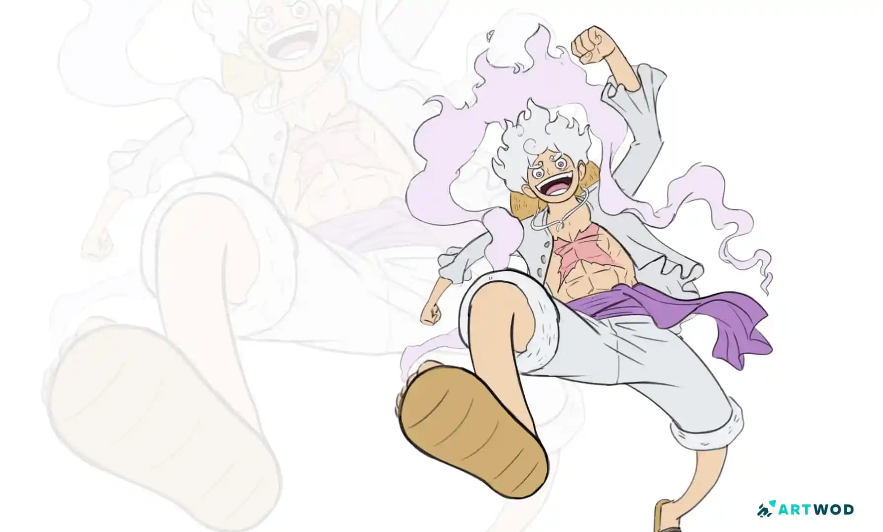
@lyxen59994 submitted a Gear 5 Luffy and identified the problem clearly: the drawing felt stiff despite using reference. @fosco's feedback went straight to the root. The legs in the original drawing were too straight. The shirt used straight lines for its inner shapes. Even the torso was too upright.
In Oda's style, almost nothing is straight. Limbs follow curves. Clothing follows curves. Even standing figures have a slight lean or bend built into the torso. This isn't about anatomy - it's about the visual rhythm of the character. Straight lines in One Piece read as wrong because the whole style is built on flow. When you're drawing a Luffy transformation mode in particular, the curved lines aren't decoration - they're doing the work of communicating the transformation's energy.
The practical lesson: before you ink anything, check every major line in the figure. If it's straight, ask yourself if it should be. In One Piece fan art, the answer is almost always no.
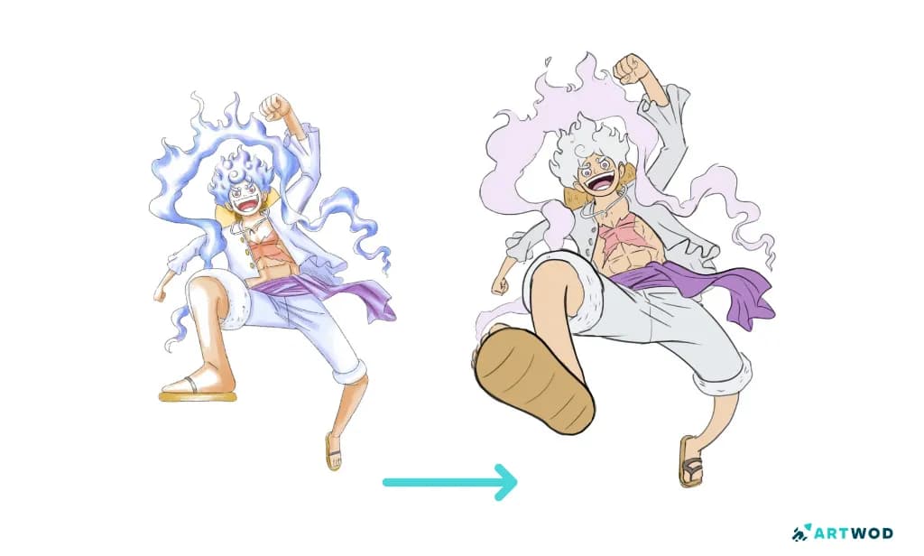
One piece fan art, Monkey D Luffy Gear 5 paintover with improved foreshortening and lineart. Digital 2d art.
Foreshortening - Luffy Snakeman
@lyxen59994 submitted a second piece, this time Snakeman, with a similar stiffness problem. @fosco's corrections pointed to something more specific: the stretchy arm. In the original drawing, the arm was drawn in a neutral position with stretch applied as a surface effect. In the paintover, @fosco demonstrated drawing the underlying arm first - with clear structure in the shoulder and bicep - and then beginning the stretch and wrapping effect partway down the forearm.
This is the difference between applying a style on top of structure and building the style from structure. The stretch in Snakeman's arm has to follow the logic of an actual arm first. Once the form is right, the exaggeration sits correctly on top of it.
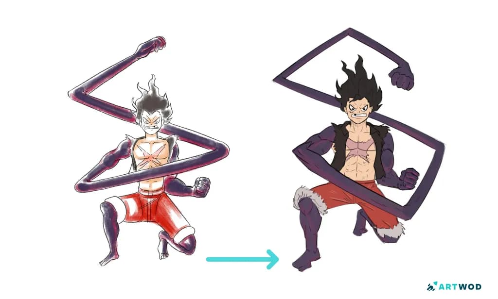
One piece fan art, Monkey D Luffy Snakesman with improved foreshortening and lineart. Digital 2d art.
Artwod Intermediate Road - boost your skill further.
Shape language - Blackbeard's face
@jezart23 submitted a Blackbeard portrait with a good likeness but a few specific things missing. @fosco identified three: the sides of the face curve slightly outward rather than being straight, the beard is triangular rather than rounded, and the nose is wider and also more triangular.
The beard detail is worth dwelling on because @fosco explained the logic behind it. Triangular shapes communicate danger and evil - this is basic shape language, and Oda uses it deliberately. Blackbeard is one of the most menacing villains in the series. Of course his beard is triangular. Of course his nose is wide and blunt. Every physical feature of Blackbeard is communicating something about who he is.
This is what makes One Piece character design so distinctive. Oda isn't just drawing people - he's encoding personality into physical shape. Heroes tend toward rounder, more open shapes. Villains tend toward sharper, more angular ones. Understanding this doesn't just help you draw Blackbeard more accurately - it helps you understand how character design actually works.
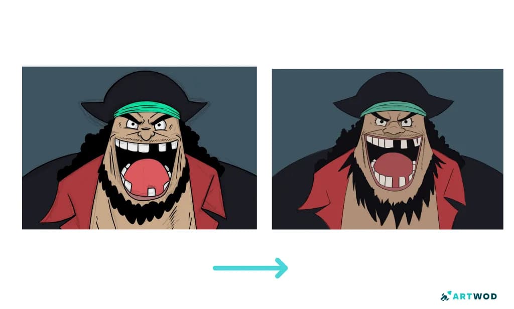
Blackbeard from One Piece fan art. Draw over and critique by the Artwod Community.
Composition - Blackbeard at Marineford
The fourth submission was @jezart23 again, this time a scene: Blackbeard at Marineford. The complaint was that the composition felt empty. @fosco's paintover addressed this with three specific changes: scaling the character down slightly and moving him left, establishing a vanishing point above with the horizon line low to emphasise height and drama, and adding the castle with proper perspective convergence and smaller scale toward the top to suggest depth.
The principle @fosco articulated is important: avoid thinking in flat shapes. The background in the original felt empty not because there wasn't enough in it, but because what was there had insufficient convergence - no sense of depth, no vanishing point doing any work.
One Piece backgrounds are often dramatic precisely because Oda pushes the perspective hard. Low horizon lines, high vanishing points, extreme scale contrast between near and far elements. This is cinematography thinking applied to illustration, and it's a significant part of what makes key One Piece scenes feel epic in scale.
@fosco also noted something worth keeping: the existing references from the Marineford scene are already composed well. Study them. The solution to a composition problem is often already there in the source material - you just have to look carefully enough to see what decisions were made and why.
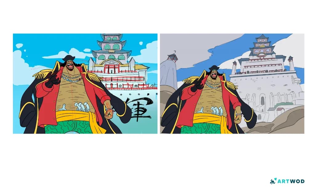
Blackbeard from One Piece fan art. Draw over and critique by the Artwod Community.
The thread connecting all four submissions
Flow, foreshortening, shape language, composition. These are the four things that came up across four different submissions about two different characters. They're the foundation of what makes One Piece's visual style work.
You don't have to reinvent them. Study the source carefully. Understand the logic behind each visual decision. And then apply that logic to your own drawings rather than copying the surface.
If you want feedback on where your One Piece fan art is and isn't holding up, the Artwod Community Hub is the right place. Submit your work, explain what you were trying to achieve, and ask specifically about whatever is bothering you. The feedback you'll get - like the four paintovers above - will tell you something specific and actionable, not just that something feels off.
FAQ
How do I draw Luffy's stretchy limbs correctly?
Build the underlying arm or leg with normal structure first, then apply the stretch effect from partway down the limb. If you apply the stretch without the underlying structure, the form reads as wrong even when the stretch looks right. The Figure Road on Artwod covers construction of limbs in a way that applies directly to stylised figure drawing.
Why do my One Piece poses look stiff?
Almost certainly because you're using straight lines where the style uses curves. Check every major line in the figure - limbs, clothing, torso - and ask whether it should curve. In One Piece fan art the answer is usually yes. The Practice Section has gesture exercises that help develop the curved-line instinct.
How do I get Blackbeard's likeness right?
Focus on the shape language. His face curves outward at the sides, his beard is triangular not rounded, and his nose is wide and blunt. Each of these is communicating his personality, not just describing his face. The Portrait Road covers how to read and reproduce specific face structures.
Why does my background feel empty?
Probably a perspective problem - flat shapes without convergence. Establish a vanishing point and a horizon line before drawing any background elements, and push the scale contrast between near and far objects. Low horizon lines and high vanishing points create the dramatic scale that One Piece scenes are known for.
How do I use shape language in character design?
Circles read as friendly, triangles as dangerous, squares as solid. Study the characters you're drawing and identify which shapes dominate their design - then make sure your drawing reflects those shapes accurately. This applies to face shape, beard shape, body silhouette, and clothing. Understanding this makes accurate likeness much easier to achieve.
How do I get feedback on my One Piece fan art?
Submit to the Artwod Community Hub and ask a specific question - whether your foreshortening is reading correctly, whether the flow of the pose is working, whether the likeness is holding up. A specific question gets more useful feedback than a general one.