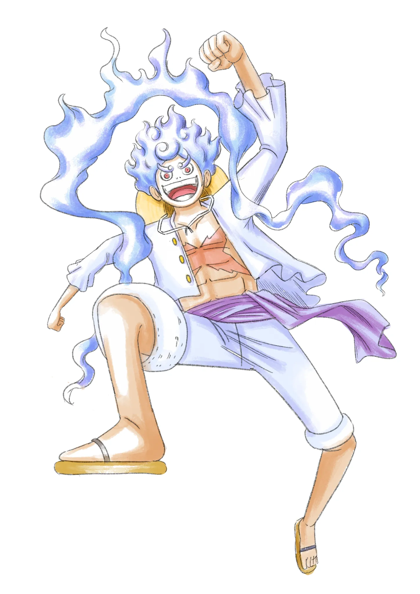
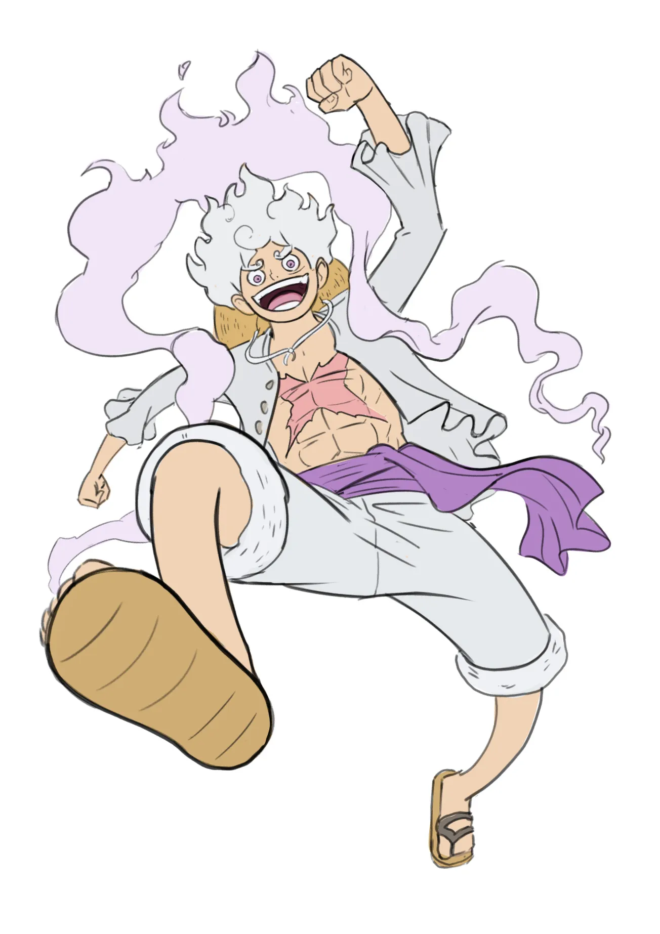
Hey there! Good job so far! One of the main differences between the original drawing and yours is the movement and flow of the body. If you look closely, the legs aren’t completely straight—they follow curved lines instead. These curves are what help create that sense of movement. The same applies to the shirt: the inner part has more flow because it uses curved lines rather than straight ones. Notice as well that the torso is not completely straight, but it is a bit bent to the right (his right). Another very important factor is the foreshortening of the right leg. In your drawing, the leg looks like it’s in a more neutral position, while in the anime reference, it seems to be pointing forward toward the camera. Because the foot and lower part of the leg are closer to the camera, they appear larger. These are some of the aspects that help give the character a better sense of flow and movement. :) I also changed the colors a little bit, i like how the purples look instead of the blue one for the smoke hehe :) Hope this helps!
Paintovers (1)
how do you guys draw Luffy Gear 5? i cant get the body right
Artist's notes:
Been working on this Luffy Gear 5 drawing and the character transformation is messing me up pretty bad. I really like the anime version but mine feels stiff, especially around the arms and legs. Not sure if its the proportions or the pose tbh. Would appreciate some feedback, trying to learn from what i did wrong and share my art progress here. also using these as little art workouts
Comments 2
idk if stiff limbs need more detail, maybe bend one knee and swing the far arm out so the gear 5 stretch reads before you refine the hands