New: switch between gallery and single view here.
#1
Rank
1682
Upvotes
1083
Feedback Given
100%
Helpful
“Hey there! Well, you said it yourself: you're painting shadows without following a light direction, and this portrait would look even better if the lighting were consistent. Always think about the”
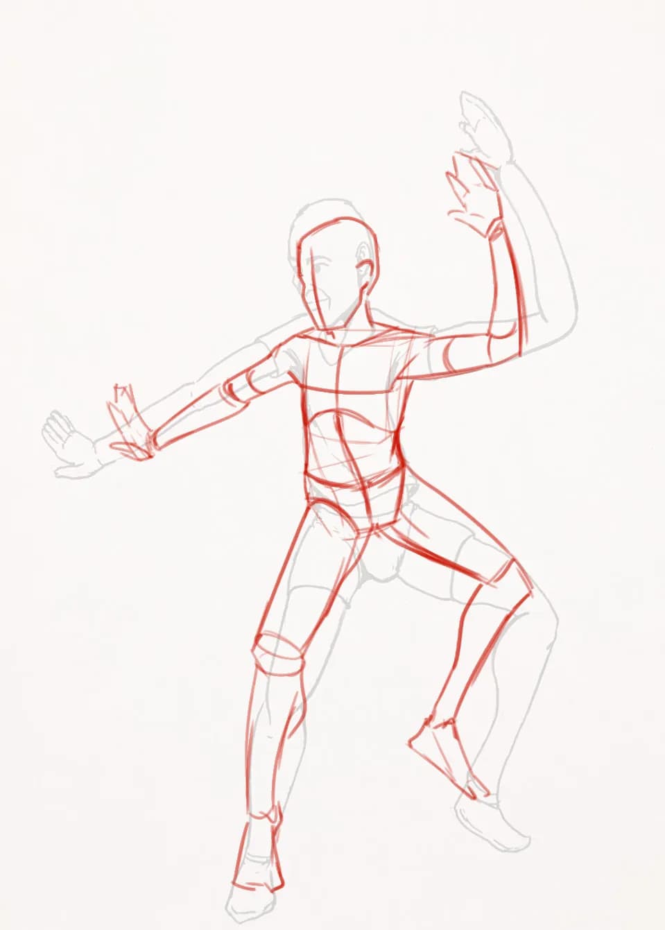
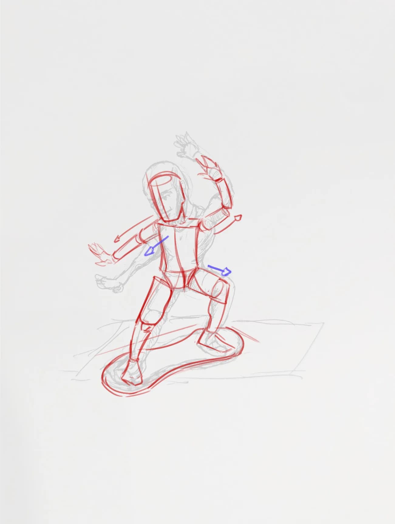
“Hi there! I agree with the feedback you've already received. :) Try improving your character's pose by tilting the shoulders and the hips. Doing so will give the pose more gesture and personalit”
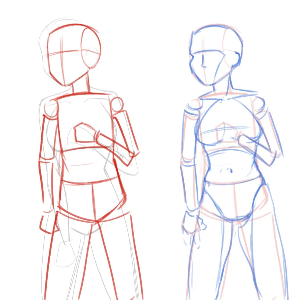
“Hello there! The legs do look a bit out of proportion compared to the upper body... Which is exactly why we should never skip leg day xd You can make the hips a bit wider so they're more proport”
“Hello there! I don't see a major issue with the lips themselves. I think the main problem is their placement. They're positioned a little too far from the nose, which creates the illusion that they”
“Hey there! First of all, I'd recommend understanding the volume of realistic lips before trying to simplify them. Having a good grasp of their three-dimensional form will make it much easier to sim”
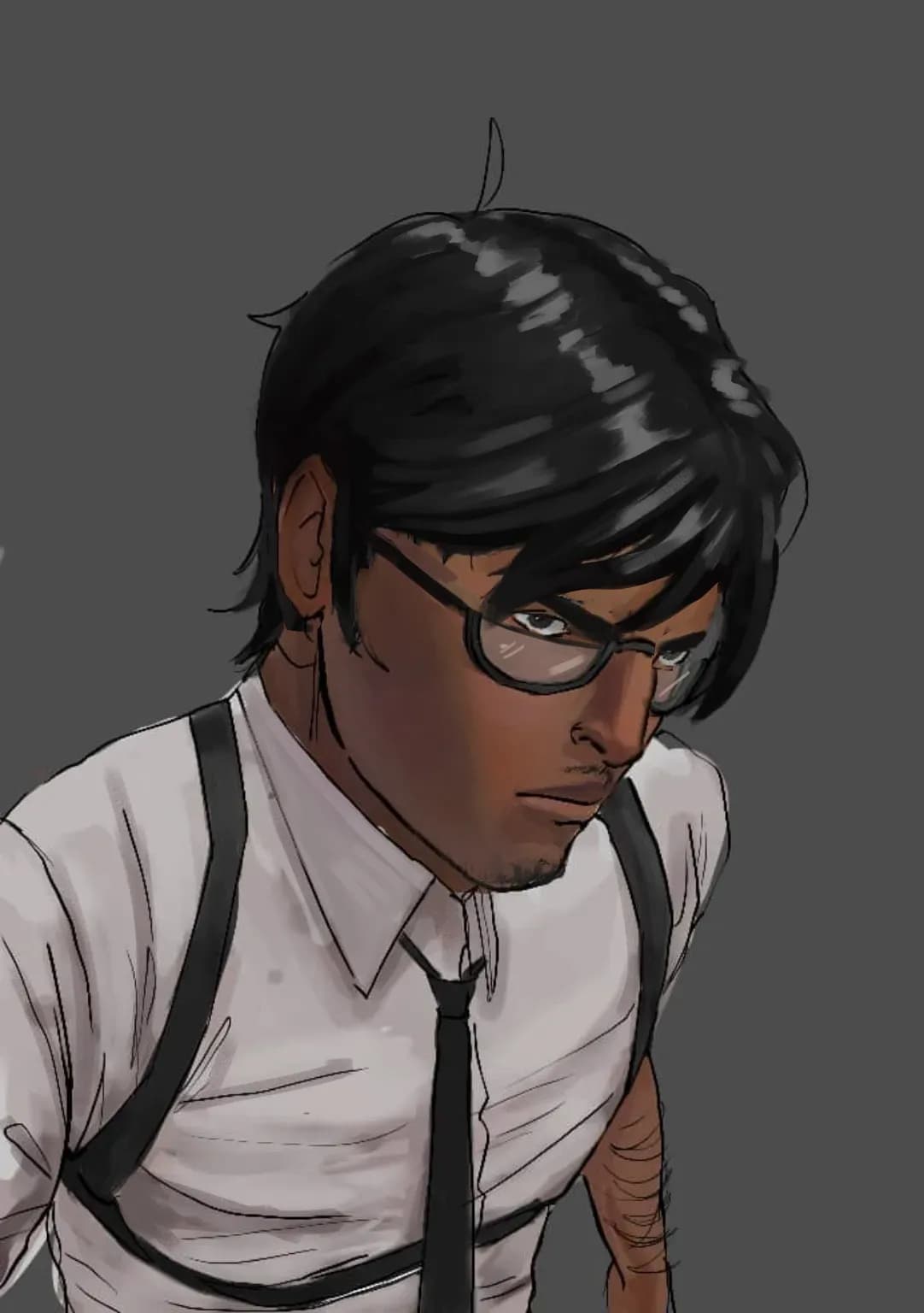
“Hey! I'd recommend looking at references for the shape of male lips, since trying to draw them purely from imagination can be quite challenging. I gathered a few examples, and one thing I noticed ”
“Hey there! I love your Trunchbull concept! :D I wouldn't change much about the design, the strong, square shape language comes across really well and gives the character a lot of presence. :D I'd ”
“Hey! Looks cool! :D You could adjust the tilt of the shoulders a little. :) If the head is tilted to one side, the shoulders could be slightly tilted in the opposite direction. This can give the p”
“Hello there! I don't see any major issues with the hand. :) However, I tried to illustrate the feedback Sage gave you by showing how to construct the hand using simpler forms. To add to Sage's adv”
“Hey there! Good sketch! The nose itself isn't bad, and I wouldn't say it looks too realistic. The main issue is that it looks a bit crooked. The nostrils are tilted instead of following the dire”
“Hello! These kinds of angles are some of the most challenging to draw, at least because of the way the forms "compress" and overlap. In your drawing, the facial features are slightly out of alignm”
“Hello there! I don't see any major issues with the mouth. The shape and volume look good! The only thing I would do is make the corners a little wider so the mouth doesn't appear too small. :) A”
“Hello there! The neck itself doesn't cover the entire lower part of the head, just as you've drawn it. Try thinking of the neck as connecting roughly around the middle of the head. If you look at ”
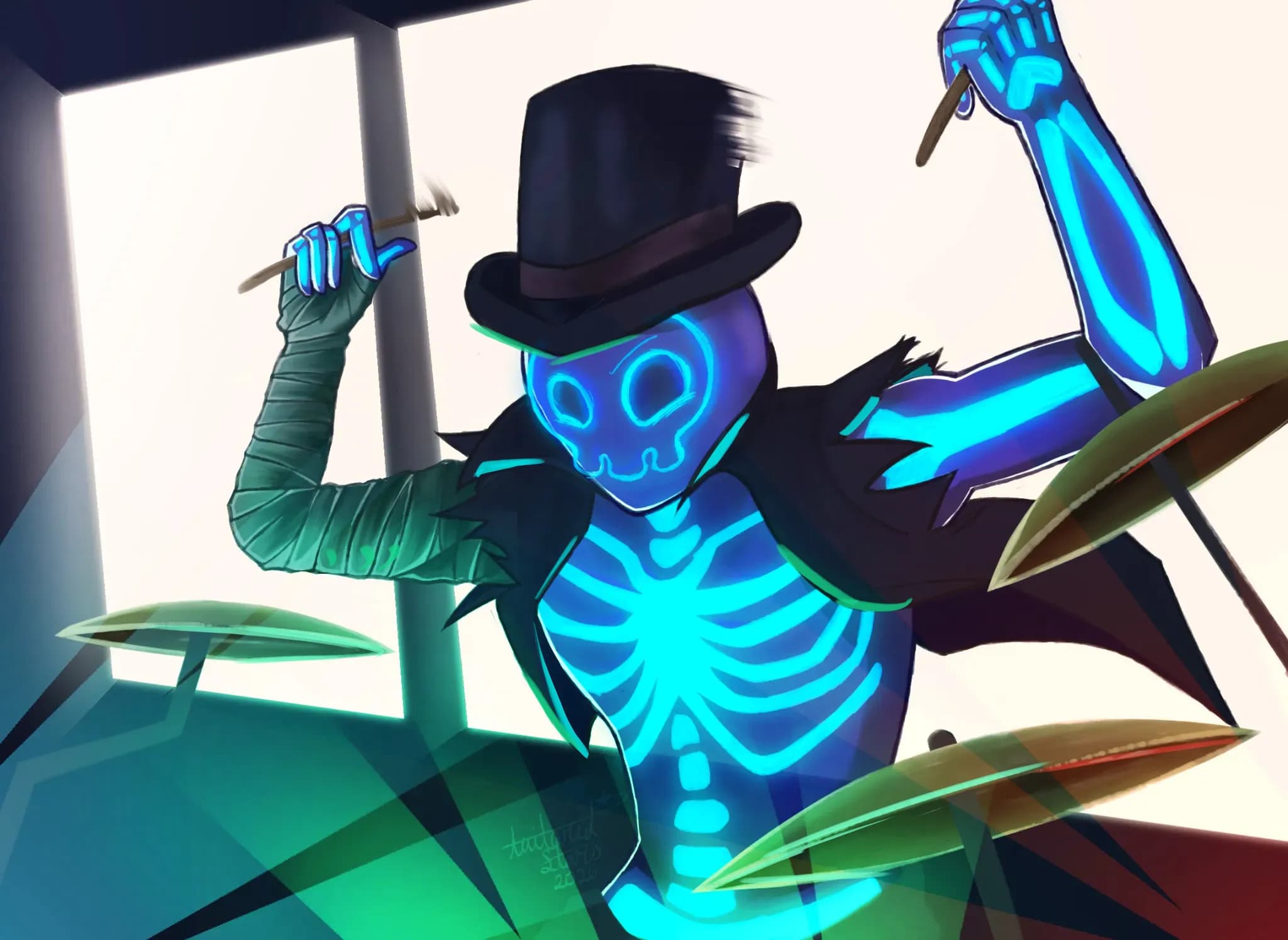
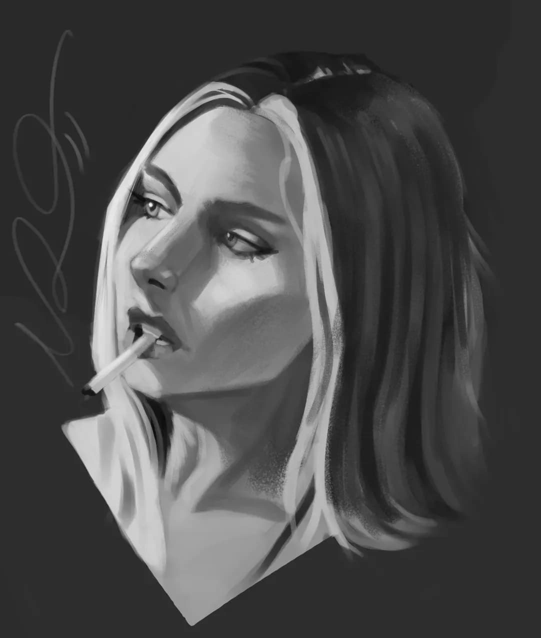
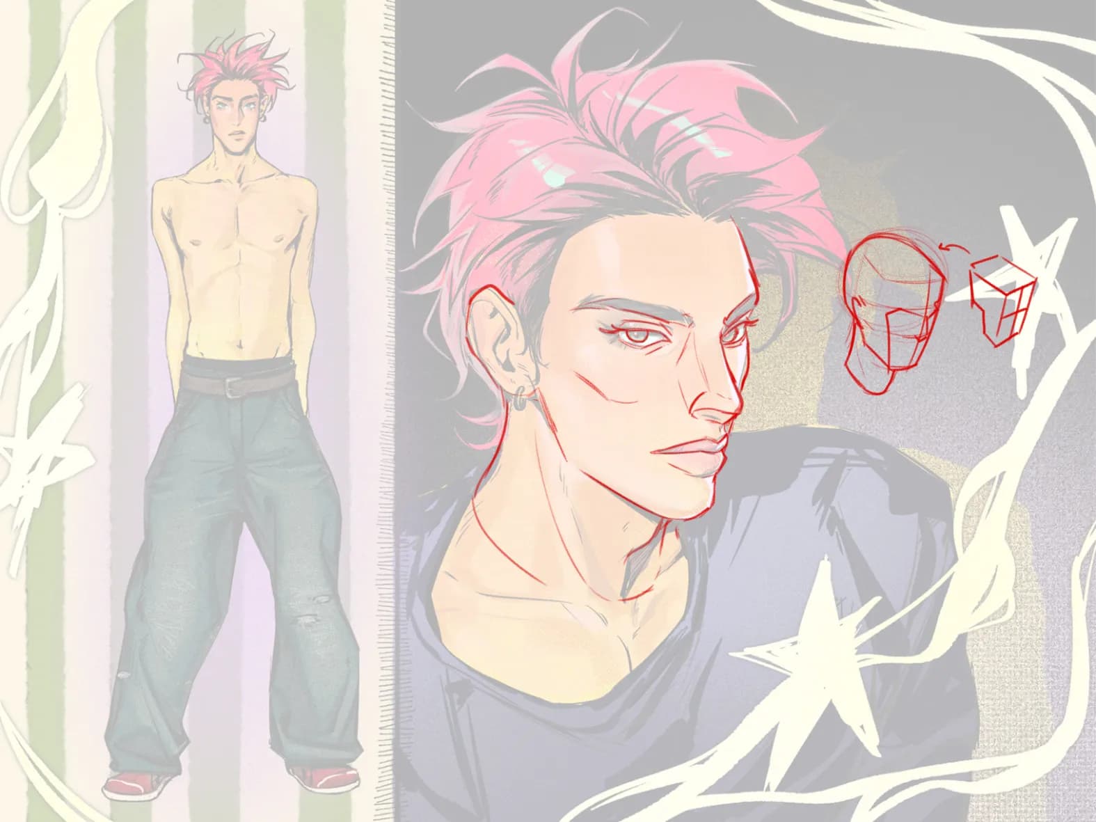
“Hey! I really like the illustration! But you could push the lighting a bit further to create much stronger contrast, since everything feels a little flat at the moment. Since the light is coming t”
“Hello there! The character's proportions were a little off. The head wasn't properly connected to the neck, leaving too much space between the jawline and the back of the neck. The ear is also pos”
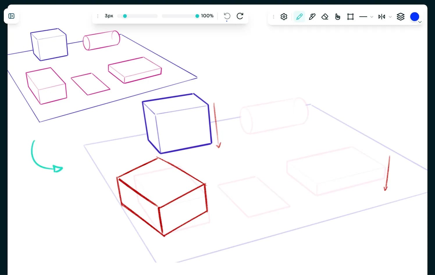
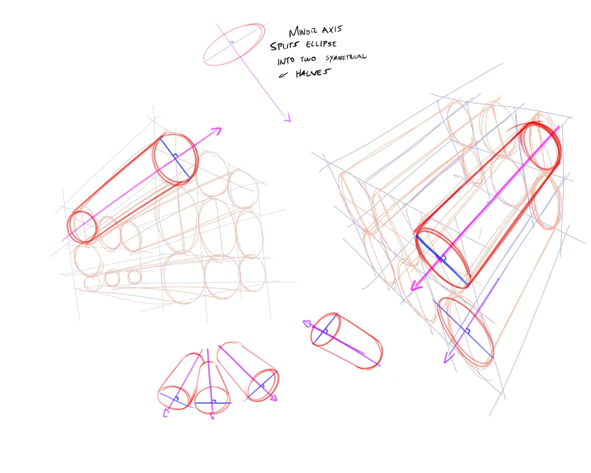
“Hello there! When rotating boxes while using the same horizon line, keep in mind that the angles of the boxes should maintain their 90° relationships. This helps prevent the lines from converging i”
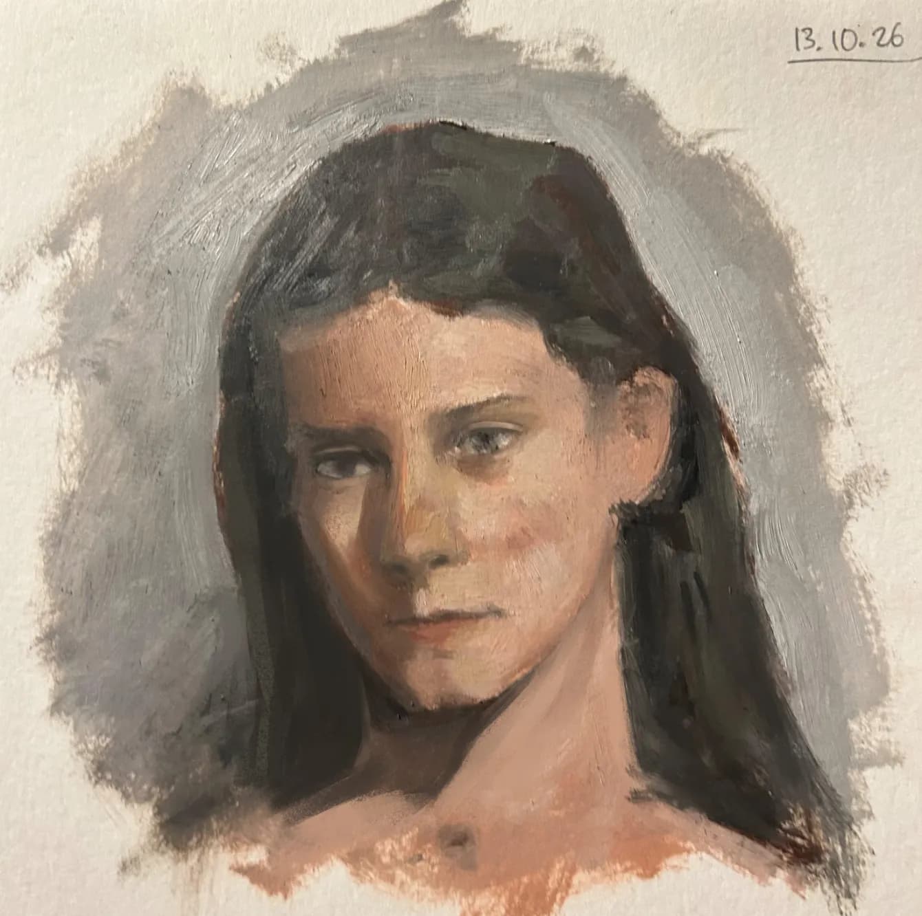
“Hey there! Very nice painting style! :D You could push the shadows a little more so they help create a stronger sense of volume in your character, since it looks a bit flat at the moment. I pai”
“Yo! This one looks so good! :D I really like the painting style. :) So, when it comes to the hair... I'm not the best at painting hair, but I know a thing or two haha. Think about the curve, ”
“Hello there! I really like the character's pose! Because of that, I think an expression with a slight frown would suit the character really well. :) Something that conveys confidence. To achieve t”
“Hi there! I don't see any major issues with the neck. It's positioned correctly, and the width looks appropriate. The main problem is that the features aren't following the form and perspective of ”
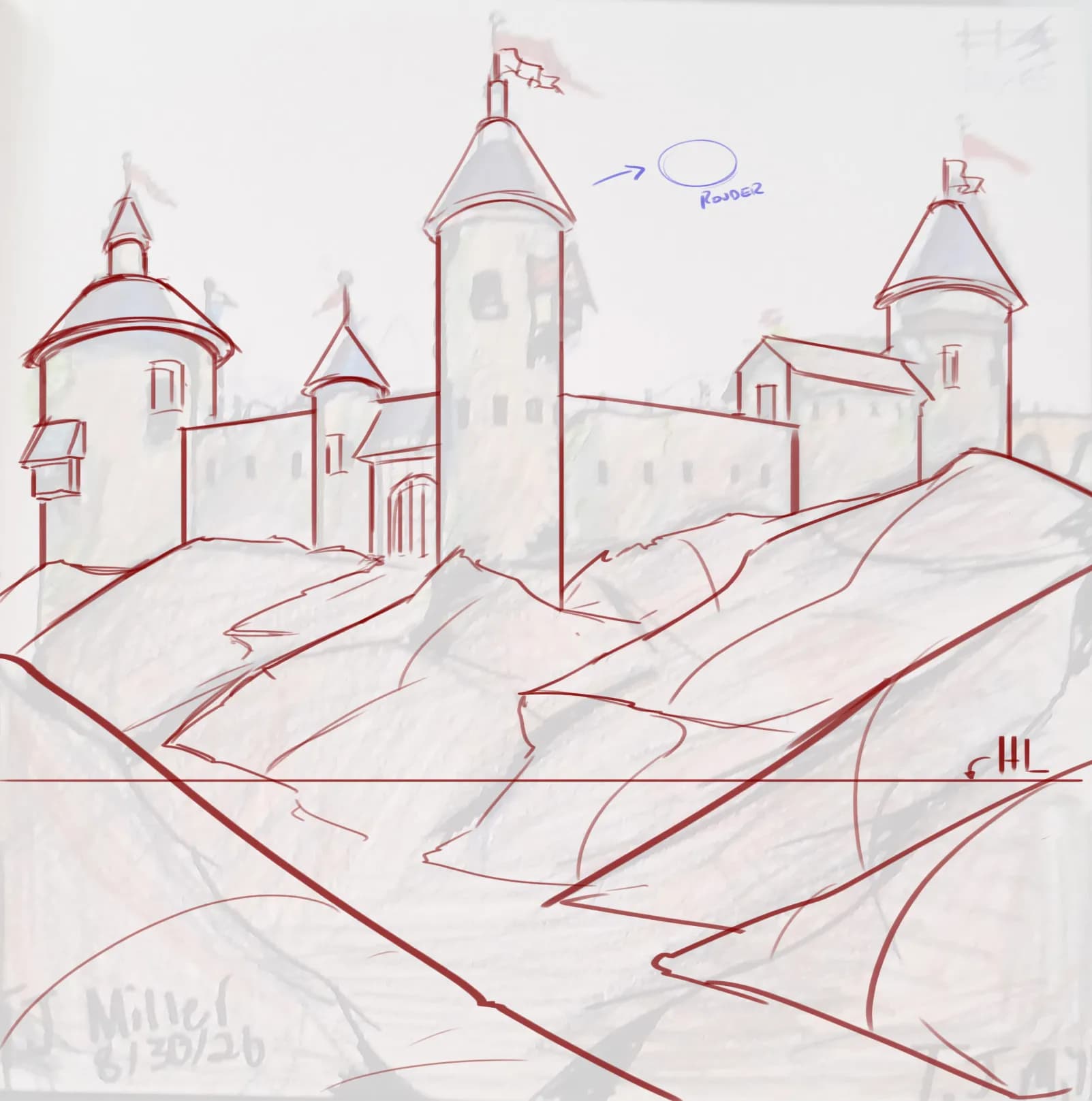
“Hello there! I think your intention was not to draw the pillars using one-point perspective, which is perfectly fine in my opinion. However, the perspective on the pillars is reversed. We should b”
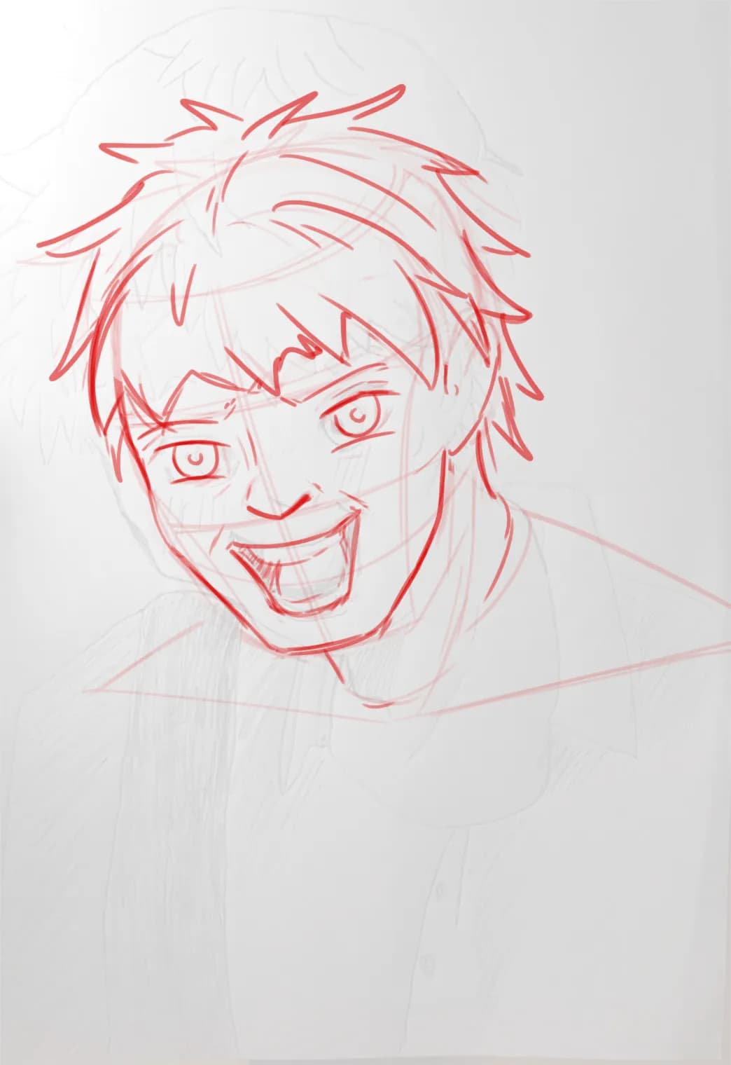
“Hello there! Keep in mind how to measure the proportions of the face. Even if you're drawing in an anime style, the basic facial proportions, especially the spacing between the eyes, still apply to”
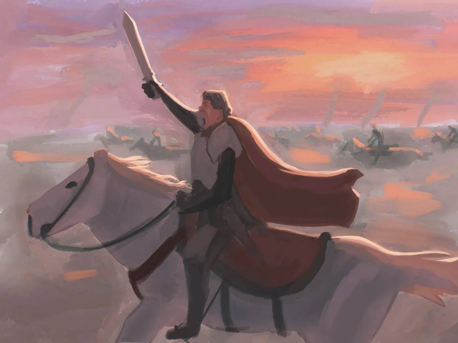
“Hello there! Good work so far! :D If you're aiming for a more realistic look, you'll need to spend more time defining the forms of the characters and the environment, at least in the midground (”
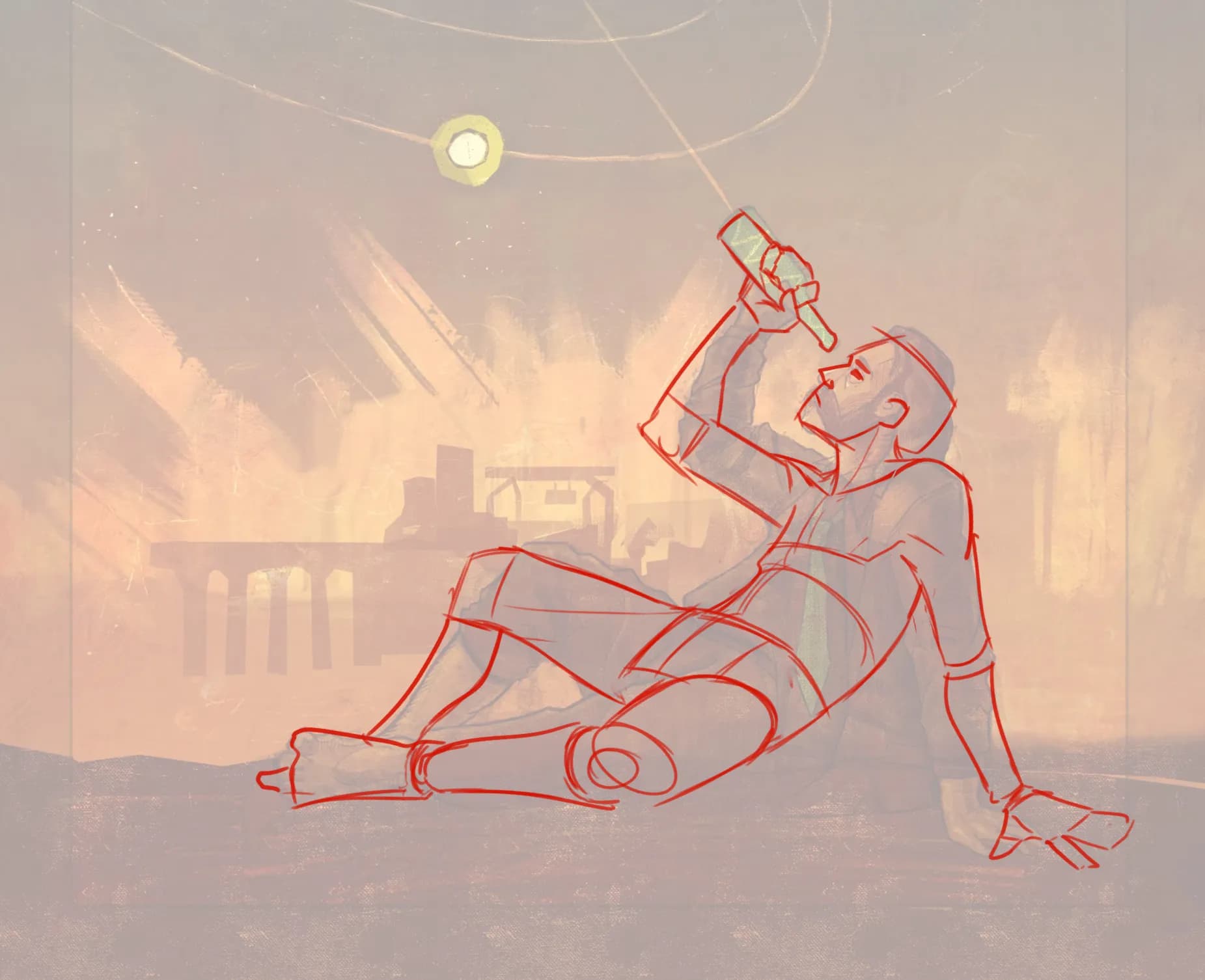
“Hey there! Good study! To improve the proportions, you'll need to measure a bit more carefully, or at least look for reference points that help you match the proportions of the original more acc”