#477
Classificação
1947
Votos a favor
1223
Feedback dado
100%
Útil
“Hey there! It’s a good foundation as an idea, but here are a few things you can do if you want to push this piece further. :) First of all, the character is taking most of the attention in the i”
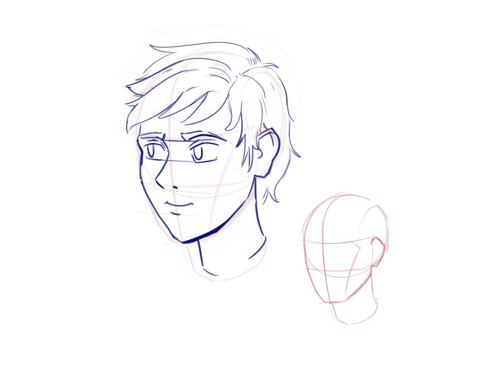
“Hello there! I adjusted the face a little. I felt that the upper part of the head was slightly too long, so I reduced it a bit. I also made the face and the ear slightly wider. I emphasized the ”
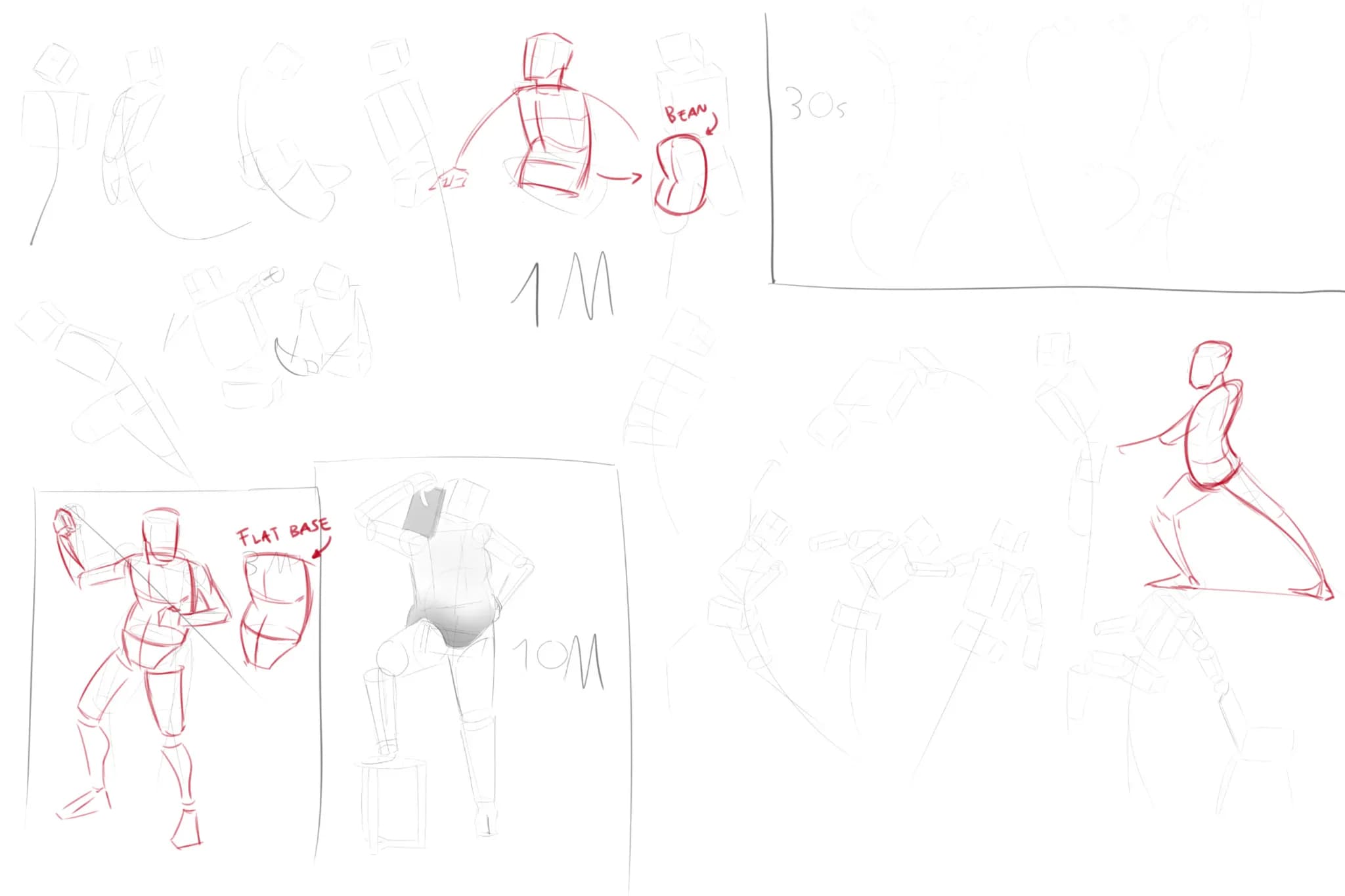
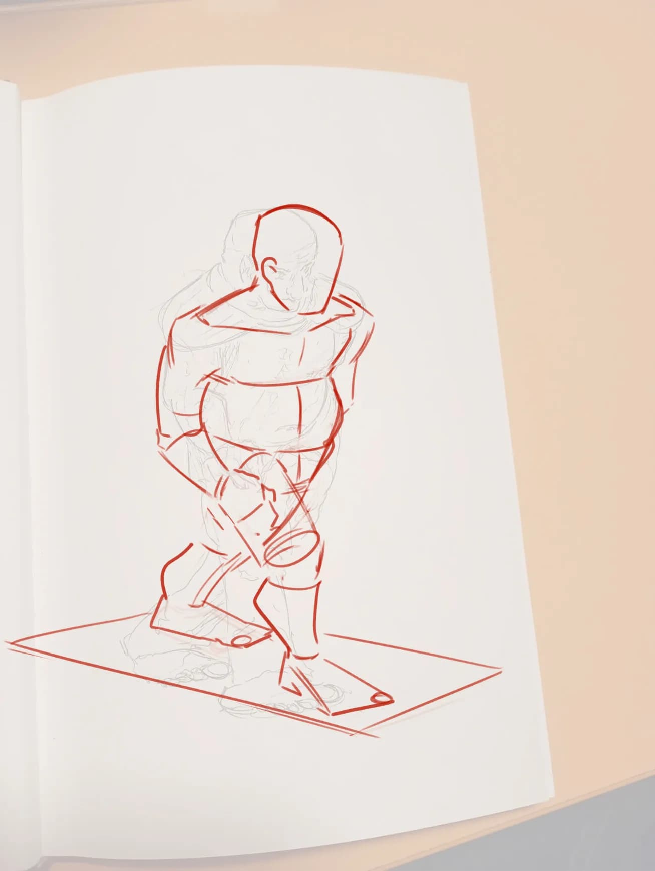
“Hey there! Good job here! One thing I’d recommend when drawing gestures is to focus more on the movement of the pose and use more organic shapes rather than thinking too much in boxy forms. You”
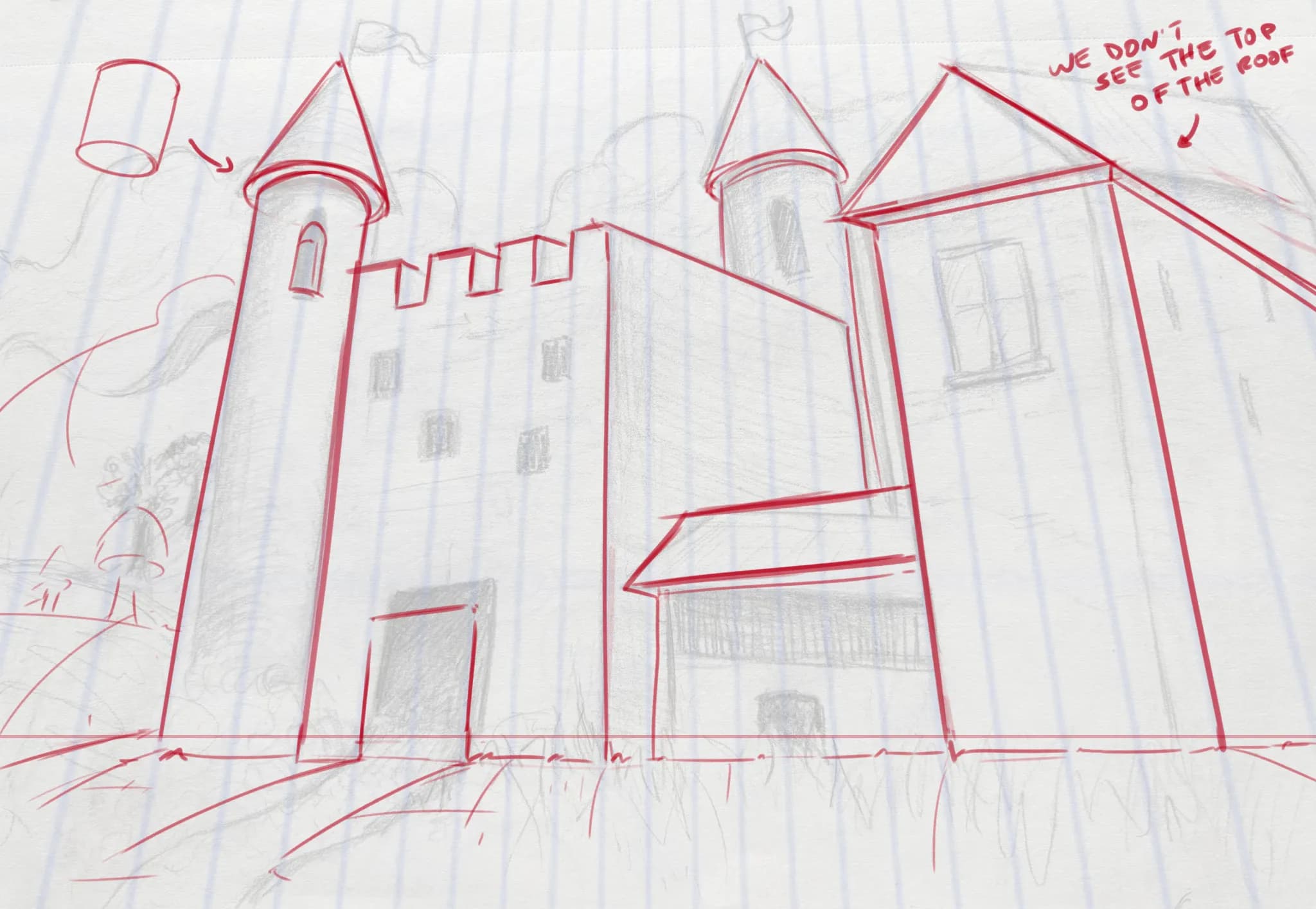
“Hey there! The main issue I see here is that you’re not establishing a horizon line, and because of that, the lines aren’t converging properly toward the vanishing points located on the horizon lin”
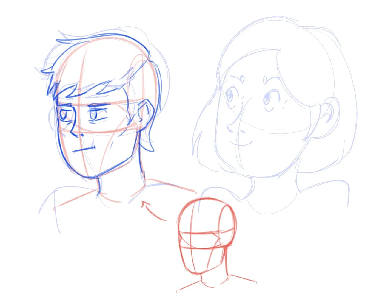
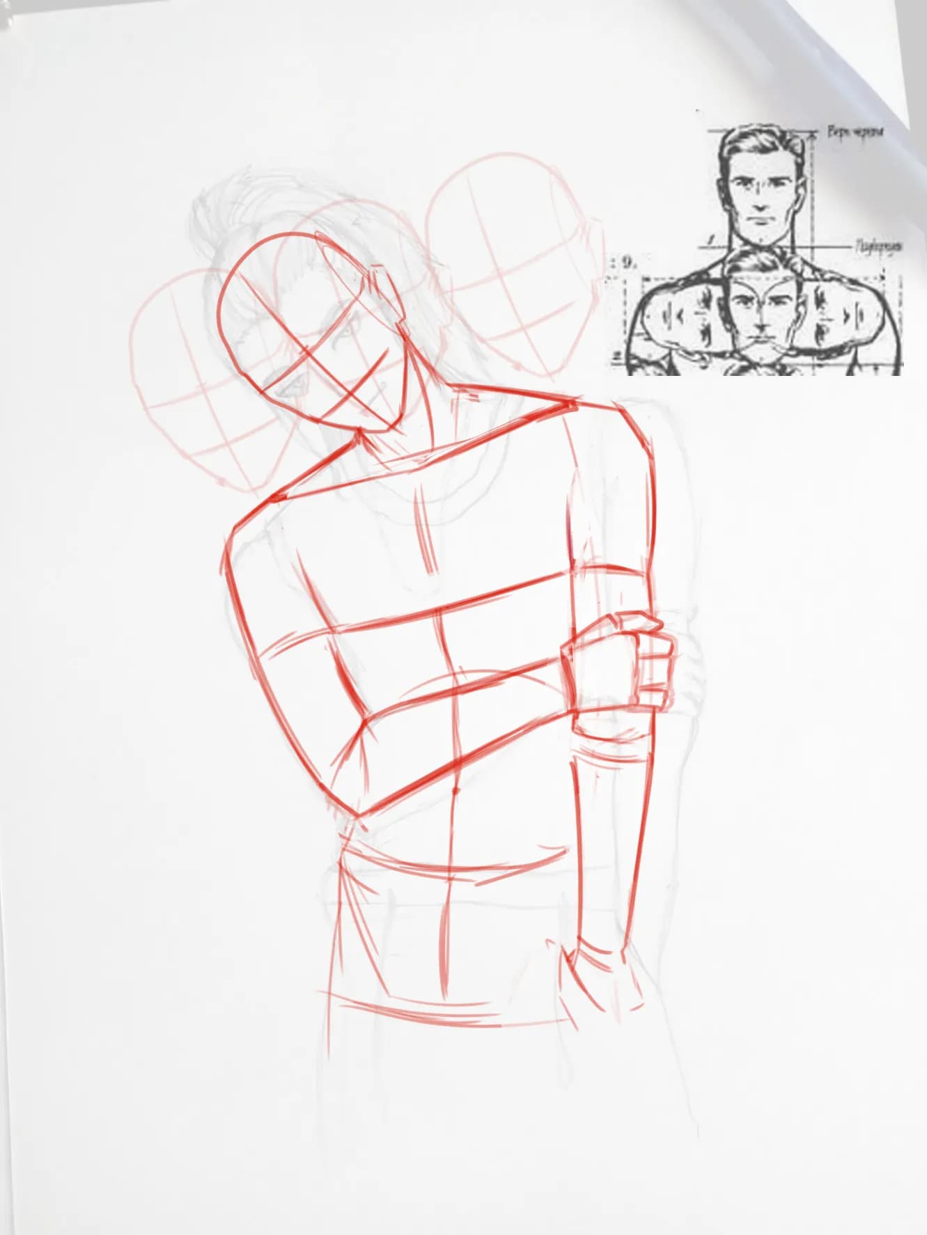
“Hey! I’d recommend drawing a more solid foundation so that the proportions and perspective of the heads are more accurate. For example, the character’s nose isn’t following the center line you est”
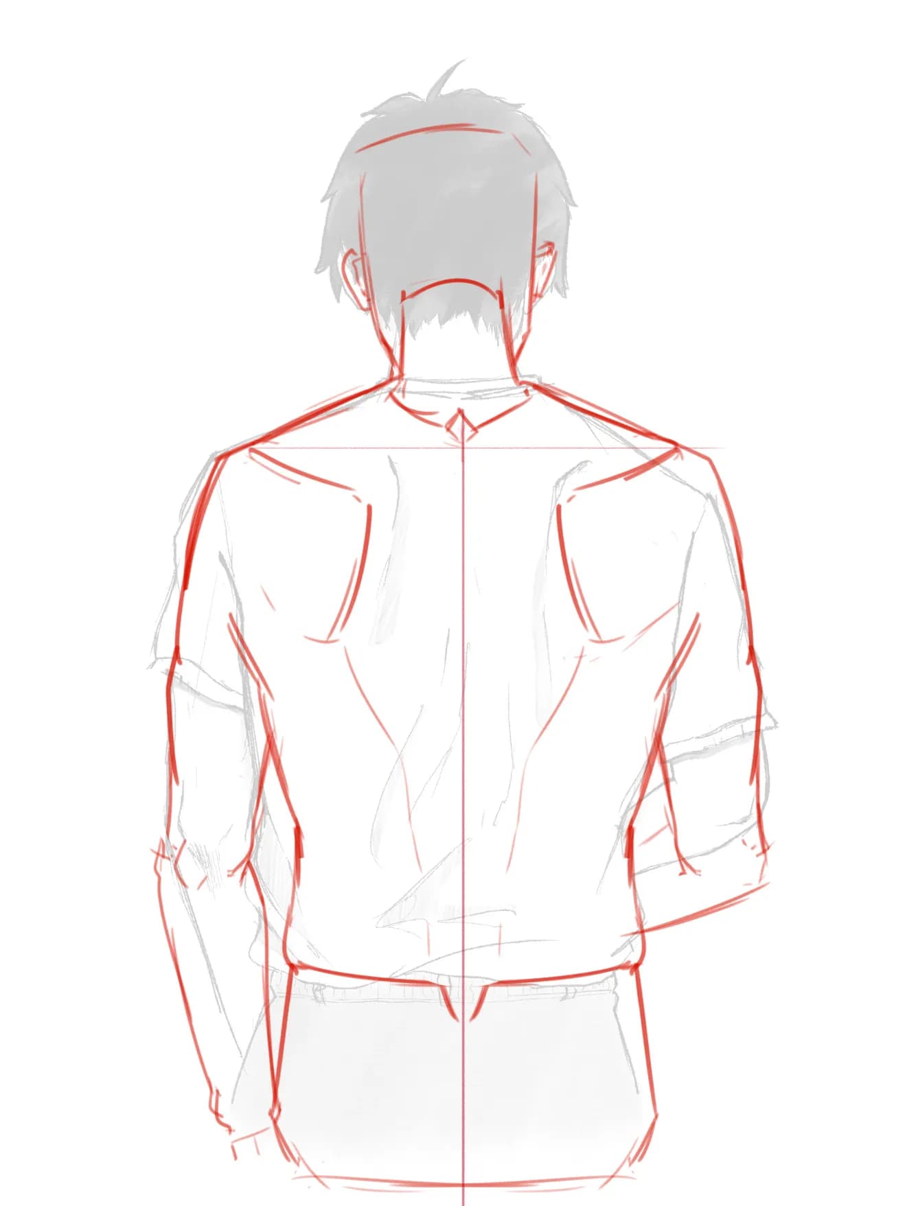
“Hey! You can measure the width of the shoulders using the character’s head as a reference. Remember that the shoulders are approximately three heads wide, or about half a head extending on each sid”
“Hey there! Good job here! :) It would be helpful to draw a line to represent the spine so you can keep the proportions a little more accurate. Similarly, you could draw a horizontal guideline ac”
“Hello there! It looks great! :D Just a few small corrections. :) You can adjust some of the shadow shapes or add a few more shadows, such as underneath the hat, as well as emphasizing the shadow”
“Hello there! Good job so far! :)) I made a few corrections to your drawing, starting with the proportions. The torso was a little too long, the pelvis was quite elongated, and the feet were too ”
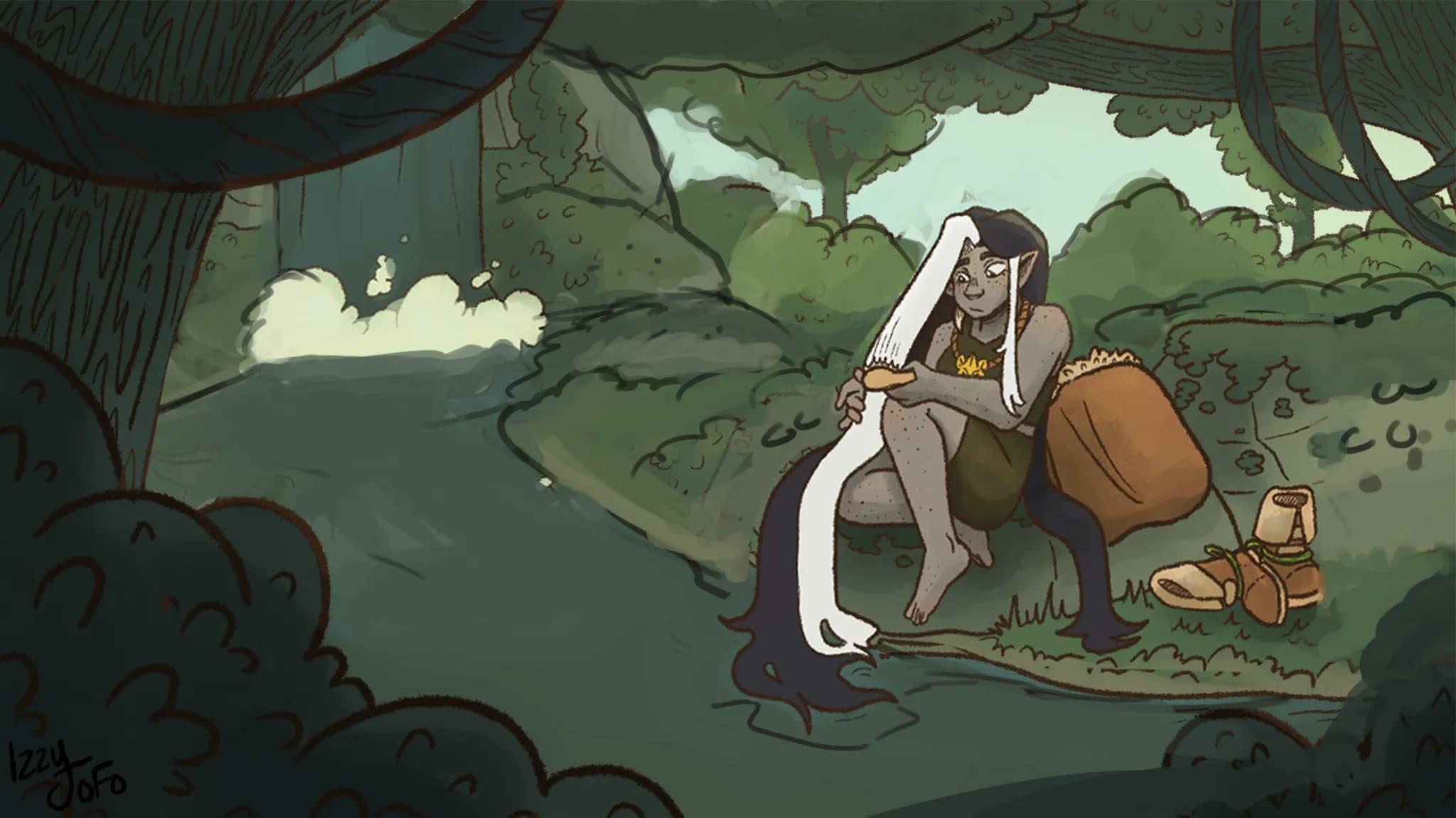
“Hey there! I like the scene, but the scale feels completely off. Unless the character is supposed to be a giant, which would justify them being larger than the waterfall and pretty much everything ”
“Hey! If this is a winter scene, the colors should feel cooler, but right now you’re painting with very warm colors, so you’re not fully considering the local color of the objects within the context”
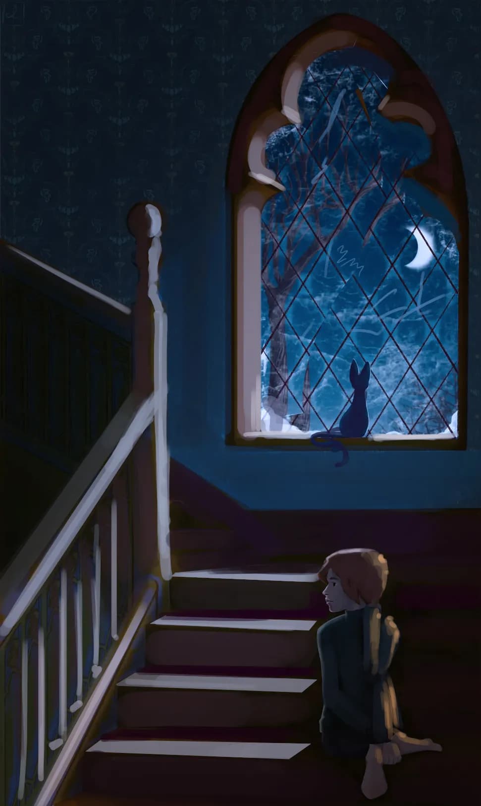
“Hey there! Nice drawing, bud! The main issue I see is the perspective. It feels like you’re combining a top-down angle with a more eye-level view. This happens because we can see the top of the ”
“Hey there! I’m not sure if you’ve tried this already, but you could act out the pose you’re trying to draw if you can’t find a similar reference online, although I’m sure there are plenty of refere”
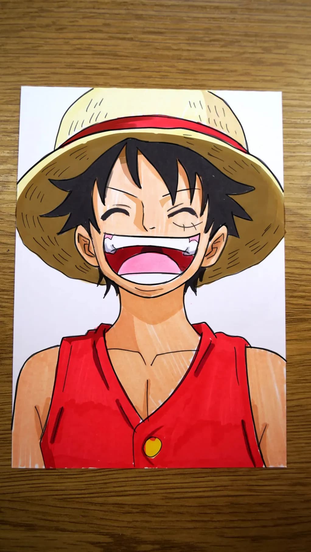
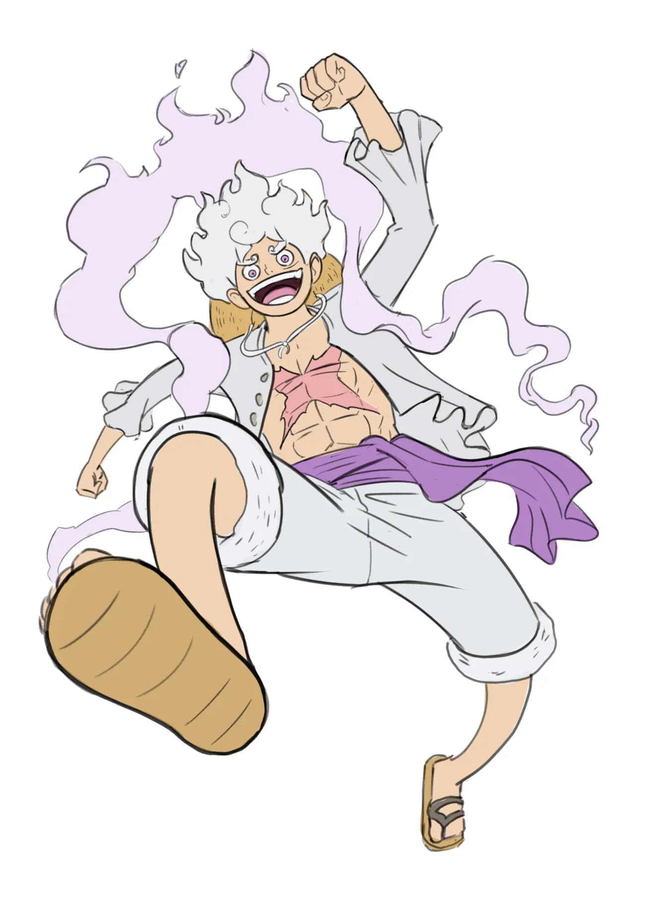
“Hey there! Very nice! It actually looks a lot like the character! :) There are just a few things you could adjust to make the likeness even closer, mainly three aspects: 1. The shape of the fac”
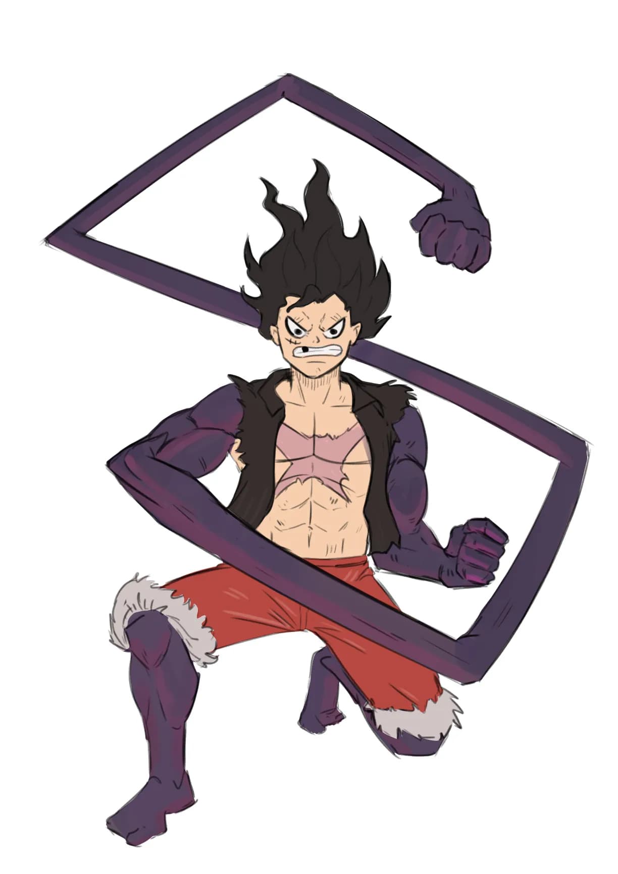
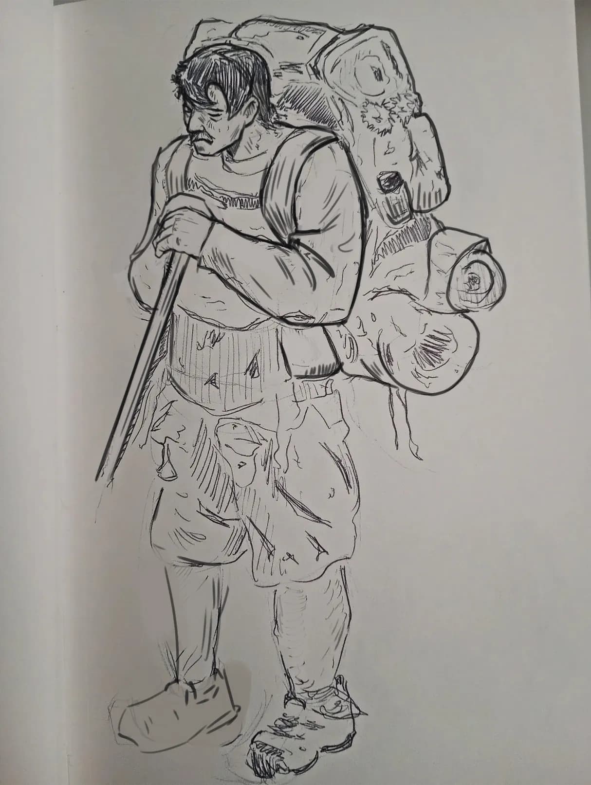
“Hey there! Good job so far! One of the main differences between the original drawing and yours is the movement and flow of the body. If you look closely, the legs aren’t completely straight—they”
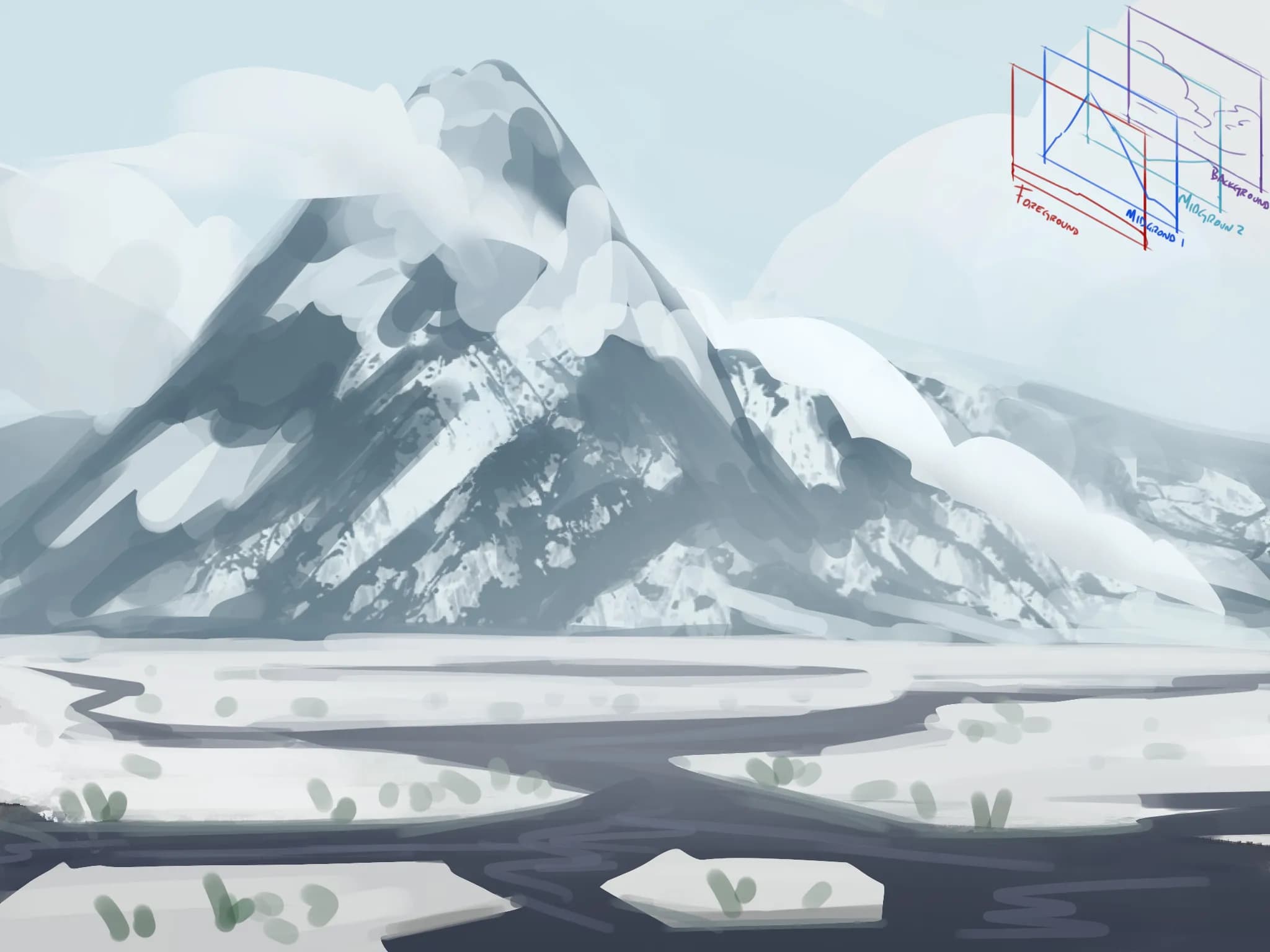
“Hey there! First of all, the value range isn’t quite working yet. You have some dark areas on the mountain that are almost as dark as some areas of the lake, which reduces the sense of depth. On th”
“Forgot to upload the paintover lol”
“Hey there! Nice illustration! You could direct the focal point more toward the character by keeping most of the lighting concentrated in that area. It’s common to want to illuminate the entire ”
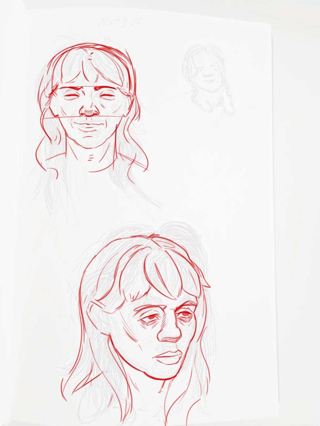
“Hey! Cool sketches! In the upper portrait, the right eye is misaligned compared to the left one. The nose also lacks a bit of volume, so ideally, you could shade the underside to suggest its ro”
“Hello there! Indeed, there are a lot of lines, but the main issue is that there isn’t a clear focal point and, overall, everything looks a bit flat because there’s no clear line hierarchy. I did”
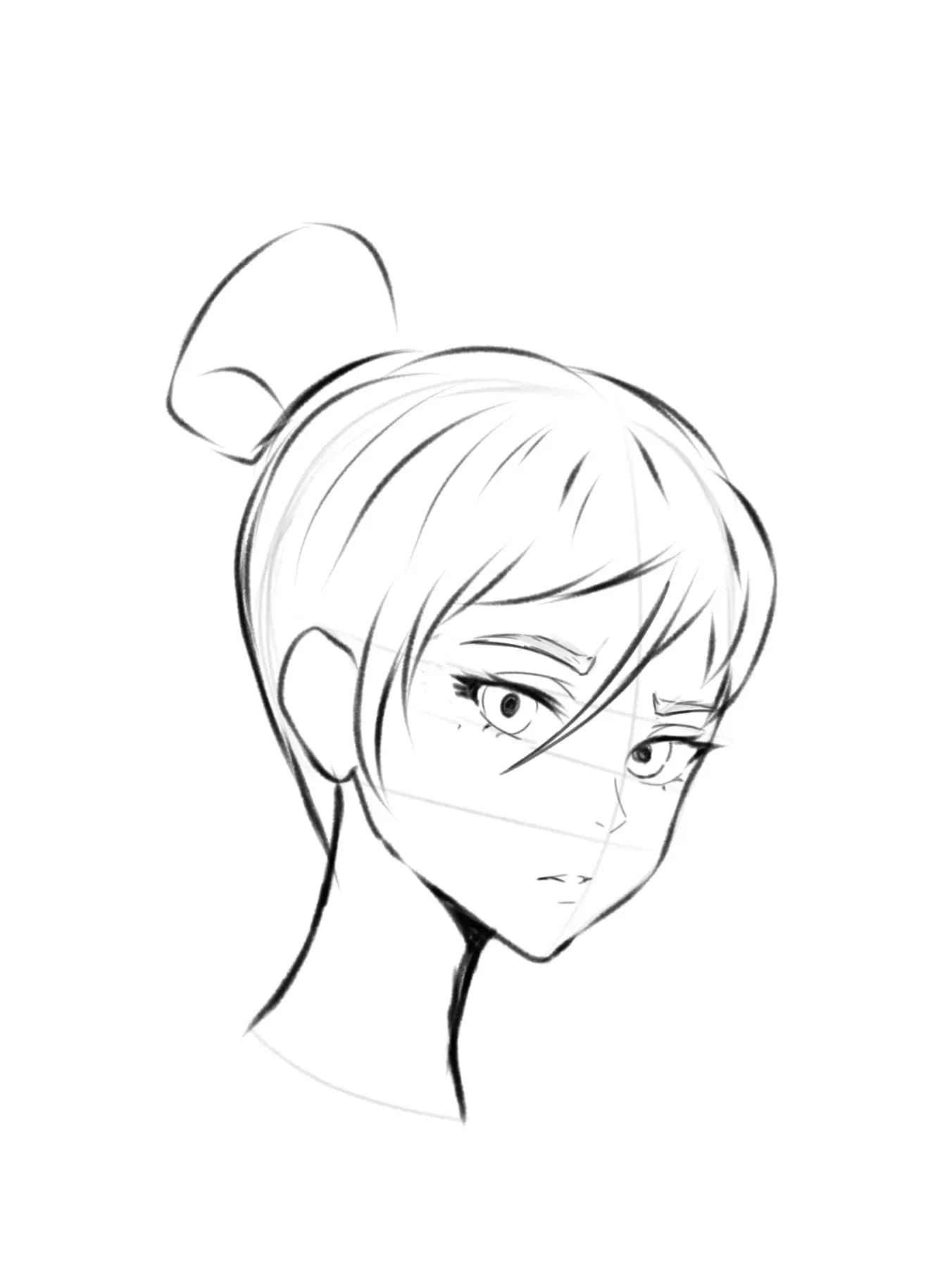
“Hello there! You could sketch the shape of the eyebrows and emphasize the lower line a little more, while on the upper line you could draw a few individual eyebrow hairs to give it some sort of tex”
“Hello there! Well, first of all, I’d recommend studying the basic structure of the head, as well as the fundamentals of the eyes, nose, mouth, etc. Study how these features look in real life so tha”
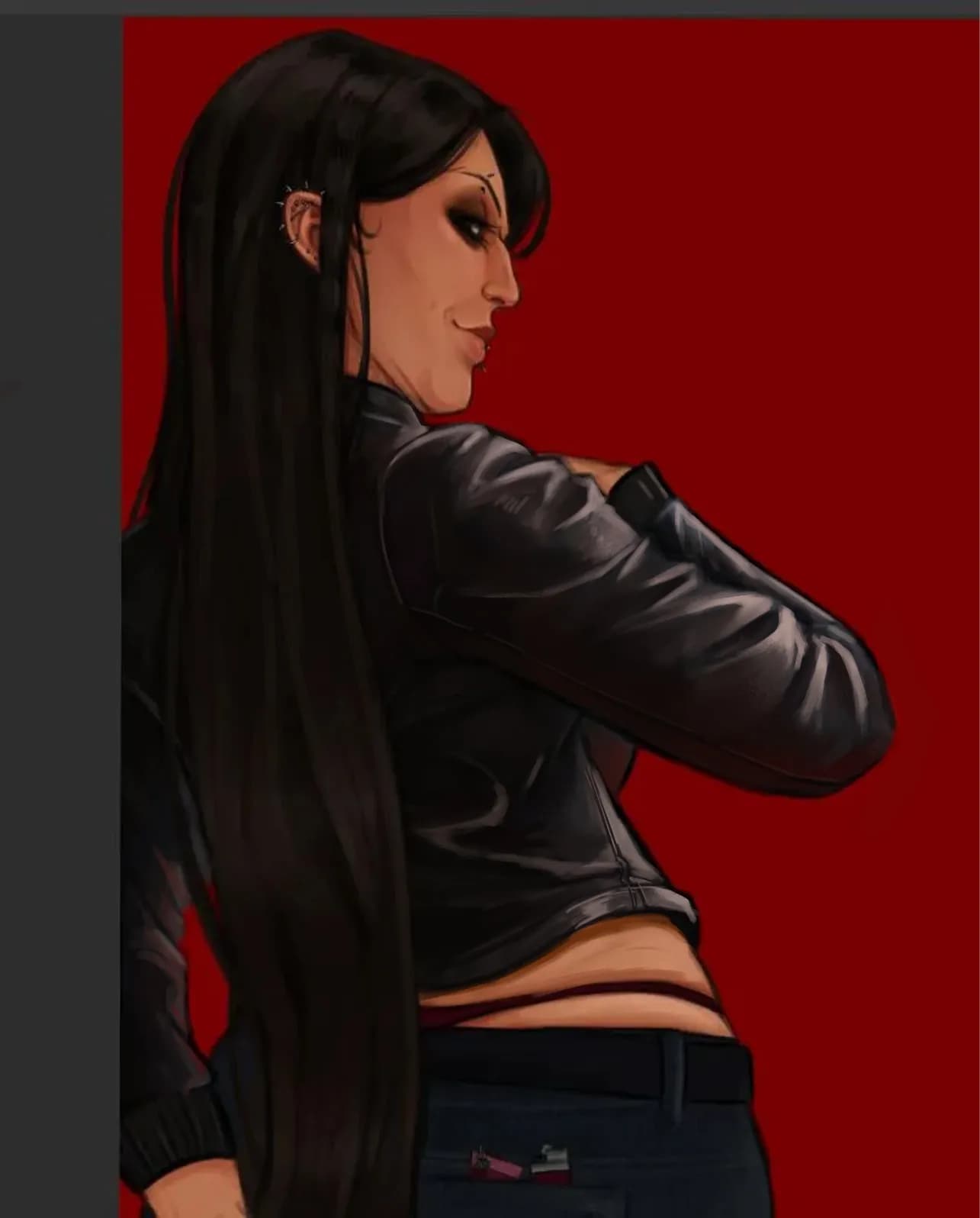
“Hey there! Such a cool illustration so far! Keep in mind that leather has strong and clear specular highlights, with some smooth transitions along the folds. You could also use a slightly text”
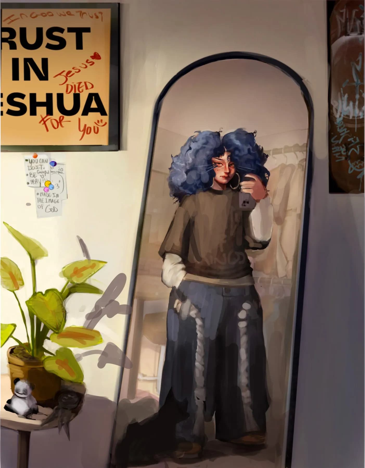
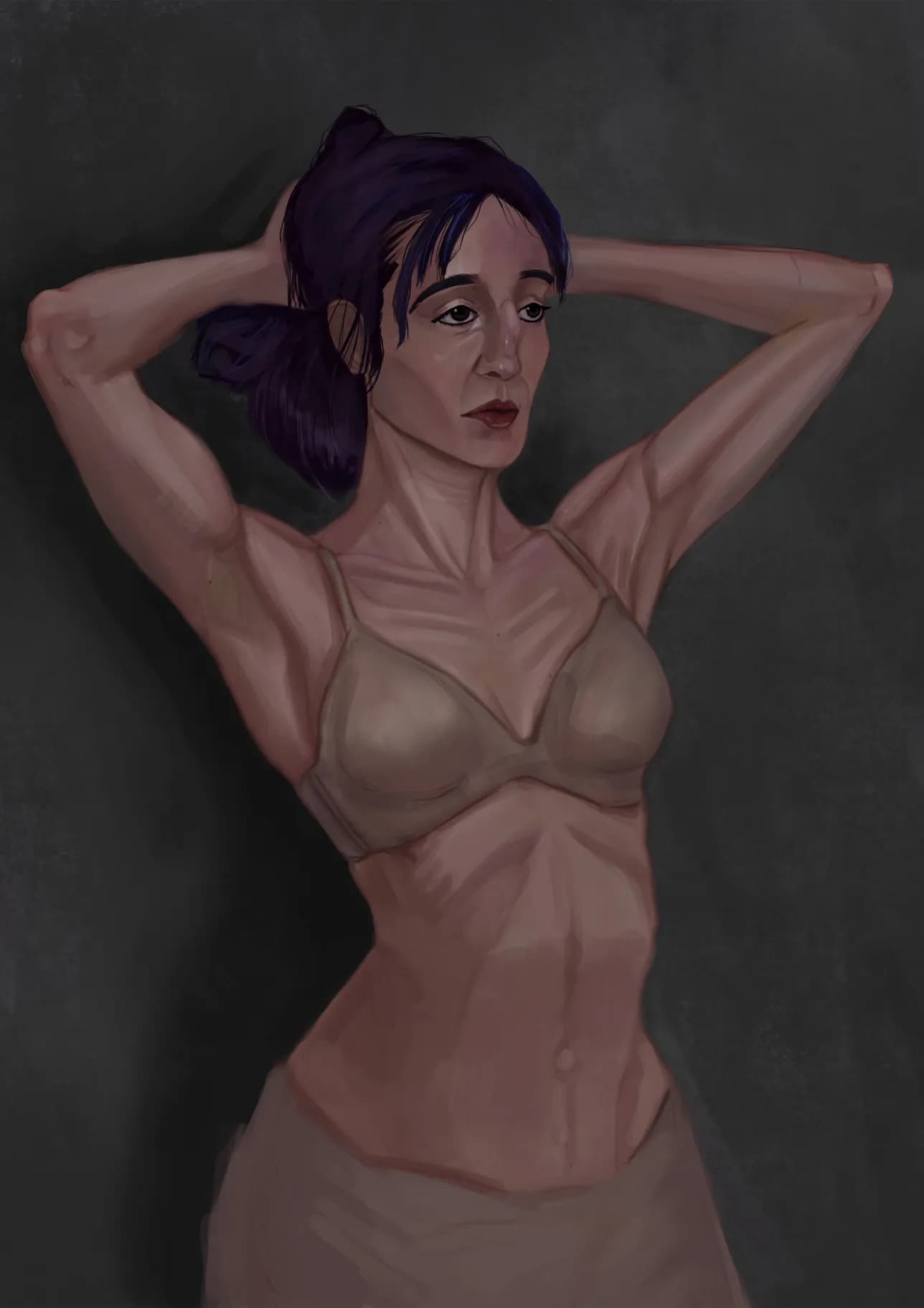
“Hey there! Such a cool painting! My suggestion would be to emphasize the form and volume of the body a little more. Even if the goal isn’t to paint with a wider value range and you want to keep”