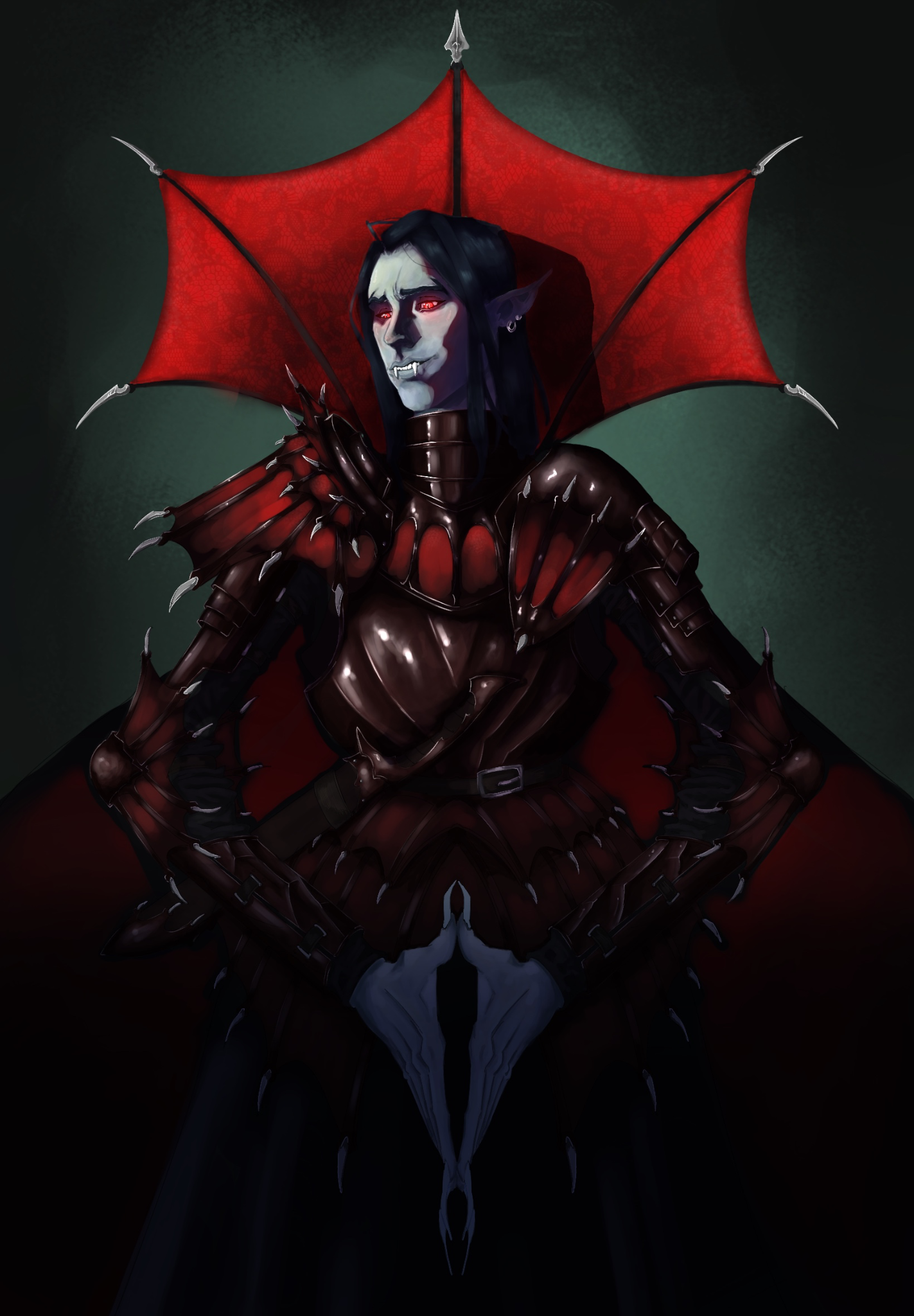
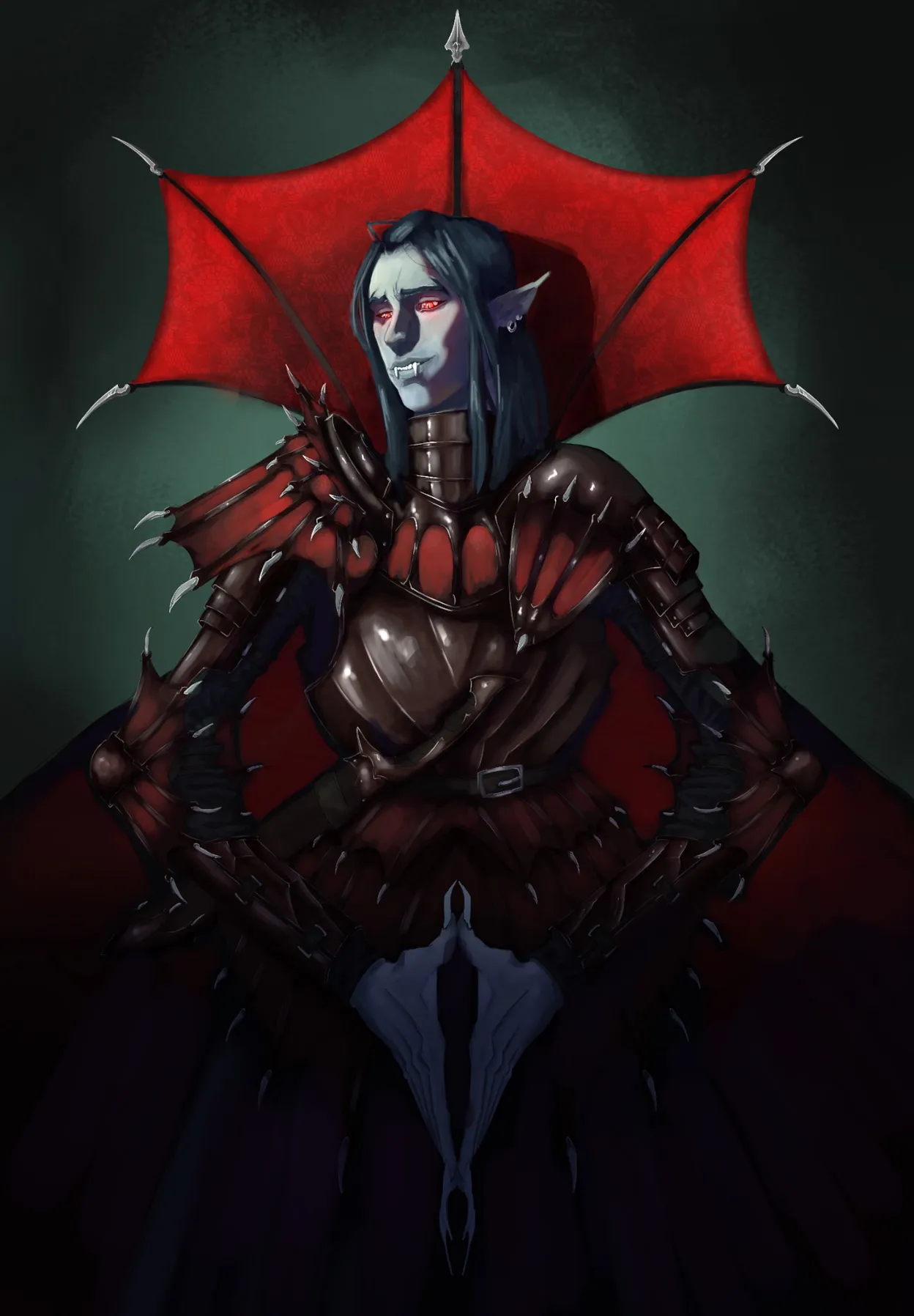
Hey Oscar! Se ve muy chido hasta ahora! :D I like that in the face area, there’s that contrast between the desaturated, cool skin tone and the red of the hood and eyes. Good contrast! :) As a general rule, use hard edges in focal areas and in cast shadows, while you can use soft edges in form shadows. For example, use a hard edge in the cast shadow of the nose, while using a soft edge in the transition between light and shadow on the cheek and chin area. Then, use lost edges in low-interest areas, such as the lower part; a combination of soft and lost edges. What I would avoid is using near-black colours in the shadows. In this case, I would rather use dark purples to accentuate the darkest shadows a bit and also give the colours a bit more vibrancy. :) I also think that, in general, you can increase the values a bit in the upper part so there’s more contrast between the illuminated area at the top and the shadowed area at the bottom. Hope this helps!
Gracias como siempre! Just yesterday I was watching a vídeo about lost edges and the tupes of edges. Thanks for painting it out, i feel like there is a lot to keep in mind each time you make a painting. I will keep it in mind. Thanks!