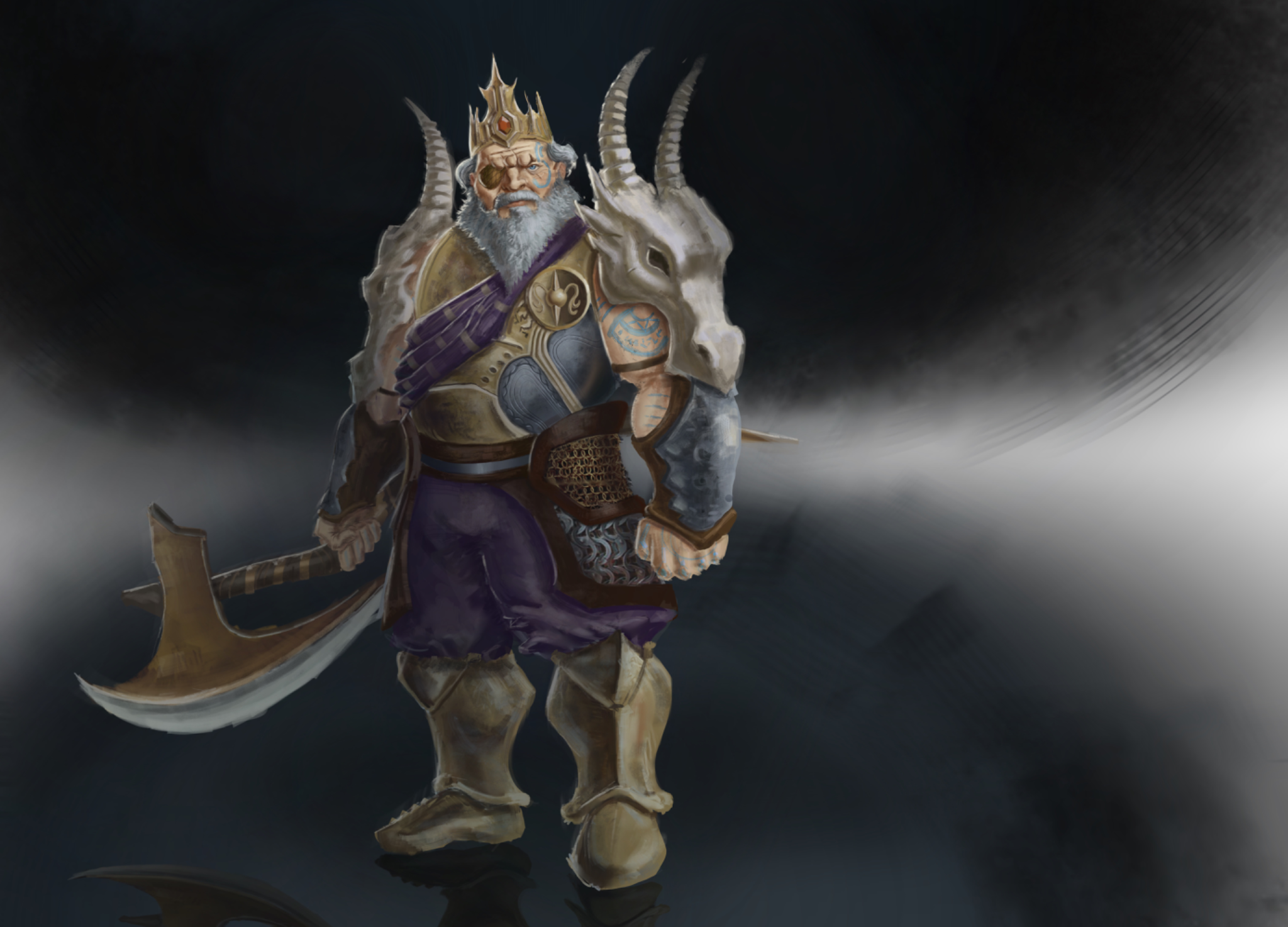
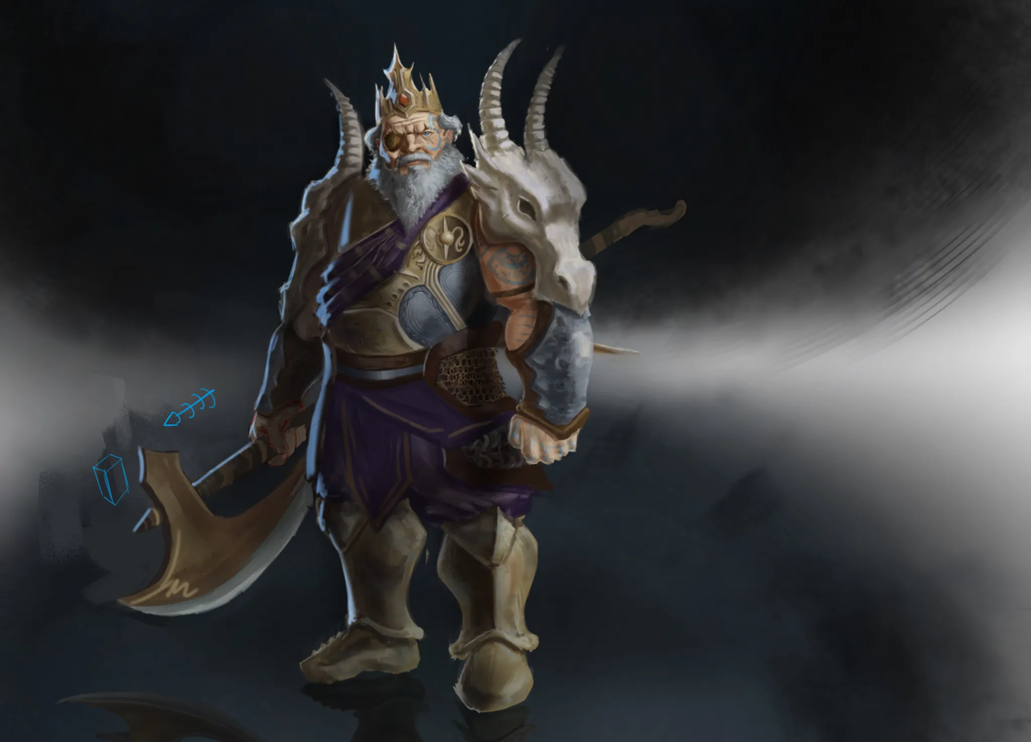
Hey! Such a cool character! :) Just a few corrections from my side. The perspective of the axe, as well as its angle, isn't quite right. On one hand, the perspective makes it look like the axe is pointing outward, while the character's grip indicates that it should be pointing forward. Likewise, the angle of the axe doesn't match the position of the hand; it should be tilted further downward. The right knee is positioned a bit lower than the left one, so it doesn't follow the same perspective. I adjusted it. :) The lighting is a bit inconsistent and makes the character look somewhat flat. This is because you haven't painted shadows with enough contrast. In general, when it comes to lighting, what I recommend for these types of characters is using a three-light setup: key light, fill light, and rim light. This emphasizes the character's design, makes the volume read better, and makes the character look more presentable. Keep the lighting focused on the focal areas, such as the face, shoulder pad, and part of the breastplate; keep the rest in shadow. Rim light emphasizes the character's silhouette and keeps it from getting lost or blending into the background. :) Hope this helps!
Correções pintadas (1)
Comentários 1
King Cassian the Dragon murderer

Notas do artista:
I guess i need to improve design cous it fils to clean And perhaps you have some professional tips regarding this piece?
10