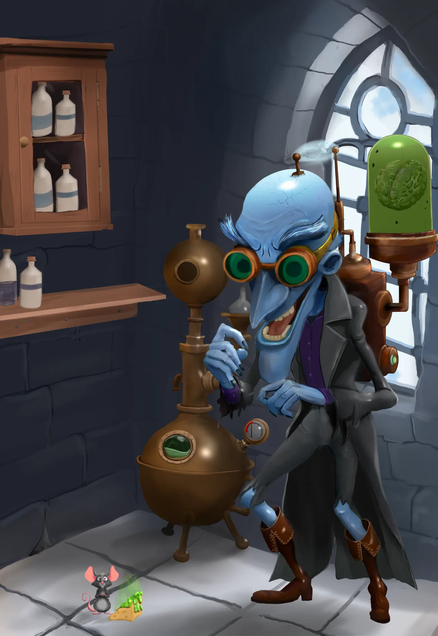
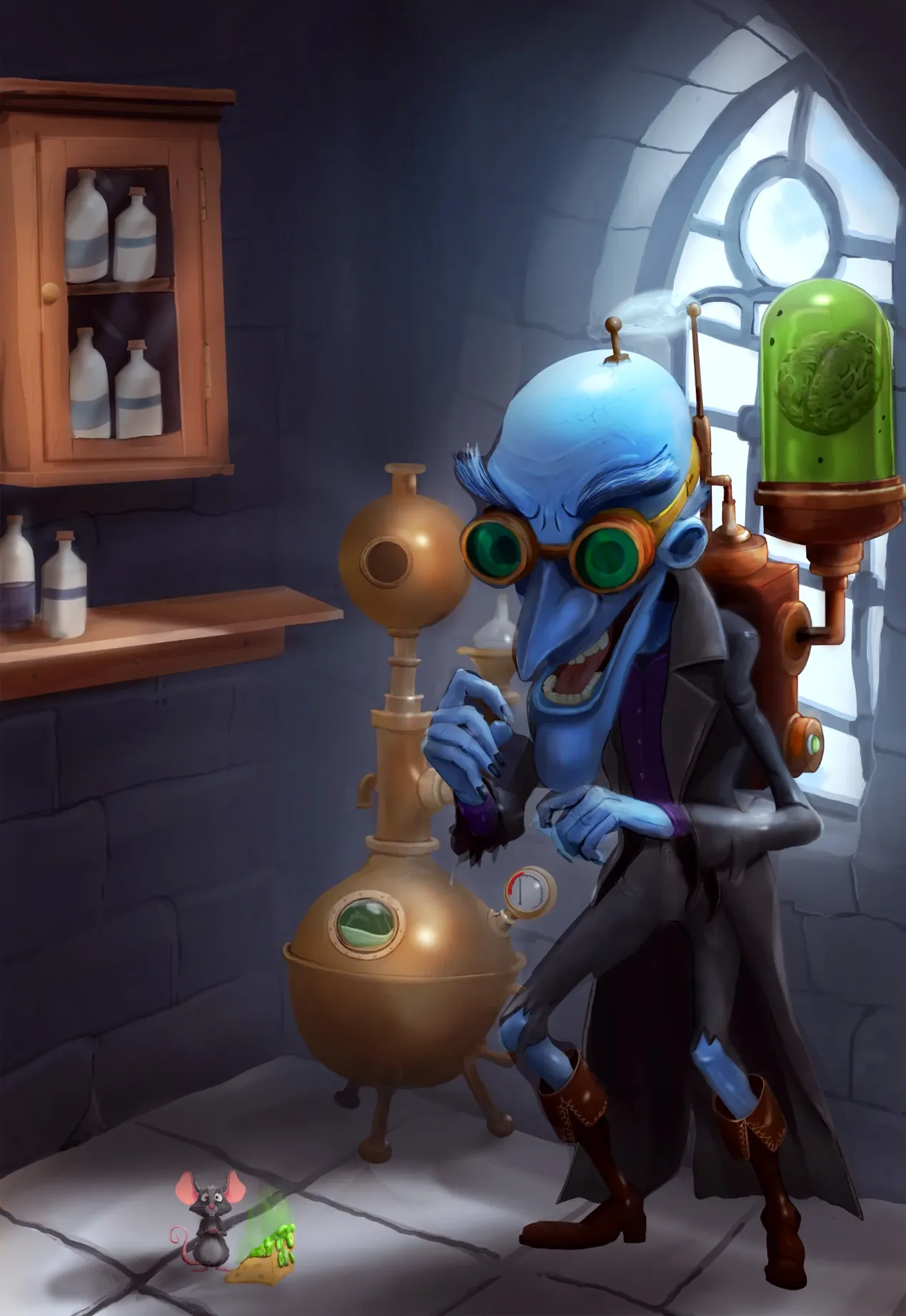
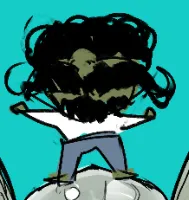
Hello there! Such a cool character! But you need to adjust the lighting a bit to create better contrast in the illustration. For now, even though the light is coming from the window, the character is illuminated as if there were a soft light in front of them, which makes the values feel a bit inconsistent and causes the silhouette to get a little lost against the background. You can first adjust the shadows using a "Multiply" layer to darken the front of the character, the wall, and all the areas that aren't exposed to the light. Then, on another layer, paint some light behind the character to separate them from the background a bit and make the silhouette more readable. After that, you can adjust the lighting and saturation a bit using an "Overlay" layer. :) By adjusting it this way, you can continue refining the illustration by improving the transition between light and shadow, ambient occlusion, etc. But keep in mind that you want to achieve this type of contrast, whether it's dark against light or light against dark. :) Hope this helps!

Thank you fosco for yor great advice and i can see what you mean via your enhancement ,for some reason i can never quite get the light contrast mix correct