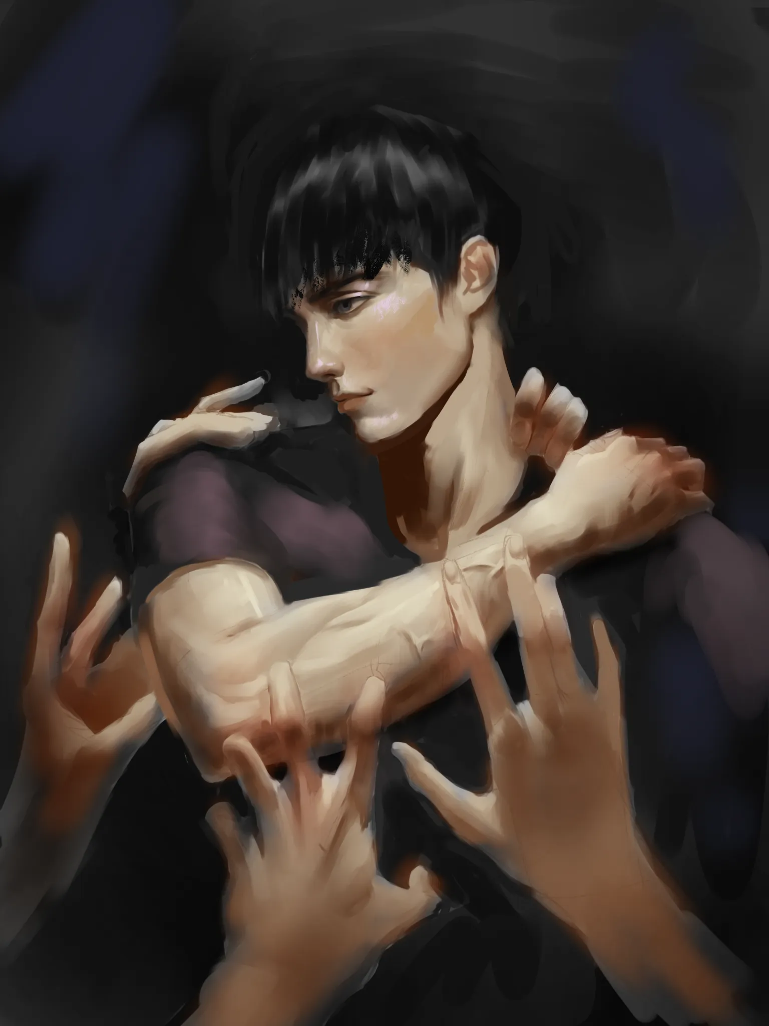
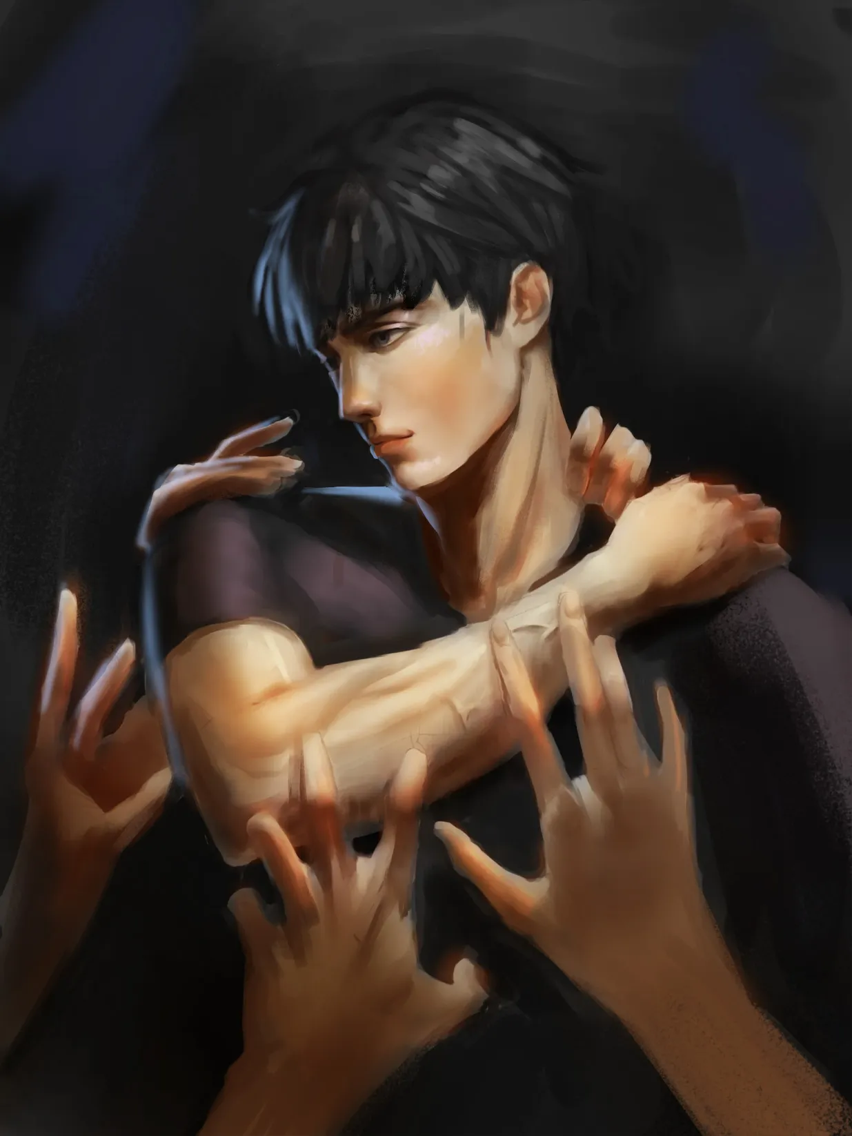
Hello there! It's looking great so far! Although the head looks a bit disproportionate. For one, the hair at the top has been reduced in size, as well as the area around the neck; this makes the head look considerably smaller. On top of that, the fact that you haven't painted the right eye makes the perspective of the head feel a bit off; as if you were trying to draw a side view while also making it slightly three-quarter. I corrected both of these things. :) Now, by also adjusting the lighting a bit, you can help keep the focal point centered on the head and prevent the viewer's eye from wandering all over the canvas. You can simply darken the hands around it so the lighting contrast on the character's face becomes more noticeable. :) Also, add a bit more saturation, since the skin looks a little dull. Lastly, to prevent the silhouette of the head and shoulder, as well as the hands on the left side, from getting lost, you can add a rim light to accentuate the silhouette. This way, you already have a 3-lighting setup: key light, fill light, and rim light. Hope this helps!
Correções pintadas (1)
Comentários 1
Toji wip

Notas do artista:
I feel like this paintings a bit too stiff or flat. I don't really know if its the lightning or the perspective
10