Nouveau : passez de la galerie à la vue unique ici.
#1
Rang
1722
Upvotes
1113
Feedback donné
100%
Utile
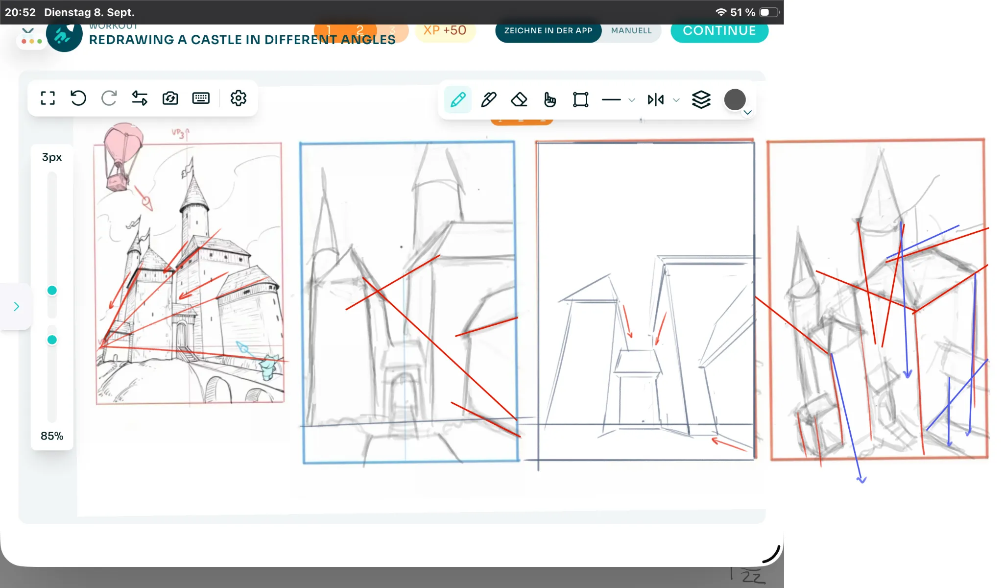
“Hey there! Good so far here! However, the lines aren't converging correctly toward the vanishing points. In the first exercise, notice that the lines are converging toward different points. If”
“Good job here! :) First of all, you do need to put a little more effort into getting cleaner lines. :D The concept of "T-lines" depends to some extent on line quality, since using thicker and thinn”
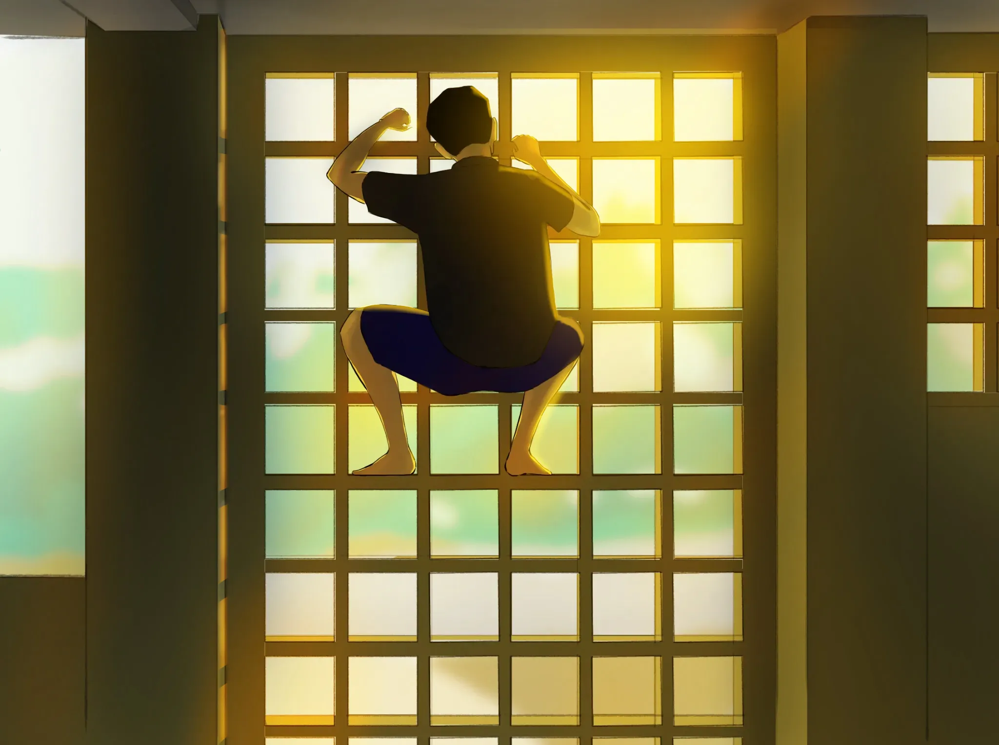
“Hello there! You could push the lighting a bit further to make it feel more cinematic. :) You could add the glow of the sunlight on the right side and have that light pass through the bars, illu”
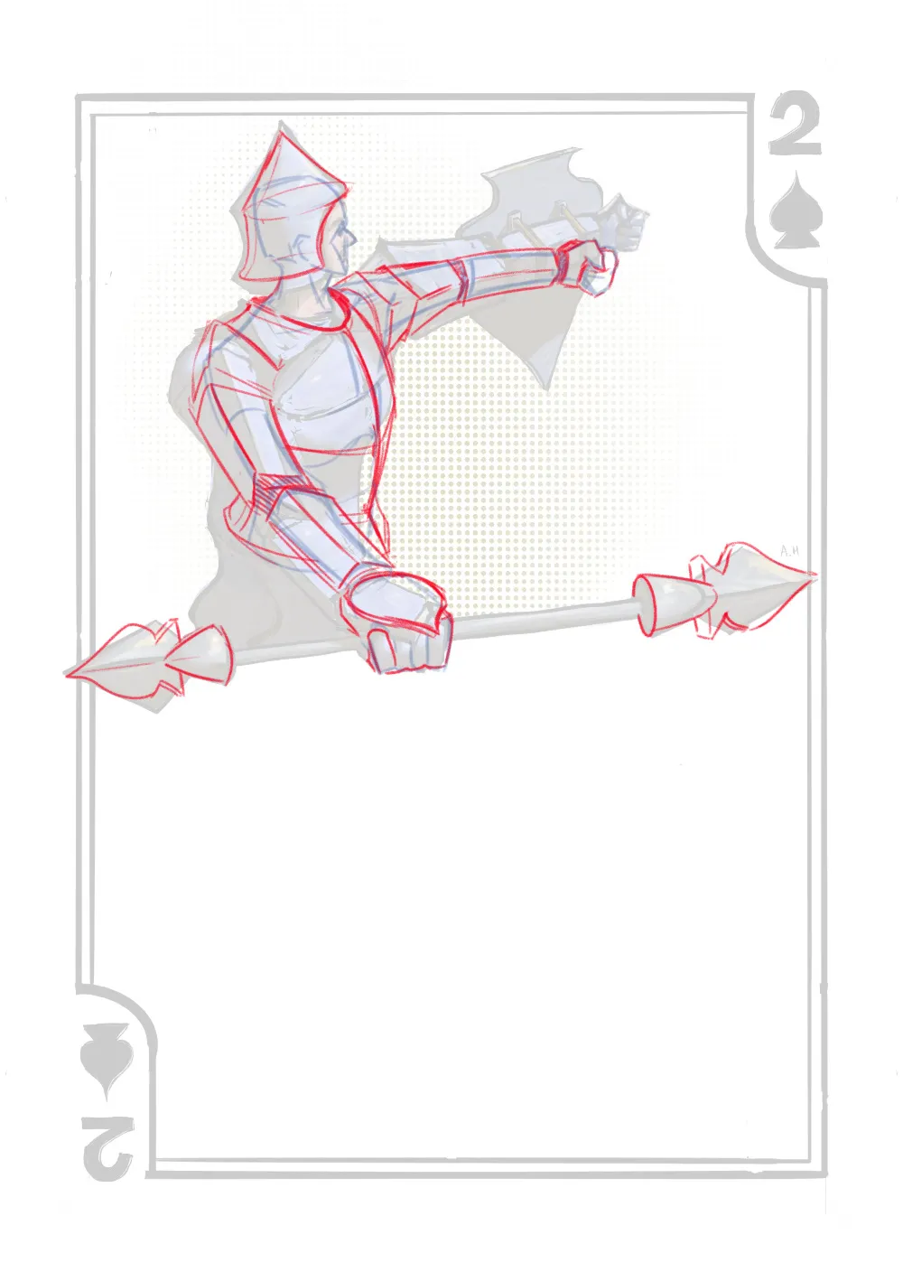
“Hey there! Good job! I really liked how you divided the card using the spear. :D Although I think it would be interesting if, instead of using conventional spearheads, you used the shape of the "Bl”
“Hey there! The image looks a little flat due to the lack of contrast in the shadows. :) Try painting stronger shadows to create a clearer separation between light and shadow and give the objects i”
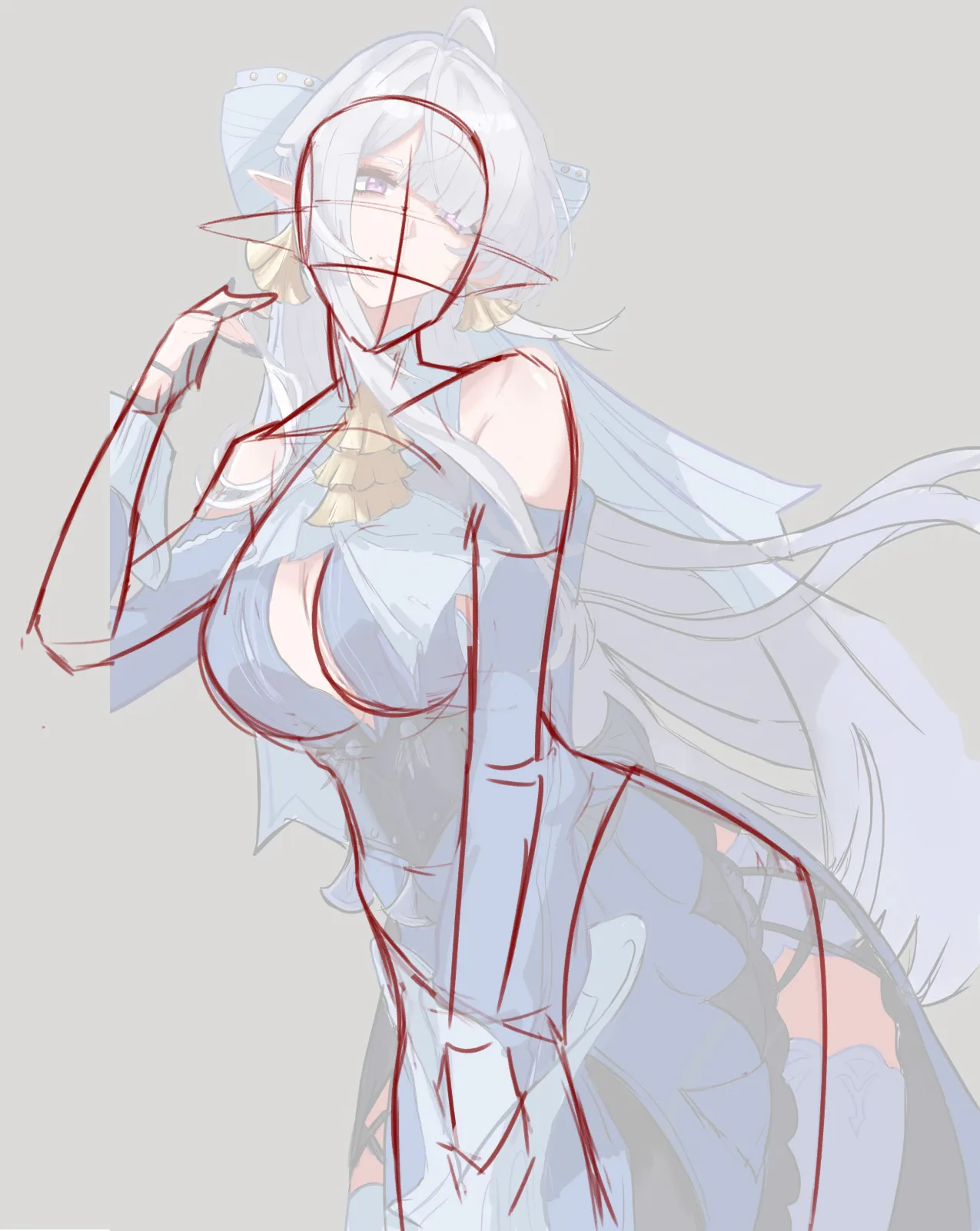
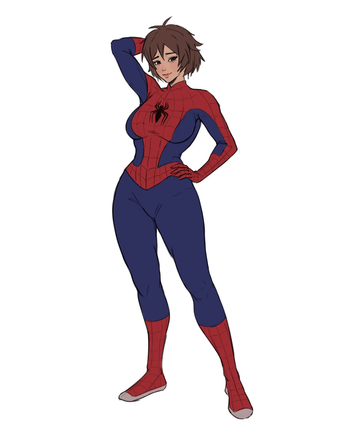
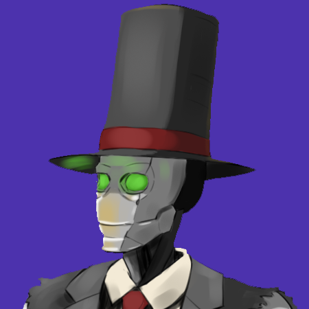
“Hello there! The proportions feel a little off. The neck is too long and narrow, which makes the character feel somewhat unbalanced overall. On the other hand, not showing part of the waist makes ”
“Hey! I'm not exactly sure what you mean by "line for line." But I'd recommend first using light strokes or a 4H pencil to create the base of the drawing. Ignore the details and just focus on the”
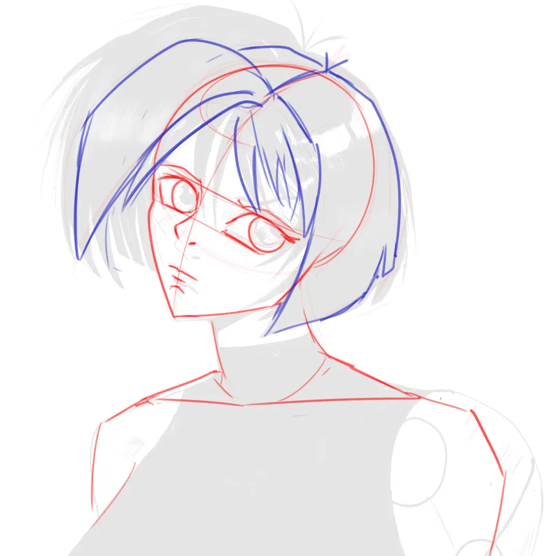
“Hello there! Overall, I think it looks good! :) I only made a few adjustments to the proportions, since I felt they were slightly off. The neck looked a little too long, wide at the top and narro”
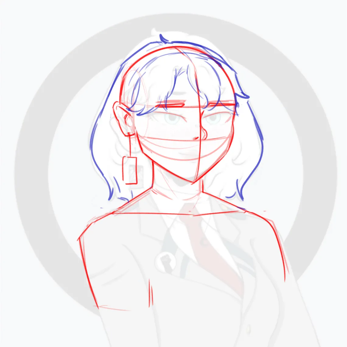
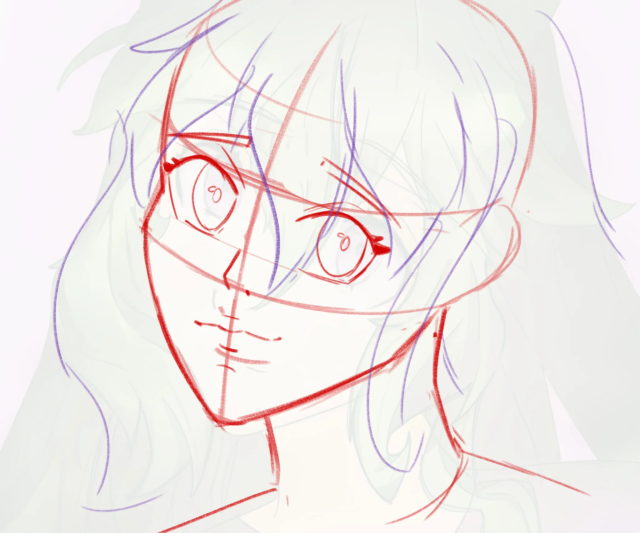
“Hey there! I'd recommend keeping the structure of the head in mind and using a simple construction. First, this will help you keep the facial features better aligned with each other. Notice how th”
“Hey there! It looks cool! The only thing I'd suggest is to make the shadows stronger to create better contrast or separation between the light and shadows :) Right now it looks a bit flat becau”
“Hey there! Great job so far! :D Just a couple of corrections: The facial features were a little too small, while the hair was taking up a large portion of the face. The legs were also quite lo”
“Hello there! Overall, you're doing well! However, the shoulders are raised too high, which makes the head feel like it isn't properly connected to the torso. The arms also seem a little disconne”
“Hey there! I like the concept! However, the scene feels a bit empty, which makes everything look a little boring or flat. Think about adding more depth and elements that contribute to the narrat”
“Hey! Well... It seems like you're struggling with everything, although I'm not sure if you mean in general or specifically with this illustration... Either way, overall it looks good! I like the”
“Hey there! I like the composition! However, what isn't working quite as well are the values. :) If the window is the main light source, then the rest of the scene should remain within a lower valu”
“Hello there! Well, the proportions feel a little off to me. The head is slightly too large, while the right hand is a bit too small. You could also draw the body slightly in 3/4 so that it follows”
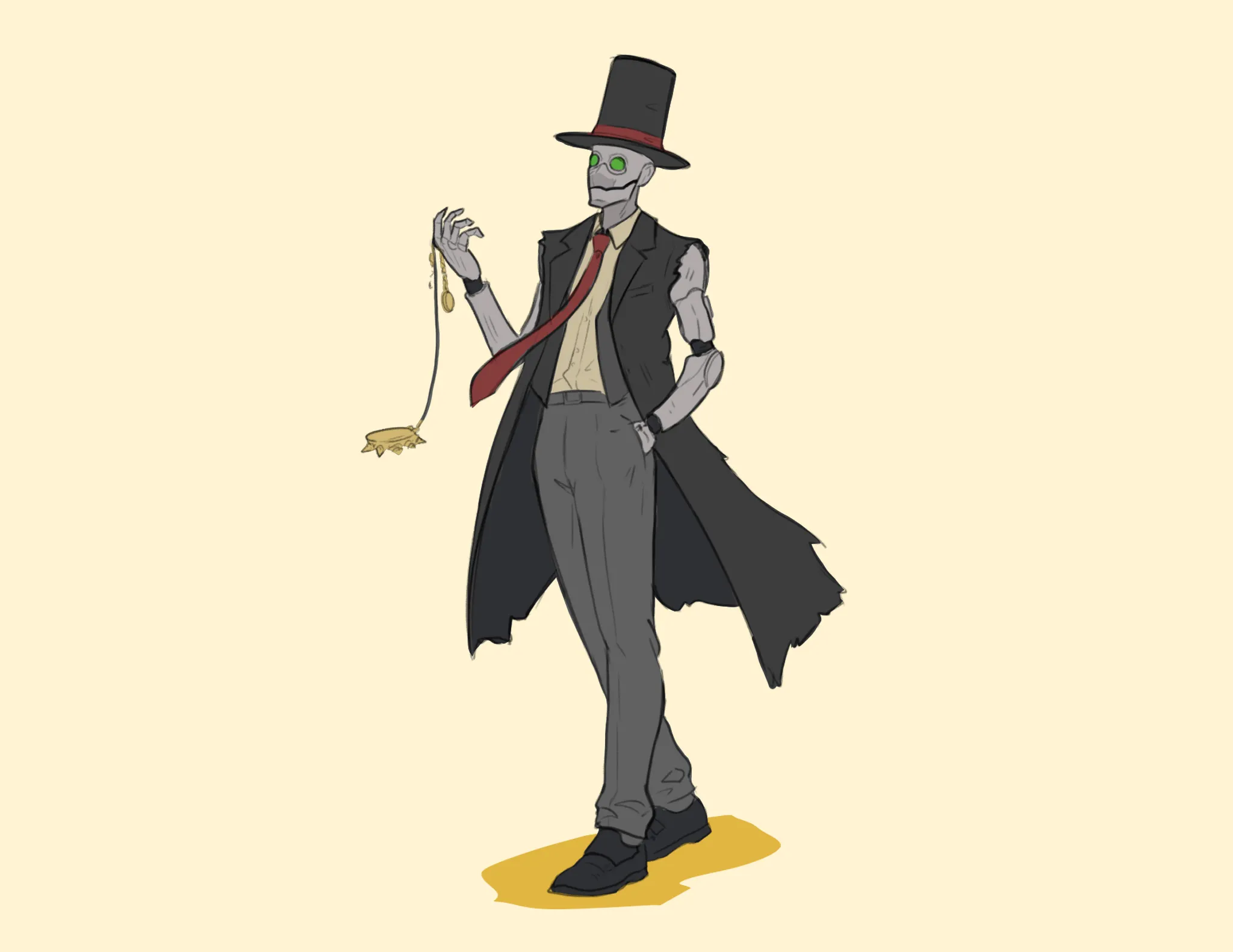
“Hello there! When drawing a character walking, ideally one foot should be planted on the ground so it can act as the main point of balance for the pose. Otherwise, if you draw both legs spread apar”
“Hey there! Well, the face looks a little off because you're not following the center line of the head. If you drew the center line using the Loomis method, you'd notice that the nose is out of plac”
“Hello there! What a great improvement! :D I only made a few small adjustments to the pose and the character's silhouette to make it a bit more interesting. The concept is really cool! I just thi”
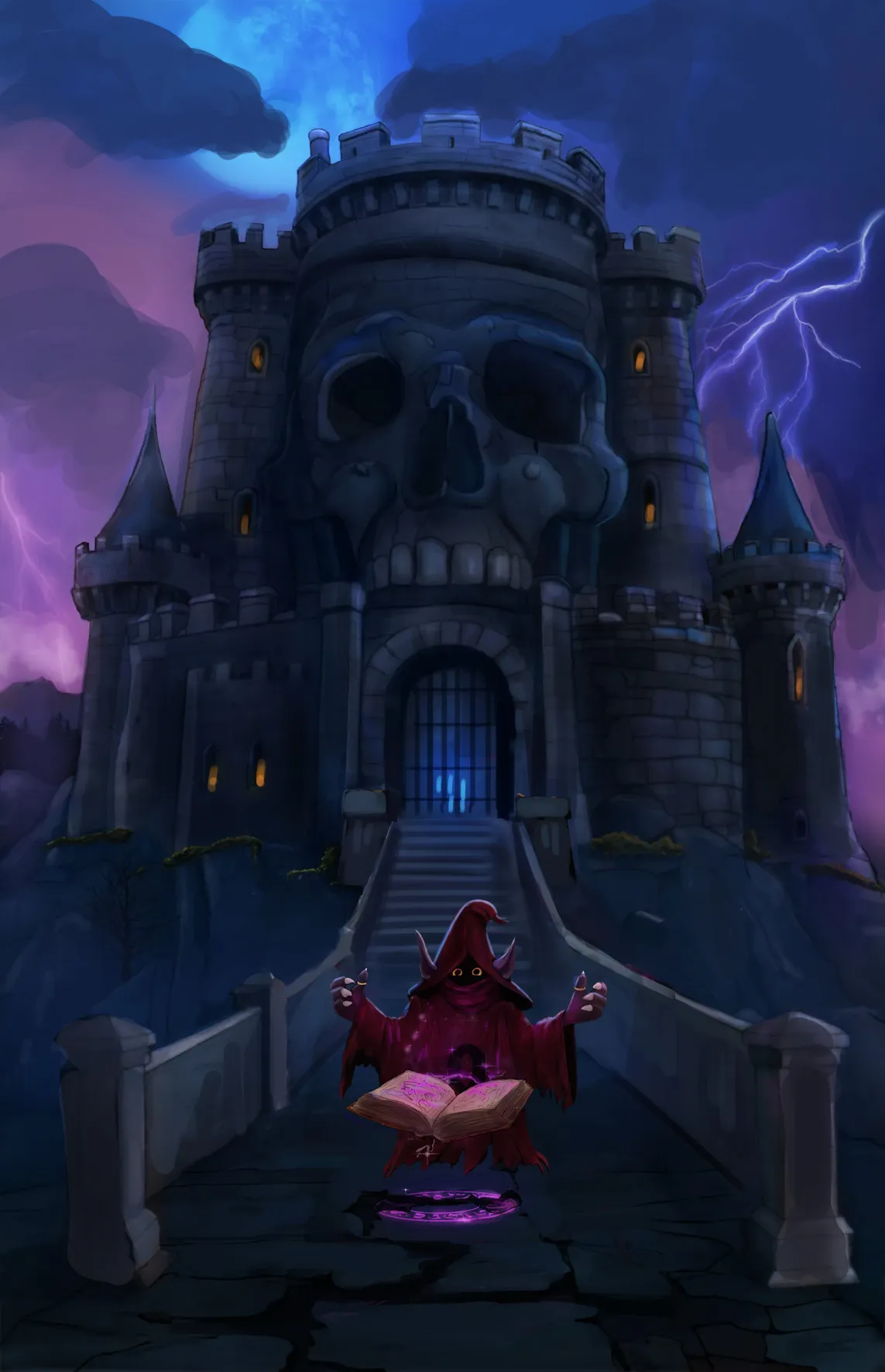
“Hello there! I made a few changes here. First, I made the character smaller. The character's scale didn't quite match the scale of the castle, so reducing the character's size immediately makes ”
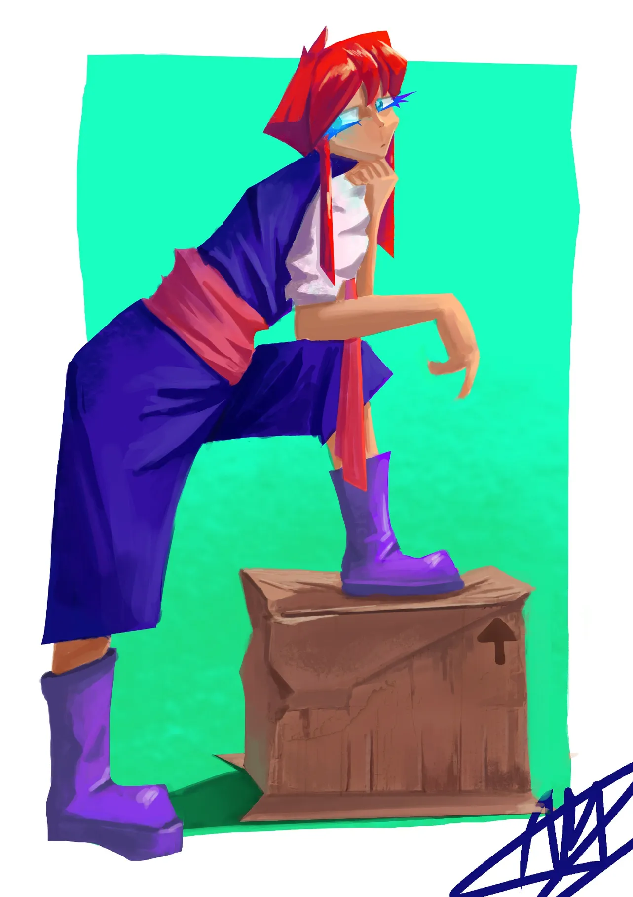
“Hey there! First of all, you need to define what kind of materials you're dealing with, such as the clothing, the boots, and so on, and gather references so you can paint them more accurately inste”
“Hey there! Good job here! To take this illustration to the next level, focus on improving the lighting. :) I'm assuming the light is coming from the upper left, so notice that I shaded all the ”
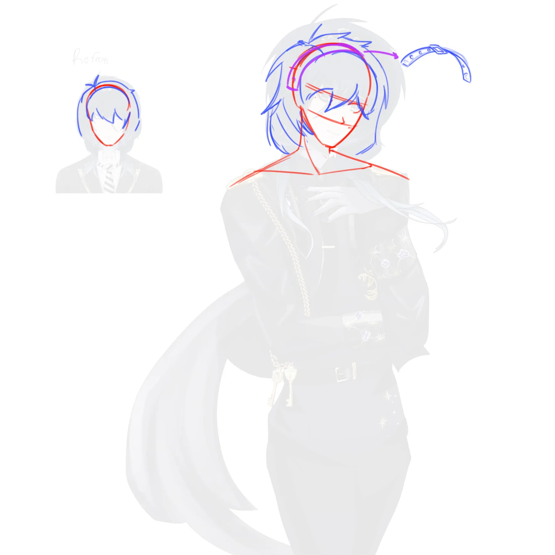
“Hello there! The face feels a little disconnected from the body because the distance between the trapezius and the side the head is tilting toward should be smaller. Since the head is leaning in th”
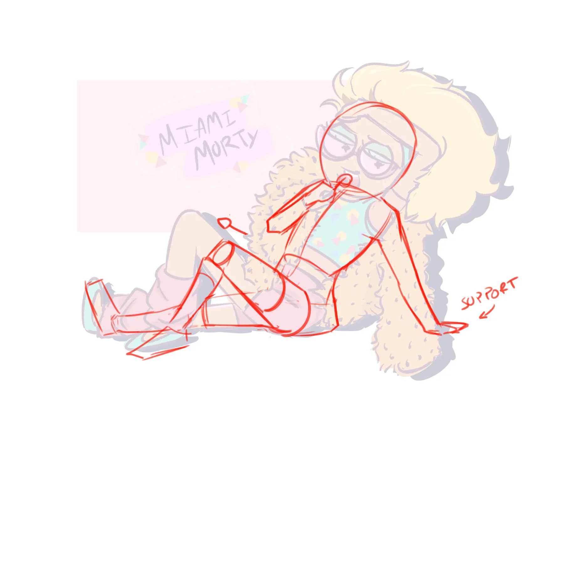
“Hello there! The first thing I asked myself was: What is the character leaning on? With the pose drawn this way, both arms close to the face and the body leaning, the character feels completely ”