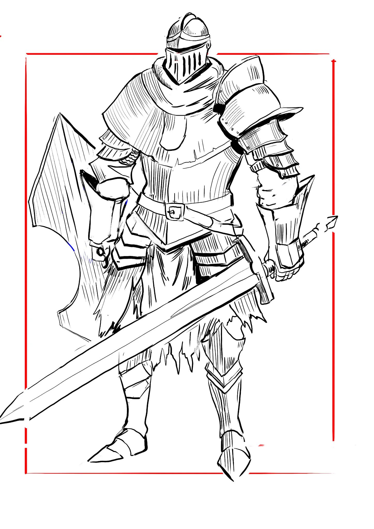
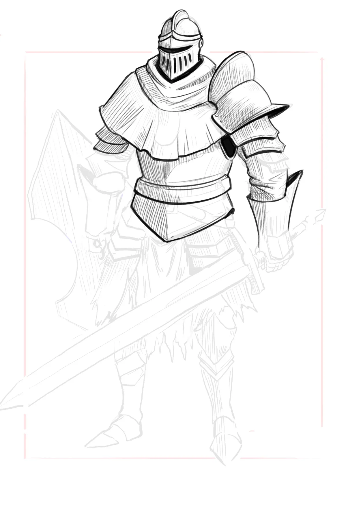
Hey there! Good job here! I focused on just one area of the knight to show you how I would approach it. :) In general, when thinking about line quality, remember that thicker lines will help you emphasize contours, overlapping forms, shadows, and ambient occlusion. For shadows and ambient occlusion, notice how I used thicker lines on the shadow side, not the illuminated side. Use thinner lines for internal details or less important areas. I'm not the best at shading with hatching, but when you use this technique, think about the form's direction to give objects volume. And of course, think about the shapes of the shadows so you can shade more accurately. One thing I like to do is draw the shape of the shadow first and then add the lines inside that shape. In my opinion, it gives the drawing an appealing finish. :) Hope this helps!
Retouches (1)
Commentaires 1
Knight
Notes de l’artiste :
im having issues with tangents and how to do the line art so its makes for shading the piece
10