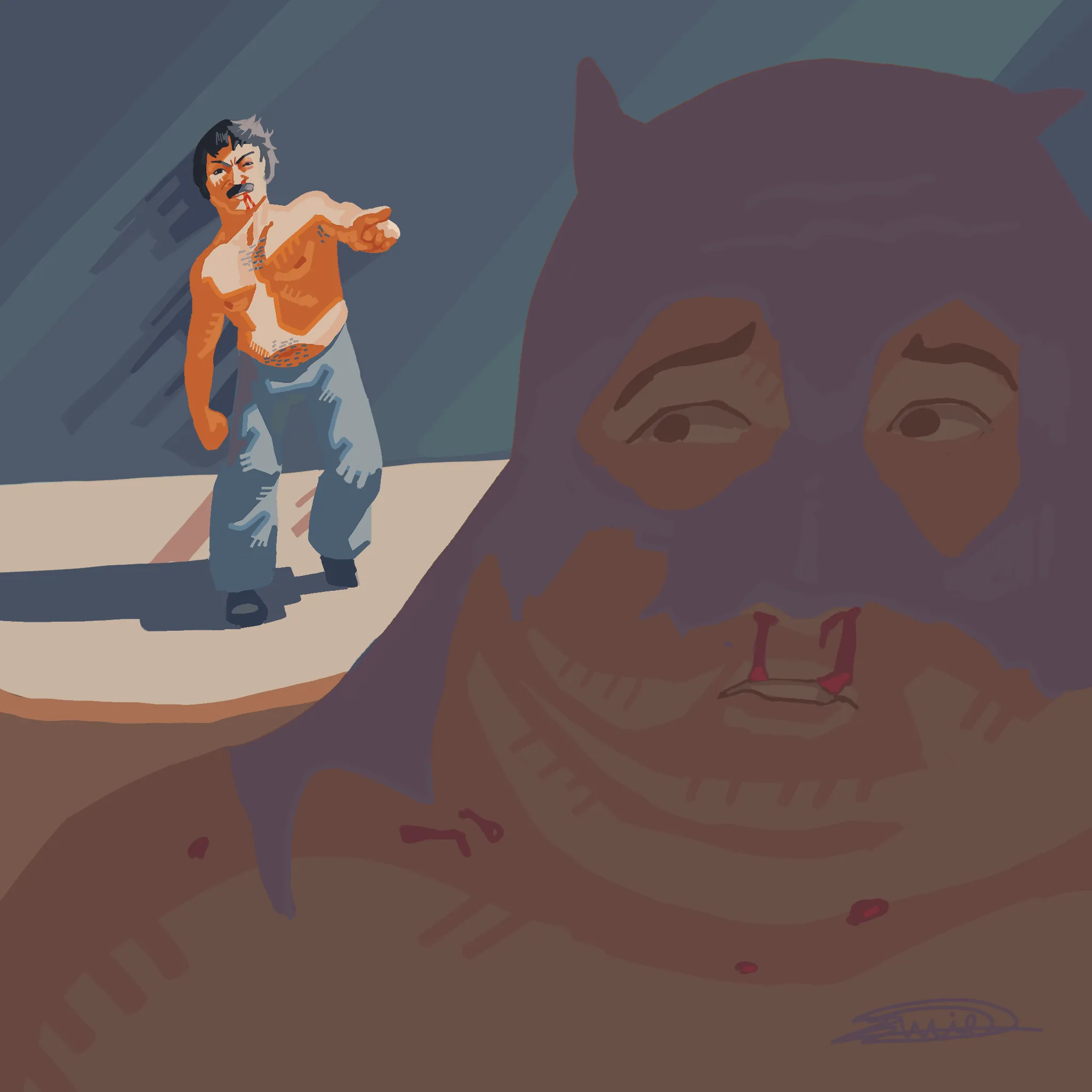
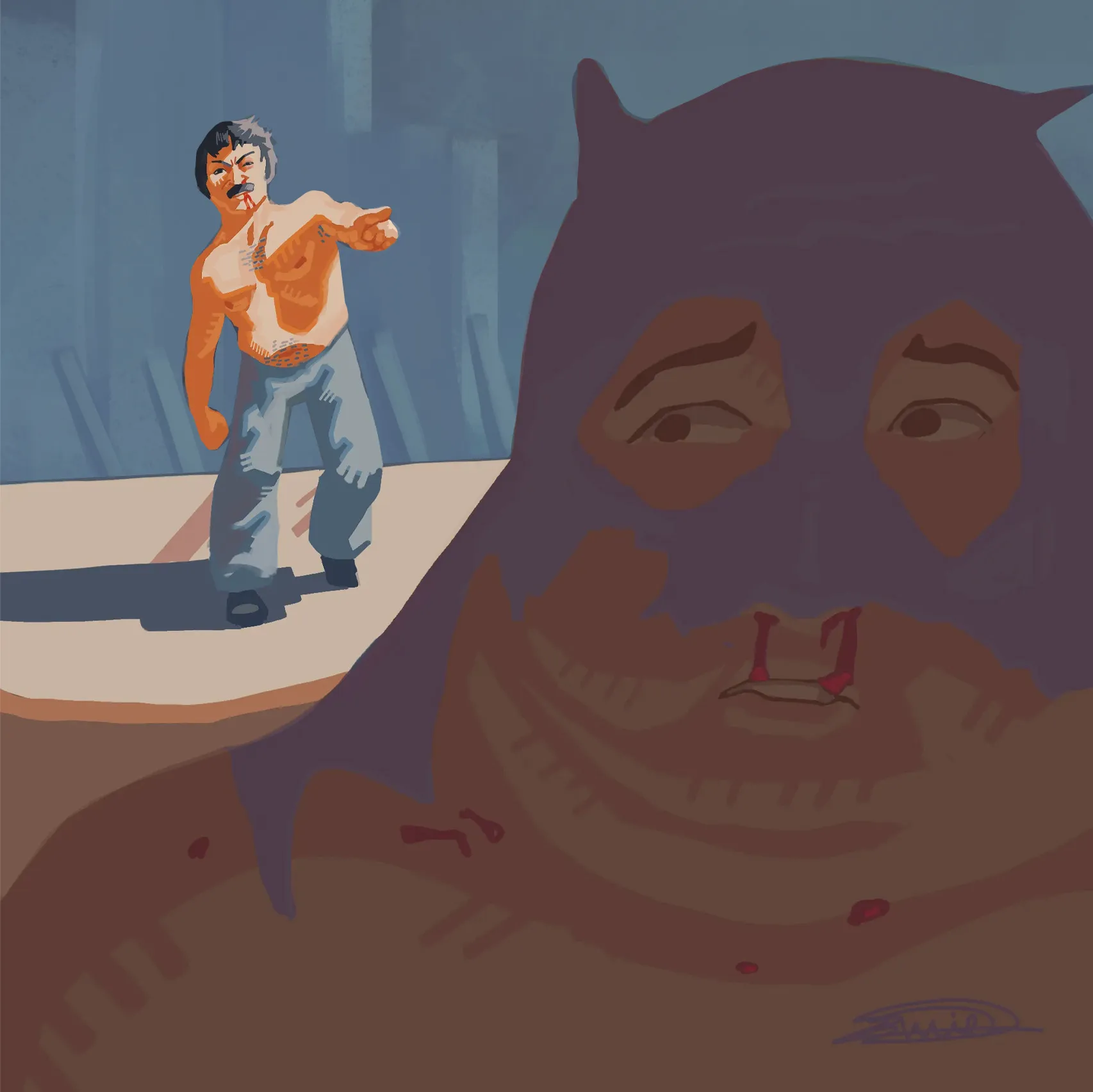

Hey there! Good job! I like your version of this scene! Overall, it looks good, but what you need to do is create a clearer separation between your different BG, MG, and FG planes. This is especially important between the BG and MG, since their values are quite similar, causing some areas of the pants to get lost. Take a look at the values I used. The shadow values aren't darker than the values in the MG, while the illuminated areas are almost as bright as the darkest value on the lit side of the MG. Meanwhile, I made the FG character slightly darker to create stronger contrast and a greater sense of depth. The goal of using values this way is to learn how to group them across the three different planes and use them to create good contrast. Always look for clear "light against dark" or "dark against light" contrast around your focal points so the silhouette reads more clearly. Hope this helps!
Retouches (1)
Commentaires 1
"I didn't hear no bell"

Notes de l’artiste :
So im triying to prioritaze values lately but i feel im sacrificing a lot of color and also i had to simplify the composition because i didnt understand how the light work, imagin everything else is dark but you have a dramatic light on the hero, i didnt know how to do that whille having stuff on the background so i just erased the background
10