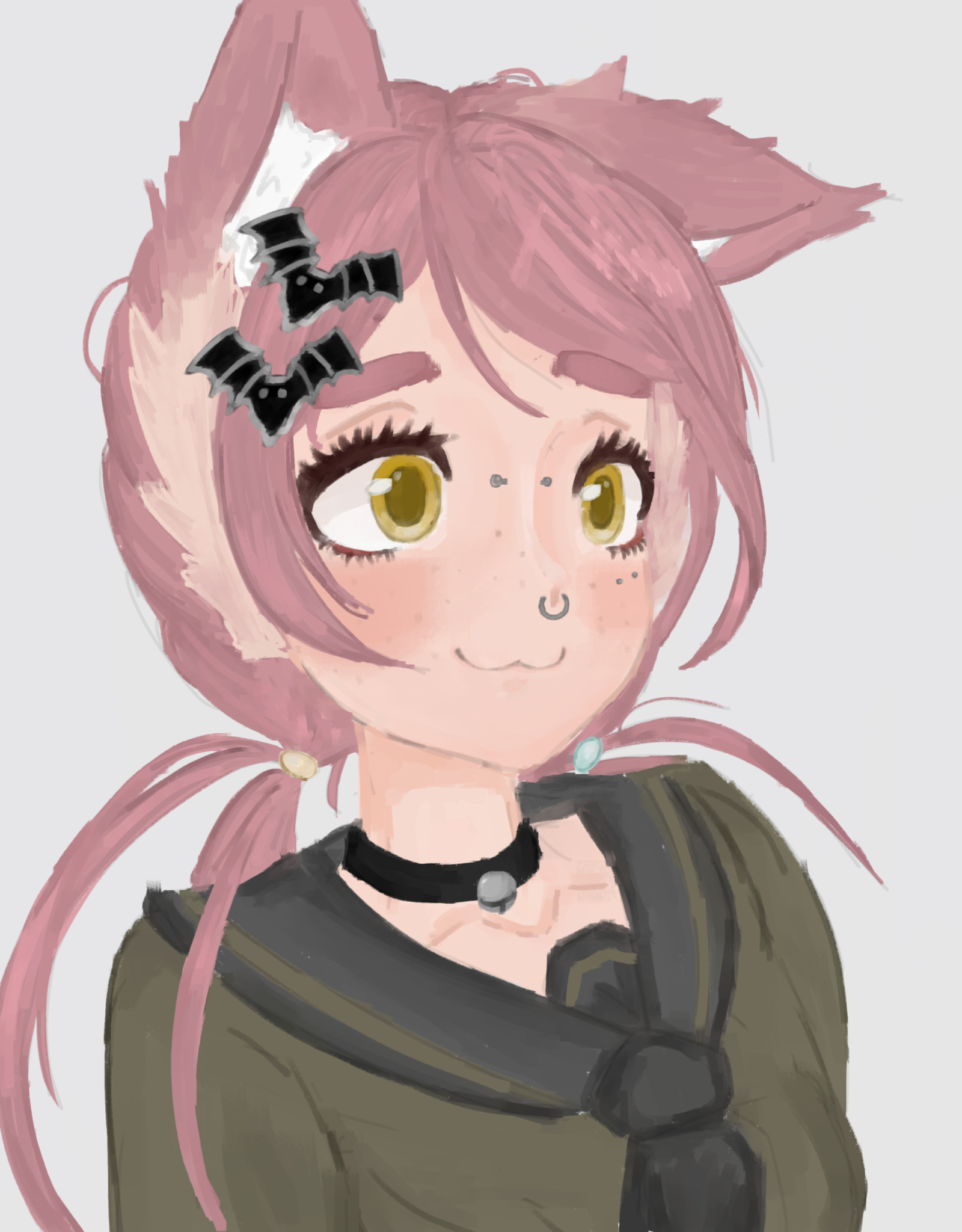
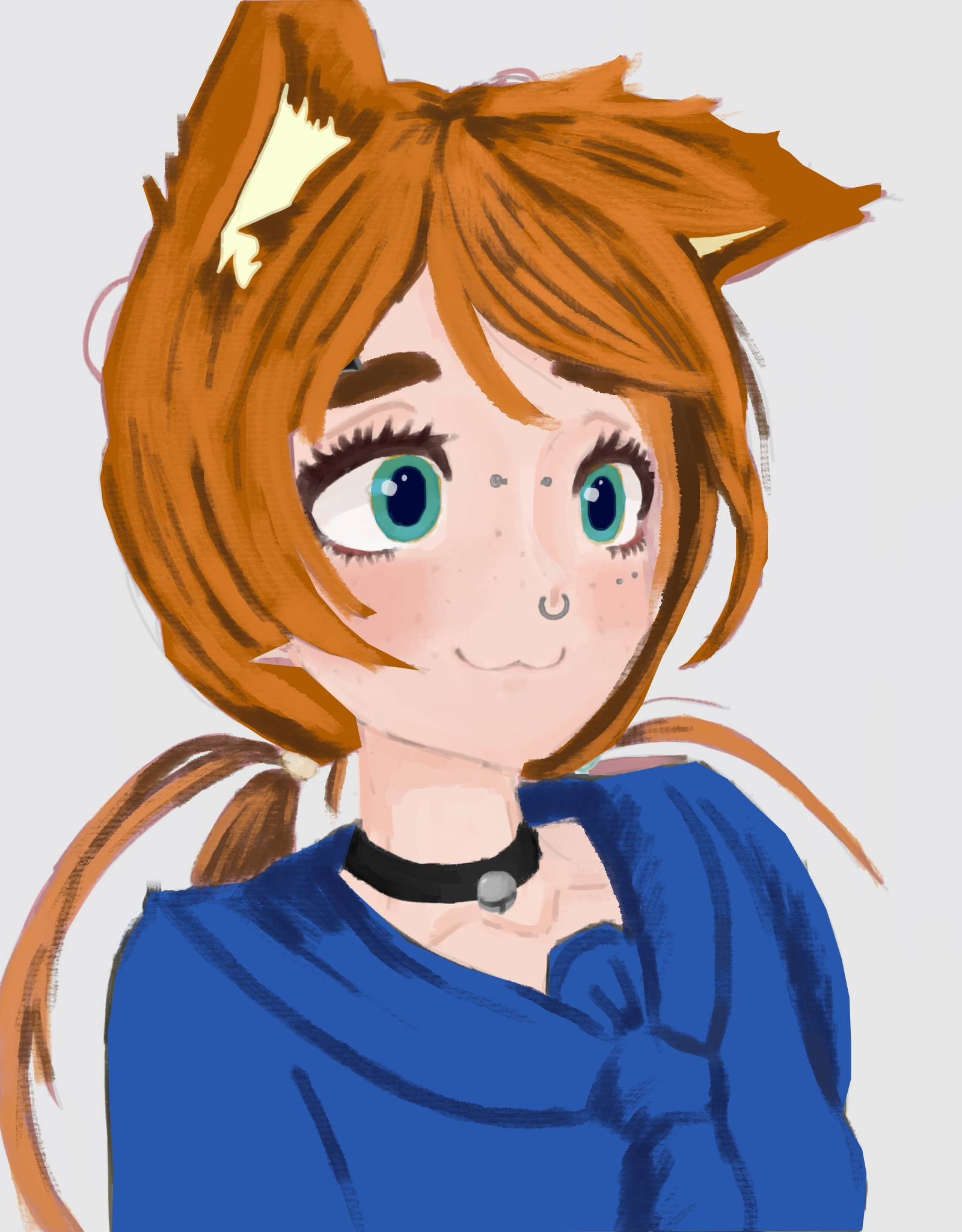
Great character here!! I just think the colors could be more vibrant. Obviously cant go wrong with complimentary colors…blue and orange, red and green, etc. Also, try to increase the contrast, lighter lights and darker darks. There are endless possibilities here. Hope this helps.
maybe keep the blue and orange pairing, then push the lights warmer and the shadows a bit cooler so the contrast reads more without losing the soft color idea
Replying to @mira72602
I like that idea. Would love to see this reimagined in that sense.
idk if changing the hues is the main thing, maybe keep the blue and orange and try one darker shadow pass plus a warmer light on the face so the colors feel less flat.
idk if it needs a whole new palette, maybe add a small warm red accent in the background and save the deepest shadow for under the hair and chin so the face separates.
maybe push the background a little darker behind the face first, then let the blue shirt and orange hair carry the main contrast so the colors feel brighter without losing the soft look.
maybe keep the blue and orange as the main pair, then darken the background a little so the lighter face side stands out without needing every color to be more vivid.
idk if max contrast everywhere is the fix, maybe brighten the lights on the face and one accent color first, keep the rest a bit flatter so the design still reads
idk if pushing the shadows cooler is the first fix, maybe keep the soft pairing and darken one shape behind the face so the character reads without losing that calm color mood.
maybe keep the blue and orange as the main pair, then darken the background a little behind the face so the warm light has more room to pop without pushing every color brighter.
the blue and orange already feel like a good pair, maybe push the warm light on the face and one small red accent first so the rest can stay softer without the whole piece feeling flat