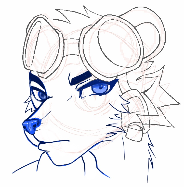
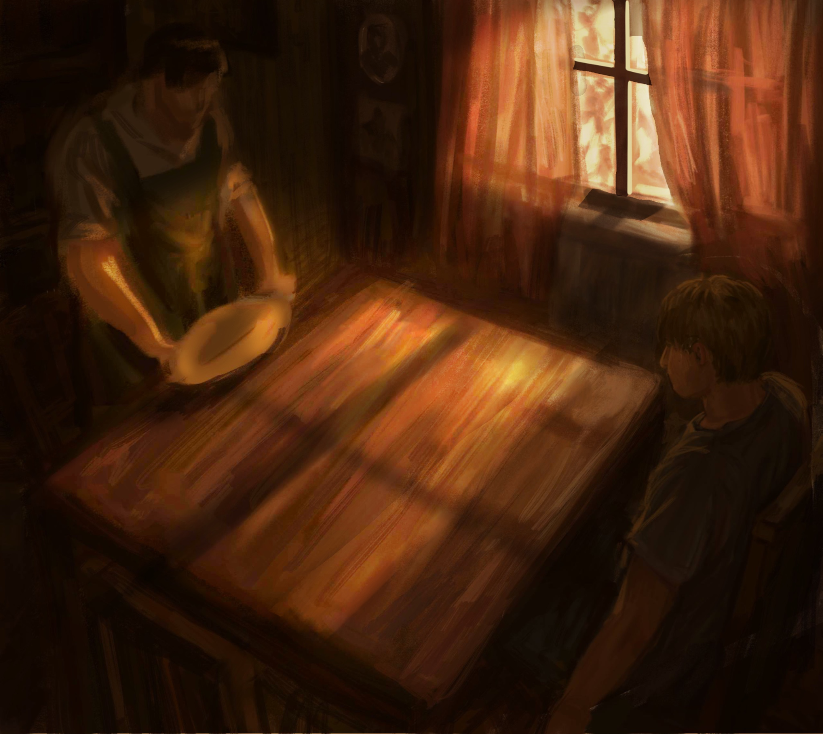
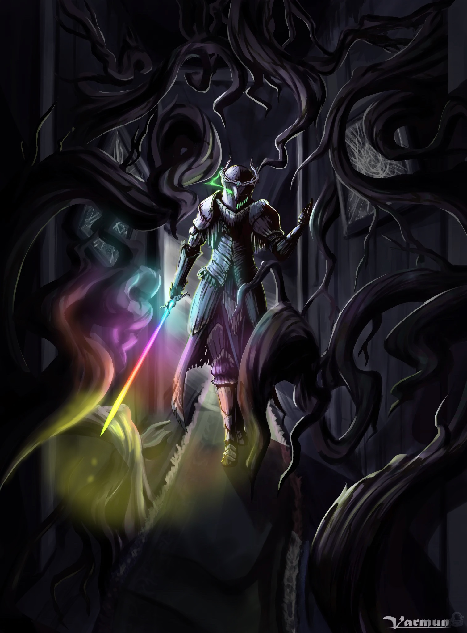
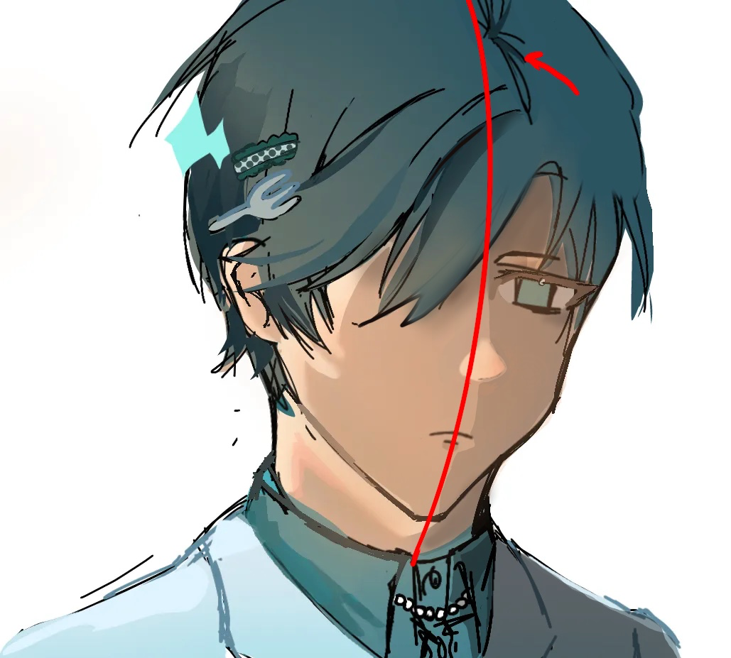
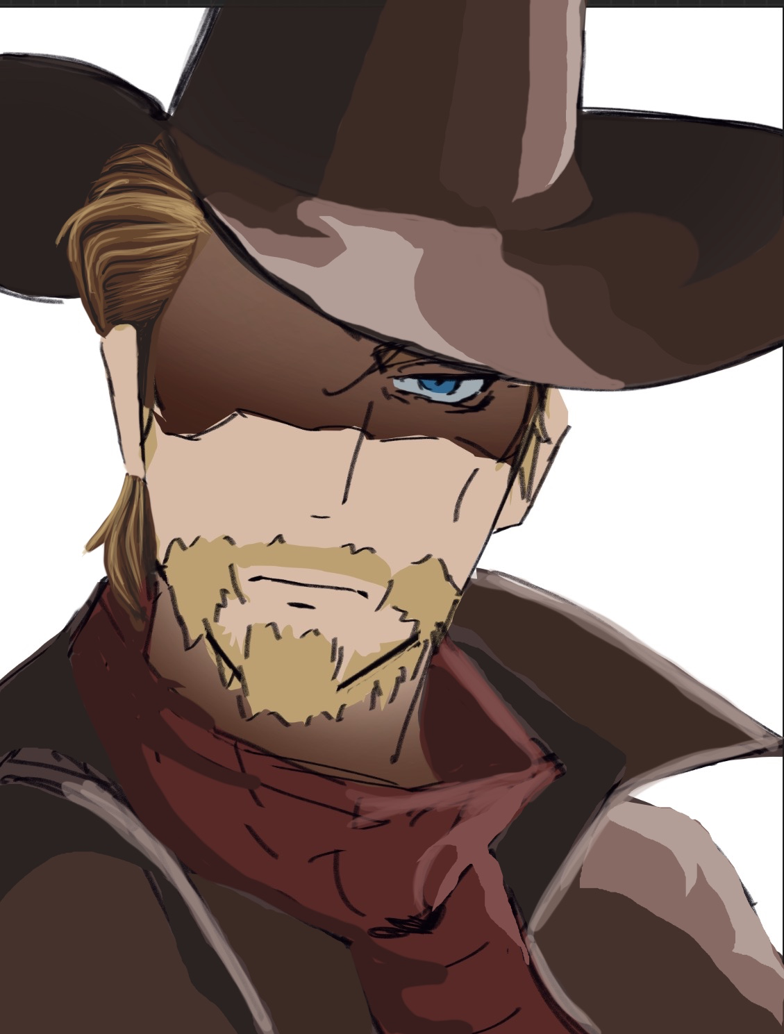
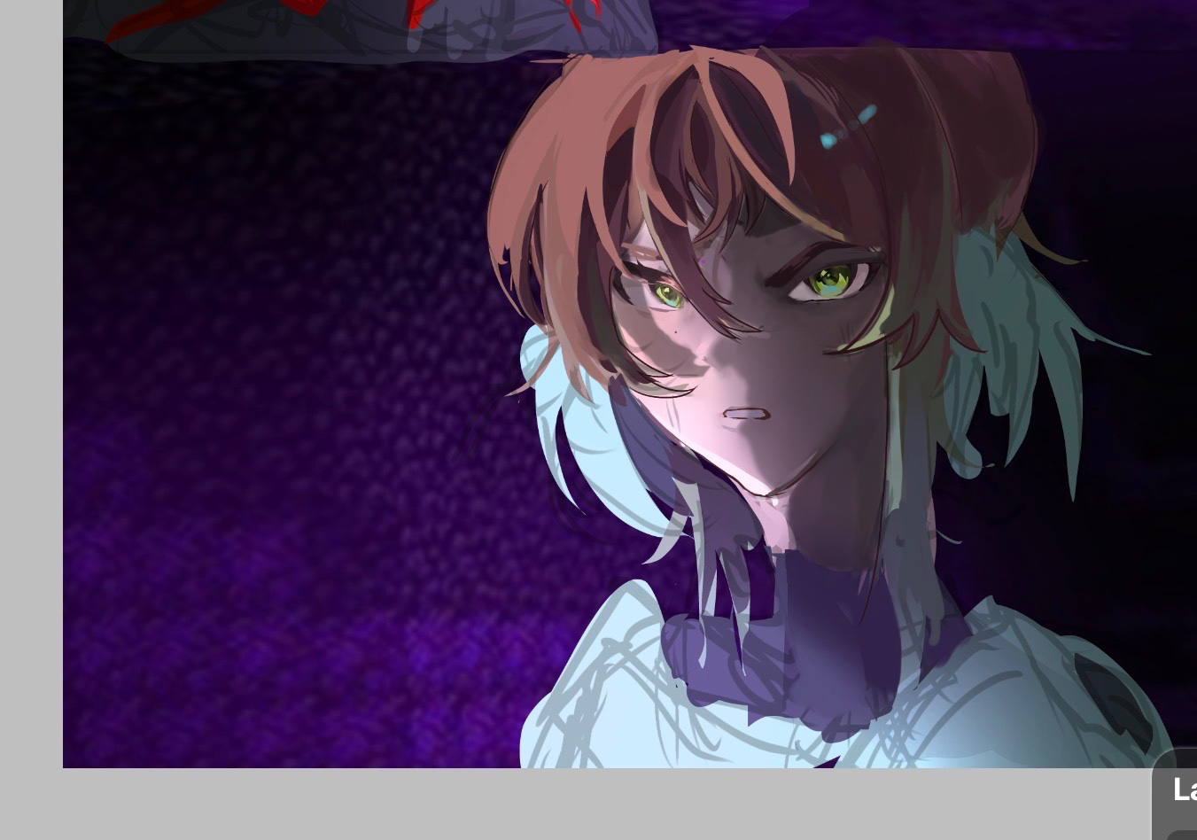
Been a copier/renderer for my entire 45 year art journey. Humbled myself by joining Artwod 1.3 years ago and started over. I wanted to really learn how to draw/create and not just be an art forger. Artwod has allowed me to enjoy art again.
#7
Rank
125
Upvotes
100
Feedback Given
95%
Helpful
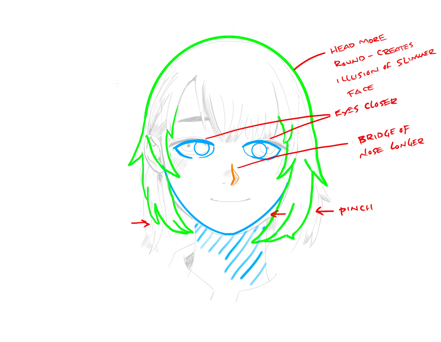
“Honestly you aren’t far off here. I think what is causing the illusion is that her cranium isn’t round enough. Being too pointy gives the illusion of a wider jawline. Her chin is pointy and your cheek”
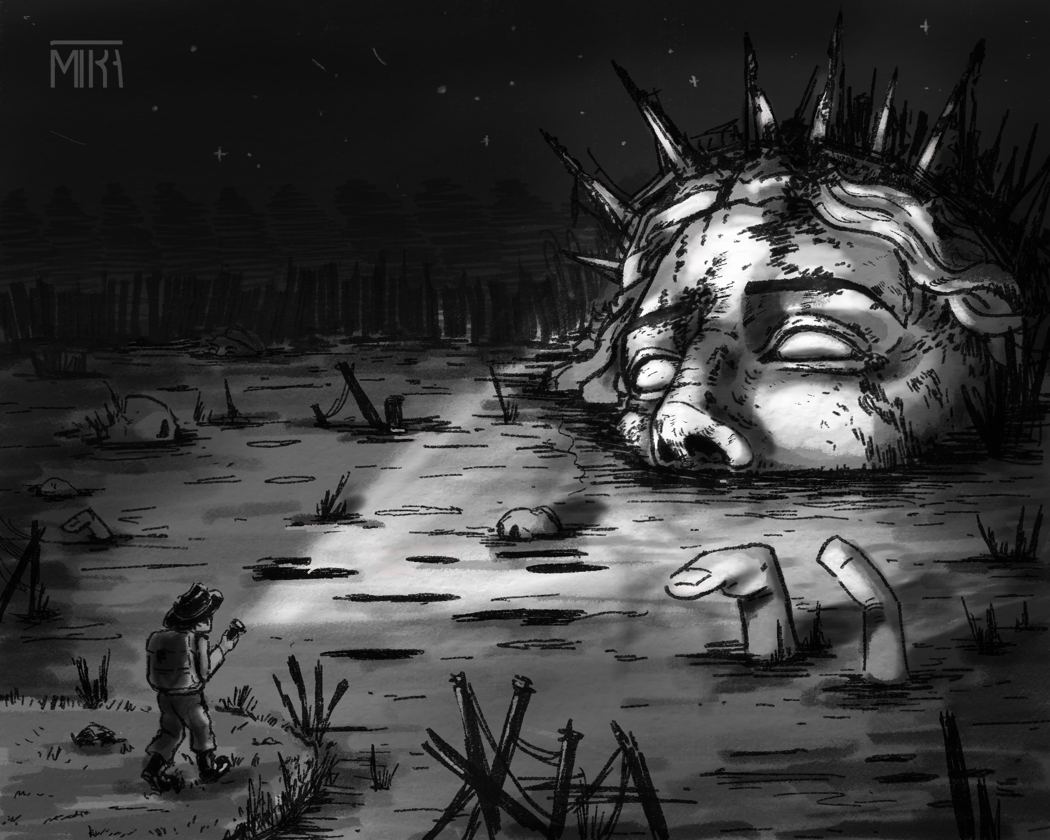
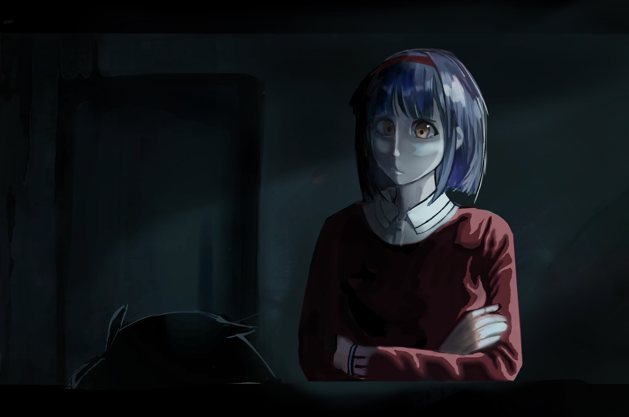
“Cool piece here and I think what you need is some contrast to give this depth and drama. You can really accentuate the the flashlight’s lighting and use it to create that depth and drama as well as g”
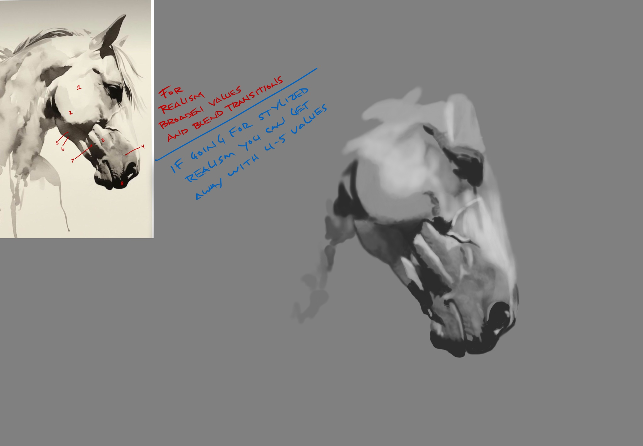
“In order to create a depth you need to broaden your value range. In your piece I am seeing maybe 3 values. If by “painting” you mean realism, then you are going to have to at least double your value r”
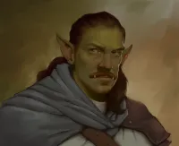
“I think you have a great start at a character here.With a little perspective and proportion it will work. I just threw in an idea but there would be many more to choose from based on the type of anima”
“You have a great piece here and I think it’s just lacking a little drama. That drama needs a story or a FOCAL point. That can be done with a little light. Right now your piece has one overall value or”
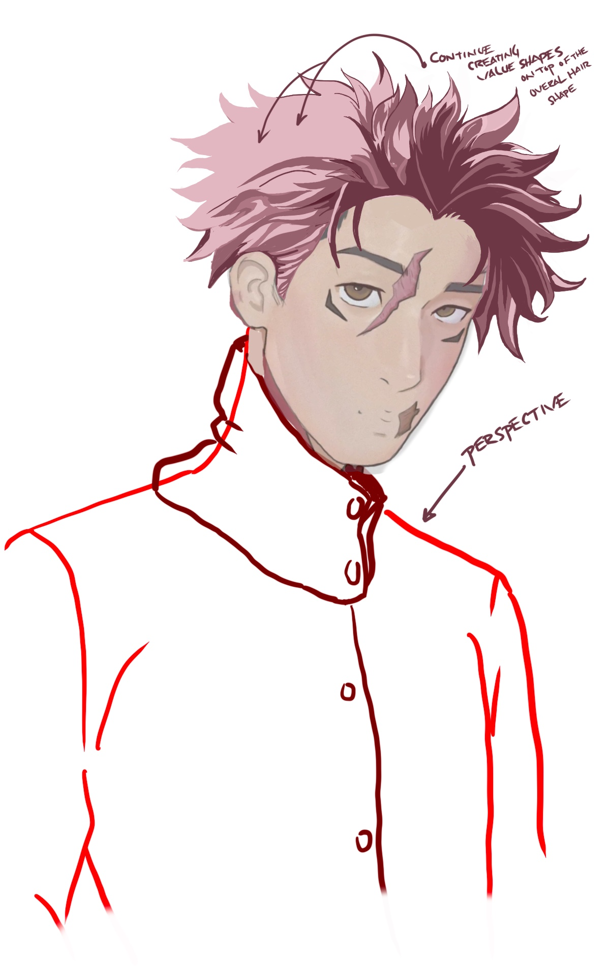
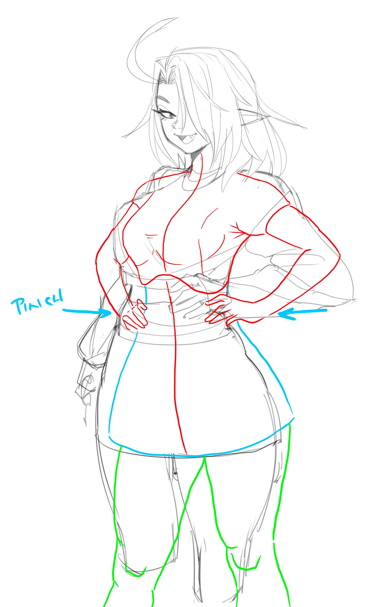
“Great job on the character portrait here. Tings to practice would be the figure mannequin and perspective. The torso perspective especially. For the hair you kind of have the right idea, you just need”
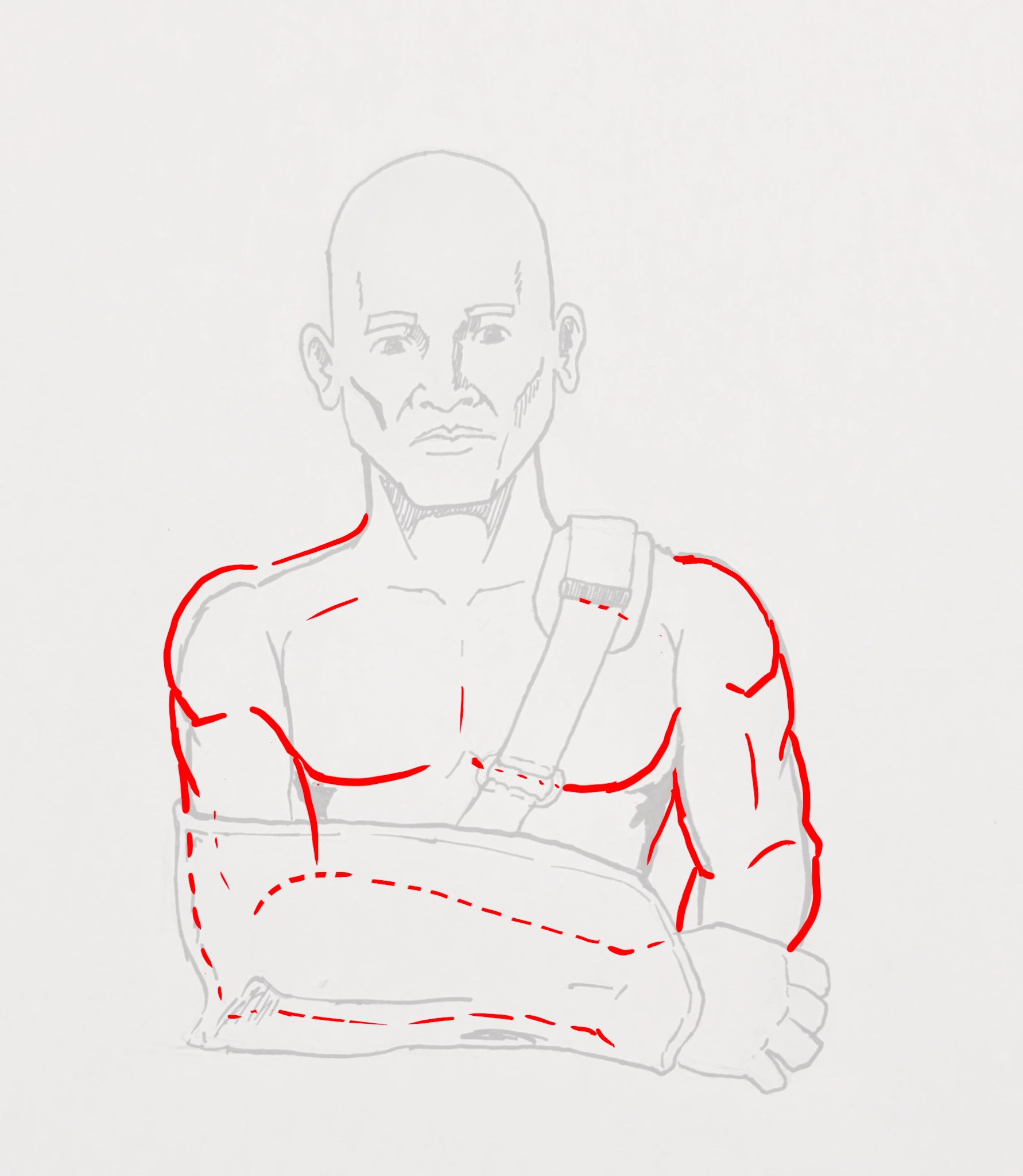
“You have a really good start here. Just a bit of proportion tweaking and you got it. One thing to note, the pec muscle overlaps the bicep as it connects to the upper arm as it tucks under the deltoid.”
“First of, nice character here. You did a really nice job on the figure and proportions. One idea would be to just expand on what you already started with a few more values. I went with a little red le”
“Good start here. I think a bit of practice with the figure mannequin and how the limbs attach to the torso and pelvis would be a great thing to work on to improve the fluidity of your figures. Hope th”
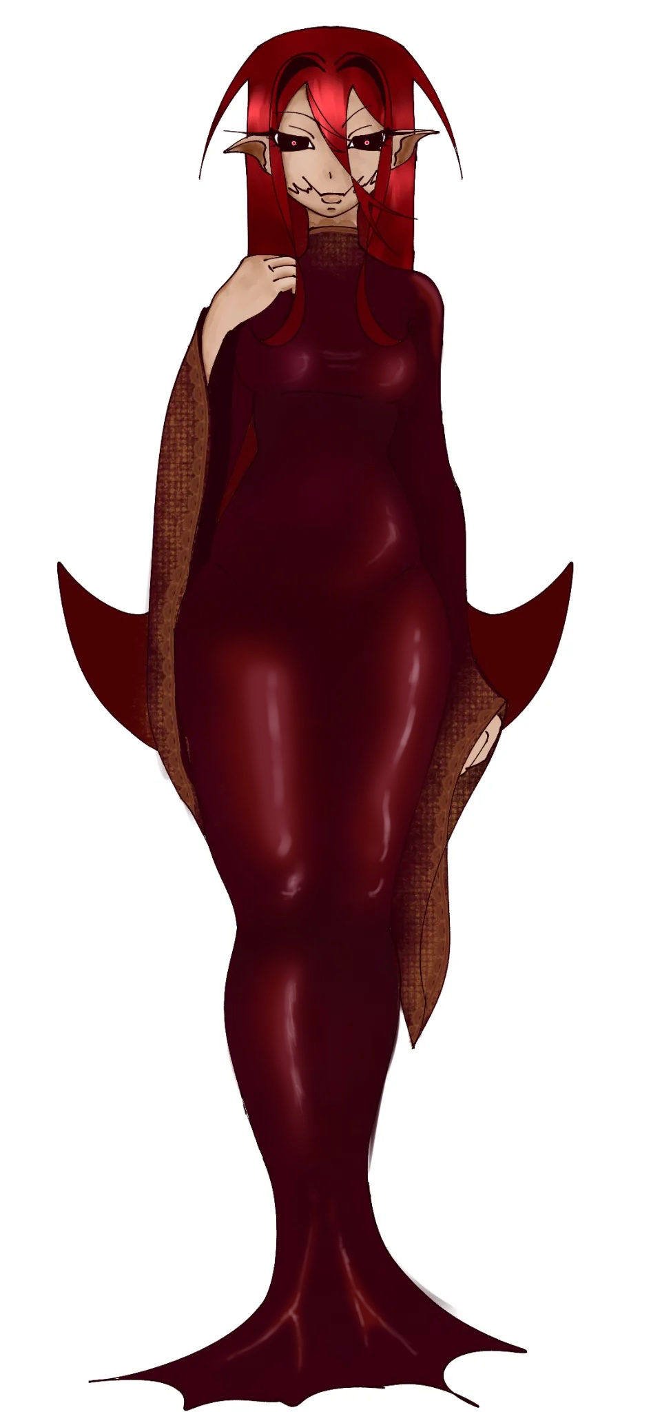
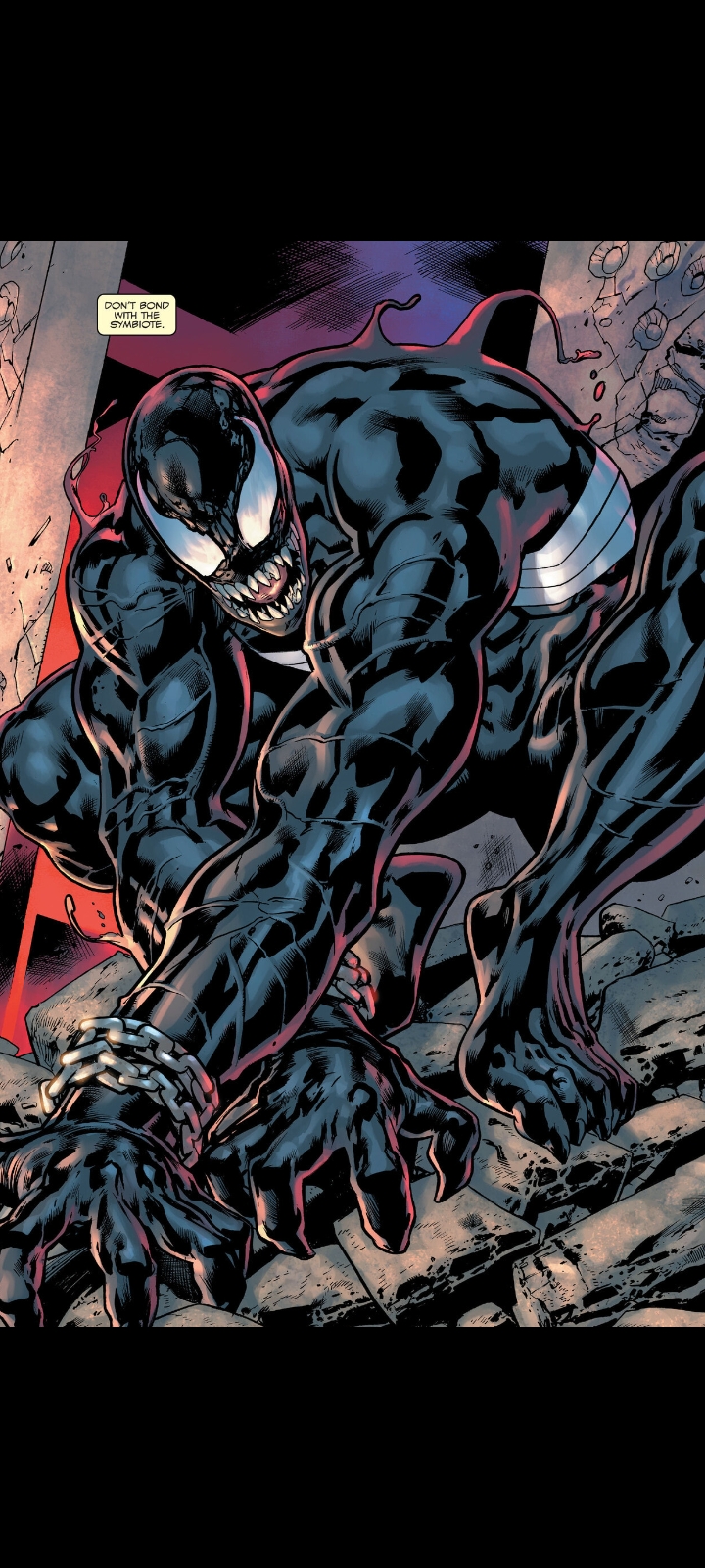
“Great character here. Nice job. One idea for the suit would be to add a lighter shadow and a dark value t try an enhance the shine of it. I think the leg space would’ve be there based on the perspecti”
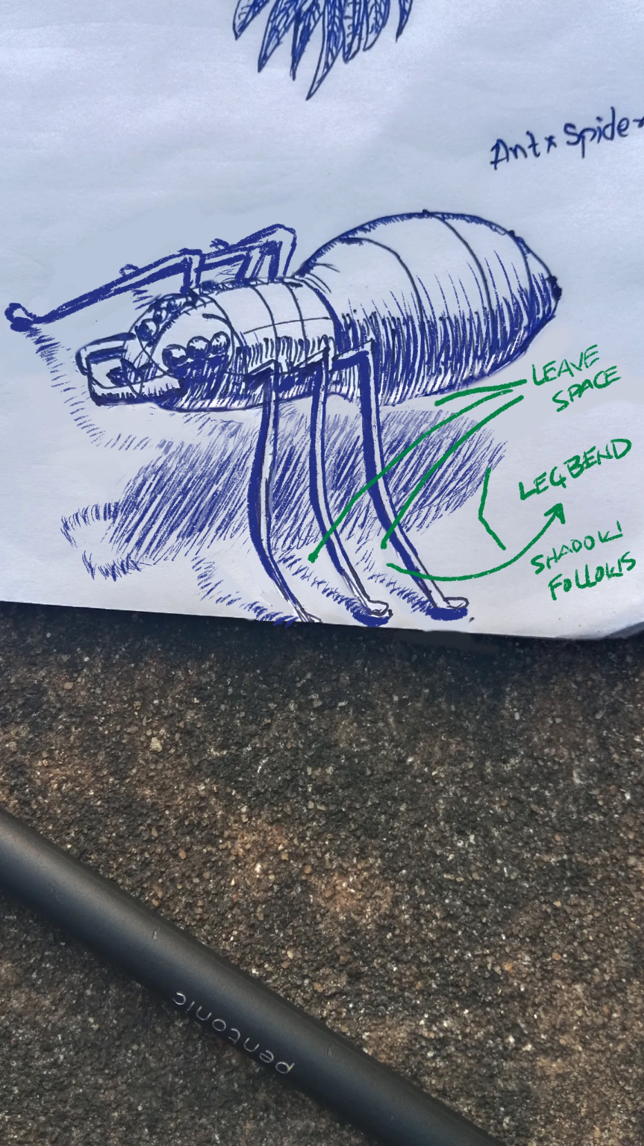
“Good spider design here. What can enhance the believability here is a lighter shadow that is further from the body. Gives the illusion of height with the long legs of the spider. Also, the shadow shou”
“To be honest, I think you just need to layer your artwork differently. I see the lighting coming from the front right of the image and you aren’t far off there. Just some tweaks to the dark side as we”
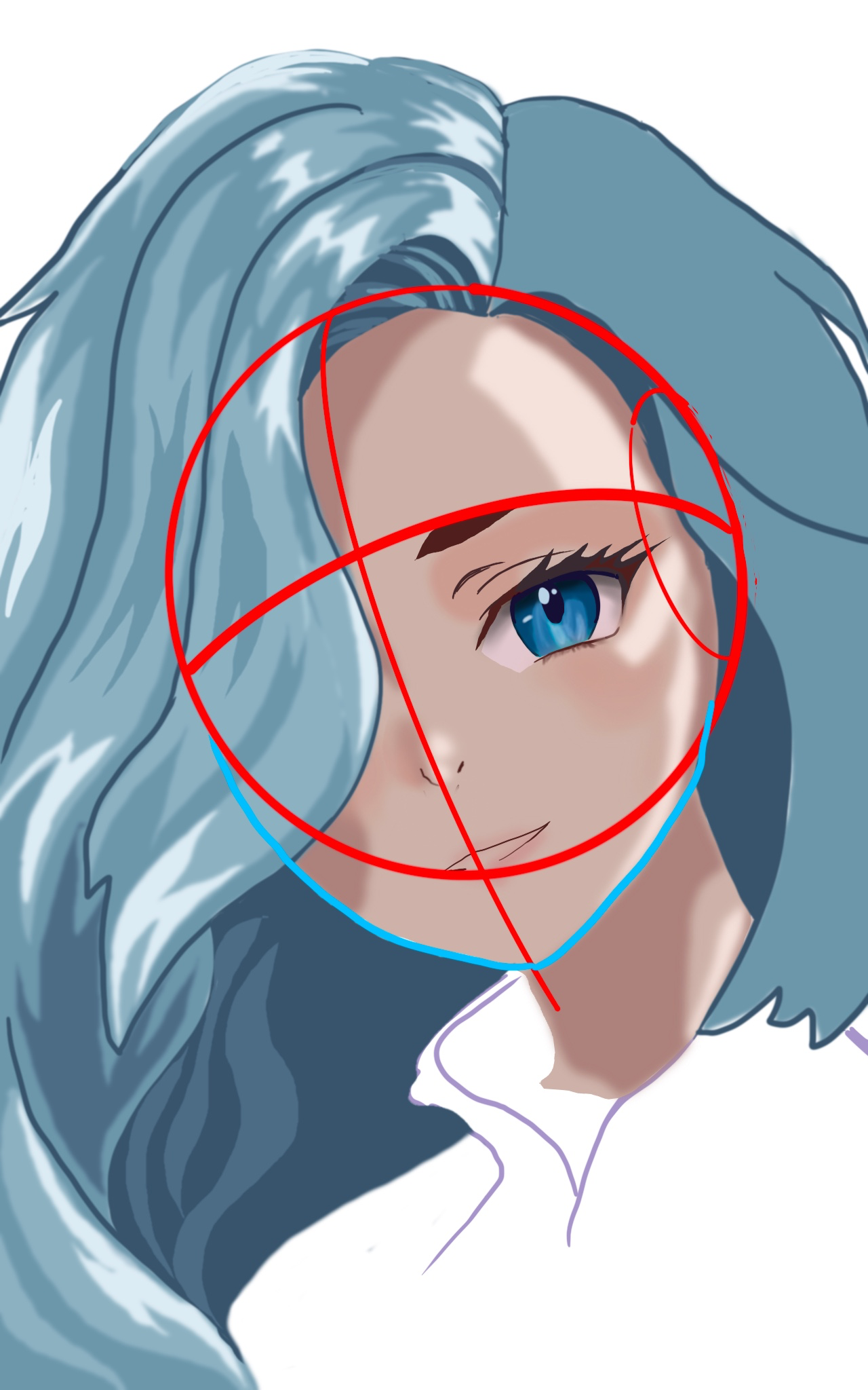
“Nice character design here. I think a little perspective practice will help you with the hair and how it follows the head sphere. As far as the rendering goes, you have the right idea but your values ”
“You are’t far off here. A little perspective practice will help you place the facial features. For coloring/rendering, try to pick out a base color for the hair, then create lighter values and darker ”
“This is such a great piece. I think right now the values are just too close together and everything is fighting for attention. I would try and put focus on the character. By darkening the background w”
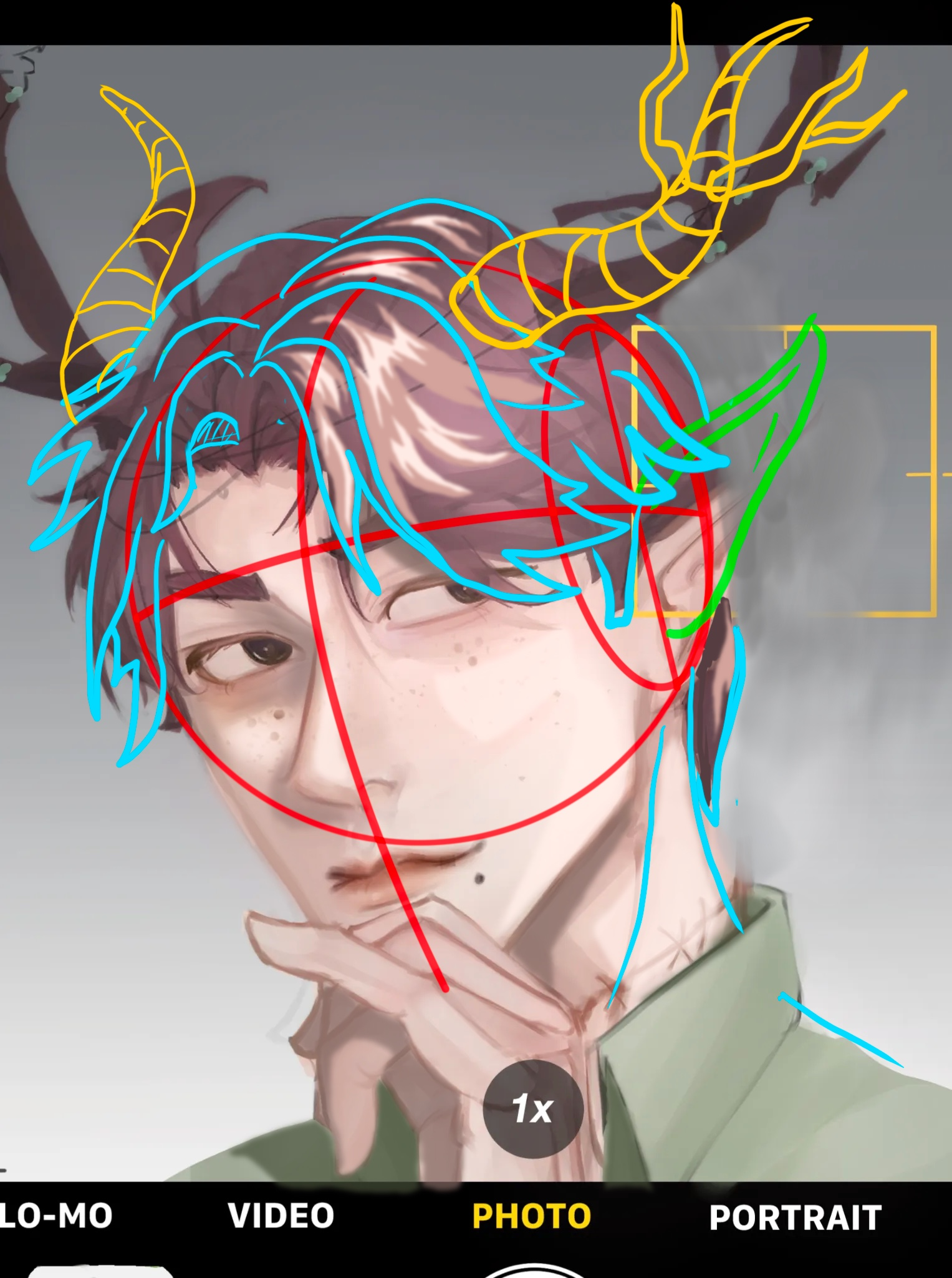
“Nice character design here. You are not far off. A little perspective Correction and I think it all works. Think about the sphere form and where the centerline would b. This will dictate where the bo”
“Nice character design here. For coloring you just need to choose a color. Then take that color and make two more colors from it, one darker in value and one lighter in value. This will give you the ba”
“I love the character you’ve created and the lighting is good. Just an idea but seeping the shadow side a bit and adding a couple of cast shadows from the hair could help the drama and believability. A”
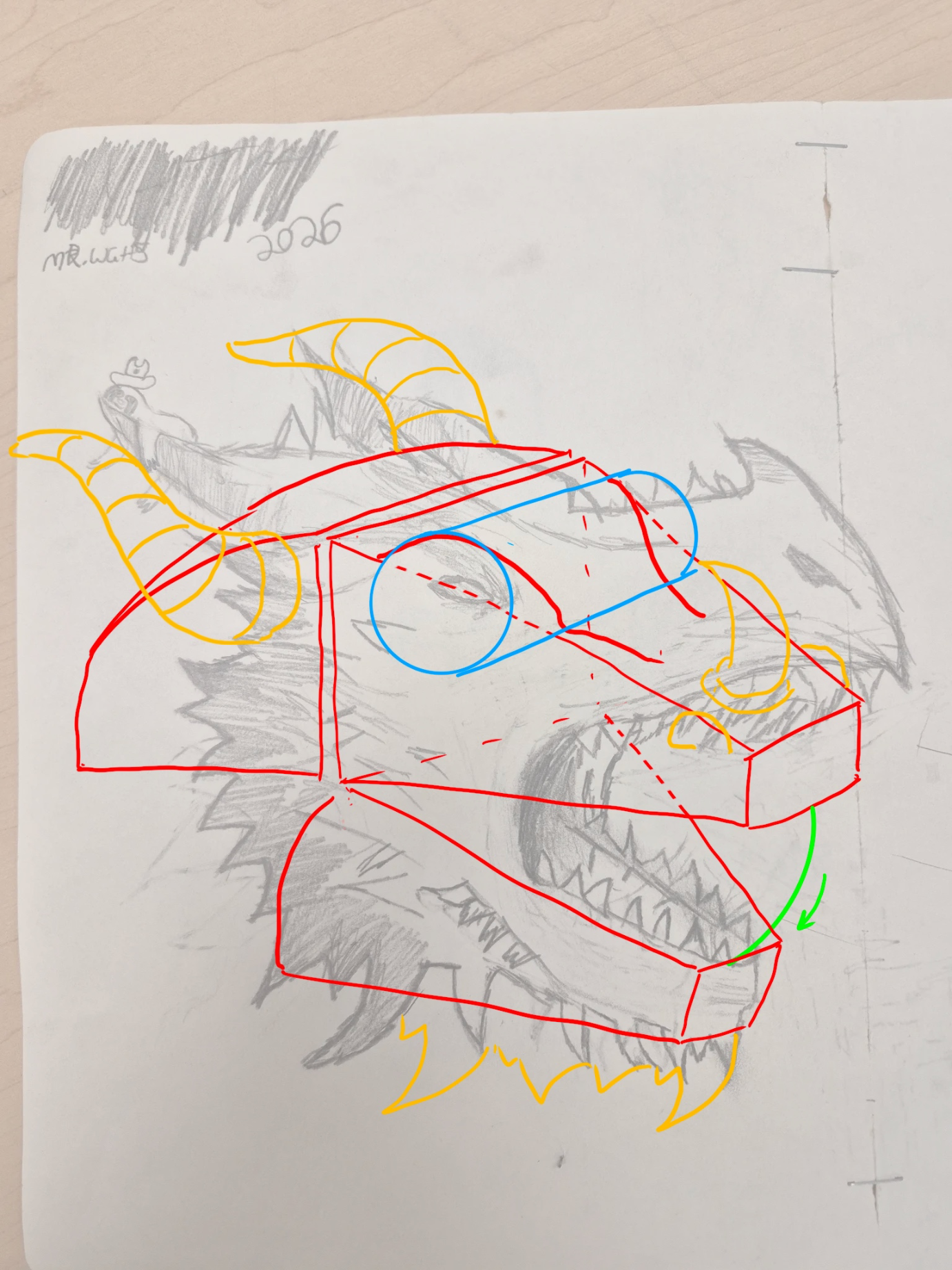
“Great job on the design of the dragon. I think if you can practice simple shapes in construction you can add a lot of volume to the dragon, making it appear more 3D and believable. Try to see the simp”
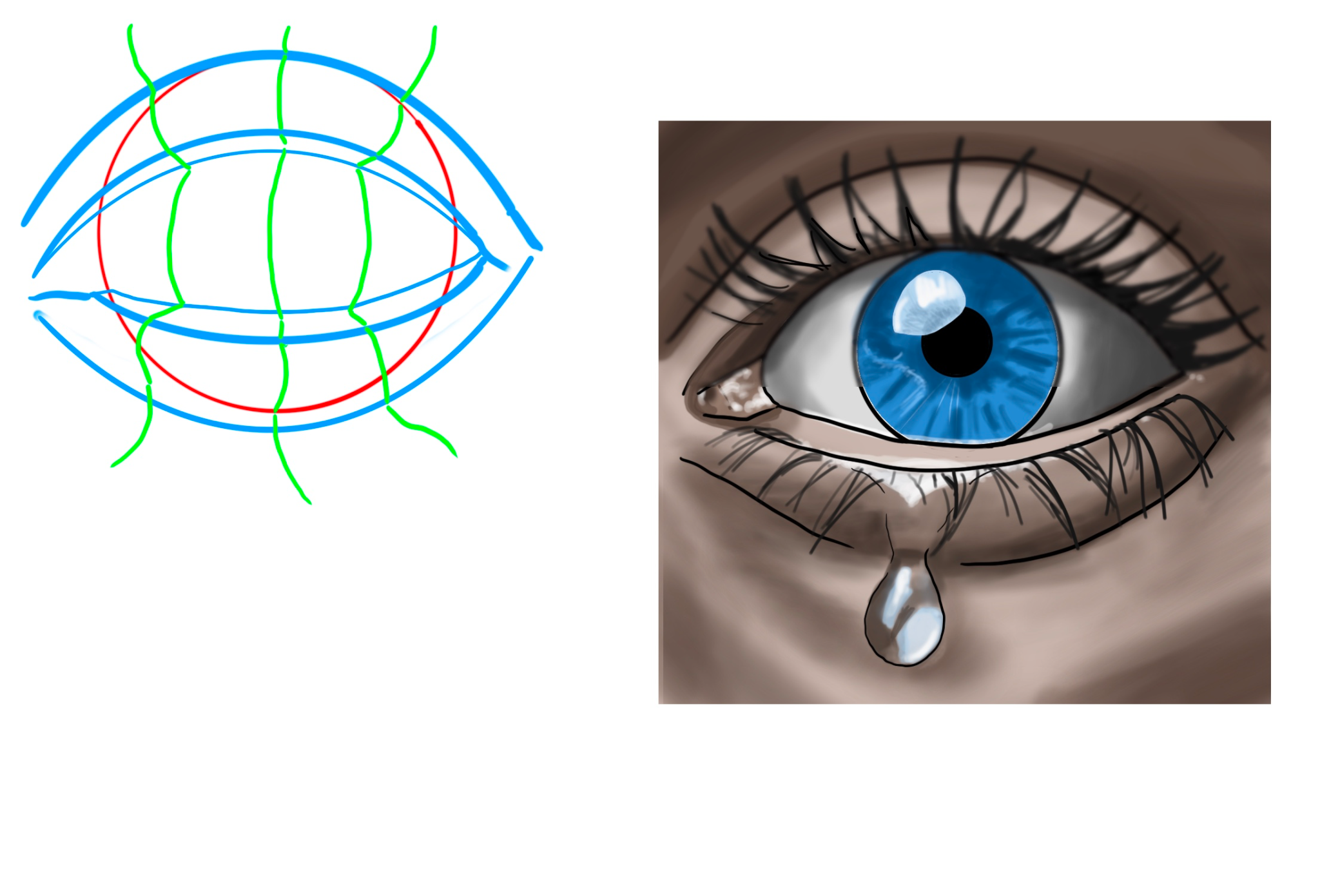
“First thing to practice would be form. The eyeball is just that, a ball. That ball sits inside of the eyelids. So the form of the eyelids must follow that sphere and they also have thickness. The gree”
“Love this piece and with just a few value adjustments I think you could really enhance the mood here. I’ve shown how you can really just darken all of the shadow side into one value. Then add in some ”
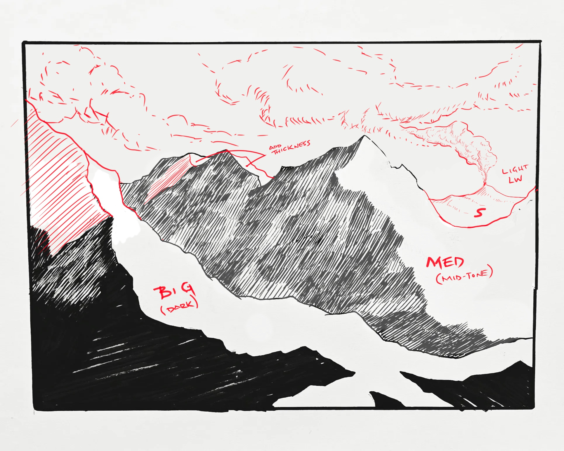
“Great foundation here. I think your values are good as the darkest is in the foreground and I think the middle ground looks good lighter. Don’t forget the thickness of the mountains(like a pyramid). I”
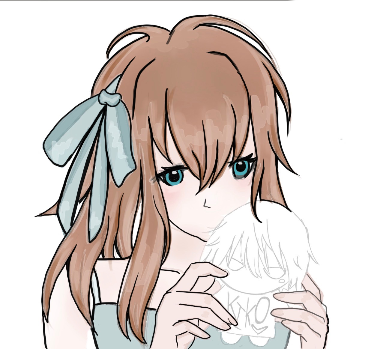
“I think you did a great job here and the only thing missing is the outline to give it form. Like the reference you used, it has an inked outline. You can see how this outline just enhances what you al”
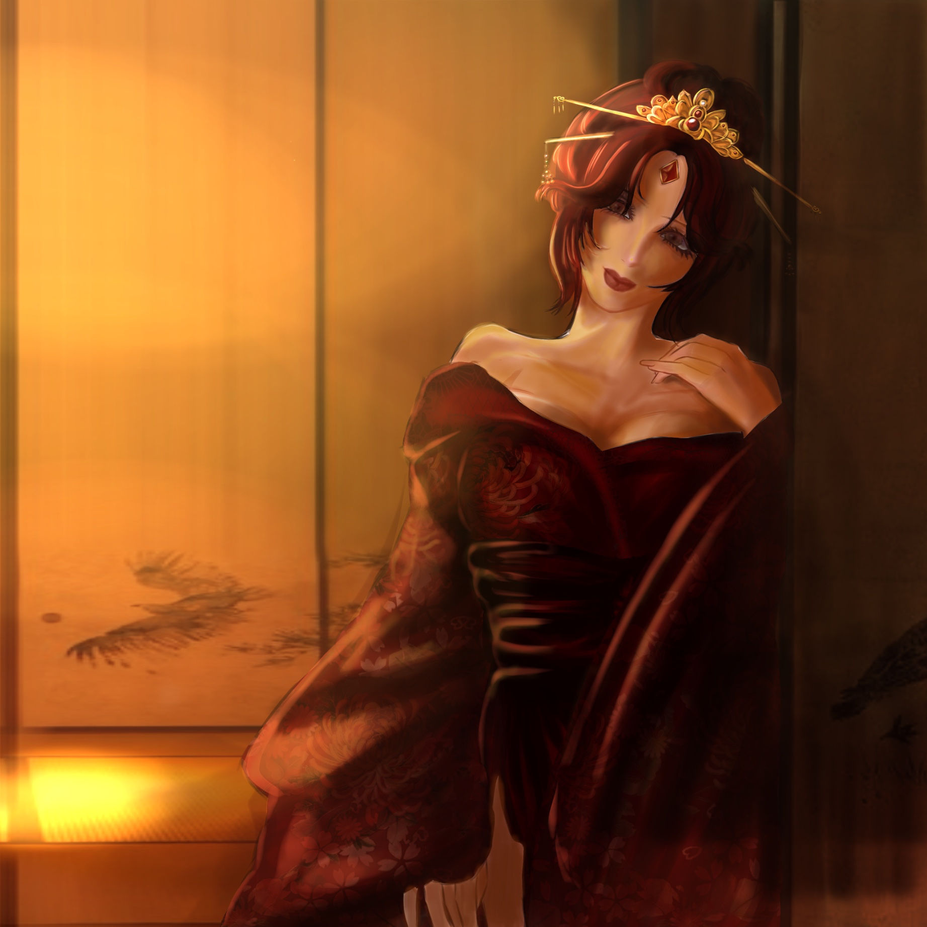
“First off, this is such a great piece. The mood and setting is superb. I think it could be enhanced simply by warming up your flesh tones to match the lighting. Also a quick deepening of the shadows a”