British illustrator & graphic designer. I love to help :)
#4
Rang
23
Upvotes
19
Feedback
100%
Hilfreich
“Looks just as sick as the last one!”
“To avoid getting caught in the details, I suggest focusing on the light areas and shadows and forgetting about drawing eyes/nose/mouth - that gets you stuck in drawing them how you think they should b”
“It’s very clear you’ve improved! Just keep studying everything you can :) I suggest creating studies of other people’s work that you like to practice what they do differently to you.”
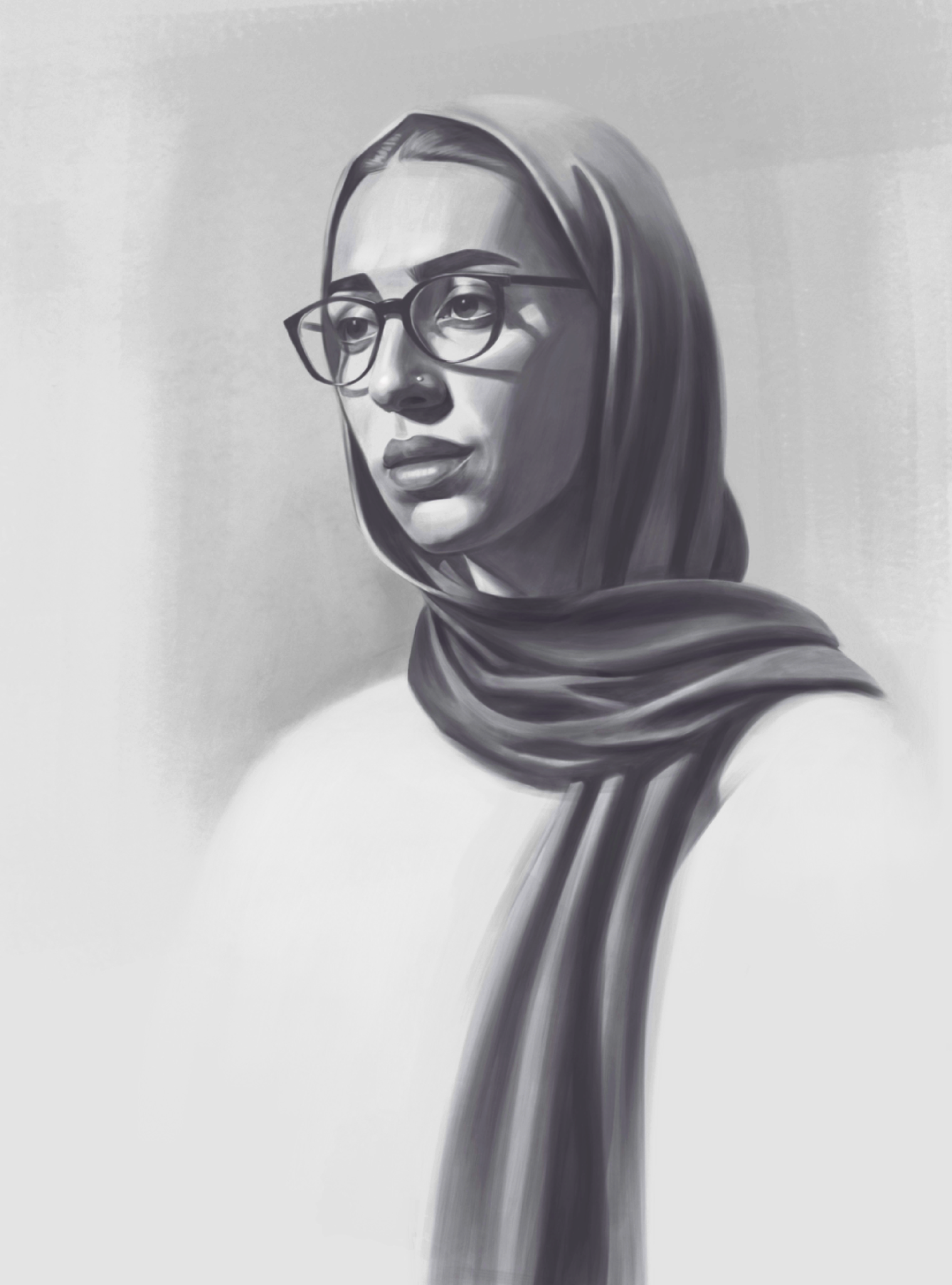
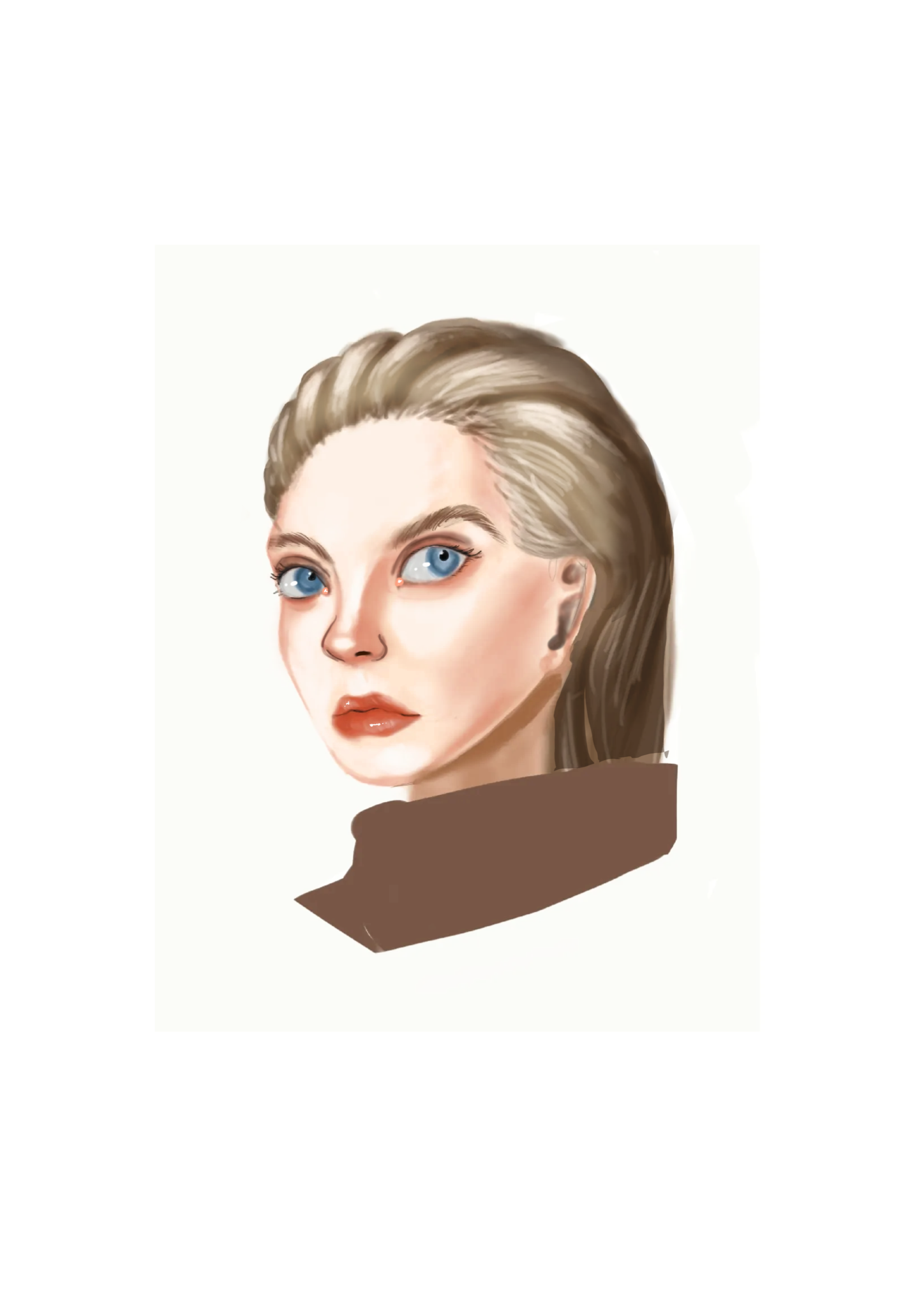
“Your portrait is gorgeous! Only you can tell if the anatomy & form is correct because we don’t have a reference, but it’s a great study. The only thing I would change (in terms of general advice) is t”
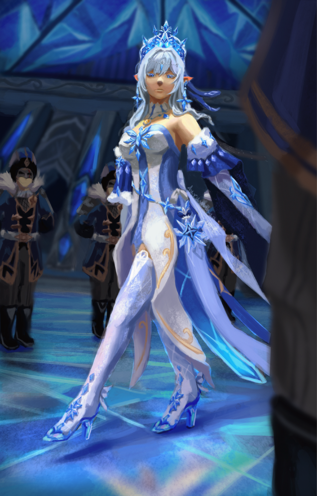
“I think the background it rendered fine as the focus is meant to be the character, so it’s better to have a slightly out of focus background if that’s what you’re going for. I think you’ve been stari”
“Painting over this drawing wouldn’t be super helpful for you as you mainly wanted rendering advice, so a lot of good it would do you for me to just render over it haha. Find artists you like and creat”
“If that’s their reference photo on the side, you should make the snout longer as in the reference it’s a but longer than yours. Their antlers are also longer and pointier. Otherwise great job!”
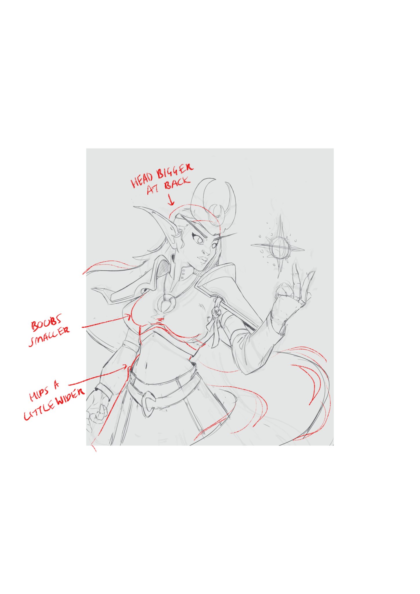
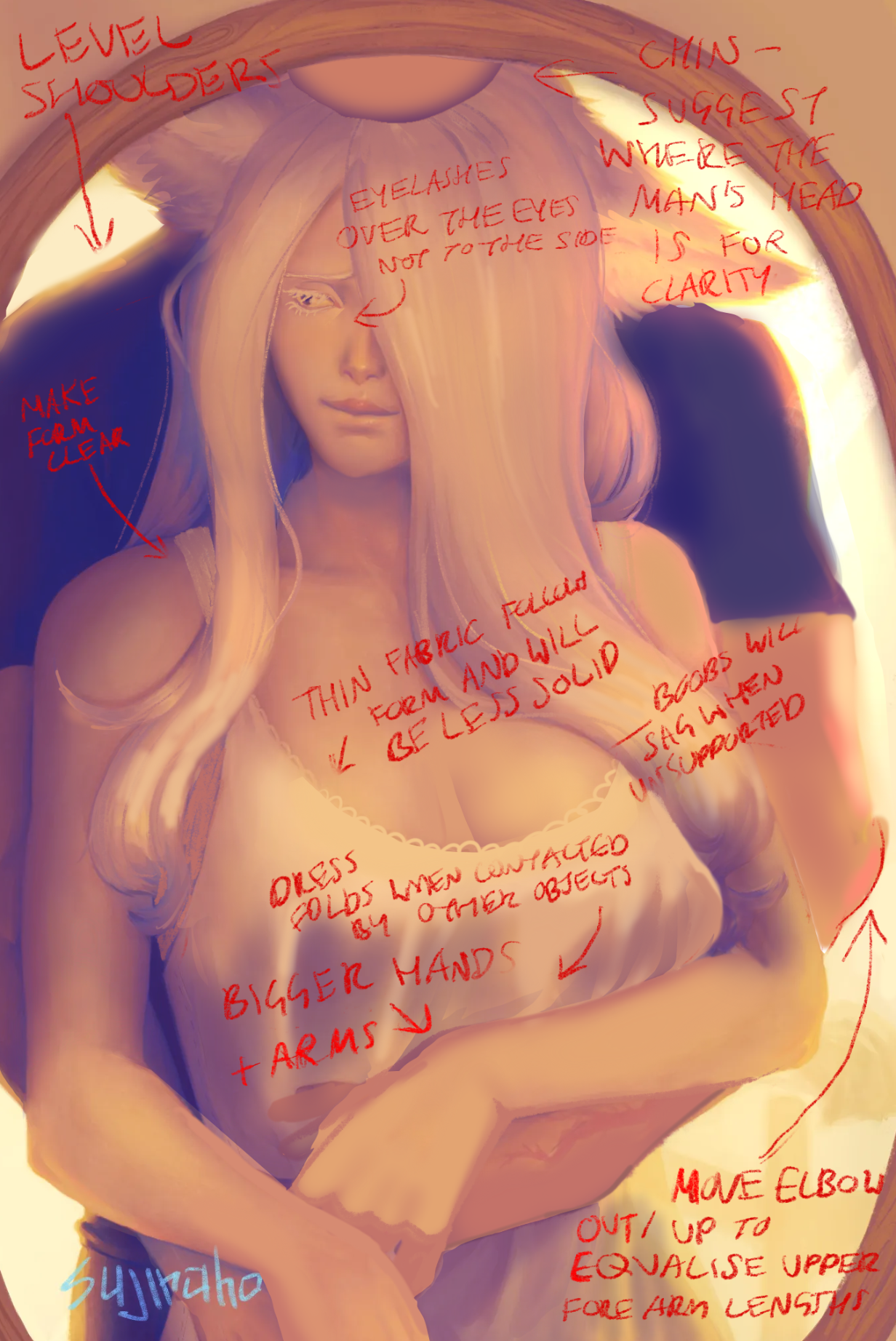
“Hi, since you mentioned it was your first attempt at drawing a woman I’ve made some anatomy suggestions. With the size of her body (quite slim) it’s unlikely her chest would be so large, I’ve drawn ov”
“Hi! The chest doesn’t need to move, you just need to move the centre point. The reason it looks off is you drew her sternum, which should always be in line with the centre of the chest, and then shade”
“This is a really good first attempt! Values are difficult, for future studies I would start out black and white, then greyscale, then colour. That’ll help you avoid making everything too pale. Darker ”
“Hi! I think your main problem is the position. Her left arm is stretched out uncomfortably behind her, while her right shoulder is pushed uncomfortably forward. The joint of the shoulder doesn’t move ”
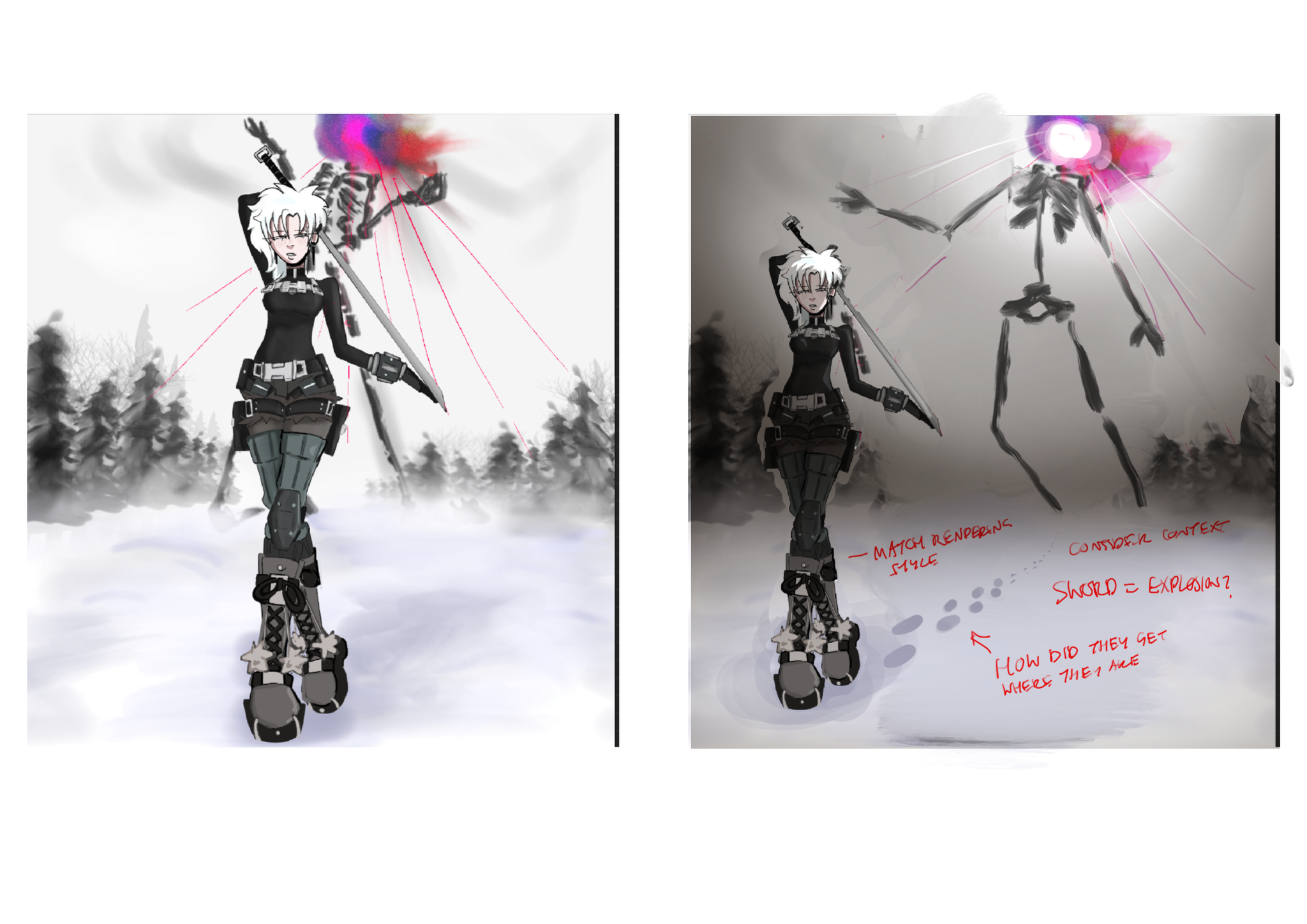
“I would move the character so the monster is clearly in view and the story is more clear. The ‘dullness’ is just a lack of contrast which can be fixed with some stronger lighting! The lines from the ”
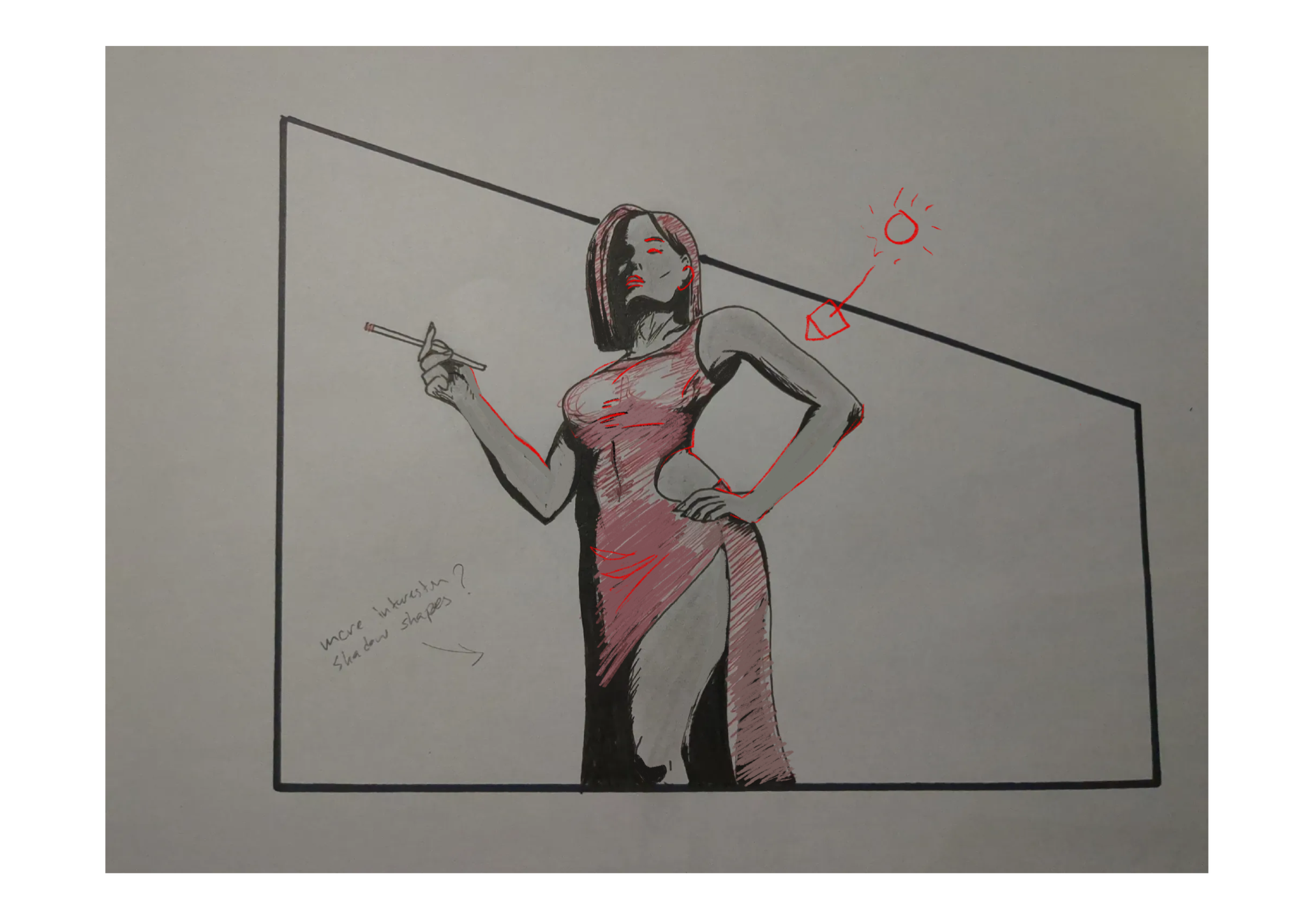
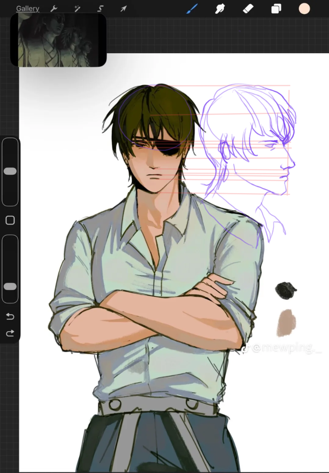
“I really love the drawing! You can give dimension to your drawings by using contrast to showcase the forms even with soft lighting. For example the light is brightest on the parts nearest the mirror (”
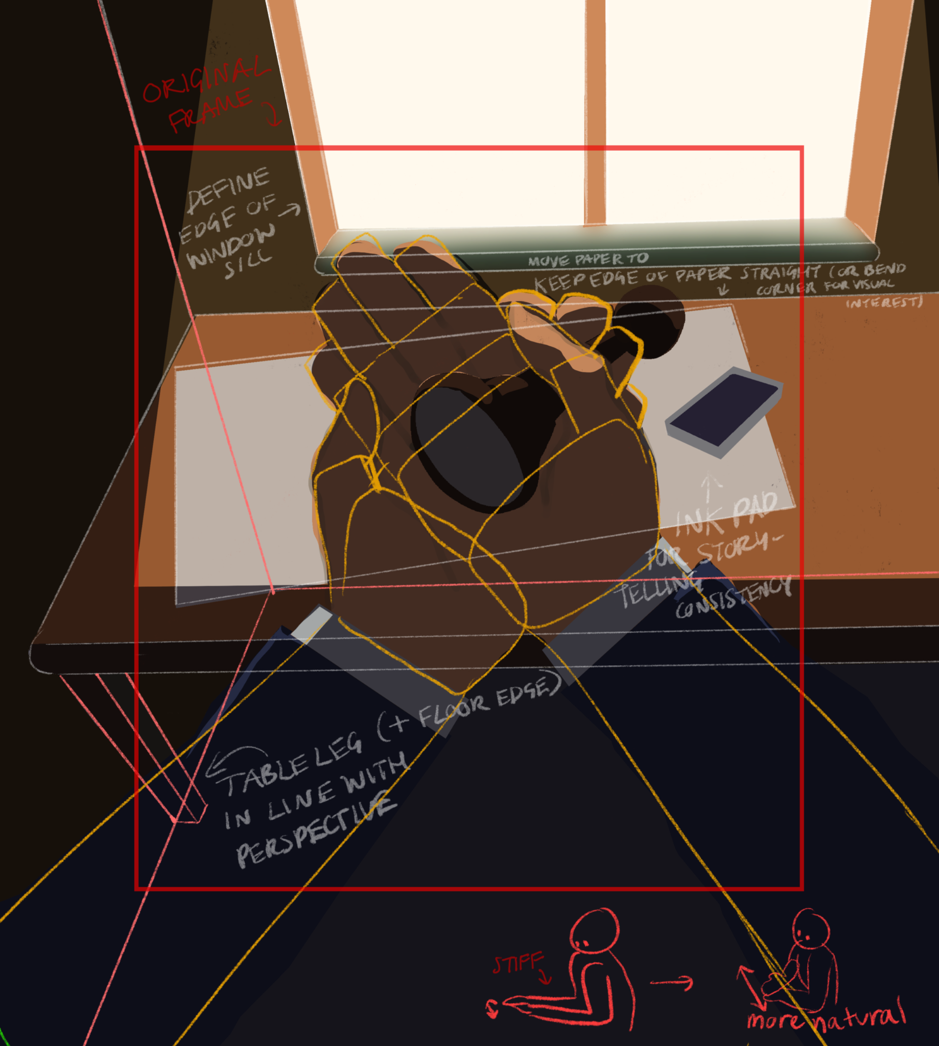
“I think the perspective is really interesting, the elbows are quite close together so spreading them out will make them look more natural. I’ve attached a paintover for what I would change, alongside ”
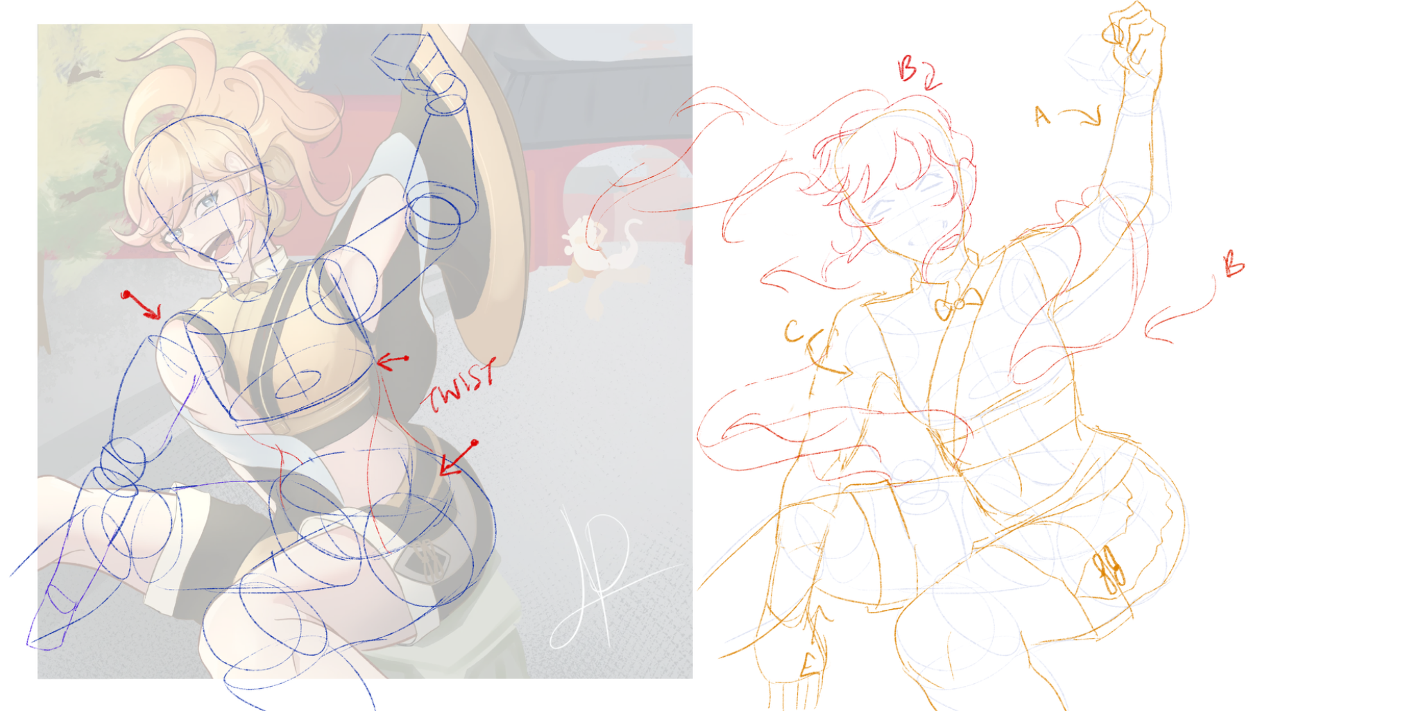
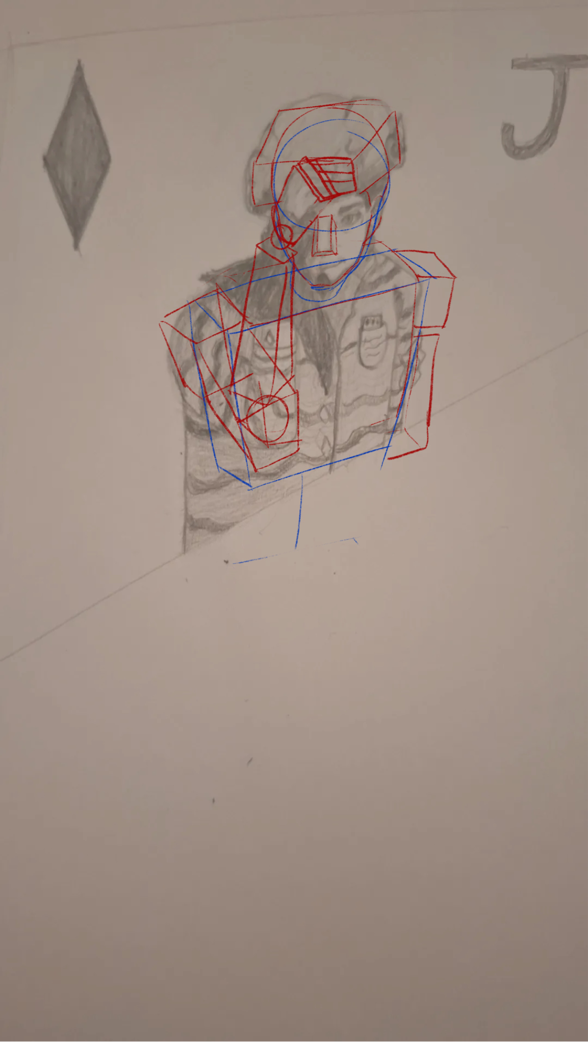
“It’s a great idea to use the box as a starting point, in my version I’ve shown how I like to use boxes. The body is a little more complex than just one box for the whole upper body. I’d suggest using”
“It’s unclear what kind of feedback you’re looking for, I think the face looks cool and stylised, definitely not bad proportionally. That being said if you can draw them from the side, just use parall”
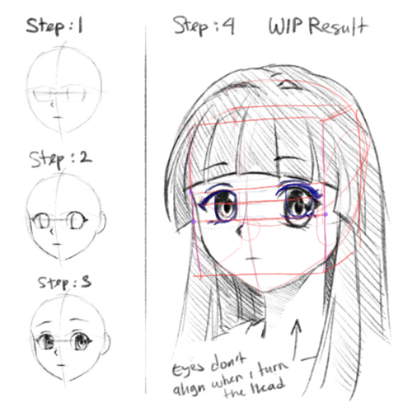
“This is an easy fix! You’re just forgetting to use your guidelines. The eyes need to be pretty much the same height and width in the perspective you’re using here. Just use construction lines from on”
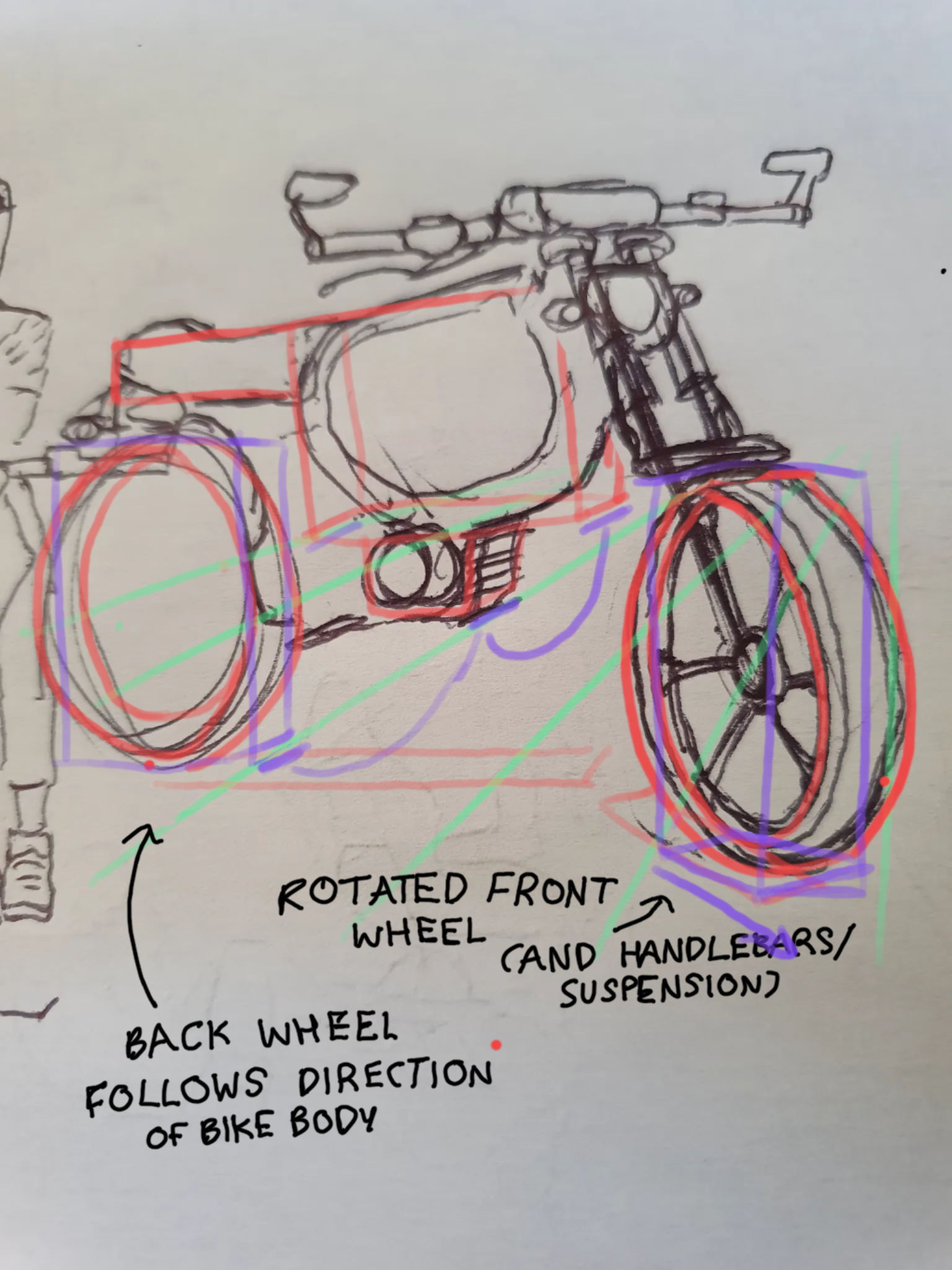
“I’ll deconstruct it for you! The front wheel and its attachments are turned in a separate direction from the bike, so the wheel is turned towards the viewer. This means the plane of the tracks is more”