Why Your Colours Look Dull (And Why More Saturation Won’t Fix It)
@lin posted a piece called Angel in the rendering category of the Artwod Community Hub with three specific frustrations: the halo looked wrong no matter how many times it got fixed, the colours stayed dull even after piling on blending modes to boost the saturation, and the background was a complete mystery.
That middle one is the trap (we have all gone down the blending mode rabbit hole at two in the morning, adding layer after layer and watching it get worse).
@yurei471 came back with a paintover and a genuinely detailed breakdown, and almost every point in it comes back to the same underlying idea.
Loading comparison…
Reveal the original or paintover
Why Do My Colours Look Dull?
Because dullness is a relationship problem rather than a slider problem, and saturation is the slider everyone reaches for first.
A colour reads as vivid in comparison to what surrounds it, so when every element in the piece sits at a similar saturation, cranking all of them up together changes nothing except how tiring the image is to look at. The character stays the same distance from the background, and the eye still has nowhere to land.
The first piece of advice in the paintover was to unify the tones across the whole image, which sounds like the opposite of what you want when things look flat, and it works because once everything belongs to one coherent palette you can then break that palette deliberately in the places you want attention.
How Do I Make My Shadows Less Flat?
Stop making shadows out of the same colour turned darker.
@yurei471’s advice was to vary the hue and the saturation in shadow rather than reaching for a darker version of the base, and this single habit separates paintings that feel alive from paintings that feel like a flat colour with a grey wash on top. Real shadows pick up bounced light from everything nearby, so they shift in temperature as well as in value, and giving them that shift costs you nothing while changing everything.
Try pushing your shadows slightly cooler when your light is warm, or warmer when your light is cool, and watch how much richer the same drawing becomes.
Where Should White Go in a Painting?
Keep it for the finishing touches.
The paintover made the point that white belongs in highlights rather than in base colouring or shading, and the reason is simple enough: white is the brightest value available to you, so the moment you spend it on a large area you have nothing left to make anything sparkle. Painting with white early flattens the whole value range, because everything else has to be measured against something already at the top.
Lay in your lights as light greys and warm tints, then save pure white for the few places that genuinely catch the light. Our Intro to Painting course builds this properly, and it is the one to take if colour is where you keep getting stuck.

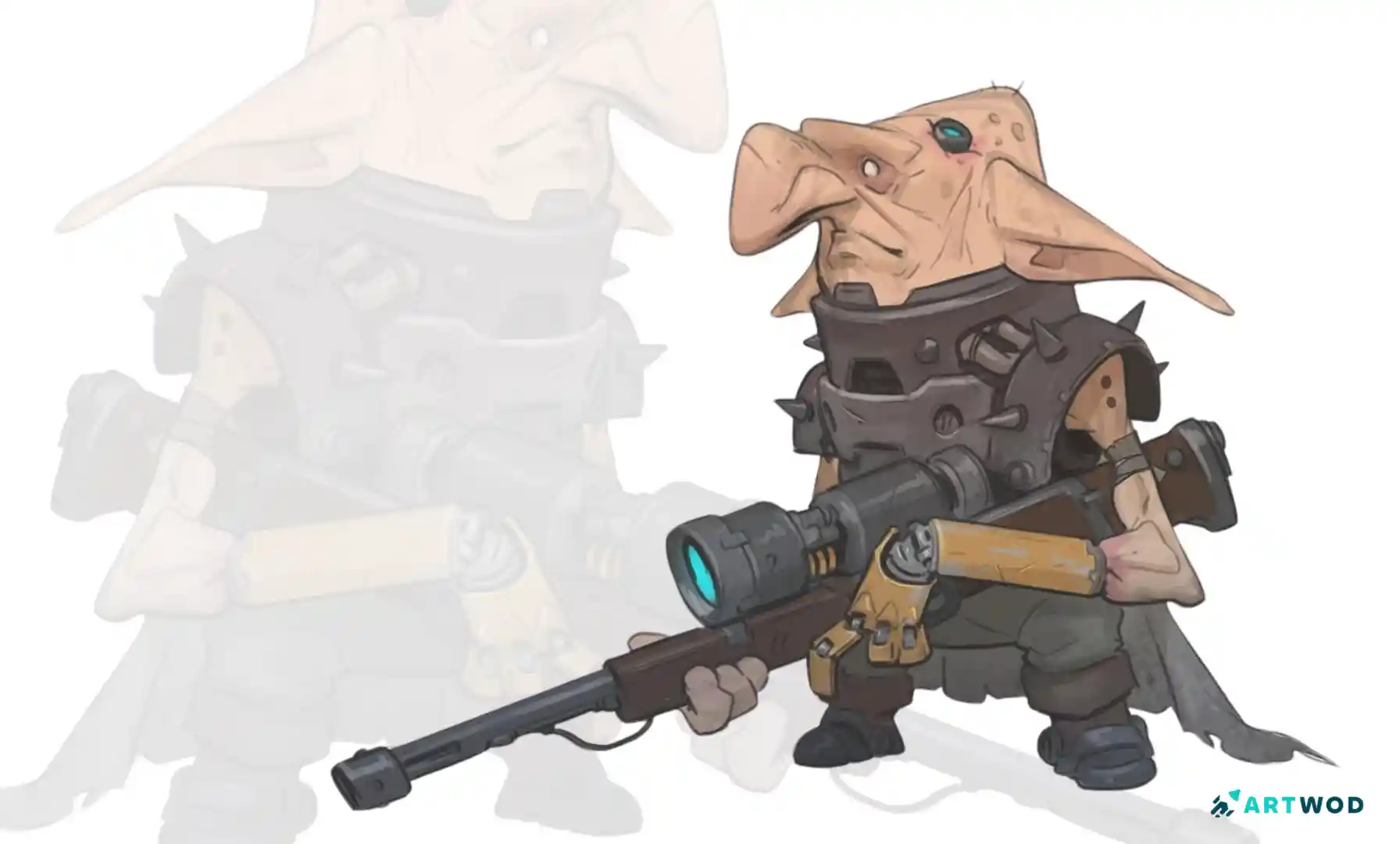
Troll painting by Antonio Stappaerts, Digital 2d Art
How Do I Approach a Background?
Push it away from the subject on purpose, in both saturation and value.
@yurei471’s suggestion was to desaturate the background and make it either much darker or much lighter than the figure. A background that sits slightly darker than your character gives you nothing, while one that sits decisively darker creates separation, depth and a clear place for the eye to go.
Decide which direction you are pushing before you start rendering, because this is a structural decision rather than something you fix afterwards with adjustment layers.
Why Does Blurring the Background Look Wrong?
Because blur describes distance, and most people apply it to everything that is not the character.
The note in the paintover was to avoid blurring everything around the figure, since elements sitting on the same plane as the character should share a similar level of focus. When you blur an object that is standing right beside your subject, you are telling the viewer it is far away while the overlap tells them it is not, and the image quietly stops making sense.
Work out what is genuinely behind your character and what is beside them, and let only the distant things soften.
How Do You Paint Metal?
Metal has almost no colour of its own, so what you are really painting is everything around it.
The advice here was to make the metal reflect its environment, including the main figure, which is the step most people skip. A metal ring beside a character picks up that character, and the background behind it, and the light source above it, and those reflections are what make it read as metal rather than as a grey ring.
@yurei471 also flagged that the rings were missing their cast shadows, and cast shadows are what attach an object to the world. Without them, the rings float in front of the painting instead of existing inside it, which may well be part of why @lin’s halo kept looking wrong no matter how many times it got repainted.

Metal render example, digital 2d art
How Do I Make the Character the Focus?
Give the figure more of everything the background has less of.
The final point was to add detail, saturation and contrast to the main figure, which follows naturally once the background has been pushed down. Your focal point should hold the highest contrast, the most saturated colour and the sharpest edges in the image, and every other area should give some of that up so the figure can have it.
FAQ
Why do my colours look dull even after adding saturation?
Because saturation only reads in comparison to what sits next to it, so raising everything at once changes nothing. Unify your palette first, then break it deliberately at your focal point.
How do I stop my shadows looking flat?
Shift the hue and the saturation rather than only the value, so shadows move in temperature as well as in darkness.
Should I paint with pure white?
Only in the highlights. Spending white on base colours or shading flattens your whole value range, since nothing can be brighter afterwards. The Intro to Painting helps with understanding values.
How dark should my background be?
Decisively darker or lighter than your subject rather than slightly, and desaturated relative to the figure, so the character separates clearly.
How do I paint metal so it looks like metal?
Paint the environment reflected in it, including your character, and give it cast shadows so it sits in the scene rather than on top of it.
Where can I get feedback on my rendering?
Post it in the Artwod Community Hub and say exactly what is bothering you, as @lin did. Naming your frustration gets you an answer about that frustration.


Keep practising
Explore roadmapsHelp an artist with feedback
Find work to critique