What Makes a Character Design Instantly Recognizable
What Makes a Character Design Instantly Recognizable
Silhouette is everything
The silhouette is the first and most honest test of a character design. If it reads at thumbnail size, in black and white, with no detail - the design is working. If it doesn't, no amount of rendering will fix it.
The silhouette is made up of every element that breaks the outline of the body - the overall shape of the character, the hair, the clothing, any signature accessories or weapons. Every element that sticks out is either contributing something distinctive or adding noise. There's no neutral. If you can swap one character's silhouette with another's and not notice, neither design is working hard enough.
The fastest way to test your own character's silhouette: fill the drawing with flat black and step back. What you see is what a viewer sees in the first half second. Make it count.
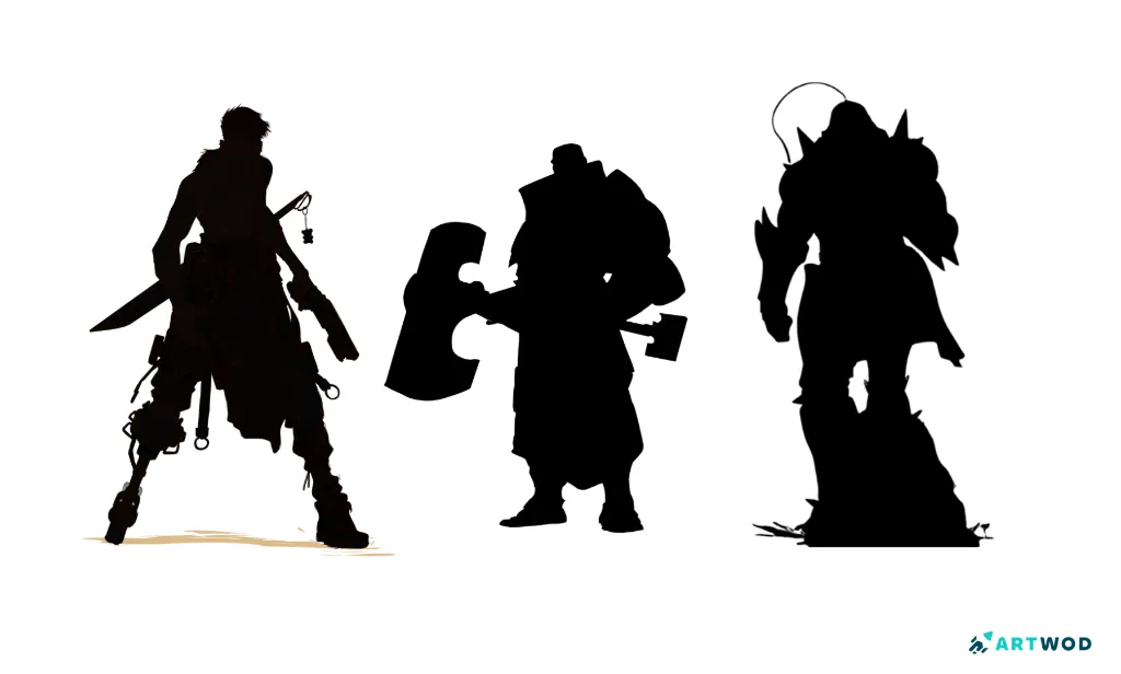
3 silhouettes of different characters
Shape language
Every shape carries a psychological association that operates below conscious thought. Circles read as friendly, soft, approachable. Triangles read as dangerous, sharp, untrustworthy. Squares read as solid and reliable.
Great character designers apply this deliberately - a villain built from sharp triangular forms reads as threatening before a single word of dialogue. The viewer has already made a judgment before they've processed anything consciously.
This doesn't mean every character needs to be made entirely from one shape. It means the dominant shapes in a design should support the character's personality rather than contradict it.
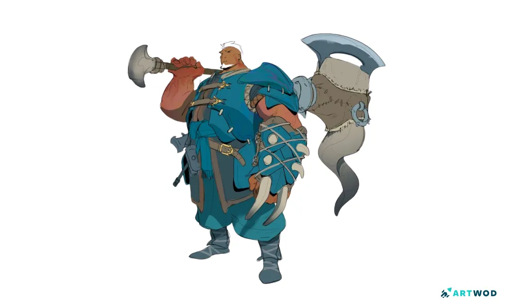
An example of shape language in Character design by Antonio Stappaerts, digital 2d
Color as identity
The most recognizable characters in history are often inseparable from their color. The palette doesn't just make the character look good - it communicates personality, faction, mood, and power at a glance.
A dominant color, a secondary color, and one accent that draws the eye to the most important feature. Three colors used with intention are almost always more powerful than ten used loosely. The accent color is particularly important - it's where you tell the viewer to look. Place it on the face, the weapon, the signature accessory, wherever the character's identity is most concentrated.
Color also creates instant differentiation within a group. In an ensemble cast, no two characters should share a dominant color if you want them to be individually recognizable. Color is the fastest visual shorthand you have.
Proportion and exaggeration
Realistic proportions are forgettable. Pushed proportions are memorable.
A character with a slightly oversized head, unusually long legs, or an exaggerated silhouette reads as designed - not accidental. The exaggeration doesn't have to be extreme. It just has to be intentional and consistent with the character's personality.
A powerful character with a broad chest and narrow waist reads as physically dominant. A nervous character with a small frame and slightly too-large eyes reads as vulnerable. These aren't accidents - they're designers making the body language of the character permanent.
The key is that the exaggeration should reinforce what you want the viewer to feel about the character, not undermine it. Pushed proportions in the wrong direction create confusion rather than recognition.
The one thing rule
The most recognizable characters usually have one thing - one visual element so distinctive that it becomes synonymous with the character itself. A specific hairstyle. A scar. A weapon they always carry. A piece of clothing. A color combination that exists nowhere else in the world of the story.
This isn't about adding more detail. It's about making one detail so clear, so consistent, and so specific that it becomes the character's signature. Everything else in the design exists to support it rather than compete with it.
When you're designing a character and nothing feels distinctive, the problem is usually that too many elements are trying to be that one thing at once. Pick one. Make it undeniable. Let the rest support it.
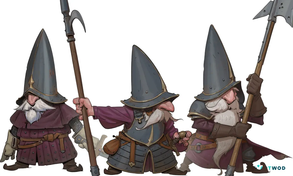
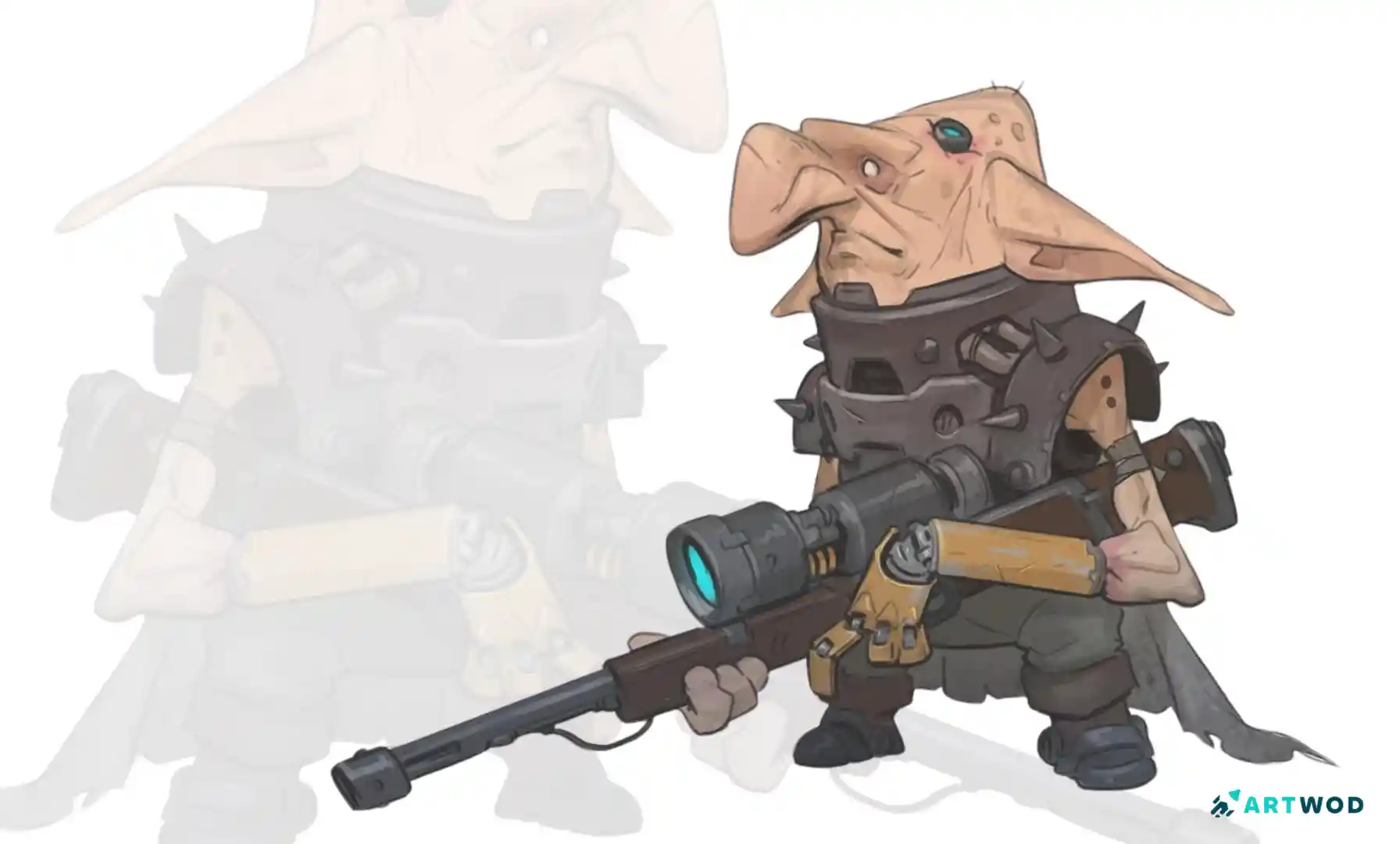
Dwarf character by Axel Van Nederkassel, digital 2d
Consistency across poses and expressions
A character design that only works in one pose isn't a character design - it's a drawing. Truly recognizable characters read as themselves from any angle, in any mood, doing anything. That consistency comes from understanding the character as a three-dimensional volume with a specific set of proportions, not as a flat drawing you happened to get right once.
This is where the construction underneath the design becomes critical. If you understand the character's head as a specific sphere with specific planes, you can draw it from below, from behind, in extreme perspective, in any expression - and it still reads as the same character. If you only know what the character looks like from the front, you don't fully know the character yet.
Character sheets exist for exactly this reason. Front, side, back, three-quarter, key expressions, key poses. Not because you'll always need them, but because drawing them forces you to understand the character as a volume rather than an image.
F.A.Q
How do I create a strong character silhouette?
Fill your character with flat black and check if it's still readable with no detail. If shapes are merging or the outline feels generic, push the distinctive elements - hair, clothing, accessories - further until the silhouette is unmistakable. The Figure Road covers construction and form, which is the foundation a strong silhouette is built on.
How does shape language work in character design?
Circles suggest friendliness, triangles suggest danger, squares suggest reliability. Apply the dominant shape to the areas of the character with the most visual weight - the head, the torso, the overall silhouette. It doesn't have to be literal, just directional. Practice applying shape language to your own characters in Artwod's Practice Section.
How many colors should a character design use?
Three is a reliable starting point - one dominant, one secondary, one accent. The accent goes on whatever you want the viewer to notice first. More colors aren't wrong, but they need a clear hierarchy or they compete rather than communicate.
How do I make my character look consistent from different angles?
Study the head and body as three-dimensional forms rather than flat shapes. The Portrait Road is particularly useful here - it covers head construction from multiple angles, which is the hardest part of character consistency to get right.
Why does my character design feel generic?
Usually because no single element is distinctive enough to become a signature. Identify the one thing that should define the character visually and push it until it's undeniable. Then check whether everything else is supporting it or competing with it. If you're not sure what's working and what isn't, submit your design to the Artwod Community Hub for specific feedback from artists who design characters regularly.
How do I improve my character design skills?
Study characters you admire and reverse-engineer the decisions - what's the dominant shape, what's the accent color, what's the one signature element? Then apply those principles to your own designs. The Figure Road gives you the structural foundation, and the Community Hub gives you the feedback loop that turns study into improvement.


Keep practising
Explore roadmapsHelp an artist with feedback
Find work to critique