New: switch between gallery and single view here.
Lazy bastard
#6
Rank
94
Upvotes
58
Feedback Given
100%
Helpful
“As requested, feedback on anatomy. I think the gesture and hatching are pretty good. - body height is between 6-8 heads for adults, split in the mid around section where legs start (omg the cens”
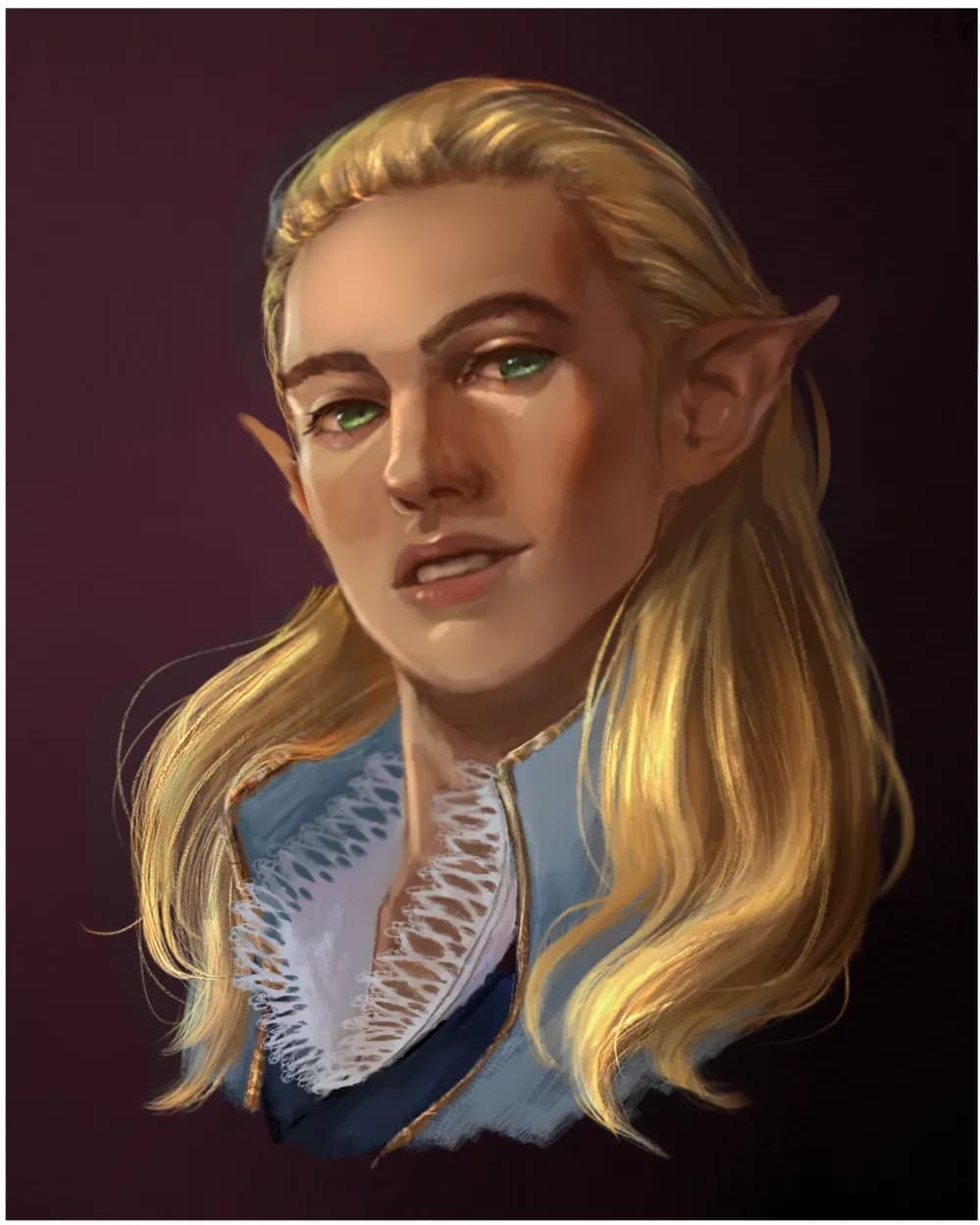
“The pose is indeed very nice indeed, I like the story telling aspect of the image. For rendering try to use not just soft edges (airbrush) but also hard edges (e.g. hard round brush) or it will all”

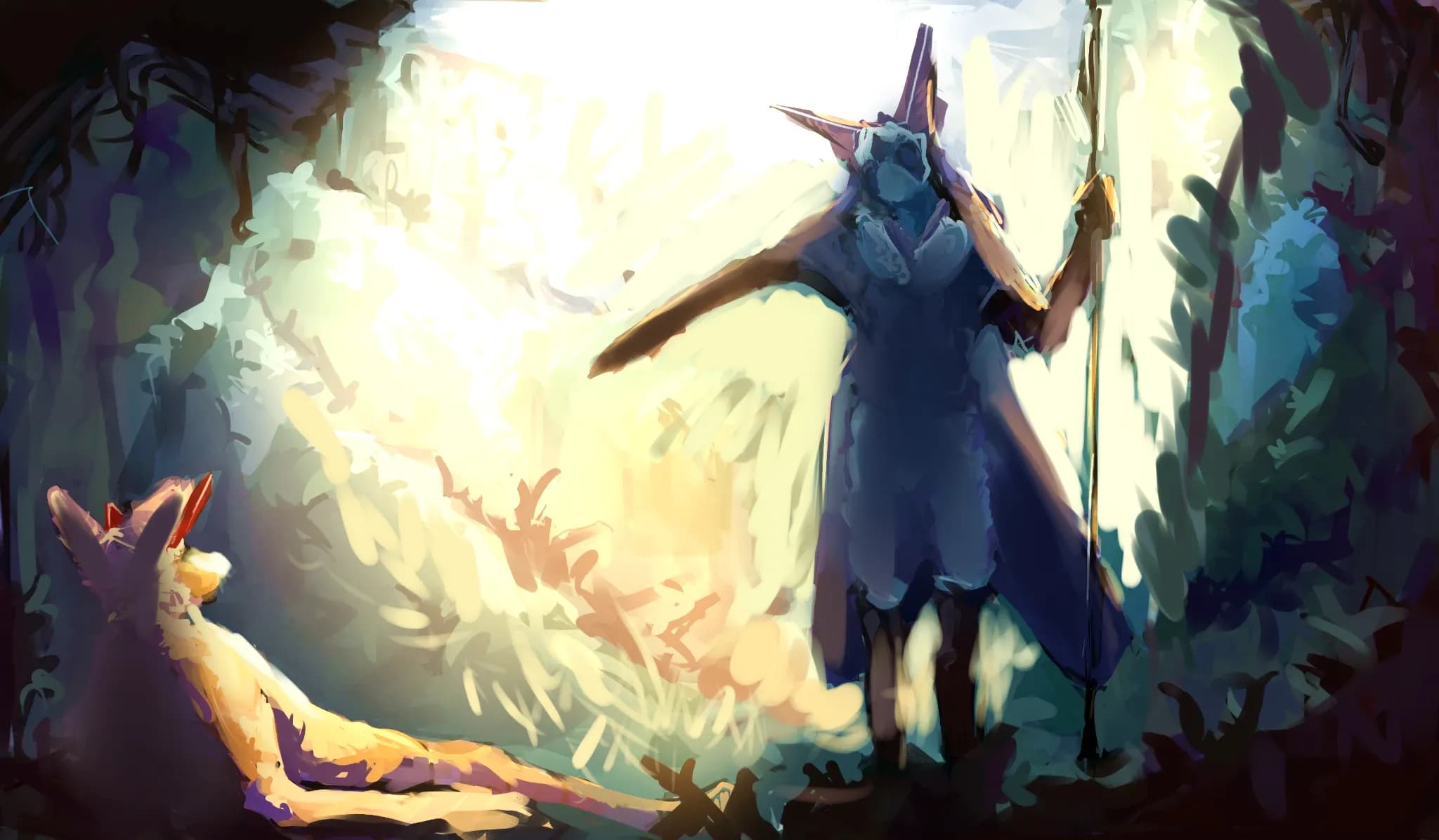
“The lighting looks flat because you can't decide on where the light comes from. Parts of her are shaded as if there was diffused ambient light around (chest), but also weak light from above (horns, fa”
“Since it is an image imitating a fight in a ring I would go for light from above, just like on a stage or in an actual fight ring. I also think working with more red would emphasize that bloody/gri”
“The combination of orange, marine and green is really pretty. The drawing is really cool design wise. The colors look dull because you are using white for highlights and simply darker orange for sh”
“The torso looks flat because you handle muscles as if they were drawings on the body. Muscles have volume, though. In simplified terms, you can imagine it as sort of bags of sand/jelly (red) attached ”
“I think the light of background doesn't correspond to the shading of the figure. The ground is covered in dark shadow and the sky is dark red-orange and yet the figure seems to be lighted if it would ”
“The shading comes out dull because you stay within the same hue when coloring the drawing. Change hue when choosing color of the shadows and highlights. You can pick it based on light warmth and surro”
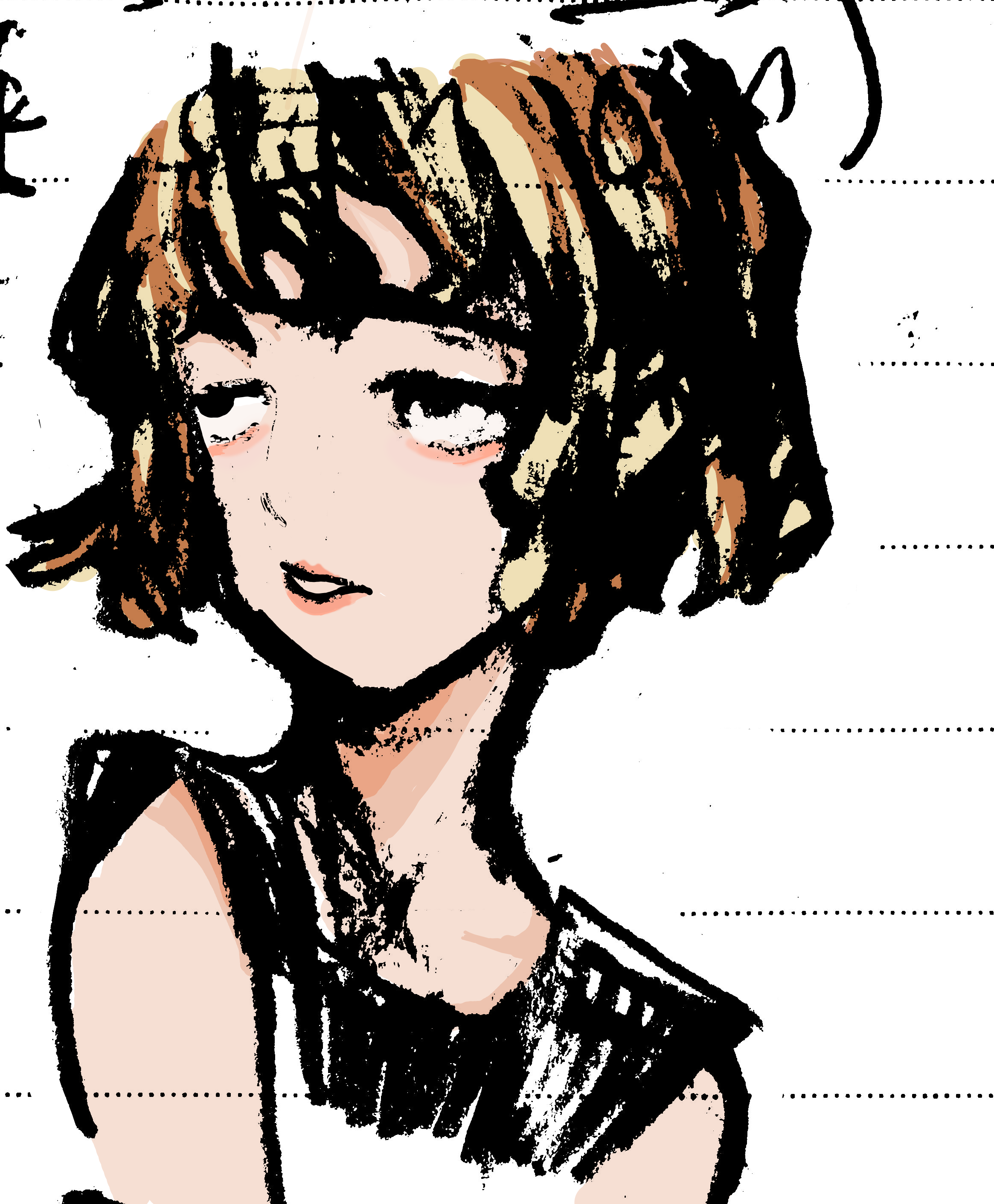
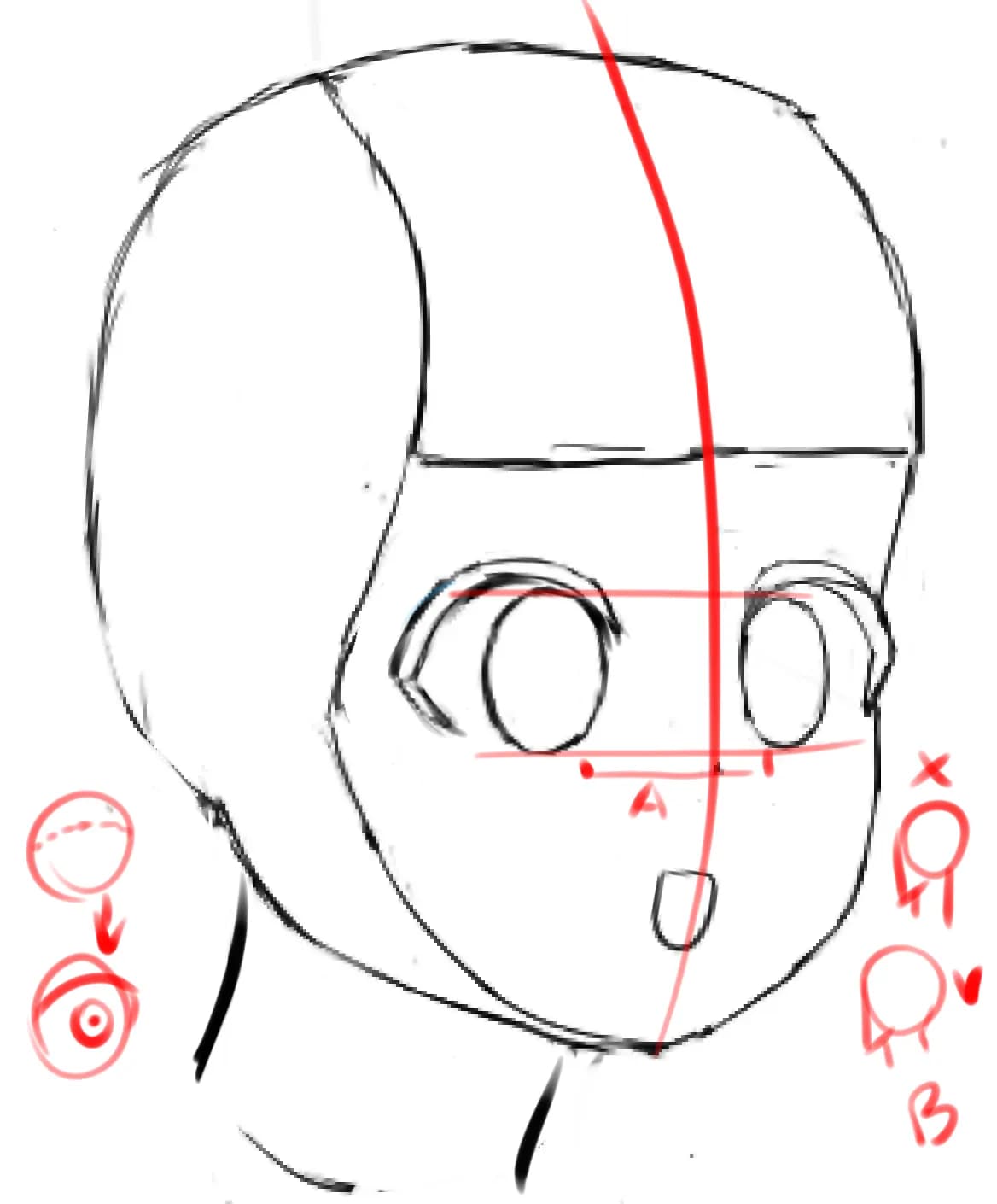
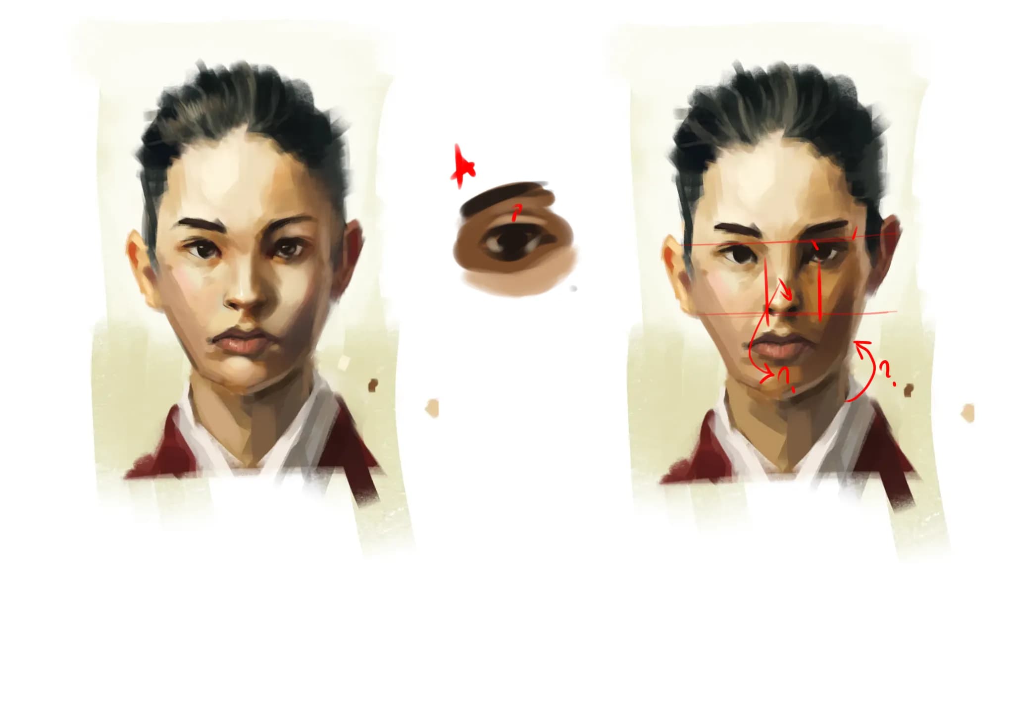
“Hi. As requested a bit of feedback from me. As another person said you already got decent face construction. You did cut part of her face too much (see our right side) and her jaw (it should be furt”
“The face is mostly fine, the stiffness comes from the neck, imo. The eye is located in a socket - the eyebrow should wrap around it. I also changed ear position (it should align with eyes and no”
“I think you got pretty nice colors and style going. The question is: is paintery look what you really want? You got cell shading style going on. Paintery look would require soft shading normally (can ”
“I would highly suggest looking up photos of sunsets. Normally during that time the upper sky is dark violet/blue and becomes more red/yellow at horizon. The house has similar value as the figure of”
“I saw this and decided to be cheeky :p I think this could be improved in lighting department: bottom of the hat and his face suggest that the man is in the shadow and that strong light comes from l”
“I think you already got decent colors. What you need is to "kill your darlings". You love your line - which is absolutely fine but it prevents you from discarding parts of it or drawing over it to pus”
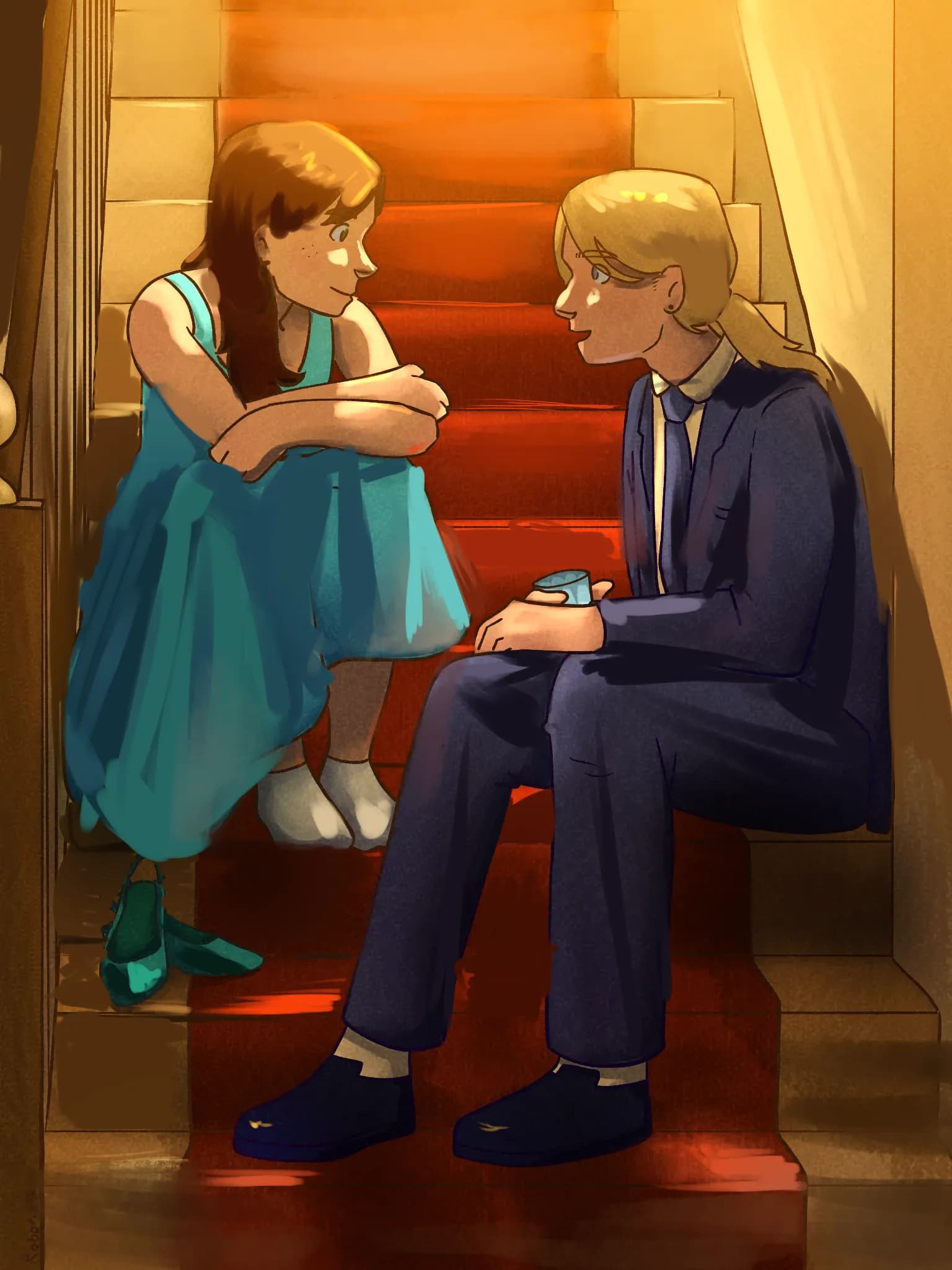
“I think you already got a decent idea about how the light should fall on the subject, however you seem to struggle to keep it consistent across all parts of the drawing. Whenever you shade somethin”
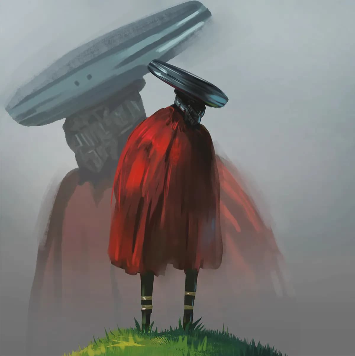
“You got nice colors for the sky and illuminated the BG properly. What could be improved: In such intense light his figure would be much darker. Look up real life reference in such lighting setti”
“You picked really nice colors. I think the painting could profit from more directional light and highlights. I added a paintover as an example of what could be done.”
“This is a cool, detailed piece, your friend is very lucky. I think the problem is that everything in this painting is fighting for attention: everything has similar value and detail degree. Try to ”
“This is an intersting concept with a lot of symbolism. I like it. I think what is missing is few shadows in the places where light doesn't fall (e.g. building walls facing away from light, inside t”
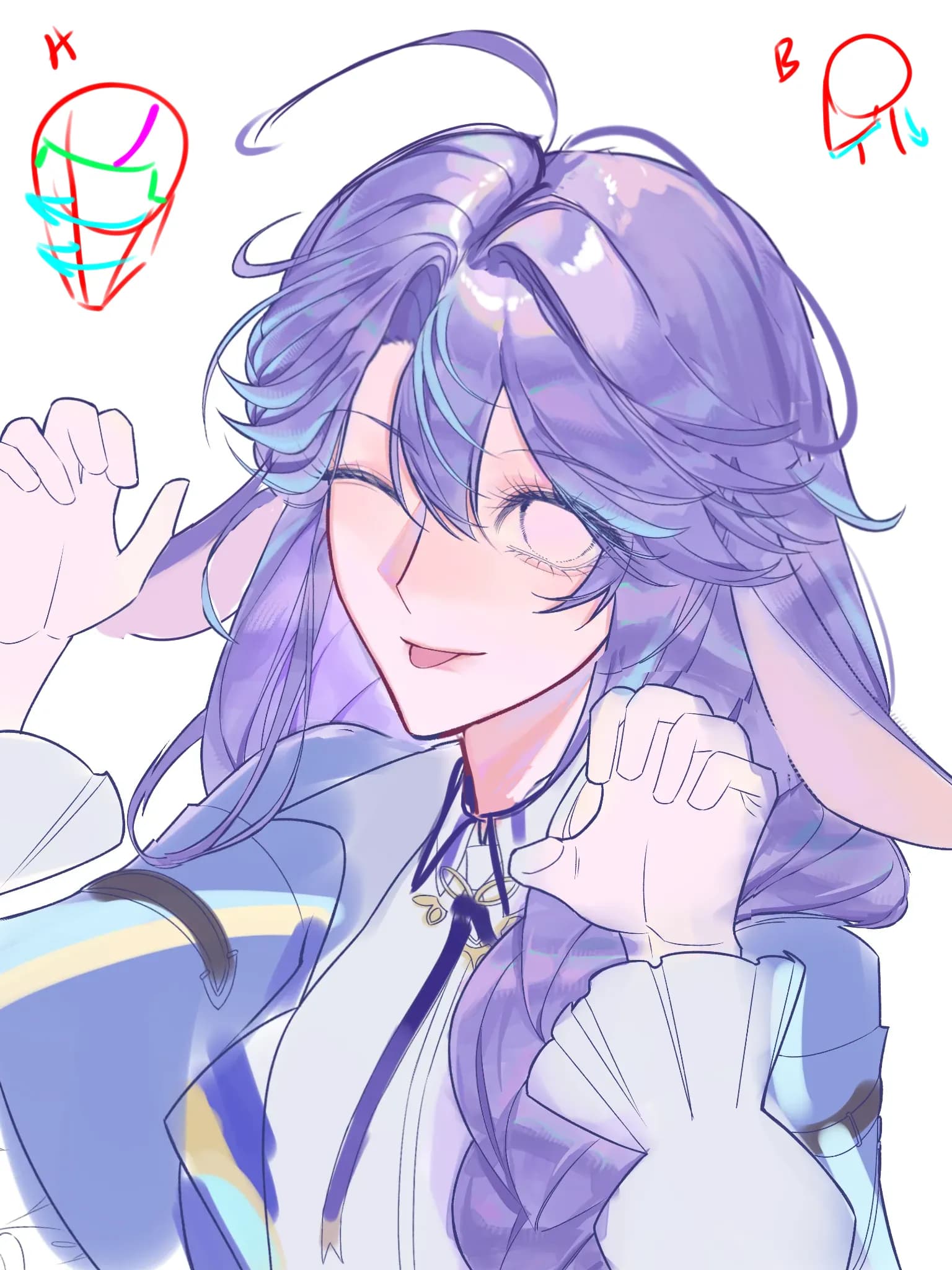
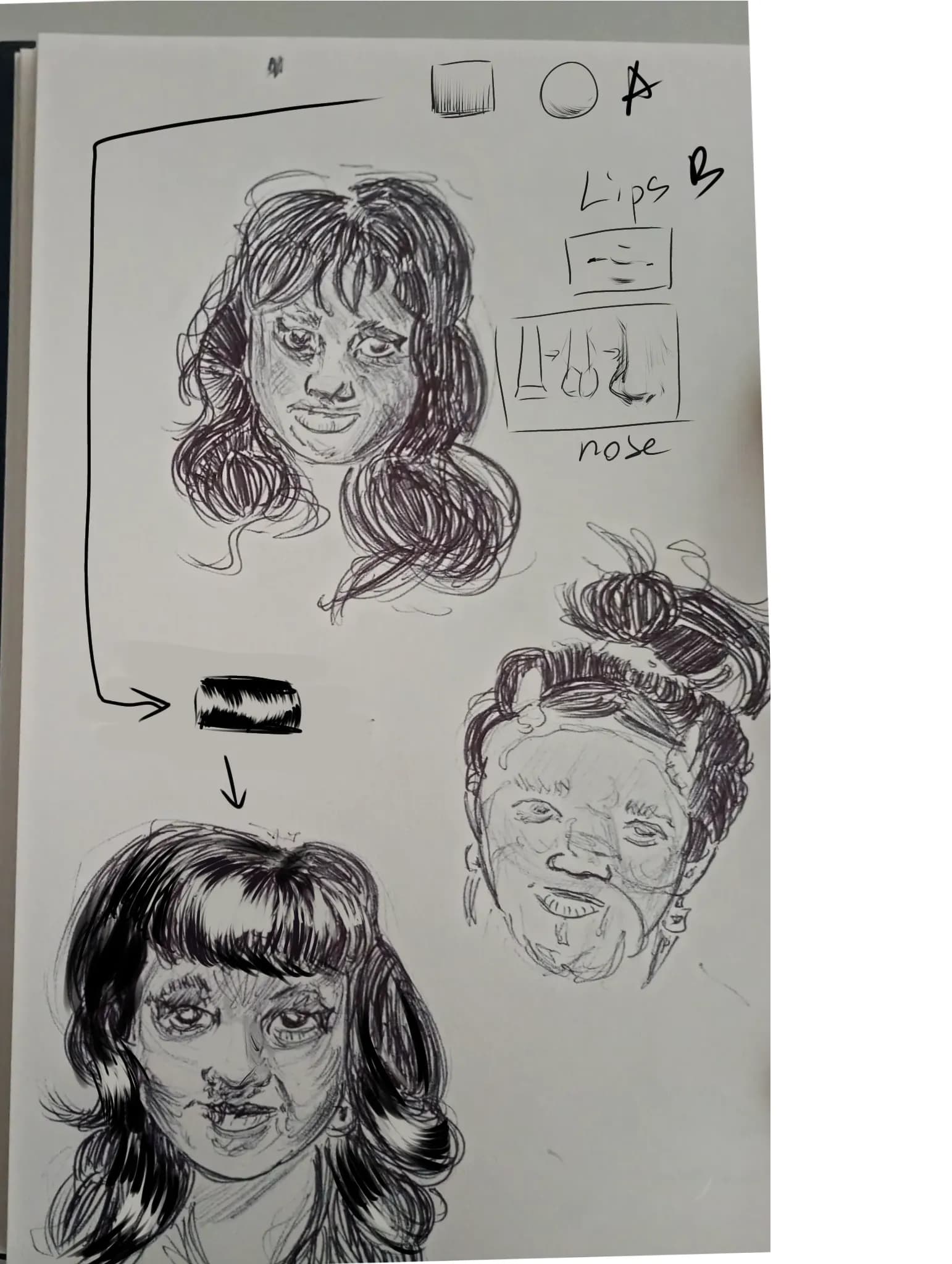
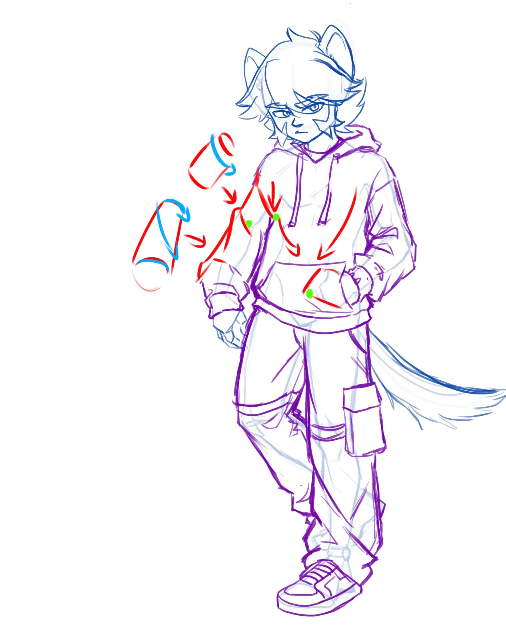
“Even clothing can be broken down to basic shapes (cylinder and cones). To make them look more 3d you need to shade folds just like you would those basic shapes (see B). The lapes also look flat becaus”
“I think you already got decent idea of how to place shadows based on one light source but do not apply it to the whole figure. There are places that could use shadows (see red arrows) - try to think i”
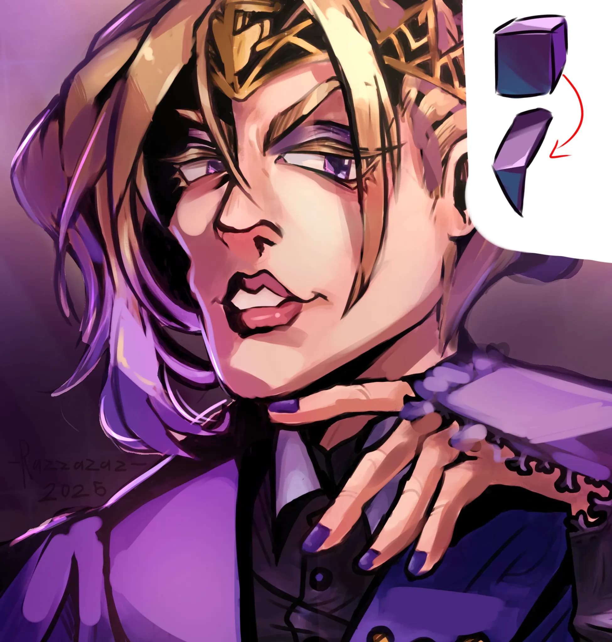
“You went for soft shading - which is absolutely fine - but I feel like the drawing style itself is more suited for cell shading (look it up). The rendering itself looks off because 1. While you”
“The colors look flat because you can't decide where the light comes from. Try to practice shading basic forms like spheres and boxes with 1 light source - it will help you immensely with shading. T”
“I think there are 2 reasons why it feels this way: 1. Parts of the drawing that are supposed to be the main focus and are located on the same level (e.g. her hair is next to her face as well as the”