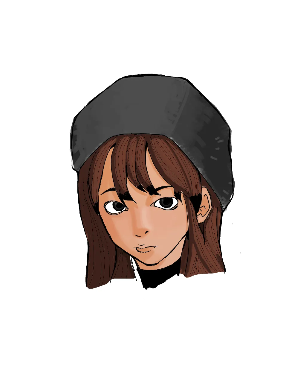
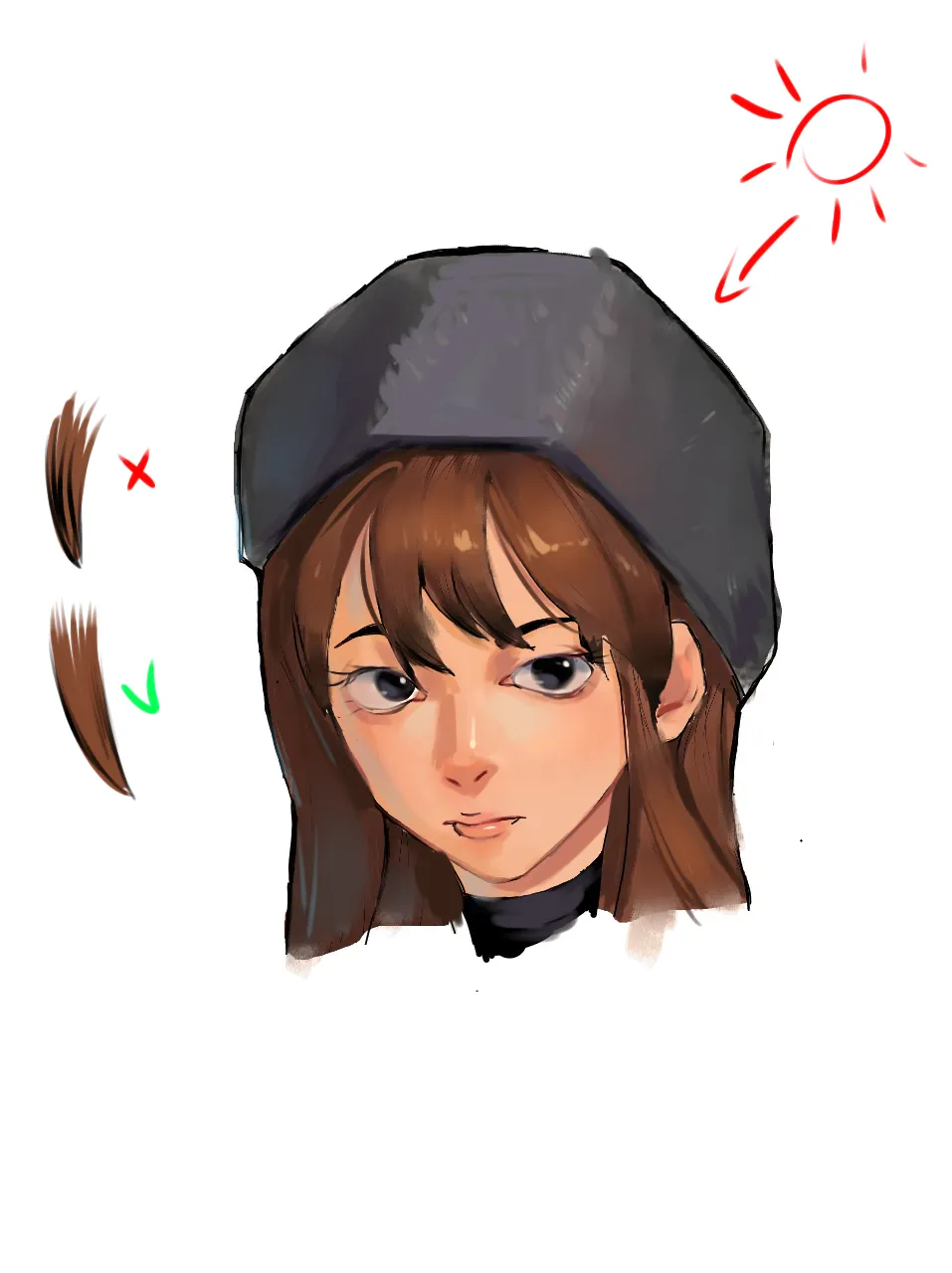
Hi! The form is pretty interesting and proportions are all right. It seems you are half way there? What could be changed: 1. Her face is shaded as if light comes from the top right but her hat is shaded as if light comes from top left. Try to keep light sources in check. 2. Her hat is rendered in soft shading, same for the face but the hair/shirt are done in cell shading. You can do it but it is a stylistic choice and makes the image look less homogeneous. I changed hair to match the rest. 3. For hair specially: IF you are going for cell shading, don't draw out every single hair. Just suggest some of it. 4. I would work with more highlights (see nose, lips, hair). 5. Don't use white (especially for eyeballs) unless absolutely necessary and for final touches. Use beige, grey, blue instead. 6. Would highly suggest to color your lineart: instead of black try to use brown, red, etc. 7. Try to work with more hues instead of just one color for each part, e.g. I added a bit blue to the shadow side of her hair. I gave her a bit of reddish tone around places that usually have better blood flow (nose, cheeks, eyes). Also added eyelashes but it is a stylistic choice ofc. Normally we would see some of them. Hope it helps. Cheers!
I really appreciate it! Just knowing that someone used my drawing and achieved this effect is truly motivating. It’s such a great review!