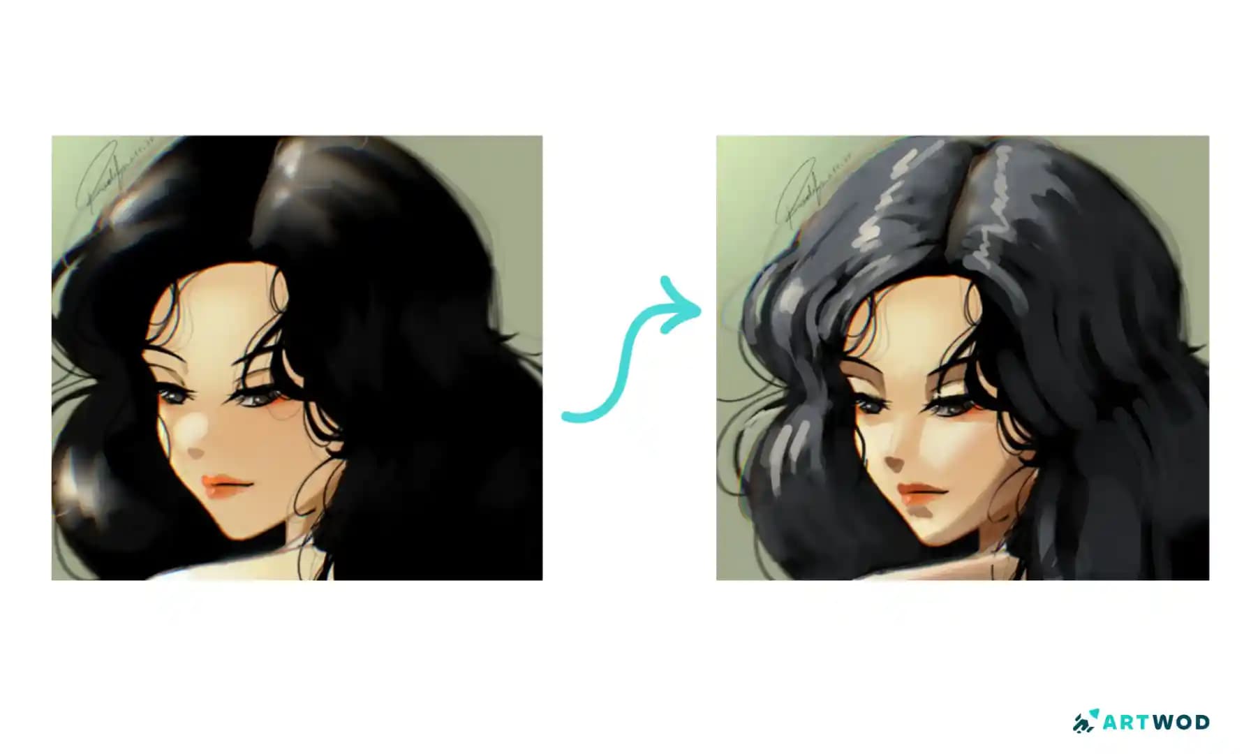
Beginner Anime Lighting Drawing: Refine Shadows and Values
Beginner Anime Lighting Drawing: Refine Shadows and Values
Learning how to draw anime lighting becomes much easier once shadows have a reason to exist. In this Artwod submission, @radifa088 is practicing different lighting setups but feels their sketches become messy because shadows are placed where they look nice rather than where the light would actually create them. The feedback offers a practical way to organize values.
Insights shared in this blog post are by: @gabrielle34427. You can also request feedback on your artwork in Artwod’s Art Community.
The Artwork and the Problem
The submission, “beginner at anime lighting and my sketches are a mess,” is a digital anime artwork featuring a character with very dark hair, light skin, and strong highlights across the face, hair, and body.
The artist identifies the main problem clearly: they are experimenting with different lighting but often place shadows based on what looks visually appealing instead of first deciding where the light is coming from.
That distinction is fundamental.
A shadow should not simply be an attractive dark shape. It is a consequence of the relationship between a light source, the form receiving the light, and the direction from which the light reaches that form.
Once that relationship is established, the shadow placement becomes much easier to reason about.
Why Anime Lighting Can Get Messy
Stylized anime artwork often uses simplified shapes and strong value contrasts. That can make lighting look deceptively simple.
In reality, you still need to answer a basic question:
Where is the light coming from?
If you do not establish that first, it is easy to add a shadow beneath the hair because it looks good, darken one side of the face because it creates contrast, or add highlights to the hair simply because they make the material feel shiny.
Individually, those choices may look appealing.
Together, they can describe several different lighting directions at once.
The result is an artwork where the values compete rather than reinforce one clear lighting setup.
The original artwork already has strong visual contrast, particularly because of the very dark hair against the lighter face and body. That makes value organization especially important.
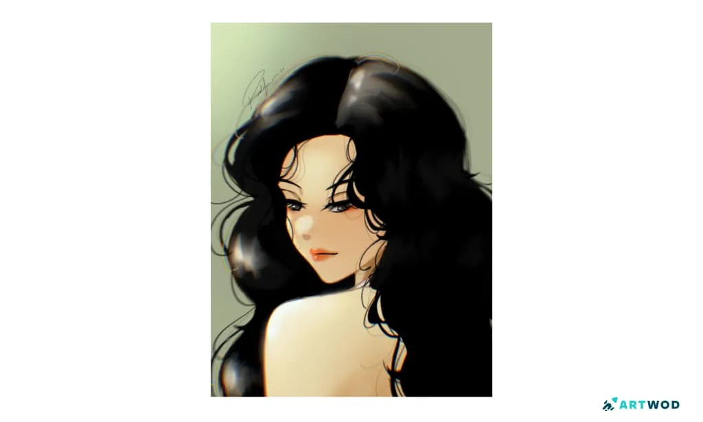
Digital anime character artwork with dark hair, light skin, facial highlights, and loosely placed shadows
Start With the Light Source
Before drawing detailed shadows, make the lighting decision simple.
Imagine a single large light source coming from one direction.
In my personal opinion the best way of keeping track of a light source is drawing an arrow or sun in the direction of the light source. This can also make it easier to visualize how the light will fall on an object. Typically on the opposite side of where the light source is, the shadows will fall.
You can see an example of this used in this paintover correcting the lighting on the hair according to an established light source for @kyaw71178 by @eewee.
For example:
Light from above-left
Light from above-right
Light from directly in front
Light from below
Light from behind
You do not need to immediately paint complicated gradients.
First determine which major surfaces should receive light and which should fall into shadow.
For an anime character, begin with the largest forms:
Head
Hair mass
Neck
Torso
Arms
Major clothing shapes
Then consider the smaller forms inside them.
This gives you a lighting hierarchy instead of a collection of disconnected shadows.
How to Draw Anime Lighting More Systematically
A useful workflow for beginners is to separate lighting from rendering.
Choose one light direction.
Decide where the primary light is coming from before adding shadows.Reduce the character to large forms.
Think about the head, hair, torso, and limbs as simple three-dimensional masses.Identify the planes facing the light.
These areas should generally receive more illumination than surfaces turned away from the source.Block in the major shadow family.
Keep the shadow shapes simple at first. Avoid adding lots of small patches.Check the values in grayscale.
Ask whether the light and shadow groups are clearly separated without relying on color.Add secondary shadows only where useful.
Smaller shadows can describe overlaps, recesses, and changes in form after the main lighting structure works.Add highlights last.
Highlights should reinforce the lighting direction rather than become decorative marks scattered across the artwork.
This approach prevents the rendering stage from becoming a guessing game.
Think in Value Groups Before Detail
One of the most useful habits for learning anime lighting is to simplify the artwork into a few major values.
You might begin with:
Light
Middle
Shadow
The exact number is less important than the separation between the groups.
Once you feel you have mastered your major values, you can create the values in between to create a smooth transition. The amount of your midtones will likely depend on your rendering or shading style, being exact doesn't matter as much in this type of style in my opinion. Just be careful not to overcomplicate it.
I think one example of the importance of contrast is in this piece “My Artwork” where the user asked for help with correcting perspective, depth, and anatomy. With the visual correction on the second slide, adding shadows in the appropriate places really helped with creating deeper depth.
In my personal opinion, a brilliant example of lighting on the hair and body was in this feedback submission by asking why their YCH (Your Character Here) looked flat. While the background, as the comments suggested, could be darker, I think it's good for ideas on how to shade the hair and body.
If everything contains many small value changes, the viewer has difficulty understanding the lighting pattern.
The paintover demonstrates a clearer grouping of values. The hair receives broader highlight shapes, while the face and body have more deliberate transitions between illuminated and shadowed areas.
The correction does not require every surface to be rendered realistically. Instead, it makes the lighting pattern easier to read.
That is a useful principle for stylized art:
Simplified lighting can be more convincing than detailed lighting that has no consistent source.
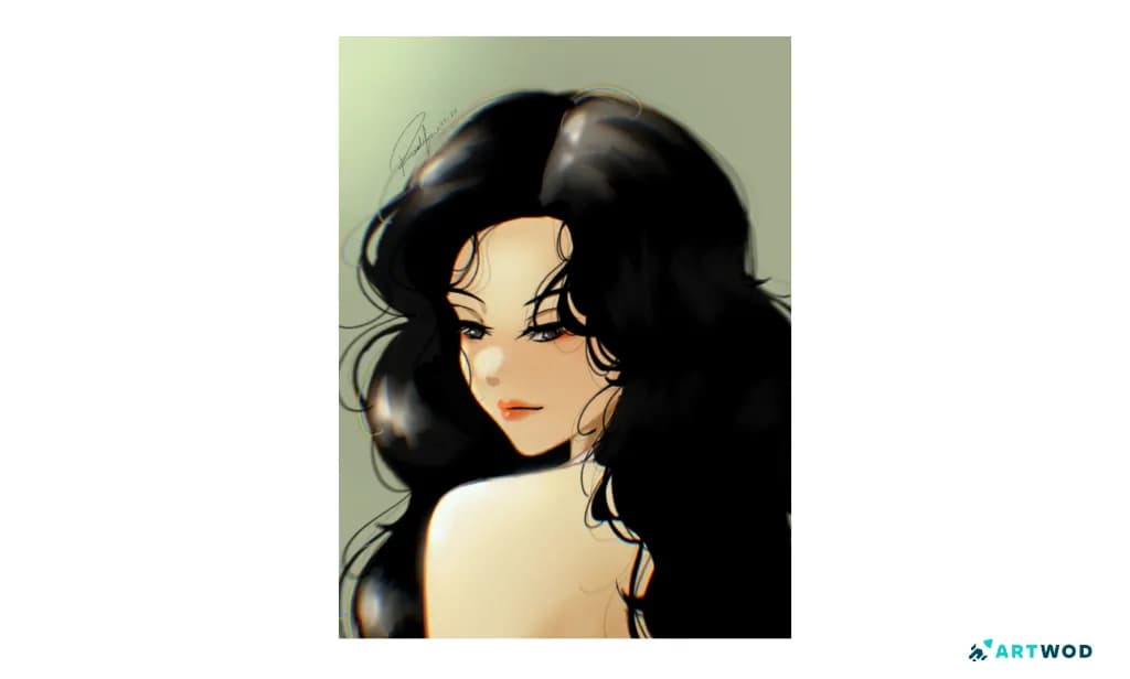
Anime lighting paintover showing stronger highlights, simplified shadow shapes, and clearer value structure across the hair, face, and body
Hair Needs Its Own Lighting Logic
The character's dark hair occupies a large portion of the composition, so it has a major effect on the overall value structure.
A common beginner mistake is to treat hair highlights as individual shiny strokes.
Instead, think about the hair as a collection of larger masses.
First determine:
Which parts of the hair face the light?
Which masses turn away from it?
Where does the hair overlap itself?
Where should the deepest darks remain?
Where can a larger highlight describe the curvature?
The paintover adds broader highlight shapes across the hair rather than relying exclusively on tiny reflective marks.
This makes the hair feel more dimensional while keeping the lighting connected to the overall form.
I also notice that having a transition value placed correctly helps make the lighting feel more realistic. The highlight is so strong with a very small transition between it and the black. Real life objects have different levels of smoothness/transition between the major core values. In this example, the transition value, as seen in the paintover, would take up much more room at the top.
Don't Let Highlights Become Decoration
Highlights can be tempting because they immediately make a drawing feel more polished.
But a highlight should answer the same question as a shadow:
Why is the light reaching this specific area?
If a highlight appears on a surface that should be facing away from the primary light, it can weaken the lighting logic.
This does not mean every highlight needs to obey strict physical realism. Stylized anime art can exaggerate lighting considerably.
The important part is consistency.
You can use dramatic highlights, unusual colors, or exaggerated shapes. Just make sure they belong to the lighting system established for the artwork.
A Quick Anime Lighting Practice Exercise
Take one simple anime head and render it three times using the same drawing.
Version 1: Use a light source from the upper-left.
Version 2: Move the light source to the upper-right.
Version 3: Place the light source below the face.
For each version, use only three major values at first.
Do not add detailed hair highlights or small reflected-light effects until the major shadow pattern is established.
Then compare the three versions.
The goal is to train yourself to think:
light source → form → shadow
rather than:
empty area → add a shadow that looks good.
Common Anime Lighting Mistakes
A visually appealing shadow can still contradict the lighting direction.
Check: Before adding it, identify which light source would create that shadow.
Using too many small shadow shapesLots of fragmented shadows can make a sketch feel messy. Check: Merge smaller shapes into larger shadow groups whenever possible.
Adding highlights before establishing shadows
Highlights can distract from an unstable value structure.
Check: Work out the major light and shadow groups first.
Making every surface equally detailedNot every area needs the same amount of rendering.
Check: Prioritize the focal areas and keep secondary forms simpler.
Changing the lighting direction across the characterA face may appear lit from one side while the hair suggests a completely different source.
Check: Compare the major highlights and shadows across the entire character.
What the Paintover Shows
This submission contains an original artwork and a paintover, not a completed before-and-after transformation by the original artist.
The paintover therefore should not be treated as the artist's finished "after" version or as proof of an art transformation.
Instead, it provides a visual correction for the lighting problem. The added marks introduce broader highlights and clearer value organization across the dark hair, face, and body. The changes make the light feel more intentional rather than simply adding more rendering.
That distinction is useful when studying feedback. A paintover does not have to represent the only correct solution. It can demonstrate one way to make the underlying lighting logic easier to read.
What Other Artists Can Learn
Decide where the light comes from before deciding where shadows look attractive.
Large value groups are easier to control than dozens of disconnected shadow patches.
Hair should be treated as a collection of forms rather than a collection of individual shiny lines.
Highlights should reinforce the lighting direction instead of functioning purely as decoration.
A simplified lighting system can make stylized anime artwork clearer and more convincing.
Community Feedback and Peer Learning
Lighting problems are particularly useful to bring to other artists because it can be difficult to tell whether an artwork feels wrong because of the shadow shapes, values, forms, or light direction.
Sharing the artwork while explaining the specific problem gives other artists a clearer opportunity to respond to the actual issue. Instead of simply asking whether the drawing looks good, an artist can ask where the lighting becomes inconsistent or which shadow shapes should be reconsidered.
Artwod’s Art Community provides a place for artists to share work, explain what they are struggling with, and get feedback from fellow artists. That makes a lighting study like this useful not only as an individual exercise, but also as an opportunity for peer learning.
FAQs
Start by choosing one clear light source and establishing large light and shadow groups before adding detailed rendering. This gives every later shadow and highlight a consistent reason.
Where should I put shadows in anime art?Place shadows according to the direction of the light and the forms of the character. Avoid choosing shadow locations only because they make the drawing look more interesting.
How can I improve anime lighting and values?Practice separating your artwork into a few major value groups before adding detail. Checking the drawing in grayscale can make unclear value relationships easier to spot.
Why do my anime sketches look messy when I add lighting?Messiness often comes from adding too many disconnected shadows or highlights before establishing a clear lighting structure. Simplify the major value shapes first.
How do I draw highlights in anime hair?Treat the hair as larger curved masses and place highlights where those forms face the light. Broad, intentional highlight shapes can describe the form more effectively than many random shiny strokes.
Should I use multiple light sources in anime art?You can, but beginners often have more control when they start with one primary light source. Once that lighting structure is working, secondary or rim lights can be introduced deliberately.
The central lesson from this anime lighting drawing is simple: do not decide where shadows go before deciding where the light comes from. Once the light direction is established, large value groups can describe the character's forms before smaller rendering details are added.
The paintover does not show a completed transformation, but it demonstrates how stronger value organization and more intentional highlights can make the lighting easier to understand.
If you're struggling with anime lighting, share your artwork with the Artwod’s Art community, explain what feels wrong, and ask fellow artists for feedback on the specific lighting or value problem you're trying to solve. If you want to hear from other artists who specialize in anime, you can put your art under the anime category. You can also request me for feedback, you can check out my Artwod page here @gabrieller34427.