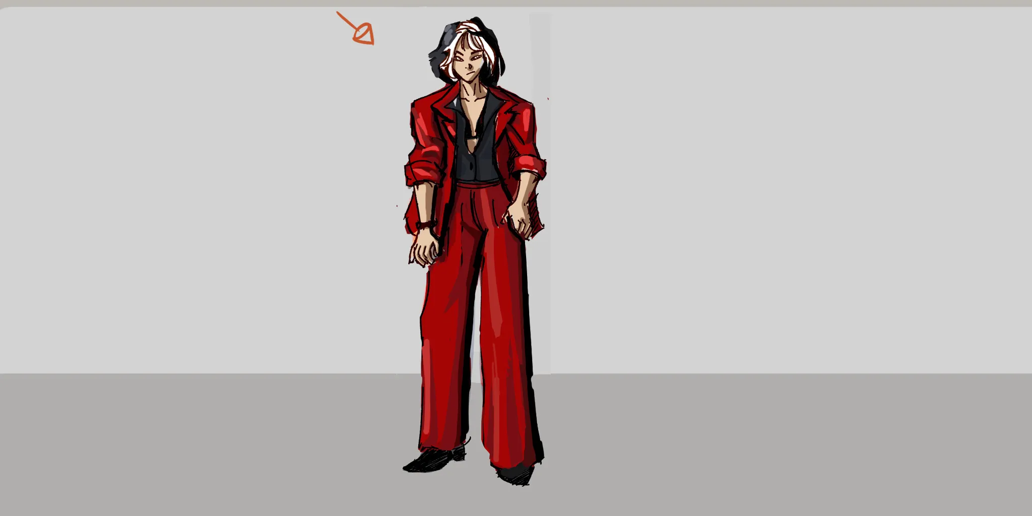
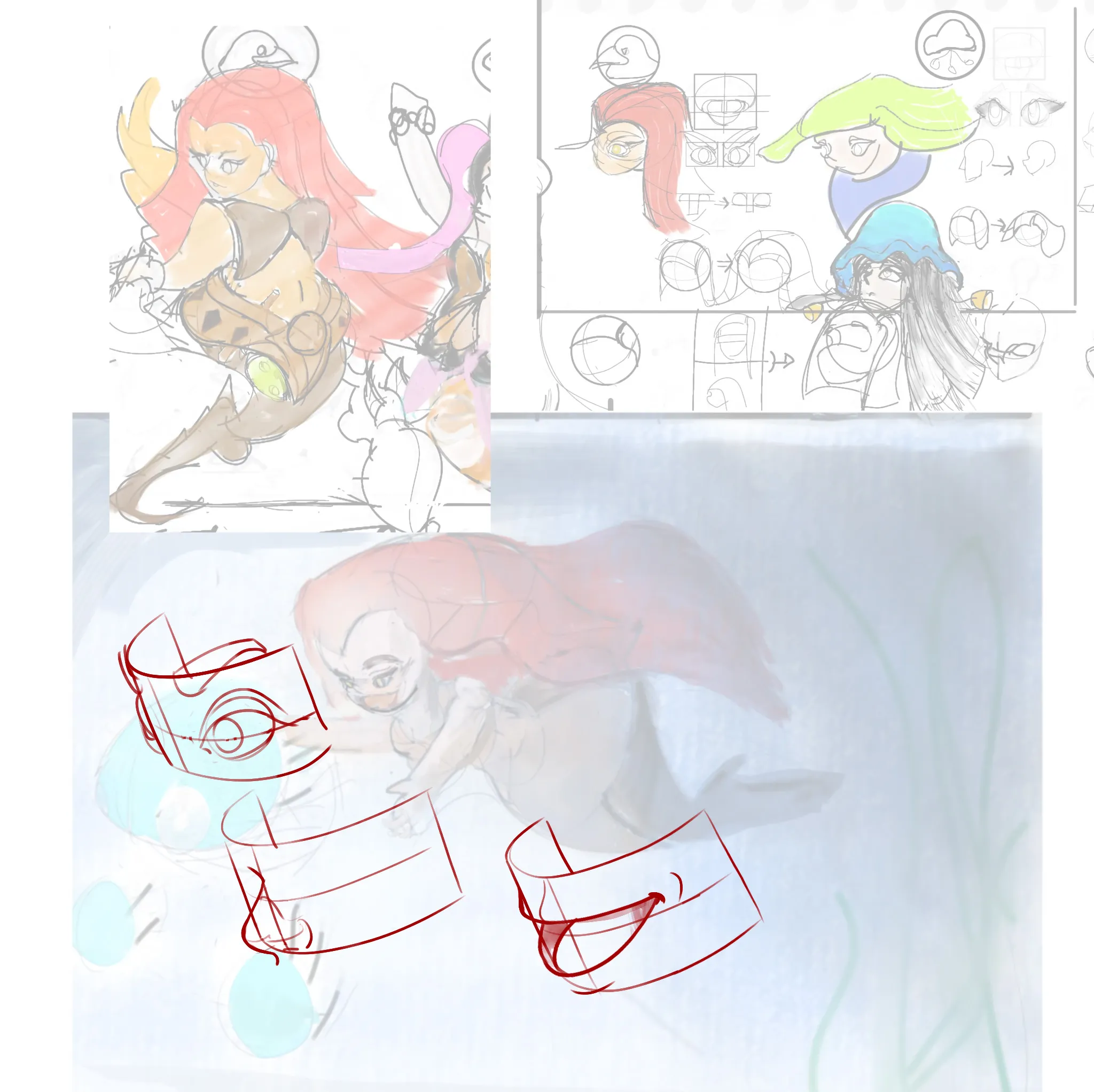
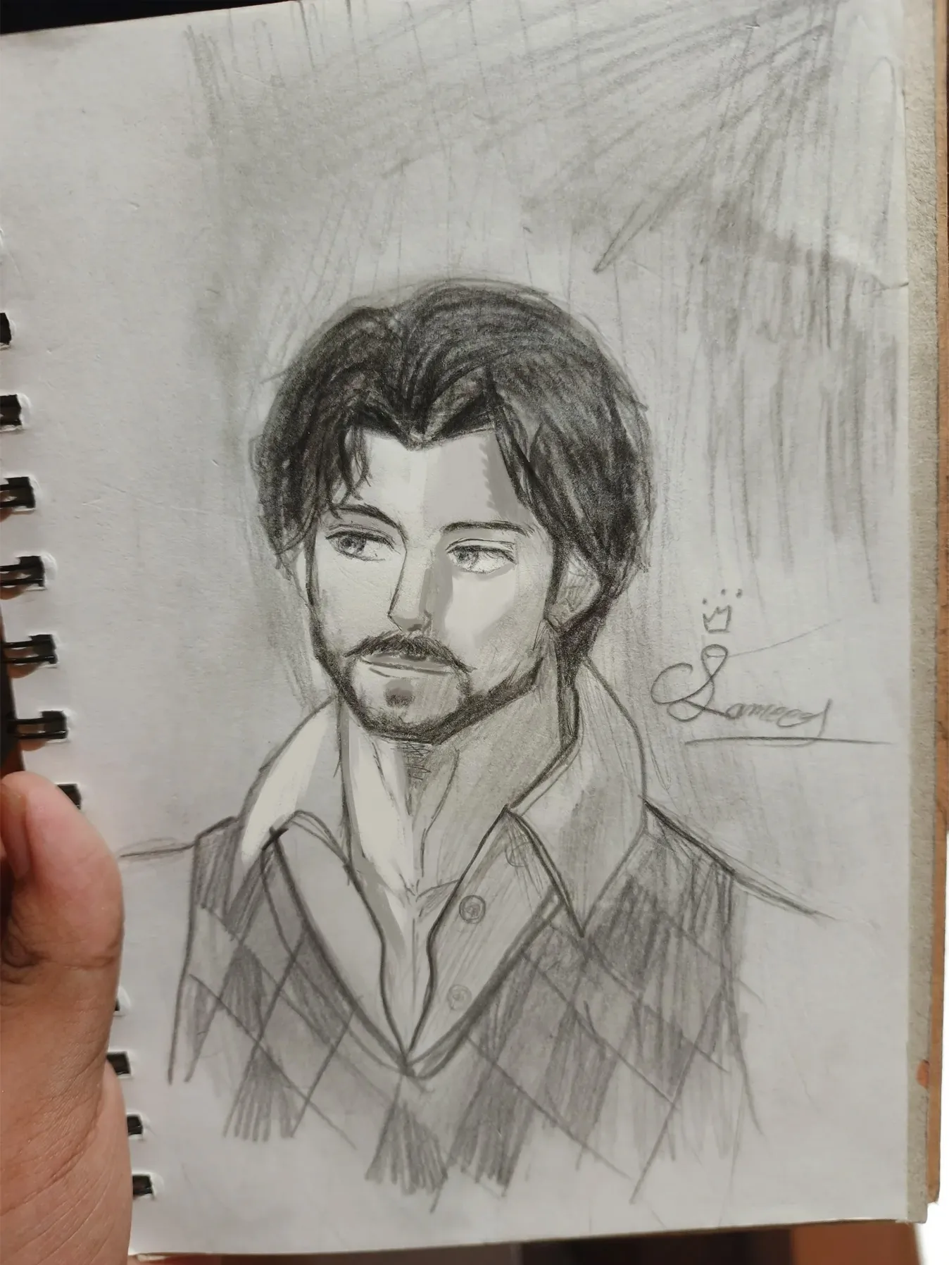
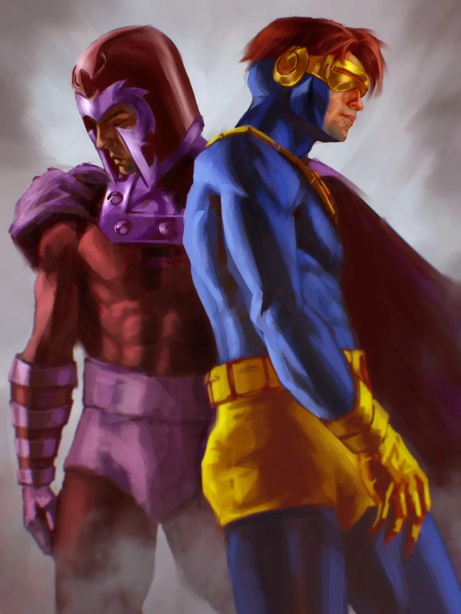
My other secret profile for feedback giving.
#422
Classificação
108
Votos a favor
57
Feedback dado
100%
Útil
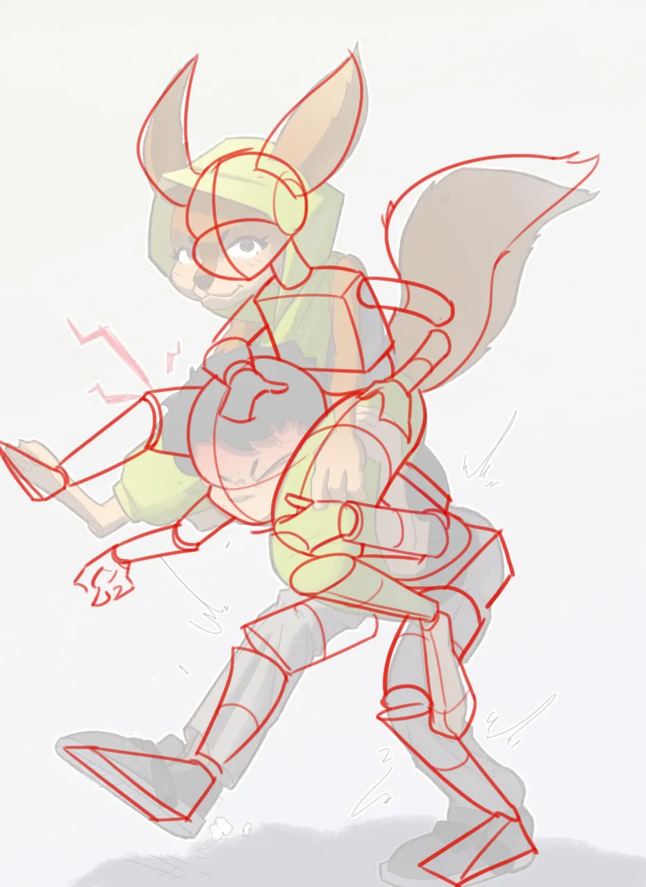
“Hi there, thanks for the cool submission! You said you were looking to make this piece a bit more expressive, add gesture,... and I agree! I tried to make the pose feel a little bit more natural (and ”
“Hey! I struggled with looking for something to say that hasn't been said in the feedback above there, I feel like they covered a lot of really good points already. What I can affirm is that indeed the”
“Hey! I really like the illustration, great work so far! You could improve the scene by making the character darker, since the strongest light is coming from the background, mainly from the screen an”
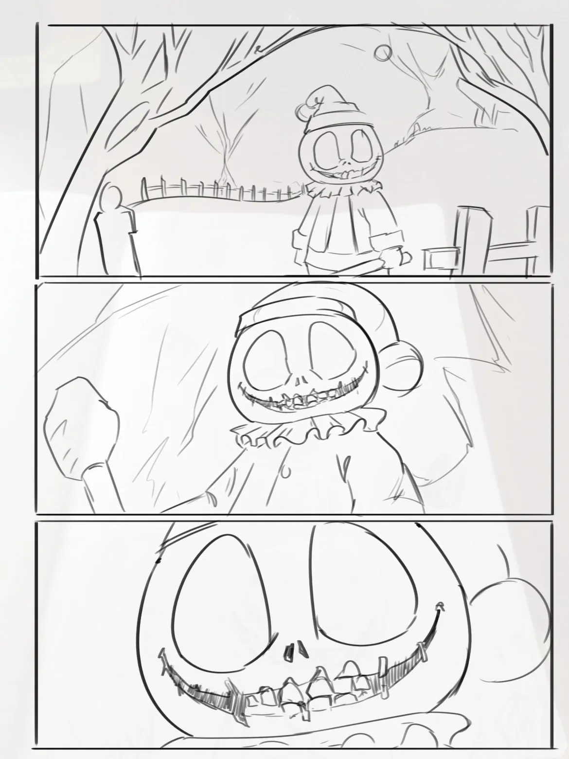
“Hey! The first thing I'd recommend is thinking a bit more about the storytelling. Right now, all three panels use the exact same camera angle and framing, so it feels more like the same drawing repea”
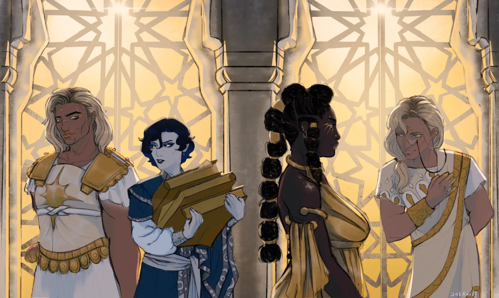
“Hey! This is a really nice illustration so far! If the windows are meant to be glowing, the first thing you should do is darken the characters. Keep in mind that if the light source is behind them,”
“Hey there! I really like the character design so far! That said, here are a few changes that could help improve him. First of all, I would simplify the background by painting a clean sky so that th”
“Hello! I really like the design. The silhouette is clear and interesting. The only thing I would suggest is improving the color of your character a bit. I increased the saturation of the gold to cre”
“Hey there! Andrew already gave you some great feedback regarding the lighting and how to paint more accurate shadows based on the direction of the light. As for the background, I'd recommend simplif”
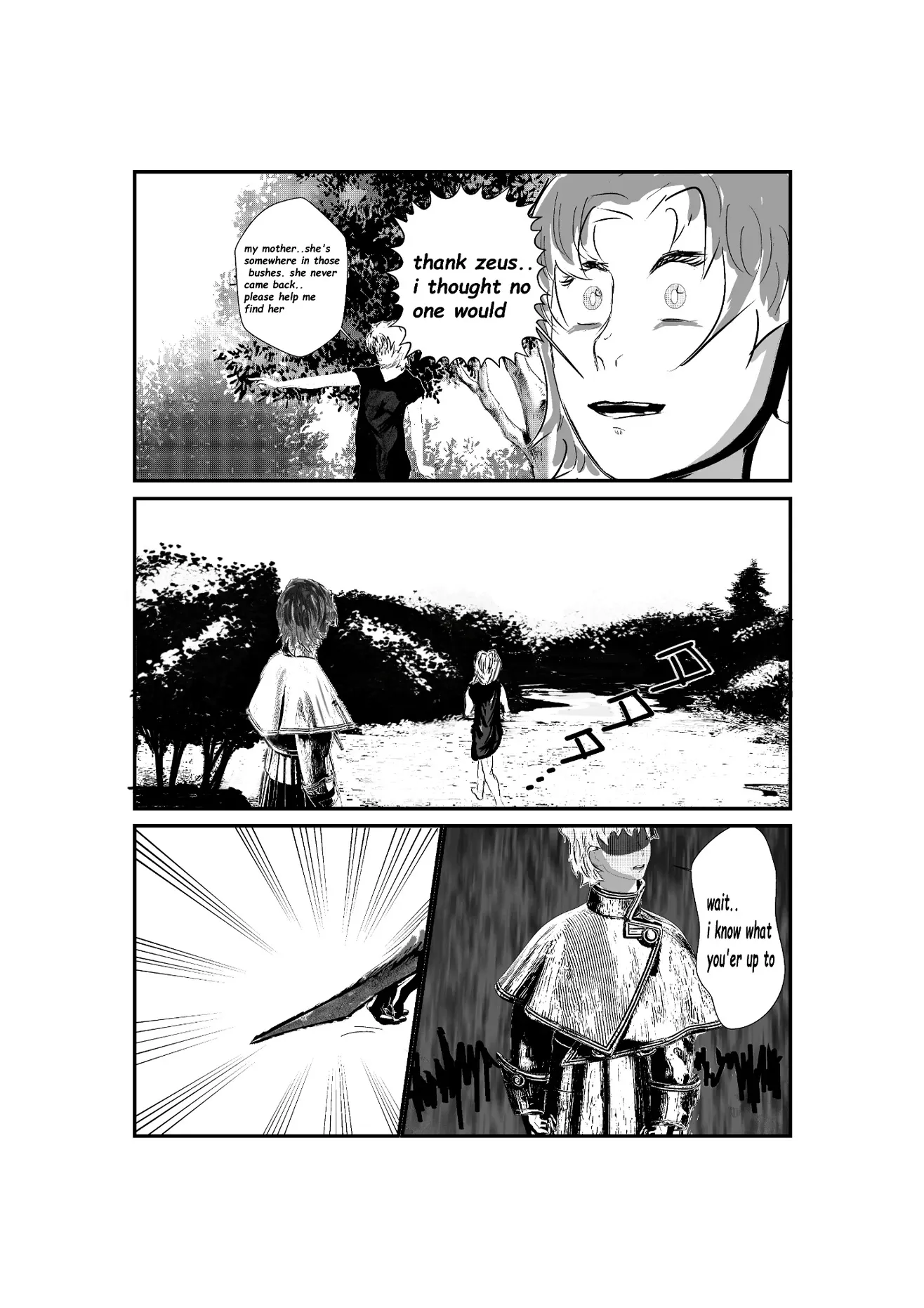
“Hello! Overall, you have a solid foundation. However, always keep in mind that you should be looking for contrast between your backgrounds and your characters. In manga, black backgrounds are often u”
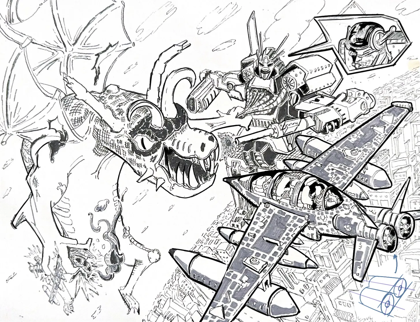
“Hello! This is a very cool scene, quite dynamic! The biggest issue I see here is the line quality. There isn't a clear sense of contrast because the line weight remains the same throughout the ent”
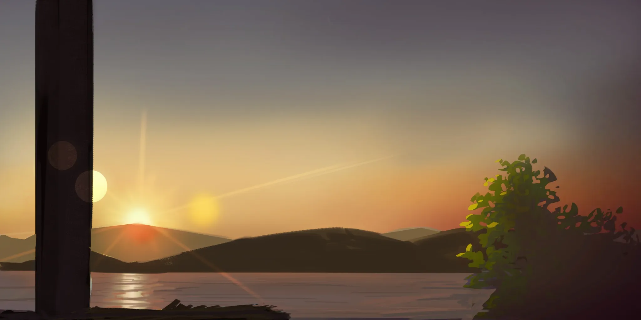
“Hey there! Good work here! The only issue is that it doesn't quite feel like a sunrise yet because of the colors and overall mood of the scene. It's not necessarily wrong, but it isn't fully communi”
“Hi! Epic submission! I think we could improve this one by getting rid of some of the noise. As you can see I have simplified some of the lighting and shading into larger shapes. Always try to start of”
“Hi there! First off, I love that you already simplified the hair into big chunks and then added small strands to break up that silhouet a little bit, but we can push it further, so that is what I did ”
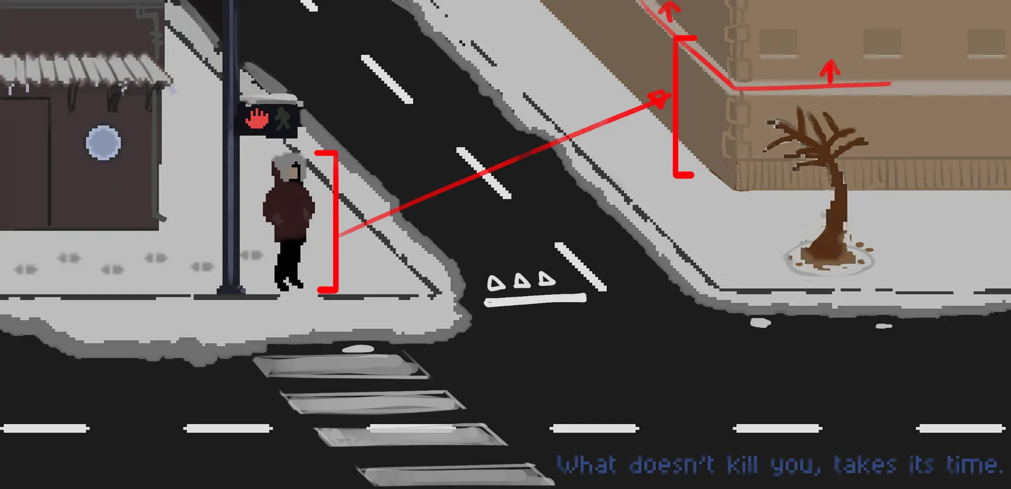
“Hi! Thanks for submitting this, love seeing all the different styles! There's a few things that I think I could help you with here. First of all, you have a character in the scene, this is great becau”
“Hi there! What an epic submission! I don't think there are any major things that need improving other than what has already been said in the other great feedbacks, so I'll be nitpicky! I think impleme”
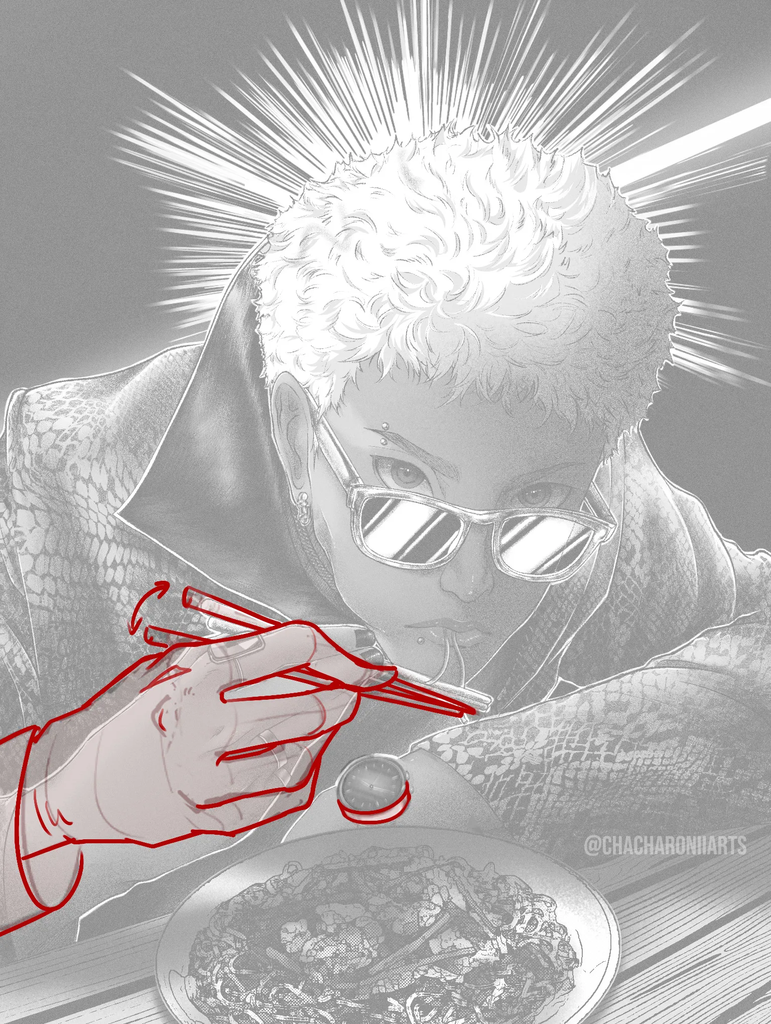
“Hi! Love your style of drawing here, there's so much detail! I think there's a few things that I would usually comment on like the glare in the shades being maybe more extreme than what is realistic, ”
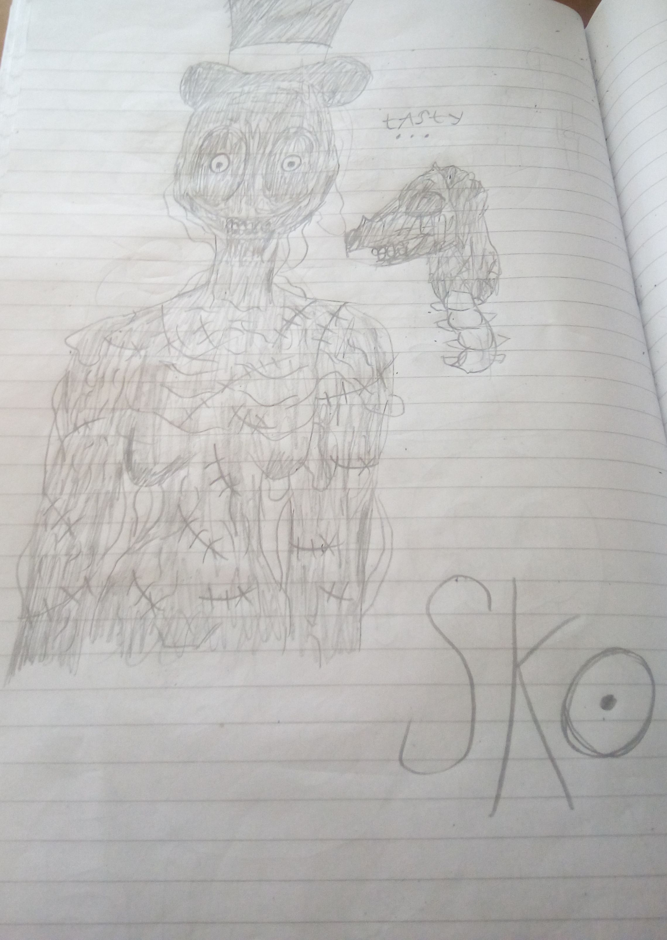
“Hey! The main issue is that your forms aren't clearly defined. Regardless of which tools you use, you need to do a better job of defining them. For that, I recommend always starting by blocking in t”
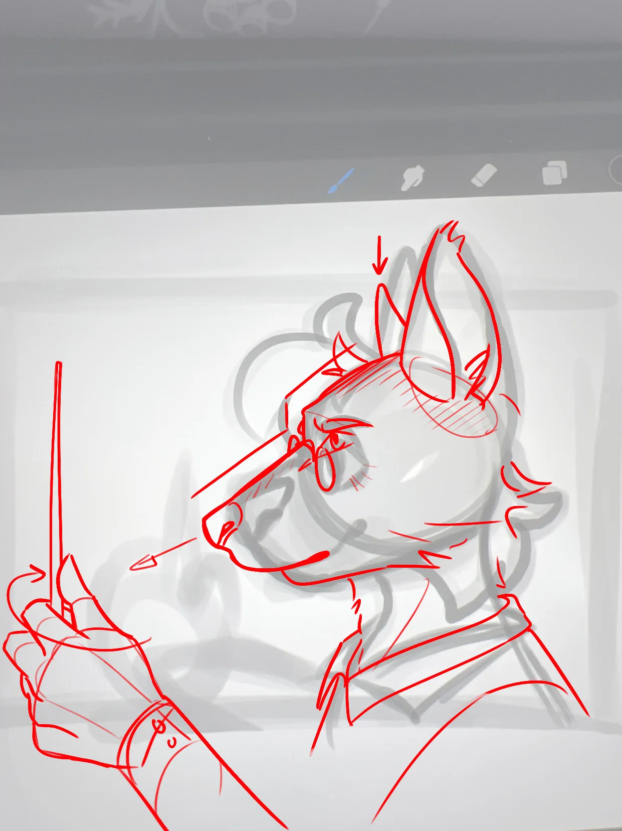
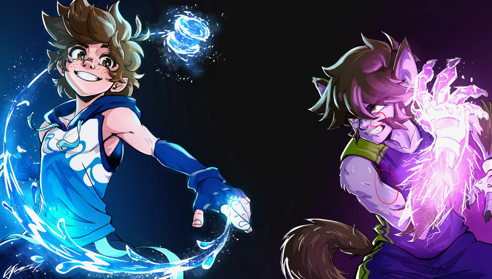
“Hey! Thanks for sharing your work. I adjusted the proportions a bit, particularly on the heads of the characters at the top, as both of them had very large craniums and relatively small facial featur”
“Hey! Great job with these characters! I really like the variety you've achieved so far. I'll use one of them as an example to help you a bit with the lighting. First of all, you need to establish th”
“Hi there! We actually love seeing the process of a piece on here, not just the finished results. It's always good to ask feedback at this stage, as a lot can still change! Like you said, if you unders”
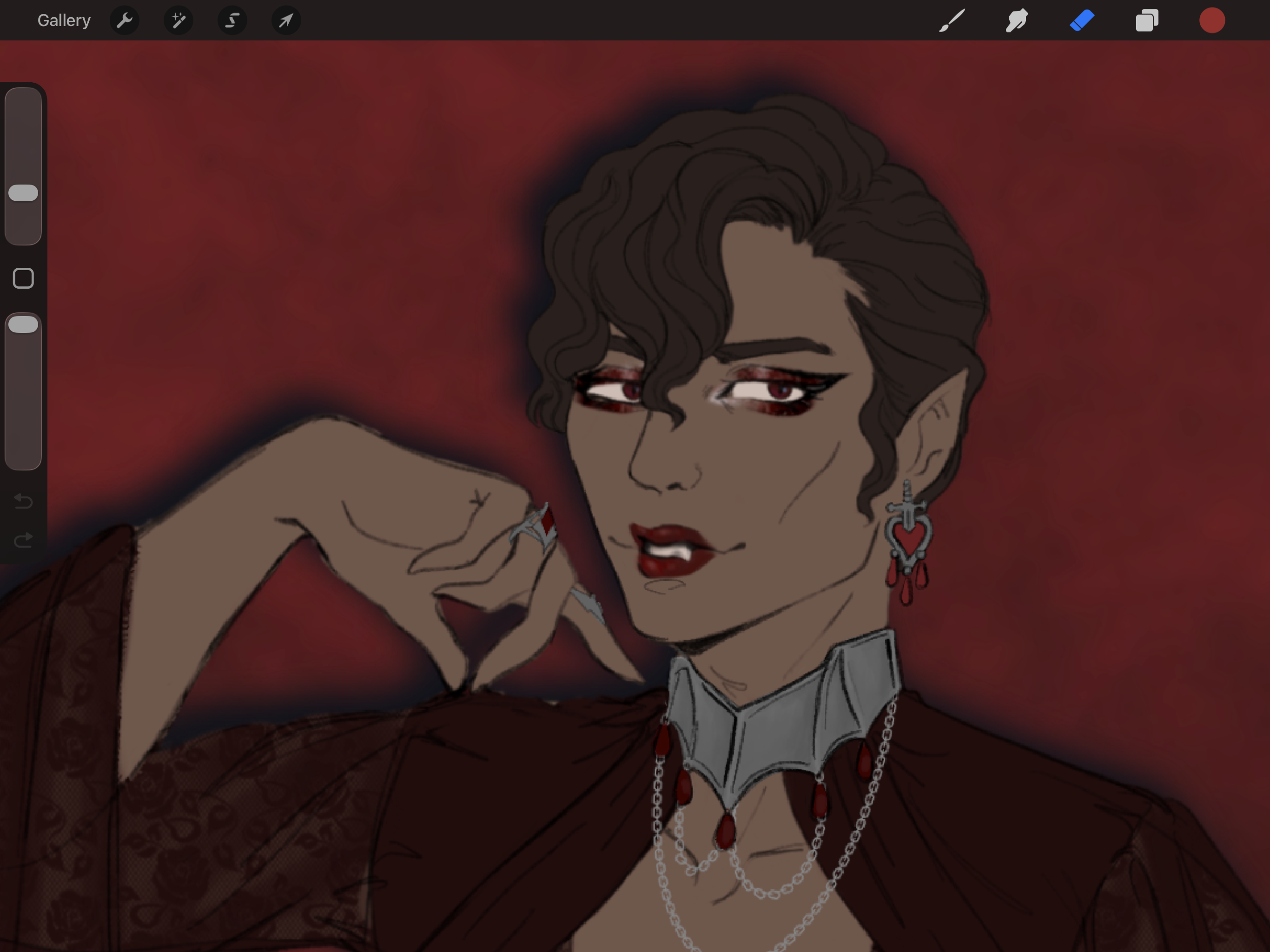
“Hello! Great job with this portrait, and well done with the technique! The only thing I would adjust slightly is the shape of the shadows. If the light is coming from the right at roughly a 3/4 angl”
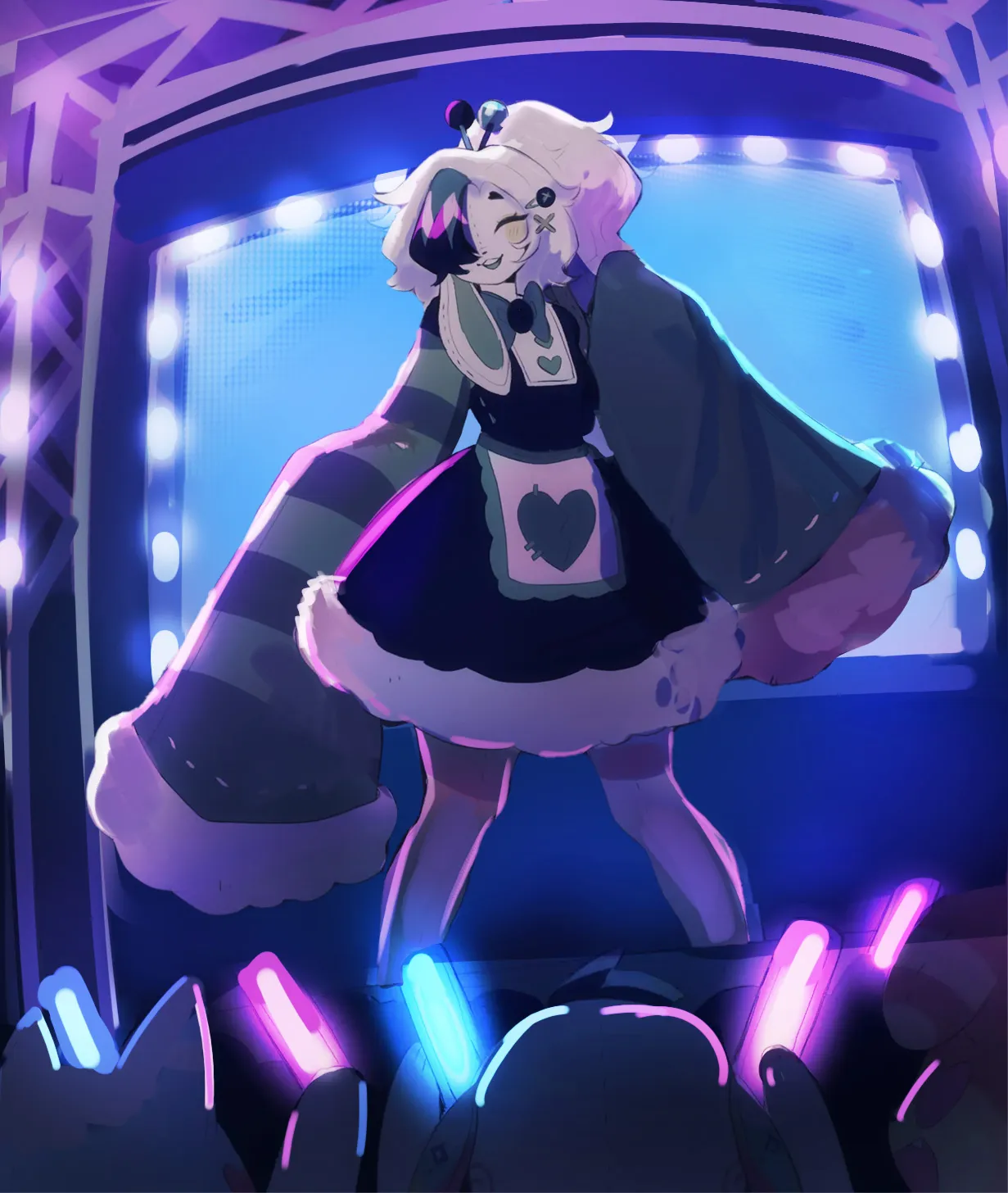
“Hey there! What a great piece, I love this 80's poster vibe! I used the light source to seperate the figures a little bit more and create more depth like in the arm/hair/... Added some bounce light in”
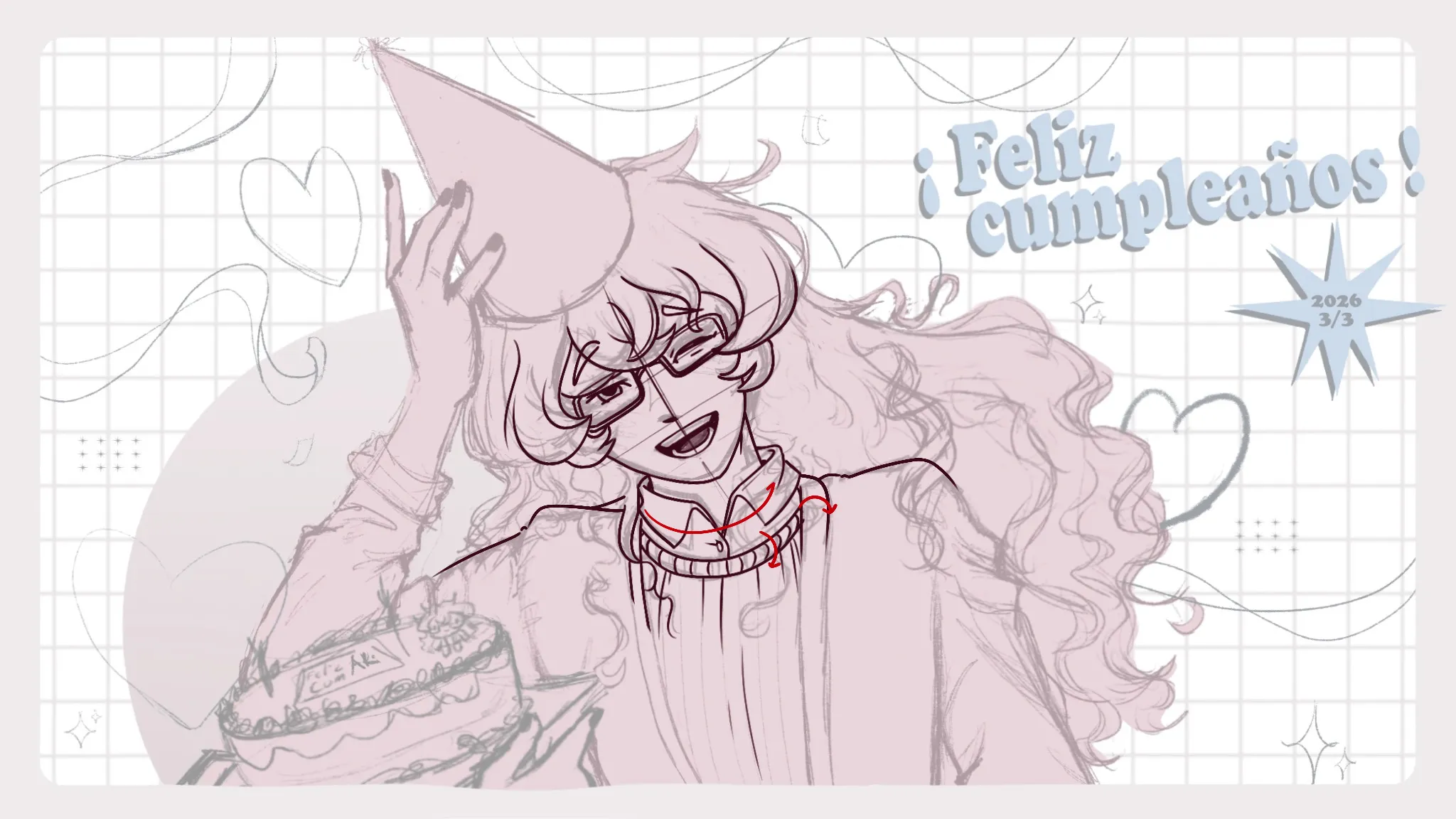
“Happy birthday to your OC! I think in terms of proportions, their right arm holding up the hat has to be a little bit longer. Other than that, I feel the angle of the neck is in a bit too extreme of a”
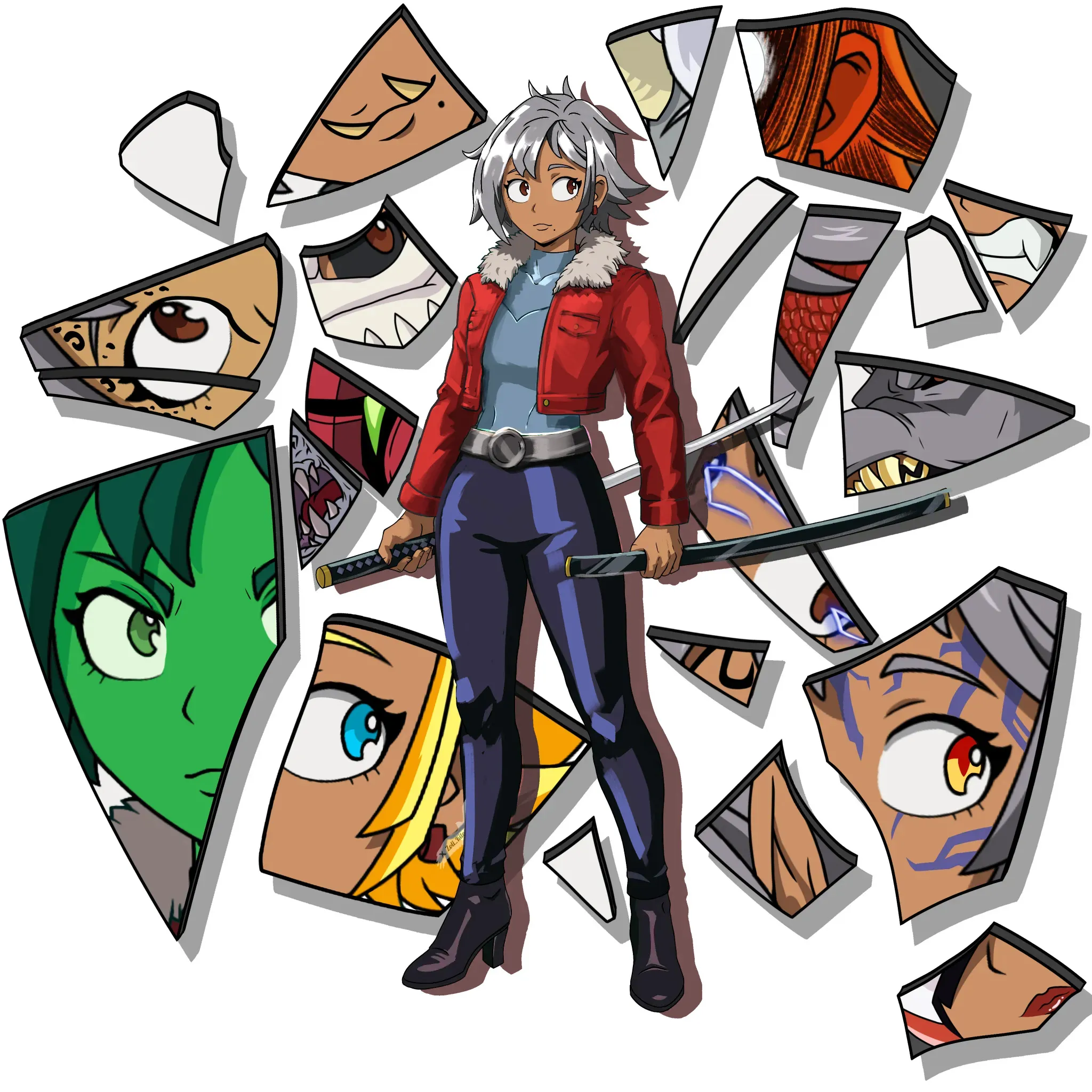
“Hi, I'm not familiar with this character/oc, but very curious to see what those different transformations look like! The hair has both a highlight & shadow celshading, so apply the highlights to the r”