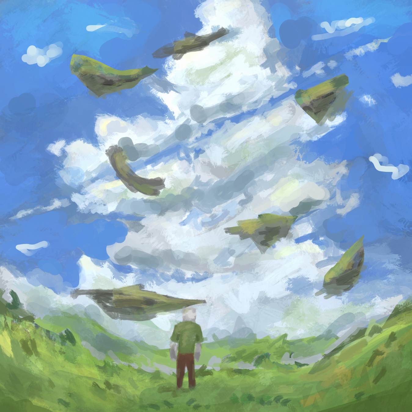
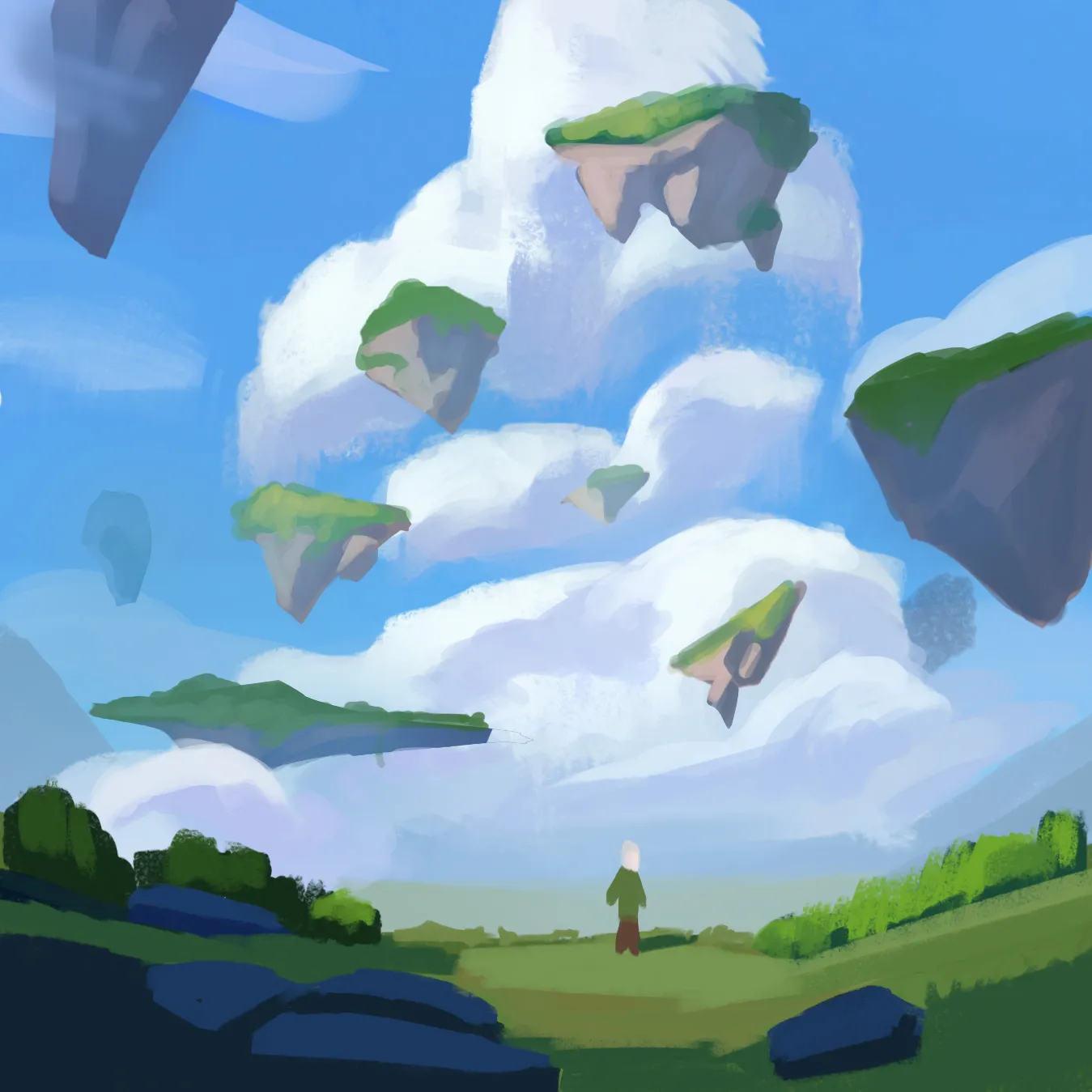

Hey! The main issue is that your forms aren't clearly defined. Regardless of which tools you use, you need to do a better job of defining them. For that, I recommend always starting by blocking in the forms using their local colors. Before jumping into lighting and volume, it's ideal to first establish the composition using only graphic shapes. Once that's done, it's much easier to add light and shadow depending on the mood you want for the illustration. Also, keep the separation between the different planes in mind. The farther objects are from the camera, the softer and more subdued they will appear due to atmospheric perspective. In fact, the rocks in the upper part of the image will tend to have more bluish shadows because of the atmosphere. On the other hand, the closer objects are to the camera, the sharper their forms will appear and the darker their shadows can be. The scale of the character matters as well, a smaller character helps sell the sense of scale and makes the world feel much larger!
Thank you for the feedback! 🙏