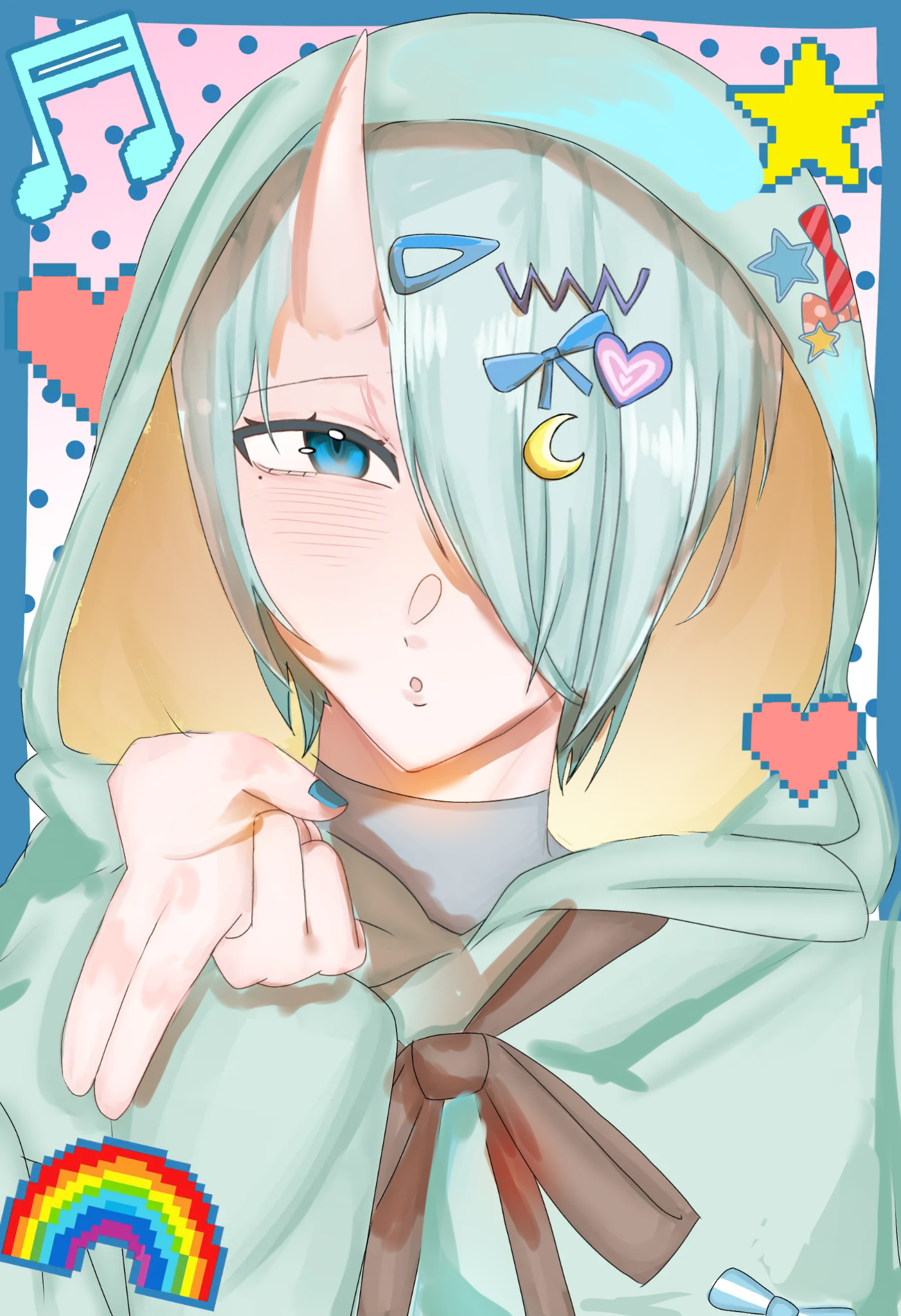
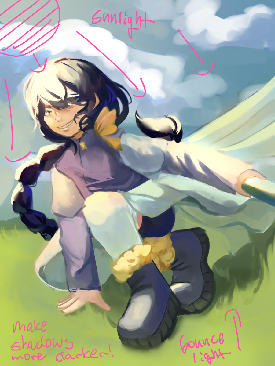
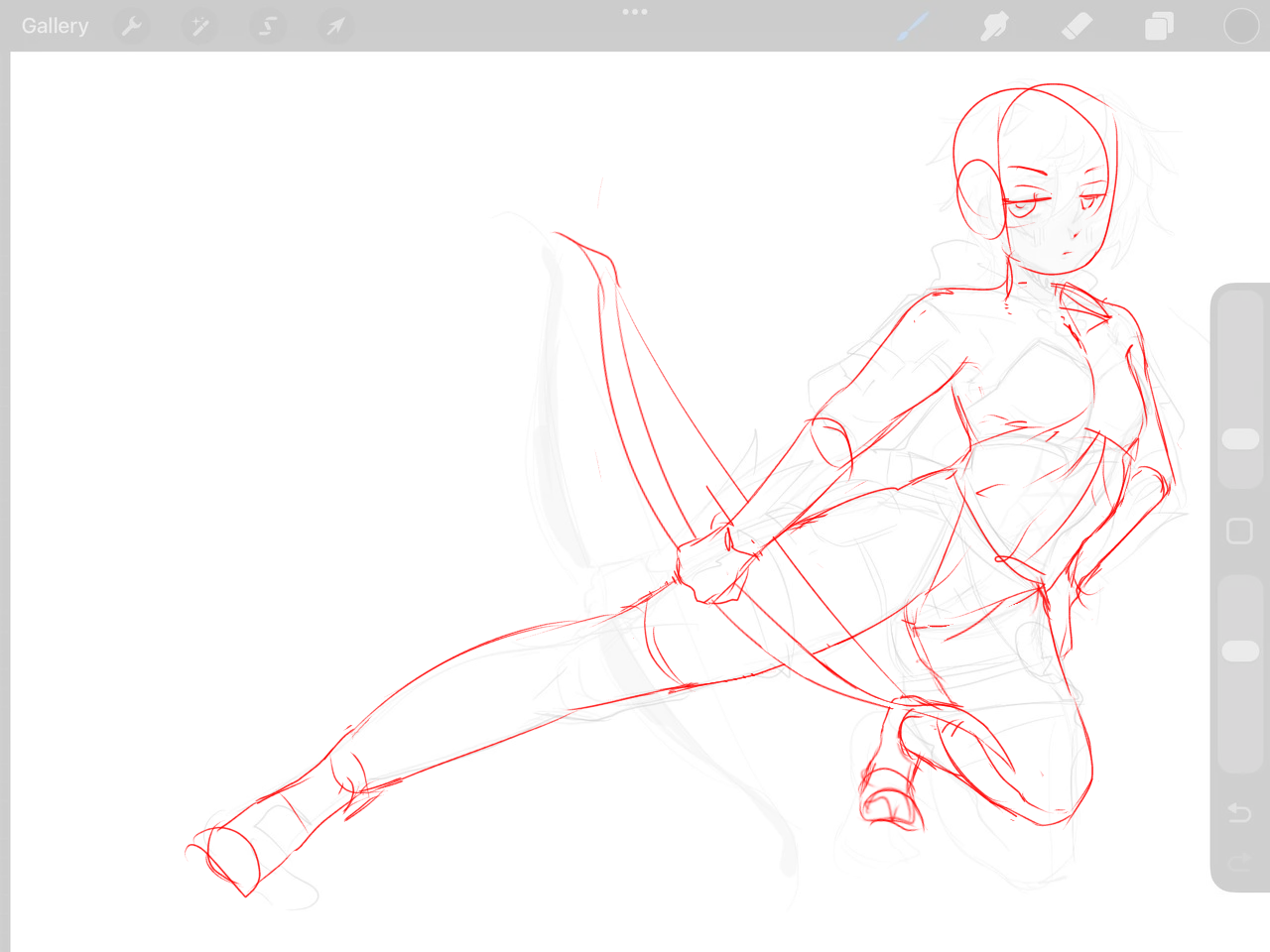
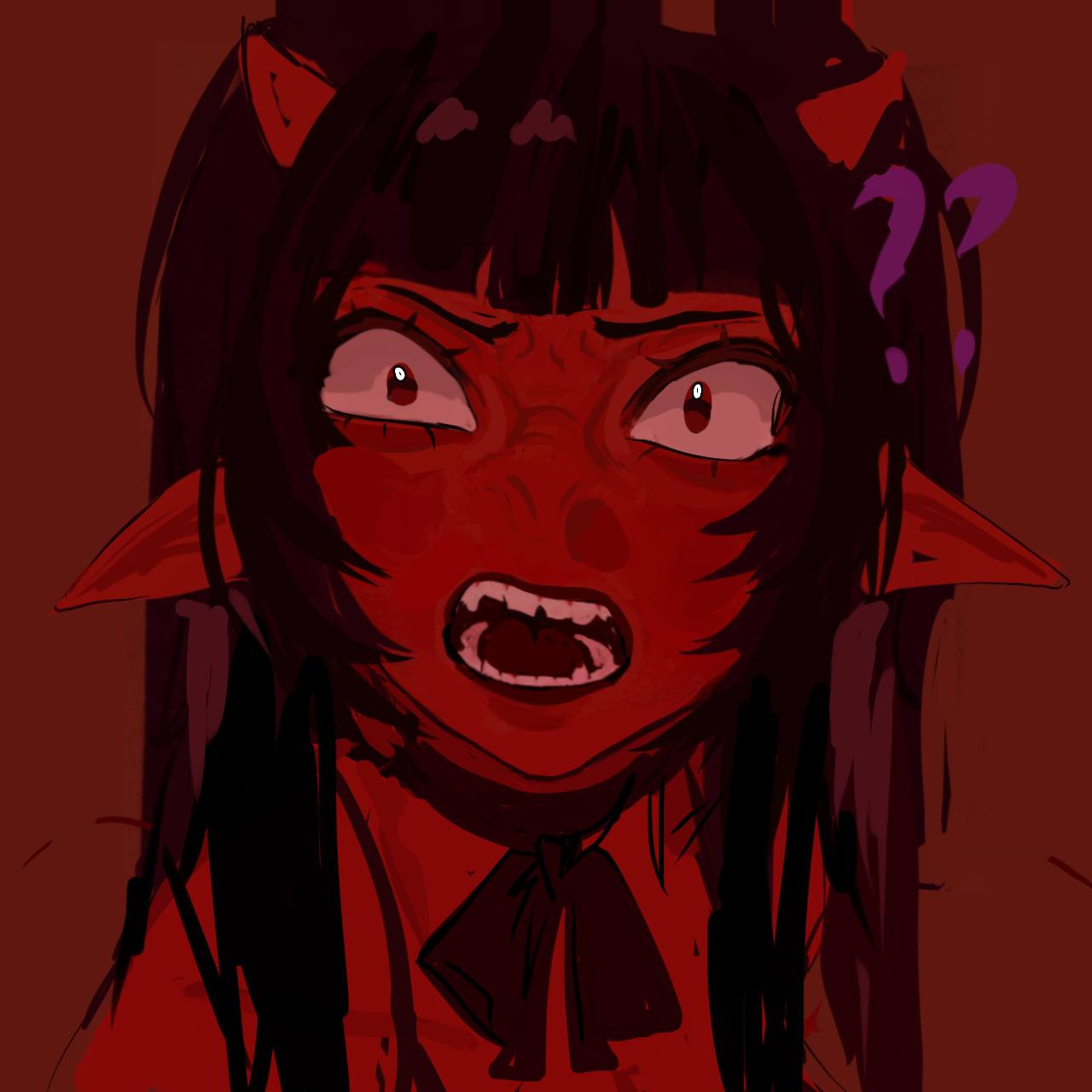
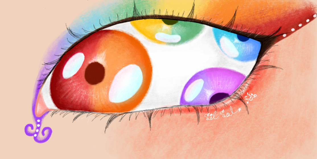
hi! I just want to do stuff here lol
#16
Place
16
Votes positifs
12
Retours donnés
100%
Utile
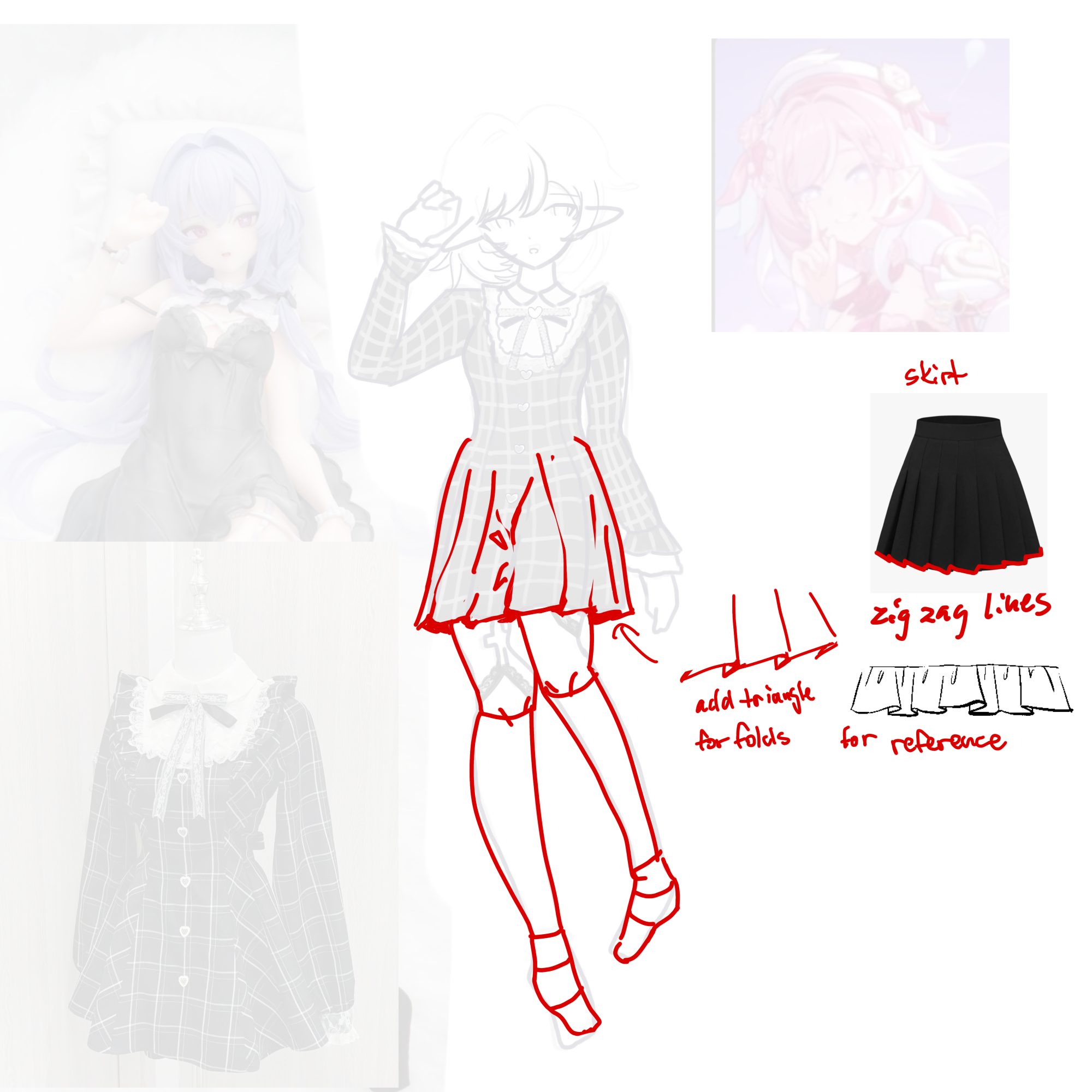
“Your art looks cute! Just needed to add the folds to the skirt and you will be good! A quick help is to look for types of clothing folds ( for example ruffles ) if you are unsure. In my opinion, I’”
“Hi! First of all, I really like your rendering. Secondly, I want to point out anatomical inaccuracies in your drawing ( which I have noted in the following revision ): -> spacing between objects”
“* I’d recommend using more saturated colors if you want it more colorful! Here I put clear shadows to separate the colors more, and made the background more of a pinkish color. I also made the girl’s ”
“Hi! Here’s a revision that I did, and the few things I noticed: -> corrections to the lighting itself The lighting looks a bit unfinished on the piece. Based on what you put the highlights on, it”
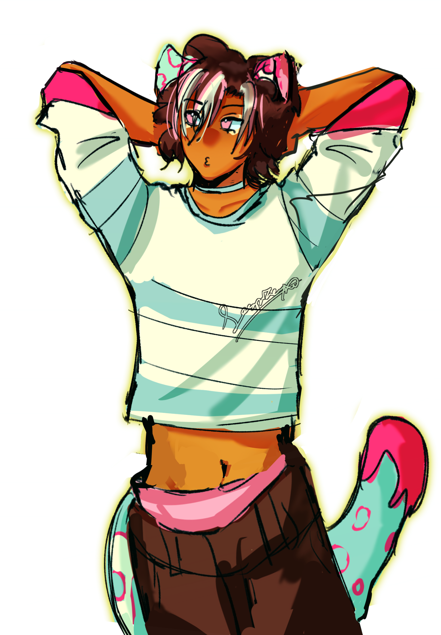
“Hi! I feel like right arm was drawn a bit too long for the body and the left leg should be lifted up since it’s in a crouching position. Besides the two things I mentioned, the rest seems anatomic”
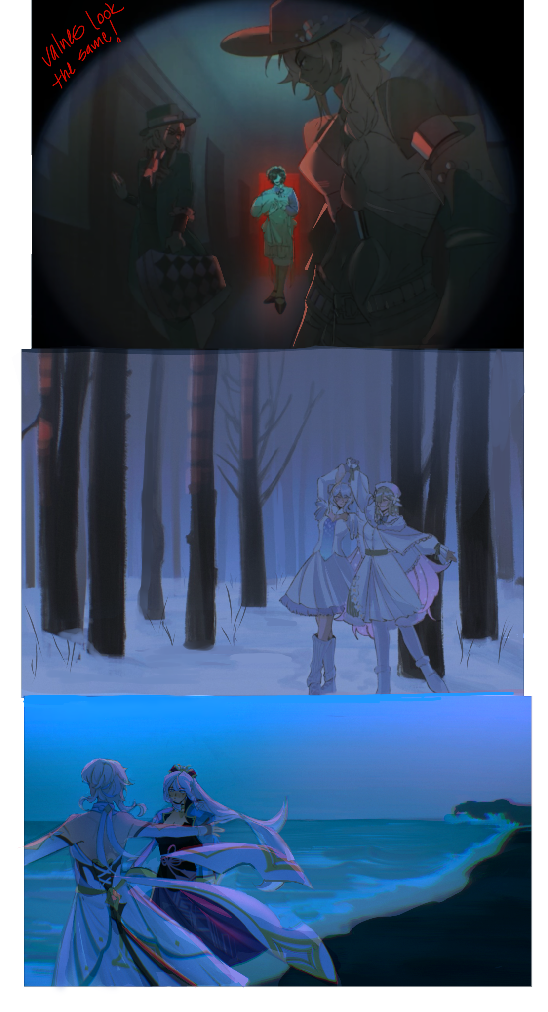
“Hi! I like your drawings! -> The main thing I noticed is that the values look too similar to each other. This can make your lighting appear more dull as it is intended. For example: the characters”
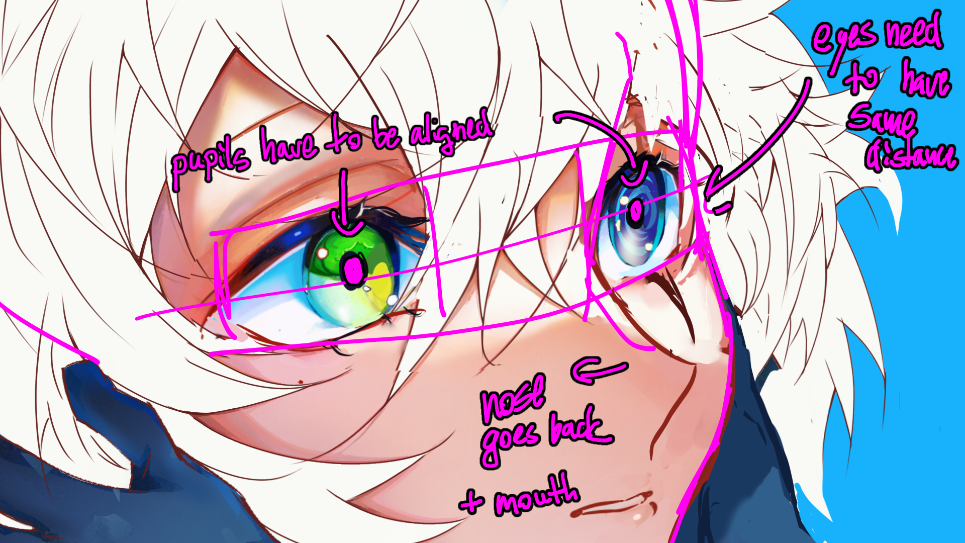
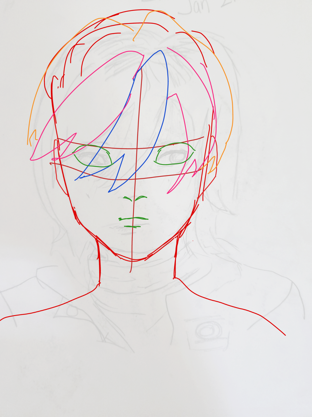
“Hi! Feeling as if your art isn’t improving is totally normal! * In my revision I drew the head in different colored line so that you can see the proportions better. The nose and mouth should be al”
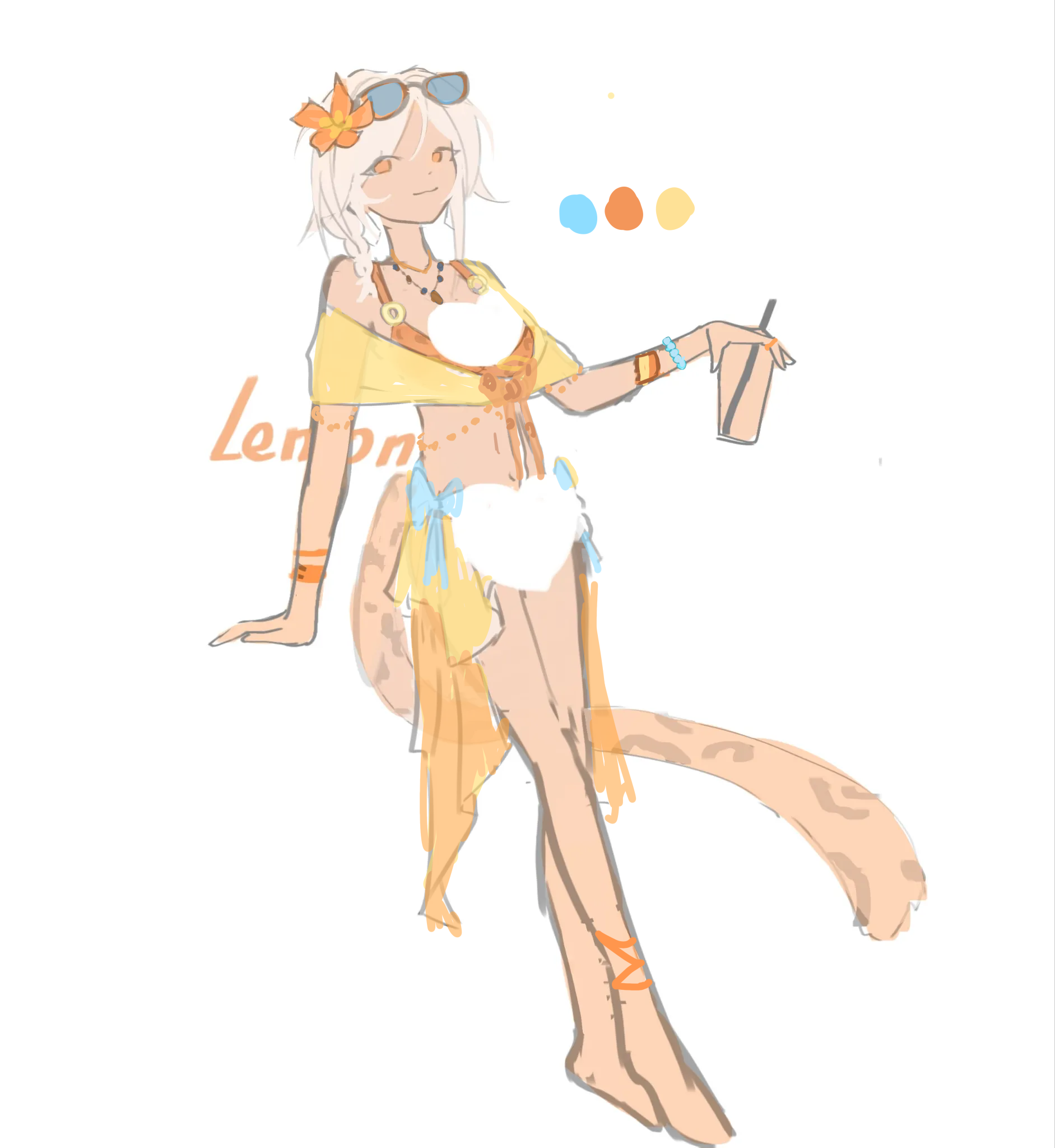
“Hi! I like your artstyle. If I have to design a summer themed character, I’d design it like this. Colors make up a difference. * Here I used the main primary color ( orange ) with a complimentar”
“Hello!!! I’m going to list a couple of mishaps I see in your drawing: -> the arms look disportionate: especially the upper arms, they seem a little too big which makes the head look smaller. -> ”
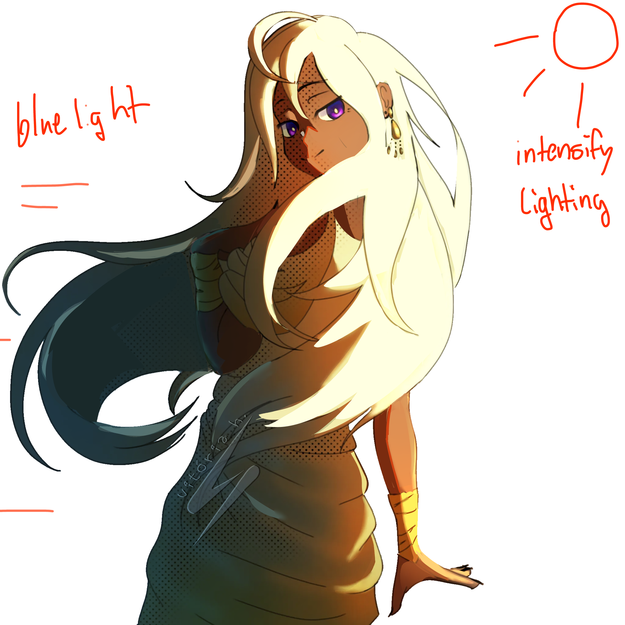
“im not a fan of lighting, but I made the lighting and shadows more intense and added some bounce light to reflect the blue colors! There isn’t anything wrong with the drawing, just that the lighting c”
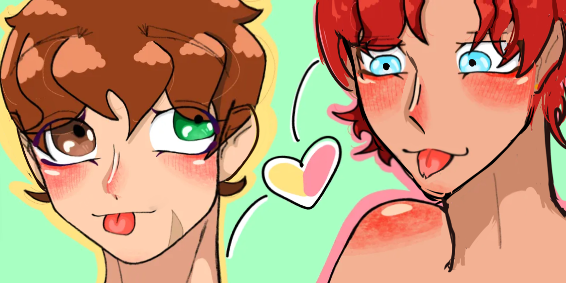
“Head seems small so I made it bigger, the space between the eyes needs to be the same distance, I changed the mouth a bit to adjust to the perspective, neck is out of place on the red guy so I fixed i”