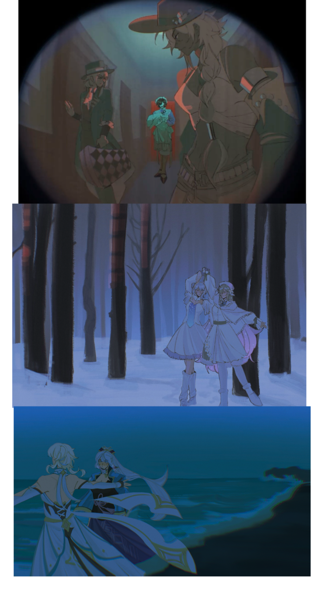
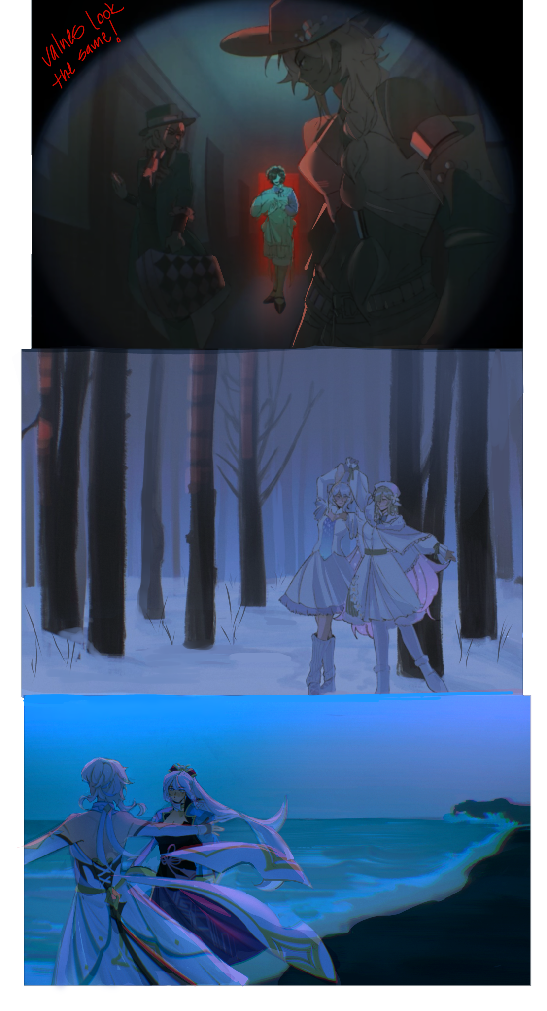

Hi! I like your drawings! -> The main thing I noticed is that the values look too similar to each other. This can make your lighting appear more dull as it is intended. For example: the characters in the first picture look a bit blended in with the background, as well as the characters in the other drawings. * Honestly I’d push the values a bit more by making the colors more saturated and the shadows more darker. Here I made the red light reflect the floor because I assumed that the light is bright enough to hit on the characters from afar. * For the third picture I added some ambient light to the characters and darkened them to distinguish them from the background. I added a few additional things such as environmental elements, reflective lighting etc. Hope this helps ^^
yeah i see it clearly now your paint-over really helped to see my problems and how to fix them thank you alot!