New: switch between gallery and single view here.
animator, storyboard artist, and character designer
#5
Rank
17
Upvotes
13
Feedback Given
100%
Helpful
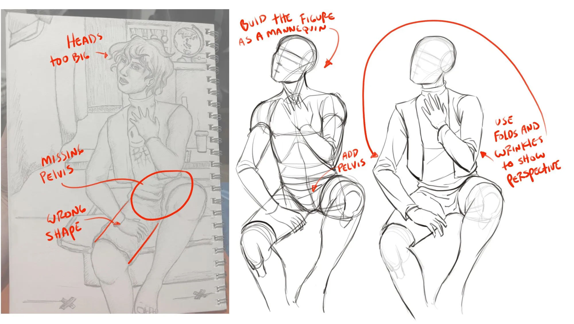
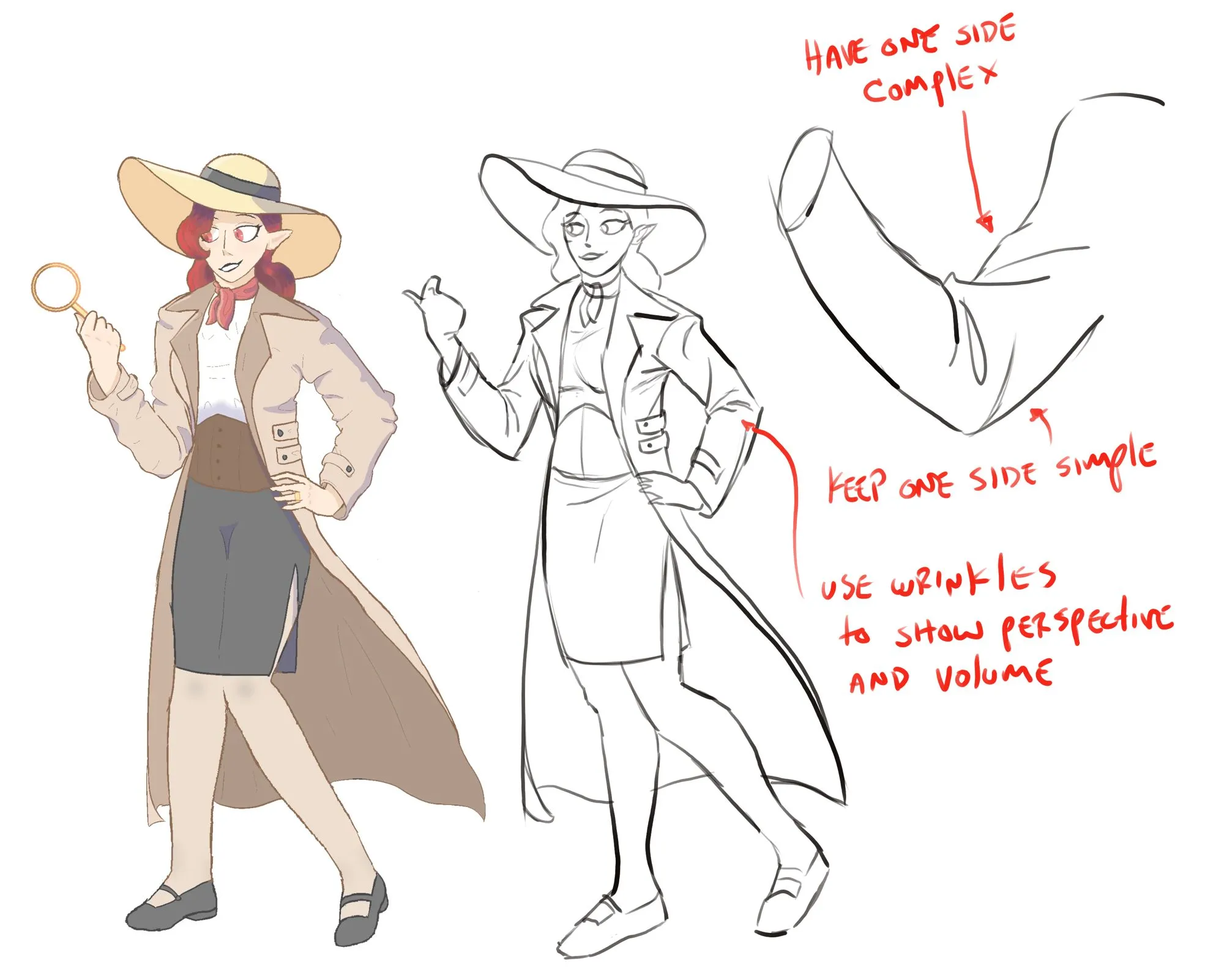
“Your missing a proper pelvis in this drawing. I would suggest building your figure with a mannequin first, then add the details like clothing. Speaking of clothing, you want to use folds and wrinkles”
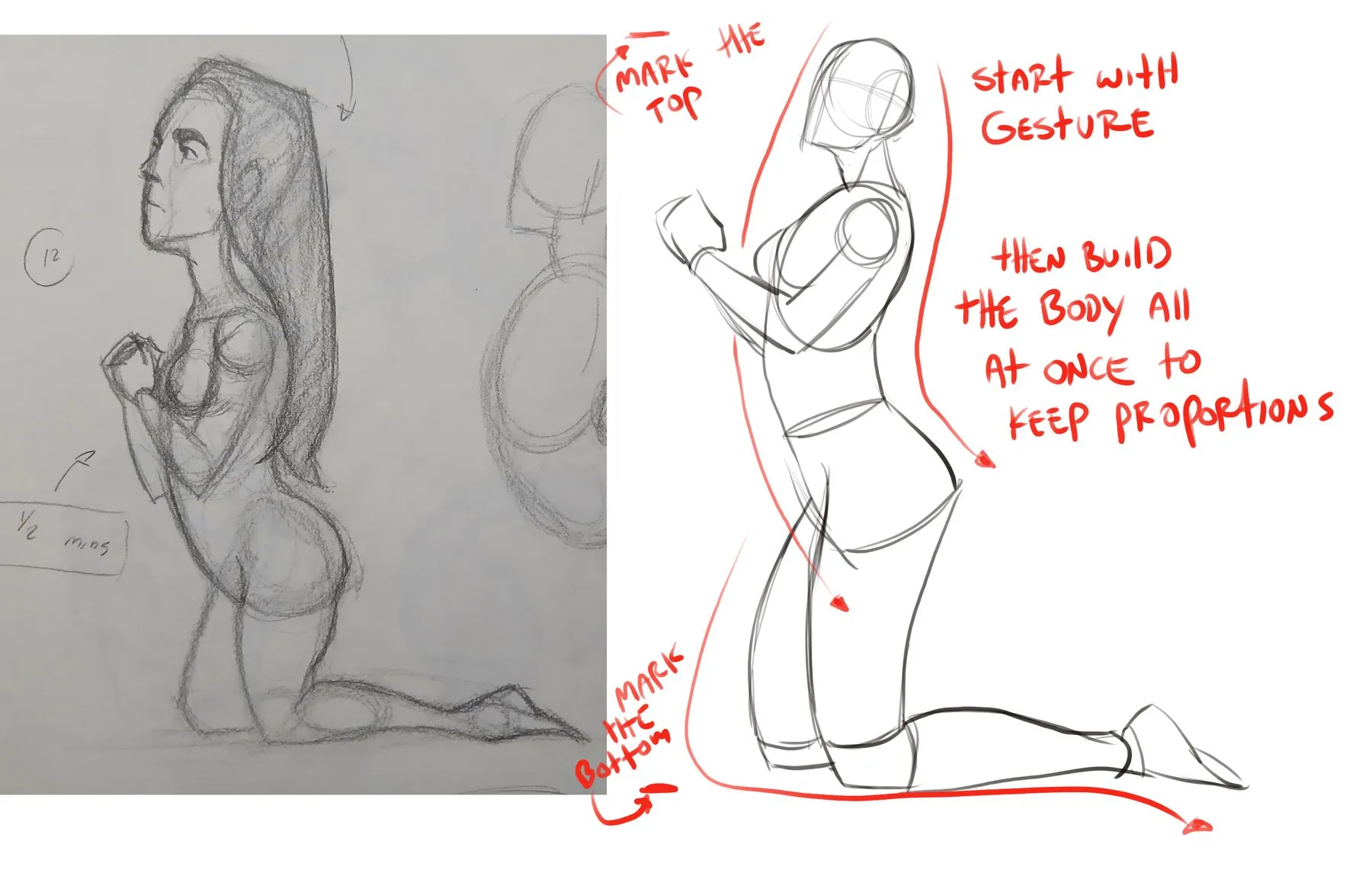
“One way to help with proportion is to mark the top and bottom of the drawing. Then draw the figure all at once, and not just starting at the head. I did a little sketch I hope helps :)”
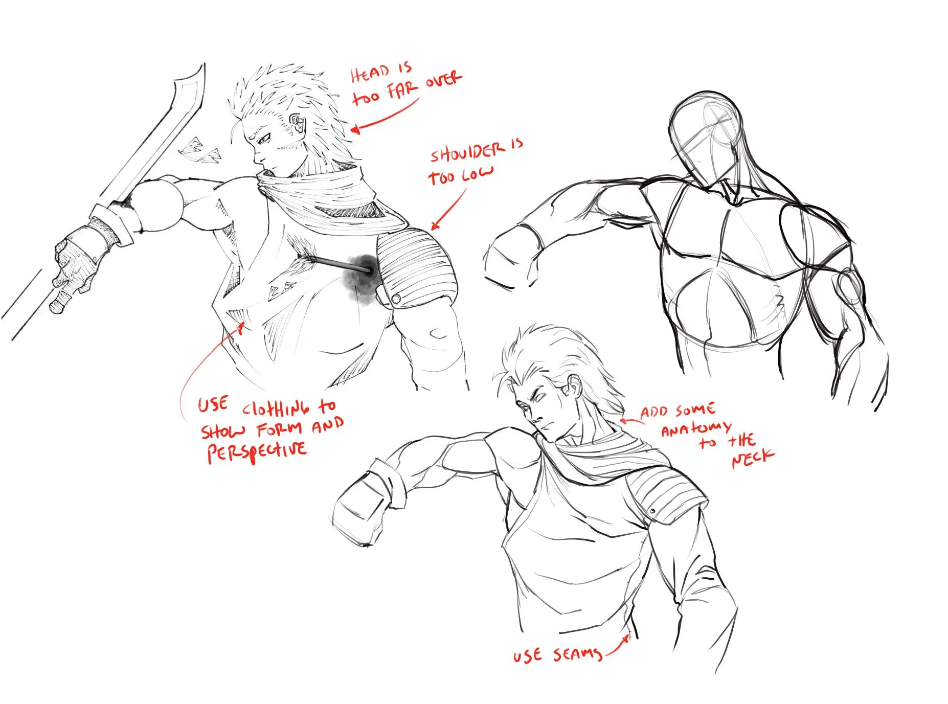
“Hey, nice job on the gesture of this pose. There are some proportion and anatomy issues, so I did a little sketch to show you what you can do to fix them. I hope this helps :)”
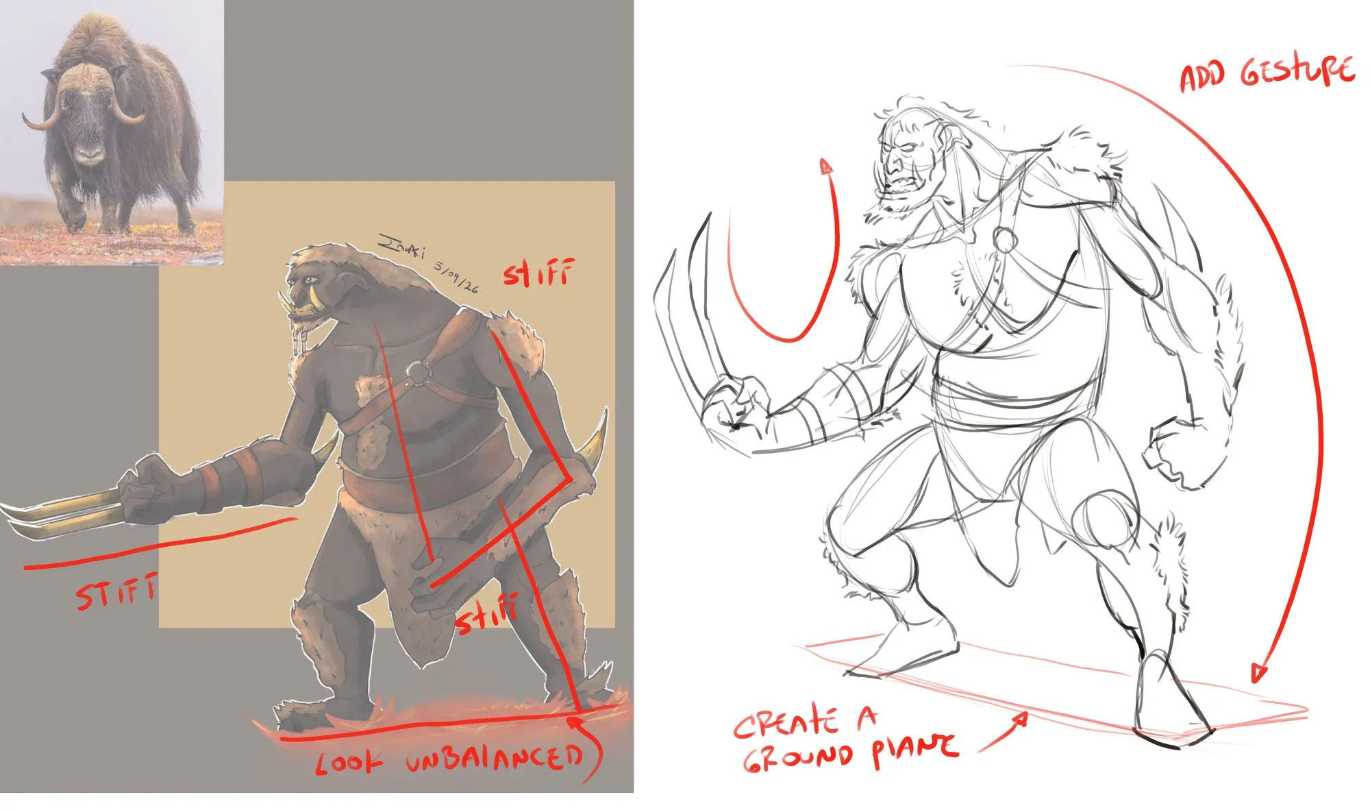
“I like your buffalo guy, especially the face. One thing you need to be aware of is to make sure you think about gesture, it keeps our drawings from looking stiff. I did a quick sketch to show you one”
“I like the 40's vibe of this. When designing wrinkles and folds keep in mind that you want to use them to help sell perspective of what its wrapping around. Also, keep one side simple/stretched and t”
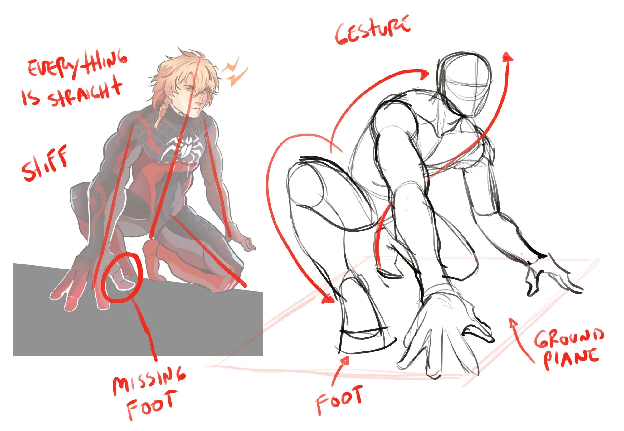
“Yeah, that can be a tough angle. You should first create a ground plane, it will help you know where to put everything so that it will look right. Also, make sure you think about gesture when you beg”
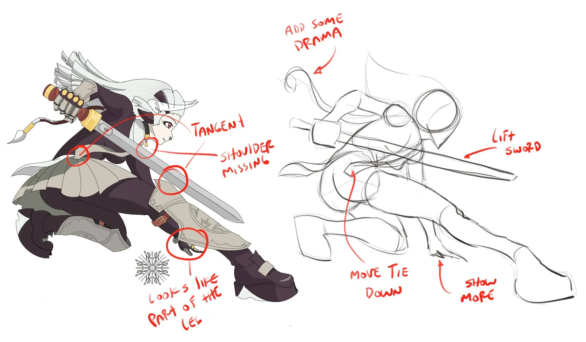
“Hey, this is a nice drawing, lots of good stuff. The one thing I noticed is some tangents, so I did a quick sketch to show you how you could fix them, I hope it helps :)”
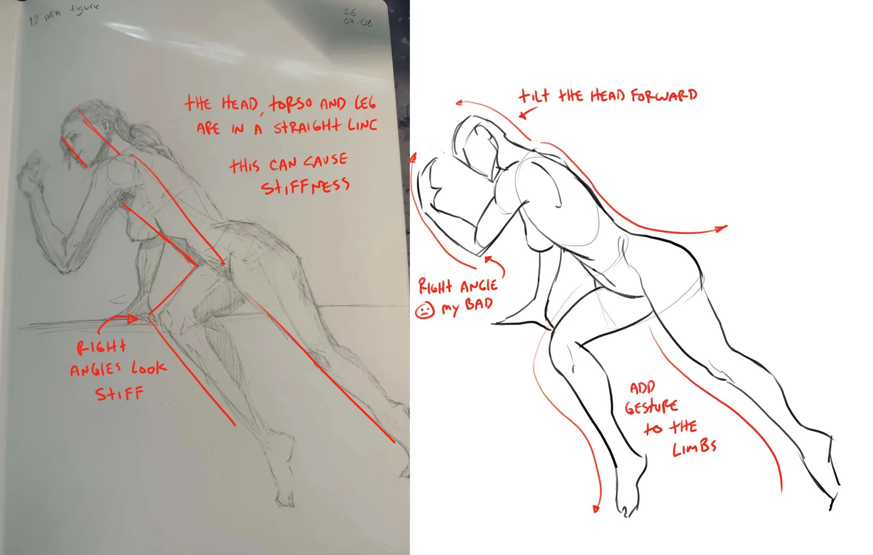
“This pose is solid and has some nice dimension, but it is a little stiff. This is due to the fact that the head, torso and leg line up all the way down the body. Also, the limbs have no gesture to the”
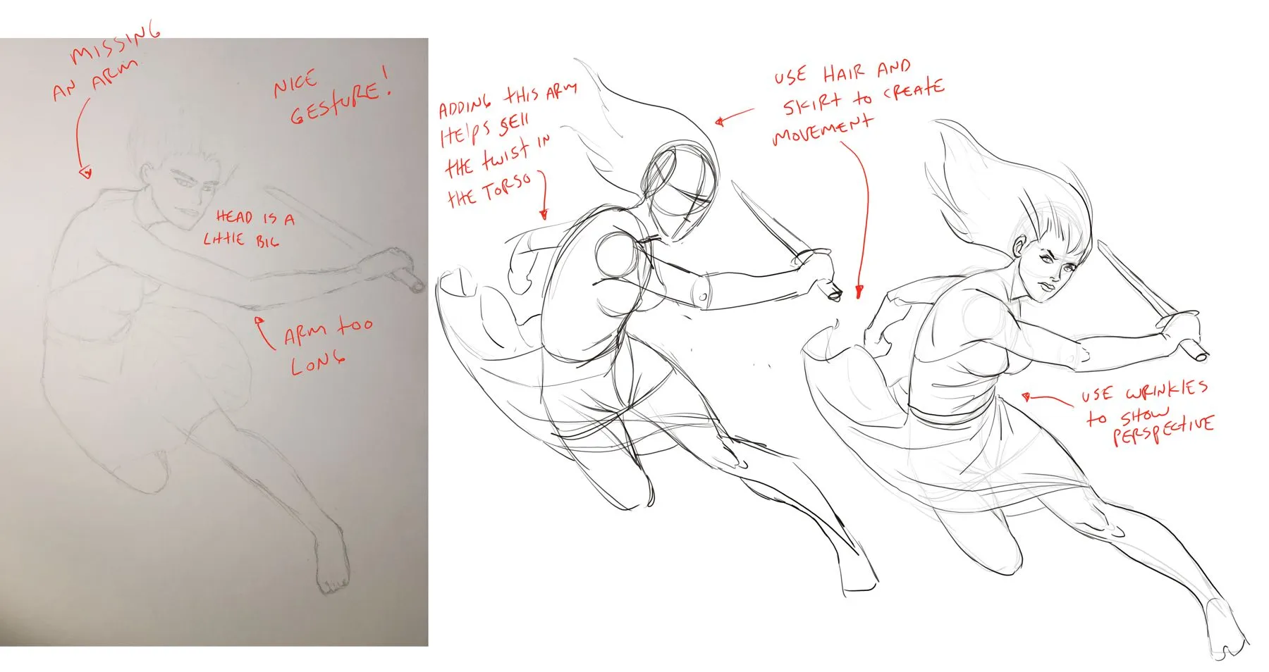
“Man, this is already pretty good. The gesture is pretty much there, I think that adding some gesture to the hair and the skirt will really help it and make it more dynamic. The head is a little big,”
“The table looks three dimensional and in perspective, nice job. To add to that 3D feel, remember to have things farther away a little smaller. If you look at the ovals on top of the table, they are a”
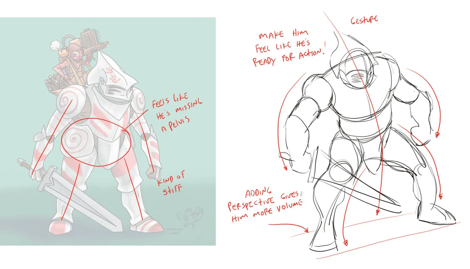
“I like your design, especially the little guy he has a lot of movement in his pose. The big guy is pretty stiff, and could use some dynamics in his pose. He also looks like he is missing a midsection”
“This is very cool, nice job. The one thing that jumps out at me is the little figures over the girls shoulders. They are too close in value to the background and are kind of hard to see. I completely ”