ArtWod
LearnCommunityLeaderboardPractice

Sign InTry for free

Join 100k+ students drawing


UNLOCK THE ARTWOD CURRICULUM

Artwod is here to guide you through the entire drawing process so that you're never on your own and never feel stuck. Receive instant feedback on your drawing assignments to learn from your mistakes and improve faster

Start learning
ArtWod
Try for free
HubRanksLearn
Upload

New: switch between gallery and single view here.

@aherve
Rank #14

@aherve

#14

Rank

60

Upvotes

51

Feedback Given

100%

Helpful

Feedback for table wod
Paintover

On "Feedback for table wod" by @draconom

3 days ago

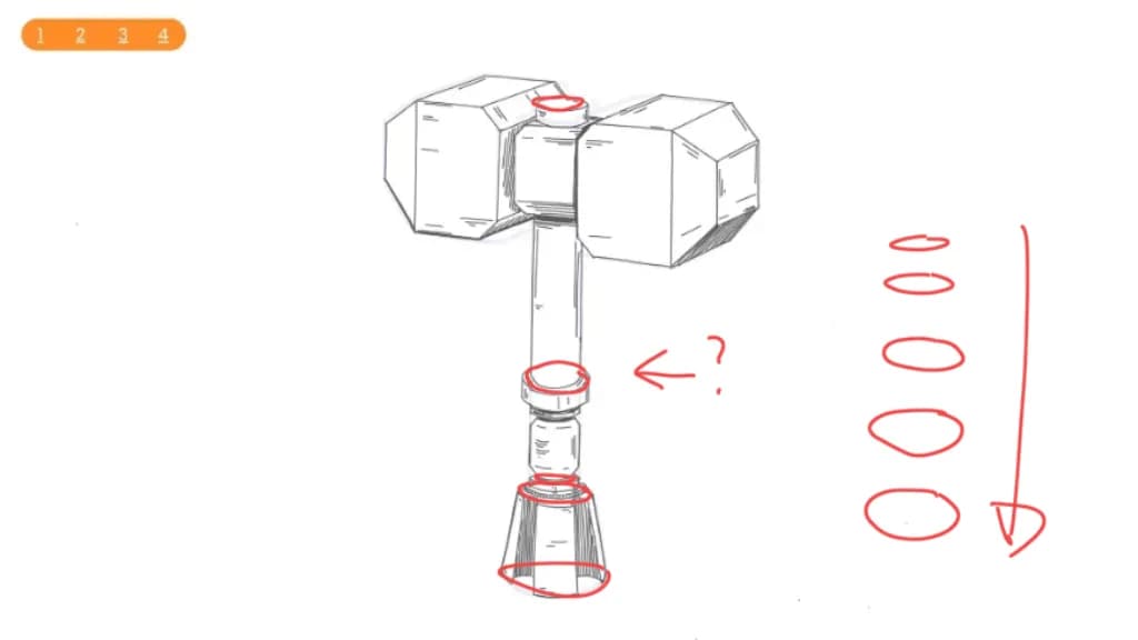
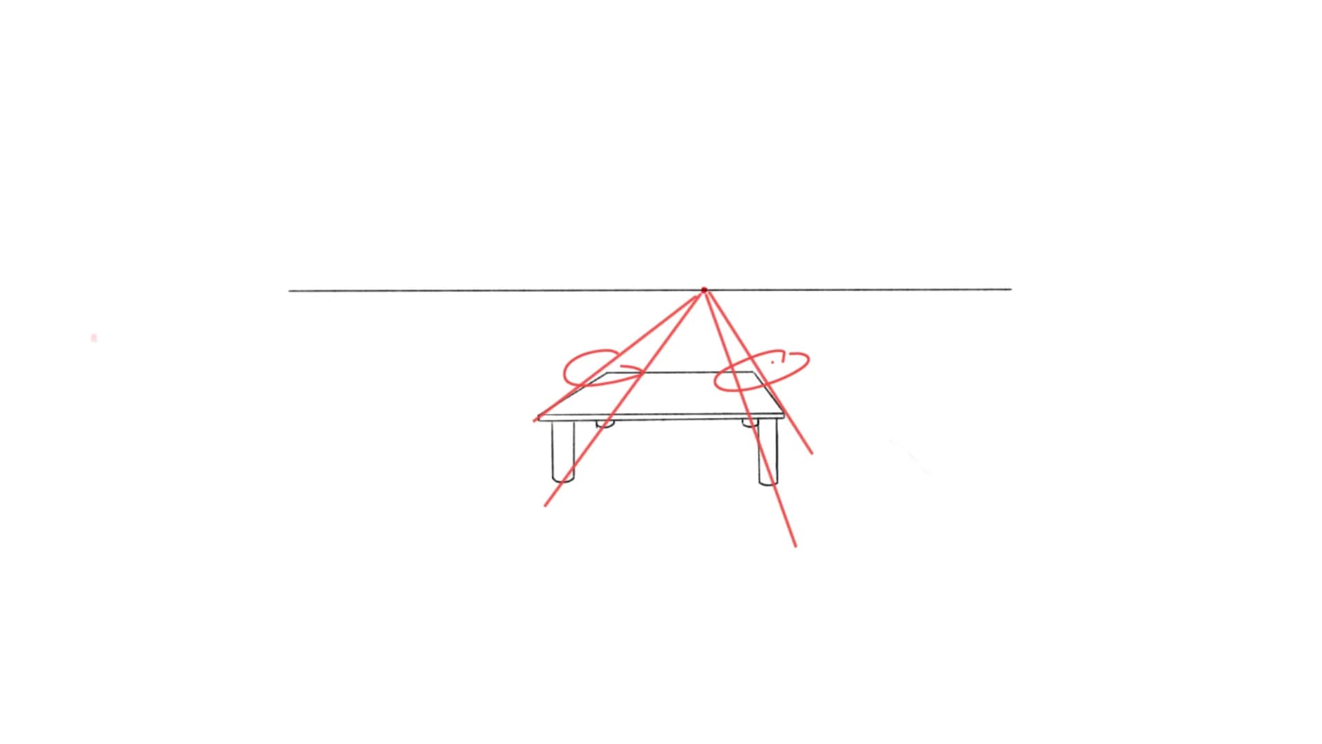
“Hello ! The feet of the table seems in perspective (for a short table). The side converge a bit too fast and suggest a lower vanishing point. It is subtle thought.”

Feedback

On "Main Character Energy" by @aldricbav

3 days ago

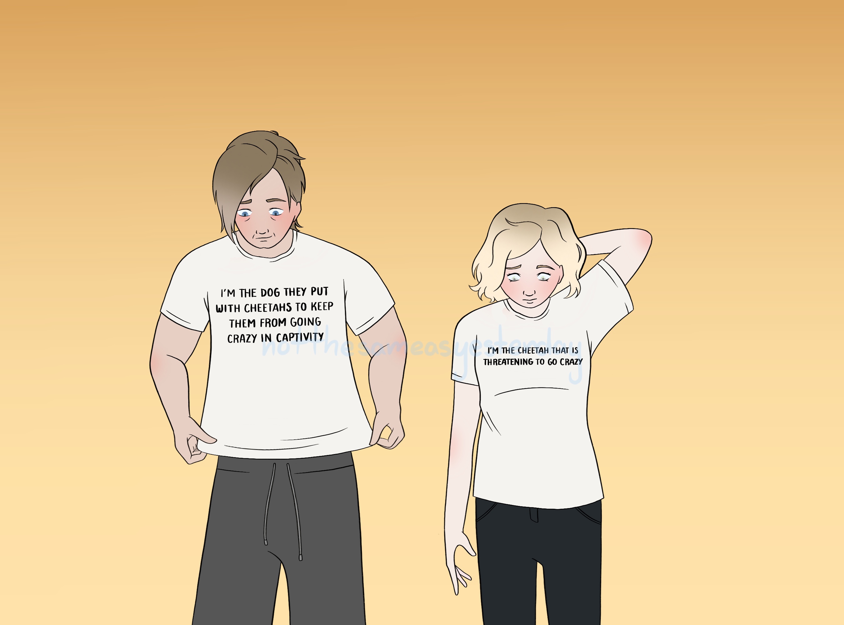
“Really cool character design ! For me they don't give main characters videos though. I think their poses is too passive for that. I would place them as parental figures of the MC. If you want t”

Helpful +1
Little robot king
Paintover

On "Little robot king" by @gabripart

3 days ago

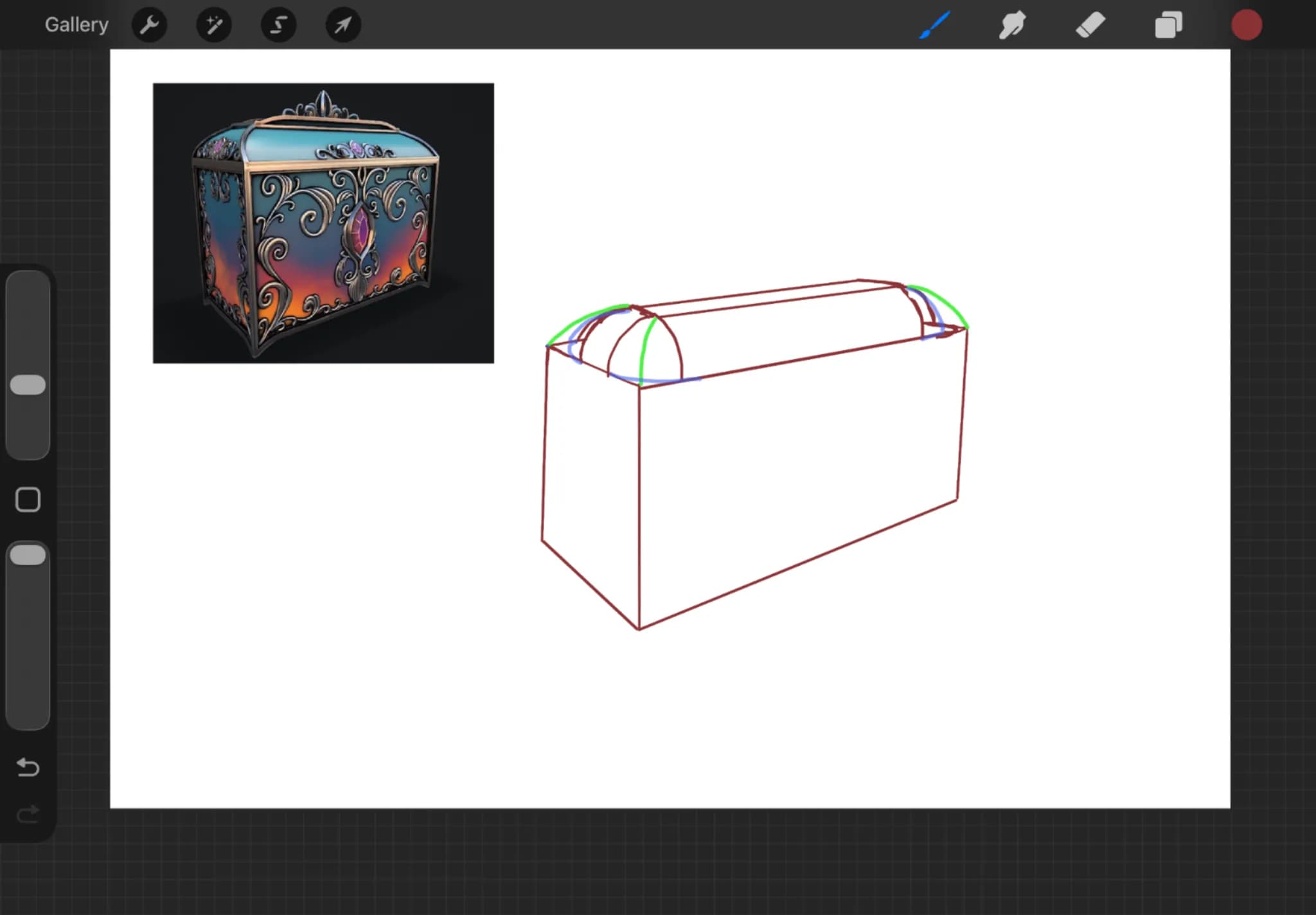
“Really cute robot ! I have heard Antonio say it a couple of times : we tend to draw props too flat because we want to show them of. But this flatten the drawing and make strange posing poses. I ”

Helpful +1
Work in Progress Character
Paintover

On "Work in Progress Character" by @absketching

1 week ago

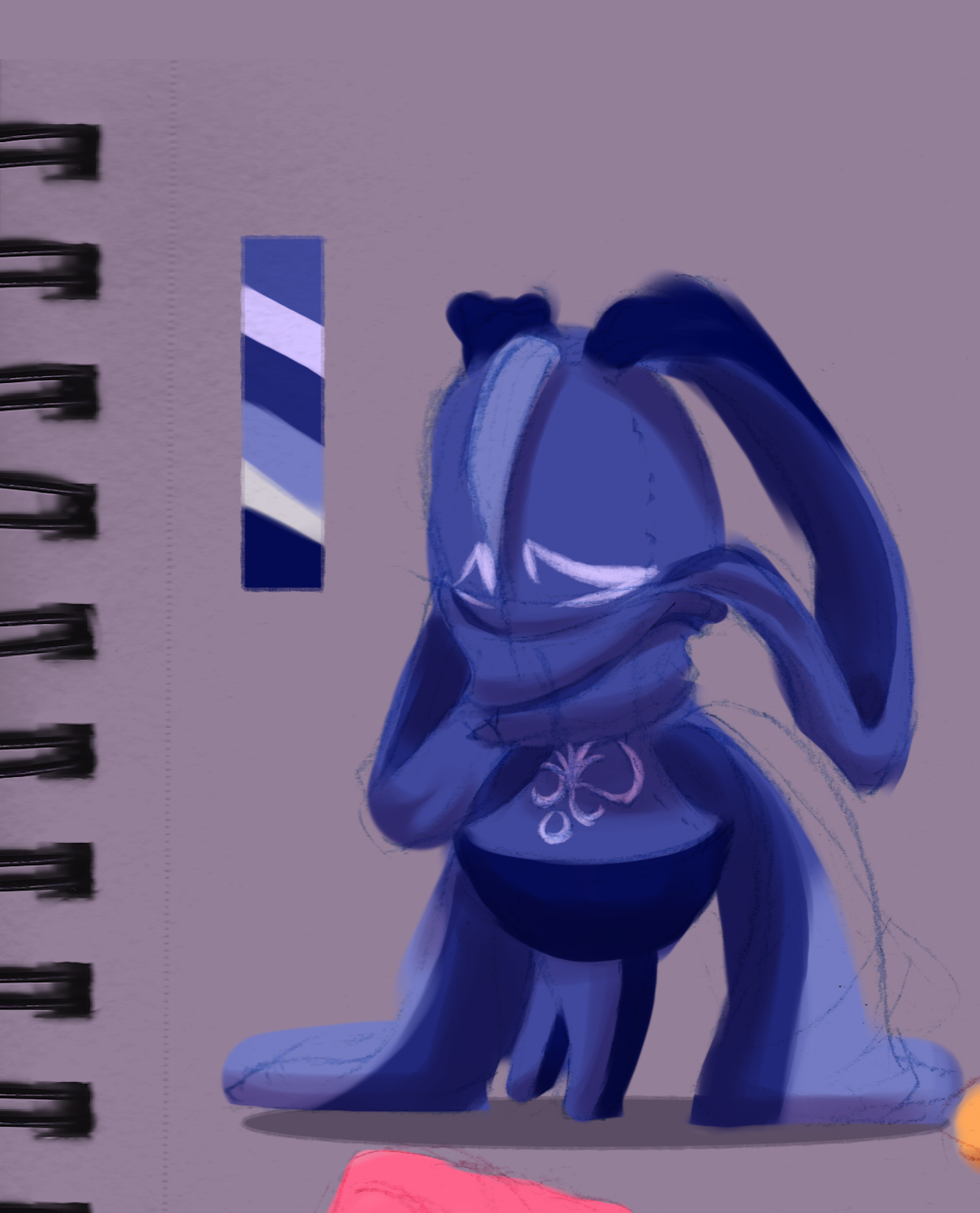
“I really like this character style. I am not a pro but for color I would use some complementary color for shadow and highlight (here orange and your background purple). I would strengthen the color”

Helpful +1
road
Paintover

On "road" by @zaidilluu

1 week ago

“I don't find that amateurish at all ! I would maybe play with the shadows to have clear dark and light shape”

Helpful +2
The Destruction of Smaug
Paintover

On "The Destruction of Smaug" by @hill82194

1 week ago

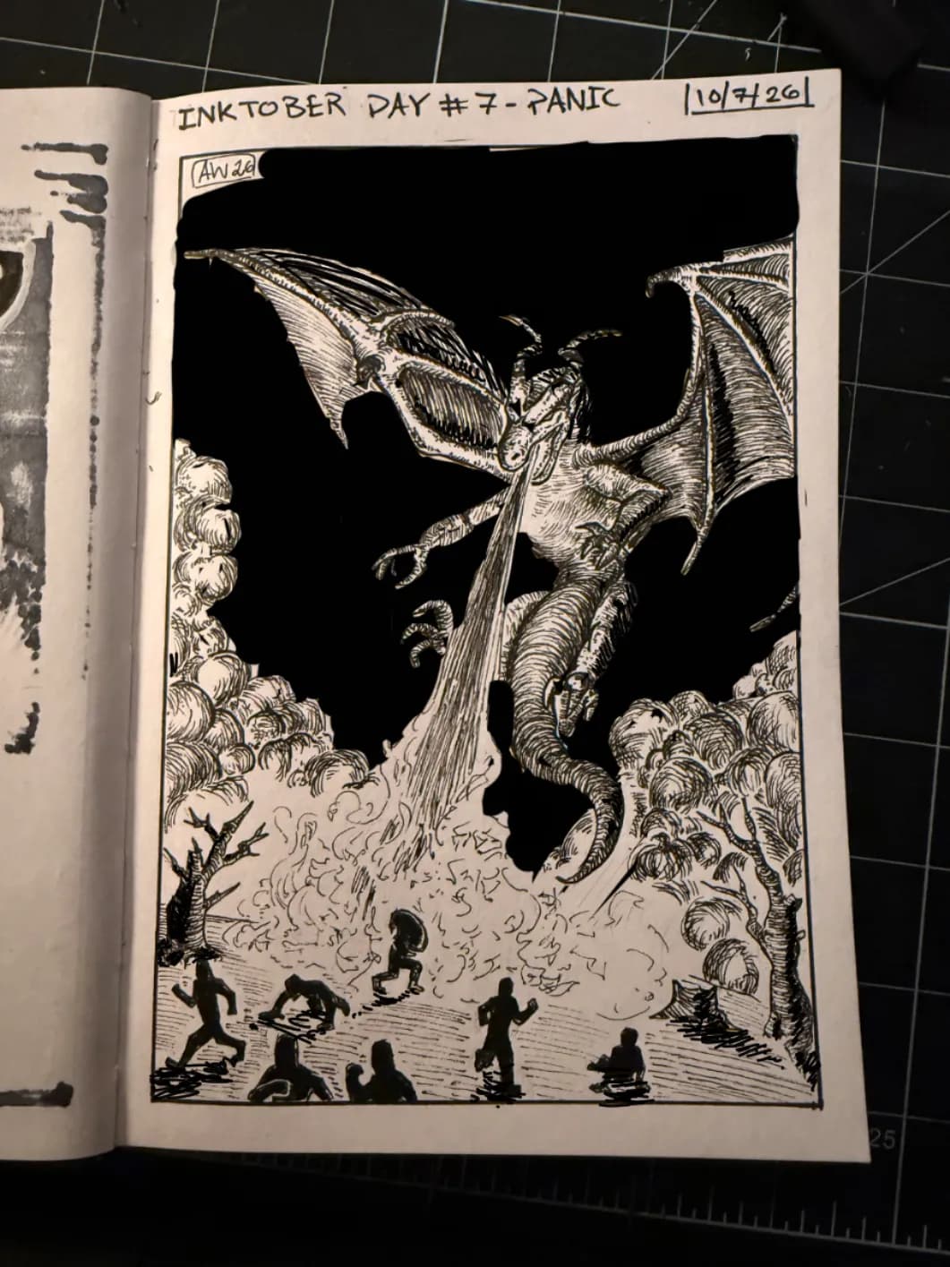
“Amazing drawing ! I'm far from an expert an this is just my personal take on it. I would darken the background to highlight the dragon. I would then use the orange emitted by the dragon has a ligh”

2 point perspective practice
Paintover

On "2 point perspective practice" by @marko20052515

3 weeks ago

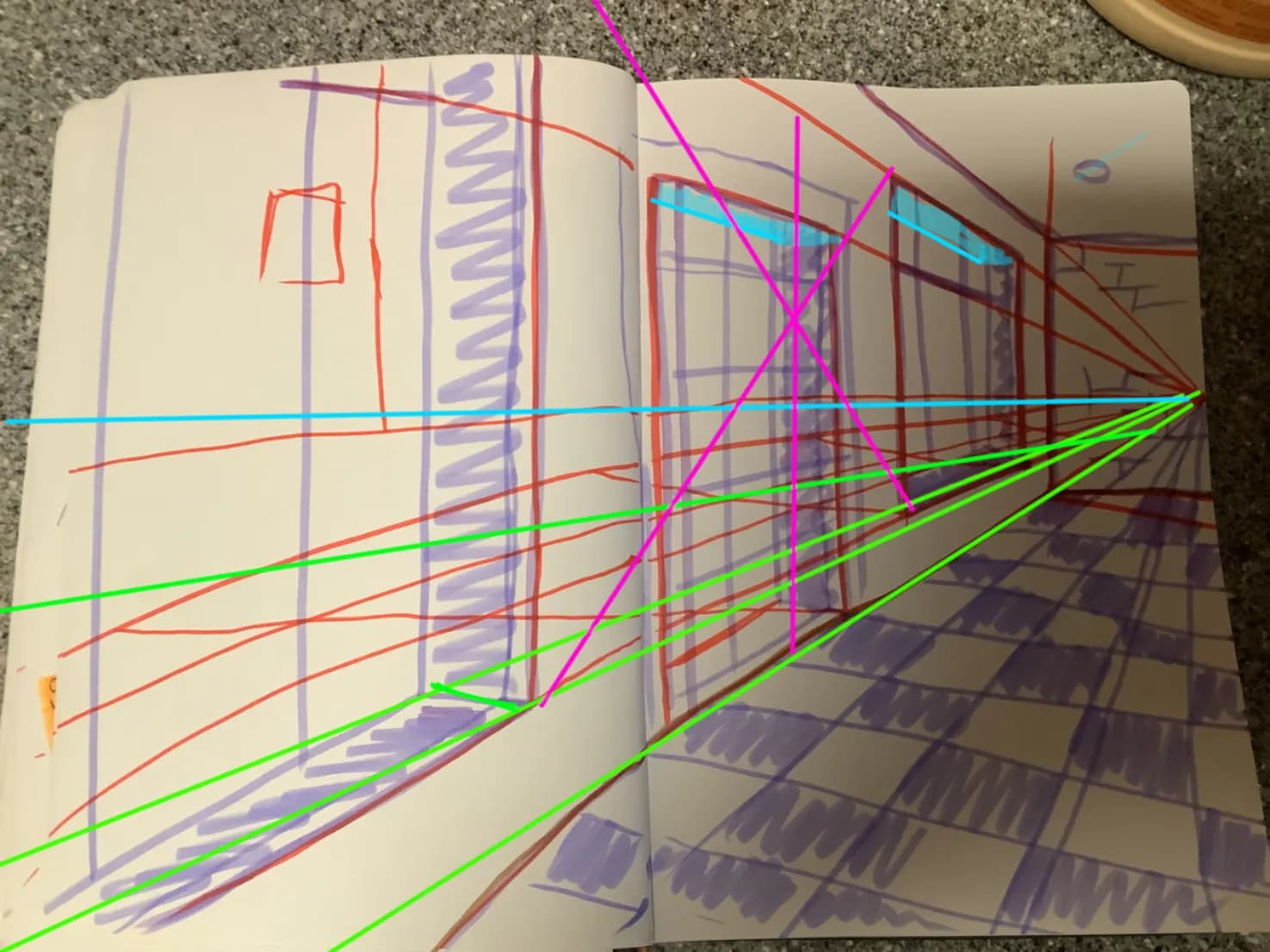
“Hello :) I think a first step you could take is train to draw straight lines, here I think you unconsciously wanted to reach a certain point and some lines curves themselves in order to achieve th”

Cover for a nonexistent book :)
Paintover

On "Cover for a nonexistent book :)" by @luc99332

3 weeks ago

“What a cute cover ! My personal opinion is to keep the lines :p. What I would rework might be the values. They are really similar. I tried something to illustrate my point but it is far from ”

Balance Outdoor tea party
Paintover

On "Balance Outdoor tea party" by @comrizz

3 weeks ago

“Hello, this illustration seems fun :) I think it depends on what you want the composition to convey. This currently put the focus on the character on the right. The left one is put out of focus”

Helpful +1
Red Tower
Paintover

On "Red Tower" by @abd71957318

3 weeks ago

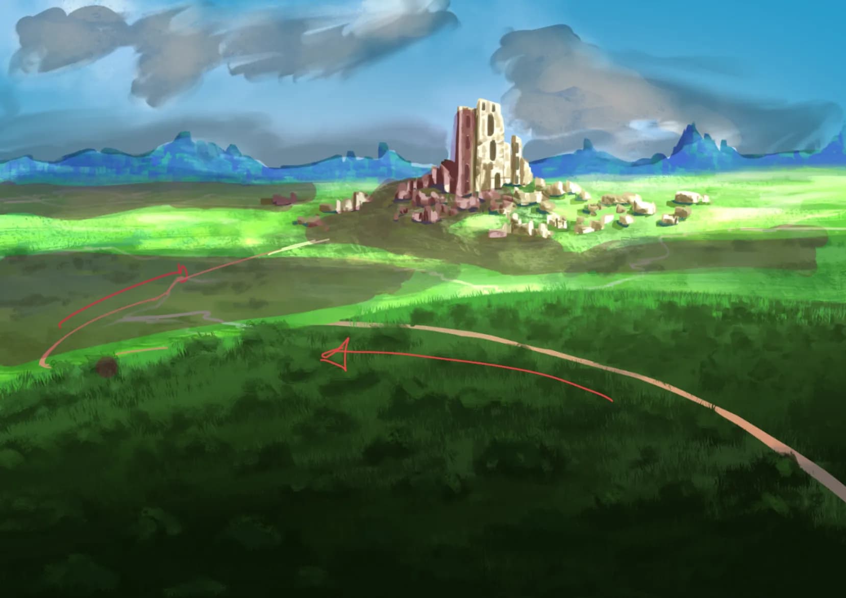
“Really cool building I am not sure what you want exaclty ? architectural advice or construction RP ? I find the building on the left side strange => a military outpost whould not put an "extra r”

pose practise
Paintover

On "pose practise" by @luna

3 weeks ago

“Hello, I find the pose practise really promising ! For proportion : It was quite right except the legs. What I did was check the distance from the knee to hips, they match hips to shoulder on the”

Helpful +1
Drawing
Paintover

On "Drawing" by

1 month ago

“Not bad at all ! I disagree with you : it is not pretty bad, especially for a first drawing. Basic proportions are here: eyes at the middle of the face, 1 eye space between the eyes, the hairs are g”

got the wrong values
Paintover

On "got the wrong values" by @wassil89504

1 month ago

“Hello ! Good work ! Here is some feedback to go a step further : The question to ask for each section is: do I put it in dark, medium or light. And then you have to be consistent: * One of ”

Work In Progress
Paintover

On "Work In Progress" by @bamkyre

1 month ago

“Hello, Really cool pirate ! 2 point I found: * The right hand (on our left) is bigger than the other even if it is far away. * The nose and mouth are nealy facing us but the face is more turn”

Helpful +1
Drawing boxes in one-point perspective: third exercise
Paintover

On "Drawing boxes in one-point perspective: third exercise" by @brandon40337

1 month ago

“Hello You did find the right vanishing point. You just fall for the brain wanting to display all sides. Here the left side is practically invisible since the side is nearly above at the vanishi”

Helpful +1
I don't understand highlights :)
Paintover

On "I don't understand highlights :)" by @yannis62546

1 month ago

“Hello, I'm not an expert of the subject but what I understood is that the iris don't pop out, it's pop inward. BUT the transparent cornea pop outward. So the light is masked by the right border an”

Helpful +1
Timed study
Paintover

On "Timed study" by

1 month ago

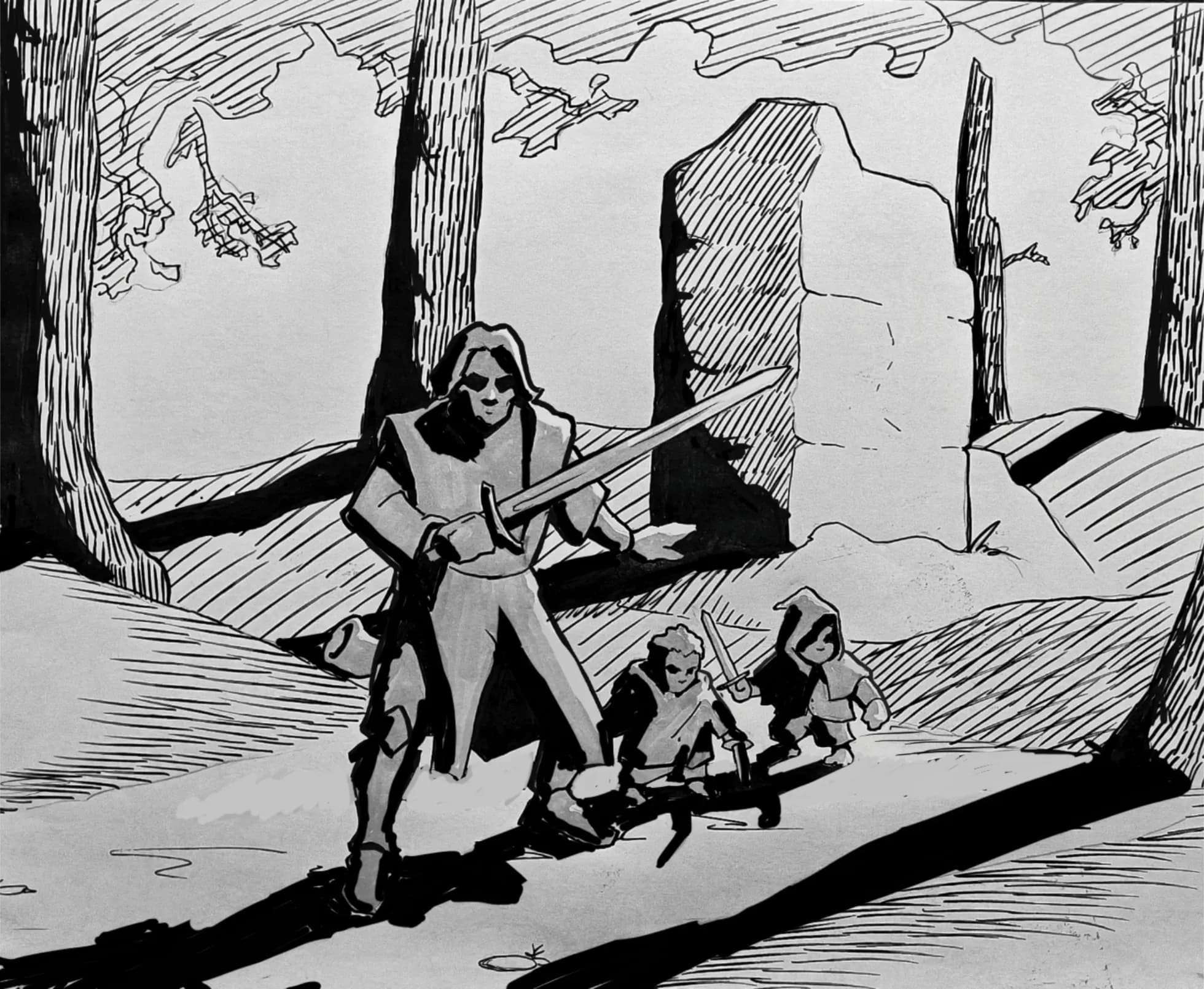
“I think you did well for a timed study. To make the colours pops I would: - add a bit more contrast in the dark. - think of overlapping forms and values. The goal of this kind of studies is t”

Fundamentals Detox Session
Paintover

On "Fundamentals Detox Session" by @beke

1 month ago

“Why not :) I feel a bird is missing :p”

Helpful +1
Violet evergarden
Paintover

On "Violet evergarden" by @kira94596

1 month ago

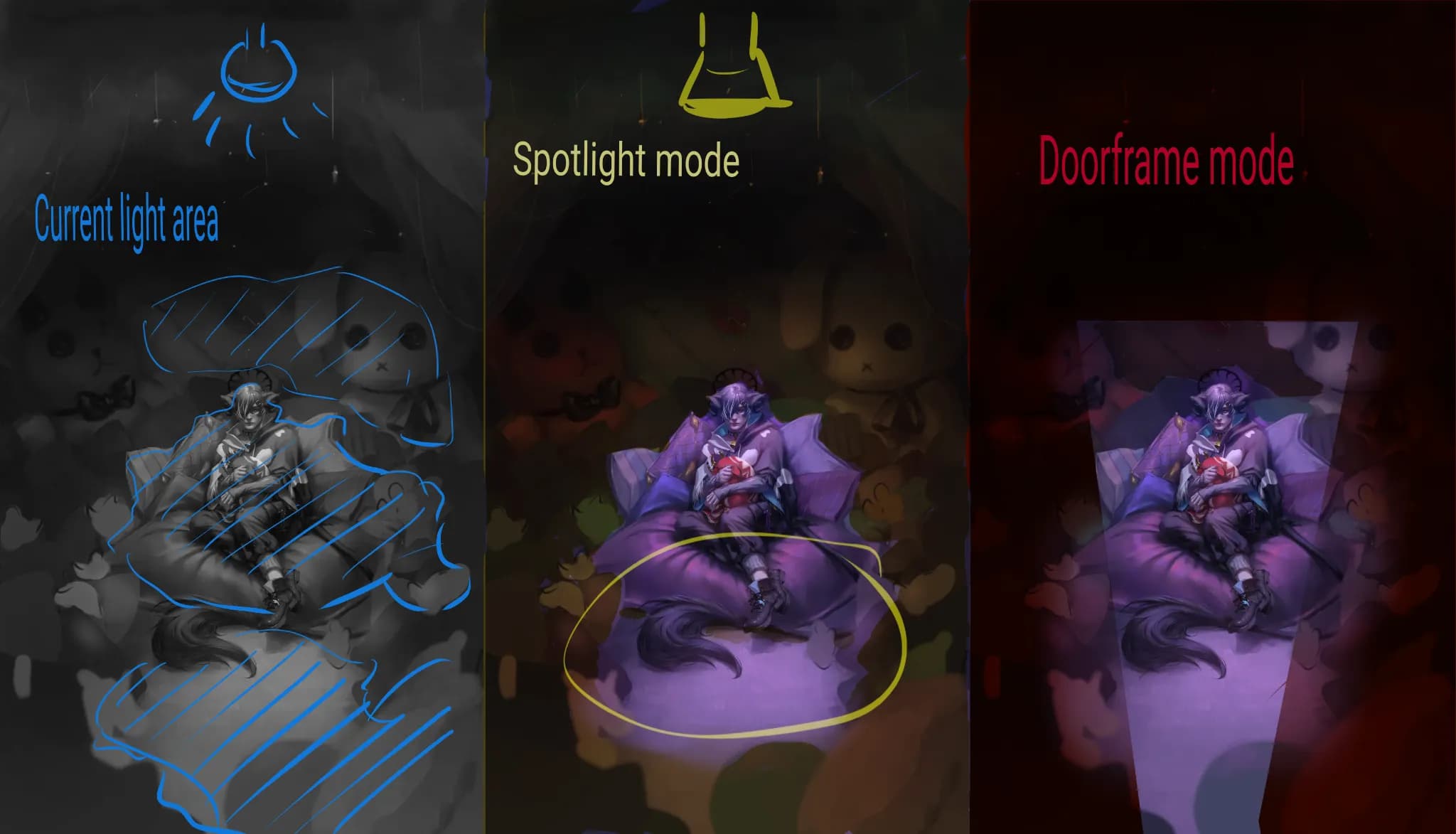
“Hello, Great painting ! From what I understood : you want to create an effect of light coming from behind and left. I would move the window to be clearly in the background for that to work. The”

Teelight
Paintover

On "Teelight" by @morling

1 month ago

“I really like this drawing ! I would work on the value to focus more on the figure. PS: I assumed you wanted to only use yellow tone. If not, I would add a blue light coming from the window to ”

Helpful +1
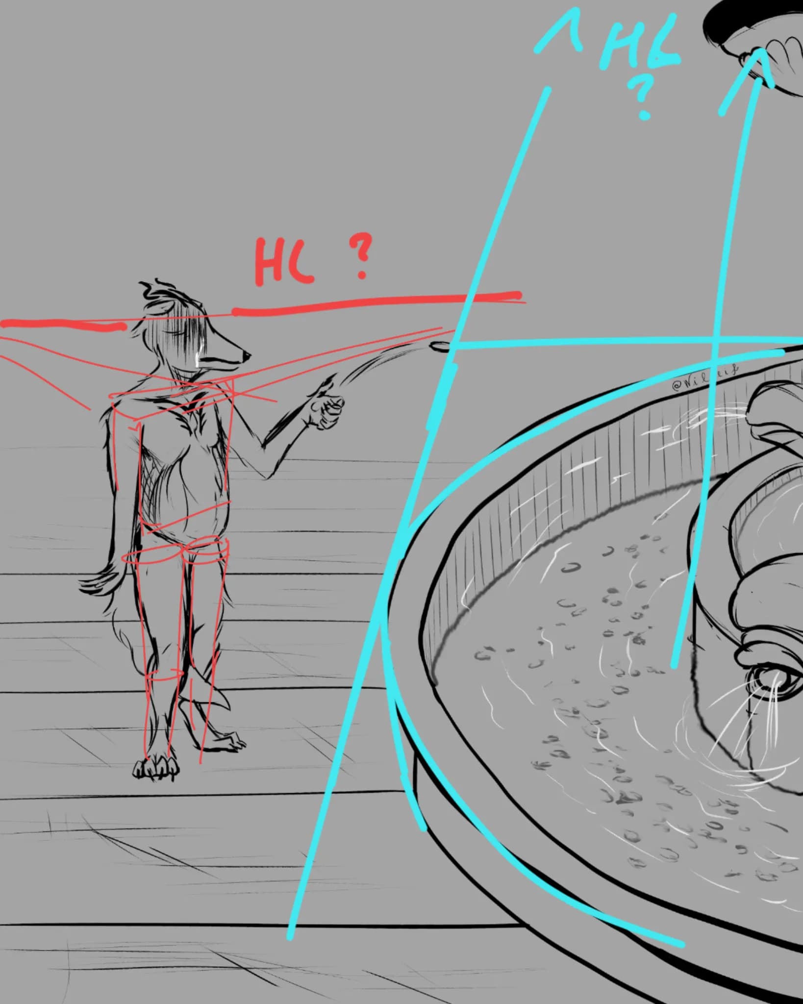
Freehanding Basic Shapes in 2PT Perspective
Paintover

On "Freehanding Basic Shapes in 2PT Perspective" by @timbrelatfouram

1 month ago

“Hello. First I would say it is a really good drawing for a freehand one ! There is indeed a mistake with the verticals (in yellow) => It would be a 3PT perspective if they all converged to the sam”

Helpful +1
A simple guard
Paintover

On "A simple guard" by @dante04204

1 month ago

“Hello, cool design ! Small nitpick : the feets are a bit weird (to small and 2D ?). The main point for dynamisum is the symmetrical pose : you have to break it if you want it to be less robot. F”

Female OC
Paintover

On "Female OC" by @amirel97

1 month ago

“Hello Really cool OC. I love the silhouette and vibe ! It's hard to say what to improve, I find the anatomy good (except maybe the waist is a bit small relatively to the leg/foot). But to real”

Helpful +1
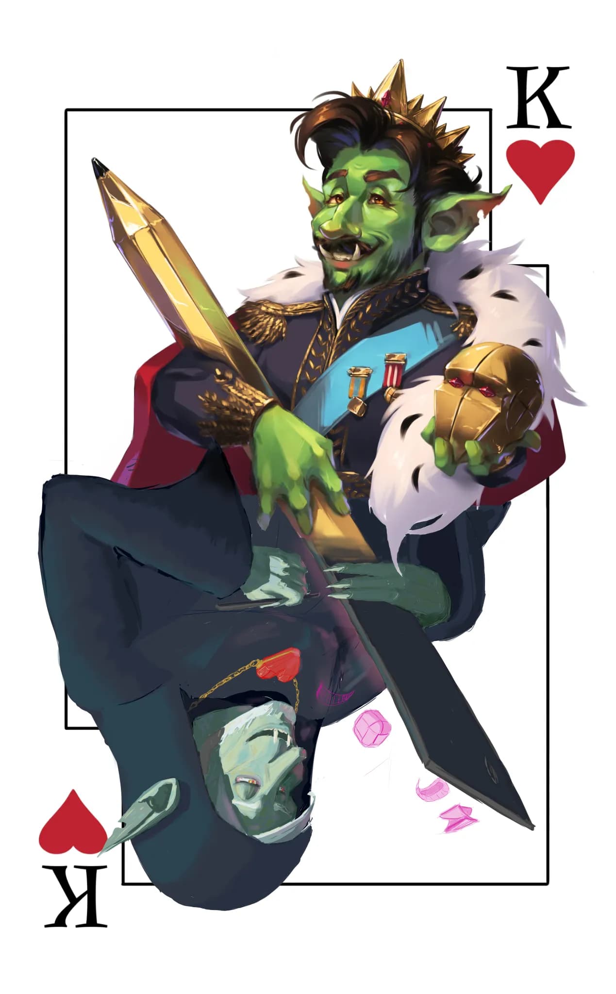
Goblin goblin goblin
Paintover

On "Goblin goblin goblin" by @matte08204413

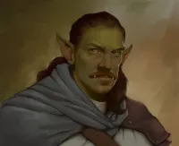
1 month ago

“Hello Really cool goblin ! I think the shadows are good (for a top light). I would put a bit more contrast and add a bit of highlight on top parts. What do you think of it ? PS: I push the con”