Want to store your feedback?
Sign up to store all your feedback in one place on your account. Your feedback will be private instead of public.

Paintovers
Paintover Notes
Choose a paintover
Pick a user avatar to see their paintover notes and discuss them.
Also need help with your art?
Improve your fundamentals, a 3 min read
Master Drawing Birds: Techniques & Tips for Realistic and Stylized Birds
Break down birds into simple shapes, study their unique features, and draw them from imagination using professional concept art techniques.
Animals
Would you like to help someone who's still waiting?
Rendering
No responses yet
Lillet
struggling with values
10 minutes ago
View
Rendering
No responses yet
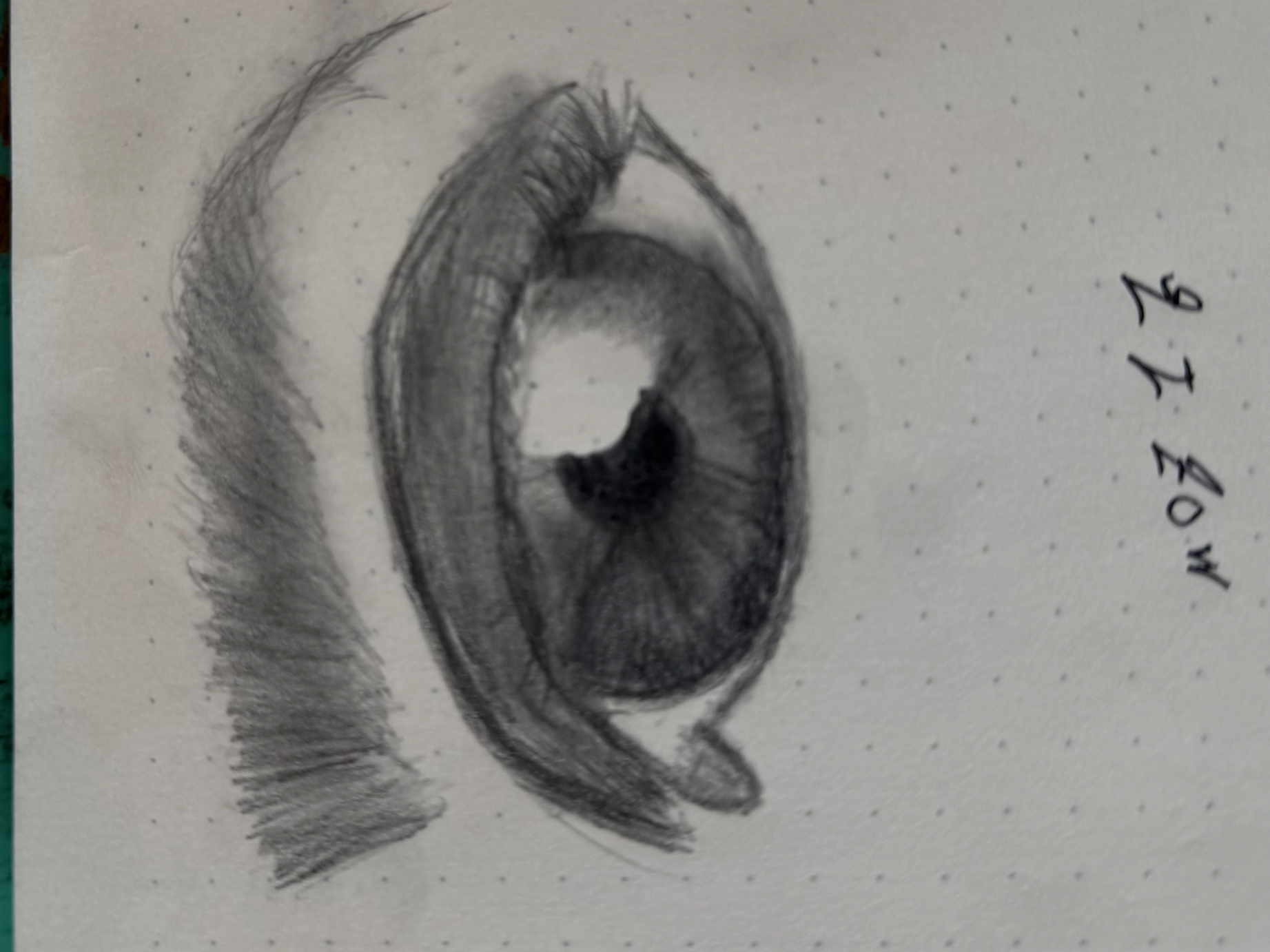
Eyes
How do I get it to be more realistic looking and are my proportions correct, and I think the pupils are too big, and how can I draw the eyelashes and eyebrows better, any help will be very appreciated!
1 hour ago
View
Perspective and Form
No responses yet
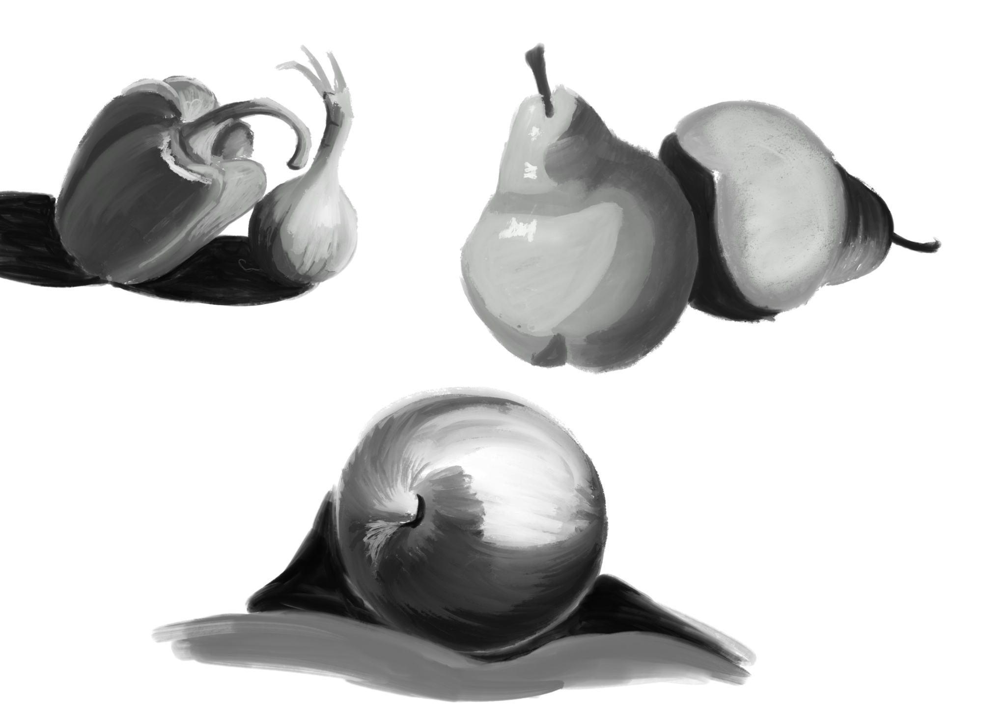
Values exercise
I know that I have a big problem with values and getting feedback is probably one of the most efficient way to learn so here I am. This is one of my exercises, what do you think? Does it make sense? Any advices?
3 hours ago
View
Rendering
No responses yet
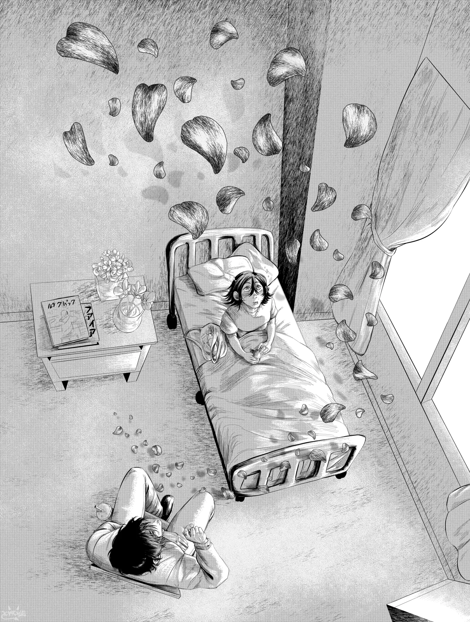
Infirmary visit
I'm very proud of this piece, trying to nail that feeling of a manga page but I feel like I'm lacking in shadows, particularly black shadows. Is there anyway I could have improved this?
6 hours ago
View
Perspective and Form
No responses yet
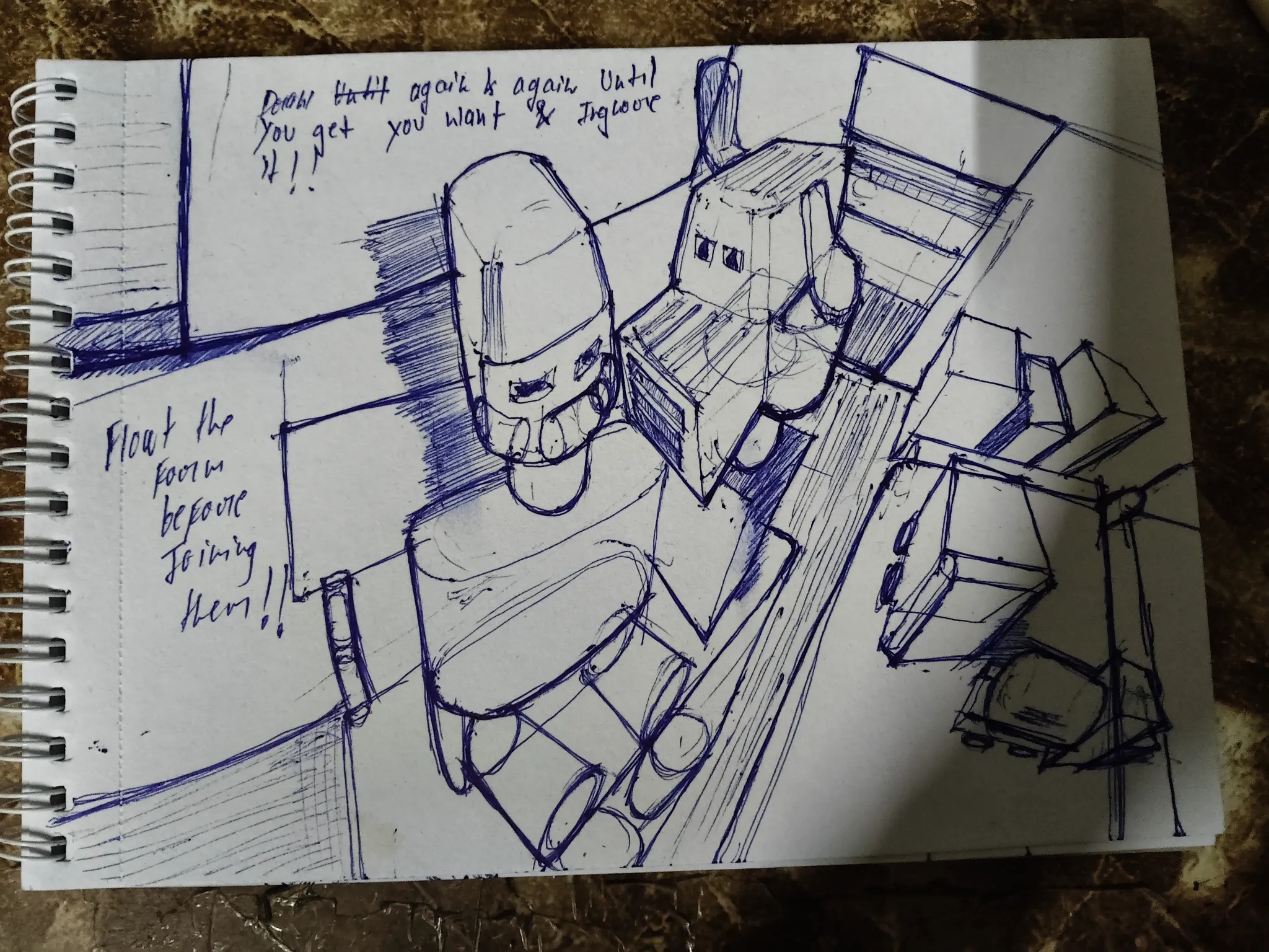
Drawing form imagination
Pure intuition .don't aware of how wide angles perspective are working and what are resources
7 hours ago
View
Perspective and Form
No responses yet
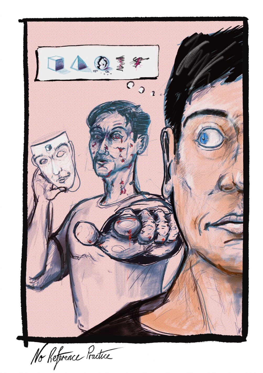
Breakdown of form.
Slowly improving graphic designer here. I’m still trying to tune my eye without the use of a reference. Can ya help a brother out and highlight which areas I need to improve on, and perhaps sketch in the proper correction if you have the energy to do so?
9 hours ago
View
Portraits
No responses yet
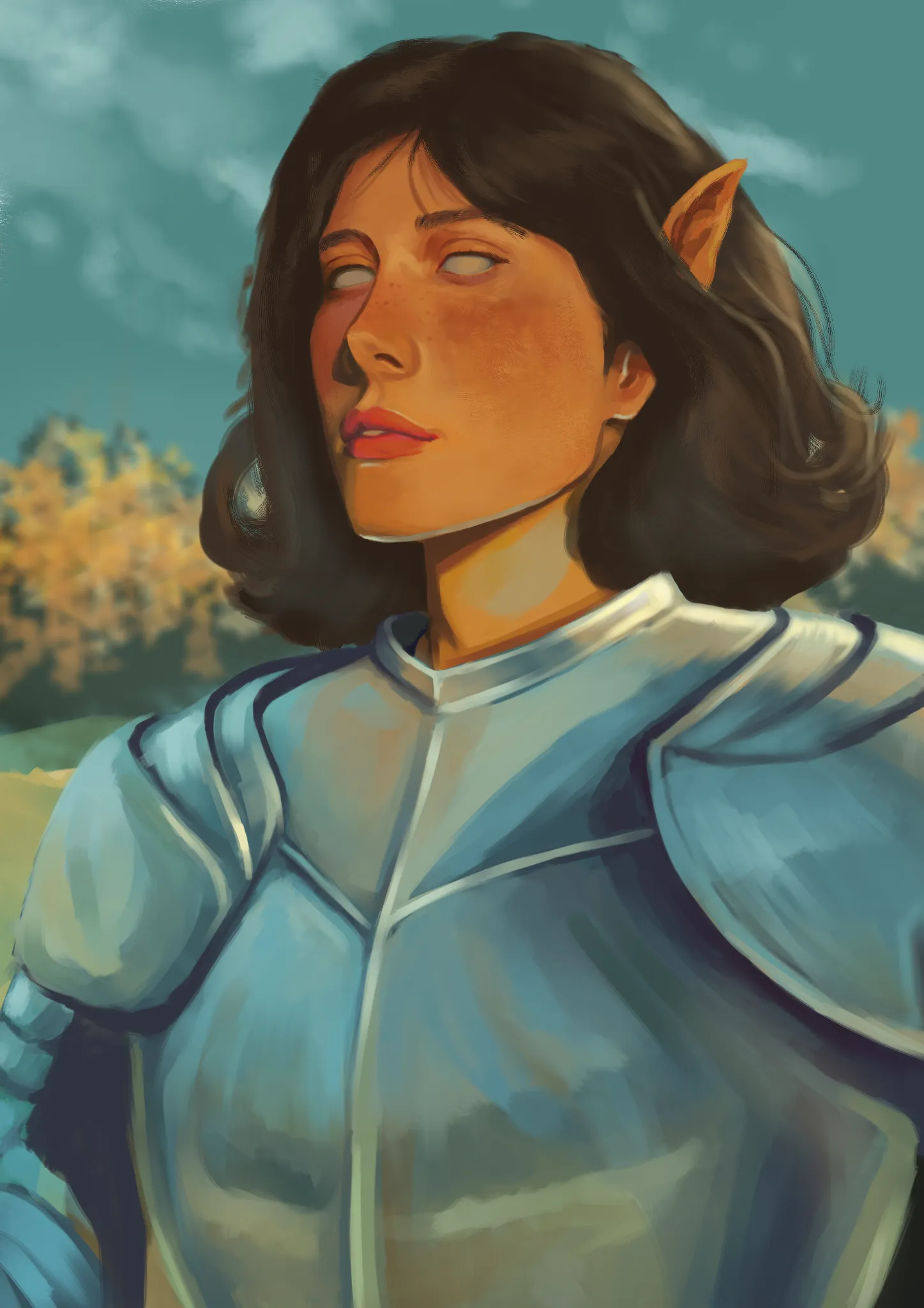
armour
Hi, I'm not sure if the values are good or if there's a problem with the shadows or rendering.
11 hours ago
View
Portraits
No responses yet
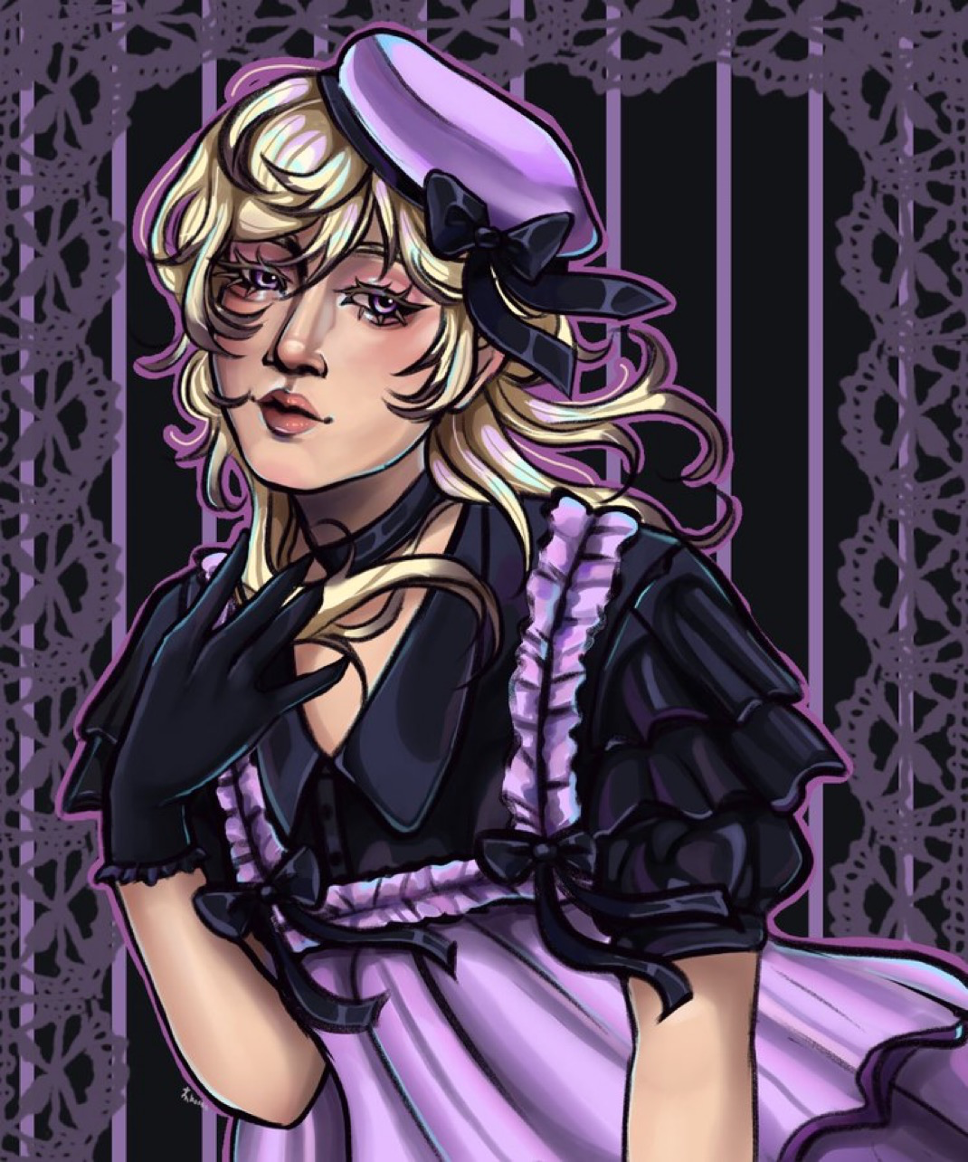
Re
I just want general anatomy/ lighting feedback!
11 hours ago
View
Rendering
No responses yet
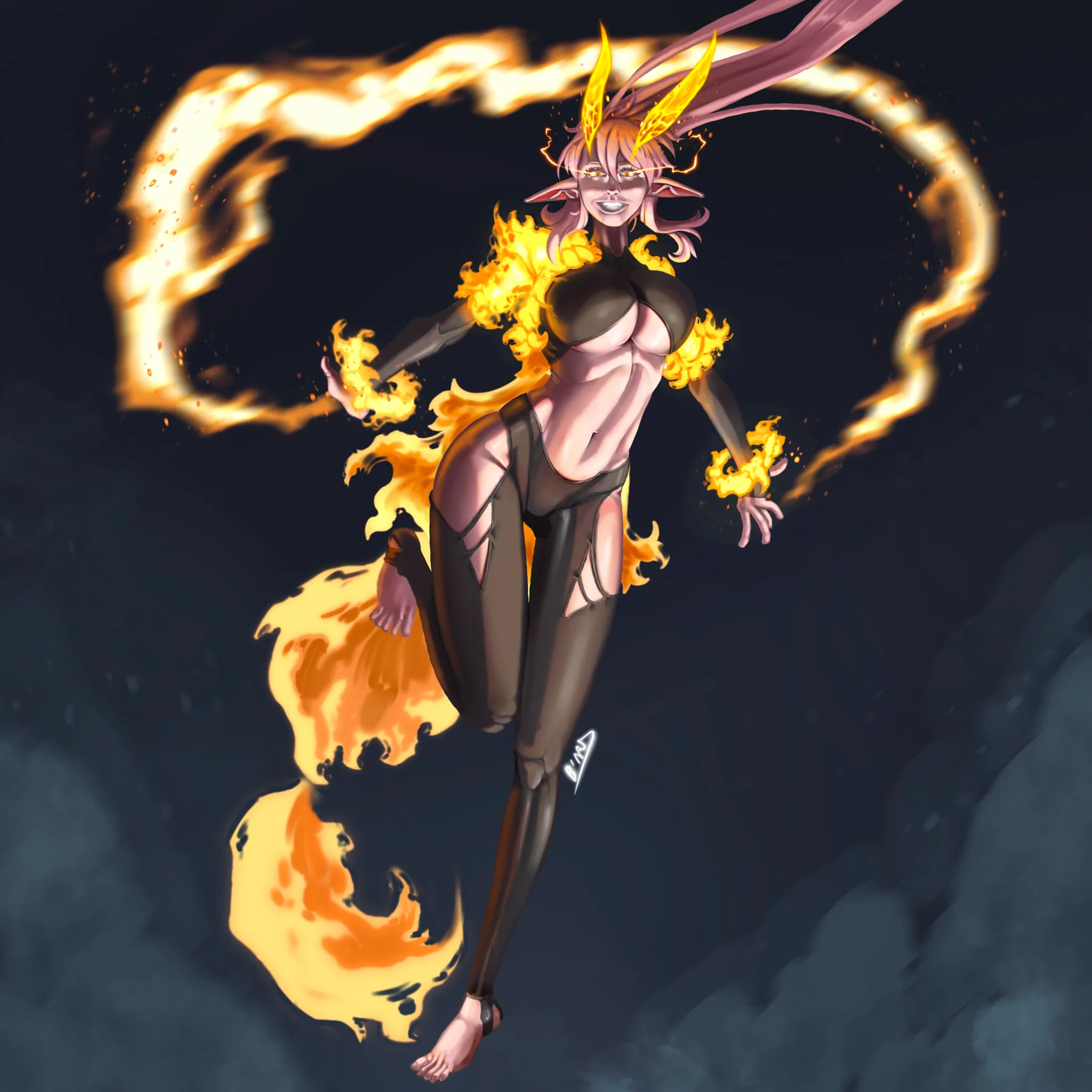
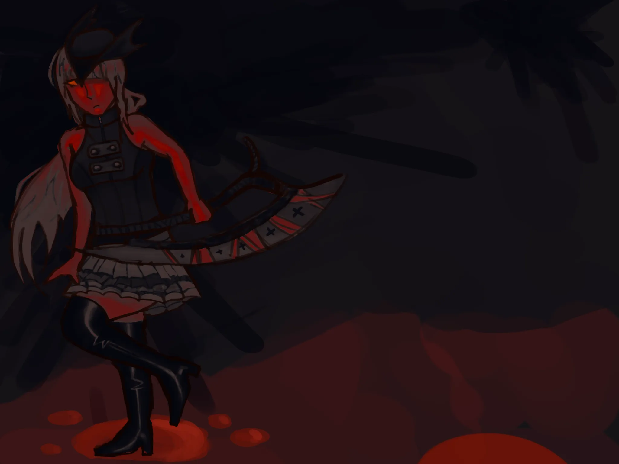
Bloodborne oc
Im not really happy with the lighting since i cant really understand how it works
14 hours ago
View