How to Use Negative Space in Art: A Guide for Artists
How to Use Negative Space in Art
Beginner artists spend their entire practice thinking about what they're drawing. The figure, the object, the subject. The thing. And that makes sense - the subject is what the image is about. But there's another element in every composition that's doing just as much work, and most beginners never think about it at all.
Negative space is everything that isn't your subject. The empty areas around it, between its parts, inside its shapes. Beginner artists treat these areas as background - passive, unimportant, something to fill in later. But negative space isn't background. It's an active design element, and learning to use it deliberately changes how you compose, how you draw, and how you see.
What negative space actually is and why most artists ignore it
Negative space is the shape of the empty areas in your composition. Not the subject itself - the space that surrounds and defines the subject. In a drawing of a figure, the negative space includes the gap between the arm and the torso, the space between the legs, the area above the head. In a still life, it's the gaps between objects. In a landscape, it's the sky, the empty ground, any area where there's no primary subject.
When a beginner looks at a tree, their brain registers "tree" - not the specific sky-shaped silhouette that surrounds it. This is useful for navigating the world. It's not useful for drawing, where the shape of every area on the page matters, not just the areas that contain subjects.
Learning to see negative space means training your brain to treat the empty areas as shapes in their own right - shapes with edges, proportions, and visual weight, just like the positive shapes they surround. Once you can do that, you stop drawing objects and start designing compositions.
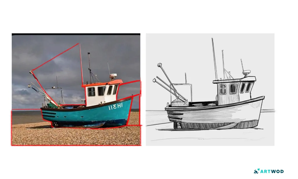
Boat drawing by Fosco. Notice the negative space outline.
Why negative space makes compositions stronger
A composition where the negative space has been designed deliberately almost always reads better than one where it hasn't - even when the rendering quality is identical. Here's why.
Negative space gives the eye somewhere to rest. A composition packed with detail everywhere is exhausting to look at. The eye needs quiet areas to recover between moments of complexity, which is what lets it keep moving through the image rather than giving up and looking away. Intentional negative space creates that breathing room.
And perhaps most importantly, the balance between positive and negative space is one of the core principles of strong composition. When that balance is off - when there's too much empty space on one side and too much subject on the other, or when the negative shapes are awkward and unintentional - the composition feels wrong even when viewers can't explain why. Designing the negative space deliberately is what fixes that feeling.
How to actually see negative space
Seeing negative space is a skill, not a natural ability. It has to be practiced until it becomes automatic. Here are two exercises that build it quickly.
The first is to draw the space around an object instead of drawing the object itself. Pick a simple subject - a chair, a plant, a hand - and instead of drawing its outline, draw the outlines of all the negative shapes surrounding it. The result is usually more accurate than drawing the object directly, because you're working from observation rather than symbol.
The second is to squint at your composition and read it as masses of dark and light rather than as objects. When you squint, the detail disappears and what's left is the distribution of values and shapes across the page. Are the dark masses and light open areas balanced? Does the composition read clearly as a pattern of shapes, or does it feel chaotic and crowded? If you can't read it clearly at a squint, the negative space probably needs more attention.
Both exercises are about the same underlying thing: training your eye to see the whole page as a designed surface rather than a collection of objects sitting on a background.
Negative space in different contexts
The principle applies everywhere, but it shows up differently depending on what you're drawing.
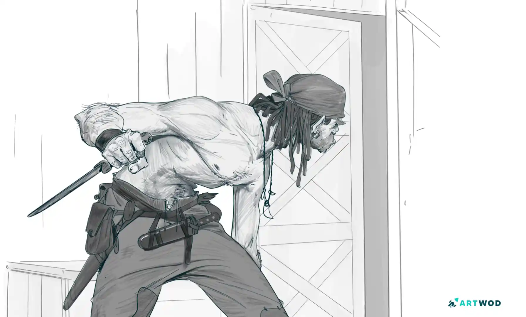
In figure drawing, the negative spaces between body parts define the pose as much as the body itself. The gap between an arm and the torso, the specific shape of the space between two legs in a running pose - these shapes tell you about the gesture, the weight, the movement. Artists who study these shapes draw more accurate and dynamic figures than artists who only look at the limbs themselves.
In still life, the gaps between objects create rhythm. A group of objects where the negative spaces between them have been carefully considered feels composed. The same objects placed without thought about the gaps between them feel random, even if the individual objects are drawn well.
In character design, clean negative shapes within and around the silhouette make a design readable at small sizes and instantly recognizable. The hole inside a weapon, the gap in a piece of armor, the space between decorative elements - all of these are negative shapes that contribute to how quickly and clearly the design reads.
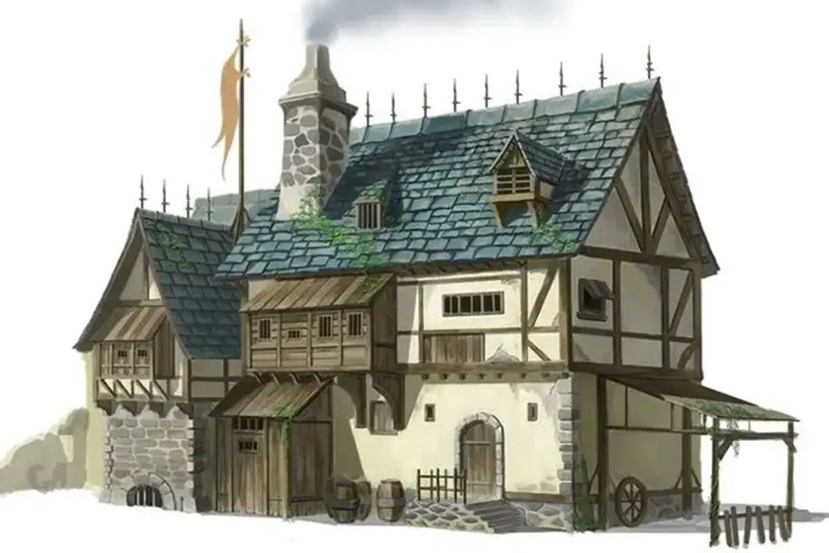
In landscape and environment work, sky and empty ground are active compositional elements, not just areas to fill in. A wide, open sky pressing down on a small figure creates scale and loneliness. A narrow sliver of sky above a dense cityscape creates claustrophobia. The negative space of the sky is doing as much emotional work as any building in the scene.
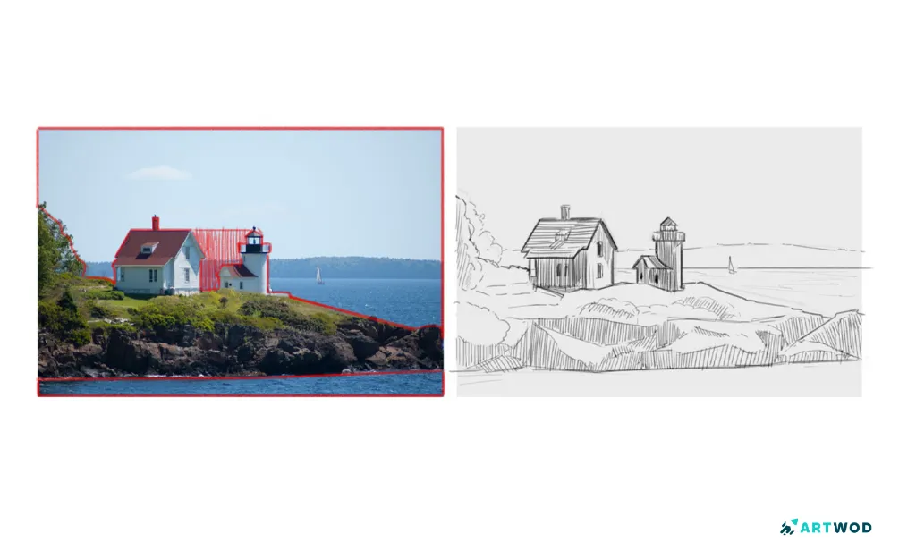
Negative space in environments. Example by Fosco. Digital 2d study
Negative space isn't just empty. It's designed emptiness - and the difference between a composition that feels intentional and one that feels crowded is almost always in whether the artist thought about it deliberately.
Start by training yourself to see it. Then start making choices about it before you commit to anything else in the composition. The distribution of positive and negative space is one of the first decisions a composition needs, and one of the most important.
If you want feedback on whether your negative space is actually doing what you think it's doing, the Artwod Community Hub is a great place to get an honest outside read. It's easy to be too close to your own work to see whether the composition is balanced - another artist will tell you in seconds where the eye is actually going.
Related Posts