How to Use Black Fills in Inking: When to Fill and When to Hatch
Black Fills vs Hatching: How to Make the Right Call Every Time
There’s a decision every artist faces when inking and nobody really explains how to make it. You’re looking at a shadow area and you have two options: fill it solid black, or hatch it. Both describe darkness. Both are technically correct. So how do you choose?
The answer isn’t random and it isn’t just taste. It follows a logic - one that professional inkers use consistently, that you can learn, and that will immediately make your inking look more intentional. Here’s how it works.
Think in tones, not in techniques
Before you pick up a pen, understand that black and white inking is actually a tonal system. You’re describing a range of values using only two colors - pure black and pure white - with hatching creating the grays in between.
Think of it as a scale:
Pure white is your lightest value - areas fully in light, untouched paper.
Wide-spaced hatching creates a light gray - areas turning away from the light source.
Closer hatching creates a medium gray - areas in partial shadow.
Tight cross-hatching creates a dark gray - areas in deep shadow.
Solid black is your darkest value - areas where no light reaches at all.
The decision between fill and hatch is simply a decision about where on that scale an area sits. If it belongs at the darkest end, fill it. If it belongs somewhere in the middle, hatch it. That’s the whole logic. Look at the drawing by @julienmariette below. Analyse it and see why the artist uses different tones in different places.
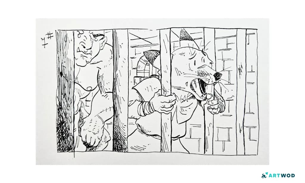
Artwod Community Submission by @julienmariette traditional drawing in inking technique.
When to use solid black fills
Solid black - called “spot blacks” or “spotting blacks” in comic and illustration terminology - is reserved for your loudest, most decisive moments. Use it where you want zero ambiguity: this area is in complete darkness, full stop.
The most reliable situations for solid black fills:
Deep cast shadows - the shadow a figure throws onto the ground beneath them, the shadow of an object on a wall, anywhere light is completely blocked. Cast shadows are almost always darker than the shadow on the form itself, which makes them strong candidates for fills.
Occlusion shadows - the very darkest slivers where two surfaces press against each other. The crease where an arm meets a torso, the underside of a chin, the corner where a wall meets a floor. These areas receive almost no light at all and benefit from being filled solid.
Hair that reads as very dark - if a character has black or very dark hair, attempting to hatch it often results in a muddy, indeterminate value. Filling it solid and then pulling out highlights with white ink or a white gel pen is almost always cleaner.
Large background areas that need to recede - a solid black background immediately pushes the foreground forward. It creates drama and spatial separation without requiring any rendering.
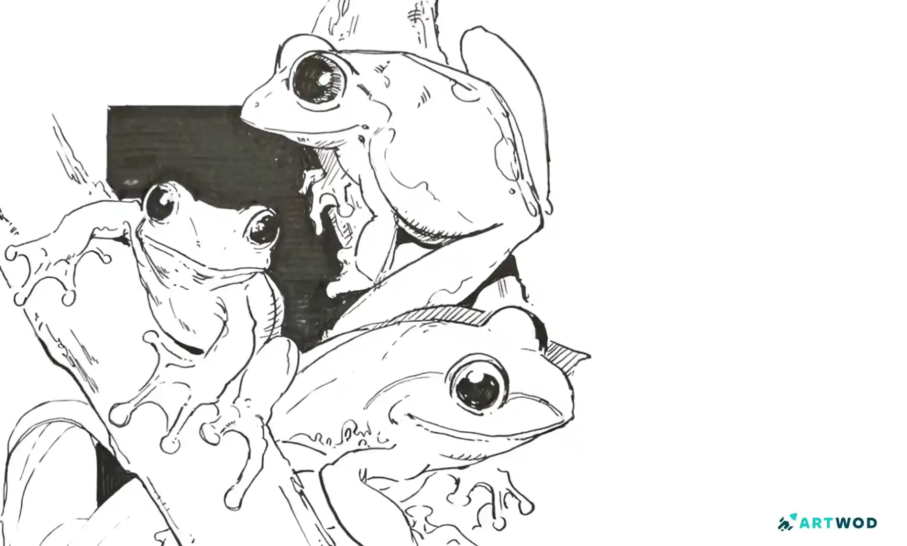
The important thing about spot blacks is that they’re compositional decisions as much as tonal ones. Where you place solid black areas shapes the visual rhythm of the whole drawing. Scattered spot blacks across a page create chaos and energy. Concentrated solid blacks create calm and weight. Used strategically, they’re your most powerful tool for directing where the eye goes. Look at the drawing by Antonio below, he's using black fill to make the frogs pop more:
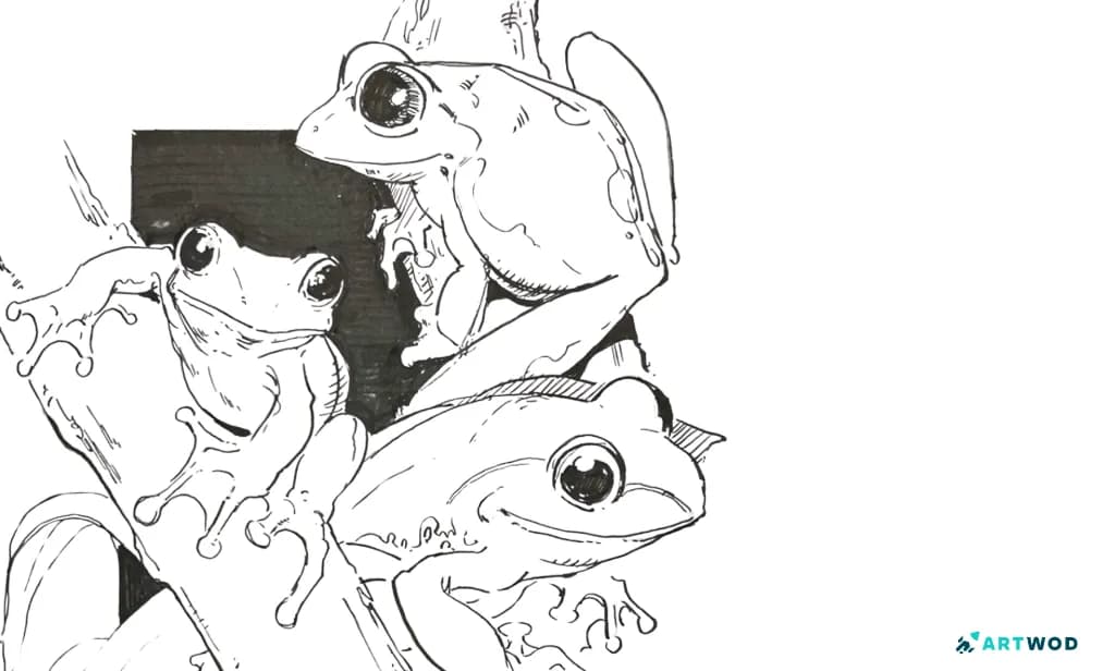
Frogs traditional drawing by Antonio Stappaerts
When to use hatching
Hatching is for everything that isn’t absolute darkness - which is most of a drawing. It’s how you describe the turning of a form, the texture of a surface, the gradual transition from light into shadow.
The different types of hatching each do something specific:
Parallel hatching - lines running in the same direction - creates clean, controlled tone. It’s graphic and precise, good for flat or geometric surfaces and for artists who want a controlled, structured look.
Contour hatching - lines that follow the curve of a form - describes volume. Instead of running parallel, the lines wrap around the surface the way a topographic map wraps around a hill. This is what makes a rendered sphere feel round rather than flat.
Cross-hatching - two or more sets of parallel lines running at different angles - builds up darker values and texture. The tighter and more layered, the darker the result. It’s particularly effective for deep shadow areas that aren’t quite dark enough for a solid fill.
Feathering - lines that start thick at one end and taper to nothing - creates soft transitions out of shadow areas. It’s how you blend the edge of a shadow into light without it feeling like a hard cut. Very useful at the boundary between hatched shadow and untouched white. Try different hatching techniques in our Practice Section and submit your results to our Community to get feedback from real artists!
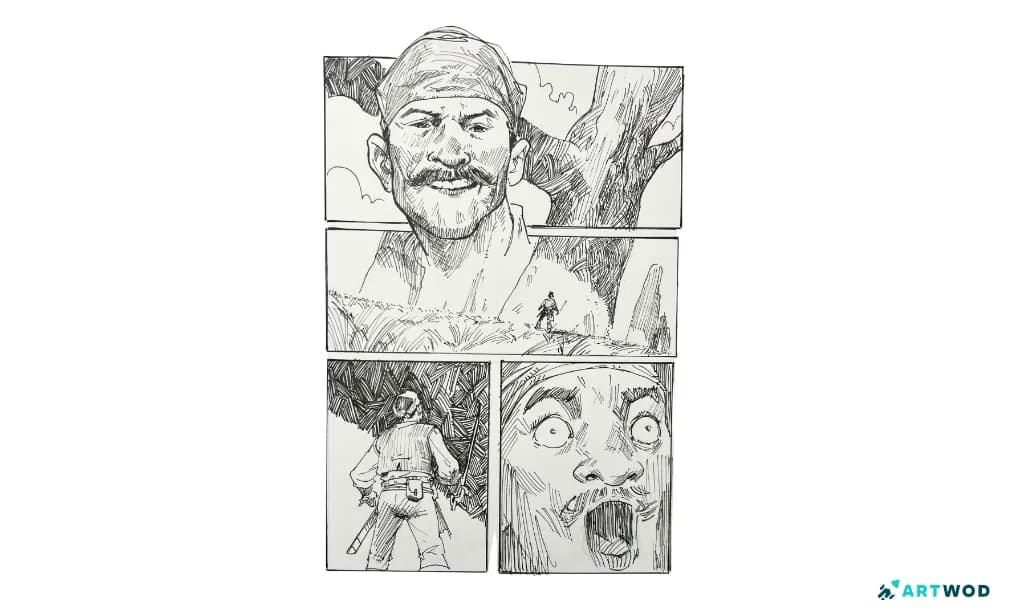
Look at the various hatching techniques Antonio Stappaerts is using in this Comic style ink drawing
The practical decision
When you’re looking at a shadow area and deciding what to do, ask two questions.
First: does any light reach here at all? If the answer is genuinely no - it’s a deep cast shadow, a crease, a completely occluded area - fill it. If any light reaches it, even bounced or diffused light, hatch it. 🖋️ If you have trouble understanding where the light goes, this probably means you need to study form. The best and the quickest way to do that is by starting our Intro to Drawing road. Thousands of artists already upped their skill with it, now it's your turn!
Second: if I squint at the drawing, does this area read as the darkest value or a mid-dark value? The darkest value gets filled. Mid-dark gets tight cross-hatching. Medium gets regular hatching. Light gets wide or sparse hatching. Untouched paper stays white.
The squint test is useful because it strips away detail and forces you to read values as masses. If you’re unsure whether an area needs a fill or heavy hatching, squint - if it should read as the same value as a definitively dark area elsewhere in the drawing, fill it. If it should read slightly lighter, hatch it instead.
A common mistake to avoid while Inking
The most common mistake beginners make is hatching areas that should be filled. It happens because filling feels aggressive - permanent, decisive, final. So instead of committing to the fill, the artist hatches tightly and adds more layers and more cross-hatching trying to get dark enough, and ends up with a muddy, overworked area that still doesn’t read as dark as it should.
If an area needs to be the darkest value in the drawing, hatch it to the point where you feel like you need one more pass - and then fill it solid instead. The fill will be cleaner and more decisive than anything hatching can achieve at maximum density.
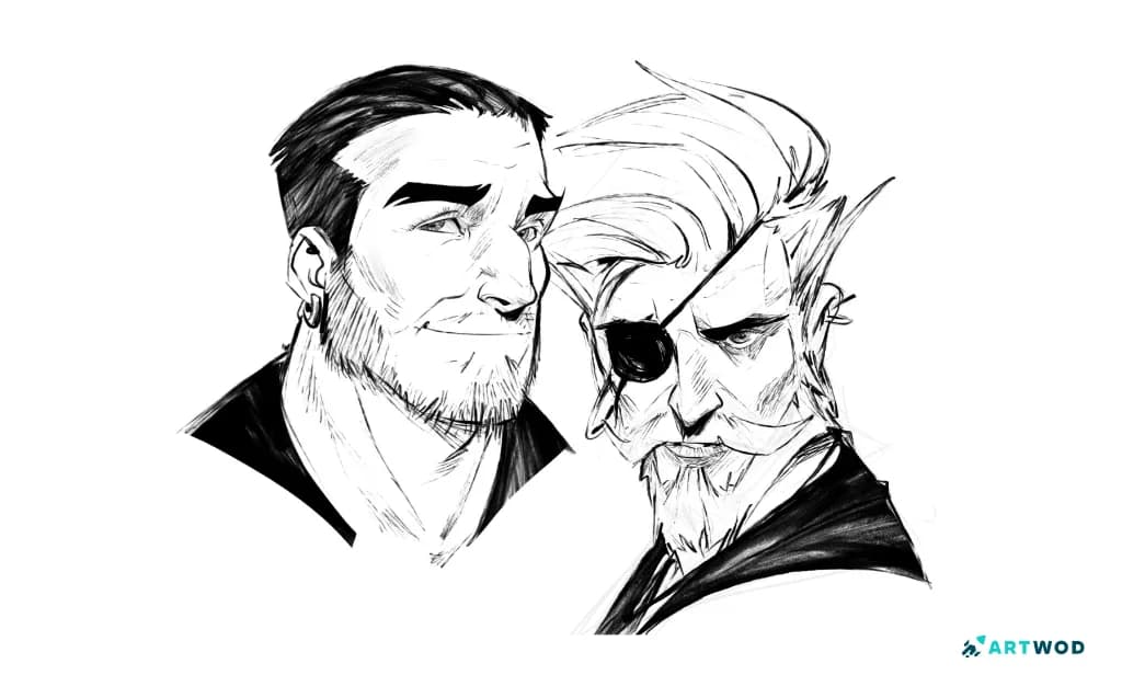
2 Digital Inking Portraits by Antonio Stappaerts
FAQ
What is spotting blacks in inking?
Spotting blacks means placing solid black fills deliberately to create the darkest values in a drawing. They’re used for deep cast shadows, occlusion shadows, very dark hair, and background areas that need to recede. They’re compositional decisions as much as tonal ones - where you spot your blacks shapes the visual rhythm of the whole piece.
When should I use hatching instead of a solid black fill?
Use hatching for any area that has some light reaching it - partial shadow, turning forms, textured surfaces, mid-tone areas. Solid fills are only for areas of complete darkness. If you squint at your drawing and an area reads as a mid-dark value rather than the darkest value, hatch it.
What is contour hatching and when do I use it?
Contour hatching uses lines that follow the curve of a surface rather than running parallel. It describes volume - the lines wrap around the form the way a topographic map wraps around a hill. Use it when you want the hatching to communicate the three-dimensional shape of a surface, not just its value.
How do I make my hatching look less scratchy?
Scratchy hatching usually comes from too many overlapping short marks rather than clean parallel lines. Draw each hatching stroke as a single confident line in one direction, then add cross-hatching at a different angle if you need to build up value. The Inktober Challenge category on the Artwod Community Hub is a good place to submit hatching practice and get specific feedback on what’s working and what isn’t.
What is feathering in inking?
Feathering uses lines that taper from thick to thin, creating a soft transition from shadow into light. It’s particularly useful at the edge of shadow areas where a hard cut from dark to white would feel too abrupt. It softens the transition without requiring a gray tone.
How do I know if my black fills and hatching are working together?
Squint at the drawing. The fills should read as clearly the darkest value, the hatched areas should read as progressively lighter grays, and the white paper should read as the lightest value. If the fills and the darkest hatching are reading as the same value, you either need to fill more areas or lighten your heaviest hatching. Submit your inking to the Artwod Community Hub and ask specifically whether the value hierarchy is reading correctly.