How to Improve Composition: Artwod Community Breakdown
How to Improve Composition: Artwod Community Breakdown
This time we will talk about a piece by @maruppan. He felt inspired by Dostoevsky’s novel “The Possessed" (we always approve some heavy literature inspired pieces!)
The Artwork and the Problem
The submission, The Possessed by Dostoevsky fanart, is a portrait-oriented scene featuring a character holding a red sphere with a large shadowy form behind him. The artist described the intended idea as a demon shadow that eats a burning house, but felt that the composition had become difficult to read.
The title refers to Fyodor Dostoevsky's The Possessed, also known as Demons or The Devils, a novel first published in 1871–72. The work deals heavily with political and psychological conflict, making the dark, ominous visual direction particularly relevant to the concept.
The key problem here is not simply "more detail." It is a visual hierarchy: deciding what the viewer should notice first, second, and third.
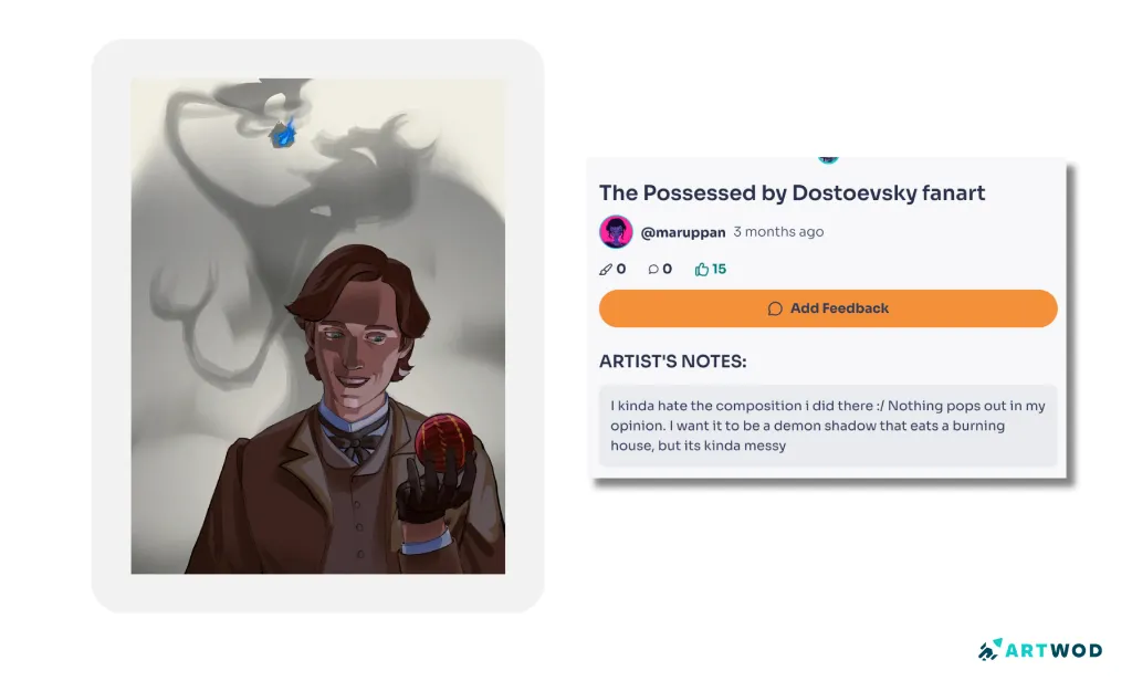
Original The Possessed by Dostoevsky fanart showing a portrait of a character holding a red object with a large gray shadow behind him
What the Feedback Revealed
The available paintover by our rendering master @yurei471 shows a clear change in the visual treatment rather than a complete revision of the original submission. And this is the type of feedback we appreciate the most - when you try and understand what the artist wanted to transmit, rather than redo everything how you want it.
The original uses relatively pale surroundings and subdued values, while the paintover pushes the environment much darker and introduces intense red and purple illumination around the character, shadow, and object.
That difference demonstrates an important composition principle: lighting and values can organize a scene just as strongly as line or shape.
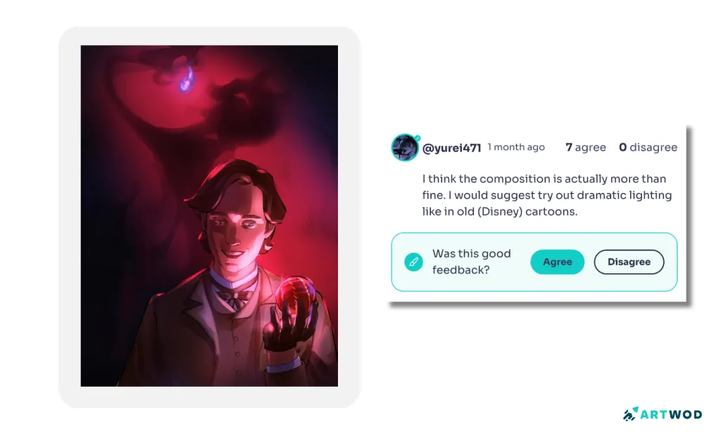
Paintover feedback for The Possessed by Dostoevsky fanart using dramatic red and purple lighting to strengthen the focal point and atmosphere
How to Create a Stronger Focal Point
A focal point is simply the area you want the viewer to notice first. In a complex illustration, several elements can compete for that position.
For this drawing, the character and the object in his hand are especially important because they communicate the scene's immediate action. The large shadow behind him provides the broader concept and atmosphere.
The goal is therefore not to make everything equally dramatic, but rather to establish a clear relationship between the subject, the object, and the background.
First and foremost, identify the primary visual message. Ask:
What should the viewer notice first?
What should they notice immediately afterward?
Which elements are supporting the idea rather than carrying it?
If every major shape has similar contrast, saturation, or visual weight, the eye has no obvious starting point.
Step 2: Simplify the Value StructureValues are the relative lightness and darkness of different areas. Try reducing the drawing to a few broad value groups:
main subject
important object
background
large shadow or atmospheric shape
The original artwork already contains a large shadow behind the character, but its relatively light surroundings reduce some of the dramatic separation. The paintover pushes the background toward much darker values, making the illuminated subject and red object more prominent.
This is why value studies are useful before detailed rendering: they reveal compositional problems early.
Step 3: Use Lighting to Support the StoryLighting should not only make a drawing look finished. It can explain the scene.
The paintover introduces a strong red-magenta lighting scheme that connects the character to the ominous shadow and gives the scene a more dramatic atmosphere. The brightest areas on the face and held object become particularly noticeable against the darker environment.
A good question is:
If I removed all the details, would the lighting still tell me where to look?
If the answer is no, the lighting hierarchy may need more work.
Step 4: Control Competing ElementsA background does not have to disappear completely. It simply needs to support the subject.
When several areas have similar contrast and saturation, they compete for attention. Reducing contrast in secondary areas or concentrating stronger colors around important forms can make the composition easier to read.
This is especially useful when your concept contains several dramatic elements, such as a character, fire, a supernatural figure, and an environment.
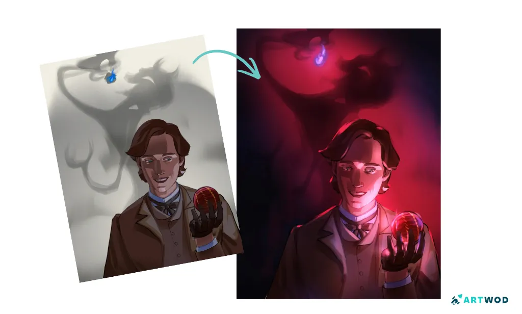
The Possessed by Dostoevsky fanart showing a character holding a glowing red object beneath a large demon-like shadow
Applying the Lesson to Your Own Drawing
If your sketch feels messy even though the individual parts look reasonably good, try this quick composition check:
Reduce the artwork to three or four major values.
Identify the element that should be seen first.
Darken or simplify competing background areas.
Reserve stronger saturation for important elements.
Check whether the subject still reads clearly at thumbnail size.
Only return to detailed rendering after the hierarchy works.
This approach can prevent you from spending hours polishing a composition that still has an underlying readability problem.
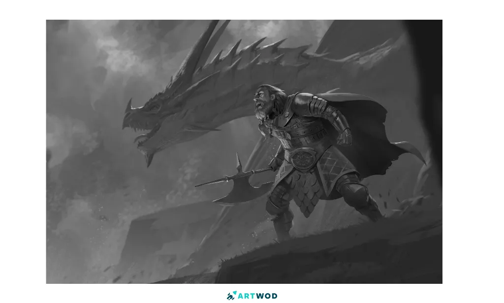
Dragon hunter drawing by Antonio Stappaerts 2d art
A Simple Art Workout for Composition
You can practice this problem without redrawing an entire finished illustration.
Create three small thumbnail versions of the same scene.
In each thumbnail:
Keep the major shapes approximately the same.
Change which element receives the strongest contrast.
Try a different value arrangement.
Try concentrating the strongest color in a different location.
Compare which version communicates the intended idea most quickly.
The exercise teaches you to make compositional decisions before committing to detail.
Learning Through Community Feedback
One advantage of sharing artwork with fellow artists is that another person can notice relationships you have become too familiar with to see yourself.
The Artwod submission demonstrates this kind of learning particularly well: instead of simply saying that the composition feels messy, the visual feedback provides a different lighting and value direction that makes the underlying issue easier to study. Artwod describes its feedback tool as a place where artists can receive feedback from other artists and learn from mistakes.
When asking an art community for feedback, a specific question can also make the discussion more useful. Rather than asking only "Is this good?", you might ask whether the focal point is clear, whether the values are competing, or whether the background supports the intended story.
FAQs
Start by deciding what the viewer should notice first, then organize values, contrast, color, and surrounding shapes around that focal point. Check the composition at thumbnail size before adding more detail. If you struggle with values, check our our Painting Road - it will definitely help!
Why does my drawing composition feel messy?A composition can feel messy when too many elements have similar visual importance. Look for competing contrast, saturation, detail, or similarly strong shapes and reduce emphasis in secondary areas.
How can values improve a drawing?Values establish the major light-and-dark relationships in an image. Simplifying them into a few groups can reveal whether the focal point is actually separated from the surrounding elements. Values are not an easy subject. Check our our Painting Road - it will definitely help!
How can lighting improve a portrait drawing?Lighting can direct attention, establish depth, and reinforce the mood of a scene. Stronger light around an important subject against a controlled darker environment can make the visual hierarchy clearer. To know what to light, you need to be familiar with the planes of the face. Check out our Portrait road - 5 minute exercises per day will skyrocket your level!
How do I make a focal point stand out?Give the focal point a stronger combination of contrast, value separation, color, or detail than the surrounding areas. You do not need to maximize all of these simultaneously.
Can feedback from other artists improve my drawing?Feedback can provide another perspective on problems that are difficult to notice when you have been working on the same drawing for a long time. The most useful feedback identifies a specific issue and explains a possible direction for addressing it.
Where can I get feedback on my drawing?You can share your artwork with an art community such as Artwod's feedback community and ask fellow artists to focus on a specific problem, such as composition, values, anatomy, or lighting.


Keep practising
Explore roadmapsHelp an artist with feedback
Find work to critique