Common Color Mistakes Beginners Make (And How to Fix Them)
Common Color Mistakes Beginners Make
Color is one of those things that looks like pure magic when other people do it, and a total trap when you try it yourself.
Most beginners assume color problems mean they just don't know enough complex color theory. But it's usually not a theory issue. Instead, it's just a handful of very specific habits. Once you spot them, they're incredibly easy to fix.
Here are the six traps keeping your colors from working, and how to get out of them.
Skipping values and going straight to color
This is the big one. If you jump into color before your values are locked down, everything usually ends up looking muddy and confusing.
Think of it like a house: color is the paint on the walls, but value is the structural framing. If the framing is crooked, a fresh coat of paint isn't going to save it. If your drawing doesn't read clearly in black and white - meaning the lights and shadows separate cleanly - adding color will only make it worse. Do a quick value study first. To know more about values, check our Painting Road!
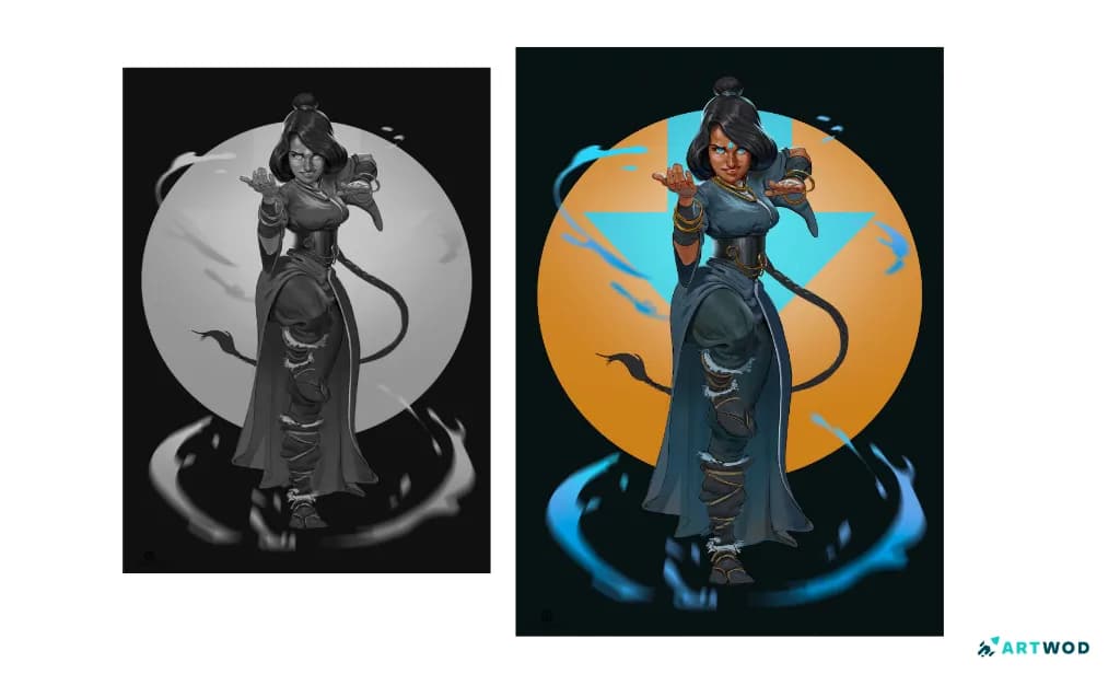
Character design by Antonio Stappaerts. Witch woman casting a spell. Values breakdown and color version. Digital 2d art.
Using color straight out of the tube (or the color picker)
It’s an easy trap to fall into: grabbing a pure, fully saturated red for skin, a flat blue for the sky, or bright yellow for the sun because that's what the color technically "is."
The catch is that real subjects are almost never that saturated. Real-world color is complex, heavily influenced by the environment, and usually a lot more muted than we think. Desaturate more than feels natural. When you think a color is bright enough, push it a bit closer to gray, and focus on temperature shifts instead of relying on brute-force saturation.
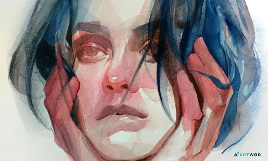
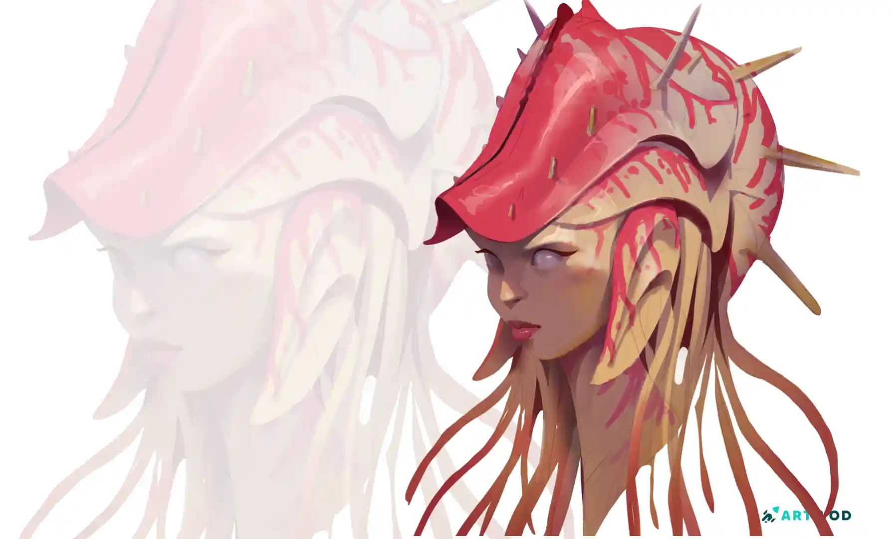
Watercolor painting of a woman. Different colors for different parts of skin.
Ignoring color temperature
Light has a temperature, and shadows have an opposite one. Warm light almost always creates cool shadows, and cool light creates warm shadows.
When you paint everything in the same temperature range, the image flattens out and the lighting feels artificial. Decide on your light source's temperature first. Once you have that locked, actively push your shadow tones in the opposite direction.
Muddy colors from over-mixing
If you mix too many pigments together on a physical palette - or blend too aggressively with a soft-airbrush tool digitally - you end up killing the life of the color and getting a dead gray-brown.
Keep your mixtures simple. Use fewer colors, keep your brushes clean, and if you work digitally, try using harder-edged brushes with less active smudging. If you struggle with a piece, don't be shy and submit it to our Community, where artists of all levels are helping each other!
No color variation within a single area
Beginners tend to treat local color like a solid bucket fill: skin is one peach tone, hair is one brown, a shirt is one blue.
In reality, a single surface has massive shifts. Human skin for example cycles through warm oranges on the cheeks, cooler blues or purples at the temples, and subtle greenish undertones around the jawline. Break up your local colors of ANY object you paint. Even within a single object or patch of skin, introduce subtle shifts in hue and temperature. It’s what stops a painting from looking like a coloring book page and makes it feel alive.
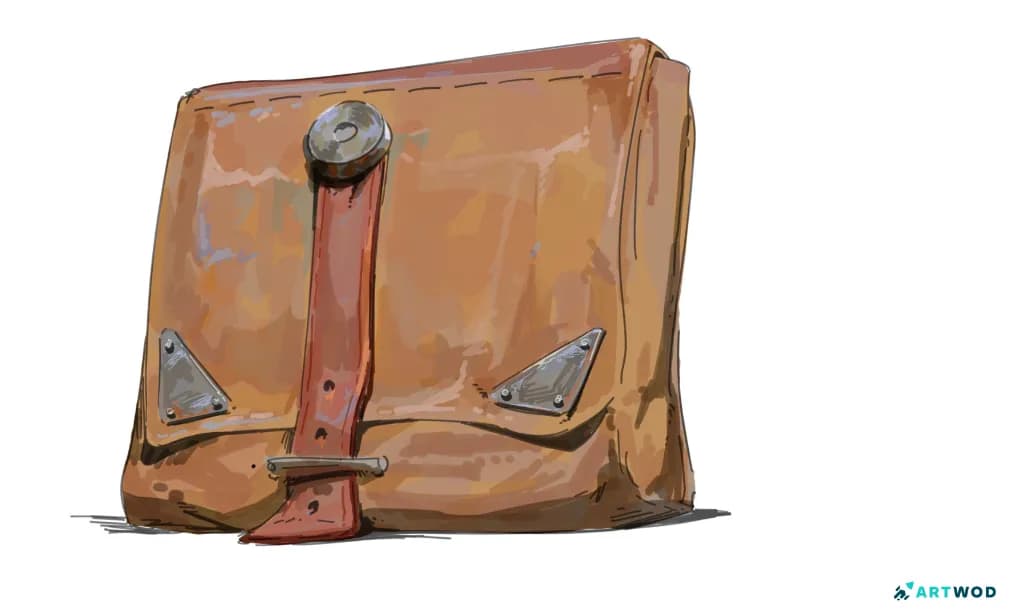
Leather bag drawing by Antonio Stappaerts. Digital 2d
Colors that all compete for attention
If every single element in your painting is turned up to maximum brightness and saturation, the viewer's eye has nowhere to rest.
Establish a hierarchy. Pick a dominant color temperature and saturation level for most of the piece, and let only one or two specific areas break that rule to act as your focal point.
Color doesn't have to be the thing you dread finishing a piece with. Most of the time, fixing your colors is just about nailing your values first, letting temperature do the heavy lifting, and giving the eye a clear place to land.
Got a piece you're wrestling with right now? Bring it over to the Community Hub to get honest color feedback from other artists, or check out our roadmaps and blog for a deeper dive into the fundamentals.