Anime Watercolor Spotlight Lighting Drawing: Fix Harsh Highlights
Anime Watercolor Spotlight Lighting Drawing: Refine Light and Values
Artist @kaylen76419 shared a watercolor anime drawing on the Artwod Community while working on a spotlight lighting effect. The artist was unsure where the light should fall and felt the yellow had become too bright, making it look like a highlighter had been drawn over the character. The feedback offers a practical way to approach anime lighting, watercolor values, and bright accents.
Insights shared in this blog post are by: @gabrielle34427. You can also request feedback on your artwork in Artwod’s Art Community.
The Feedback Request: Where Should the Spotlight Fall?
In the Artwod Community submission, @kaylen76419 explained:
"I am using water colour paint to render this drawing but I have no clue how to do the spotlight lighting affect where the light falls. I ended up using too bright of a yellow so now it just looks like a highlighter was drawn over it but idk how to fix that either"
That gives the drawing two closely related problems:
Where should the spotlight illuminate the anime character and surrounding scene?
How can the artist make the yellow feel like light instead of a layer of bright paint?
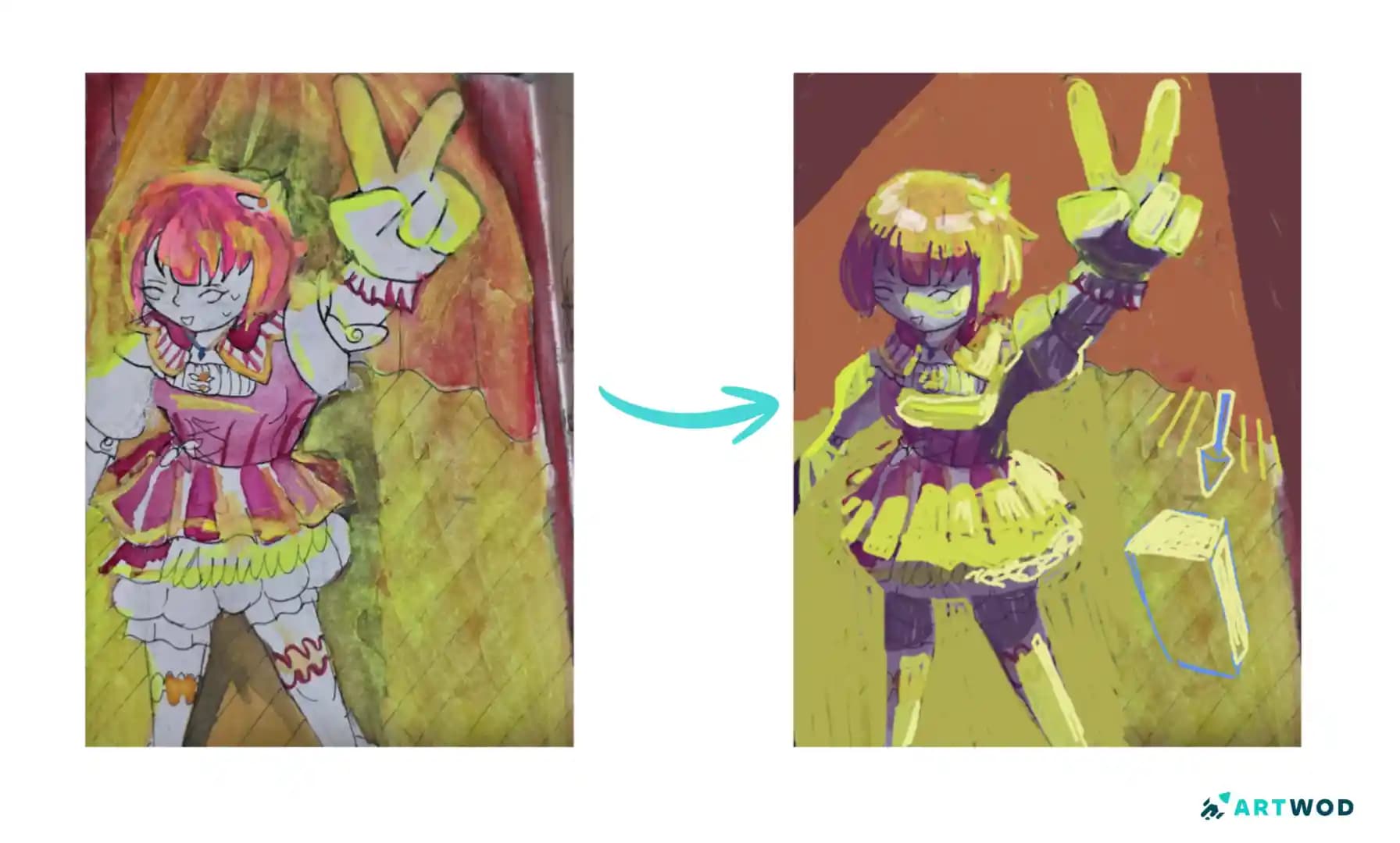
The artwork features an anime-style character in colorful clothing, with a raised hand and a large chair-like form on the right. The original painting uses strong yellow-green illumination across parts of the character and environment, while the paintover organizes the lighting into more deliberate illuminated areas.
The most useful place to start is therefore not the yellow itself.
Start with the light source.
Once you know where the spotlight is coming from, it becomes much easier to decide where the brightest values belong.
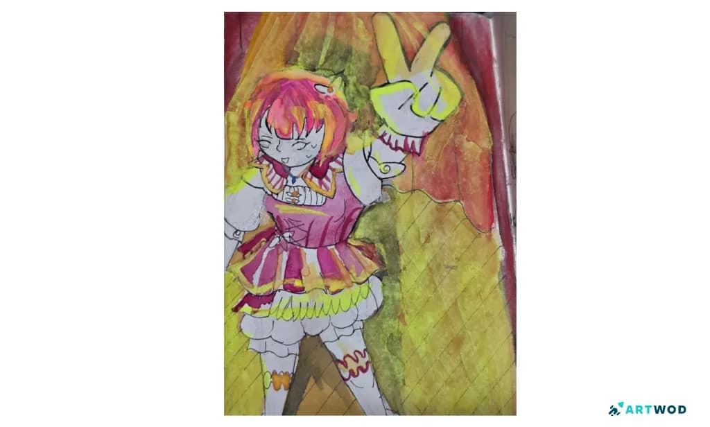
Anime watercolor drawing of a character with pink hair, colorful clothing, a raised hand, and strong yellow-green lighting
Establish the Spotlight Before Painting It
When drawing anime spotlight lighting, imagine the light as a physical source rather than simply a bright color.
Ask yourself:
Where is the spotlight located?
What direction is it pointing?
Which parts of the character face it?
Which surfaces turn away from it?
How wide is the illuminated area?
The paintover makes the lighting more directional, concentrating brighter areas along surfaces that would receive the spotlight rather than distributing the same intensity everywhere. Drawing where the spotlight is pointed from will help define where the light is coming from. In your sketch, you can indicate this via an arrow, or drawing a small spotlight where the light is coming from.
That distinction is important.
Instead of thinking, "Where can I add yellow?", try asking:
"If the spotlight is coming from here, what would it actually hit?"
That one question can give the entire anime drawing a clearer lighting structure.
Do Not Use the Brightest Yellow Everywhere
The artist's comment that the yellow looks like a highlighter points to a common problem with bright lighting effects.
A very saturated or bright color naturally attracts attention. If that brightness is spread across too much of the artwork, it stops feeling like illumination and starts feeling like an overlay.
A better approach is to create a value hierarchy:
Brightest values for the strongest illuminated areas
Light values for surfaces receiving indirect or weaker light
Mid and darker values outside the main beam
Small bright accents for the most intense points
This makes the brightest yellow more effective because it is limited. Remember, the spotlight here is an overhead light, the strongest light will fall on top of objects. Additionally, the type of bulb in spotlights is very strong making the contrast between light and dark even stronger. We can see this in actual images of spotlight lighting.
If everything is bright, nothing feels especially illuminated.
This Artwod submission has a subject, in a similar light environment, with a streak of light in the middle of painting shows how to do this. The darkest values are outside the beam of light, and the lightest are on the white fur coat. The mid values are present on the shading of the subject, as they’re still within the beam of light, the shadows are not as harsh. Notice how many of the shadows fall on the opposite side of the light such as the cast shadow on the face and fur.
A good test for your own artwork is to view it in grayscale, this will give you a good idea of the variety of values in your artwork.
Let the Spotlight Follow the Anime Character's Forms
The character in @kaylen76419's watercolor drawing contains many different forms: hair, face, arms, hands, clothing, and layered costume shapes.
The spotlight should interact with those forms according to their orientation.
A sleeve facing the light may receive a strong highlight. A surface angled away from the light should receive less. Rounded forms such as the head or arm can have transitions between light and shadow instead of becoming one uniform bright shape. Hair will have some of the strongest highlights, due to how reflective it is. The amount of light bounced back depends on the shape and texture.
This is where lighting and form come together.
Anime art can simplify anatomy and rendering, but the light still needs to respond to the underlying forms. If a single yellow shape is painted across several different surfaces, the character can start to look flat. It’s important the lighting conform to the shape of the forms, for example on the shirt I would add a curved highlight near the top as opposed to a straight line.
Instead, think about which individual surfaces the spotlight would actually reach.
With a female subject with a cast shadow over her face establishes a good example of harsh contrast between dark and lights. You can tell what direction the light is coming from, behind her, because of the way the shadows fall. Additionally, textures are considered, given the transition value on the sleeves.
Use the Background to Strengthen the Spotlight
The spotlight should not necessarily stop at the character.
The surrounding environment also helps establish the lighting effect. In this drawing, the large chair-like form on the right is part of the scene, so its response to the light can help make the spotlight feel more believable.
The paintover uses the surrounding forms to clarify the direction and reach of the light.
Think of the scene as one lighting system:
light source → character → nearby objects → background
When appropriate, each part should respond to the same source.
This makes the character feel illuminated by something that exists within the scene rather than simply painted with a bright color.
This piece uses the contrast between the subject and the water, you could do something similar with the elements in the background having a deeper contrast then the subject. Additionally, you could use the highlights on the objects in the background, to ground them into the same environment.
Watercolor Makes Lighting Planning Especially Important
Watercolor can be difficult to correct once strong pigment or washes have been placed on the paper.
That makes it particularly useful to plan the lighting before committing to the strongest yellow. Sketching out the lighting lightly could help with the planning process.
Before applying the brightest pigment, lightly identify the areas that should receive the most direct light. Then build the intensity gradually. For watercolor, I and others suggest starting light to dark, focusing on more concentrated paint later. Not only will this make undoing mistakes easier, but it can be hard to go back when you place darker values.
A practical workflow for an anime watercolor drawing is:
Establish the main local colors.
Decide where the spotlight originates.
Identify the major illuminated forms.
Add the light gradually.
Increase contrast around the brightest areas.
Reserve the strongest accents for selected focal points.
This gives you more control than applying the brightest yellow first and trying to work backward.
How to Make Anime Hair Respond to Spotlight Lighting
Hair is especially useful for showing the direction of a spotlight because it contains many overlapping forms.
Instead of covering the entire hairstyle with the same yellow, identify the larger hair masses that face the light.
Then consider how individual locks turn toward or away from the source.
The brightest areas can be concentrated on the surfaces receiving the strongest illumination, while deeper sections remain darker. This contrast can help the hair retain its structure even under dramatic lighting.
The same principle applies to the character's clothing and other forms: the light should describe the structure rather than flatten it.
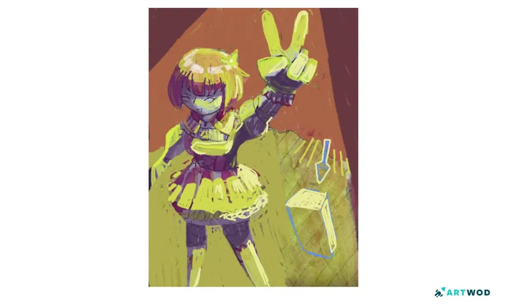
Anime watercolor lighting paintover showing a clearer spotlight direction, controlled highlights, and adjusted illumination across the character and chair
A Simple Anime Spotlight Lighting Exercise
You can practice this problem without immediately painting a full character.
Start with three simple forms:
a sphere
a box
a cylinder
Choose one spotlight direction and paint the same light source across all three.
Then create a simple anime character silhouette and repeat the exercise.
For each version, limit yourself to a few value groups: Dark → Mid → Light → Bright accent
Focus on getting the light direction correct before worrying about detailed rendering.
Once the lighting logic feels comfortable on simple forms, bring it into a more detailed anime watercolor drawing.
Common Mistakes When Drawing Anime Spotlight Lighting
A few habits can make a spotlight effect feel painted on rather than illuminated:
Using the brightest yellow across too much of the artwork
Adding light before deciding where the source is
Treating the character as one flat surface
Ignoring how nearby objects respond to the light
Giving every illuminated area the same brightness
Trying to solve lighting entirely through color rather than value
If the lighting starts looking like a highlighter, do not immediately assume the yellow itself is the problem.
Step back and check where the brightest value is being used and whether the light direction is consistent.
Often, reducing the illuminated area can do more than changing the color.
What Other Artists Can Learn From This Drawing
Choose the light direction first. The lighting color comes after you understand where the source is.
Brightness needs hierarchy. Reserve the strongest values for the most strongly illuminated areas.
Light describes form. Different surfaces should respond differently depending on their orientation.
The environment matters. Nearby objects can help establish the same spotlight effect.
Watercolor rewards planning. Building the lighting gradually gives you more control over strong pigment.
These principles are useful beyond anime watercolor art. The same lighting logic can be applied to digital painting, markers, gouache, and other mediums.
How Community Feedback Can Help With Anime Lighting
Lighting can be difficult to diagnose on your own because color, value, form, and composition all influence one another.
@kaylen76419's feedback request is a good example of a focused art question. The artist identified both the technical problem—being unsure where the spotlight should fall—and the visual symptom—the yellow looking like a highlighter.
When sharing an anime lighting study, explaining both of these things gives fellow artists a much clearer starting point.
Instead of simply asking whether the painting is too bright, you can ask where the light should fall, whether the values make sense, and whether the spotlight feels connected to the character and environment.
That kind of specific peer feedback can make lighting practice much more actionable.
FAQs
Start by deciding exactly where the spotlight comes from and which surfaces it reaches. Establish the major light and dark groups before adding the brightest pigment.
Why does my anime yellow lighting look like a highlighter?The brightest yellow may be spread across too many areas or used without enough value contrast. Reserve the strongest brightness for the areas receiving the most direct light.
Where should a spotlight fall on an anime character?It should illuminate surfaces that face the light source most directly. Other planes should receive less light depending on their orientation and position relative to the beam.
How do you make anime watercolor lighting look more natural?Plan the light direction first, build the values gradually, and use a hierarchy of brightness instead of applying the same strong color everywhere.
Should the background of an anime drawing also be affected by a spotlight?If the spotlight reaches the surrounding environment, nearby objects and parts of the background should respond to the same light source. This helps the lighting feel connected to the whole scene.
How can I practice anime spotlight lighting?Practice one light source on simple forms such as spheres, boxes, and cylinders before applying the same lighting setup to an anime character. Focus on value groups before complicated rendering.
Medium Header
@kaylen76419's watercolor anime drawing highlights a common lighting challenge: a bright color can suggest light, but brightness alone does not create convincing illumination.
For a stronger anime spotlight effect, establish the light source first, determine which forms it reaches, organize the scene into clear value groups, and reserve the brightest yellow for the most strongly illuminated areas.
If your own lighting starts to look like a highlighter, do not immediately assume you need a different color. Step back and check where the light is coming from, how it interacts with the character's forms, and whether the brightest value is being used selectively.
And when you are unsure where the lighting is breaking down, sharing the artwork and explaining the specific problem can make peer feedback much more useful. The Artwod community allows you to share your artwork, get feedback, and helps you improve your art. If you want to get feedback of your own, post your art in the anime category.
Related Posts