Posição # {{}}
@dahlhaus
#7
Classificação
9
Votos a favor
14
Feedback dado
100%
Útil
Pinte
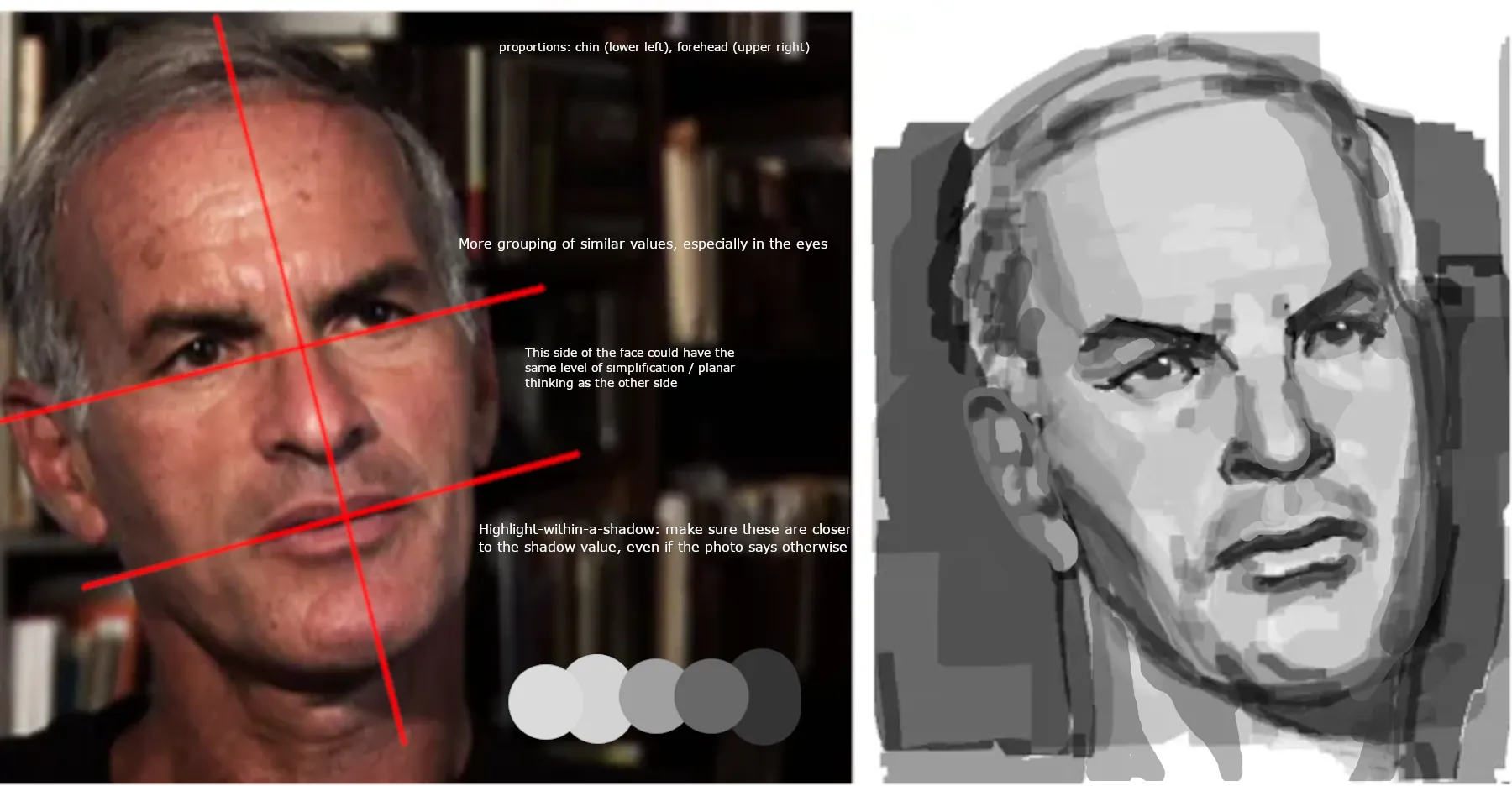
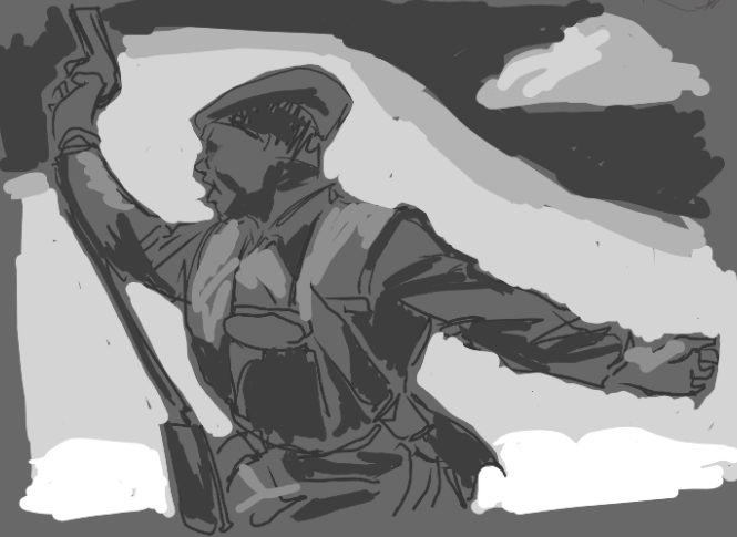
Em “Finklestein Portrait” por @tflees
“It's looking good. You did well defining the side planes of the face with simplified values. Another good thing is the simple square brush you're using: you're getting a lot out of it. This is what I ...”

Pinte
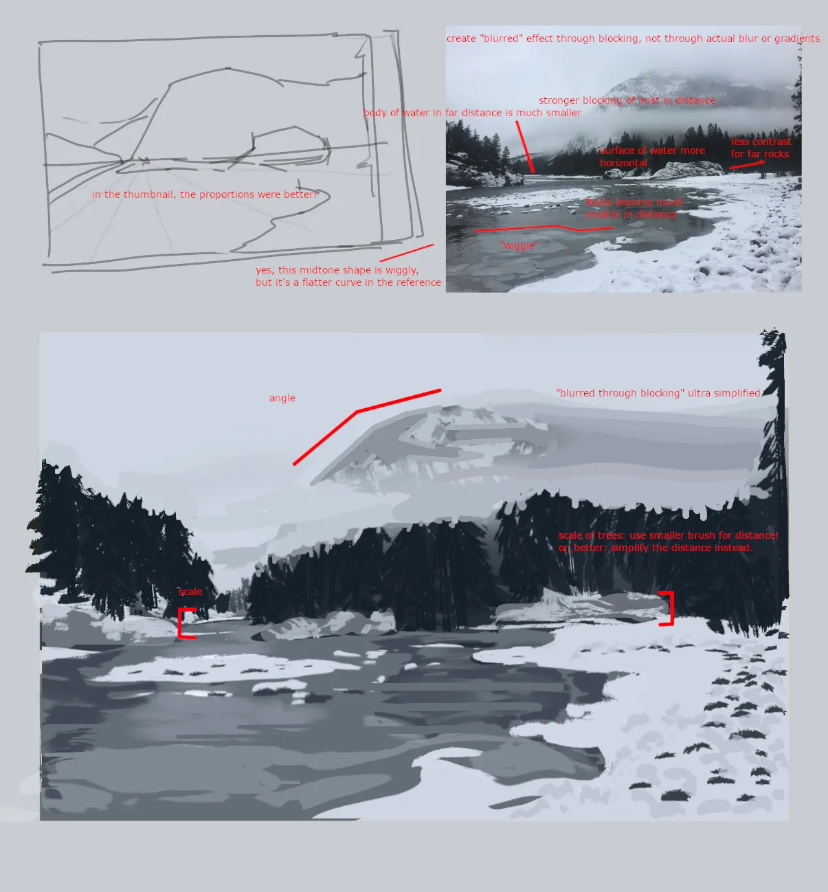
Em “Background study (30 mins)” por @anubis36867
“Hi, welcome back! Most of my notes are in the paint-over but here are the most important things: 1. Scale. The body of water in the back is much smaller than what you painted. You were right in ...”
Pinte
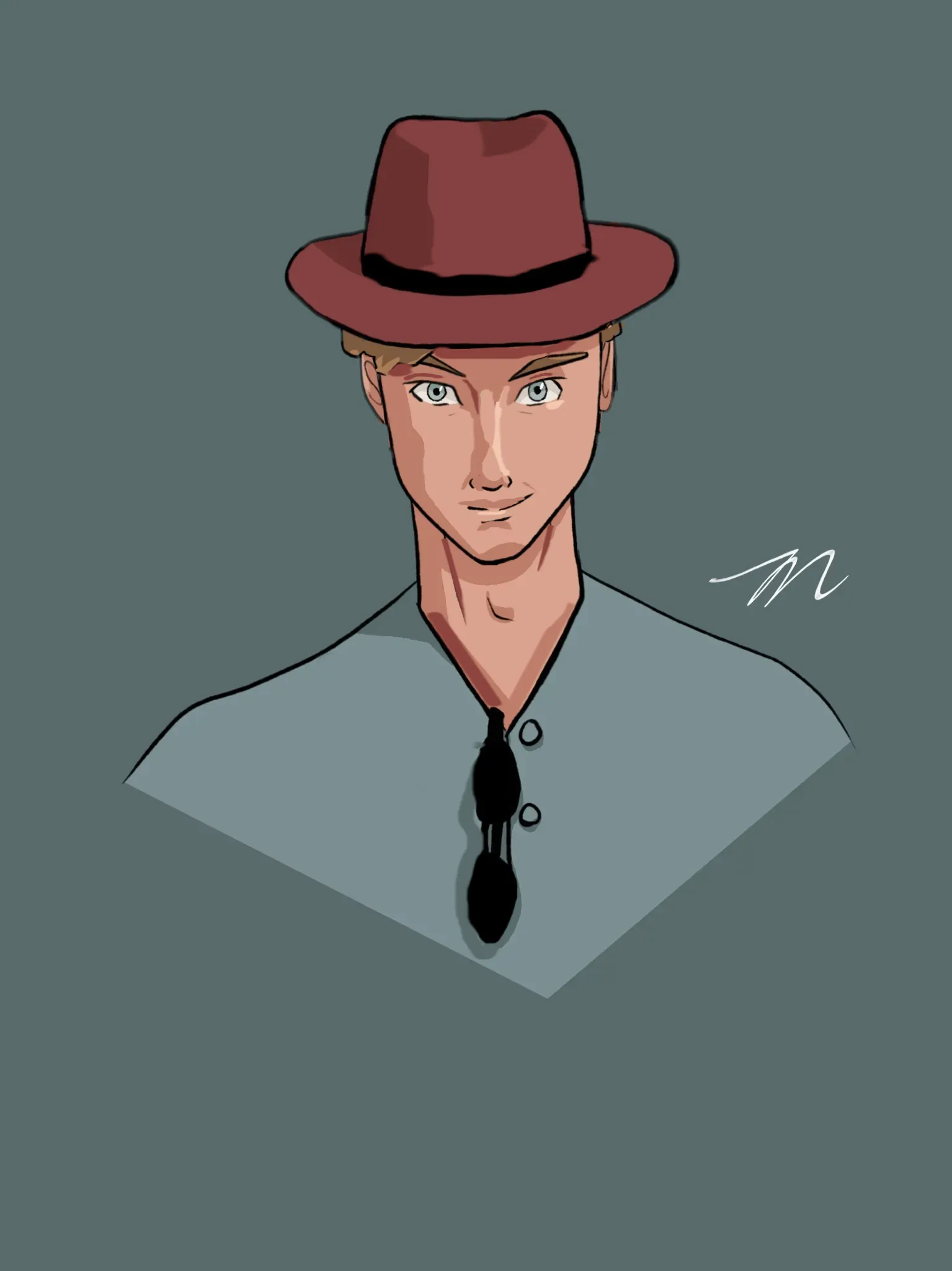
Em “Portrait of my friend” por @tyler23895835
“Here are some things to think about. I did this with a computer mouse but hopefully the ideas are still visible. 1. When should you use a line, and when should you use shading? You are bringing a l...”
Pinte
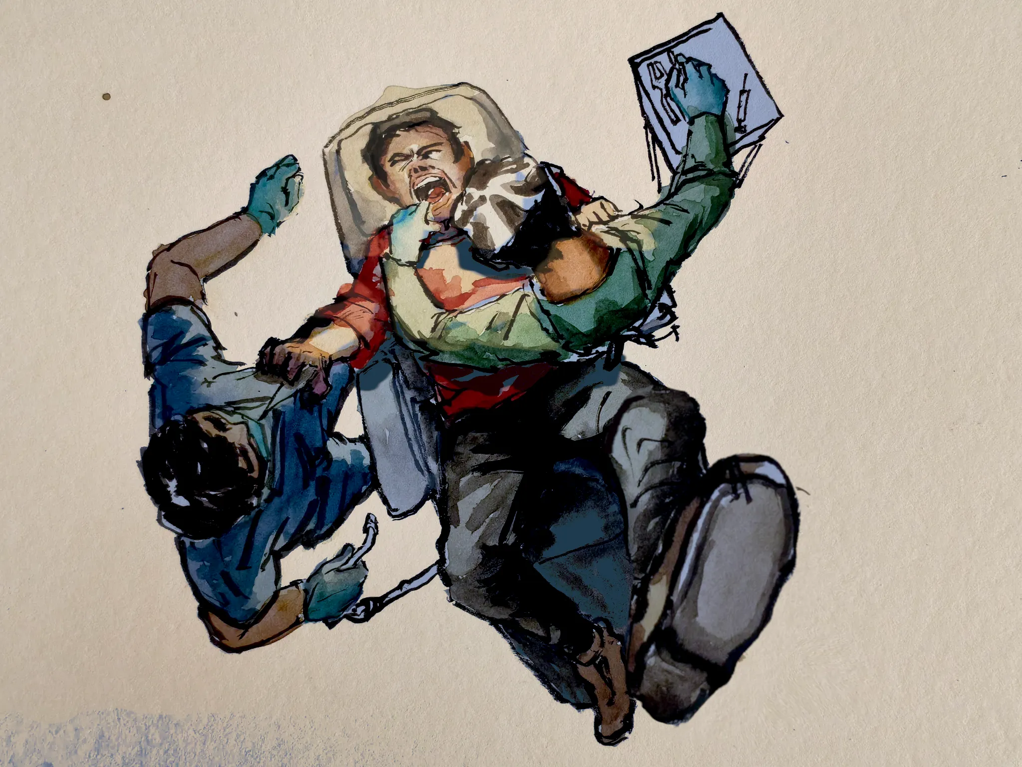
Em “coping for wisdom teeth operation” por
“You're doing fantastic. I only made two changes: 1. Light direction. I could see that you were aware of the strong light aimed at the patient's mouth but didn't use it as a unifying feature. If the...”


Pinte
Em “kenjaku and mahito” por @morstatix76243
“It looks like this is not about just contrast: the composition (where are the legs? what overlaps with what? etc.) is what you can change to make this print more clear. 1. In the original, it was d...”

Pinte
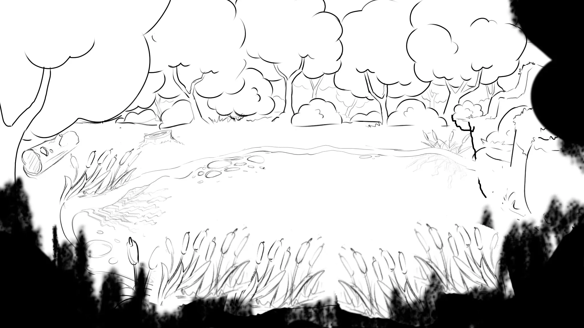
Em “Forest Pond Scene” por @amilyyap
“1. Perspective: your pond should be more flat and horizontal. Imagine this as a shape that's drawn onto a huge floor of square tiles. Even a perfectly round pond would look way more squeezed in the ve...”
Útil + 1
Pinte
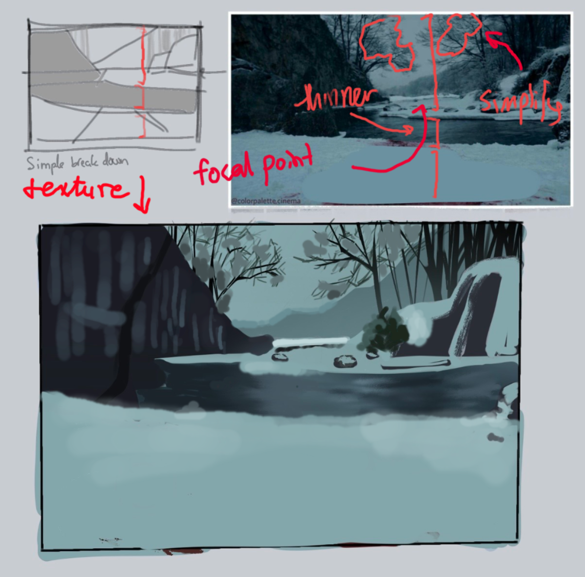
Em “Background study 2 (30 mins)” por @anubis36867
“1. River is more vertically flattened due to perspective 2. Consider simplifying faraway tree branches into a midtown value. Same with bush in the middle ground. 3. For complex things like walls, if...”
Útil + 1