Quer guardar seu feedback?
Registre seus comentários em um só lugar na sua conta. Seu feedback será privado e não público.
Pintar
Pinte sobre notas
Escolha uma tinta
Escolha um avatar para ver suas anotações e discuti-las.
Também luta com retratos?
Melhore sua imagem e proporções faciais, a 3 min
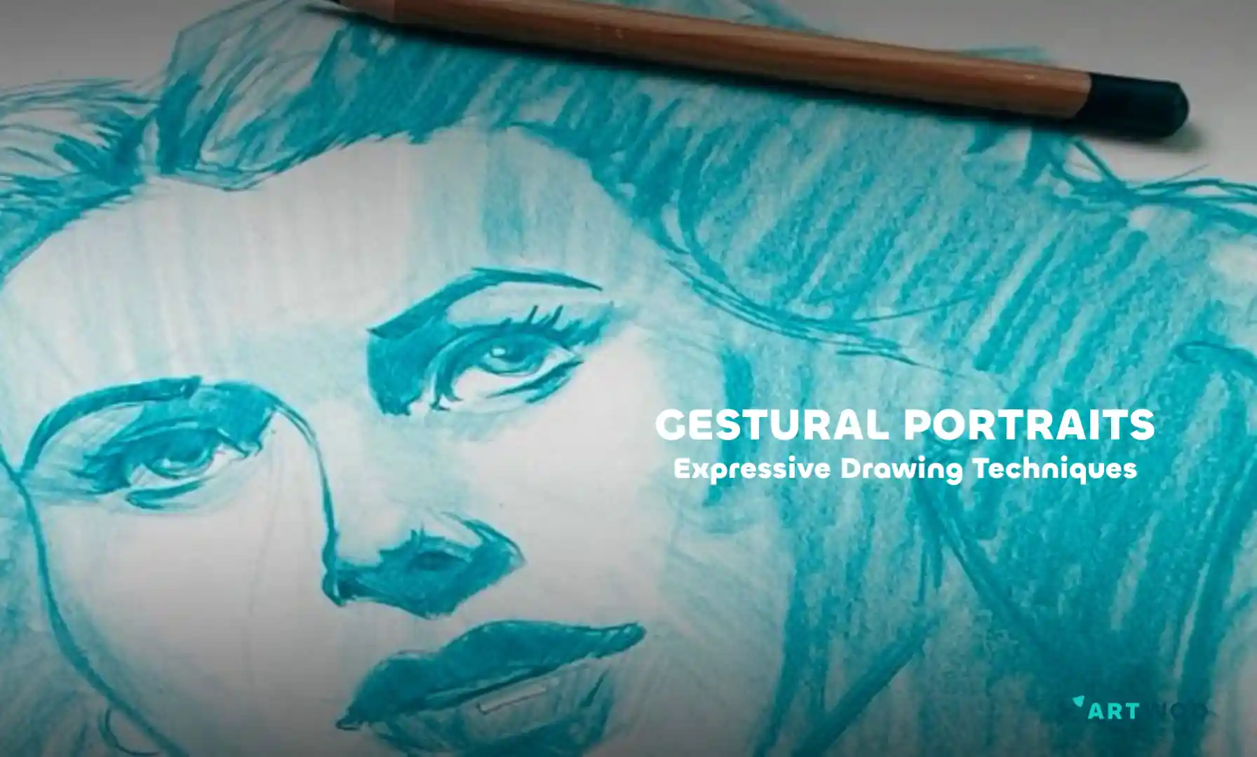
Gestural Portraits: Capturing Expression and Movement in Quick Sketches
Build expressive portraits using the Loomis head method, Reilly rhythms, and shadow mapping to establish structure, flow, and clear lighting before adding final details.
Portraits
Quer ajudar alguém que ainda está esperando?
Rendering
Ainda sem resposta
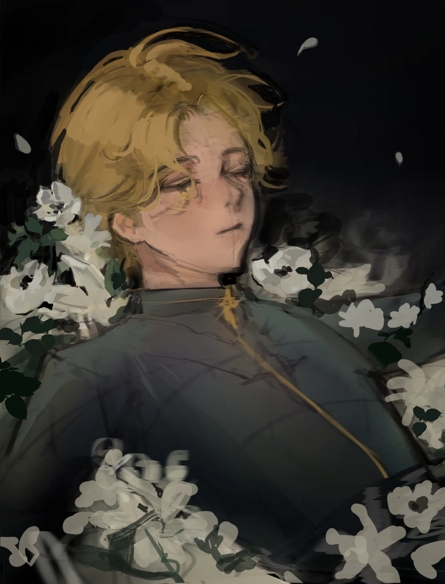
oc
I need help with how to make the drawing interesting..I haven't finished drawing the flowers yet 🥲 crits on anatomy is welcomed too!!
Há 11 minutos
Ver
Portraits
Ainda sem resposta
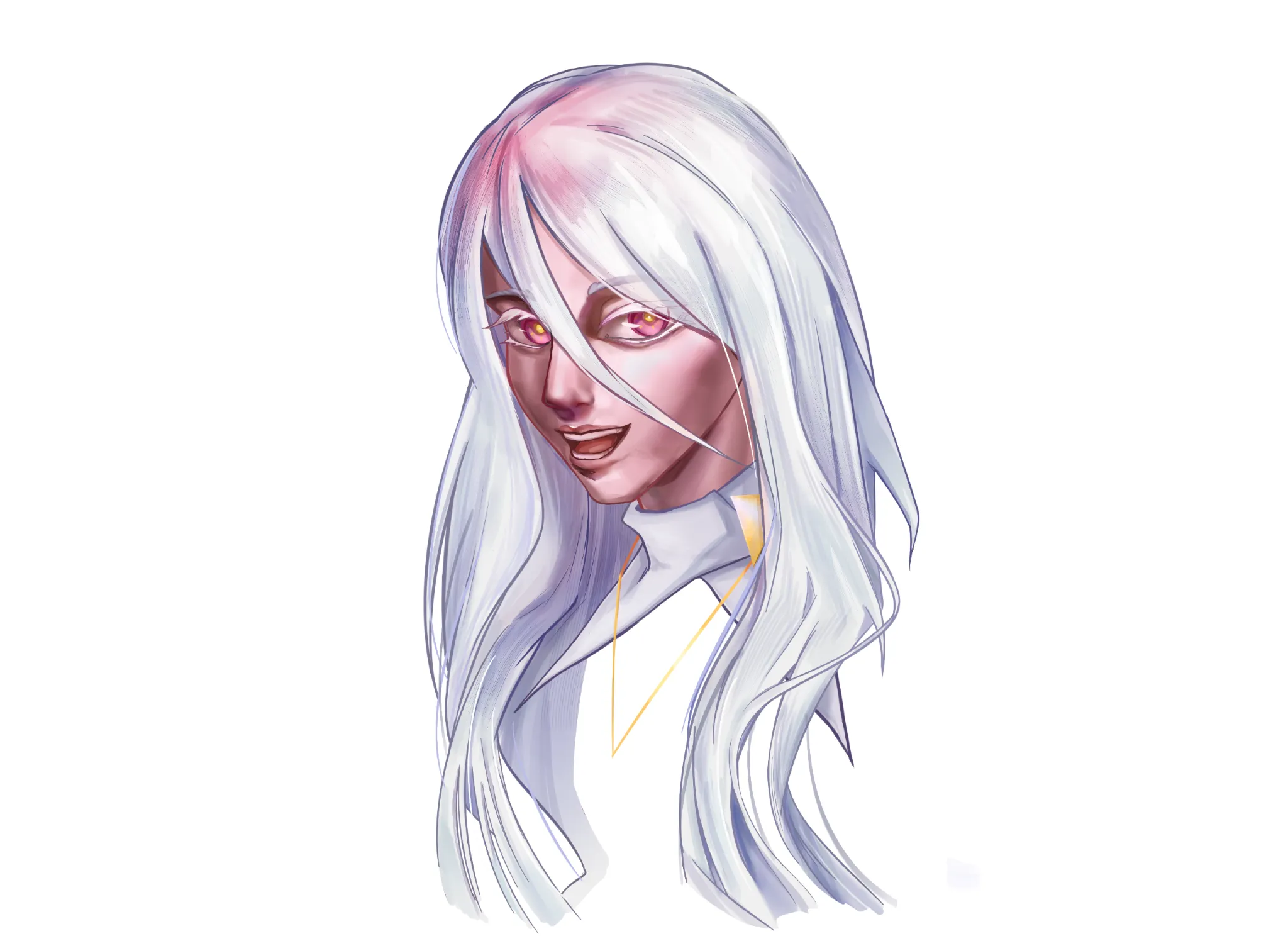
Ori OC
Hey! I'd really appreciate some feedback on my drawing. I feel like there's something off about the hair, but I can't quite figure out what it is. I'd also love to hear your thoughts on my overall art style. Do you think it's at a level where I could work professionally as an illustrator in any industry? Thanks so much!
1 há 1 hora
Ver
Perspective and Form
Ainda sem resposta
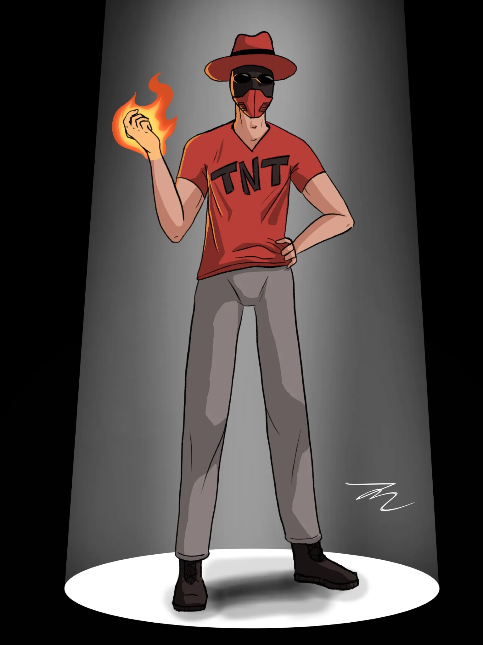
CragDyna
I want to get better at communicating shadows and perspective. That's something I've always struggled with. I'm sure there are some things I could've done better, but I need a seasoned eye to tell me what specifically.
há 3
Ver
Rendering
Ainda sem resposta
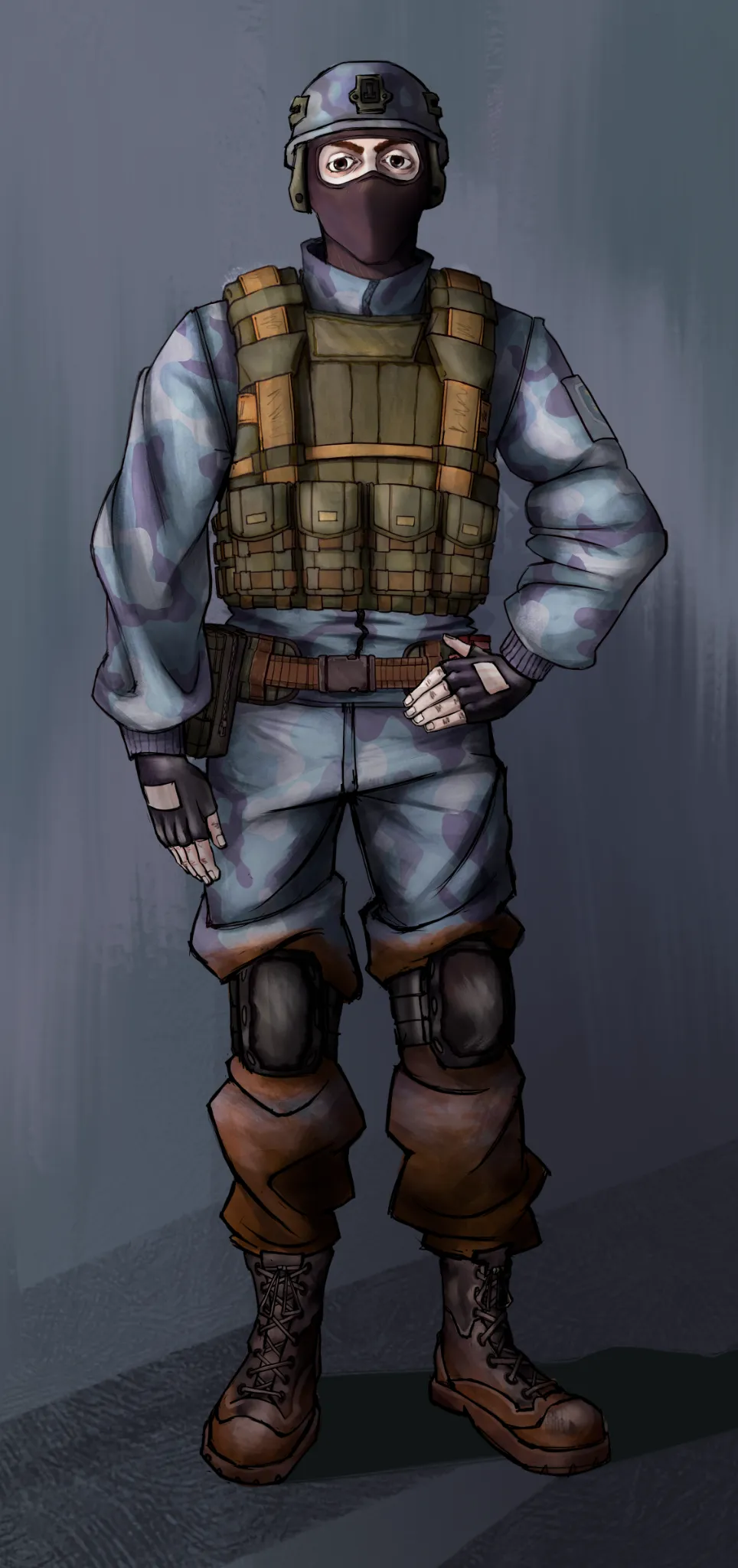
A character i drew, want to get some feedback
This is a commission i drew recently, and i think that aside from the boots, my texturing and render is kinda week.
há 4
Ver
Figure
Ainda sem resposta
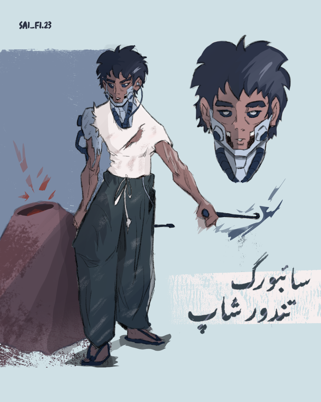
Bread maker Saleh
How can I improve the pose overall and make it feel more dynamic, I feel like the arm holding the rod can be executed better, other suggestions are appreciated as well.
há 4
Ver
Perspective and Form
Ainda sem resposta
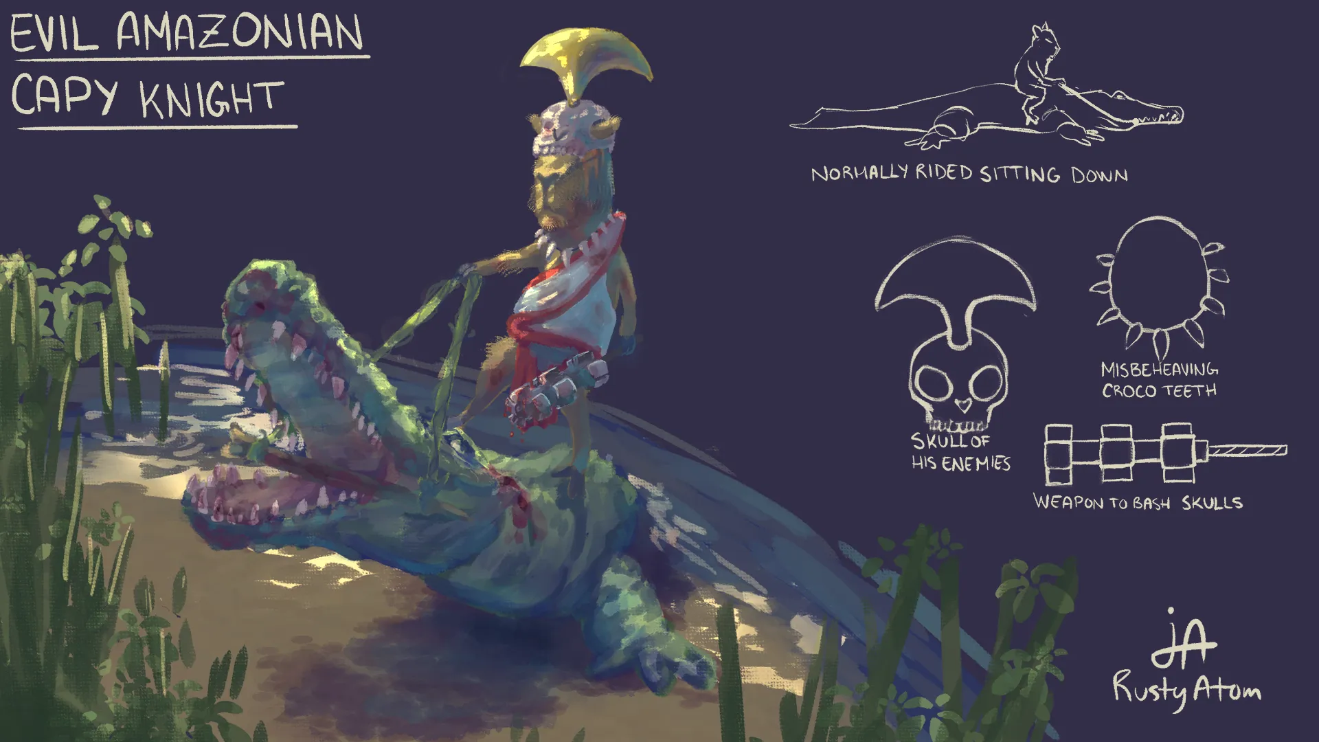
Evil capy knight
So, did this for this year's Chroma Corps assignment yesterday, and as proud as I am of this piece, I really did not receive the feedback I thought I would. I know my weak point is presentation, but I have also always struggled with both perspective and colors. I feel like the alligator and capy could've been in a more dynamic angle on more intense perspective, but I have no idea how to get it done.... Any help and ressources would be so much appreciated 👏
há 5
Ver
Rendering
Ainda sem resposta
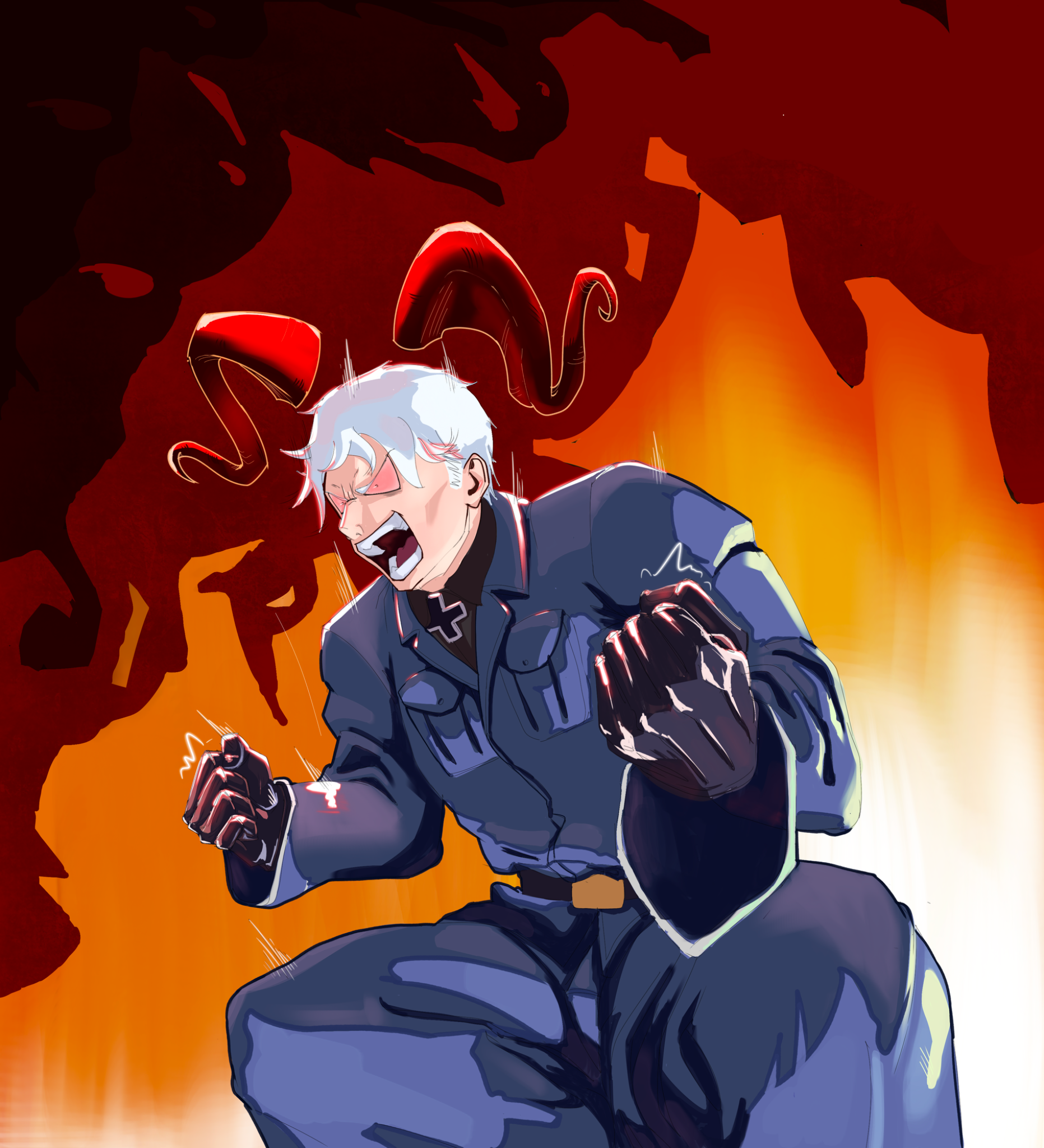
Lighting/Coloring Improvements
Anything I could do to improve this? Thanks!
há 6
Ver
Rendering
Ainda sem resposta
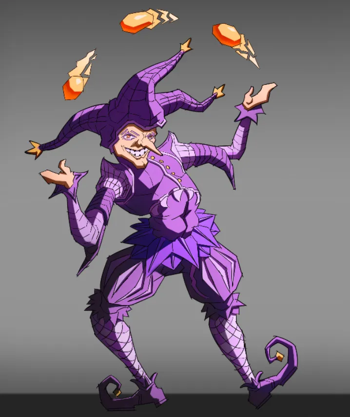
Character design, jester
This is practically my first piece of art without references. I drew it until I ran out of ideas on how to improve it. I would be glad to receive any advice.
há 6
Ver
July Before & After Art Challenge
Ainda sem resposta
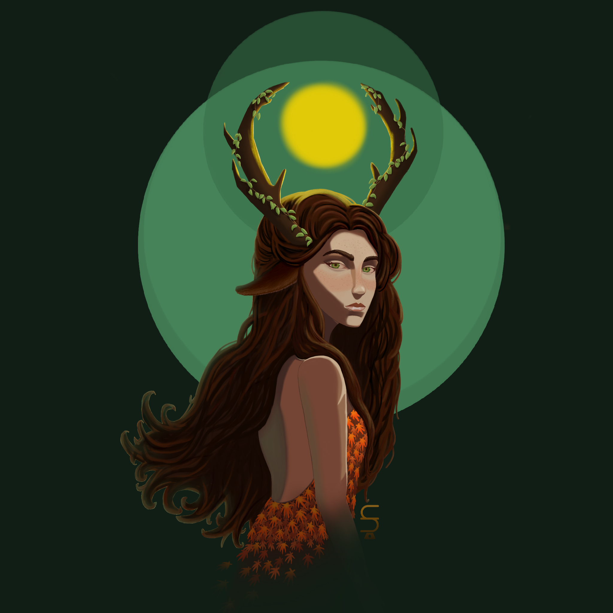
Profile illustration
Rework Thanks so much for your feedback, Fosco ! My drawing has really improved !
há 6
Ver