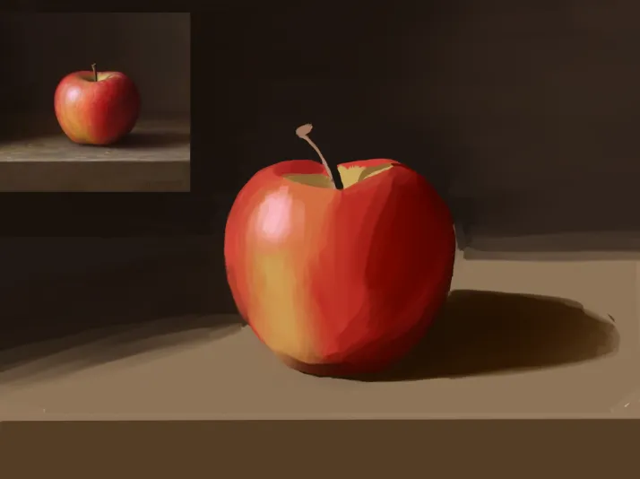
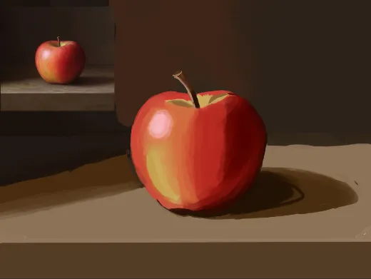
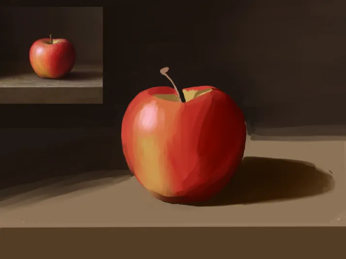

Hello there! Looks good! Good job! :) I'm not sure what your goal was with this painting, even though you mentioned that you're currently focusing on improving your painting... But it would be good if, when you do studies, you focus on studying or practicing 2 things. Maybe colour and edges, values and graphic shapes, etc. There are several options, but that's why it's ideal to know what you want to study, to avoid painting something just for the sake of painting (which isn't necessarily a bad thing either). Something you could improve here is the colours in the shadows and the edges, or brushwork a bit, as well as the values. Regarding the shadows, I would avoid painting them completely red, even though they look red in the reference. You could give the colours more dynamism if the shadows were red but closer to purple. This helps improve the relationship between the colour temperatures, since the colours of the lights are a bit warmer. Painting the shadows with more lilac/purple tones will make them feel a bit cooler. Regarding the values, the lit part of the apple isn't quite that bright; the value is slightly darker. :) And notice that in some areas, I softened the edges to give the apple more focus. :) Hope this helps!
I did some underpainting using grayscale before adding colors. I don't know how to add screenshots in but I did do some studying on grayscale before approaching.