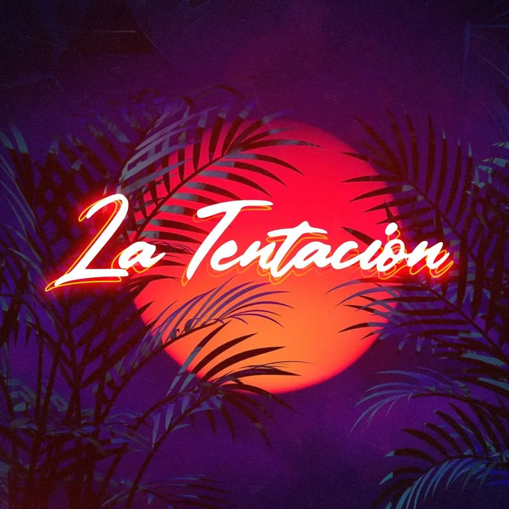

Howdy! This is a very cool, I absolutely adore the color palette. From a graphic design/branding viewpoint - it would help to have a little more information. Is this a streamer or artist logo? From what I am seeing here it is hard to figure what "La Tentacion" is supposed to be. How will it be used and what medium will it be used on the most (screens/print/embroidery/merch)? This can help define resolution/image size options as well! What I would suggest is making sure you have different variations for different usage situations. Although this image looks solid, as a wordmark logo it leaves a little to be desired. There are plenty of people/brands who use a script wordmark as their logo - how can you make this one stand out. Make sure the wordmark can stand on it's own and still clearly define who it is representing, without the background. It is still readable? Do the colors still pop the way you want? Does it still have the same impact in black and white? How would you handle it being on a white background? There is a lot going on here - will it still be recognizable/readable on a smaller screen like a phone? How will this translate to something like a profile icon? Also keep in mind things like font readability. I love this font, but my brain keeps switching between "L" and "2" for the first letter - it may not hurt to make it a similar font with a little more definition, or even taking the tail off the top of the "L". I hope all this helps, I know a big wall of text. But I can't wait to see what you do with the feedback! Happy Designing!
Participe da conversa
Assine seu feedback sobre esta obra.