Quer guardar seu feedback?
Registre seus comentários em um só lugar na sua conta. Seu feedback será privado e não público.
Tópico de feedback
Sem feedback. Seja o primeiro a fazer uma crítica séria.
Também ajuda com ambientes?
Melhore o layout e a perspectiva, a 3 min
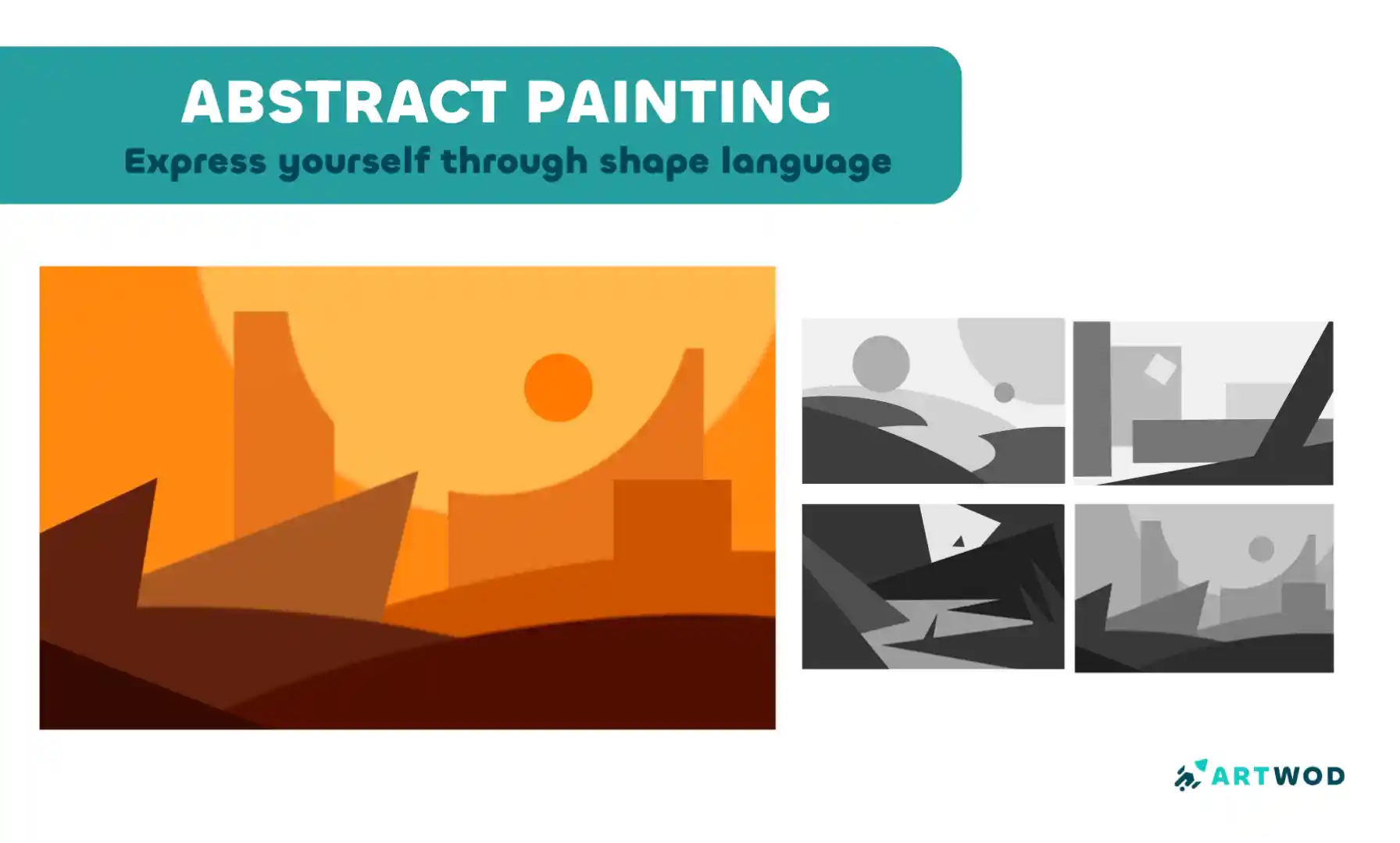
Abstract Painting Techniques: Unlocking Creativity with Color and Form
Master shape language and value composition through a six-step exercise combining rectangles, triangles, and circles to build stronger design instincts.
Environment
Quer ajudar alguém que ainda está esperando?
Environment
Ainda sem resposta
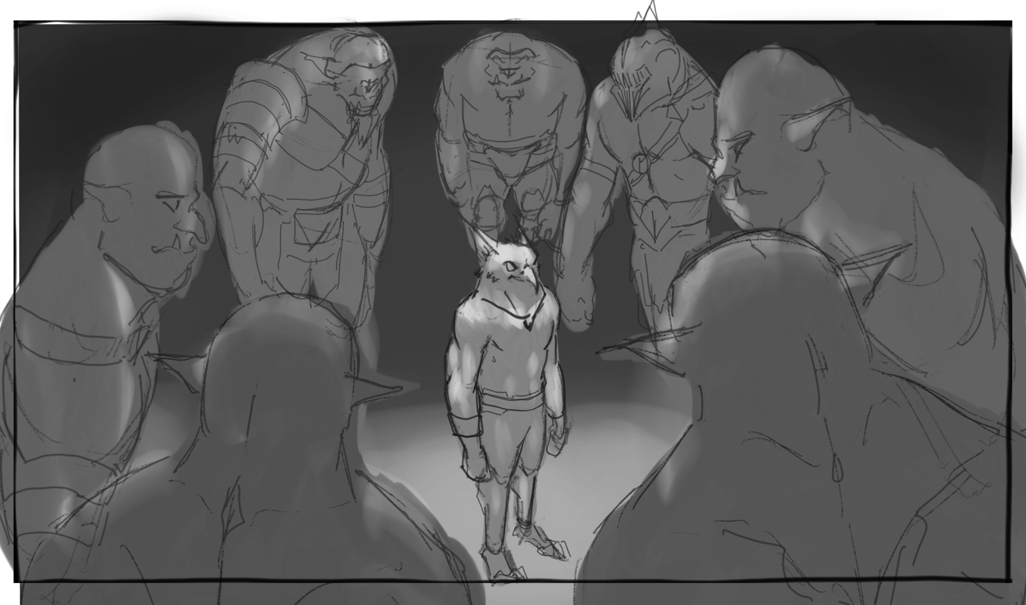
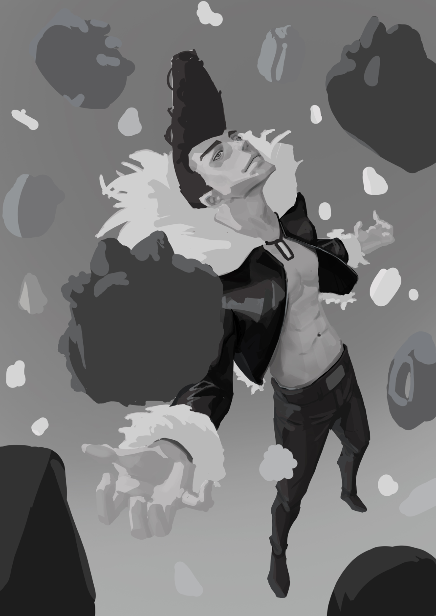
Keyframe Attempt
This is my attempt to do keyframing. I'm not sure how to place the values of the characters and the environment. The context is the hero about to fight off the orcs surrounding him. Attempt: - POV is looking down at the orcs surrounding the hero. - This is in a dark setting, so I made the hero have a brighter value to make it the focal point. So I wonder if this is towards the right direction? Is there any way to make it more interesting (value and thumb nail wise)? Should there be more detail of the background of where they're in rather than just dark value entirely? Feedback appreciated. Thanks!
1 há 1 hora
Ver
Rendering
Ainda sem resposta
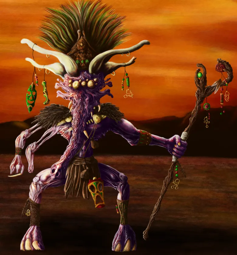
Shaman
It's my first proper colour drawing, I'm quite happy with the outcome. But. I think there are issues with lighting and hierarchies in some areas. Just looking for any feedback that could help improve it and identify anything else I may have missed. Cheers.
1 há 1 hora
Ver
Environment
Ainda sem resposta
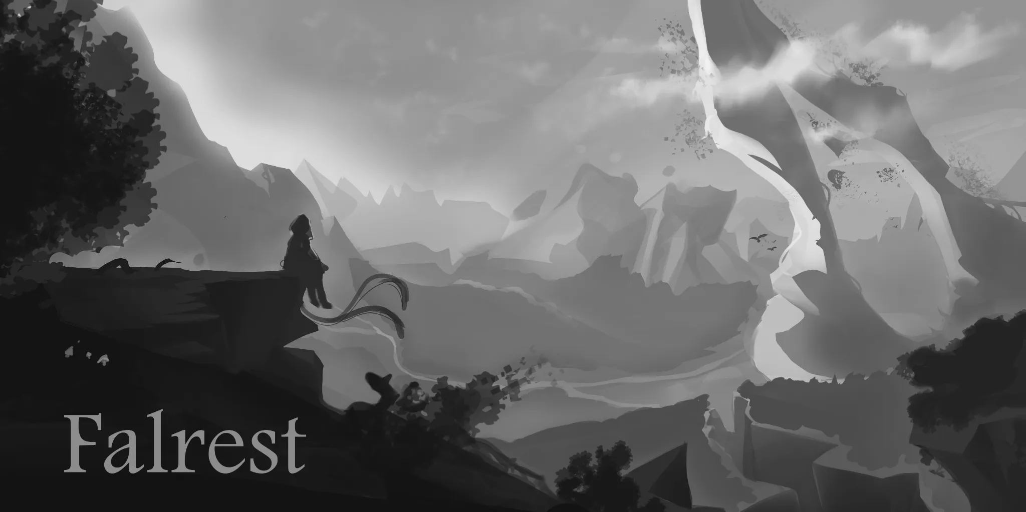
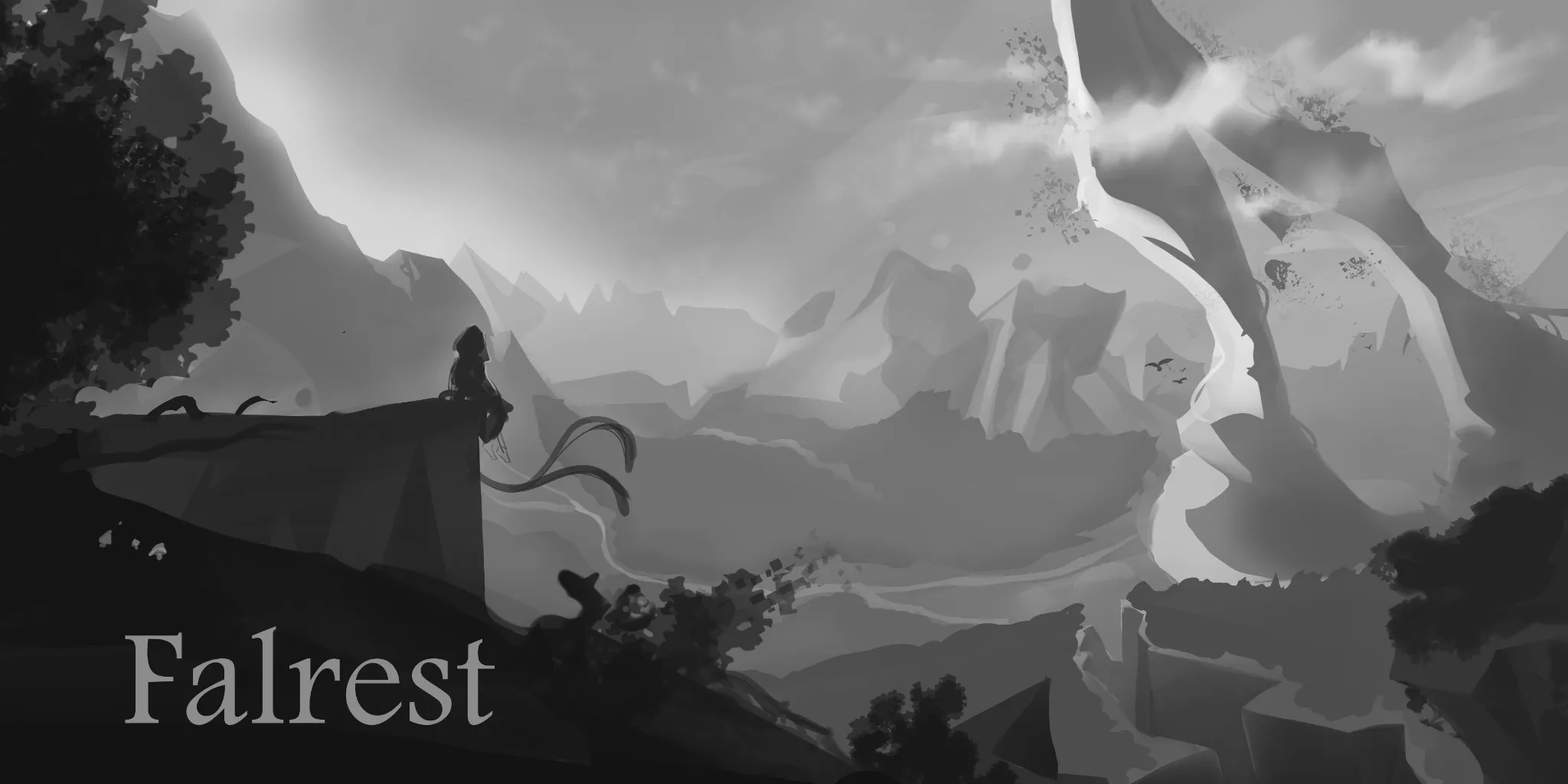
Cover Art Feedback
Can anyone help me out with this piece, environments are still hard for me and I wanted to do a landscape cover for board game box 1.Is composition pleasing or are there any mistakes that distract your eye imminently? 2.Value separation - are the planes properly separated to show distance? 3.Scale of the world - How do you perceive this zone in size small ,medium,big ,unbalanced, Not sure?
há 3
Ver
Portraits
Ainda sem resposta
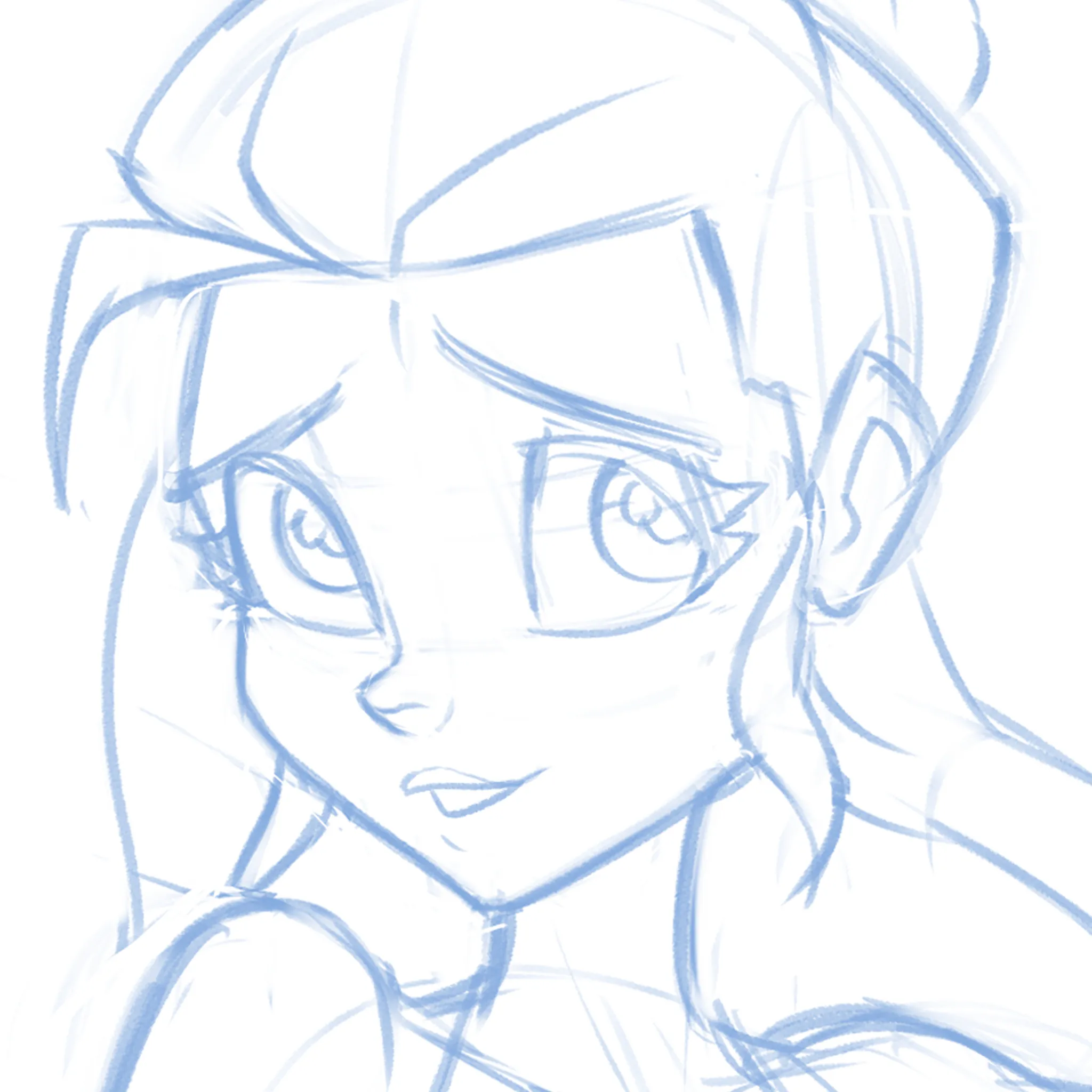
Cute-ify this Face!
Not sure if it's the eyes, the nose, the mouth or EVERYTHING but can't quite get this face pretty enough! What am I missing? I'm just moving features around randomly at this point.
há 3
Ver
Rendering
Ainda sem resposta
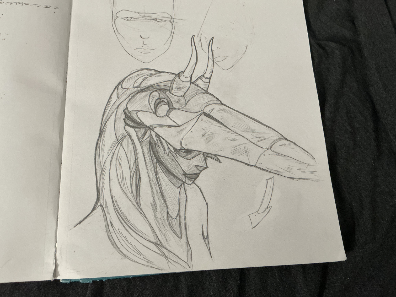
The Heron Woman
GUYS!!! remember those heron studies i did not too long ago? Well, i turned it into an idea, a concept, if you will, and came up with this heron warrior. quite proud of it! what's more is that when she pulls down her mask, the bird's nostrils act as eye holes, making it into a rad frickin' mask! anyways, i want feedback. particularly on the rendering. i feel like i didn't take advantage of the heron's plummage texture enough, or like i was a bit carelss with my light source and cast shadows. but what do you all think? any other suggestions? please let me know!
há 5
Ver
Figure
Ainda sem resposta
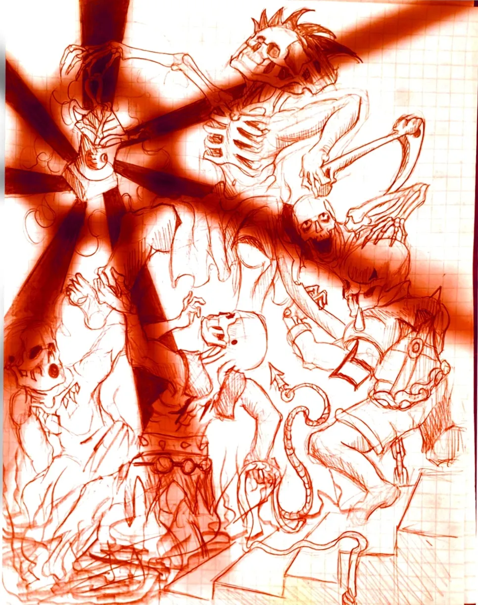
Eternal Fight of the Wicked Part 2
Im the same creator of the OG drawing in the figure drawing section, I just decided to throw the drawing on a sketchbook app on my phone and play around with it. Feel free to critique it some fun ideas to play around with.
há 5
Ver
Rendering
Ainda sem resposta
Feeling lost with values
I tried to create an illustration of Ichigori Ryu in a rain of dessert and I feeling quite lost when the rendering part came on. Like how do you choose if you need more contrast on the skin for example or less. It’s not finished but I would appreciate some guidance
há 5
Ver
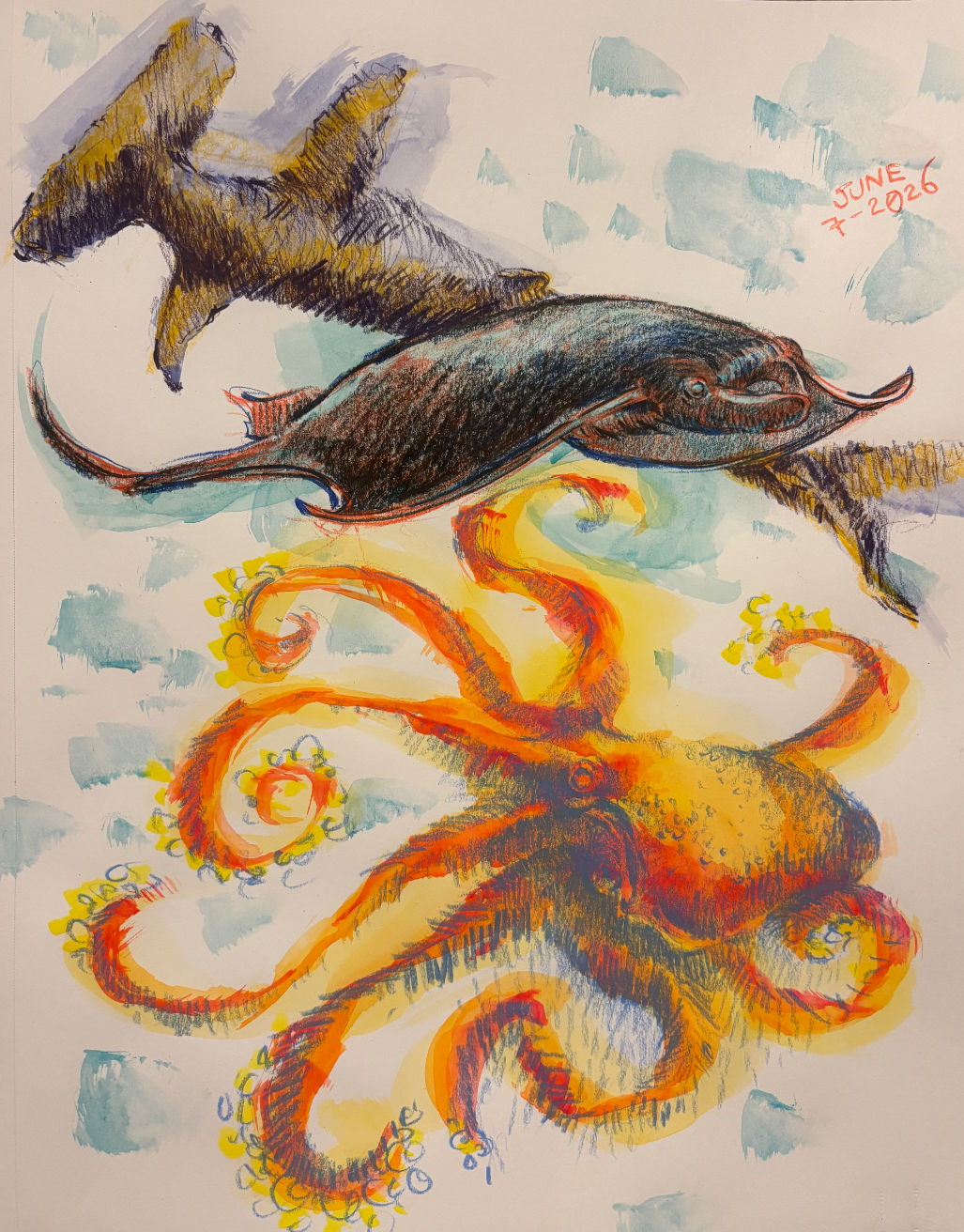
June 30 Sketchbook Pages Challenge
Ainda sem resposta
6/7/26
Day 7
há 6
Ver
Animals
Ainda sem resposta
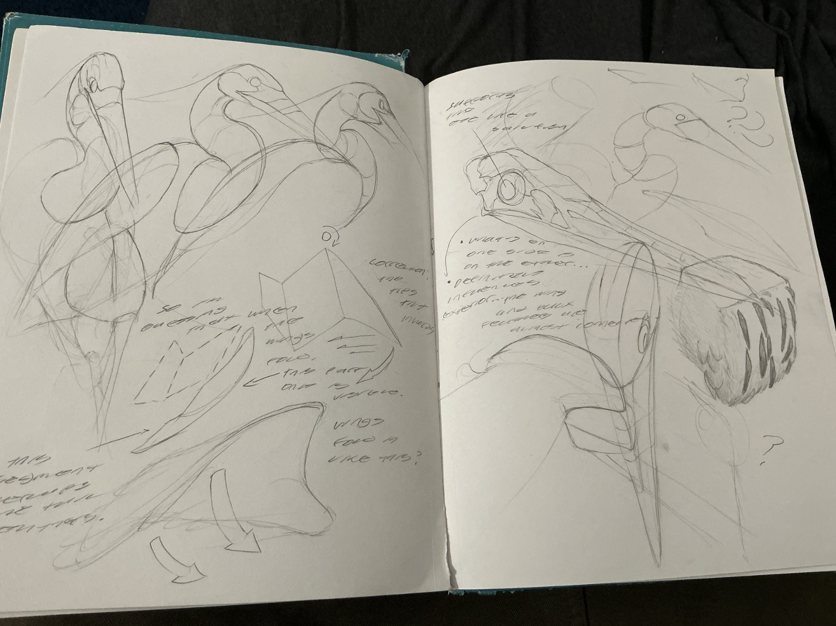
the lad and the neroh
I was studying grey blue herons today since i usually see them around my local lake and love miyazaki's films! Whilst doing these studies, i put on a peter han sketchbook tour for background noise, so that influenced my studies a bit with the observational notes and texture blocks and such. I also did 3d rotations, and even tried to figure out how the wing folded in. On either one of these things, how'd i do? Please let me know so i can push my drawings more towards that peter han skill level sort of direction!
há 7
Ver