Quer guardar seu feedback?
Registre seus comentários em um só lugar na sua conta. Seu feedback será privado e não público.
Tópico de feedback
Sem feedback. Seja o primeiro a fazer uma crítica séria.
Também luta com renderização?
Melhore o controle de sombra e luz, a 3 min
Halftone Techniques: Adding Texture and Depth to Your Artwork
Master halftones by establishing shapes, volumes, and shadows first, then practicing on beans, noses, portraits, and posters to add texture and depth to your artwork.
Rendering

Quer ajudar alguém que ainda está esperando?
Environment
Ainda sem resposta
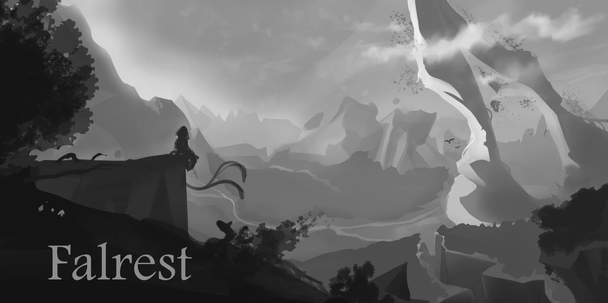
Cover Art Feedback
Can anyone help me out with this piece, environments are still hard for me and I wanted to do a landscape cover for board game box 1.Is composition pleasing or are there any mistakes that distract your eye imminently? 2.Value separation - are the planes properly separated to show distance? 3.Scale of the world - How do you perceive this zone in size small ,medium,big ,unbalanced, Not sure?
Há 24 minutos
Ver
Portraits
Ainda sem resposta
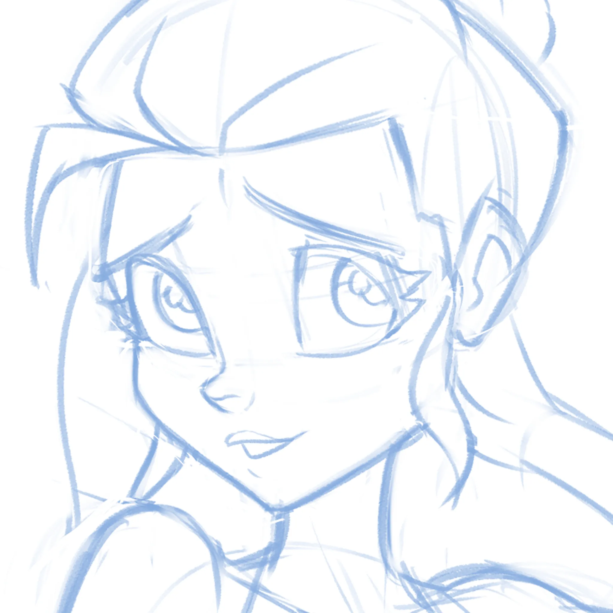
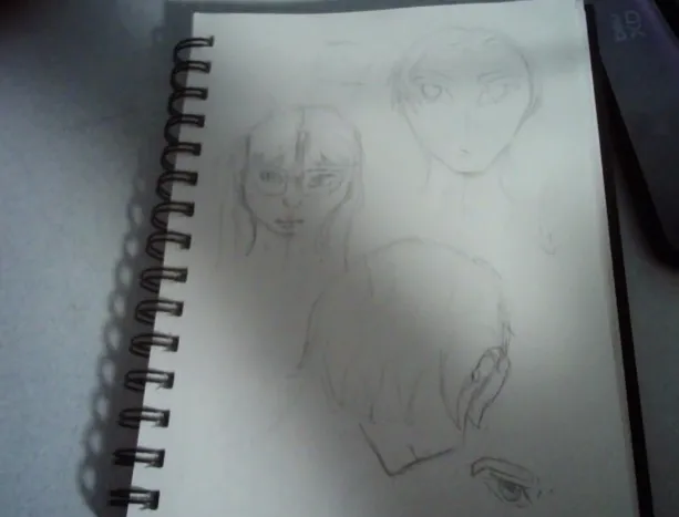
Cute-ify this Face!
Not sure if it's the eyes, the nose, the mouth or EVERYTHING but can't quite get this face pretty enough! What am I missing? I'm just moving features around randomly at this point.
Há 39 minutos
Ver
Figure
Ainda sem resposta
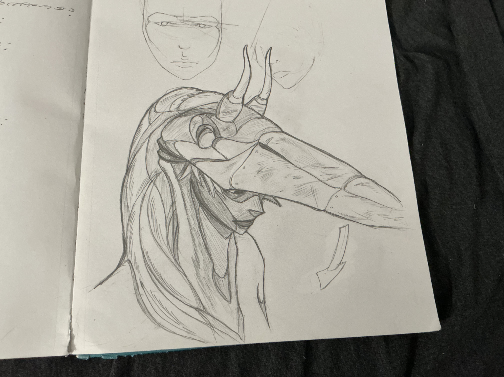
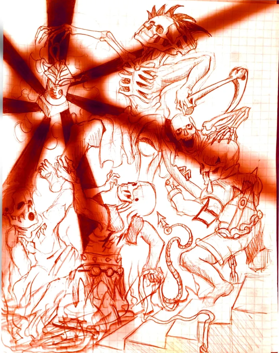
Eternal Fight of the Wicked Part 2
Im the same creator of the OG drawing in the figure drawing section, I just decided to throw the drawing on a sketchbook app on my phone and play around with it. Feel free to critique it some fun ideas to play around with.
há 2
Ver
Rendering
Ainda sem resposta
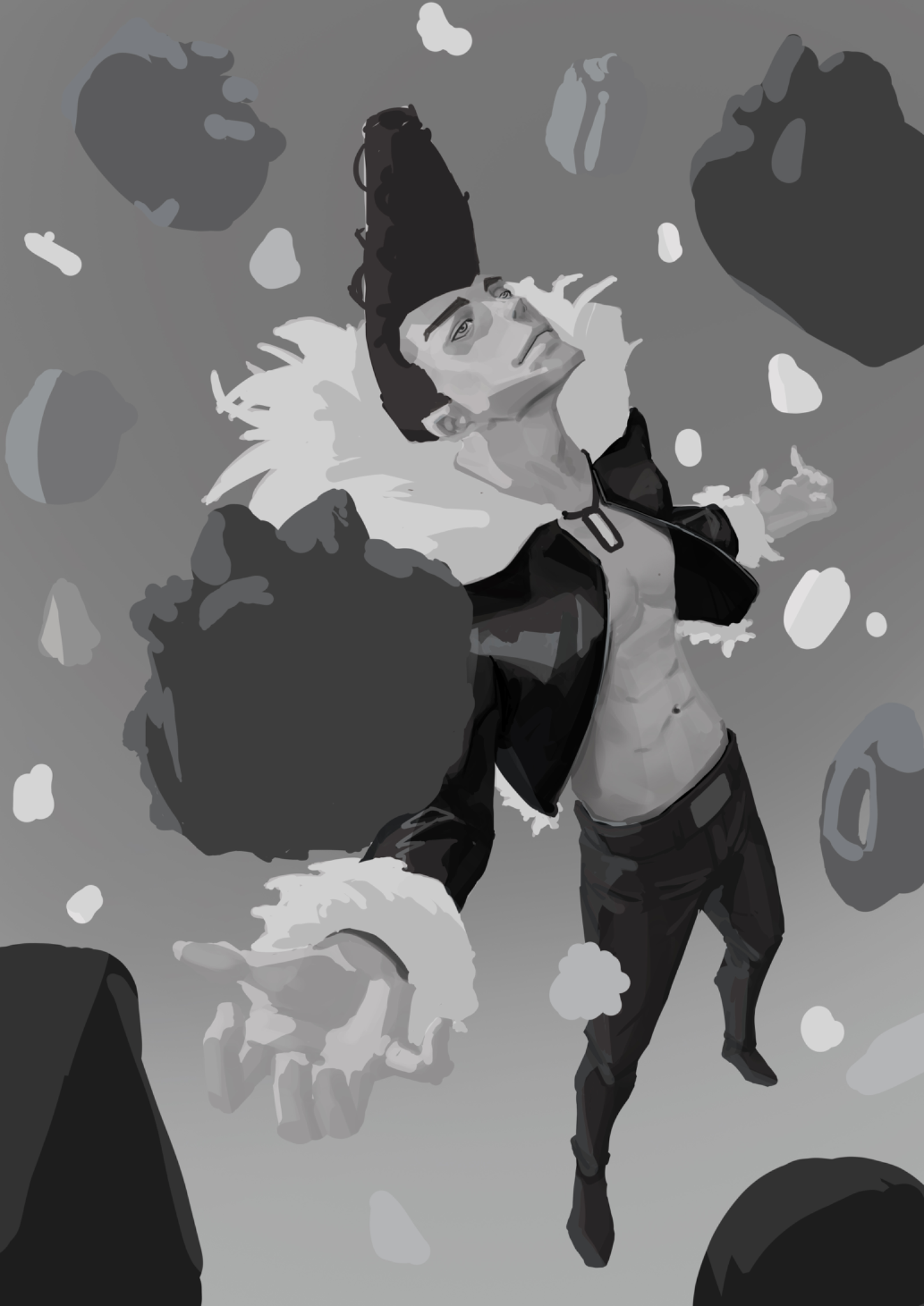
Feeling lost with values
I tried to create an illustration of Ichigori Ryu in a rain of dessert and I feeling quite lost when the rendering part came on. Like how do you choose if you need more contrast on the skin for example or less. It’s not finished but I would appreciate some guidance
há 2
Ver

June 30 Sketchbook Pages Challenge
Ainda sem resposta
6/7/26
Day 7
há 3
Ver
Animals
Ainda sem resposta
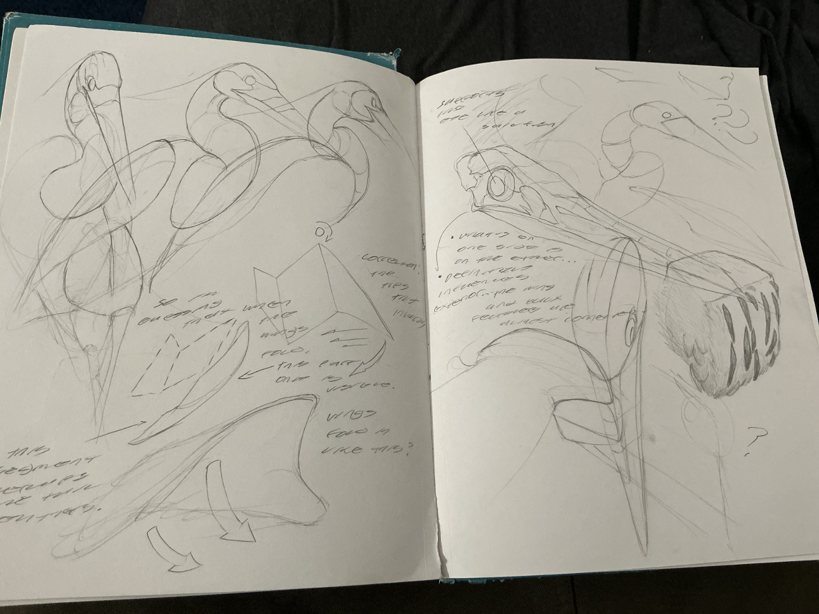
the lad and the neroh
I was studying grey blue herons today since i usually see them around my local lake and love miyazaki's films! Whilst doing these studies, i put on a peter han sketchbook tour for background noise, so that influenced my studies a bit with the observational notes and texture blocks and such. I also did 3d rotations, and even tried to figure out how the wing folded in. On either one of these things, how'd i do? Please let me know so i can push my drawings more towards that peter han skill level sort of direction!
há 3
Ver
June 30 Sketchbook Pages Challenge
Ainda sem resposta
6/7/2026
im having a hard time with constructer
há 4
Ver
June 30 Sketchbook Pages Challenge
Ainda sem resposta
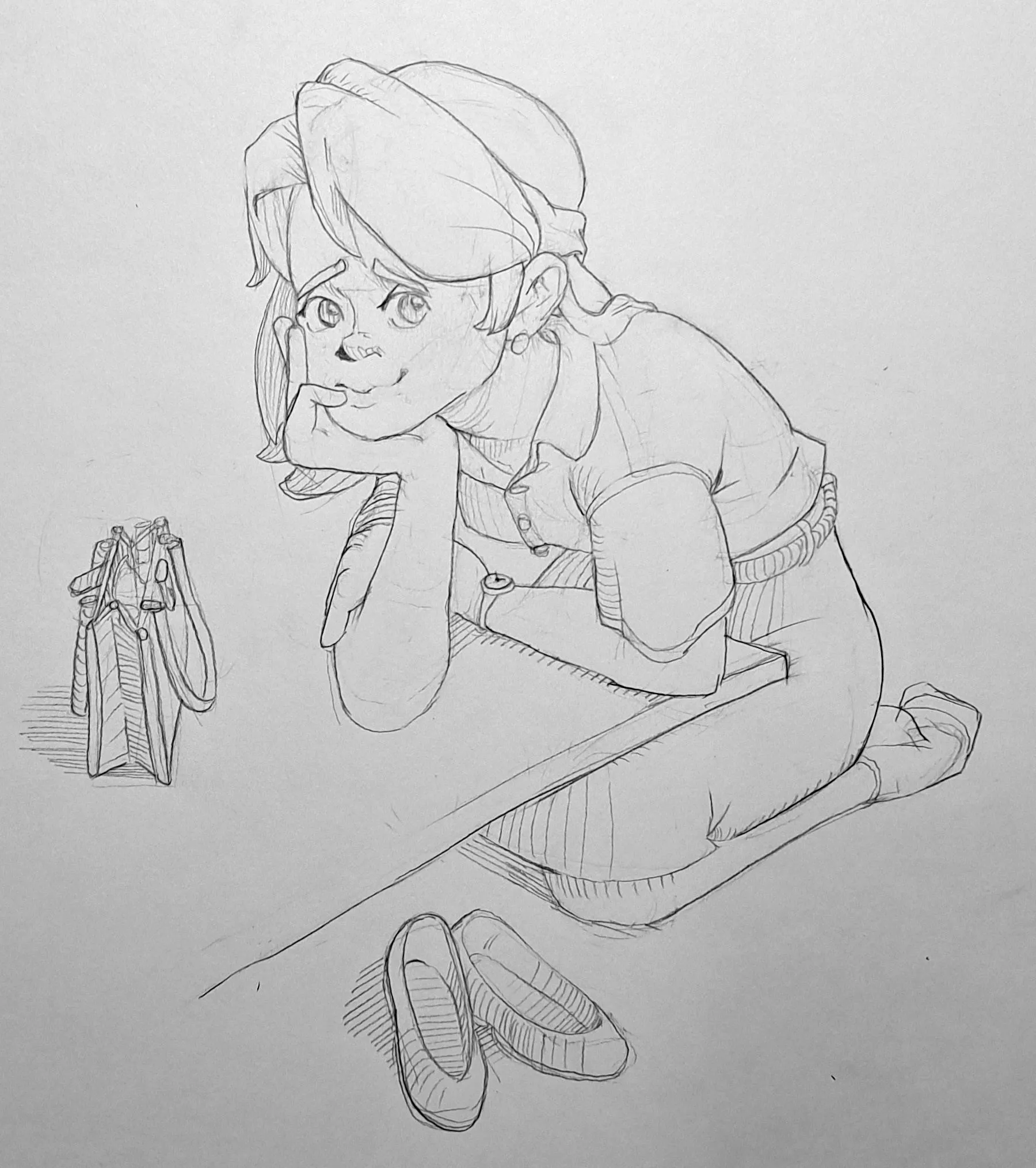
June 30 Sketchbook Pages Challenge Day 7
I am happy with the pose and the objects around the character. The main problems I'm seeing in this piece are proportions. Firstly, the head is much larger than I intended, and it makes this character look like a young girl when I was going for a lady just getting back from work look. I had already drawn a face I was happy with and the hand felt believably placed on the head so honestly I couldn't muster the willpower to draw the head again at that point. I also think the left arm's above the forearm (do you call that an upper arm?) is short, and I am unsure about her right arm's proportions. I did spend some time fixing things in the construction stage, but I got hasty and did not double check when the figure was fully in, I actually extended the length of her right forearm by enlarging the elbow, and I think that helped. I could use some tips on dealing with proportions when dealing with dynamic angles. The one tip I already know I need is to fix all these problems in the construction stage!!! Thank you!
há 6
Ver
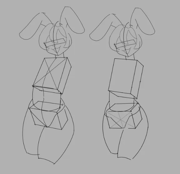
Figure
Ainda sem resposta
FIgure drawing
Which version is better constructed? I want my figure to have a downward-tilted pelvis and for the contrapposto to be visible. It seems to me that the first figure has more volume, but I’m confused by the fact that the front plane is higher on the side that should be lower, which is why the contrapposto isn’t noticeable.
há 8
Ver