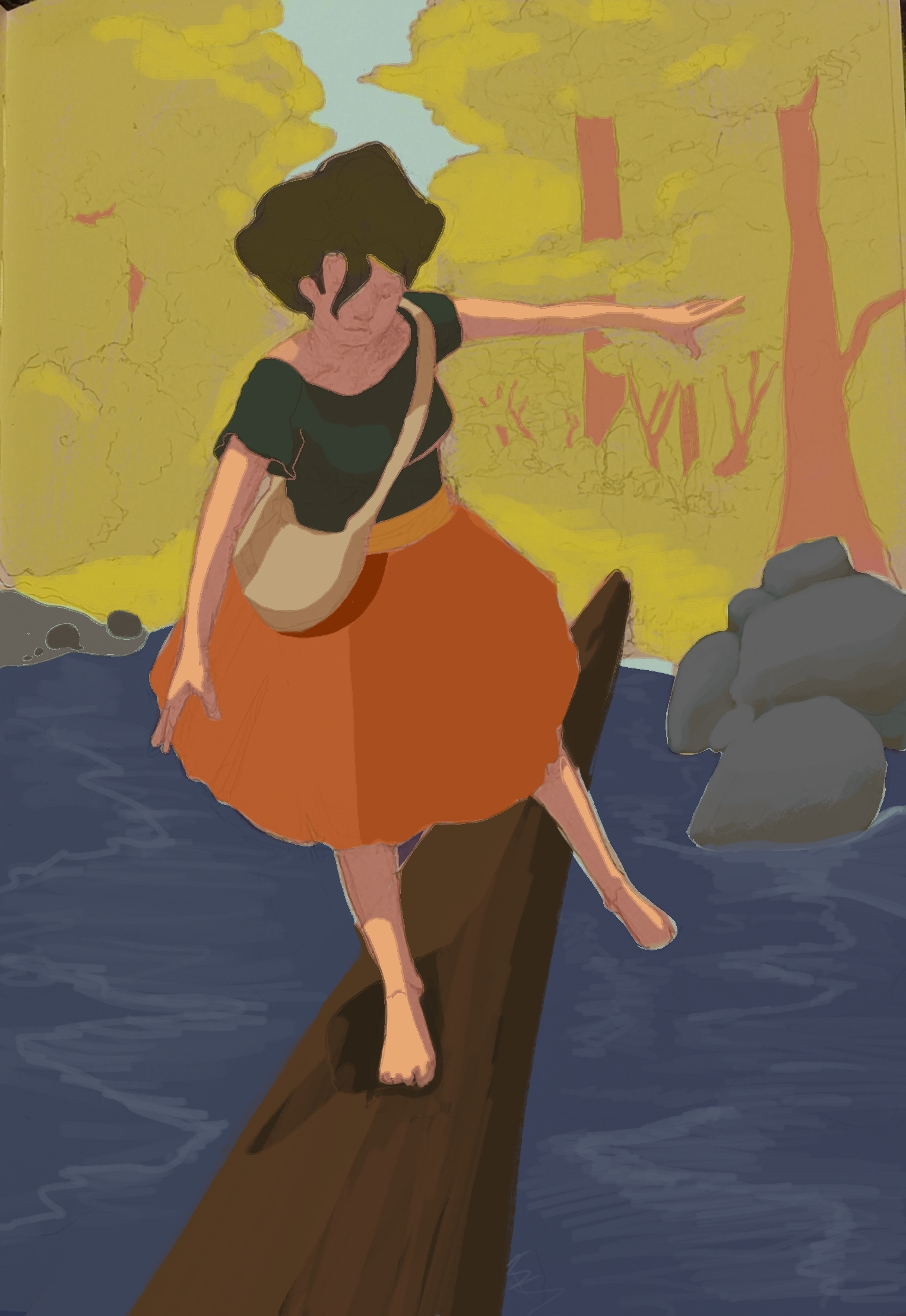
Rang # 19
@beke
Hi! My name is Béa. I'm from Spain, but I currently live in the south of France. I'm here because I want to improve my art and be able to draw like I breathe. I'd absolutely love to work as an illustrator, or even better, in an animation studio—even if it's creating props, designing backgrounds, or coloring. And, of course, with a good salary because I have a family to support! Here on ArtWod, I mainly want to take the opportunity to improve my technique and become a better artist every day!
#19
Rang
36
Upvotes
33
Feedback donné
100%
Utile
Peindre
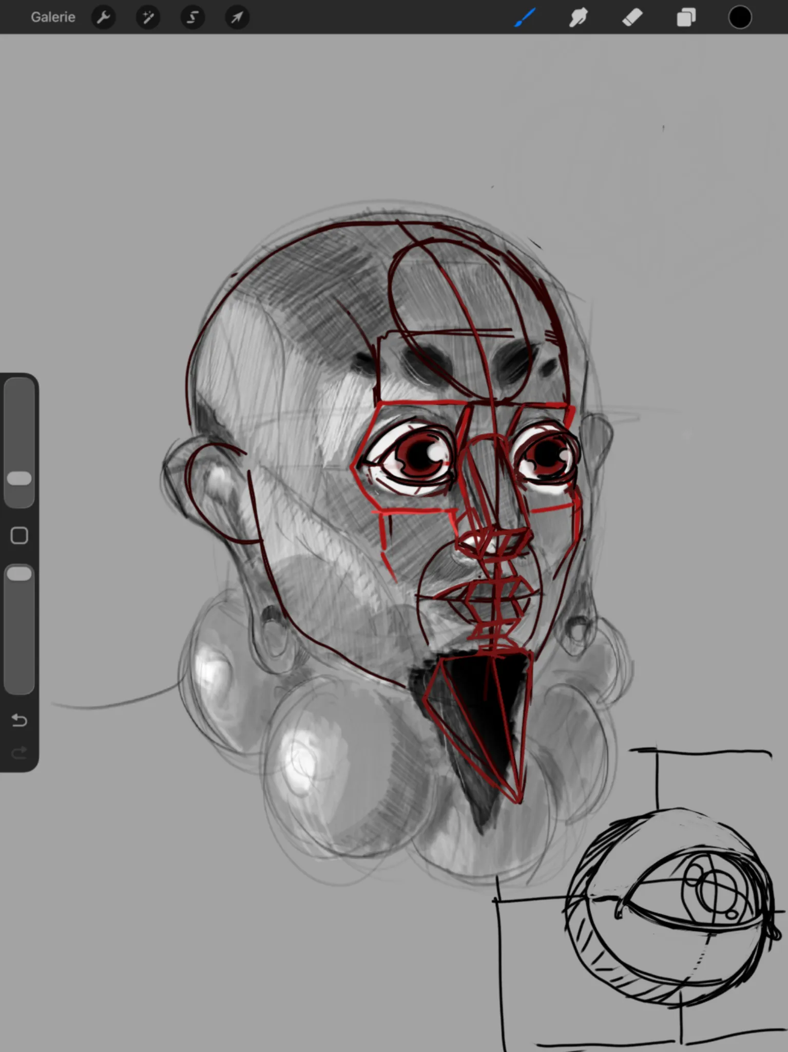
Sur « imagination portrait » de @nelybi
“Hi, I'm glad you found it helpful. I'll try to answer your question about the eyes, although I'm a bit limited because I'm still trying to better understand some aspects of their construction myself....”
Peindre
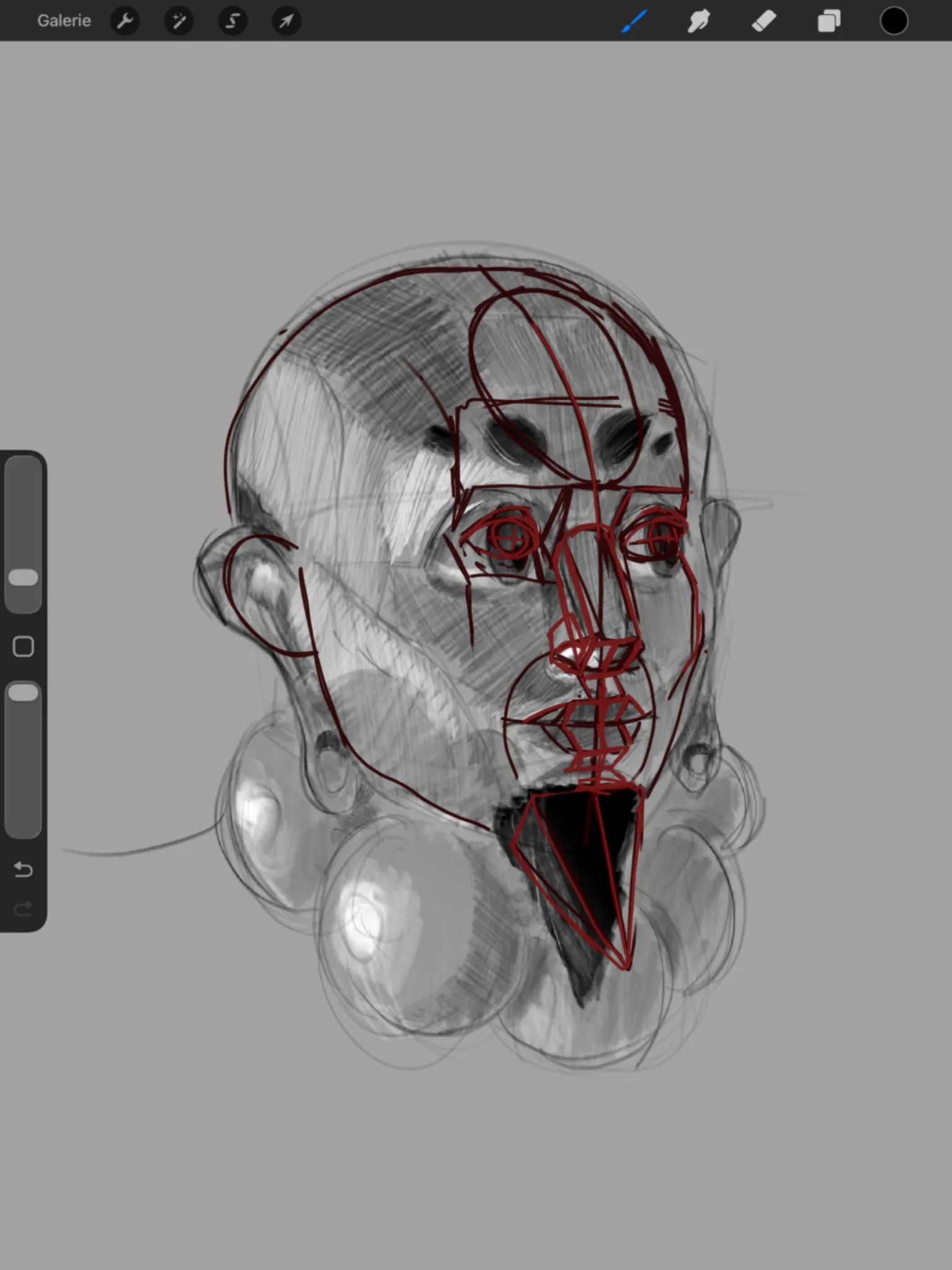
Sur « imagination portrait » de @nelybi
“Hi, I think there was an inconsistency in the perspective. The width of the skull corresponded to a face seen from the front, while the nose and the gaze suggested a three-quarter view. So, using the ...”

Peindre
Sur « Cupcake » de @learaart
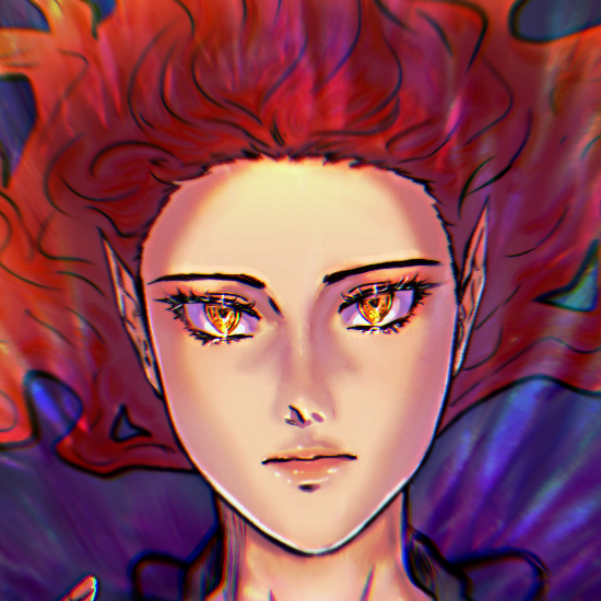
“Wow... what beautiful work!! I thoroughly enjoyed it! I could almost taste strawberries and wild berries the whole way through. I love drawings that appeal to the senses! Here’s a summary of what I d...”
Utile + 1
Peindre
Sur « Potrait » de @willbee
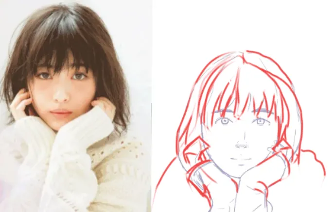
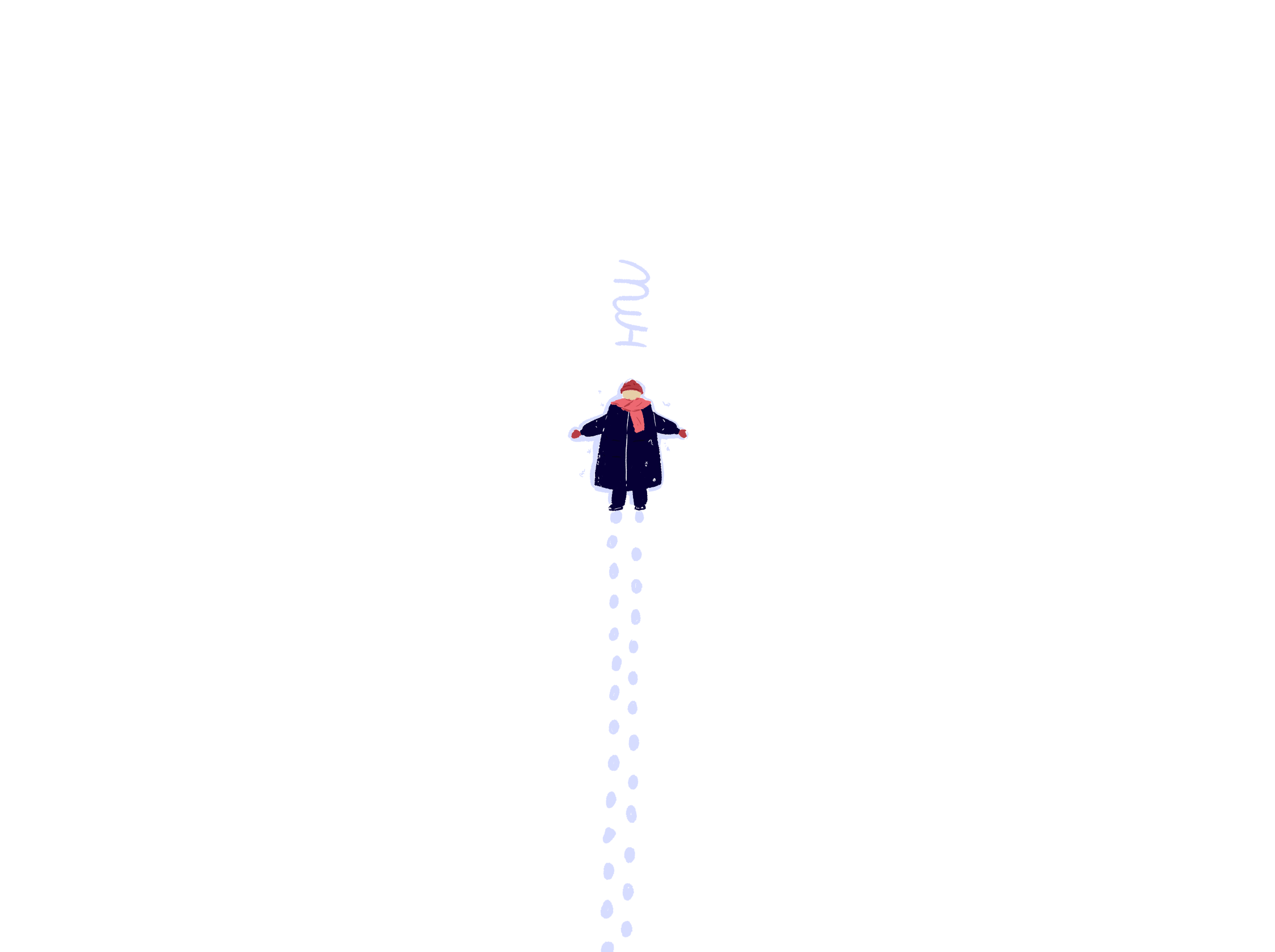
“Very beautiful and sensitive… I only adjusted the hands, which were a little too small, and added a body to give the figure a bit more presence. I also made a distinction between the different volumes...”
Utile + 1

Peindre
Sur « Sumone » de @christiano95675
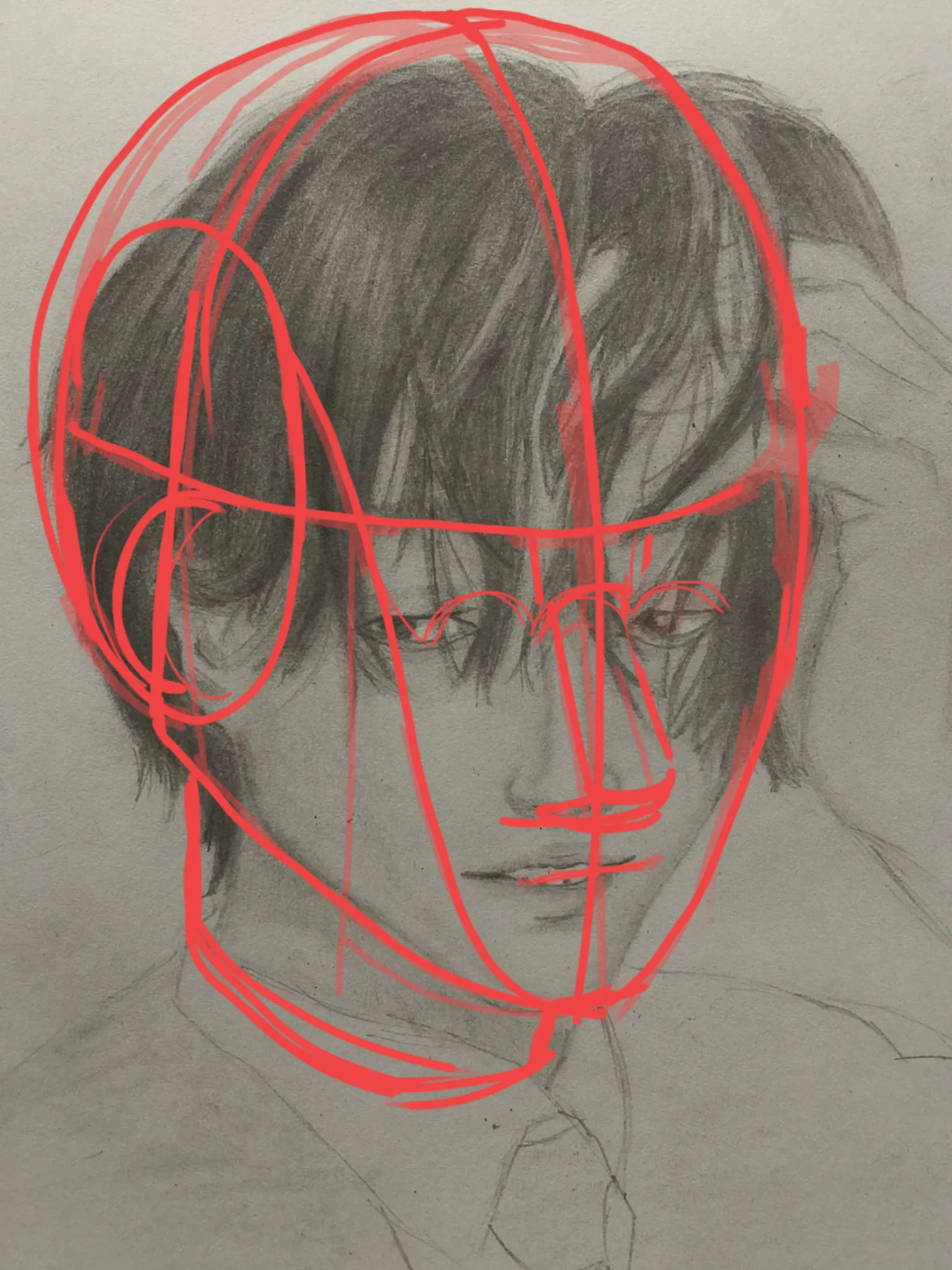
“You were almost there! Make sure to carefully follow the line of orientation and the structure of the face. It becomes especially tricky when placing the nose. The main points that need to be aligned ...”
Utile + 1
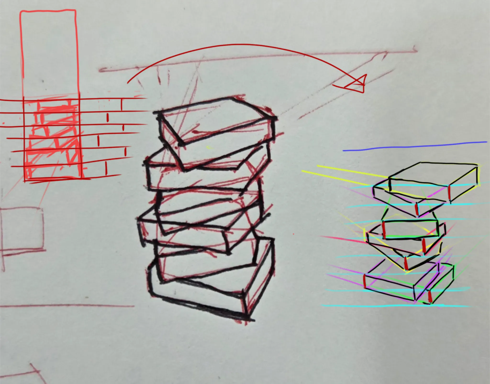

Peindre
Sur « Stacking exercise » de @yanky65431
“Hi!! What a challenge! Thanks to you, I learned something new as well. I hope the explanatory drawings are clear because it would take a long text to explain it all. I think my solution seems coherent...”
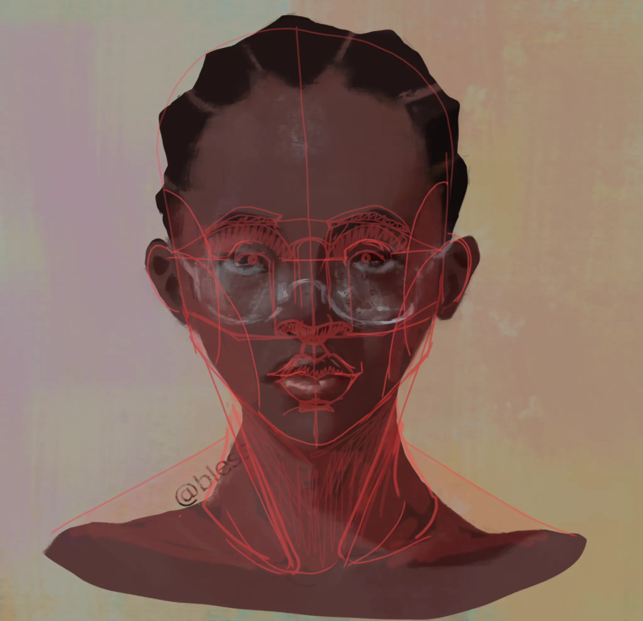

Peindre
Sur « portrait » de @njabulo99326
“I sketched over it using the Loomis method, so it changes the style a little. If you'd like to keep your more stylized look, you can simply adjust the position of the nose and mouth. I hope you find ...”
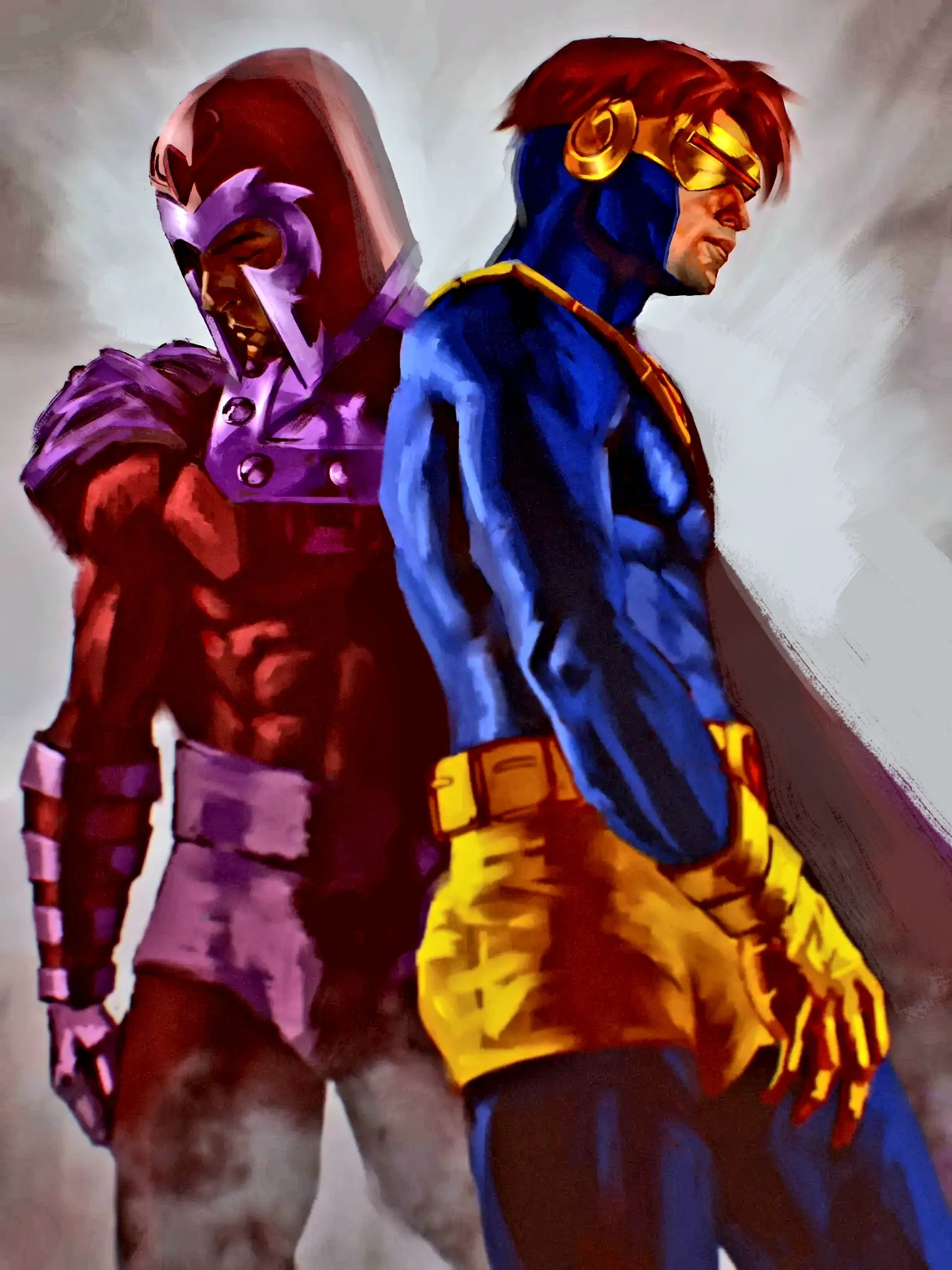

Peindre
Sur « X-men Fan art » de @ken27048
“In this version, I adjusted the cape to leave more space for the figure in the foreground. I integrated the second figure into the background by allowing some of the background to show through the sil...”
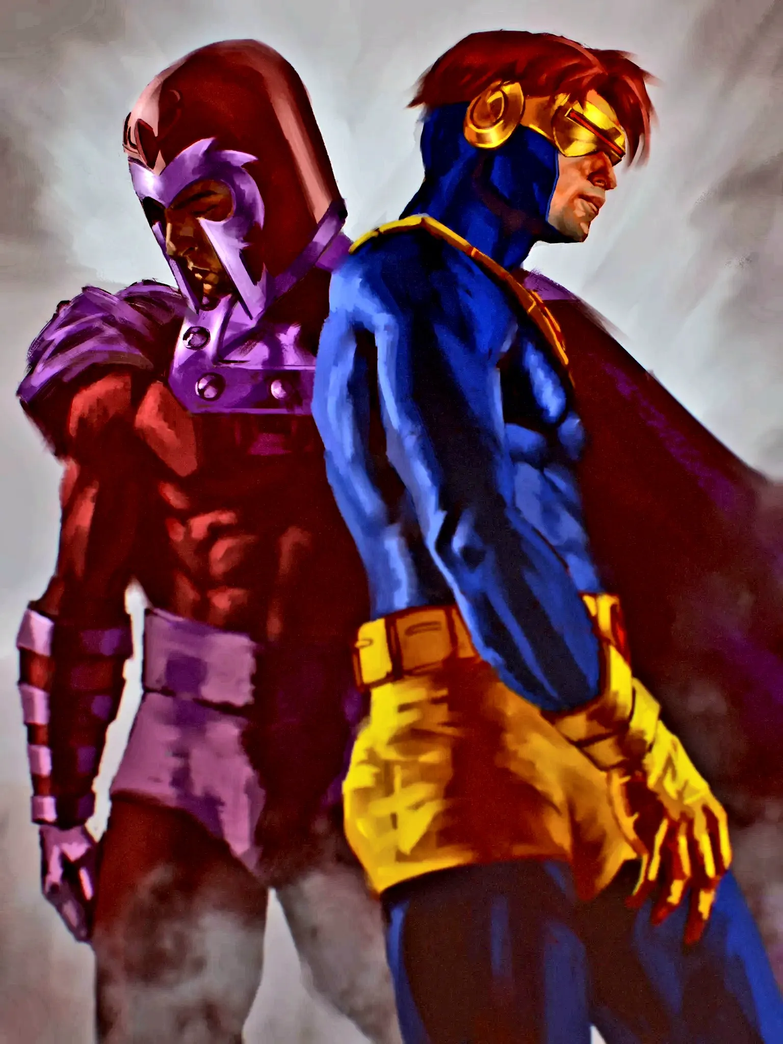
Peindre
Sur « X-men Fan art » de @ken27048
“Wow, excellent! I ran it through some image editing, and there seems to be a gray haze over the entire drawing. Check the colors, contrast, and lighting. If you want to add a bit of purplish mist, yo...”
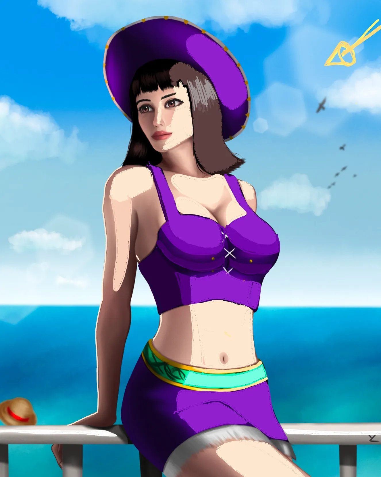

Peindre
Sur « Miss All Sunday / Nico Robin » de @yuelin15187
“Hey, the little arrow helps to better identify the focal point. I didn't spend much time on it, so I didn't redo everything... I mainly worked on the torsos. I recommend watching the video about ligh...”
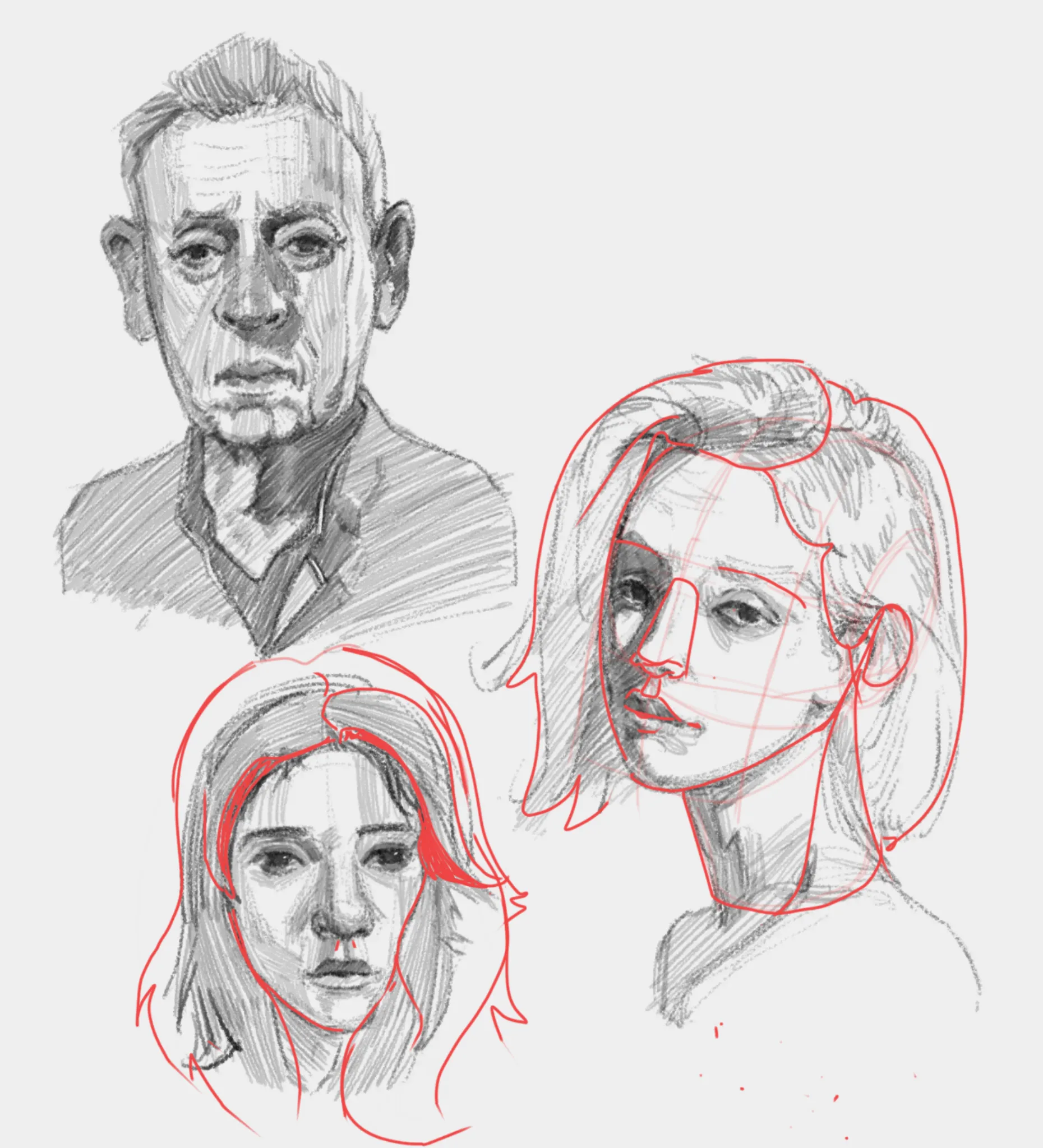
Peindre
Sur « Portrait sketches » de @teo06155472
“I used the Loomis method for the three-quarter portrait and increased the size of the skull and the volume of the hair. I hope this helps!”
Utile + 2
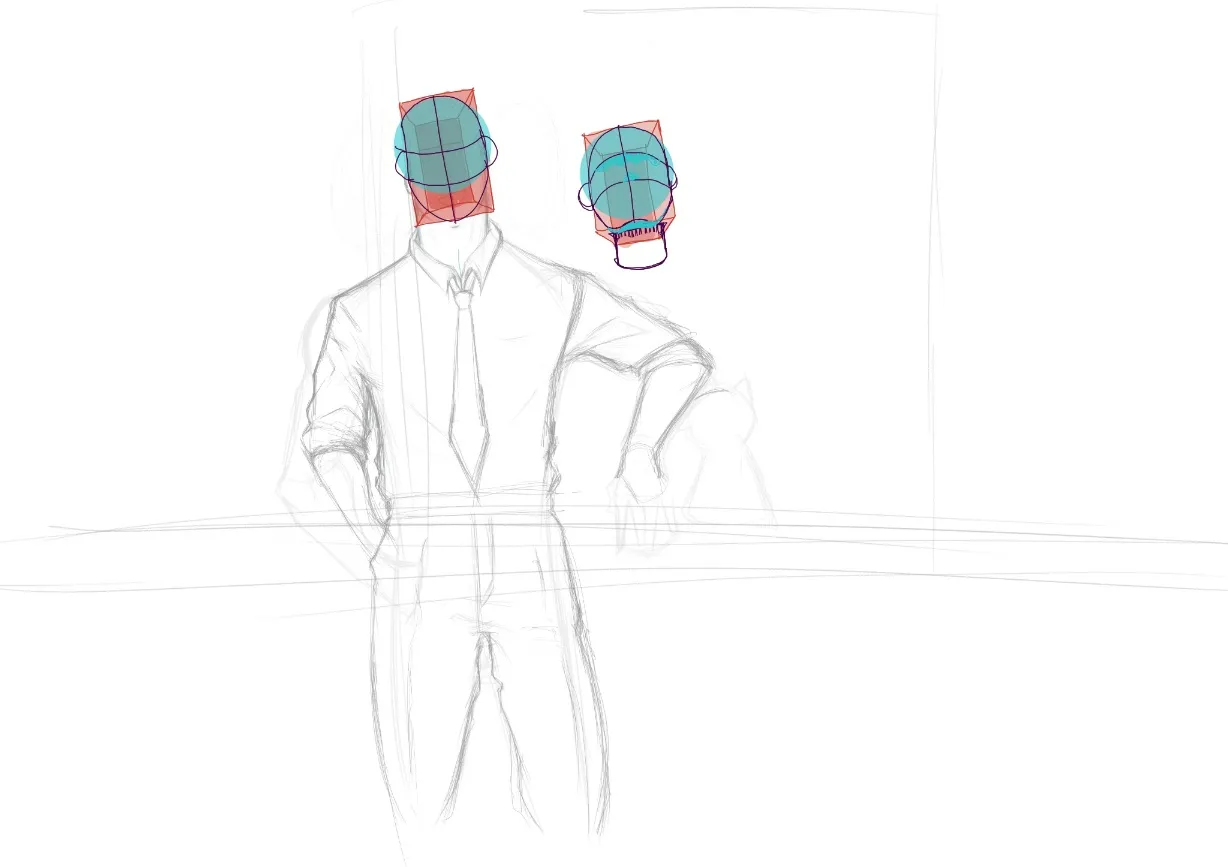
Peindre
Sur « Reigen and mob as a cat » de
“I love your style! You already have a strong artistic voice. In my opinion, you just need a bit more understanding of perspective and form. Perspective exists in every object we draw because everythin...”
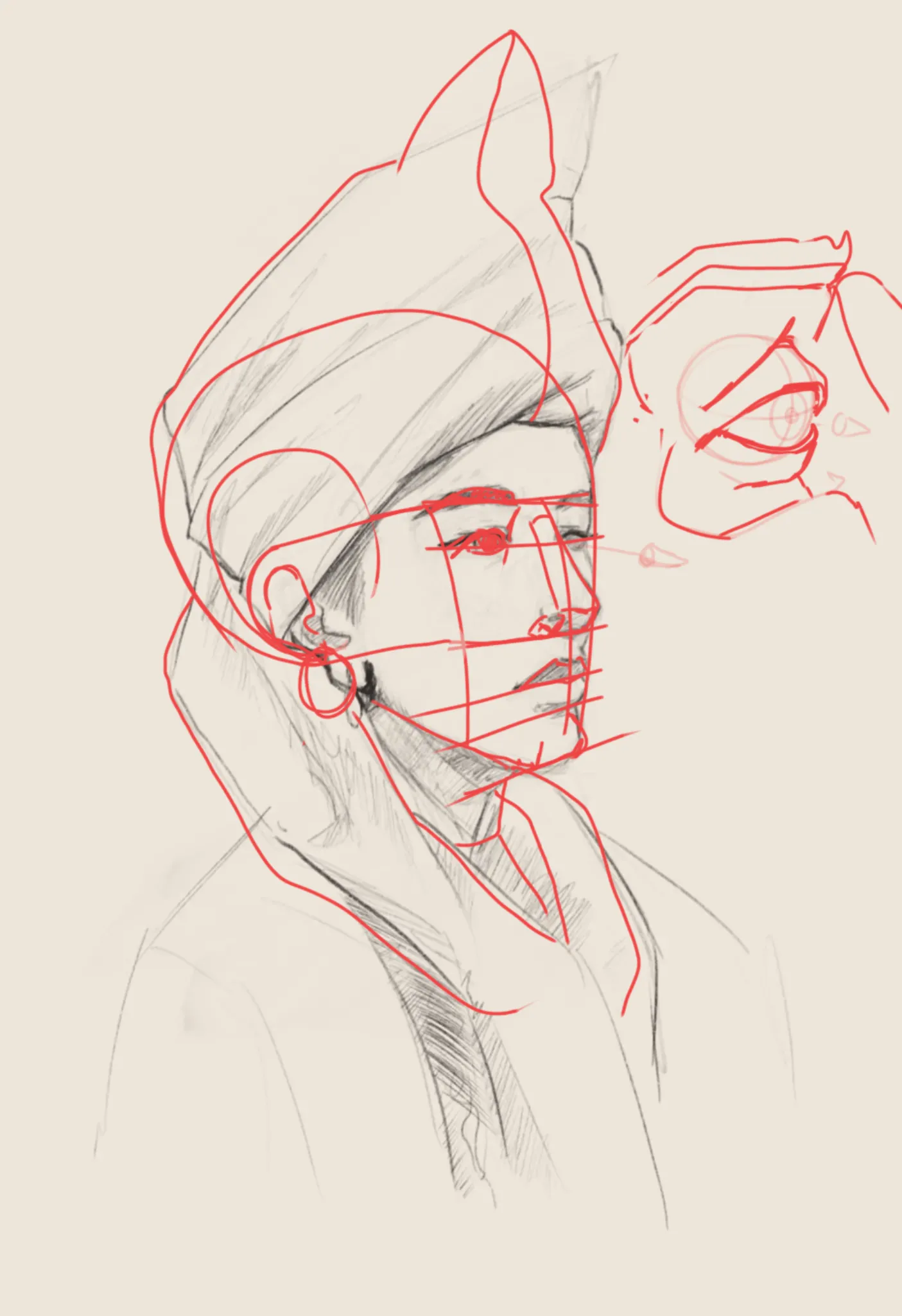

Peindre
Sur « Face proportions » de @jimi13473
“I really like your character. The tip of the nose was shifted to the left, which distorted the whole face because it looked like there were two different facial axes. I moved the tip of the nose and t...”

Peindre
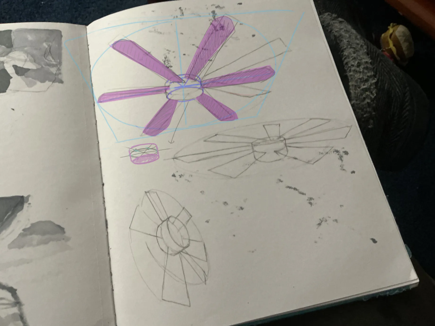
Sur « not really a FAN of this one » de @jord
“I started by drawing a square in perspective (using one vanishing point, although you can use two if you prefer). Then I drew an ellipse inside the square. I reconstructed the cylinder, improving the ...”
Utile + 1

Peindre
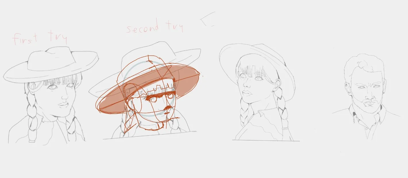
Sur « How to improve my proportions and form from imagination? » de @david39882967
“Hi, my approach is based on building the head from simple shapes—spheres, ellipses, and the combination of these forms. I couldn't quite determine the exact perspective you were aiming for, so I used ...”
Utile + 1

Peindre
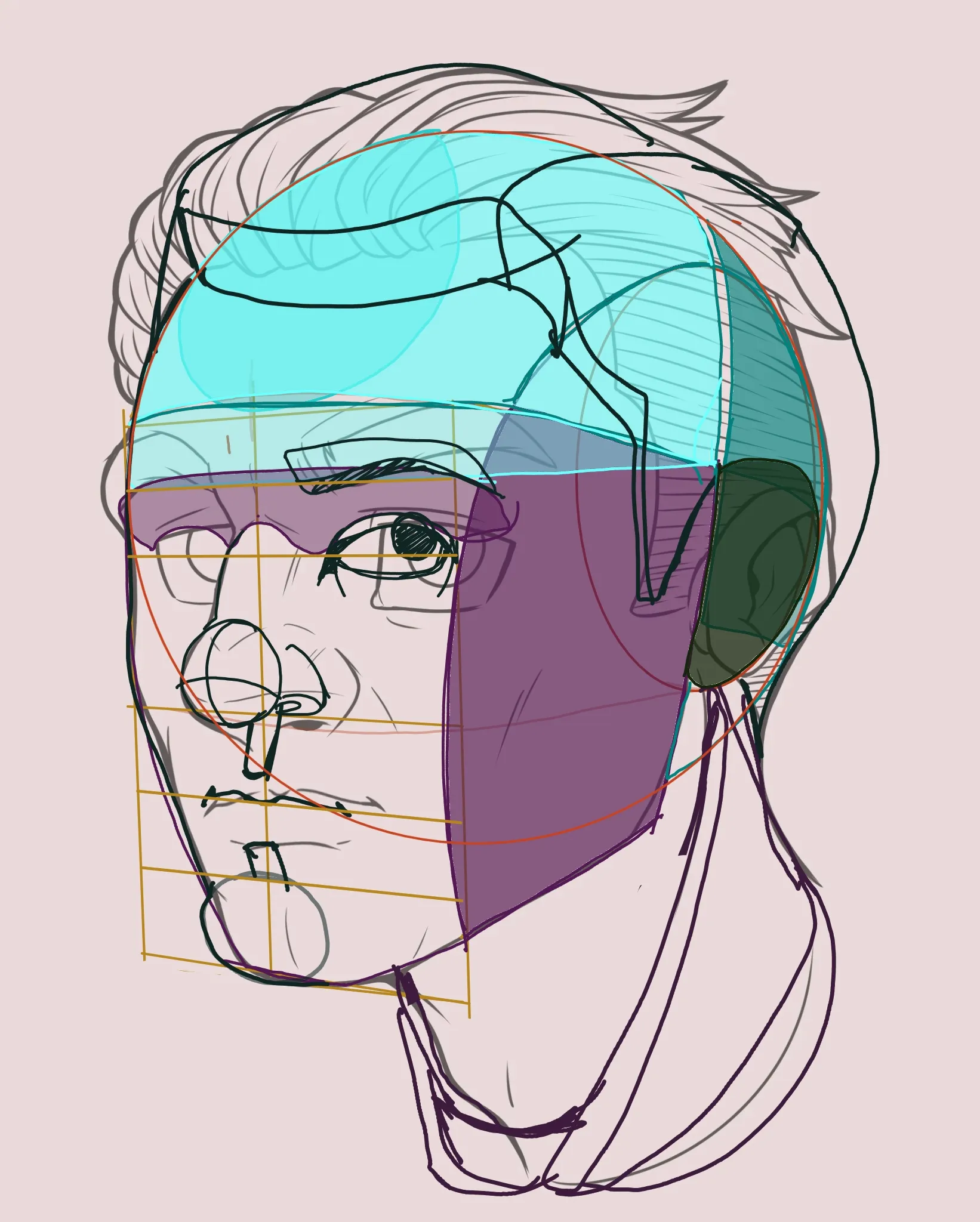
Sur « Portrait feedback » de @jessie75971846
“Hi!.There was something strange... There were two perspective options, as if you could choose between two eyebrow lines. I chose the one that best matched your drawing, but I saw that someone else cho...”
Utile + 1
Peindre
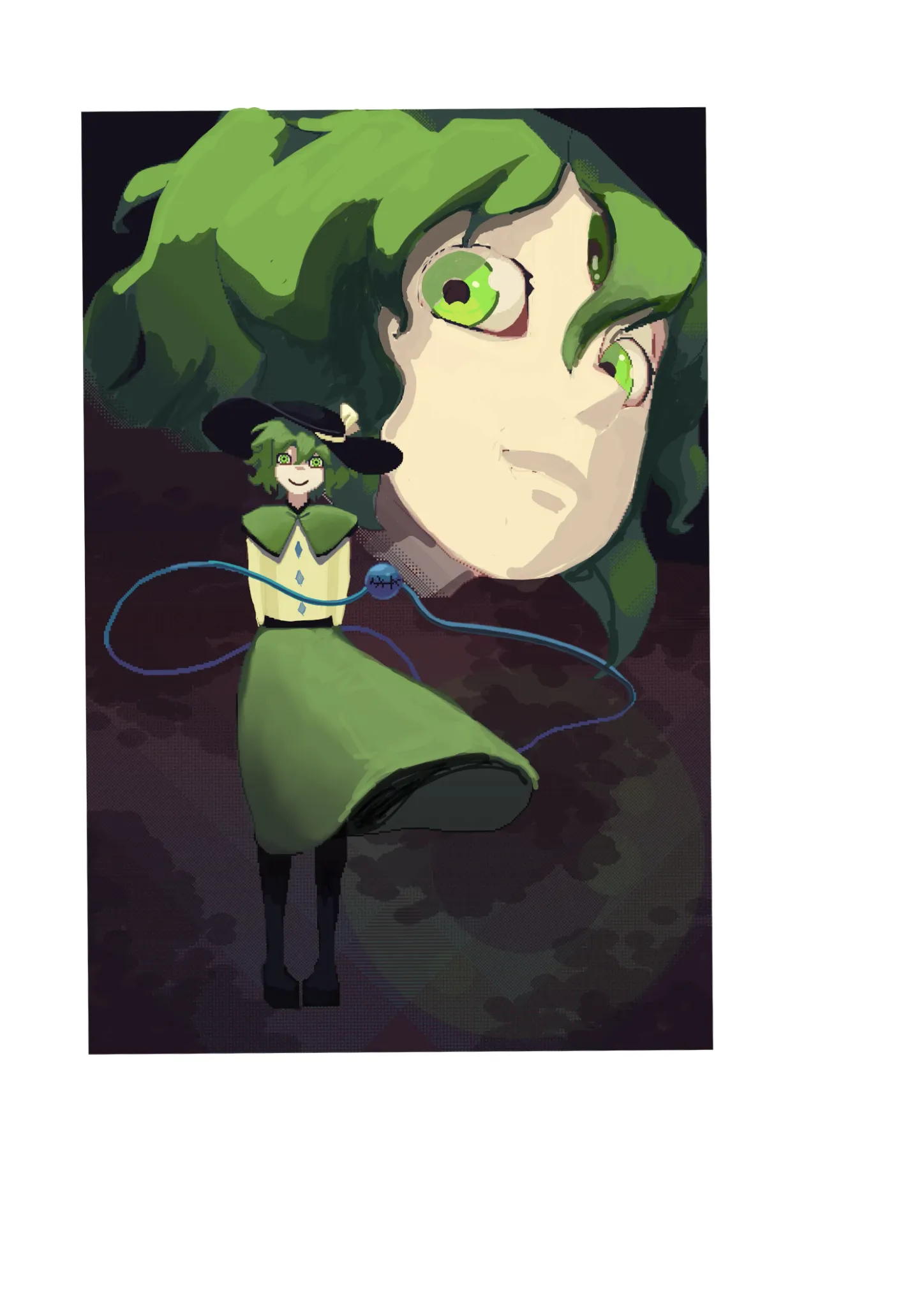
Sur « Color issues » de
“Hi, I really like the colors and the composition. I was wondering which rendering software you use. I'm not sure whether the visible pixels were an intentional stylistic choice or simply a limitation...”
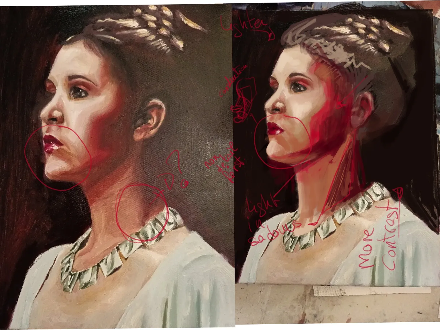
Peindre
Sur « Leia organa » de
“Hi. I admire the way you know how to use oils. Your work has great quality in the construction of the form and in the use of color values. The expression in the gaze is very well done, as well as the ...”
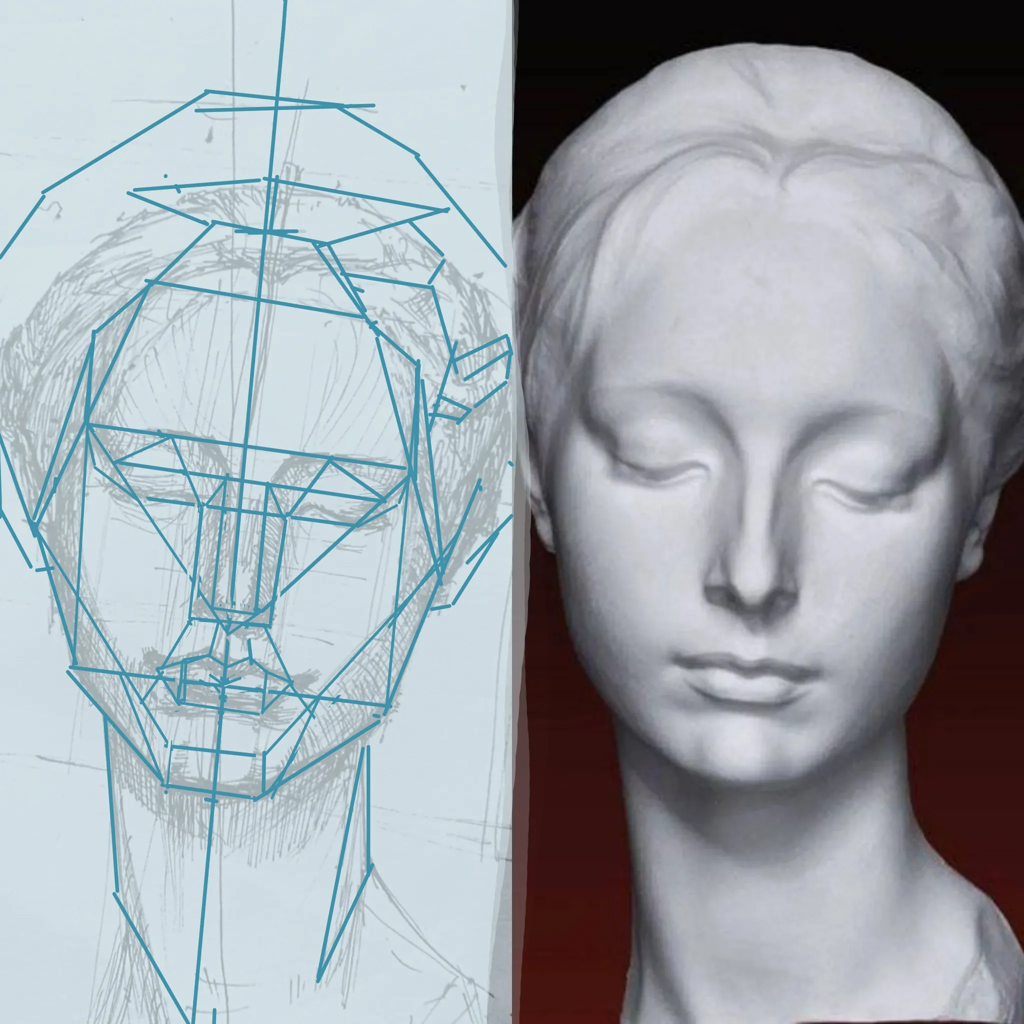
Peindre
Sur « Observation study » de @learnboys20834283
“Hi! The lower part was perfect, but at eye level the proportions weren’t quite right. It’s a very common mistake to flatten the skull. I recommend first properly blocking in the structure and carefull...”
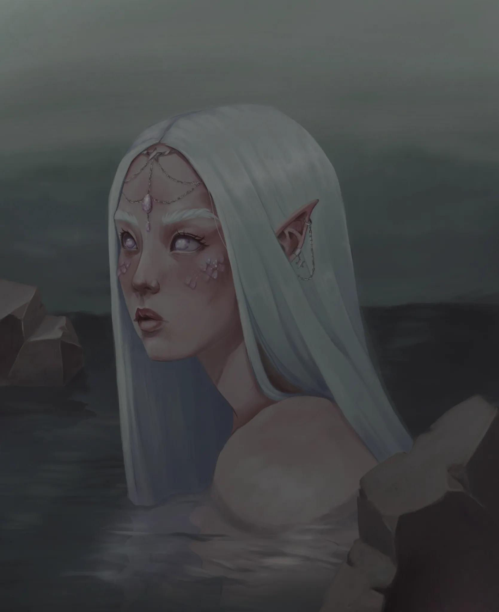

Peindre
Sur « Siren » de @magdalena96734571
“I’ve realized that I didn’t really respect the almost-nightfall atmosphere. I think that, to achieve a more subdued mood, I would have worked with darker transparent layers... but I’m not a profession...”
Utile + 1
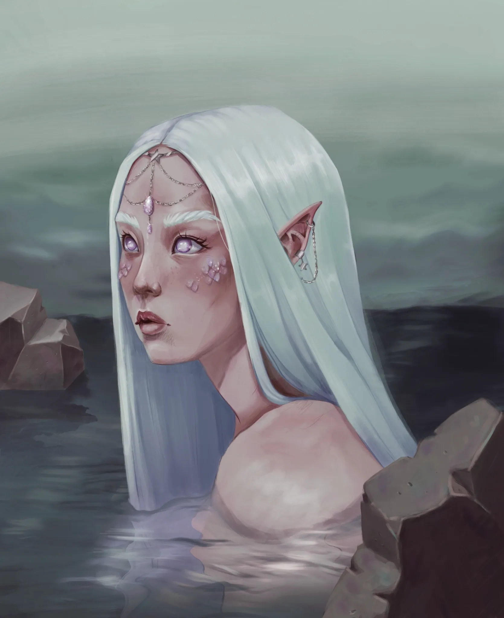
Peindre
Sur « Siren » de @magdalena96734571
“Hello! I really like your illustration. This mermaid has a lot of personality. I think it’s mainly a matter of contrast. For example, on the rocks you only added a line along the edges for the light… ...”
Peindre
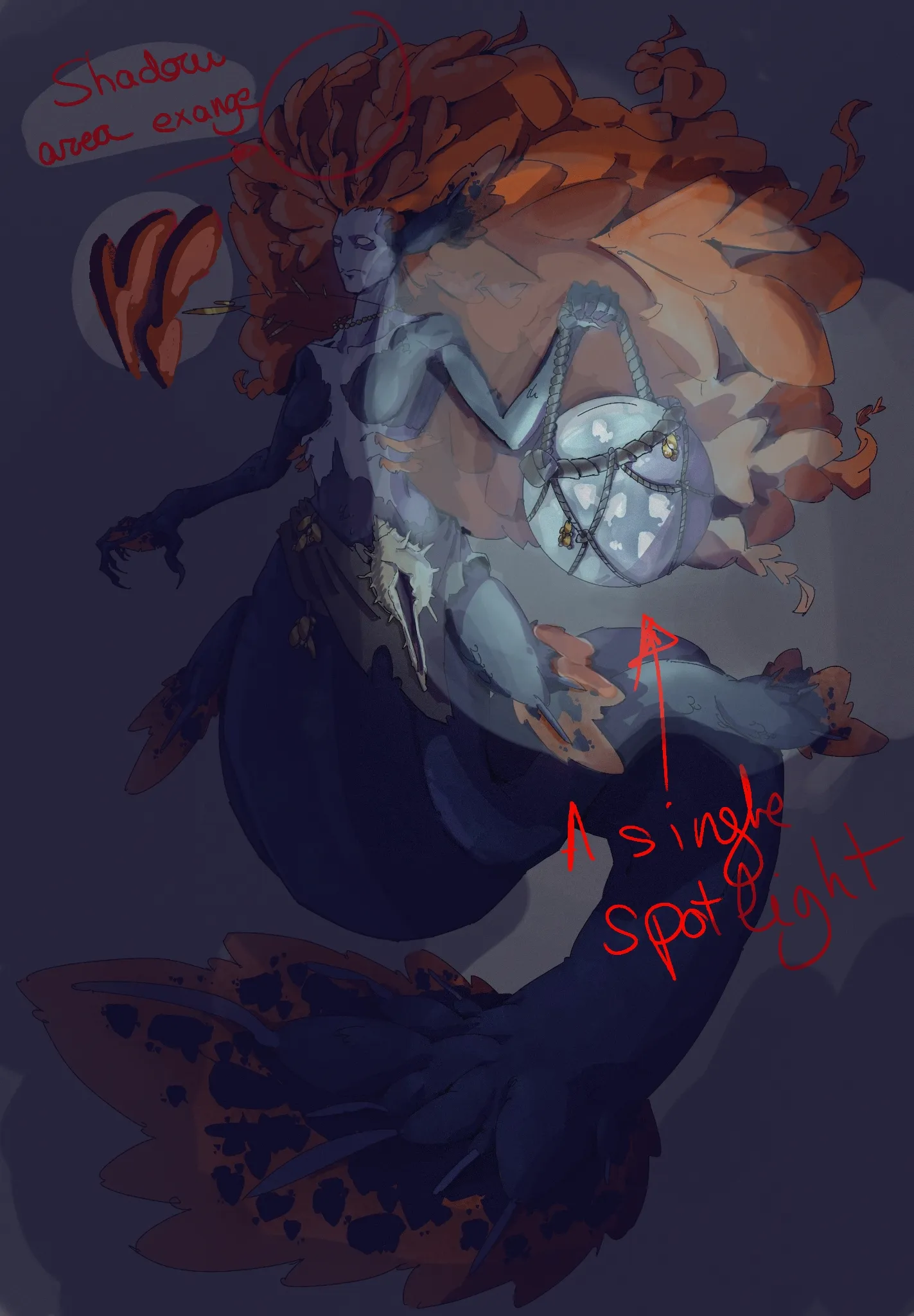
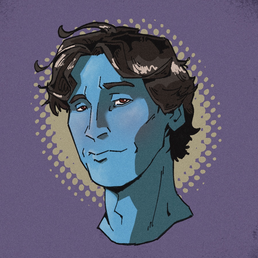
Sur « Lantern mermaid » de @oscartejedor
“Hi!! I love the design of your mermaid!! She’s my favorite! I hope I haven’t ruined it too much with my intervention. I just wanted to offer my visual point of view. I think it would work better if th...”
Utile + 2
Peindre
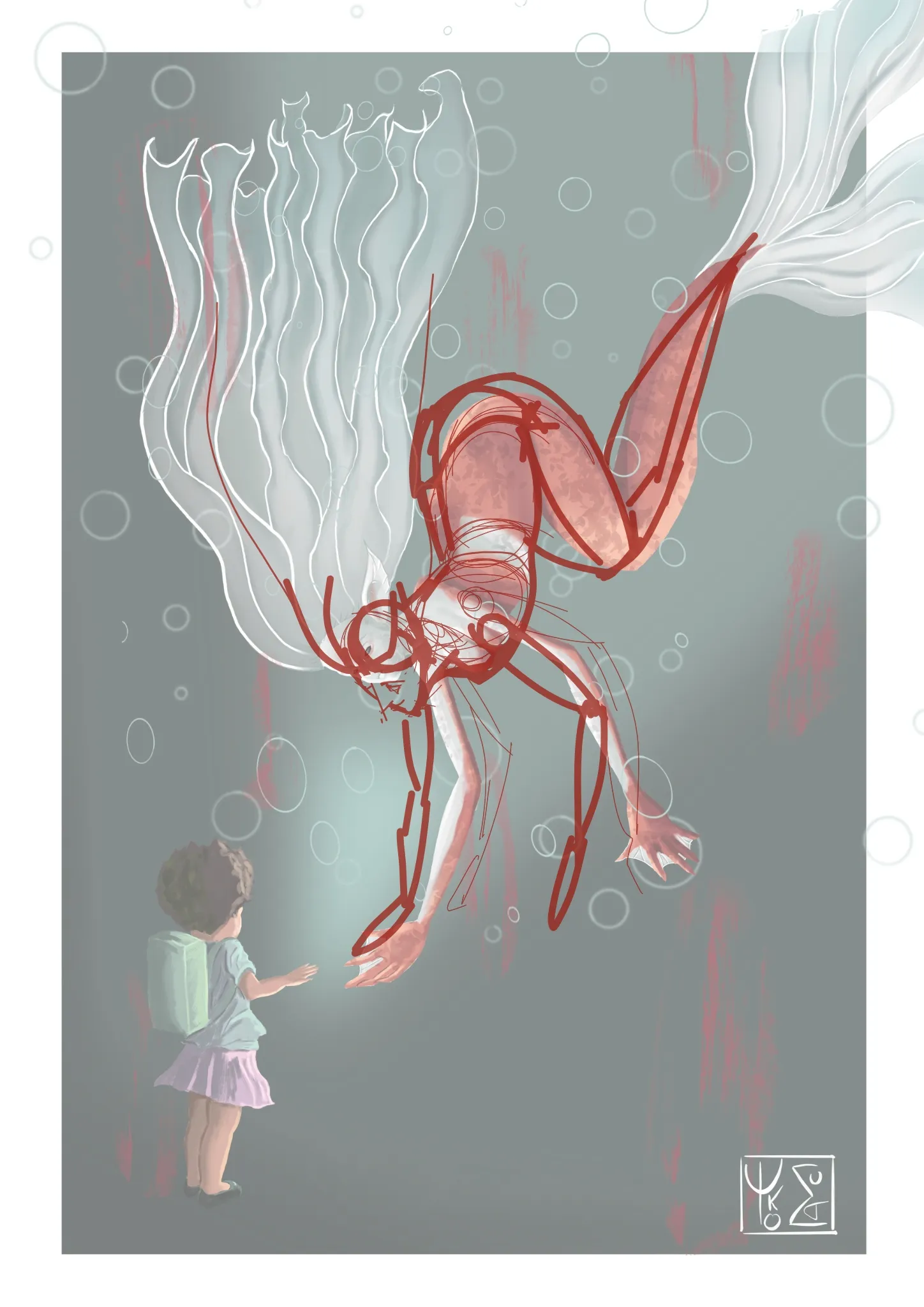
Sur « Mermay challenge ! » de @teddy66688723
“I did my best, but it’s true that it’s not an easy position.I connected the lower and upper parts through the spine.”
Peindre
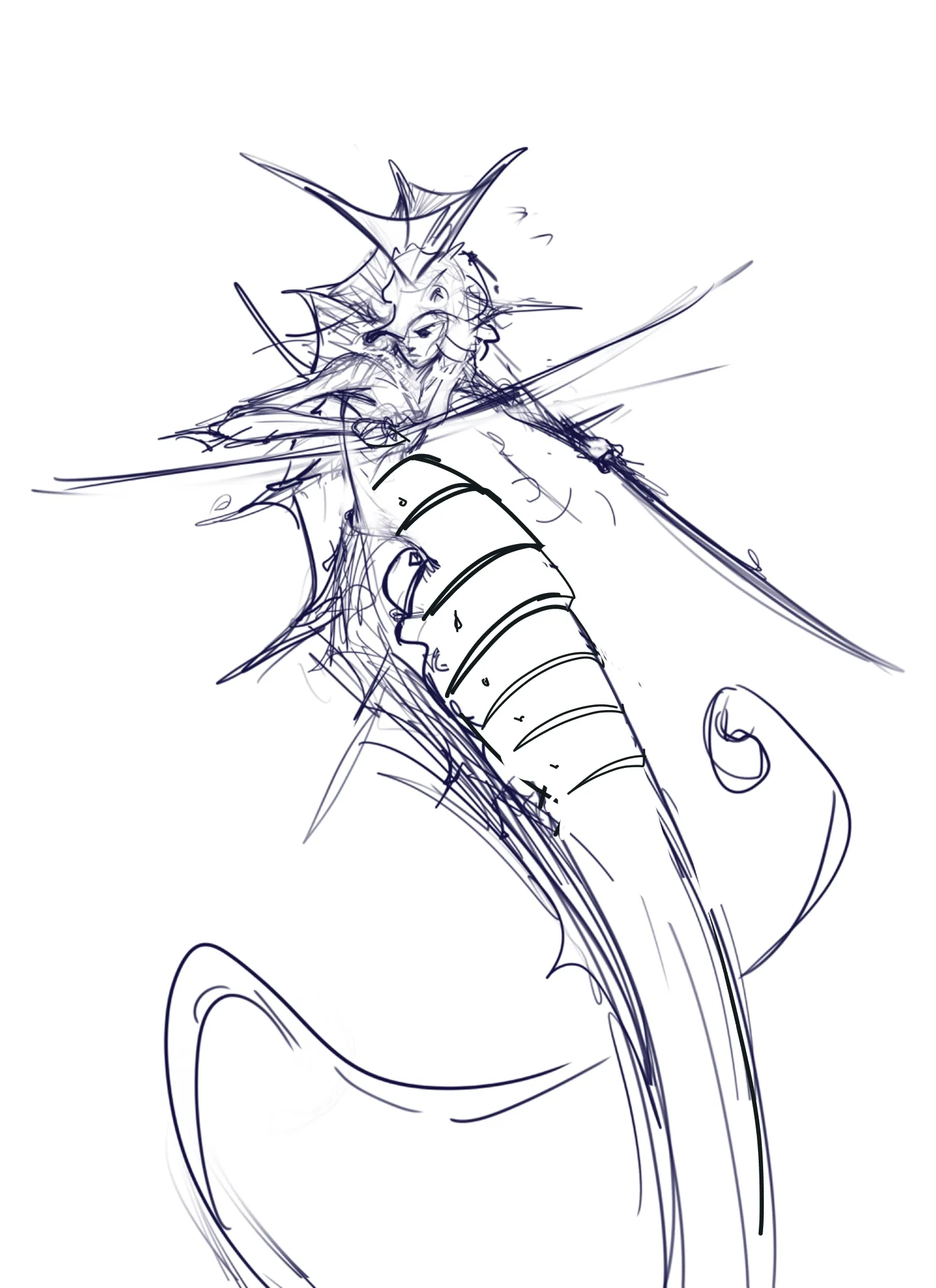
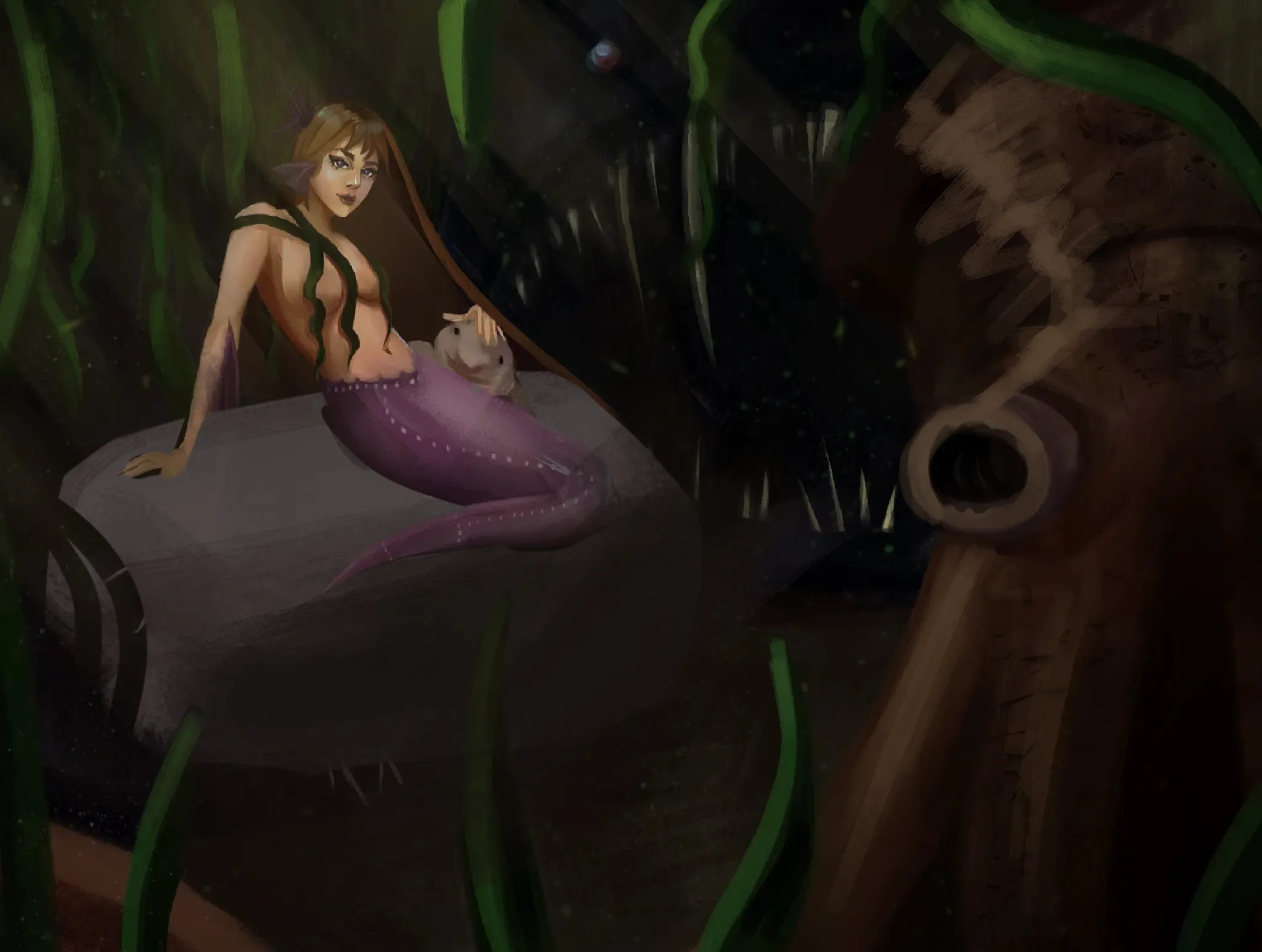
Sur « Sea Horse Mermaid » de @artwodguy
“Hello. I suggest integrating the body into the structure to make it more creature-like.”

Peindre
Sur « Mermay » de @kalamari
“I think it comes from the fact that the volumes aren’t clearly defined.”