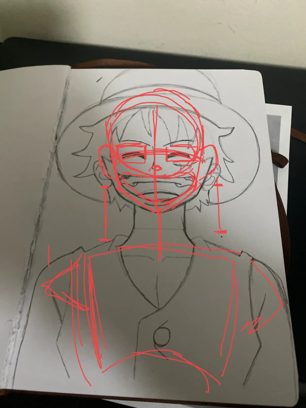
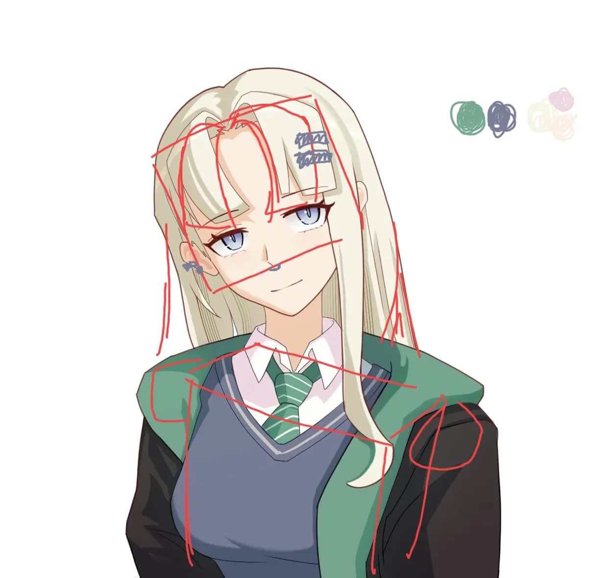
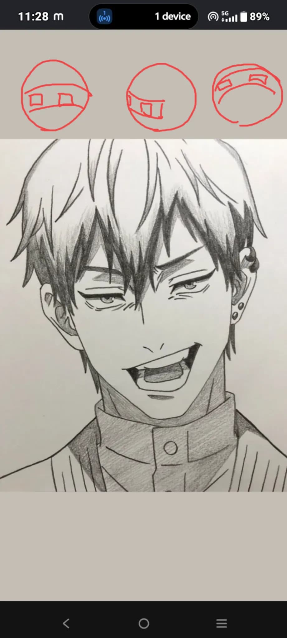
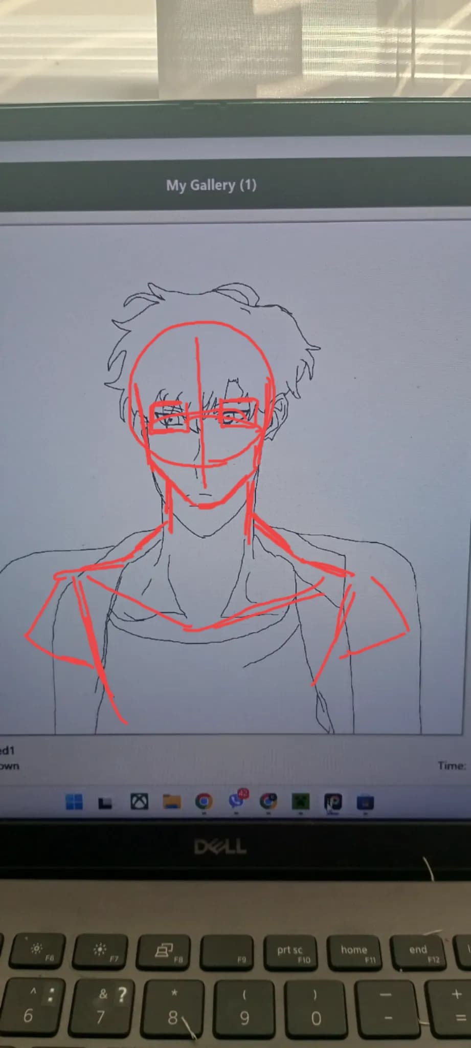
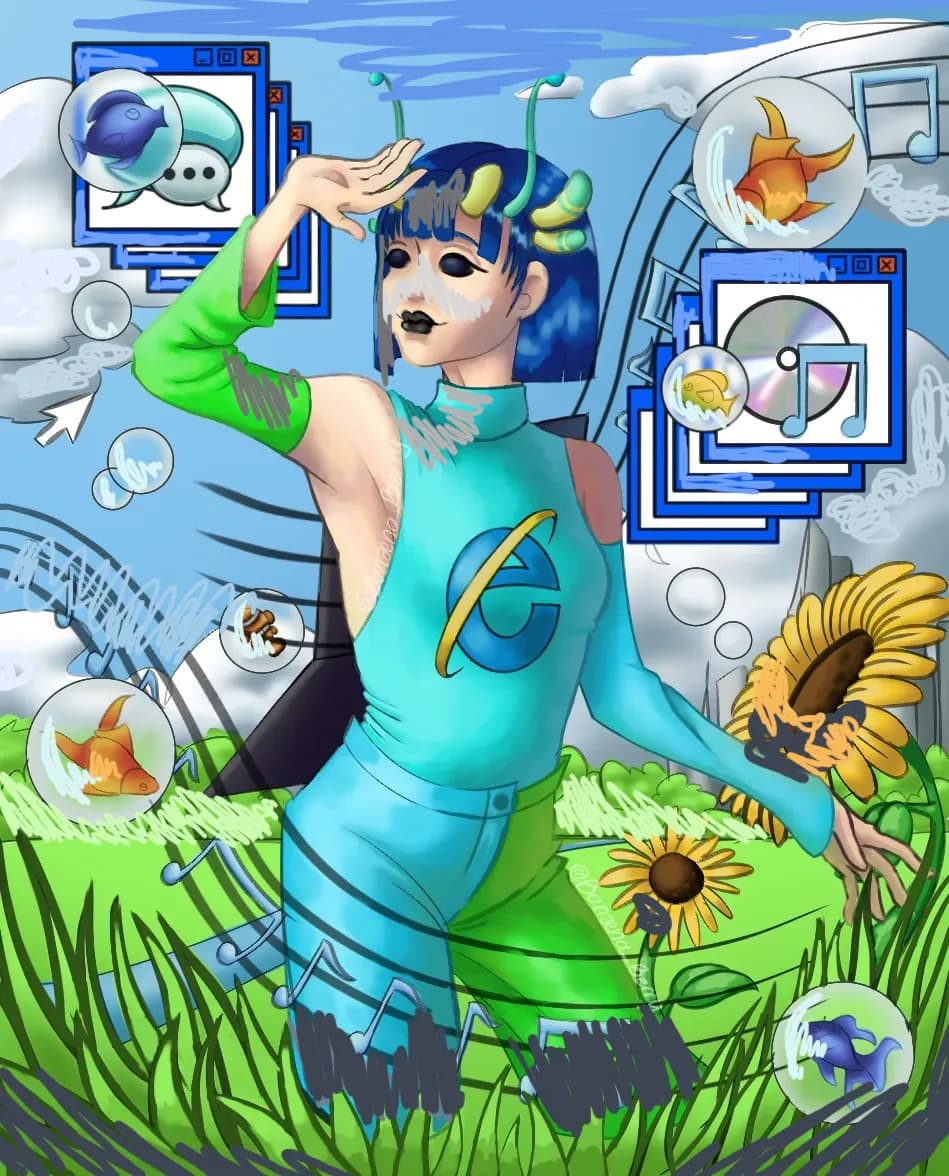
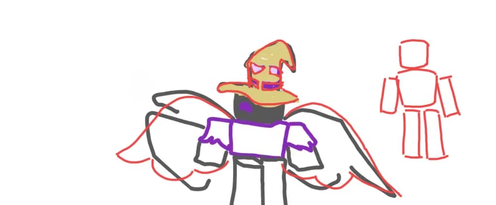
Lowkey wanna get better at art but like suck at actually doing, i just look at pinterest and think I obsorb all the knowledge. I also SUCK at spelling
#520
Rank
40
Upvotes
29
Feedback Given
98%
Helpful
“<3”
“studying some basic shapes and like base for humans could help. but super cool ^^ <3 got the shadows pretty good”
“So this is really good, I think adding shadows and highlights to define the shape would help. Im not to great at enviroments. but shadows and highlights are KEY to defining shapes, figure out the plan”
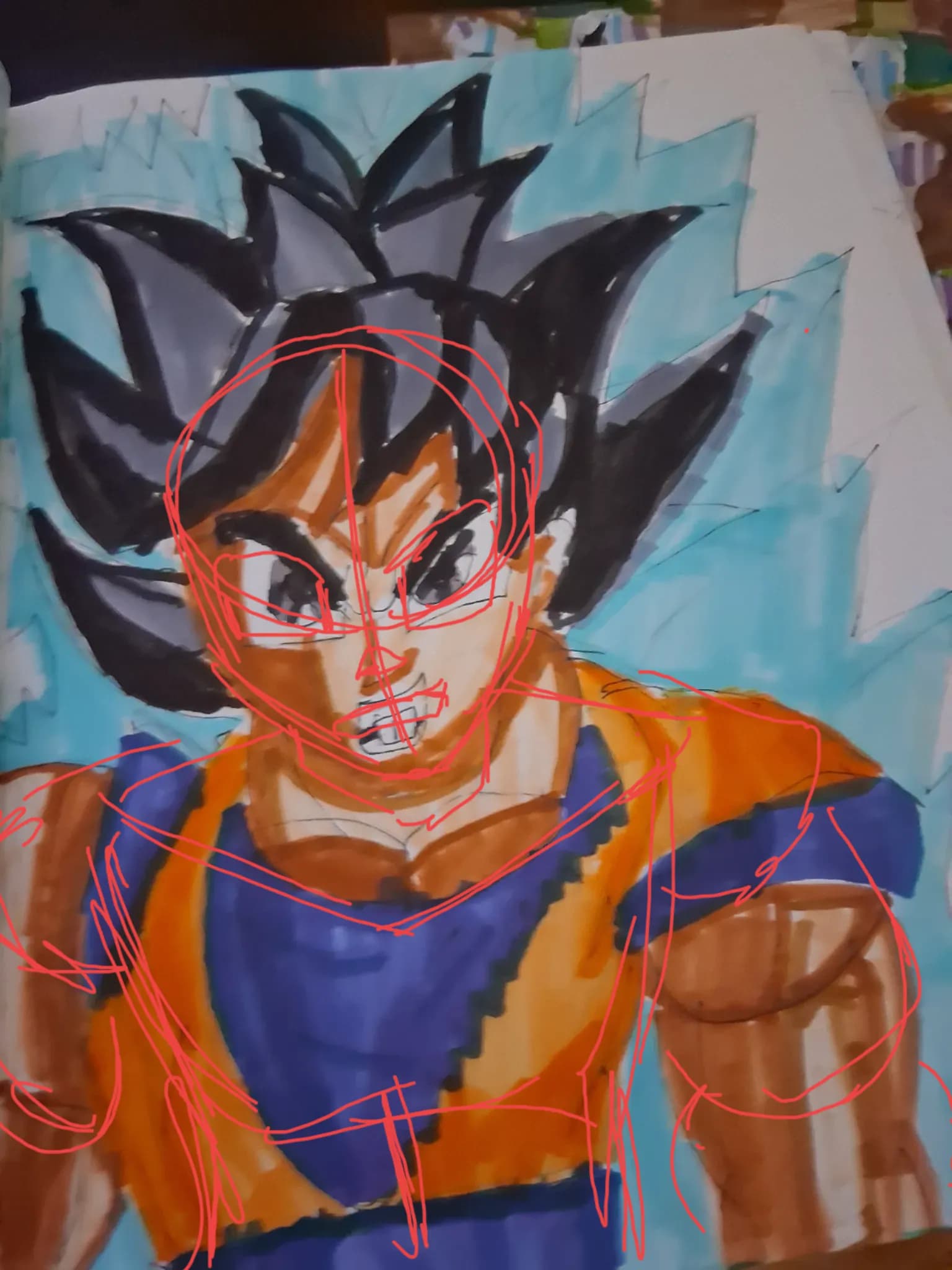
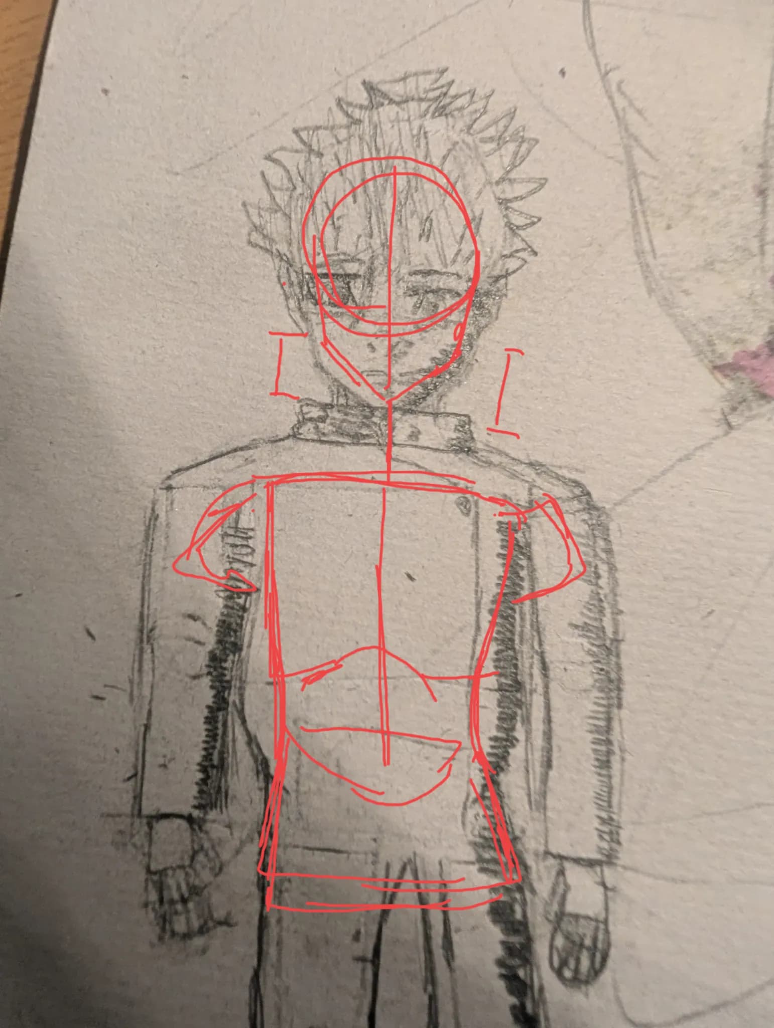
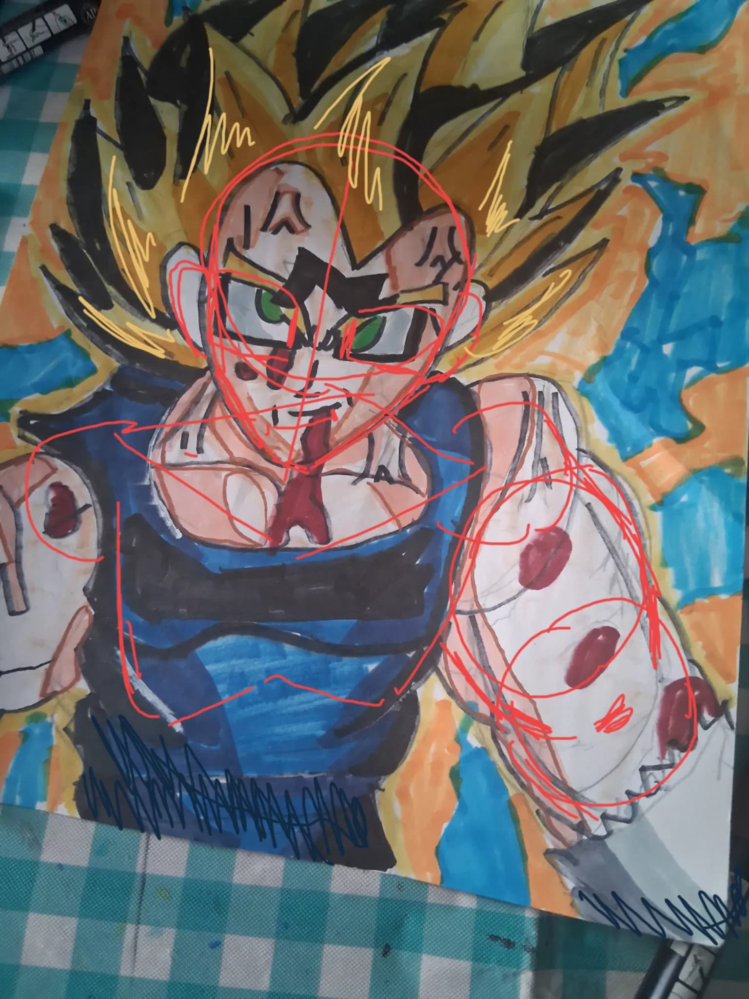
“I think why it doesnt look right is the anatomy/proportion is a little bit off. The torso is around 2 ish heads long. The neck is also a bit shorter and the shoulders a bit longer, adding a curve for ”
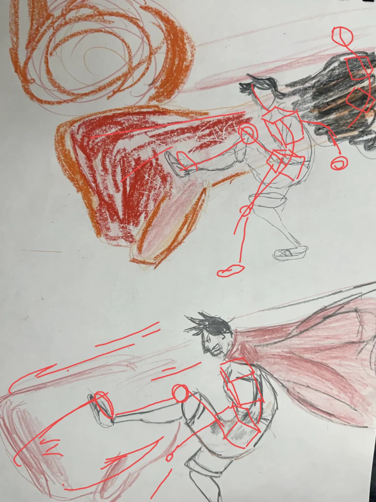
“This is super cool! im not very good at effects but can give kinda a base for anatomy etc. Boxes for the chest and waist are helpful to, breaking it down into simple shapes like cyliders and stuff. Fi”
“I personally like more highlights with stronger shadows. And if thats kinda a vibe you want to go for you can brighten and darken stuff. And for like breaking it down you have a really solid base to w”
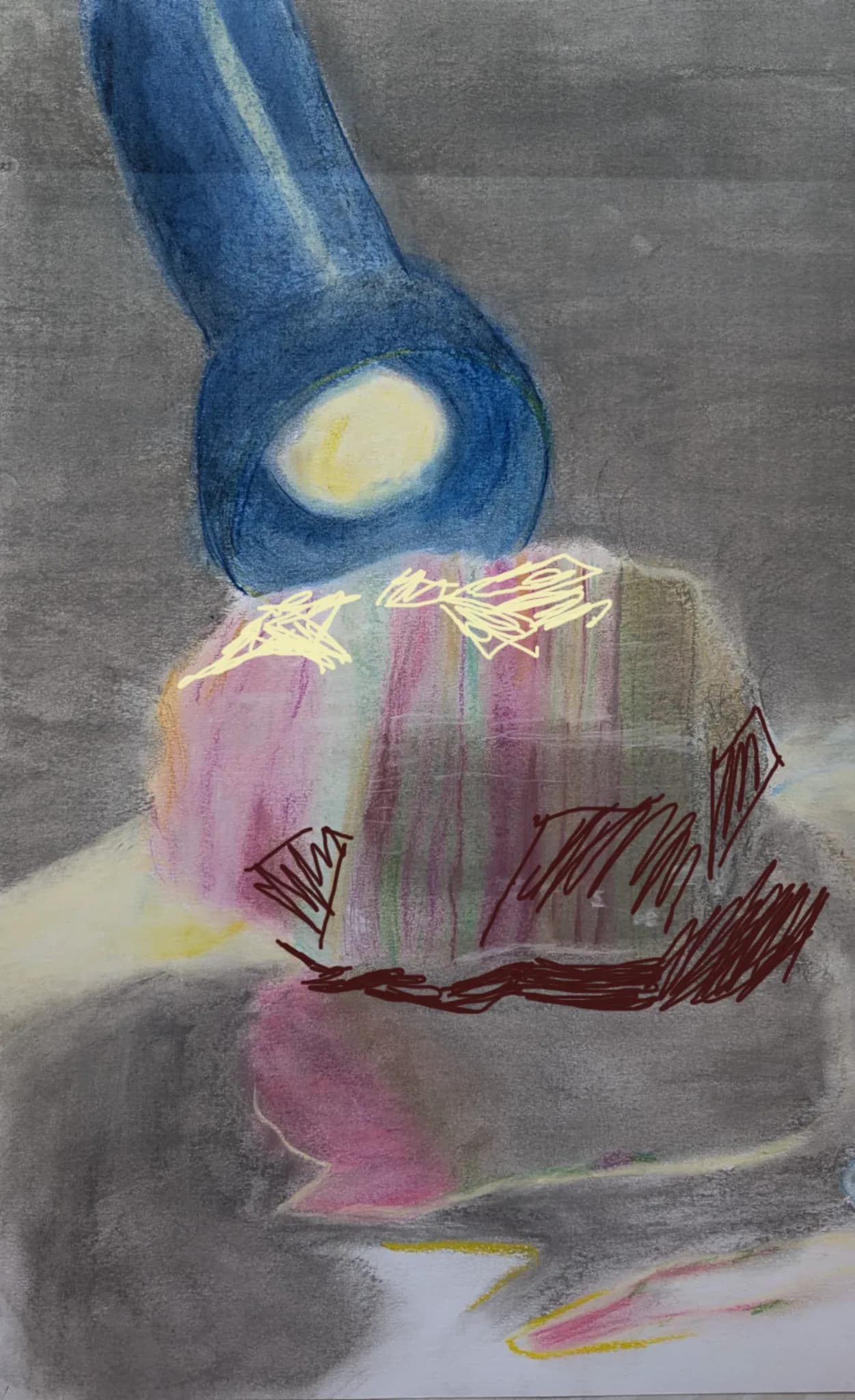
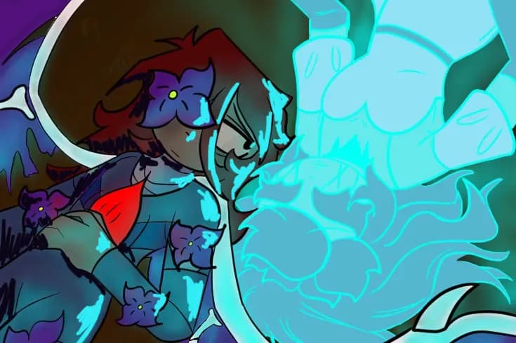
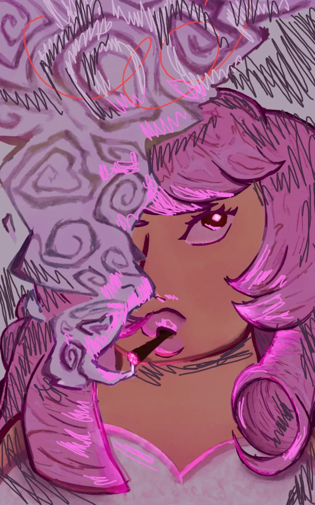
“This is super peak, I think the blue lighting could be pushed a bit, and adding darker shadows away from it. But like this is awesome”
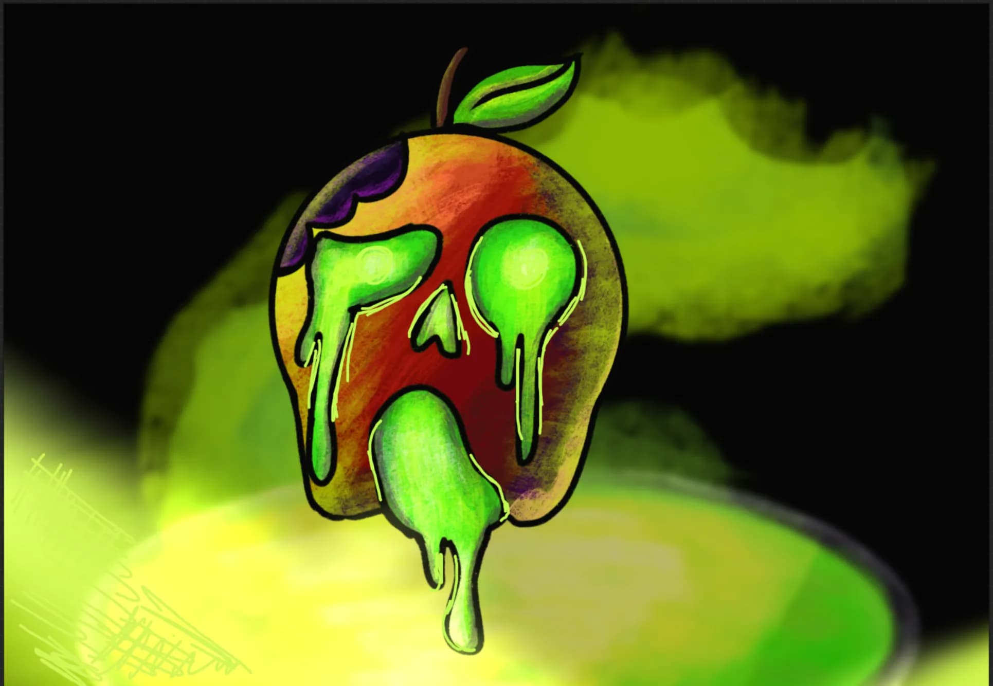
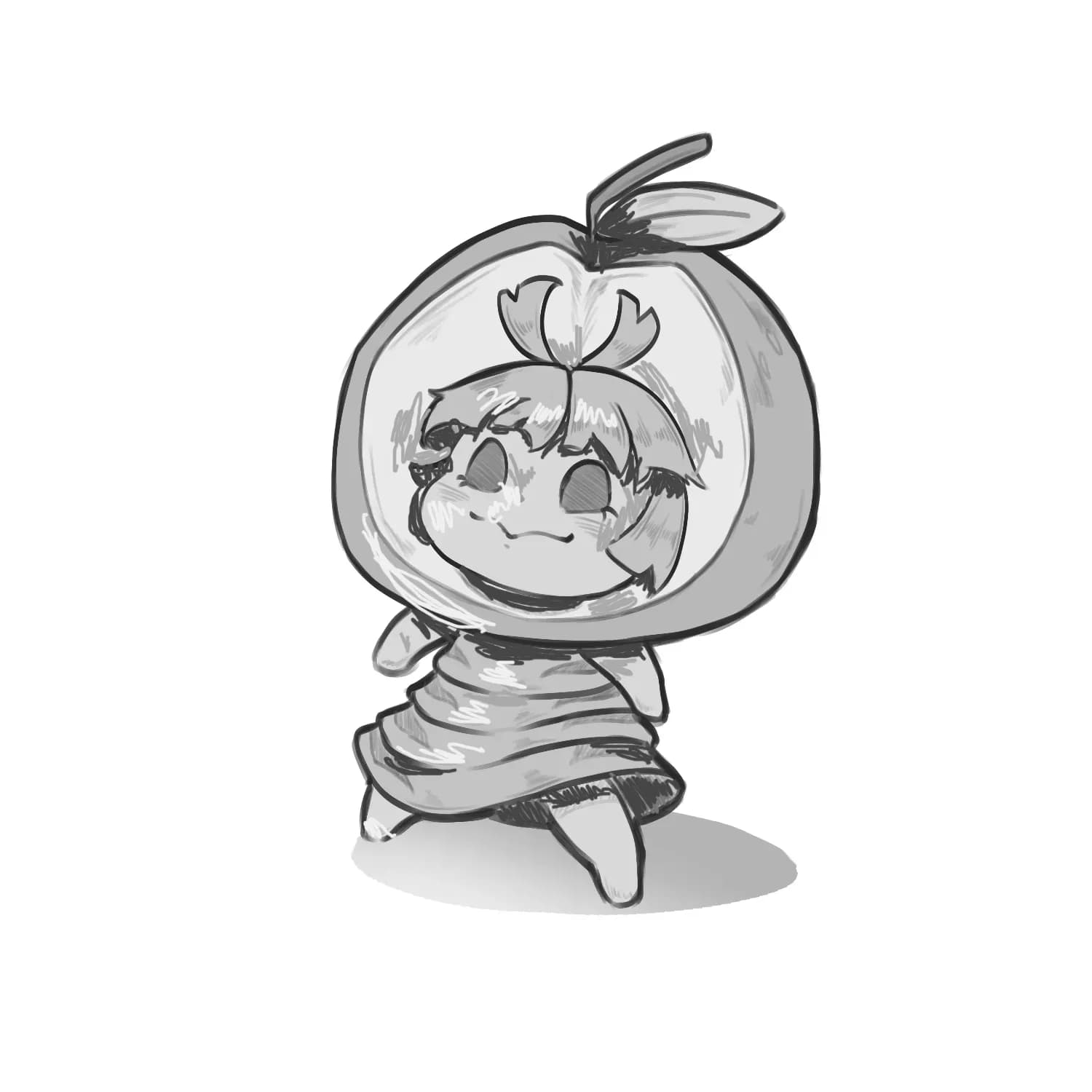
“Peak apple, I think if thinner lineart might be nicer with your colorijng style :3. It gives off more of a skethy kinda coloring, and I think having that along with the cloud closer might also look a ”
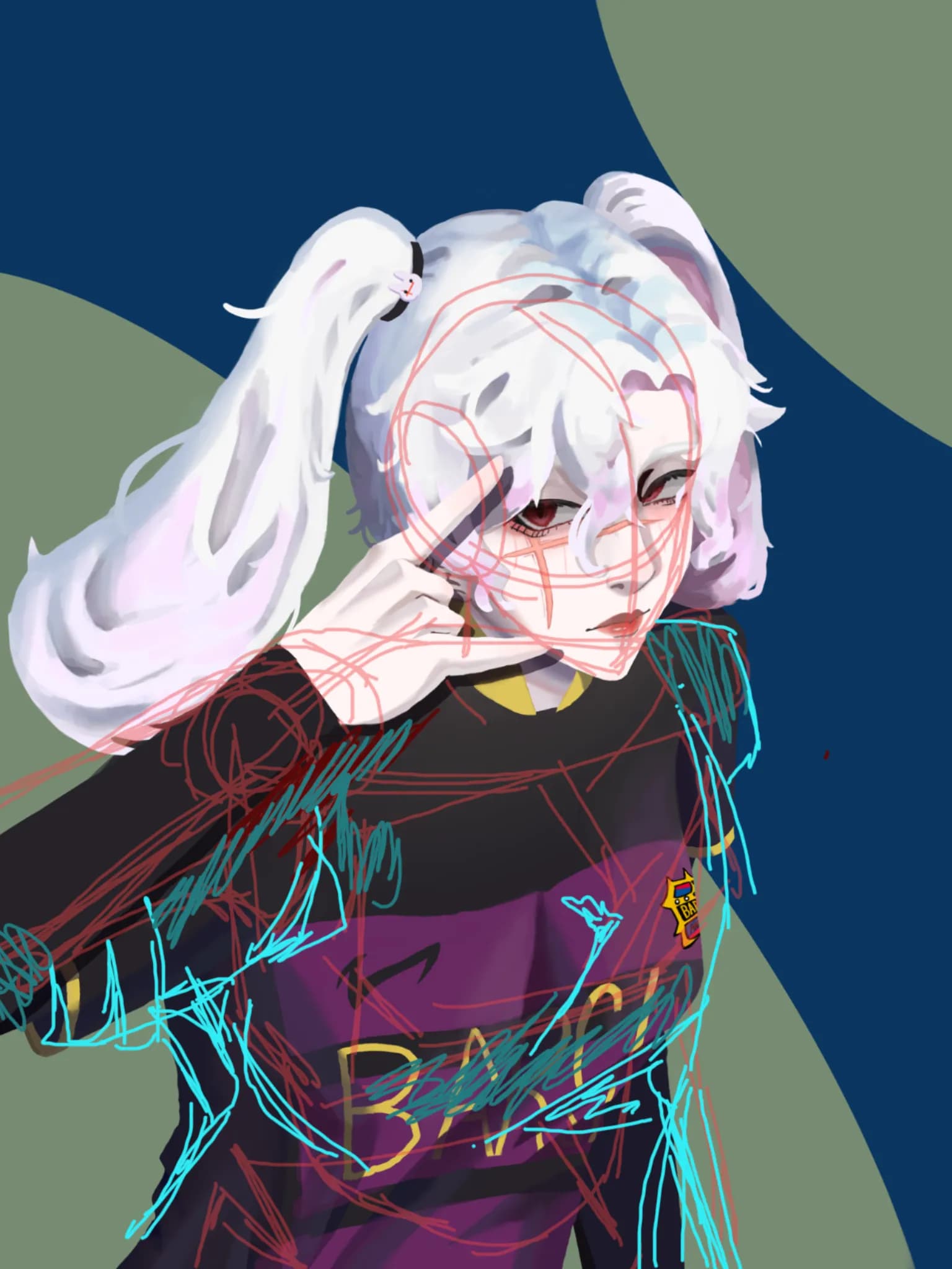
“Im not to professional with art but I have a bit of a basic with boxes and some knowledge on clothing/ The hair is really well one and you have good color for the folds. I think the should since itll ”
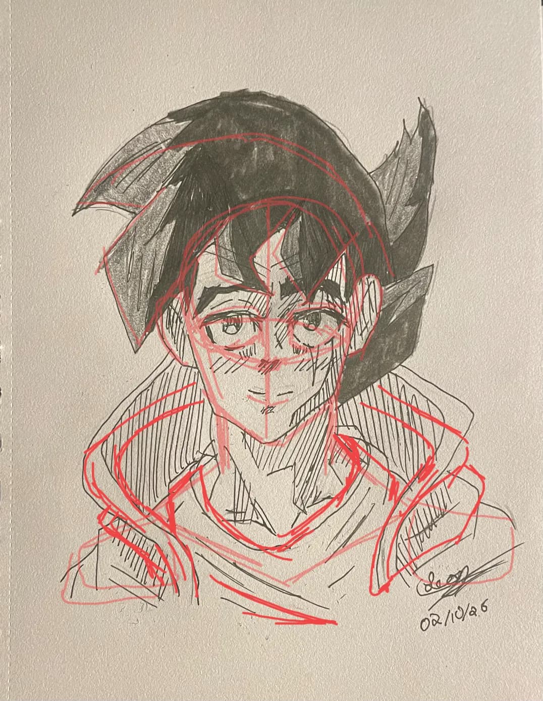
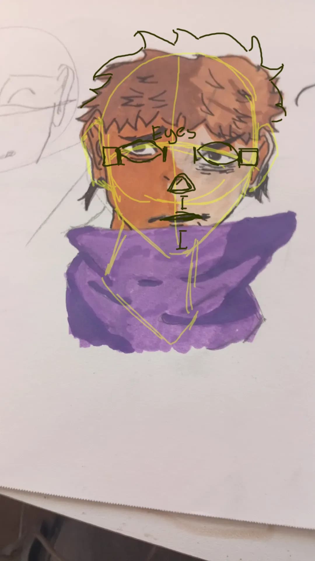
“Something I notice is the head, its a bit more wider, I find matching it with the torso length is around where the ears go. Heads are also more like ovals. The eyes could also be a bit bigger to go al”
“Design is tricky, along with perspective, but this looks really good. I think giving movemtn to the hair might help it tho. But with design when it comes to OCs finding things that you like, like chra”
“When it comes to moving facial stuff (im not great) but ive seen that like using planes is helpful.”
“I think the head is a bit too long and the eyes a bit to small compared the the rest of it, along with the shoulders being a bit wide. But this looks great <3”
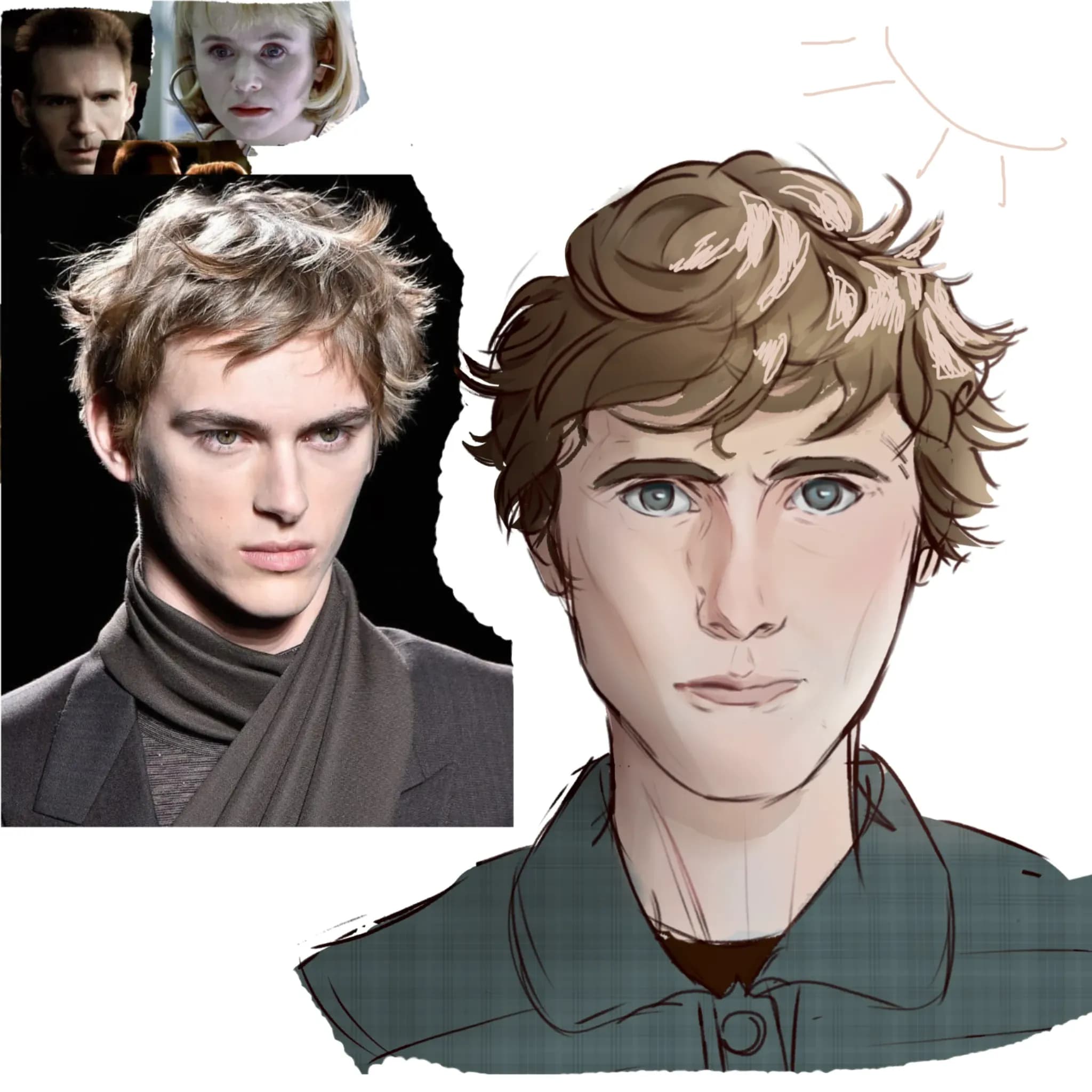
“This is super good, I love the colors ^^. I think the anatomy could use a bit of work. I would put the eyes further apart and the mouth more downward. I would also add brighter highlights to the hair ”
“This is already a very complex pose and youve done very good on it! I think adding depth to the pose might help it look a bit better (im not great at this but you could have the arm going closer to th”
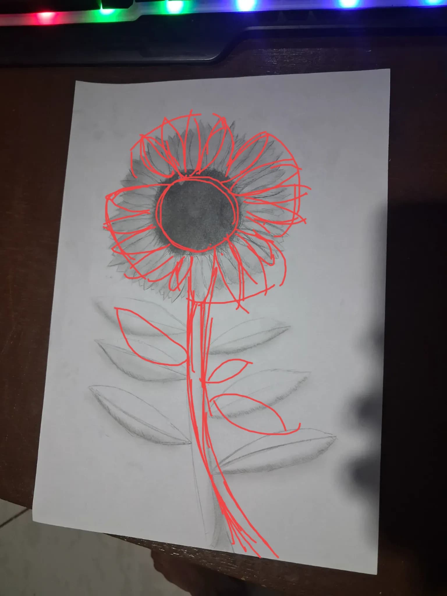
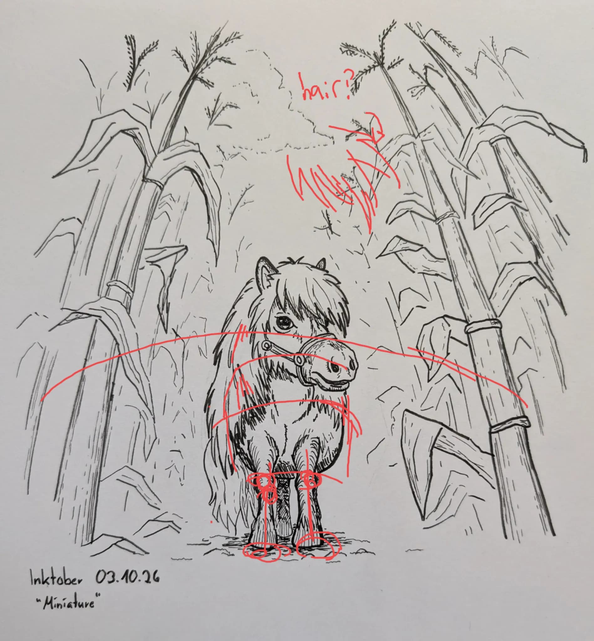
“Following the plant kinda vibe you could make the hair more sketchy, I think it might match it to. Also for the kinda curved perspective I think the horse could follow a little bit of that to. you cou”
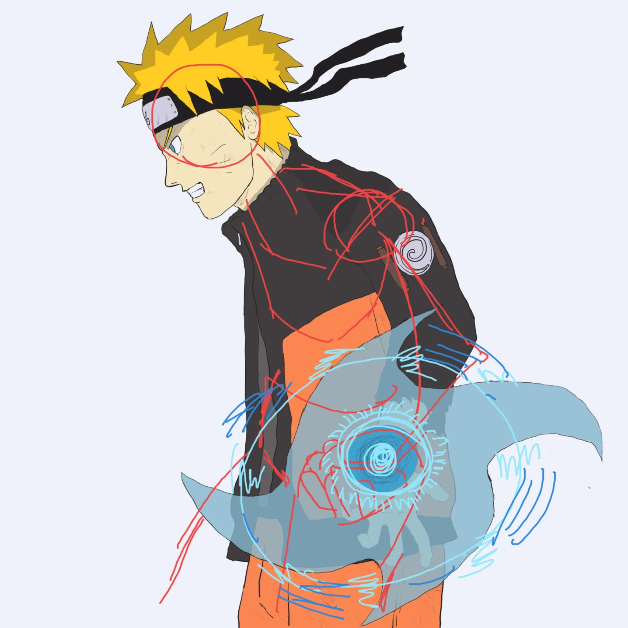
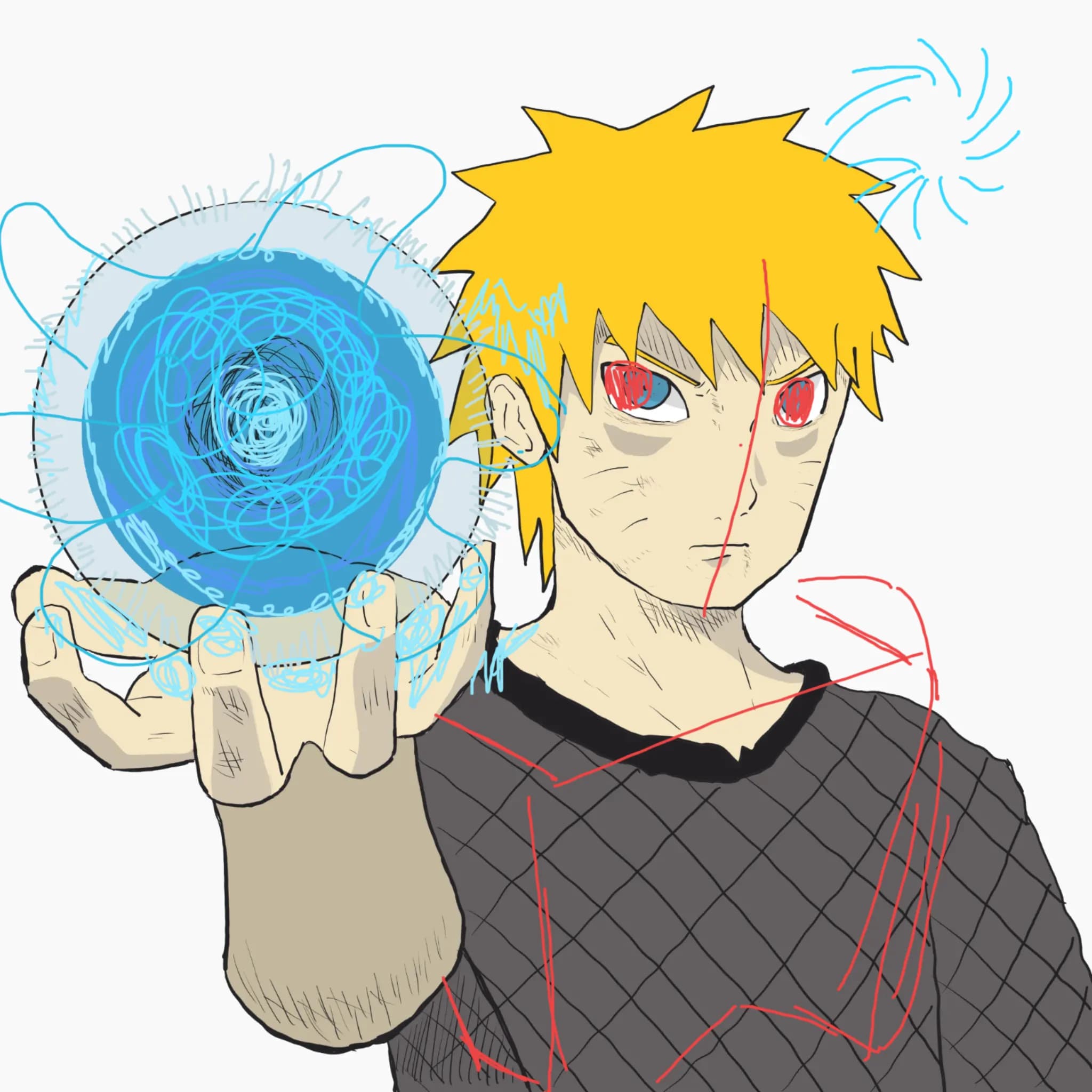
“this is super cool! I think with the rasengan thing the colors can be pushed, along with a glow. And for a more action pose you can tilt the character a bit. moving the eyes to focus on the center mig”
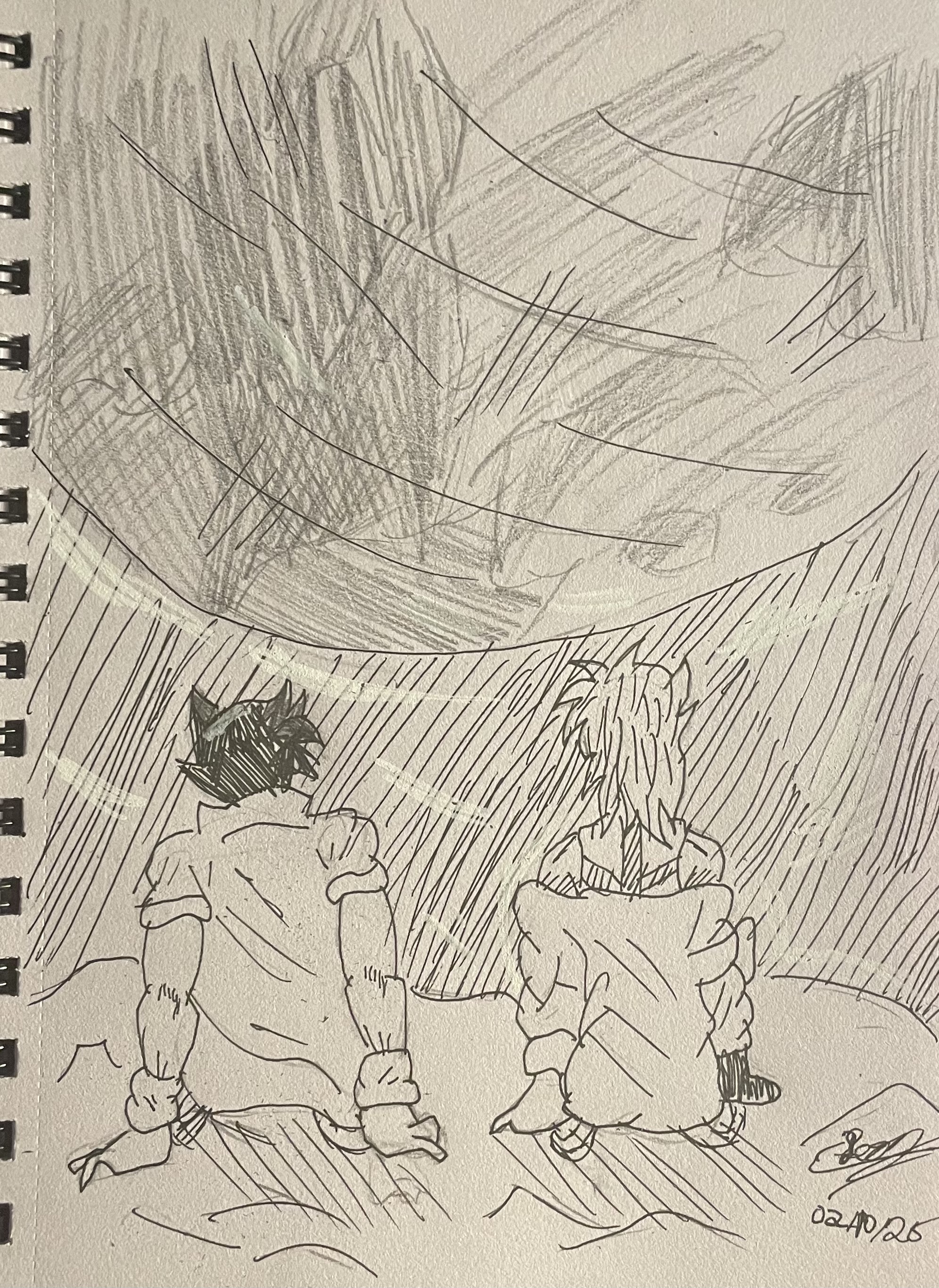
“This is really cool! The hatching youve done looks amazing! I think something that might make it more appealing since you dont know is the anatomy is a bit wonky (small ammount of proportions) Since t”
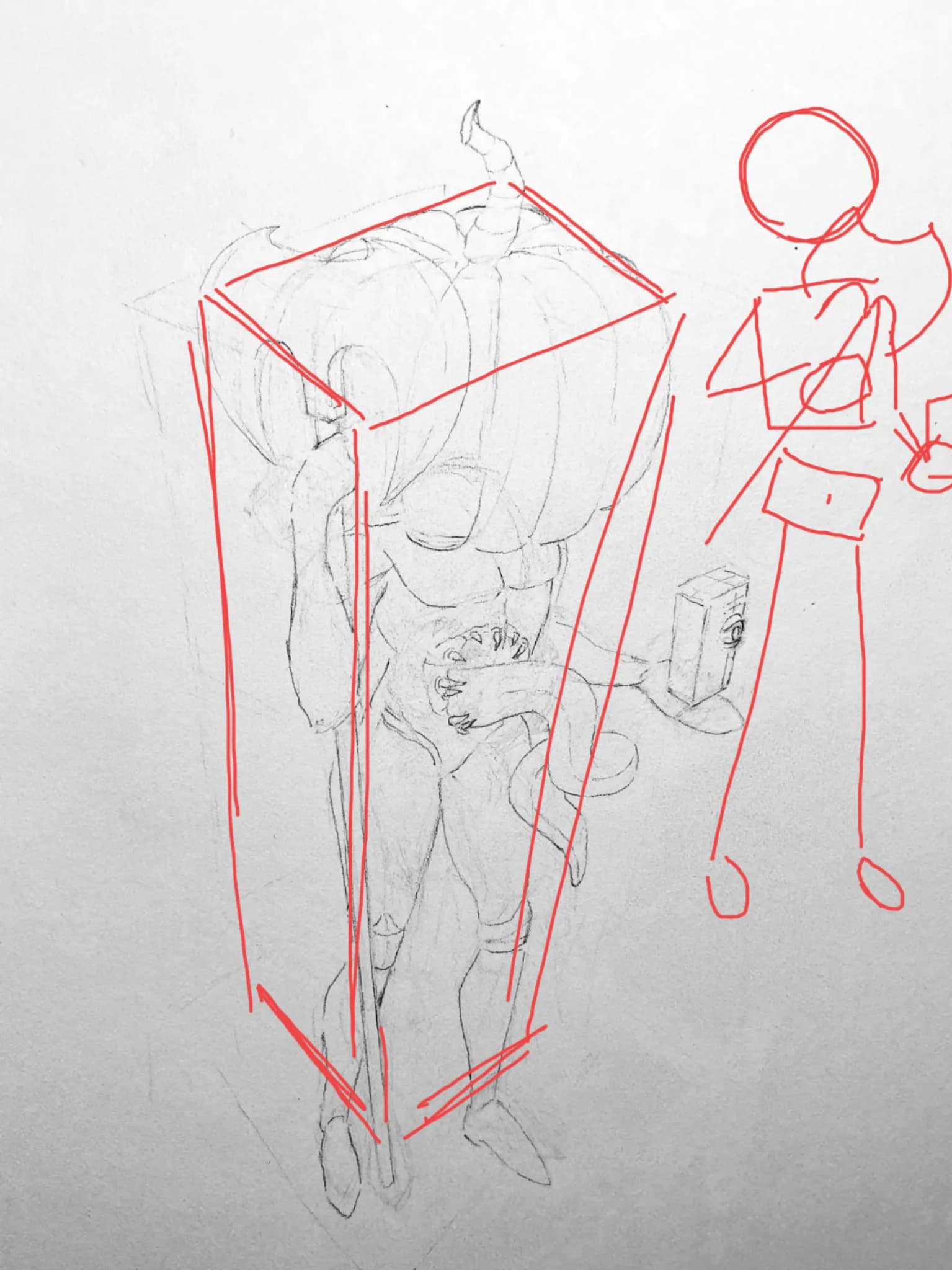
“This is just some small things (this is more than I can accomplish) but hopefully its a bit useful. If your wanting more of a top down I would push your box, its incredibly well down but a bit more d”
“This is a really good piece! I think why it feels a little flat is due to values and composition. It lacks a bit of depth too (not much_) I would try to define whats closer and further away from the v”
“This is really good! youve got shadows layed out really nice. I would try and focus tho on studying facial structure and head shape. The head is also a bit flat and I would try to get the eyes alioghn”
“This is super cool <3 I think something that might help is pushing darker gray for more depth. And maybe creating more shadow with grays. Your values are also incredibly good, creating depth tho I thi”
“This is super cool! I love frutiger aero ^^. Im not a professional but I think looking at like some images of fruitger aero to kinda get the color vibe might help. Also to make the art pop, I think ma”
“Forsaken? I think something that might be nice to add is having more of a blocky kinda proportions so its a bit less squished. (looks great tho :3) I usually see roblox kinda art looking a bit like th”