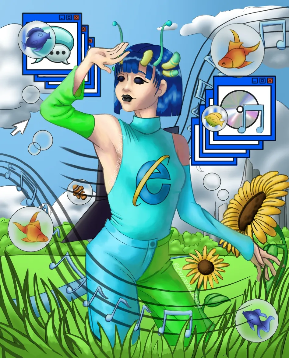
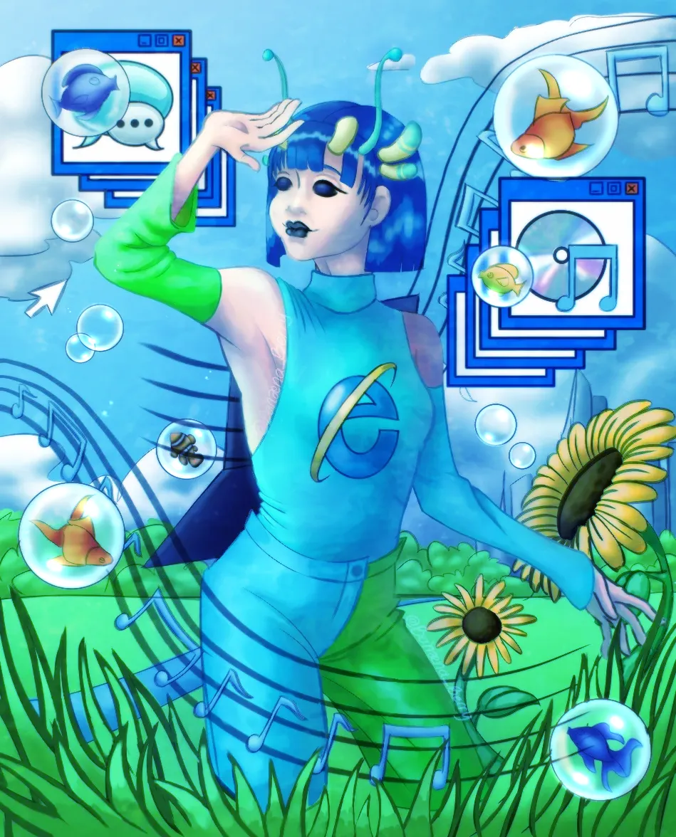

Hey!! First of: I LOVE this piece! I'm a bit fan of frutiger aero and this is great composition wise. I feel like the colors are a bit too grey for an aesthetic like frutiger aero, so I have some small effects that could make it a little vibrant, I use ibispaint so this is my process: - make a new layer, parrarel gradation, white and blue, adjust and lower the opacity to your liking. - duplicate the layer. Add chromatic abberation zooming , lower the layer. - merge the two layers, duplicate and add a small Gaussian blur and lower the opacity. Imo it makes it a little more frutiger aero-ey cuz it focuses on the blues and the shiny stuff! Now for the shading, I tried to copy a little of the MSN people shading style, added some hard shadows and also I added a shadow at the back of the character to make them the main focus of the piece. For a little extra I use a picture of water and put it on overlay mode for a little texture and colour. I also reccomend using a white pen for the bubble and blurring it a little, adding highlights or using an actual bubble for reference. Otherwise, everything looks amazing! This is just my opinion, Keep making more amazing art like these <3
Paintovers (2)
Frutiger aero world
Artist's notes:
I can't get the values and composition right. Idk what's wrong composition wise, and values look too chaotic. Also, are there anything I can add or subtract to make my art pop?
Comments 2

This is super cool! I love frutiger aero ^^. Im not a professional but I think looking at like some images of fruitger aero to kinda get the color vibe might help. Also to make the art pop, I think maybe a bit more vibrant colors might help. Adding shadow to the legs (as it looks like they are in tall grass) might help bring out the focus of the character. I would also make the popups not as bright. I would also make the bubles in the front a bit brighter (maybe a highlight.) I would also maybe dim the sunflower a bit and maybe lower the opacity of the clouds or make them lighter. I would also add more sky variation like darker at the top. And the background as your get further it tends to get lighter too. And for values, something I use is grayscale, I put them around and try to make the grays bring eachother out and try to match the color with that. Overall this is a very nice and incredible piece. I love it <3
also sorry if its not great info or critique. lowkey this is alot better than what I could do. I just thought id share some things idk <3