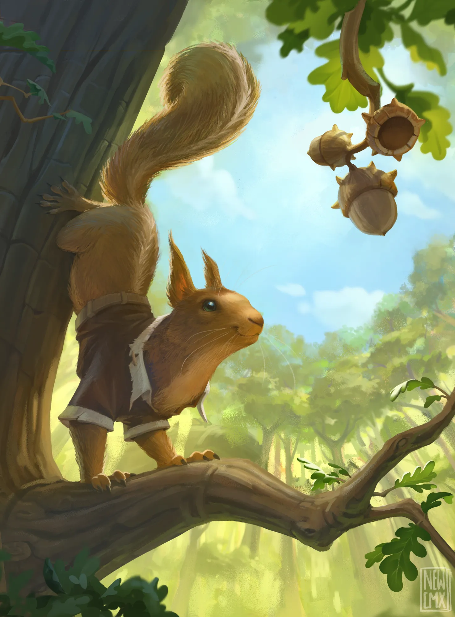
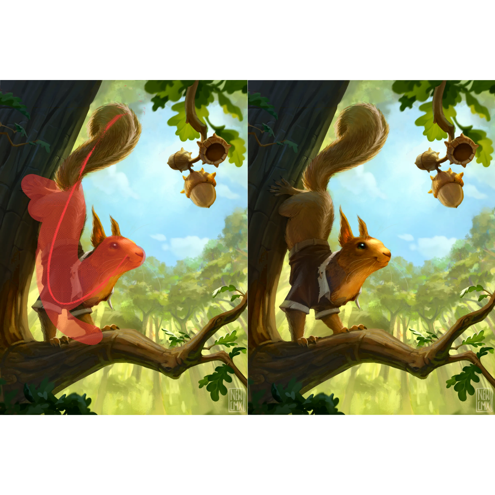
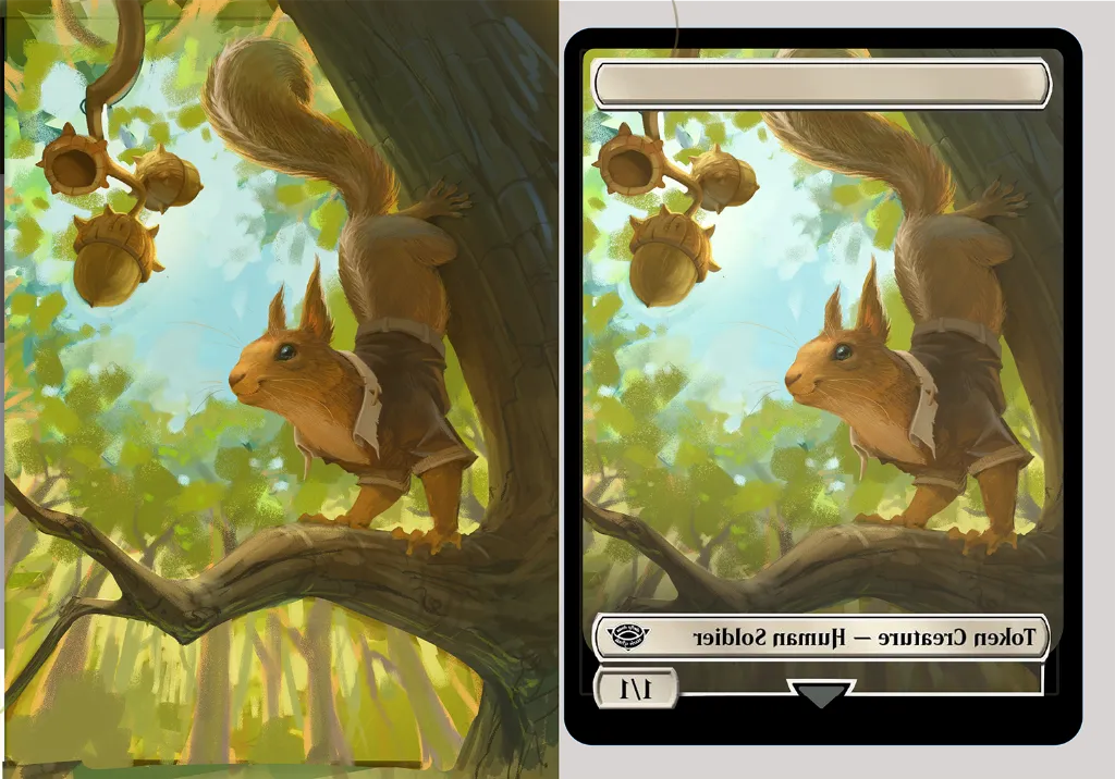
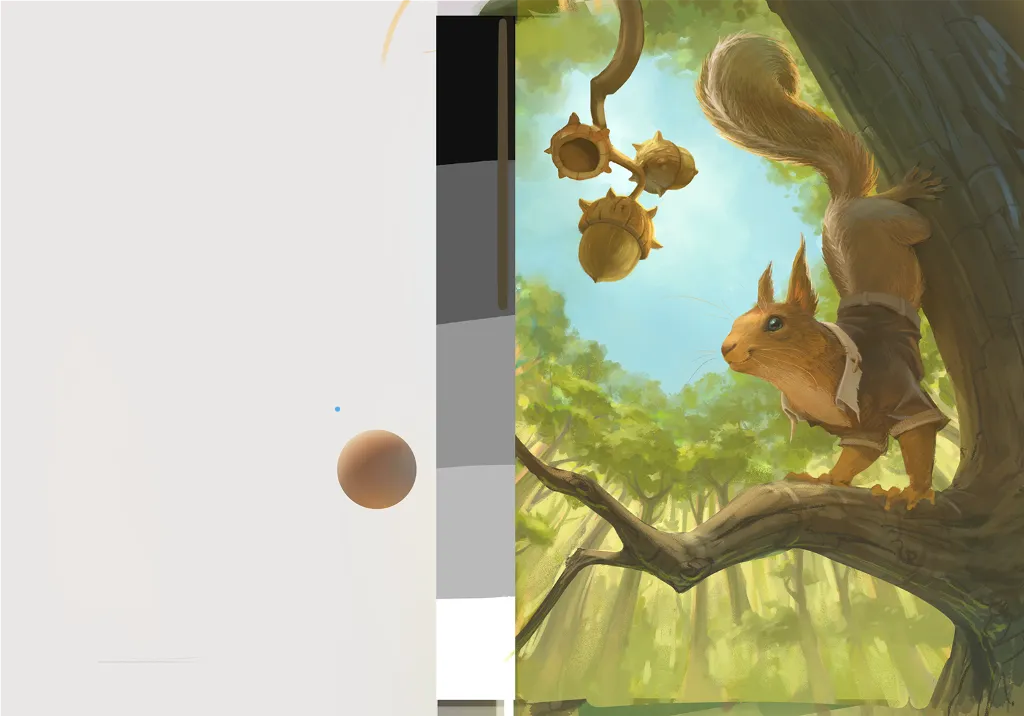
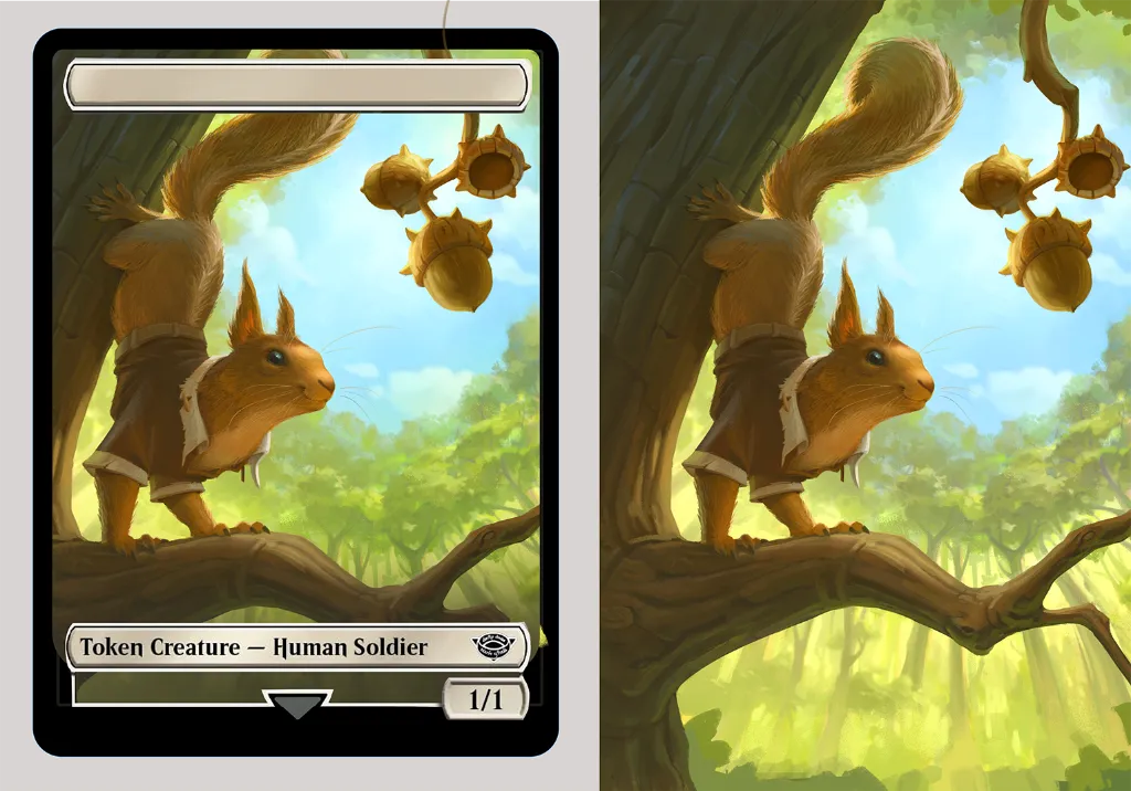

Hey! I would suggest pushing the values, I know you said you didn’t want to go into super dark values, but using the whole spectrum will make your lights pop and make the piece less flat. The red line shows the squirrels line of action, I think if you pushed the bend of his back more his pose would be less stiff. When I messed with the curves the orange came back, sorry lol. I do think it implies a nice sunny day tho if you are willing to let the piece be a bit orange. The background change to strengthen the silhouette of the acorns by removing some trees was a great move. I also lightened his head as it seems like a focus point and giving that contrast from his body should draw the eye more. The subsurface scattering in his ear is great :)
Paintovers (2)
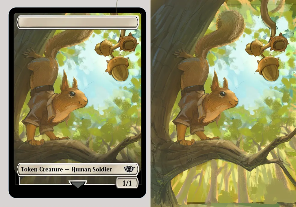
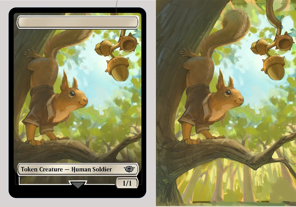
Squirrel token MTG card WIP
Artist's notes:
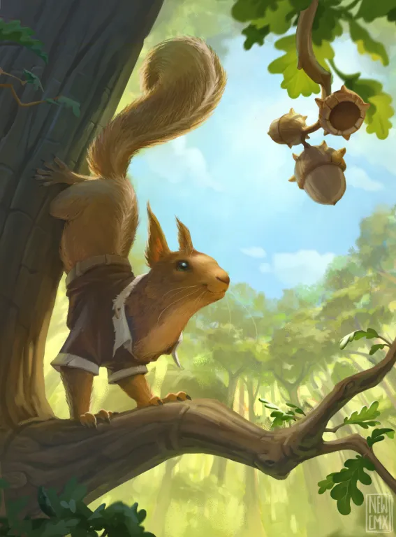
Tilted the squirrel to look more to the acorns. Added some overlap and tree details. Added some color variations because it all felt quite orangy
Comments 2
Hey! Great job! Rendering something like this takes a lot of time and patience... I don't usually have the patience to spend that long on a painting, haha. Anyway... I think the squirrel needs stronger contrast. In particular, if the light isn't hitting it directly and the main light source is behind it, then the shadows should be darker. That will create a much clearer contrast between the squirrel and the background, making the dark-against-light relationship read much better. Darkening the scene overall also gives you the opportunity to add a bright rim light around the squirrel, which will help it stand out even more. :) Hope this helps!
Ye I see what you mean! Thanks for the feedback, I will apply something similar!
Replying to @jacquelinevr
Glad it helped! :D