Paintover
Sorry I didn't add the actual feedback drawing so here it is.
Apr 6, 12:54 AM
Want to store your feedback?
Sign up to store all your feedback in one place on your account. Your feedback will be private instead of public.
Sorry I didn't add the actual feedback drawing so here it is.
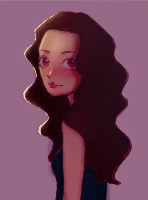
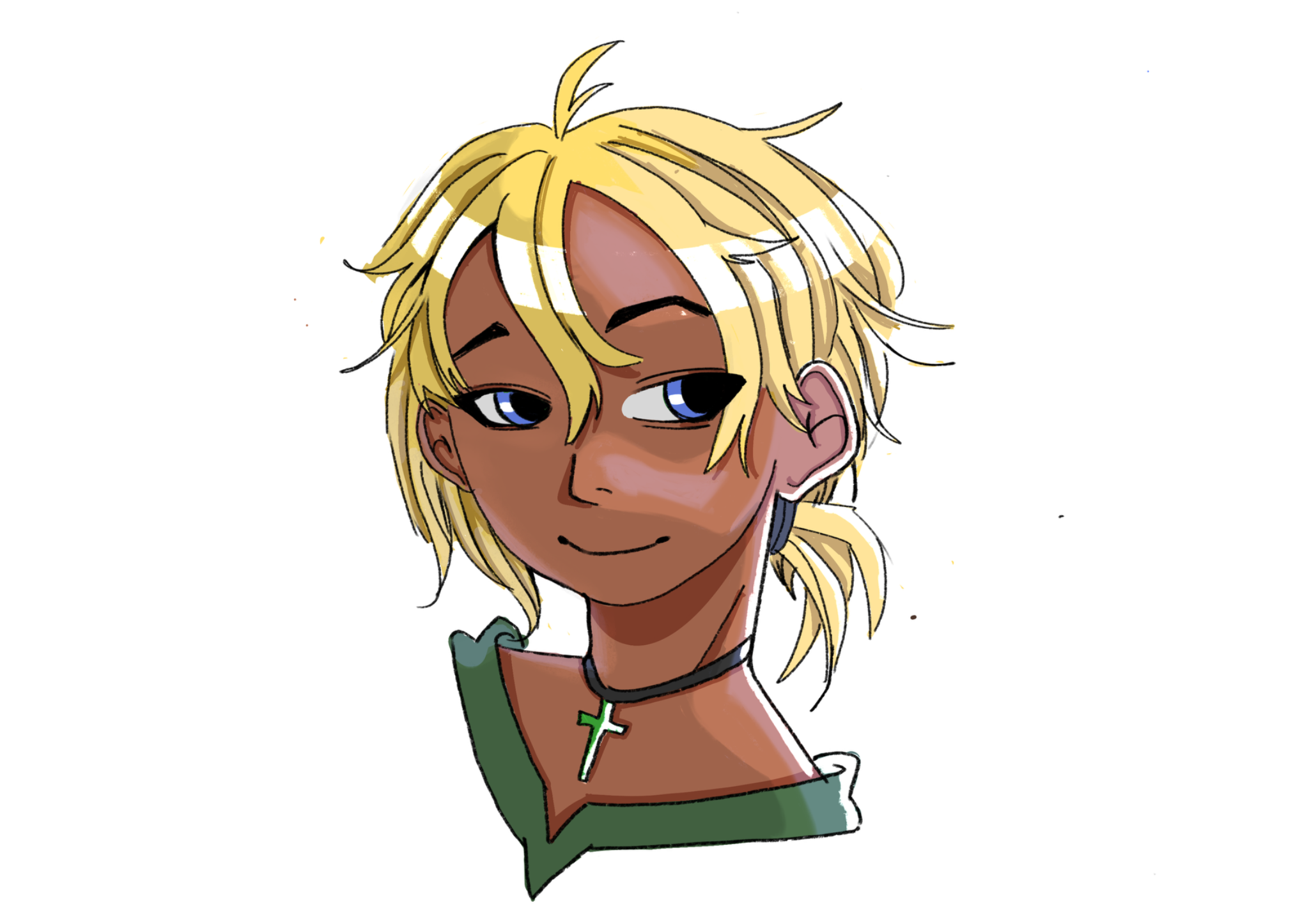
Hi, it's me again. I think a lot of your colors are honestly pretty good, but I did make some tweaks to the base colors. I increased the saturation by a little bit to give her skin some more life, since the mood of the piece seemed more sunny and cheerful. Of course, if you don't like how saturated I made it, feel free to disregard. For rendering, you of course want to pick your light source. Based on the shine you put in her eyes, I figure the light is coming from the right, possibly above her. With the light source chosen, I created a couple layers: one for shadows, and one for highlights. I set the shadow layer to the Multiply blending mode, at about 50% opacity, and I used a mildly-saturated, mildly-tinted red color to shade (meaning the red color is roughly in the middle of the color wheel, neither too bright, too dark, too saturated, or too desaturated). I set my highlight layer to the Color Dodge blending mode, at around 75% opacity, and used both a saturated orange color and a heavily desaturated (borderline white) yellow. Lastly, I added a little red trim along the edges of the shadows on her skin. This is called sub-surface scattering. It's what happens when light hits out skin, bounces around in our blood, and comes back out, creating this red glow. It's most visible on the edges of shadows. Adding it makes her shadows really pop and gives more life to her skin. Last tip: while you're working, or before you even add color to your painting at all, try to work with black, white, and grey. By working in monochrome, you can see if parts of your image art hard to read, and where you need contrast. What I do is I create a layer at the very top, set it to the Color blending mode, and fill the entire layer with white. This turns my painting into a black-and-white image. I can then toggle the layer on and off to check if my painting is readable. When I did this to your drawing, I could more or less read it clearly, but I I felt like the contrast between her hair and her top could have been stronger, so I made the top a little brighter and a little more saturated. This made the top, hair, and skin easier to distinguish. I hope this helps!
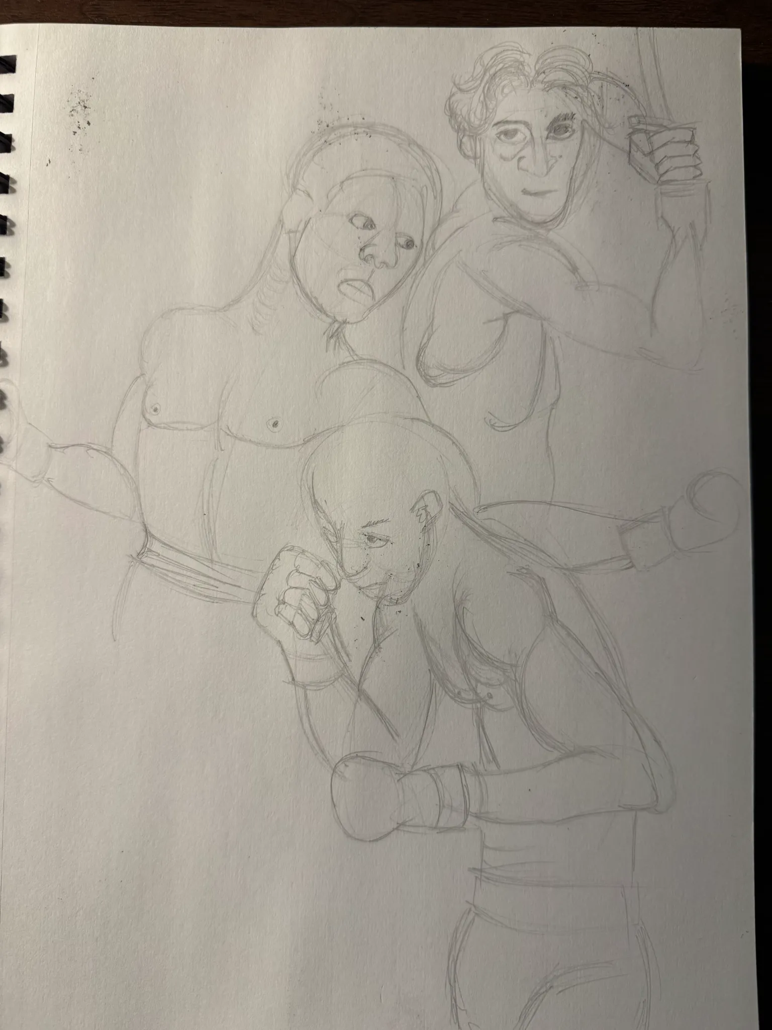
Hi! I'm here to attempt useful critique. Wish me luck! So, overall, you've got a solid loomis head here. Given the anime proportions of the eyes, the divisions of the face are looking good. In a more realistic style, the distance between the hairline and the brow line is the same as the distance between the brow line and the bottom of the nose, as well as the distance between the bottom of the nose and the chin. Those are the three thirds of the face, as you may have learned already. For anime styles, having the middle section be larger is perfectly on brand because of the big eyes. The body is where I found more places for anatomical improvement. The first thing I did was measure the top of the head to the top of the shoulder. If her shoulders were relaxed, measuring from the top of the head to the shoulder is a way to measure the height of the ribcage. So I doubled that measurement on the left to find the bottom of the ribcage. The ribcage, when at a resting state, is tilted. The waist, which we can barely see in this image, tilts in the opposite direction. The body creates a sort of zigzag, as the neck goes back, the ribcage goes forward, and the waist and hips go back again. So to make her pose more anatomical and dynamic, I added that angle to her ribcage. Bonus tip, the elbow lines up with the bottom of the ribcage. Because her shoulder is a little raised, I raised the elbow the same distance. If her arm was relaxed, her elbow would line up with the ribcage. I'll upload a separate rendering paintover in a bit. Hope this was helpful! :>
Your rendering seems flat and what you could do is use shadows and light to bring out the form of the character. Feedback art; With this I added a dark background and brought a light source from the left. Tip, don't make your character's colour similar to the background else it will not stand out. Also, I added reds to the skin to make the character seem like she has blood and I added a bit more blush on her cheeks and nose. Hope it helped
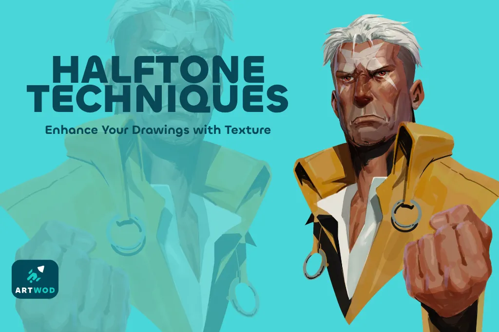
Improve your shading and light control, a 3 min read
Master halftones by establishing shapes, volumes, and shadows first, then practicing on beans, noses, portraits, and posters to add texture and depth to your artwork.
Rendering
06-02-26
Hi everyone, I am participating in the June 30 challenge to help me build a habit, become more comfortable with sharing my work, and receive feedback! I've never really taken myself seriously as an artist, and I've always doubted myself, and that is why I am here.
6/2/2026
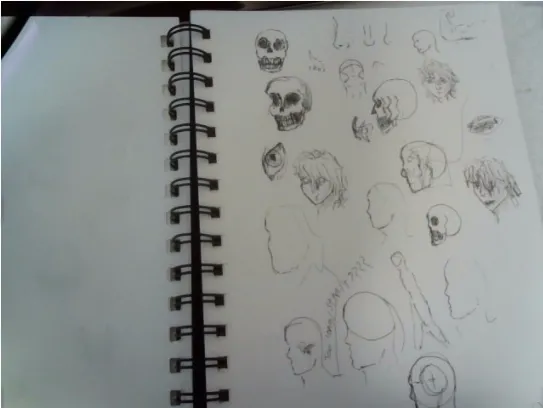
trying to draw with pen only so i can't erase or use guide lines i realize that many of the side profile siluets are to long
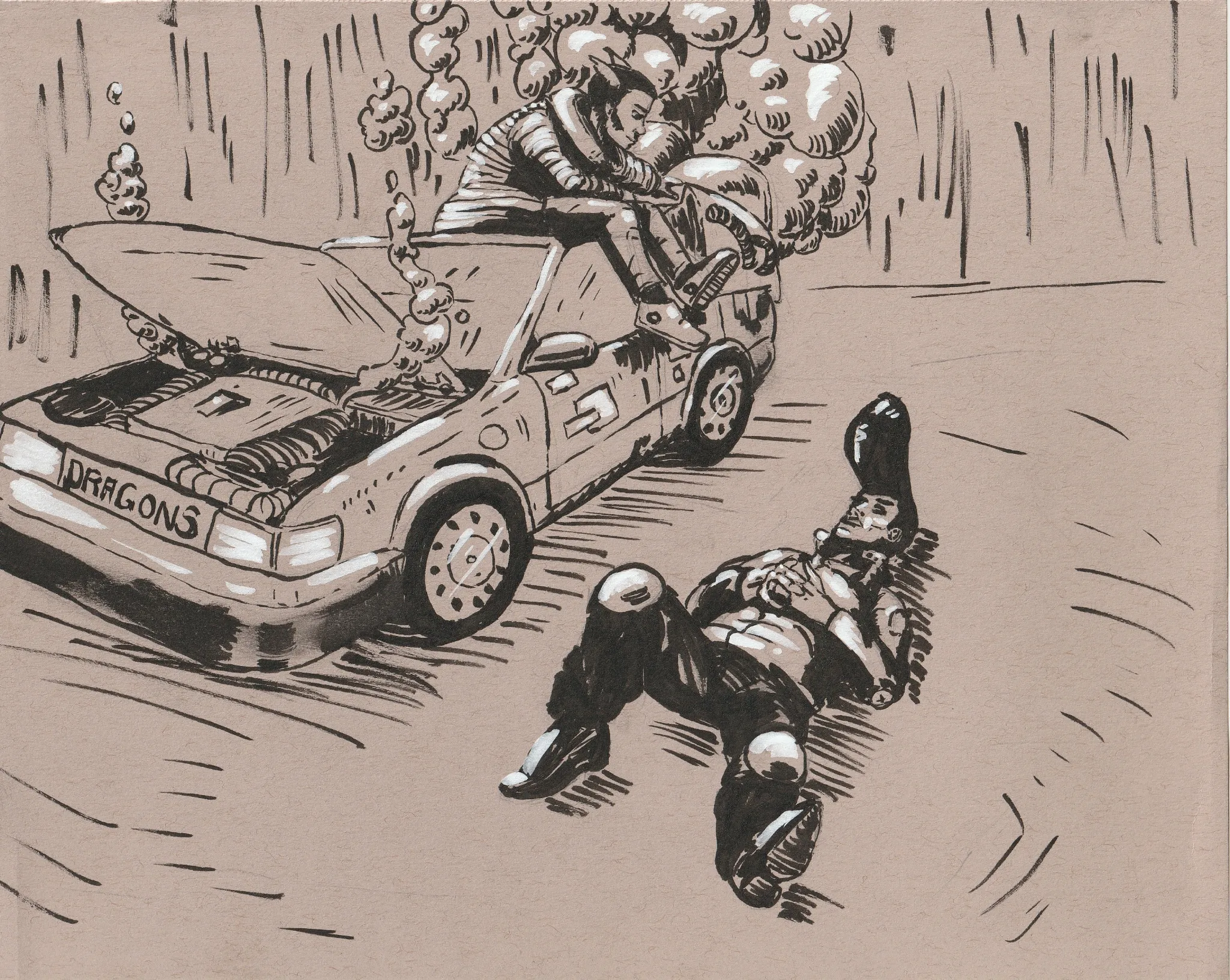
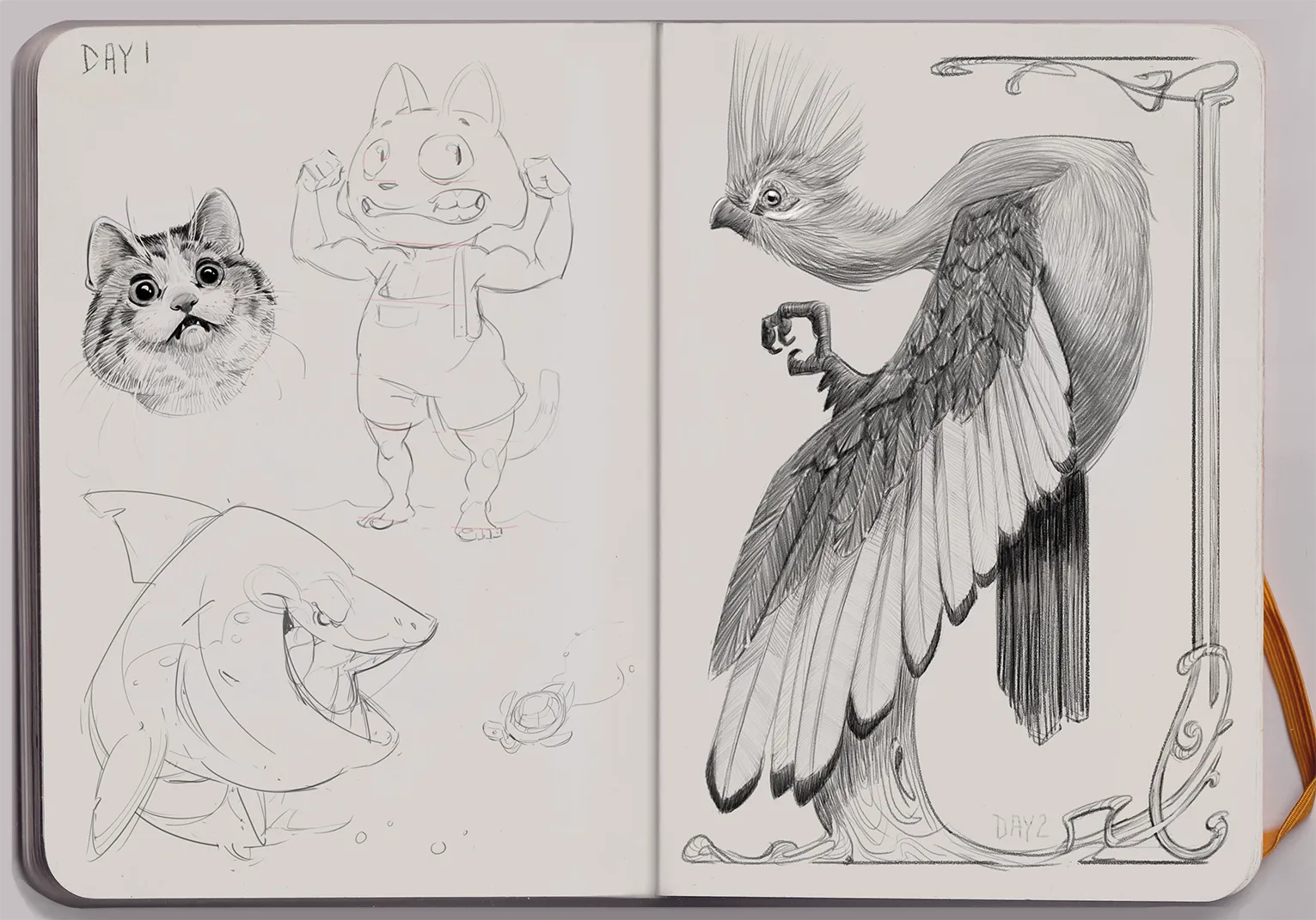
Sketch 01 - The Dragons
Hey! I had a lot of fun making this sketch and I'm looking forward to putting in another entry soon! My biggest challenges were controlling the line weight with the brush pen and smudging the ink likely due to my current brush pen. This is my first upload to the site and would love some feedback! Thank you!
June 30 Challenge - Day 1
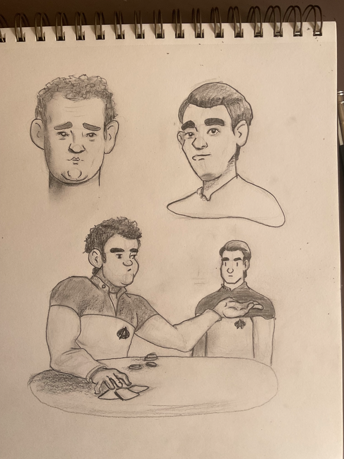
Practicing Trek characters and attempting illustrating a scene from a book.
Daily sketch page, day 2
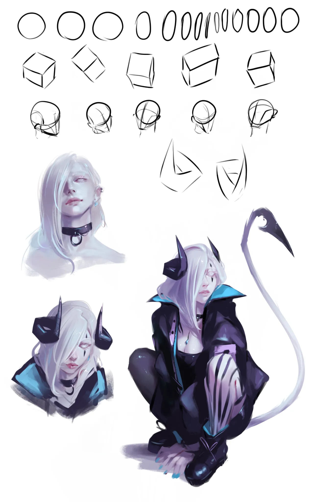
Trying to incorporate stuff I learned from portrait road. Drew my OC this time. Struggling with keeping face looking the same in all angles (and fail :x)
David
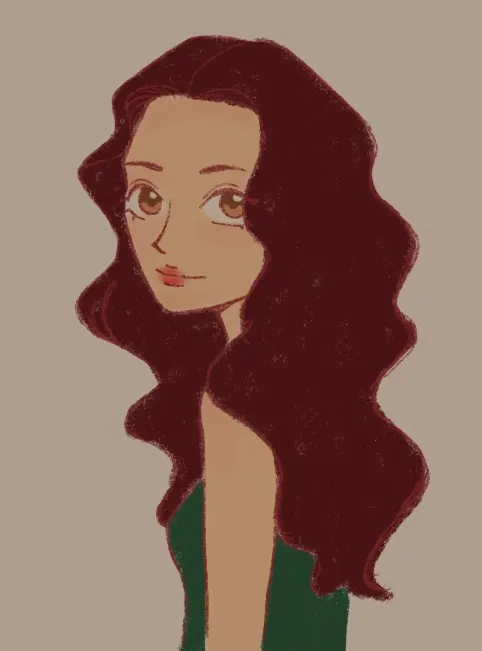
One thing I constantly struggle with is rendering it always feels as if I’m missing a step or theirs a gap between my knowledge. Feel free to critique my lighting, shading, and etc.
Day 2 Jacqueline's Sketchbook
A Knysna Turaco bird in Art Nouveau style
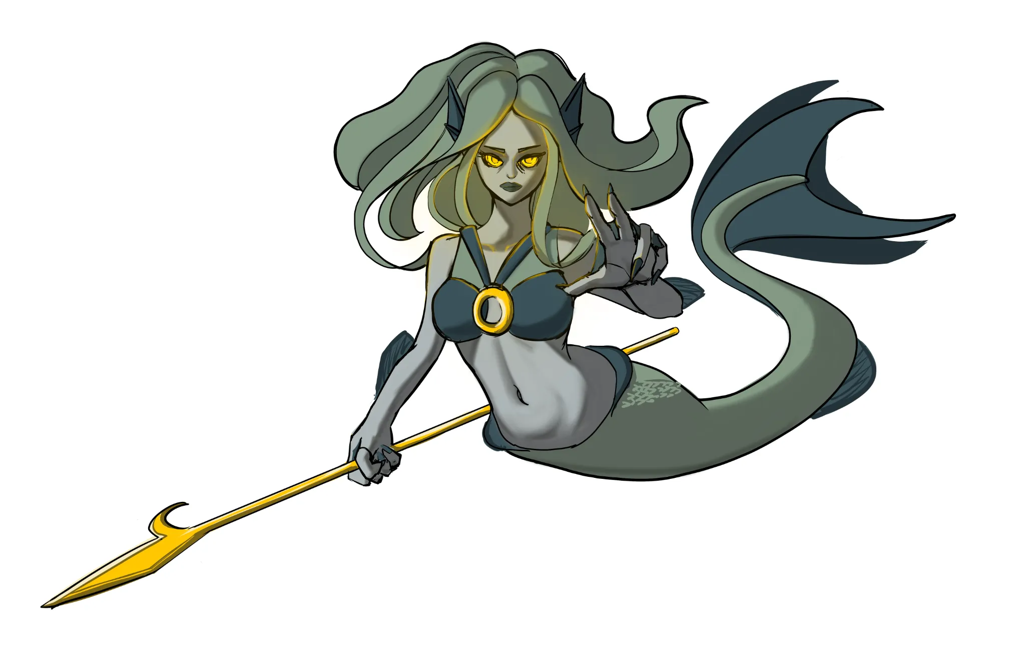
Mermaid
Made improvment of the hands.
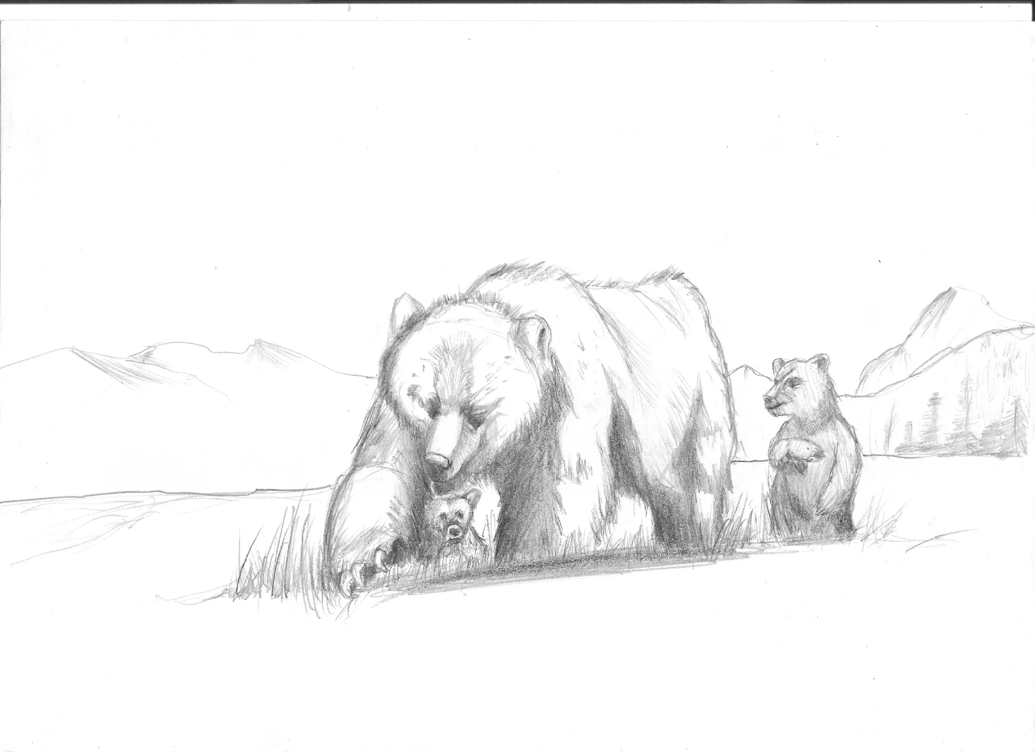
Page 2 (day 2)
Page 2 (day 2) Trying to be consistent with the challenge. In this drawing, can someone teach me how to make simple backgrounds? ( Other adivces is good too!)