
For things like boats, cars, bikes etc. you can use free model sites like sketchfab to get some models and position them in the 3d preview and take a screenshot and trace over them. Or import them in blender for more control over the positioning.
Paintovers (0)
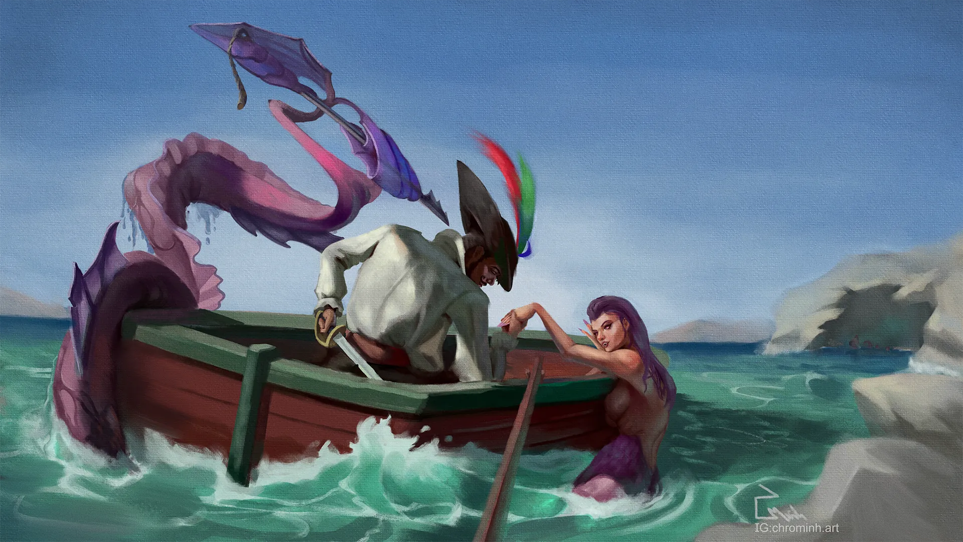
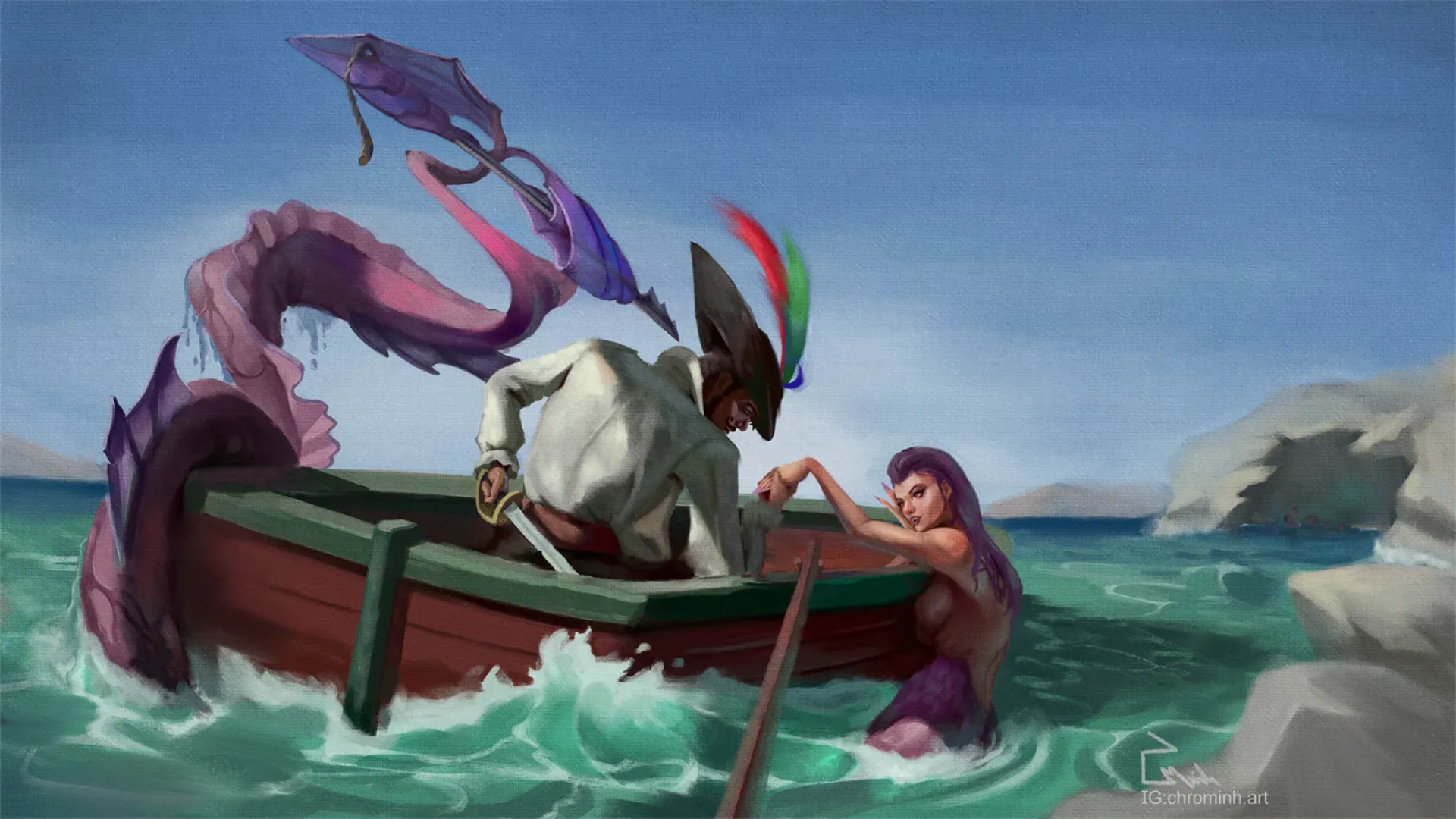
Mermay Challenge - Story Telling
Artist's notes:
Hello! I appreciate all feedback, What I would want to focus on is how can I remain loose and put further emphasis on my Focal points. As well as How would you improve my composition. For this challenge I wanted to focus on story telling. but ALL feedback is welcome! thank you
Comments 5
I think you can do a lot more with the background, to show off your world and to devide up the background, use atmospheric perspective for to create depth. I think th oar needs to just go in the water. overall the boat needs to be a little tighter as some of the bold brushstrokes distract from the figures. The feathers on the pirate hat are a bit too bright and distracting, id keep the brighter colors for the mermaid. You can try to show that the mermaids tail goes under water by shifting the water color to purple closer to the surface.
hi Jens, apologies for the late reply, But could you clarify what it means for the boat to be a little tighter? Cheers.
Hey! It’s looking much better now! :D Well done! :D There are just a few details that still stand out to me. One of them is atmospheric perspective. Don’t forget that objects in the background should generally have lighter values than the elements in the foreground and midground. For example, you added some rocks in the foreground (which was a good idea), but those rocks currently share almost the same values as the cave in the background, which reduces the sense of depth. Always keep checking your values while painting, that’s a golden rule for me at least :p I also adjusted the pirate’s shirt a bit. Mainly the folds and the shadow being cast by the mermaid. It makes more sense to me this way. I also increased the space between the spear tip and the pirate slightly. Having them too close together was creating a tangent. Hope this helps!
great catch, thank you for feed back :)
Hey! Incredible illustration so far! I really love the theme and the storytelling The illustration feels a bit too dark, especially considering the environment appears to be a bright and sunny open space. Because of that, the first thing I would do is adjust the values and lighting in the background. You could paint the sky with a lighter blue and even add some clouds so the space doesn’t feel too empty or visually flat. You can also use the cloud shapes to help guide the viewer’s eye toward the focal point. Also, don’t forget about atmospheric perspective. Elements in the background should generally shift toward cooler and more bluish tones. As for the characters, I would push the lighting a bit more. For example, you could increase the contrast around the mermaid’s face so it separates better from the background. You could even place a slightly darker shape behind the face to create a stronger “light against dark” contrast. Also notice that I made the light warmer while shifting the shadows toward cooler blue tones to create a warm vs. cool color contrast. Hope this helps!
extremely helpful, again I got blindsided by details and not see the overall broad image. Your paintover is awesome, i can see how i can also push for more saturation with these value changes.
This is an awesome piece! Fantastic work! I think something that may help direct even more to some of your focal points is pushing your contrast a touch further as well as some highlights within the pirates face. When I zoomed out the basic read I was getting was more or less one dark triangle. I think adding that will make some of the detail work shine as well as direct attention to the interaction between the pirate and mermaid.
I would suggest this too. Though in the greyscale paint over here I think the mermaid’s face draws my eye more than the pirate’s, since I can see her face more clearly. If that’s not the intent, the lighting scenario might need to be reconsidered.
thank you for the feedback, to me it was unintentional how dark i wanted the male face. ill brighten the male face.