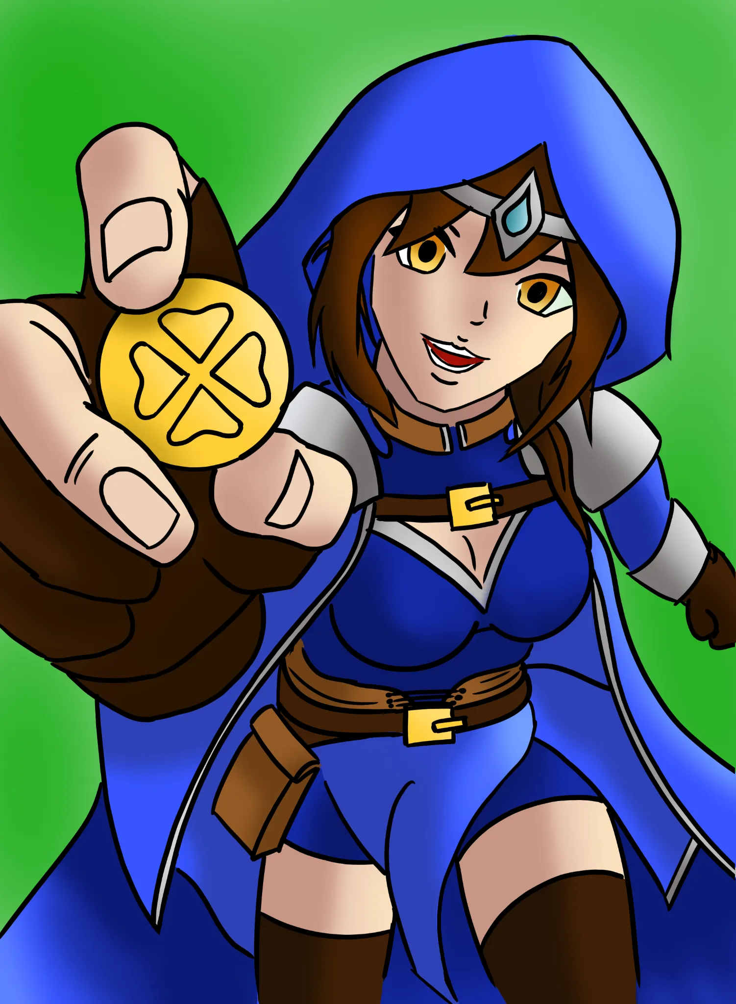
I like her cheerful expression and the pose. Instantly gives good vibes. Anatomy: 1. Her shoulders/head face left, torso faces right, legs face left again. Shoulders should be moving with torso, or in this case torso should also face the viewer more. 2. When drawing bodies in perspective try to break it in simple shapes,e.g. cylinders. Things like her belt should follow the contour lines. 3. Face features should also follow the perspective. We look at the character from above, so for example bottom of her nose should be less visible to us. 4. Her head is a bit too detached from the neck. Colors: 1. Once again, try to break the body into simple shapes and shade them accordingly. 2. Shadows are usually not just darker color of the same hue; try to use neighboring hues with less saturation and lightness. Consider environmental light. E.g. in this case sunlight hits the grass, the light bounces back at the cloak, adding greenish hue to it. 3. Try to keep BG less saturated than the main subject or it takes away the focus from it and makes everything look flat. 4. Consider adding highlights to the eyes or they end up looking lifeless.
Want to store your feedback?
Sign up to store all your feedback in one place on your account. Your feedback will be private instead of public.
Feedback Thread
Paintover
Mar 28, 2:42 PM
Paintover
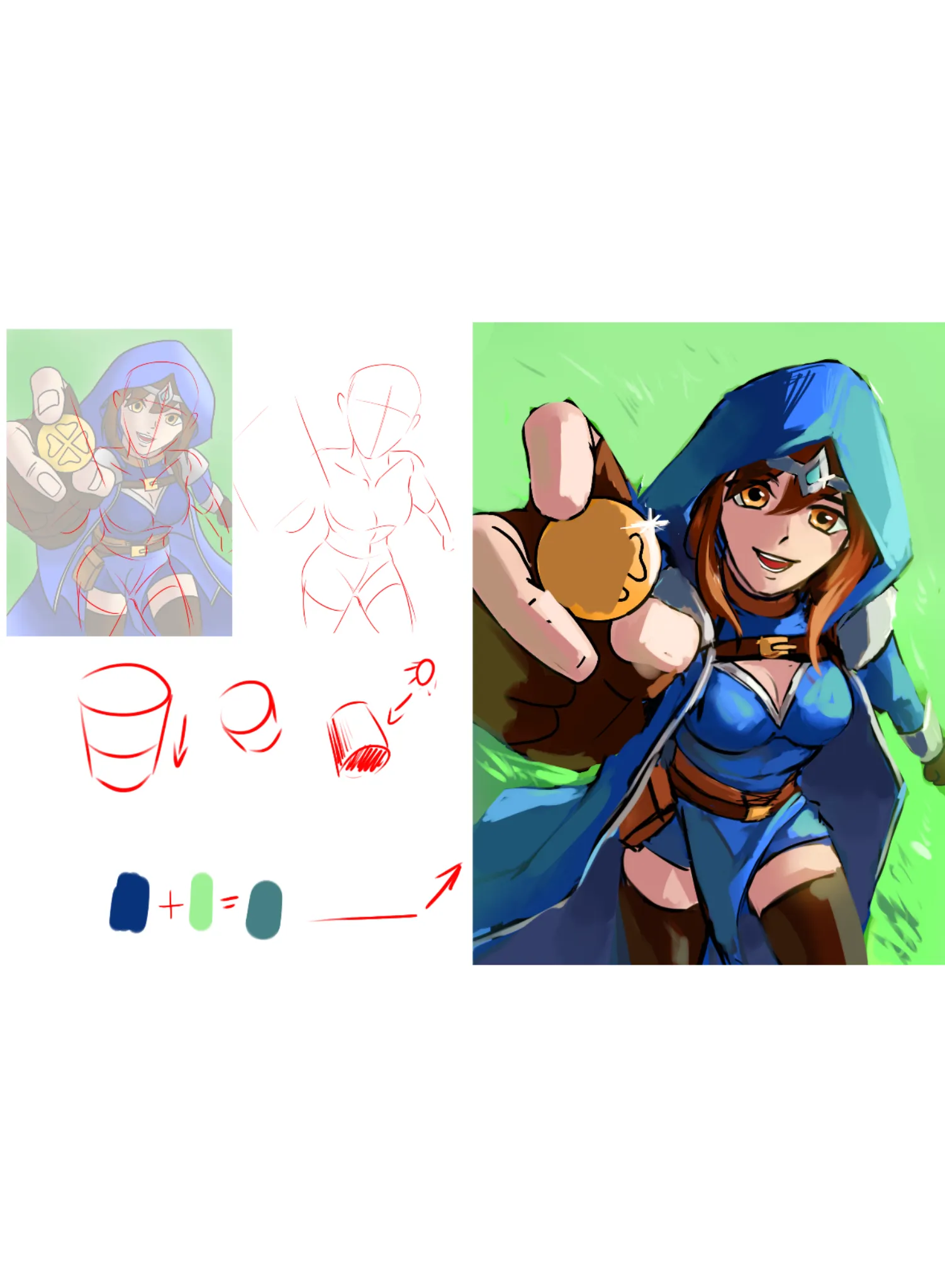
Hi! My first time giving feedback, so I hope this is at all useful and encouraging. First off, very cute character! And great job with this sort of perspective. It's really tough with the foreshortening. Here are the main things I did for the perspective: I brought the wrist of her right hand up more, to try and create more of a solid line between her hand and her shoulder; I shrank her left arm and tapered it to try and sell that it's further back than the rest of her body. Her left leg also didn't seem to fit into her hip, so I nudged some things around. I added a few lines for drapery. I'm not an expert, but I tried to add some lines that followed the flow of the cloth to help imply thickness and parts where it would bunch up due to her body underneath. For your lighting, I recommend starting out with cell shading. I believe Antonio encourages the same thing when you're starting out with rendering 3D form. When putting down your shadows and highlights, try to treat them like shapes, and don't worry about blending all that much. By treating your lighting as solid shapes, and thinking about your subject as an object in 3D space, it can make it easier to figure out where those shapes need to go (i.e. which planes face the light source and which planes face away). Of course, cell shading is a stylistic choice, so feel free to ignore that if you don't care for it. Cell shading simply makes for a good onboarding to rendering, especially because you want hard edges in your lighting to help show the transitions between planes. A mixture of soft and hard edges make for a more painterly style, while exclusively hard edges is a more anime/cell-shaded style. To help you out with digital painting, if the program you're using has "Blending Modes" for its layers, you can use the "Multiply" setting for your shadows (if this doesn't make sense, I recommend looking up more info on blending modes for your program of choice). Create a new layer above your drawing and set it to Multiply, then lower the layer's opacity depending on the mood of your piece (I do around 50% for most pieces, but be sure to play around). Then, use a red color that's moderately saturated (somewhere in the middle of your color wheel) to shade things like skin, and use a blue color that's moderately saturated for most everything else. The reason you use red for human-like skin is because of light bouncing around and bringing out the color of our blood. You use blue for most everything else because--unless your character is being lit by some other light source--ambient light is often blue due to the sky. The sun may be yellow/orange/red, but as it bounces across the sky, we get more blue in our shadows. So if a character is outside on a sunny day, you'd shade them blue. If they're inside and it's dark, maybe a purple. If they're being lit harshly by a fire, maybe the color of the fire. This is a very basic intro to the idea, and I'm once again not an expert. I usually make a second layer for shadows, once again set to Multiply, and use that second layer for "Ambient Occlusion Shadows." These are the shadows that are the deepest, in places where light has a hard time reaching, such as crevices. You can see on your character that I put harder shadows just below her jaw, and right where bits of drapery overlap with her body, as well as the deepest parts of her robe. Try not to go overboard with occlusion shadows, but also don't be afraid to use solid black for those really deep shadows. When doing your shadows, remember that on most materials, the deepest part of the shadow is actually on the edge near the light. This is because light will bounce around and hit the subject from multiple angles, so the hard edges of your shadows should be the darkest. You can see this on her left pauldron, where I have an intense shadow right next to where the light hits it. For highlights, create a new layer and set its Blending Mode to something like "Color Dodge," or "Glow Dodge," or any of the "Light" modes, depending on your program. Use a color that matches your light source (so yellow for the sun, in this case). Play around with this, honestly. It may be confusing how blending modes interact with your drawing at first, but you can keep changing your colors to get the right look. Finally, there's a thing called "Sub-surface Scattering." This is when light hits our skin and makes the red of our blood more pronounced. Try holding your hand up in front of a light source and see how red your fingers look along the edges. You can draw this by painting a little bit of red at the edges of your shadows,. You can see this most clearly on her fingers and her thighs. I was really harsh in those places so that it was clear what I was doing, but I was much softer in her face, where I blended the red in with her face shadows for something that looks a bit more natural. By doing sub-surface scattering, you make her shadows pop and give them more life. I hope this was at all helpful!
Mar 28, 2:43 AM
Also need help with your art?
Improve your fundamentals, a 3 min read
5 Easy Drawing Steps for Dynamic Figures: A Beginner's Guide
Master dynamic figure drawing by progressing through five fundamental techniques: simple shapes, action lines, exaggerated poses, anatomical details, and expressive character design.
Figure
Would you like to help someone who's still waiting?
Rendering
No responses yet
David
One thing I constantly struggle with is rendering it always feels as if I’m missing a step or theirs a gap between my knowledge. Feel free to critique my lighting, shading, and etc.
5 hours ago
View
June 30 Sketchbook Pages Challenge
No responses yet
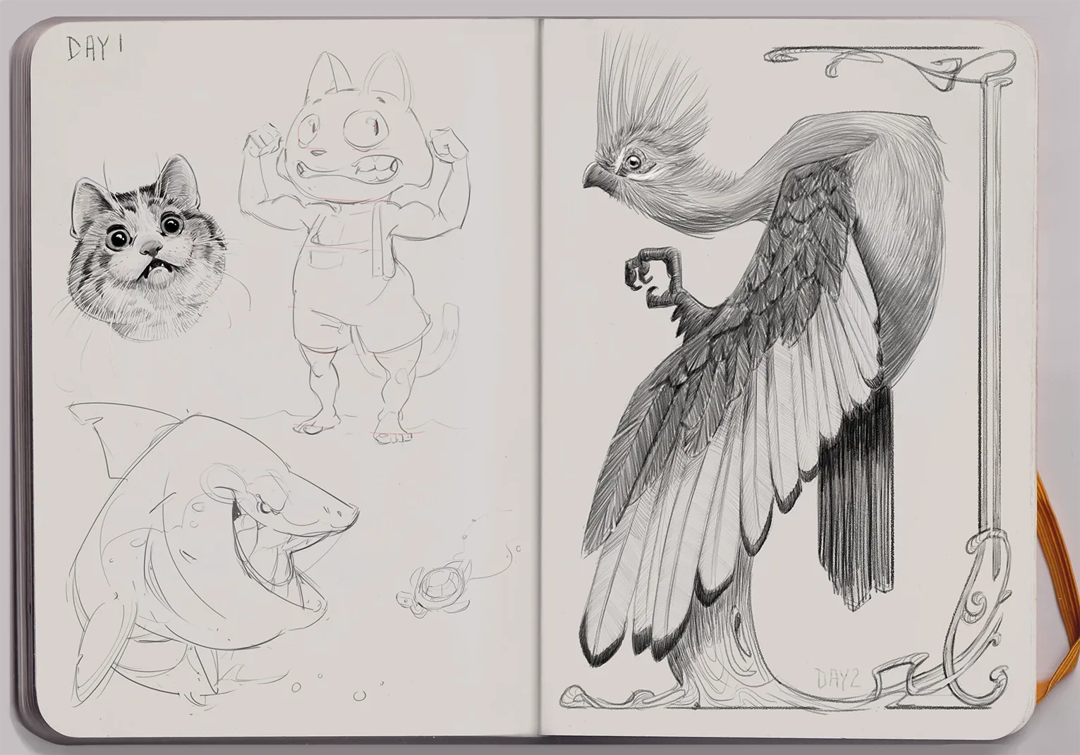
Day 2 Jacqueline's Sketchbook
A Knysna Turaco bird in Art Nouveau style
5 hours ago
View
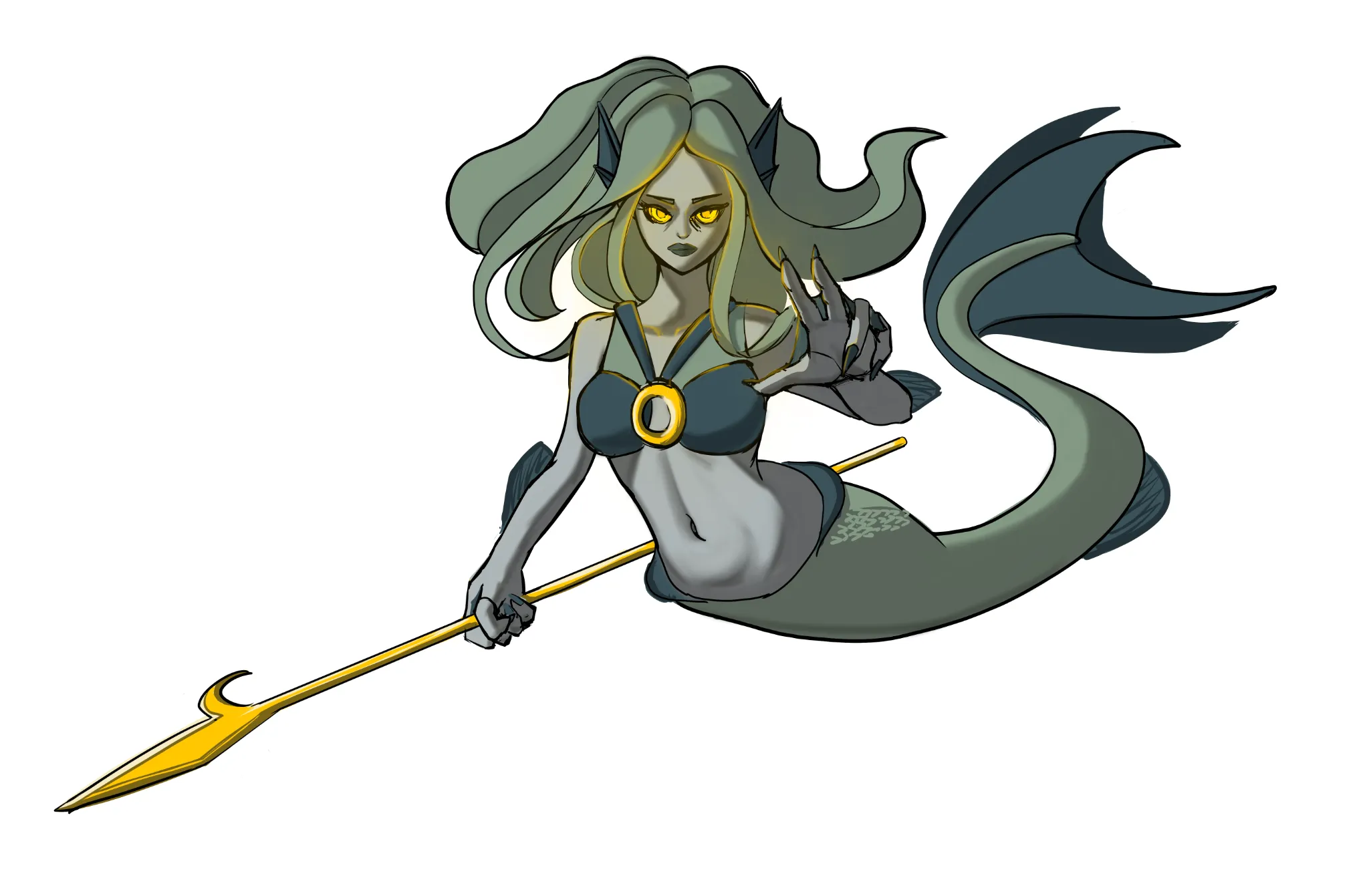
May Mermay Art Challenge
No responses yet
Mermaid
Made improvment of the hands.
7 hours ago
View
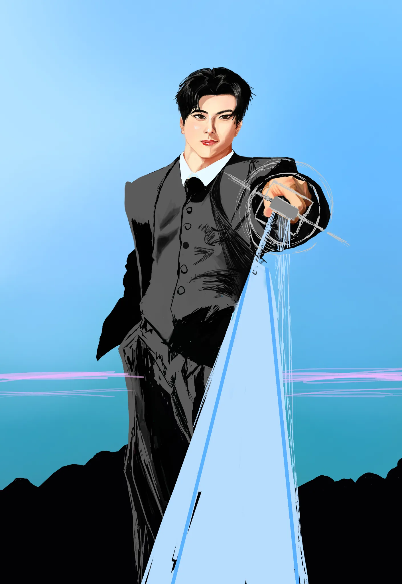
Rendering
No responses yet
WIP Jay Enhypen
I am struggling with capturing his face from my refrence, I made a mistake with choosing my reference a bit, I chose the refrence pose where the face wasn't fully visible and used other refrence for his face so I had to adjust the face angle and how he is looking at the viewer which led to facial structure changes, I can't add my reference in this site because it doesn't support more images. I want you to help me with how do I make look more like Jay.
8 hours ago
View
Challenge of the Month
No responses yet
Page 2 (day 2)
Page 2 (day 2) Trying to be consistent with the challenge. In this drawing, can someone teach me how to make simple backgrounds? ( Other adivces is good too!)
8 hours ago
View
June 30 Sketchbook Pages Challenge
No responses yet
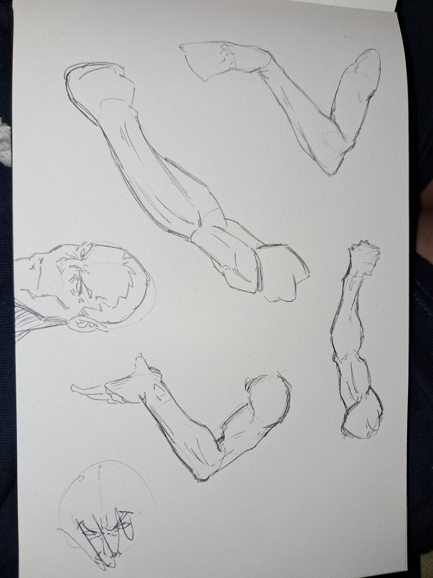
2 sketchbook page
Some arm studys. I wanted to practice the anatomy for the ice arm of the eleven archer character
9 hours ago
View
Perspective and Form
No responses yet
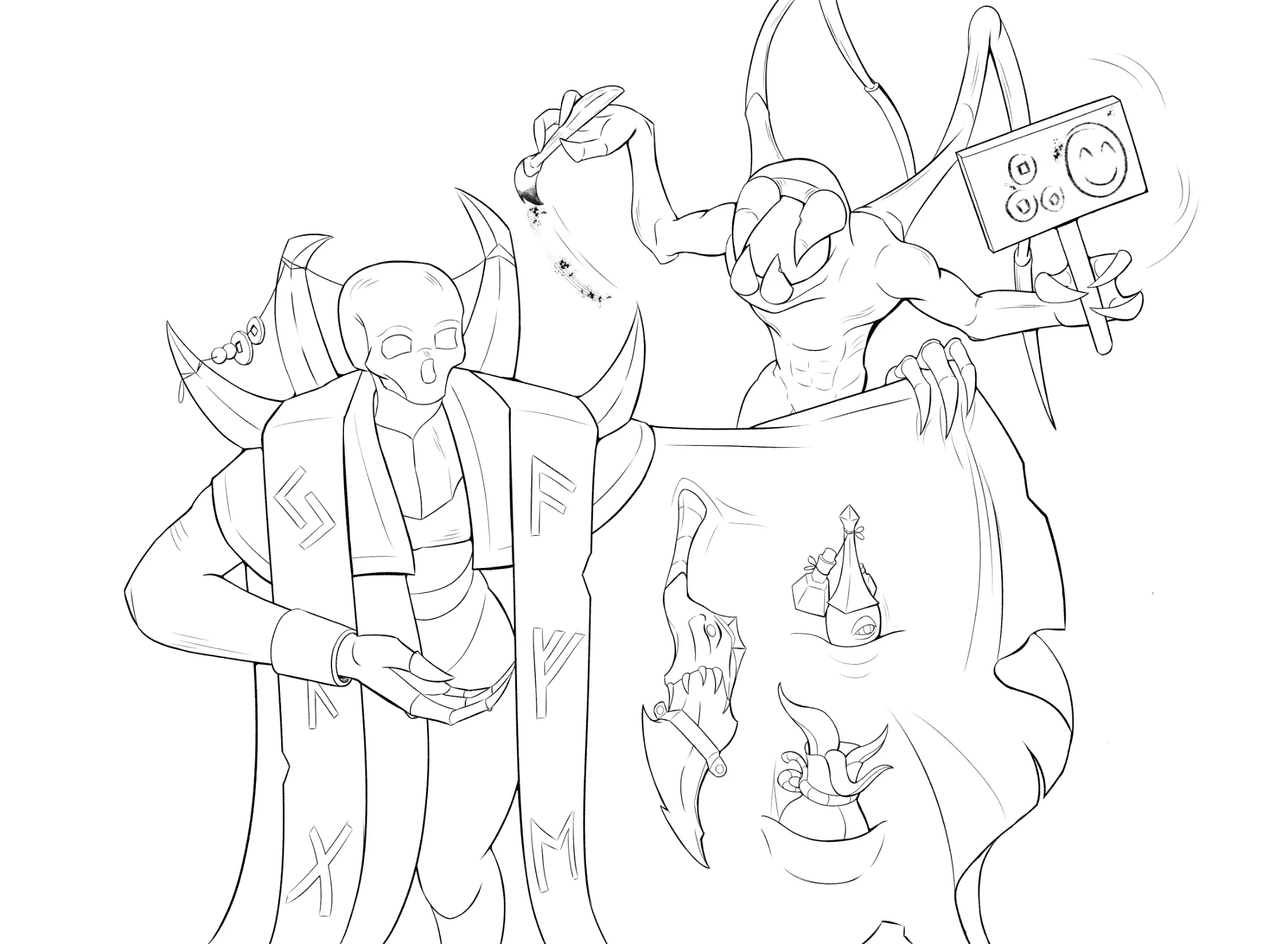
About linework in general
I finished it by adding this little walrus imp thing. I believe this is currently the absolute limit of my abilities. If there is anything to improve in this i am currently blind to it. I see this as a problem, since if i do not recognize my mistakes i cannot improve further, therefore if anyone can poke holes in this it would be deeply appreciated. Or maybe i should just start learning values already, since linework is kinda the only thing i've ever done.
9 hours ago
View
Rendering
No responses yet
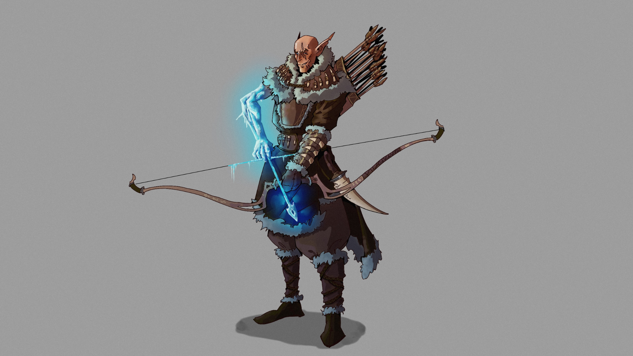
Ice archer
I got some feedback and tried Applying it, but my request still stands. I think it’s better now, but it could be even better, so any advice on the render or materials like the leather or the ice would help. Thanks!
9 hours ago
View
Anatomy
No responses yet
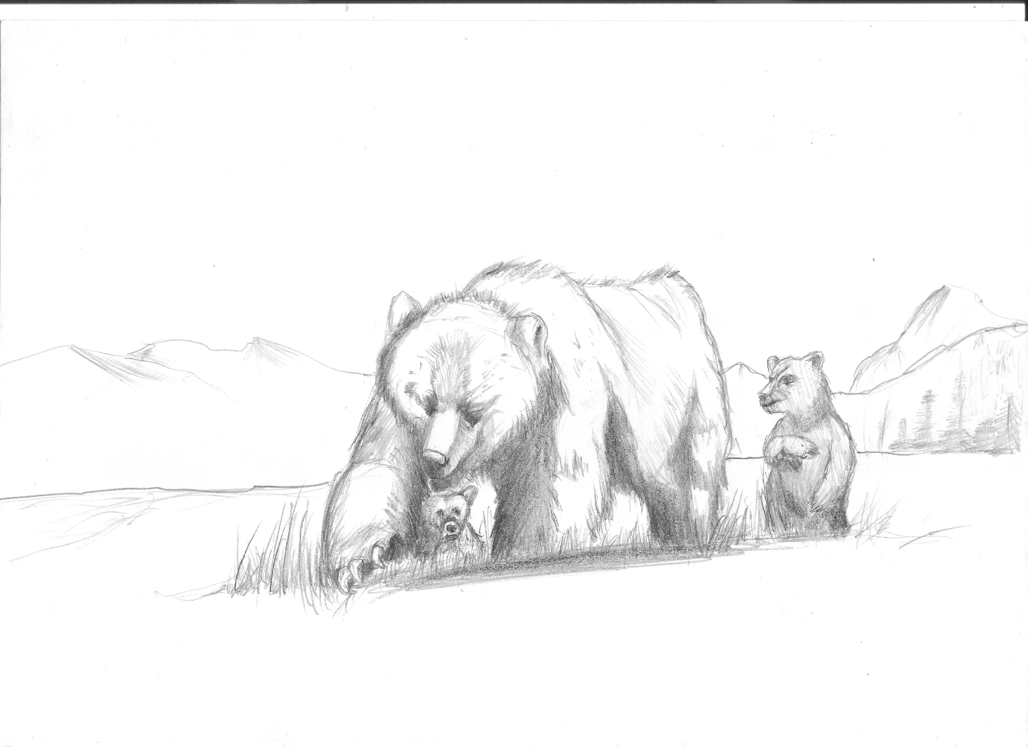
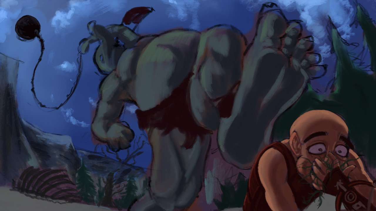
Behemoth thumbnail idea
I feel like I’m struggle with a few parts to this piece. First one is just the anatomy of the giant. The stomping foot over the figure seems off or maybe it’s the alignment of the back leg. I feel like I like this angle and composition but maybe it’s not as believable as it should be? Any help would be amazing! Also I’m sure I should adjust the colors too, it’s supposed to be a snowy mountain like landscape but I didn’t really set up a good foundation to depict that. Many thanks to all you talented helpers!
10 hours ago
View